Thoughts on Cybertruck
You may love the way Cybertruck looks, or you may hate it, but one thing is certain: it does not go unnoticed. People actually stop and stare at it. One guy in Bellevue even spit his coffee back into his cup when I drove past. Cybertruck makes you feel like a minor celebrity, and you just have to play the part.
I had a crazy idea of buying one, and then painting the Declaration of Independence all over it in Blackletter, for no other reason than to shock my fellow Seattleites. But, you know, as fun as doing calligraphy on a Cybertruck sounds, it would be a very expensive purchase, and I'd have to drive it for some years afterwards. So my husband and I figured we'd rent a Cybertruck for a day to see if we would fall in love with it (and go along with my crazy plan), or not.
HUGE but nimble
Just to get the obvious point out of the way, this car is enormous. Sure, it's not the biggest truck out there, but still.
Parking it was a challenge, and sometimes even attracted spectators (I smiled and waved), but the rear steering made it a lot easier than I expected. Model S definitely has a worse turn radius than the Cybertruck.
When I parked it front-in with no other cars around, I was able to center it in the spot pretty well, but it felt like I would have hit the other cars (perhaps it is just an illusion, but I didn't feel up for trying).
Obviously, it is a long car, so even in a non-compact spot, the back sticks out quite a bit. Forget about trying to squeeze your large car into a compact spot.
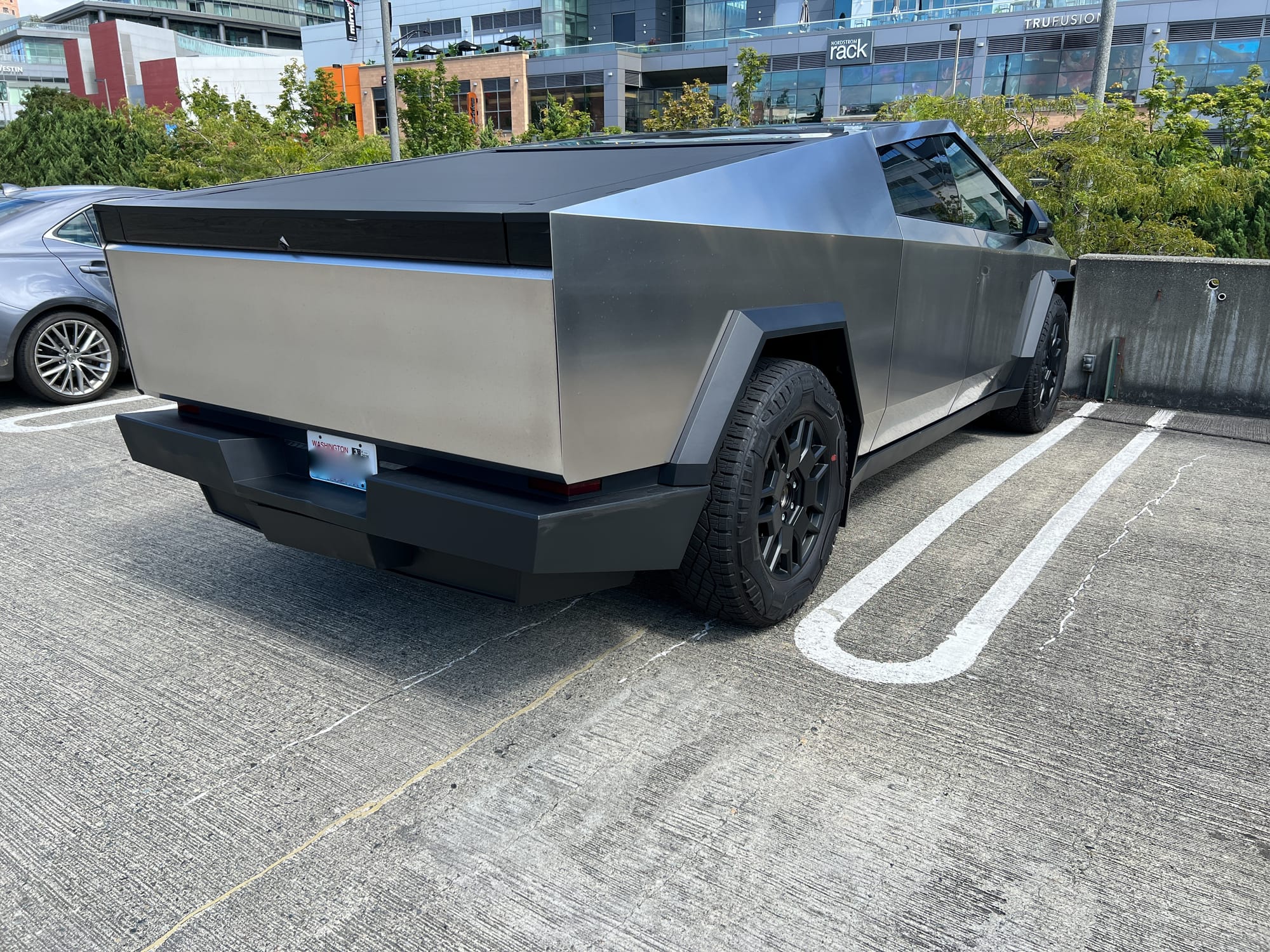
Another thing that felt terrifying was how tall this car is. It felt like it would scrape the ceiling in a 6' 10" parking garage, although of course it was about a foot shorter in reality. Perhaps this is something that people who own trucks are just used to, but I felt compelled to get out and check just to make sure it would fit.
Parking Cybertruck back-in was pretty easy, although it was a very tight fit due to its size. The cameras definitely help a ton.
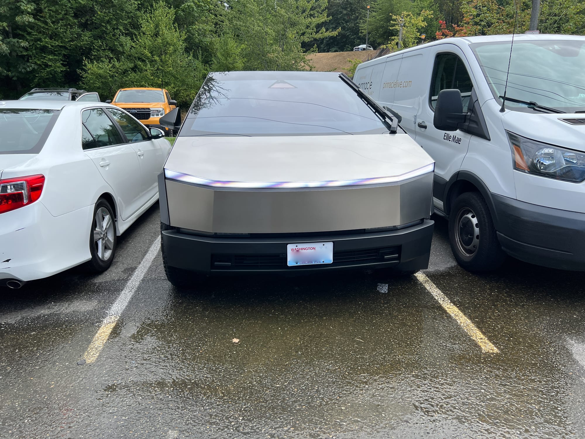
On a side note, check out that epic windshield wiper! It even has nozzles for spraying the cleaning fluid on the windshield, so it can spray and wipe in one go. Unfortunately, it didn't rain (that's Seattle for you, never rains when you want it to!), so I could not truly test it, but it seemed like the wiper would do a pretty good job.
One thing that was a bit silly with backing into a spot was that sometimes you just had to keep going until the wheels hit the barrier, since it was difficult to judge the distance from the camera image.
Stainless just like my fridge
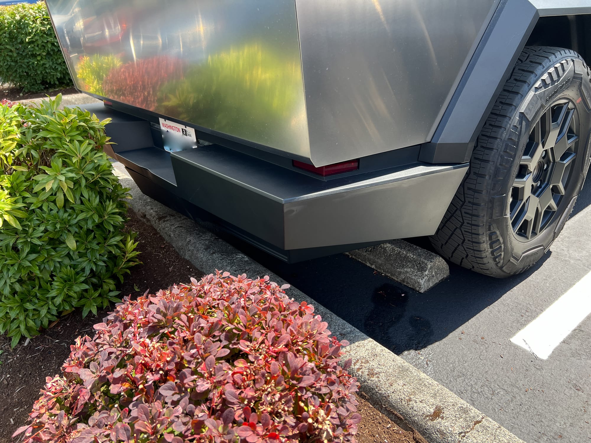
Another unique feature of the Cybertruck is its stainless steel exterior. It looks impressive when it's new and shiny, but even on this meticulously maintained rental I could already see some spots from hard water, and some too-greasy-to-come-off fingerprints. My best guess is that over time it will get worse, just like any stainless steel appliance in the kitchen. Stainless steel is a surprisingly unforgiving material.
Where do I put my groceries?
One of the practical considerations of owning any car is how good the storage is for mundane tasks, such as grocery shopping. The truck bed is obviously very large and excellent for hauling things (and for taking tents and stuff to go camping). But if you put a grocery bag in the trunk, it will tip over as soon as you hit the brakes, and then you'll have to crawl over the whole expanse of the truck bed to collect your spilled stuff. Yikes!
I suppose this problem is not unique to Cybertruck, and regular truck owners have it all figured out, but I would rather just not deal with it.
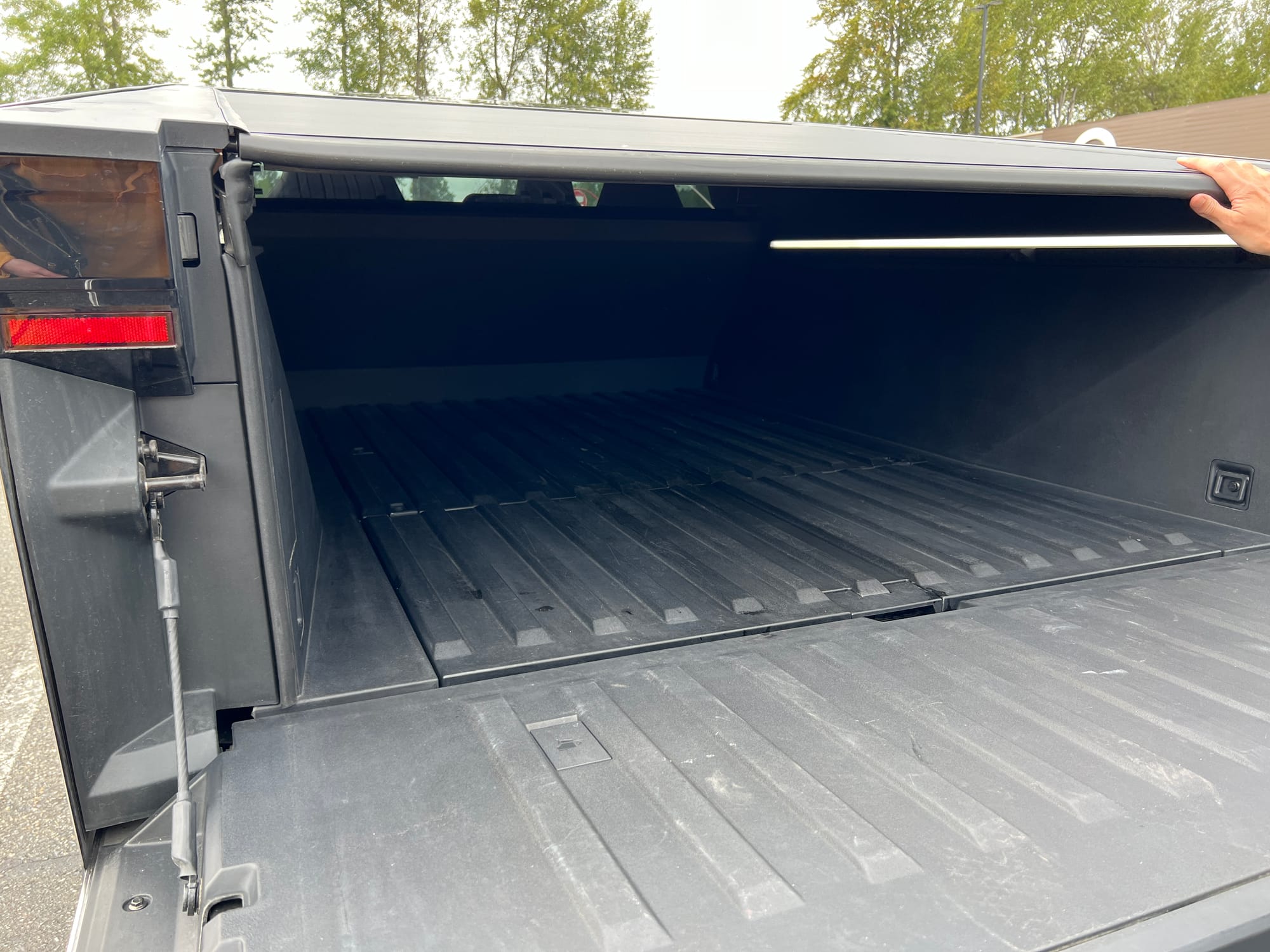
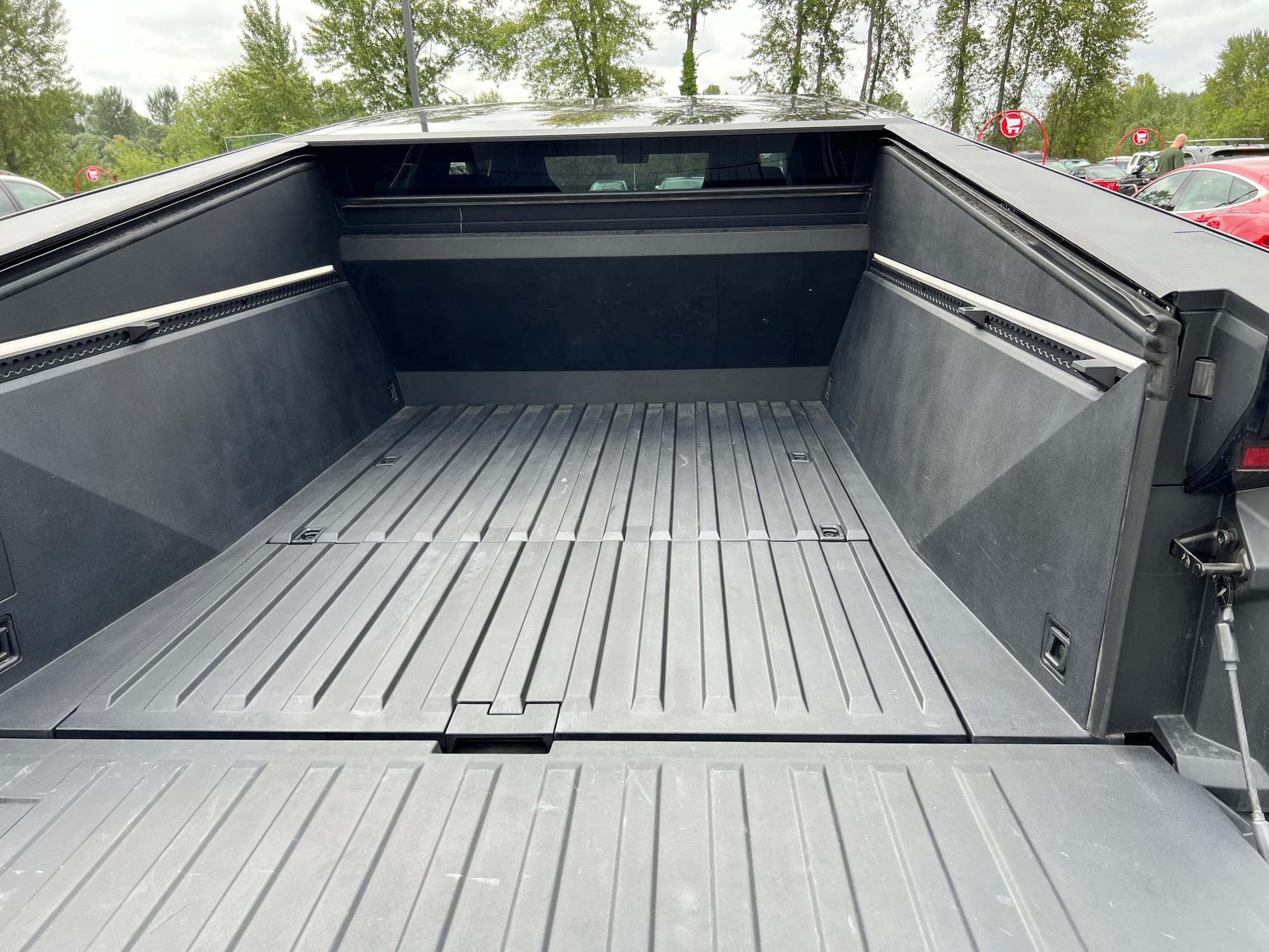
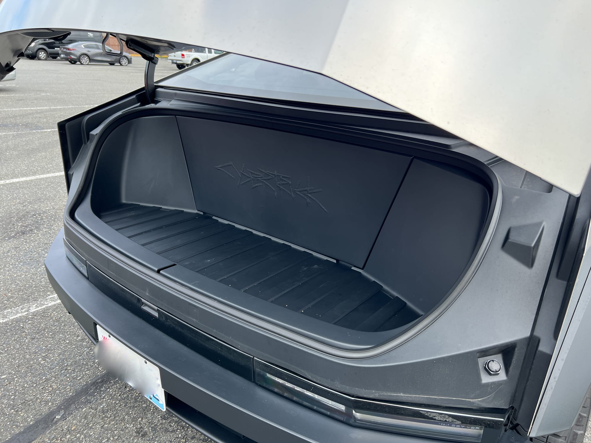
The frunk is surprisingly small by comparison. I think I could fit one bundle of firewood in there, and a couple of small things on the sides, but that's about it.
Ergonomics
Now, let's dive deeper into what Cybertruck is on the inside, and how it feels to drive one given the set of features it has (and lacks).
Steering wheel
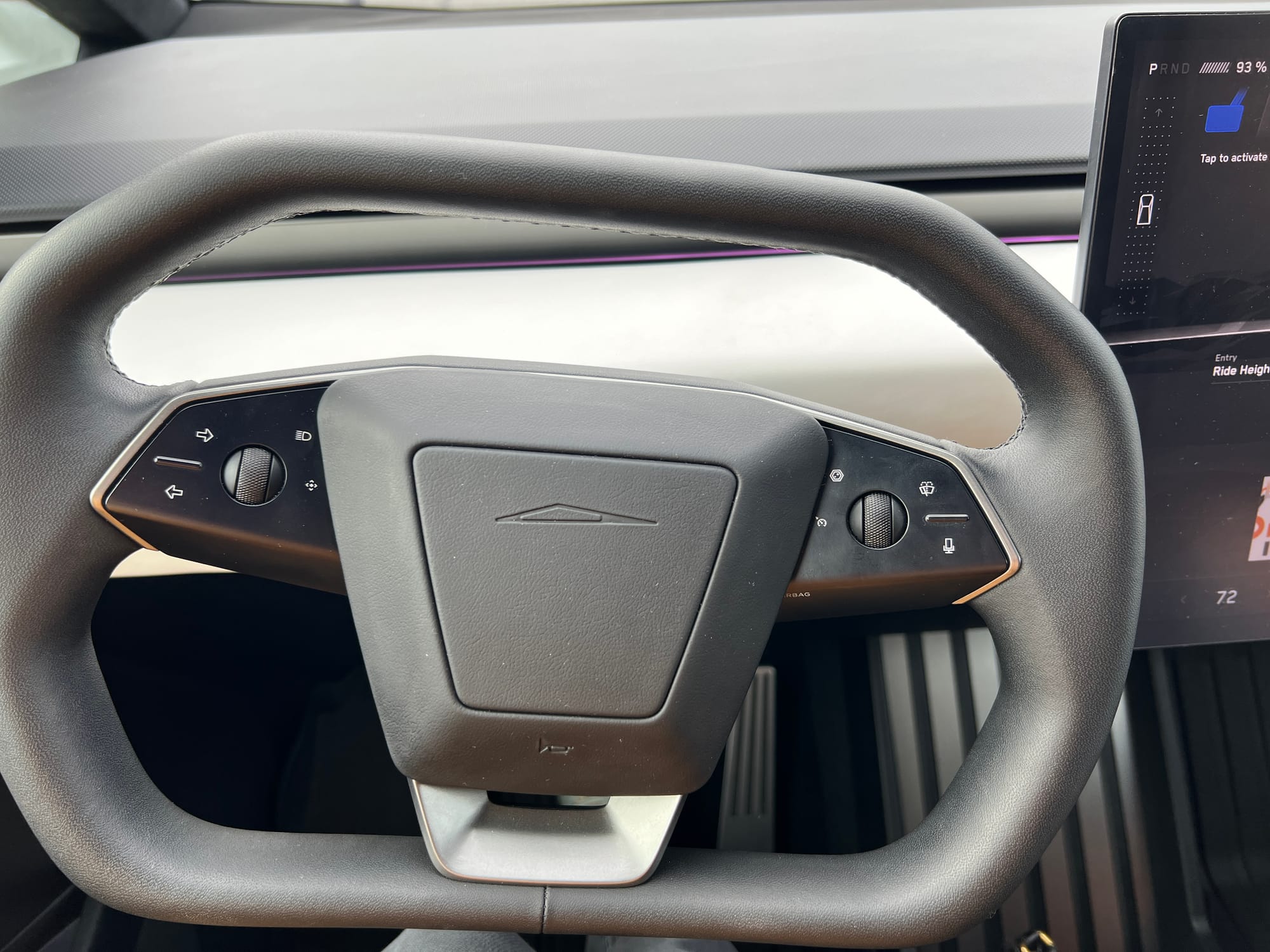
First off, a rectangular steering wheel is just uncomfortable. I didn't have any issues with using it to maneuver the car — it was intuitive, and I didn't miss the need to do hand-over-hand. I didn't try honking at anyone, but I am sure that would work fine too. However, when I tried to rest my hands on the bottom on a straight stretch of the freeway, I sort of felt like I had T-Rex arms. I only did it for half an hour, but on a longer trip I think that would become old really soon.
The turn signal buttons on the left are a bit annoying to use, since I have small hands, and cannot reach those buttons without moving my hand. But overall even though they are different from the traditional stalk, I was able to get used to them after an hour or so of driving.
One thing that I found confusing is that there are 4 icons, but only 3 buttons. For example, on the right side, there is a hexagonal icon on the top left which activates rear camera view (more on that later), but the icon below it for setting the cruising speed actually represents the scroll wheel, and there is no button on the bottom. Autosteer was not available on this car because it hasn't yet had the software update, and it was a very confusing experience trying to figure out how to activate it or cruise control. I ended up having to look that up online.
The only button to activate the windshield wiper is the one to spray windshield fluid. I generally don't mind that, since my wipers are set on automatic 99% of the time too, and do a pretty good job, but I was wondering what would happen in a car wash where you are asked to turn off the wipers. There is probably something in the controls on the screen for that, but it is annoying when some of the controls for a feature are in a different location.
I guess this is similar to automatic headlights — if they work properly, you never have to do anything, except sometimes force them on during the day when there is one of those annoying freeway signs that instructs you to have them on "for safety". So there is no need to have a button or a knob easily accessible to control them. A button somewhere on the screen 3 menu levels down is fine, since you will hardly ever use it. And I've never had a case where the automatic headlight behavior was not in line with my expectations. However, with windshield wipers, I've seen them go crazy sometimes, where they will wipe the dry windshield at max frequency (not in this particular Cybertruck, but this definitely happens in my Model S, and in my friend's Model 3). That is extremely distracting, and if there is no easy "off" switch, I'd just have to pull over and look for that menu on the screen somewhere. It would not be a good driving experience.
Overall, the shape of the wheel might just be a matter of preference. Trying to minimize the number of buttons and knobs is in general a good idea, but I feel like it's gone a bit too far, and instead of truly simplifying controls just pushed them onto the display. I would much rather have more knobs I can control with my hands without looking than be distracted from the road by desperately scanning the screen for the thing I need.
Rear view mirror
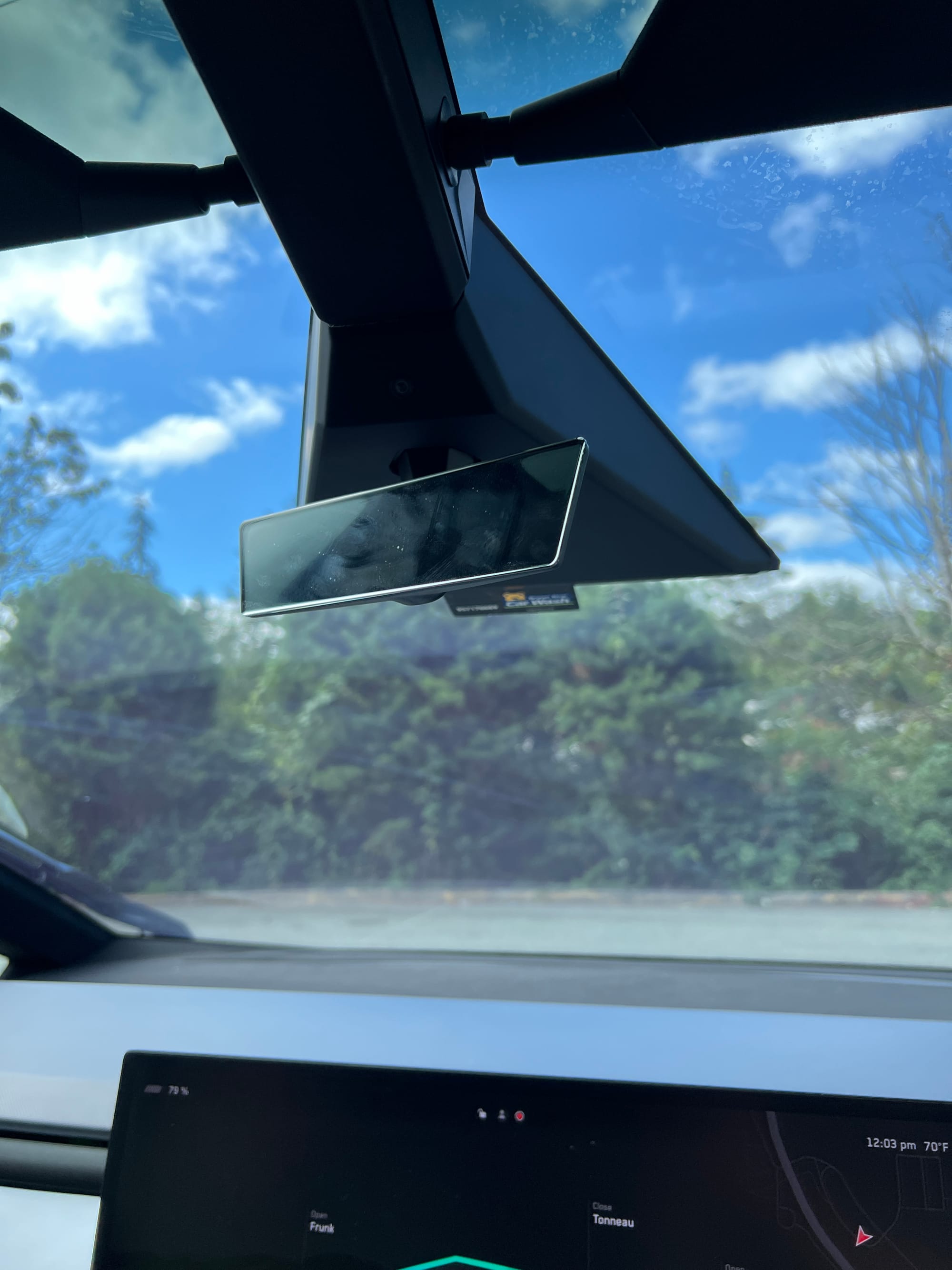
My best guess is there are regulations requiring each car to have a rearview mirror, and so Cybertruck has one. And just like anything that's there "just to check the box", it's completely perfunctory.
When the tonneau is closed, it's completely useless, since there is nothing to see other than the inside of the tonneau cover.
When it's open, you can sort of see, but the viewing angle is so narrow that if you slouch a bit, or otherwise move in the seat, you won't see anything useful either. Plus, there is a lot of distortion around the edges.
I had honestly tried to use it for a bit, but quickly gave up because it was worse than not checking what's behind me. I saw some discussions on Reddit with people suggesting it should just have been a screen with the rear camera feed, and I tend to agree with that. There is no way to make a regular mirror useful in a truck like this, and putting the camera feed on the main display just overloads it with information.
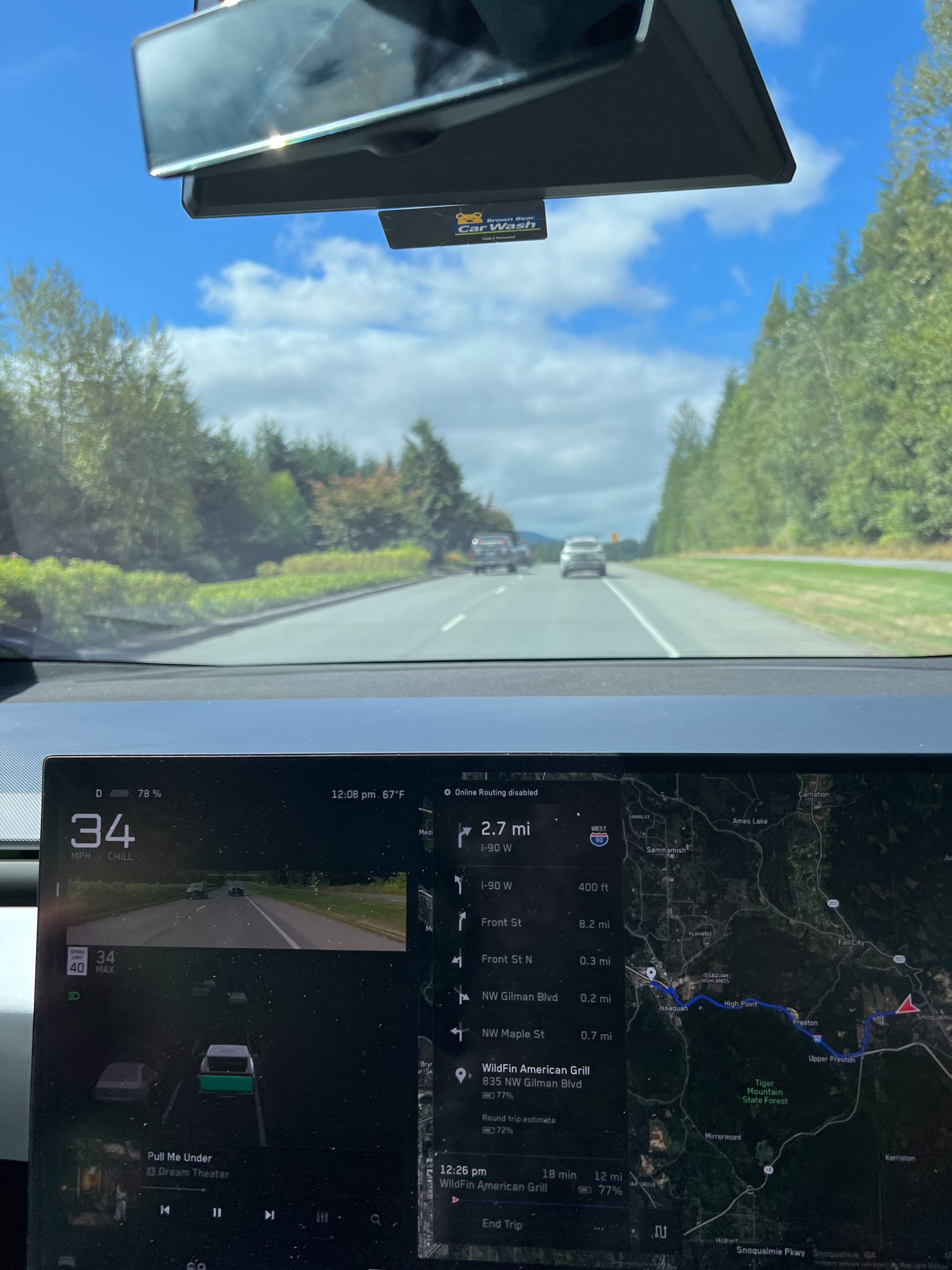
I personally find the video feed on the display distracting, and I would much rather have it on the mirror itself.
Display
It was difficult to get a good shot of the screen due to glare (and next time I will wear black instead of yellow), but hopefully this is still good enough to illustrate the main points.
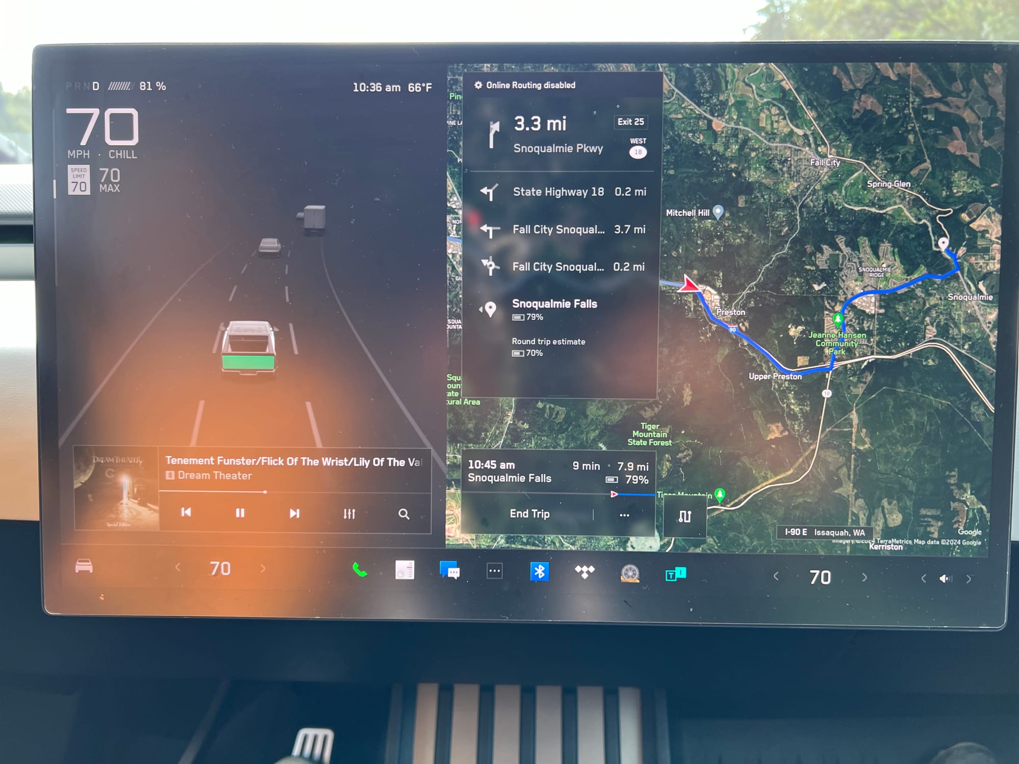
The problems I describe below are shared by all Tesla models without the driver screen. I don't think Cybertruck makes them any better or worse.
Even though the speedometer is in the top left corner, my eyes still felt sore from having to glance down at it from time to time. I felt like I had to take my eyes off the road for too long to check my speed. Similarly, the live road view is useful, but it was so far down that I would not dare look at it.
Navigation is way too far to the right to be usable, and it's difficult to pick out the immediate next step with a quick glance at it. Also, for some reason, when it offered several routes and I chose one, it would not stick with my choice, but instead reset it over and over to a different option. That was a very frustrating experience, especially in an unfamiliar car.
Changing gears
I see why Tesla moved the control to the screen — you only really need to change gears while parking and leaving parking — so why waste physical controls? I strongly disagree with this choice, and I think the UI is ridiculous.
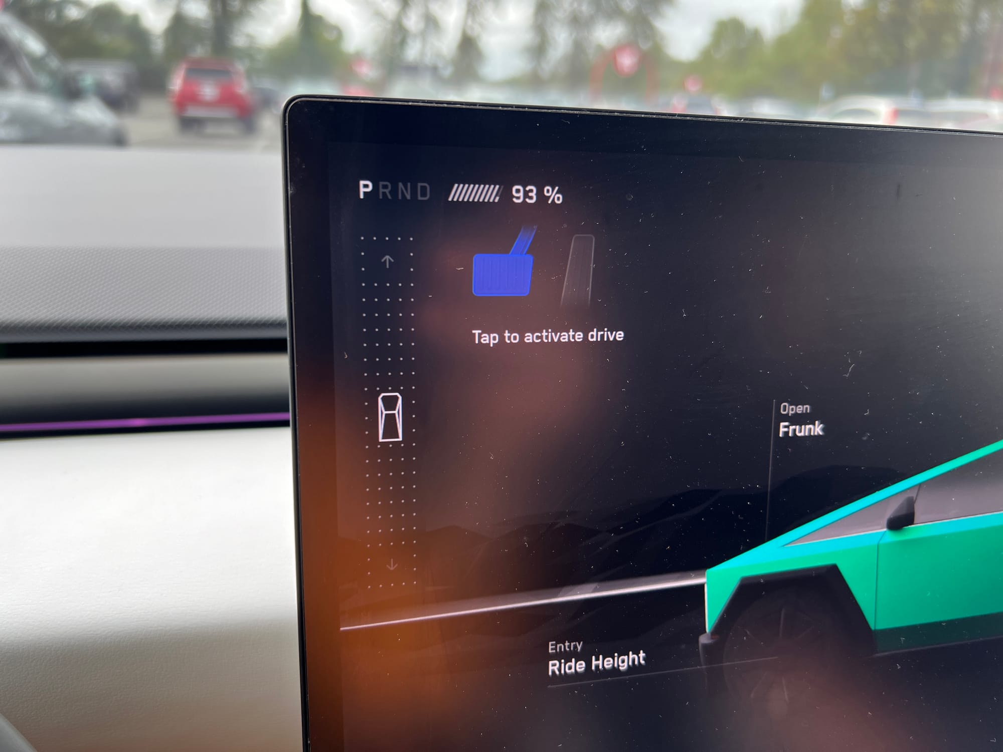
If you want to put the car in drive, you slide the little car up. If you want it in reverse, you slide it down. If you need to do this several times because you didn't quite nail your parallel parking, poor you. This really should be a physical control.
I think the car is supposed to be "smart", and choose the correct mode for you (see that blue brake pedal on top?), but somehow it didn't always do it right for me.
And yes, if automatic parallel parking was perfect, and would not give up halfway though trying to squeeze into a tight spot, this would be slightly less annoying. But only slightly.
Now, some might object to my comment about "physical control", because there is actually a redundant interface for switching gears.
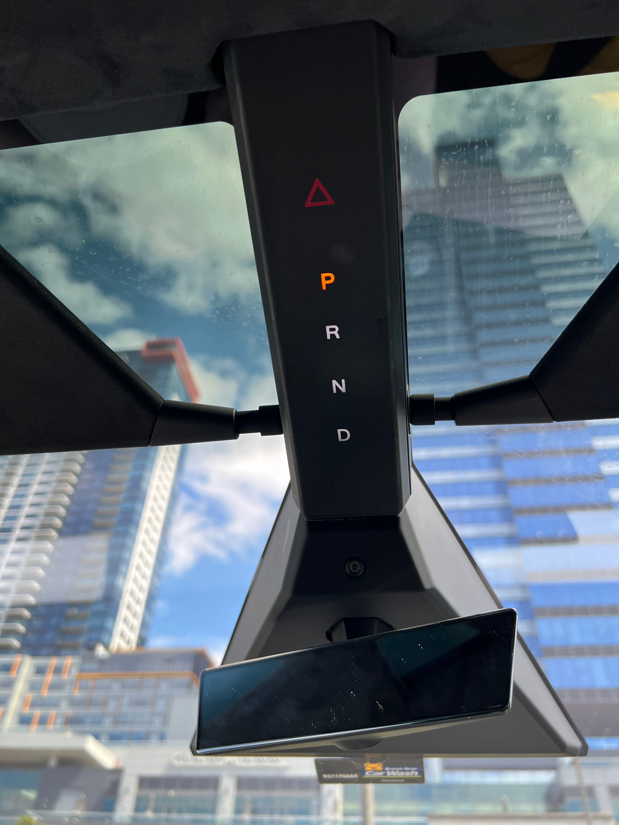
It's right above the rearview mirror, and can be activated by groping around that area. I didn't even try it, because why the heck should I have to lift my arm that high just to switch gears? I'd be shocked if anyone actually uses that. I wonder if this was done just to satisfy another legal requirement.
Blind spots
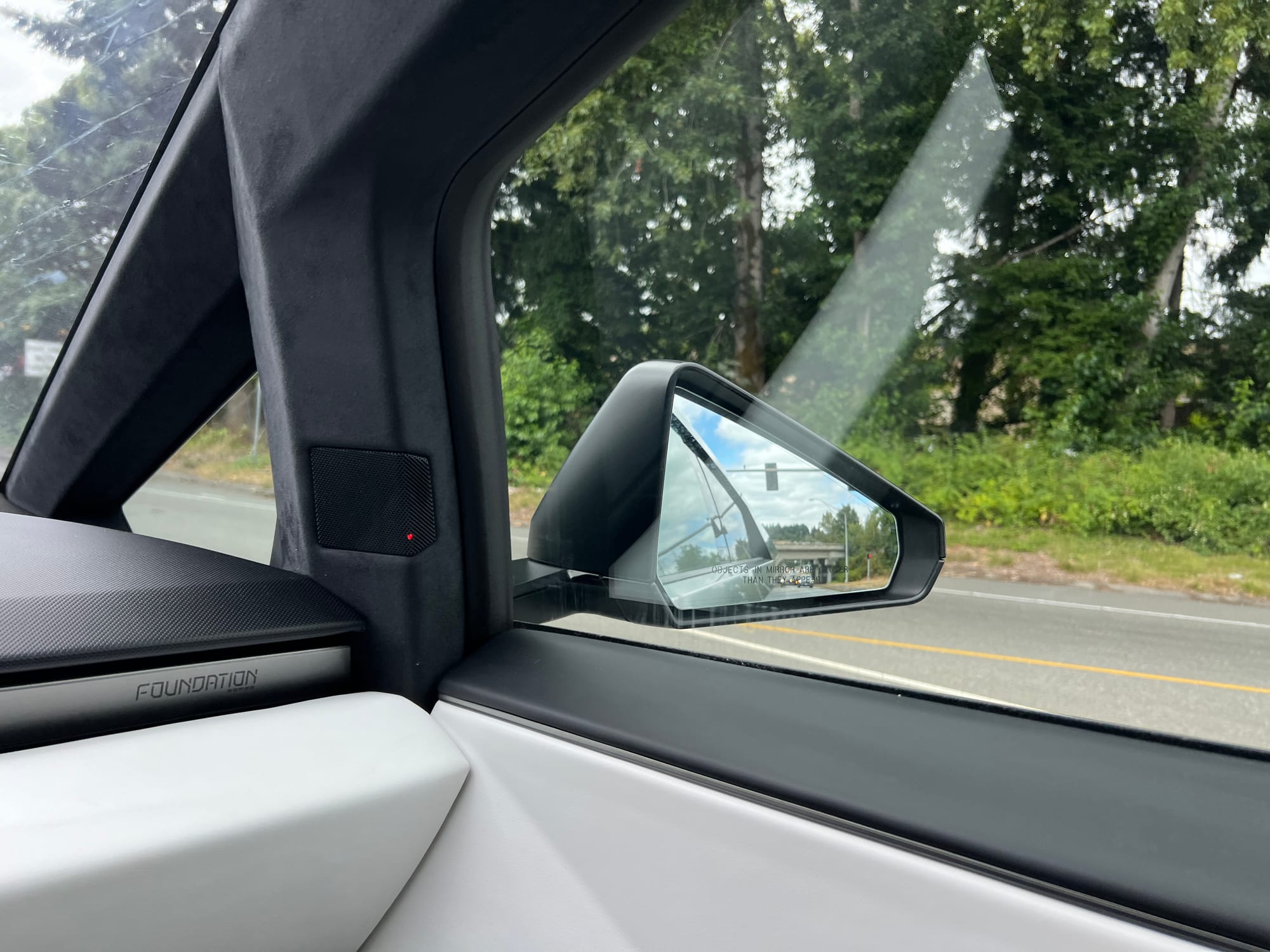
The good part: there is a blind spot indicator. The weird part: it's a red light on the speaker.
I honestly have no idea why it's not on the mirror itself. It is fully functional in that you can easily see it, but I find it bizarre that it's part of the speaker, since it's in no way related to the speaker.
Final thoughts
Cybertruck definitely stands out due to its shape and material, and is a great conversation starter.
Rear steering is really cool, I wish I could have that in my car.
But other than that, it's just meh. It's a car. It drives. The screen and lack of physical controls are hard to use, and probably cause repetitive stress injury over time.
It is way too expensive for what it offers. So no, I will not be buying a Cybertruck. But if you are, and would like some crazy calligraphy on it, send me a message ;)

Comments