Quaker marriage certificate

A few months ago, I was invited to a friends' wedding, and they asked me if I could create a marriage certificate for them. I've never done this before, but I figured it would be a nice challenge, so I said yes. Of course it turned out harder than I thought, but I also learned a lot.
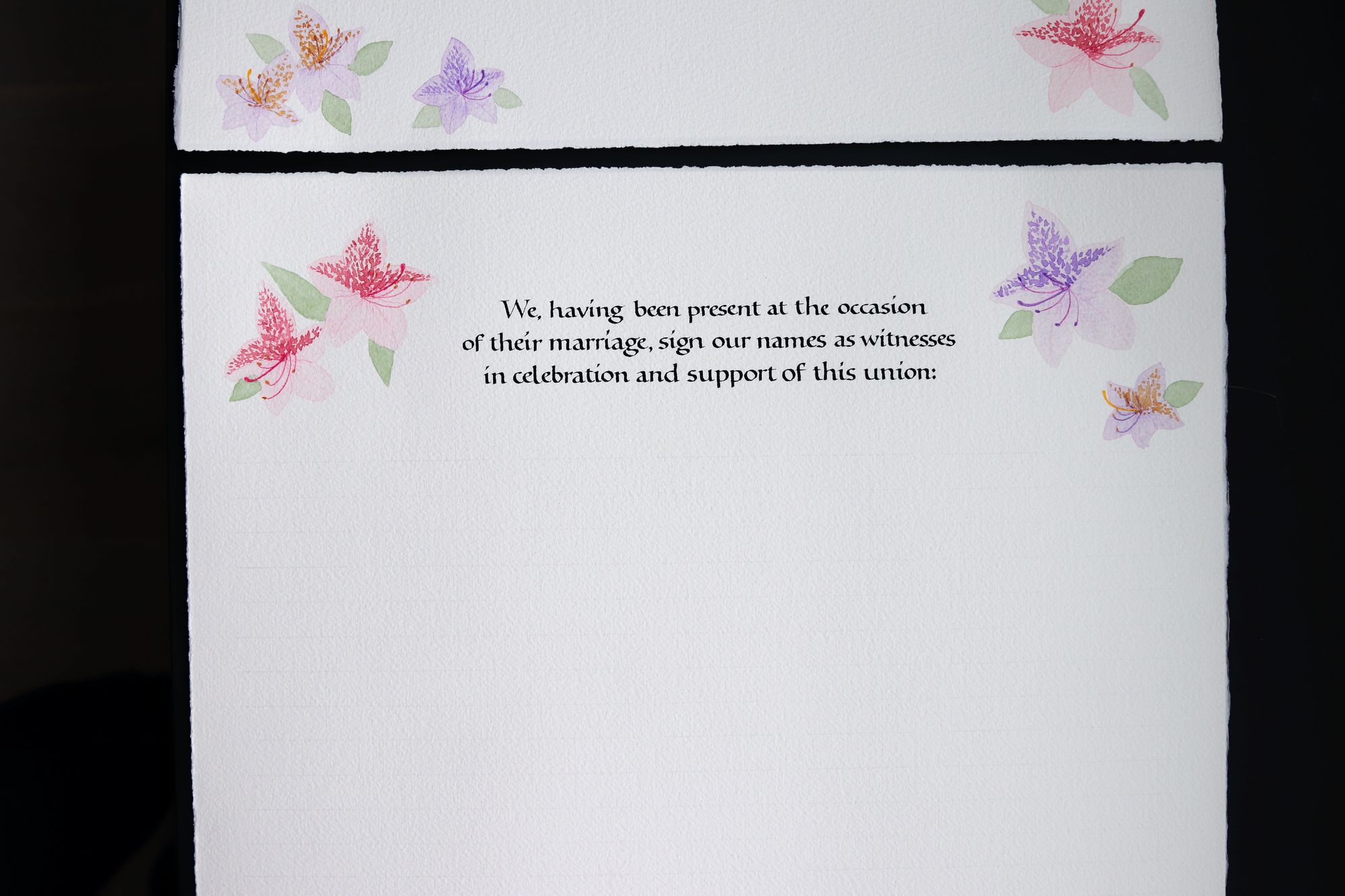
They showed me a couple of examples that they liked, so I had a pretty good idea of what they wanted in general. One thing that makes Quaker certificates different is that every guest is expected to sign as a witness, which means a lot of space needs to be left for signatures (my friends had some 150 guests at their wedding).
From the beginning, I did my best to communicate clearly and get all of the requirements. Sometimes figuring those out took several rounds, but I felt like it was always worth it to dig deeper to understand what is truly important for them.
For example, I was originally planning to make a one-page certificate, measuring 15x22 inches, but that would mean less space for signatures. It was very important to my friends to give every guest an opportunity to sign, so in the end we settled on a two-page design, where the second page was just for the witness signatures. I might have felt a bit frustrated by this initially, but then I realized I am doing it for them, and not for myself, and so it's more important to make it right from their perspective than to follow my design hunches.
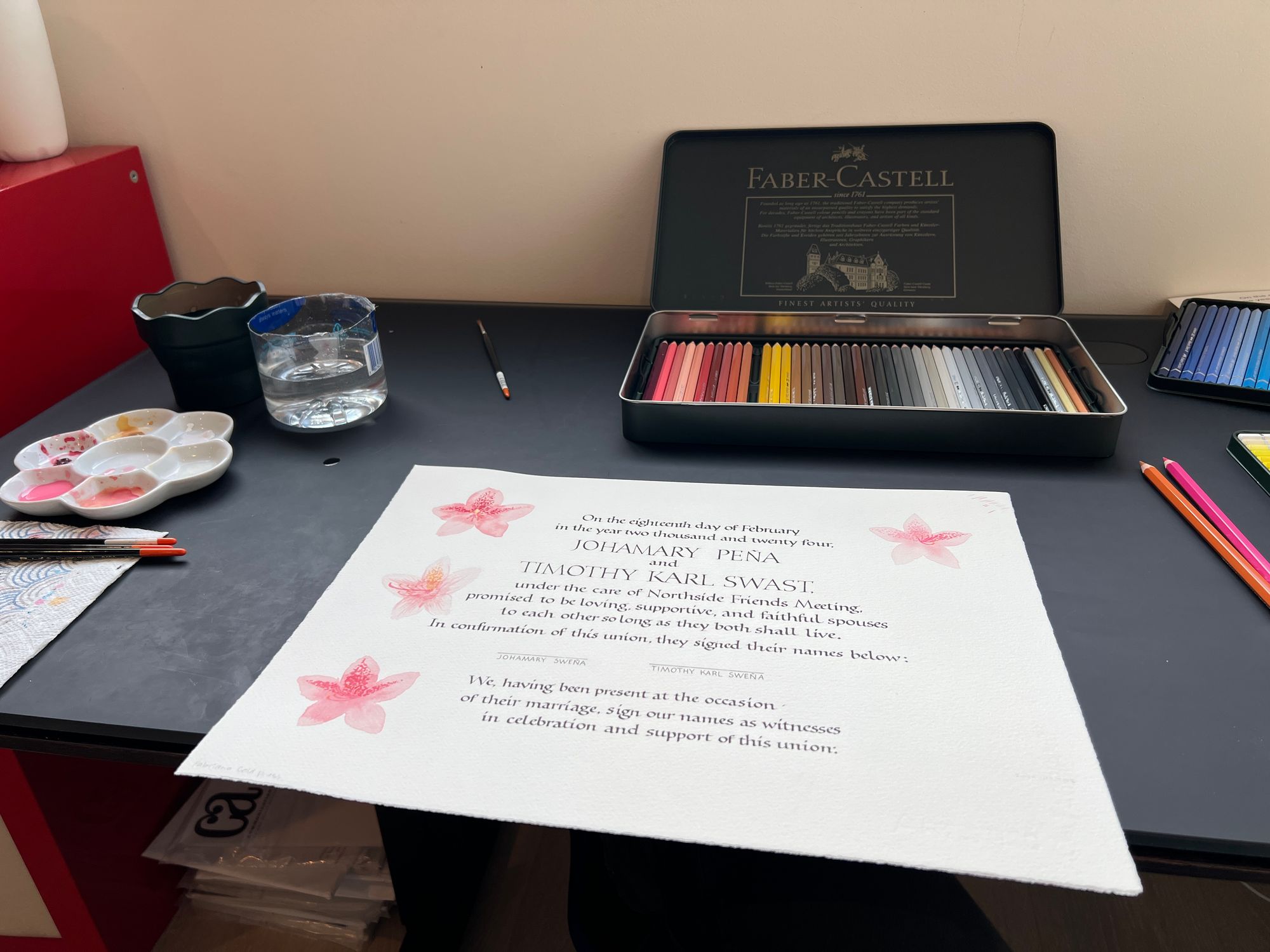
My friends also wanted a decorative border with flowers, which was a bit intimidating, as my watercolor skills are far from professional. I still decided I would try, even if it meant going further outside of my comfort zone.
Before starting on any actual calligraphy, I painted a flower, and shared it with them to make sure it would not be a deal breaker.
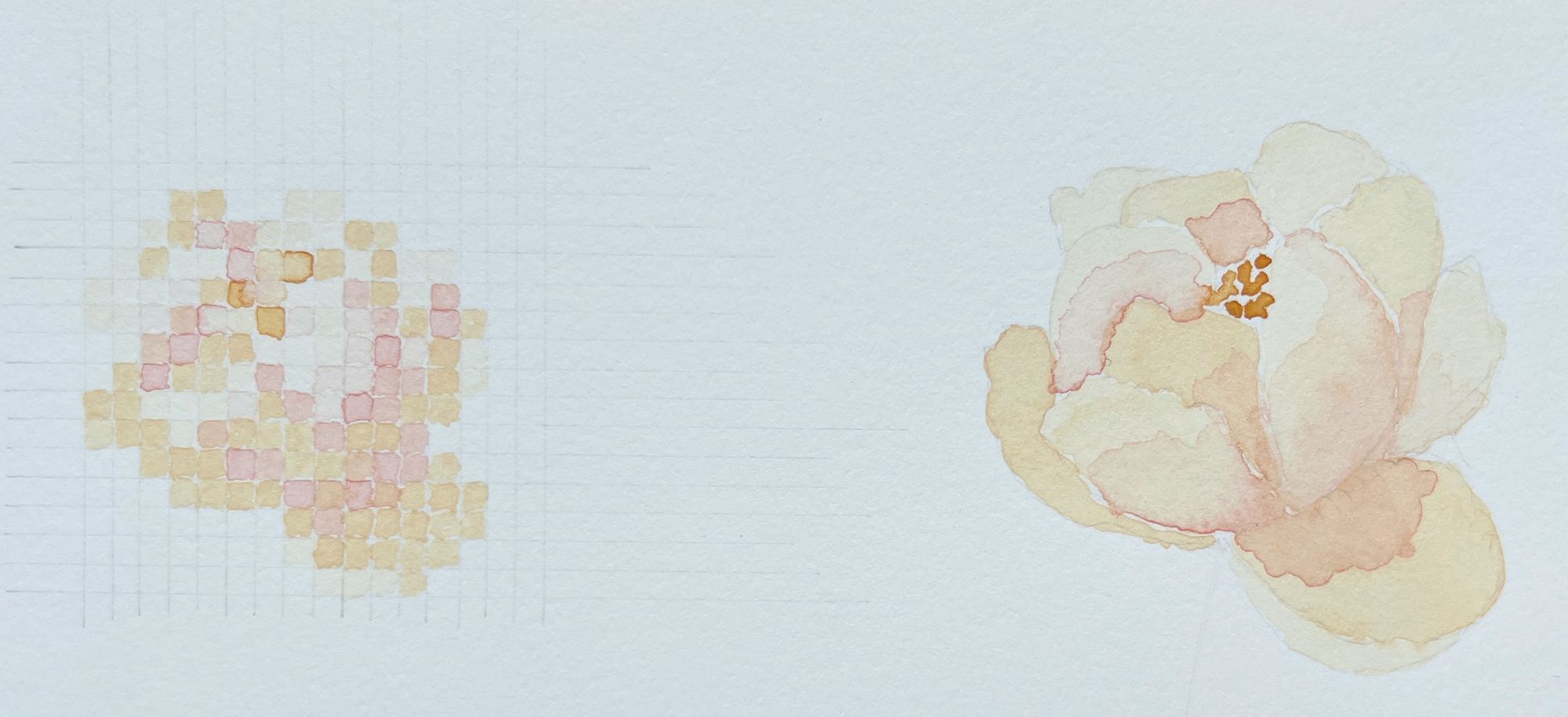
One of my friends is into pixel art, so I had this idea of potentially combining some regular watercolor flowers, and some pixel art (also done with watercolor), hence my attempt at a pixel flower above. Spoiler: the final version had no pixel art, but more on that later.
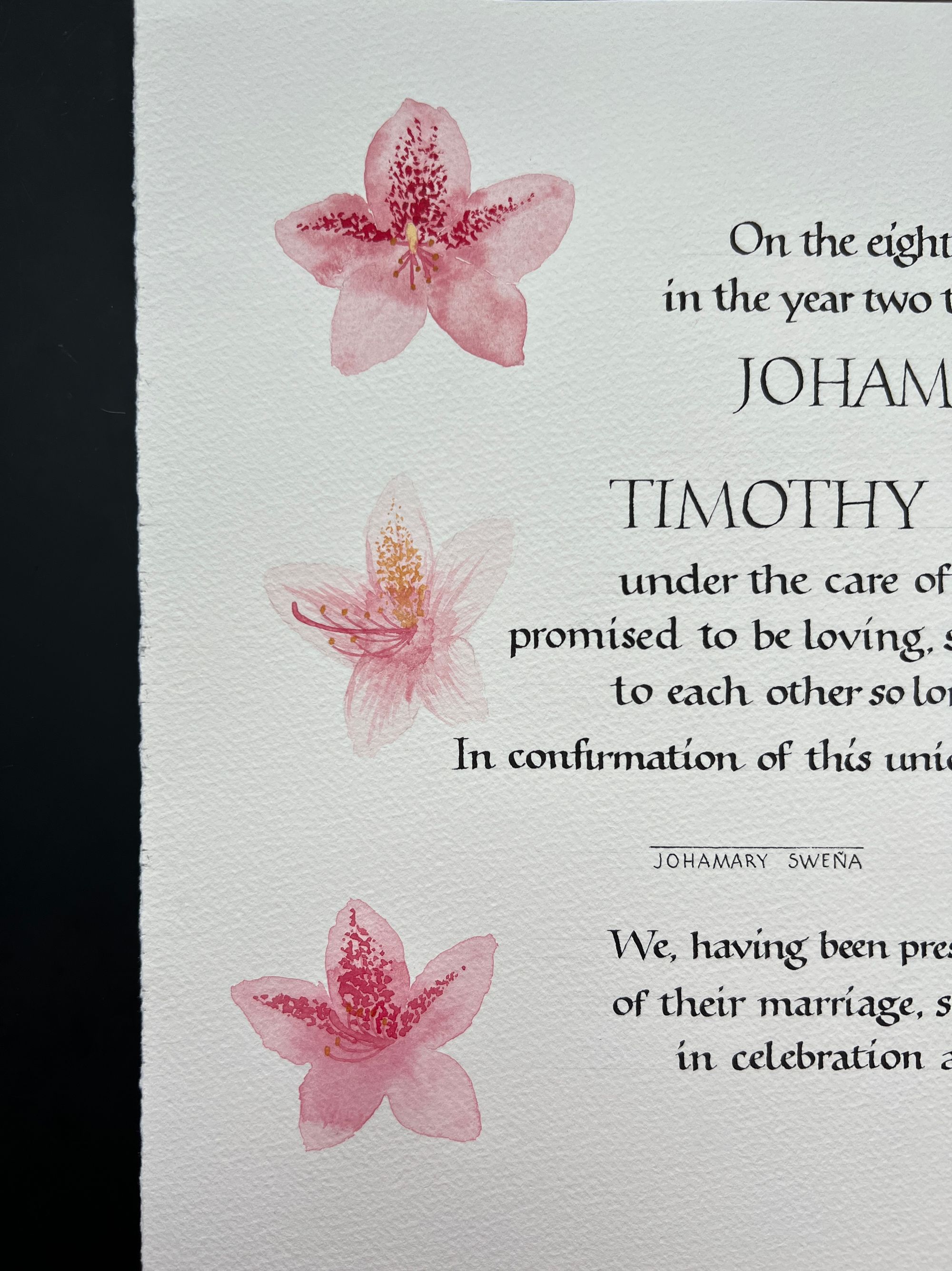
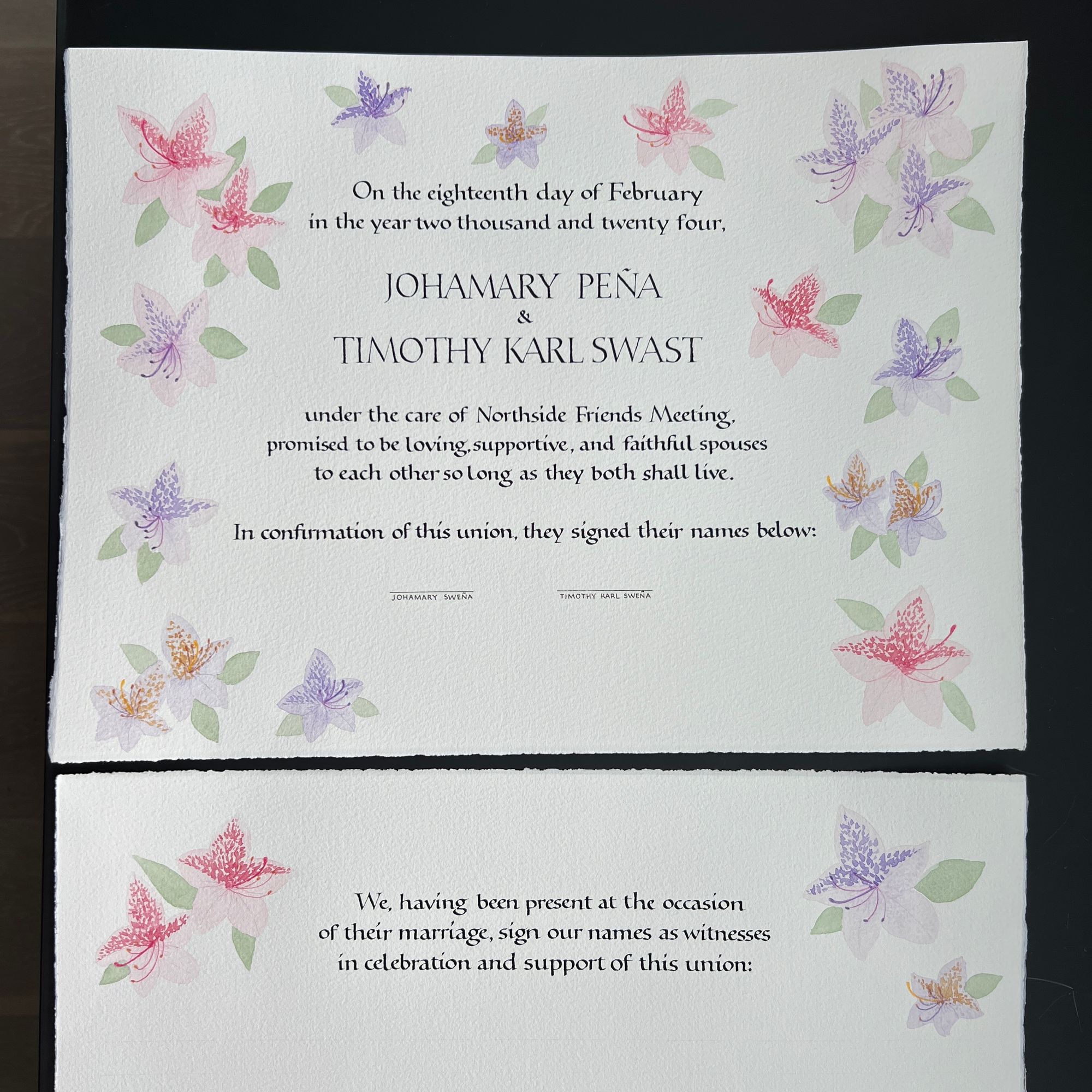
I won't bore you with the details on all the flower combinations we discussed, but in the end we settled on pink and purple rhododendron and jacaranda flowers, which they felt represented both of them. Extra challenge for me: I really dislike those colors, but I was able to overcome my aversion to pink, and finish the project.
It also took some time for them to settle on the exact wording they would use, and I waited until then to start on the writing.
Next, I sent them some samples of writing styles we could use for the certificate. I have no idea why I could not wait until morning to take a better photo, but this is what I actually shared with them:
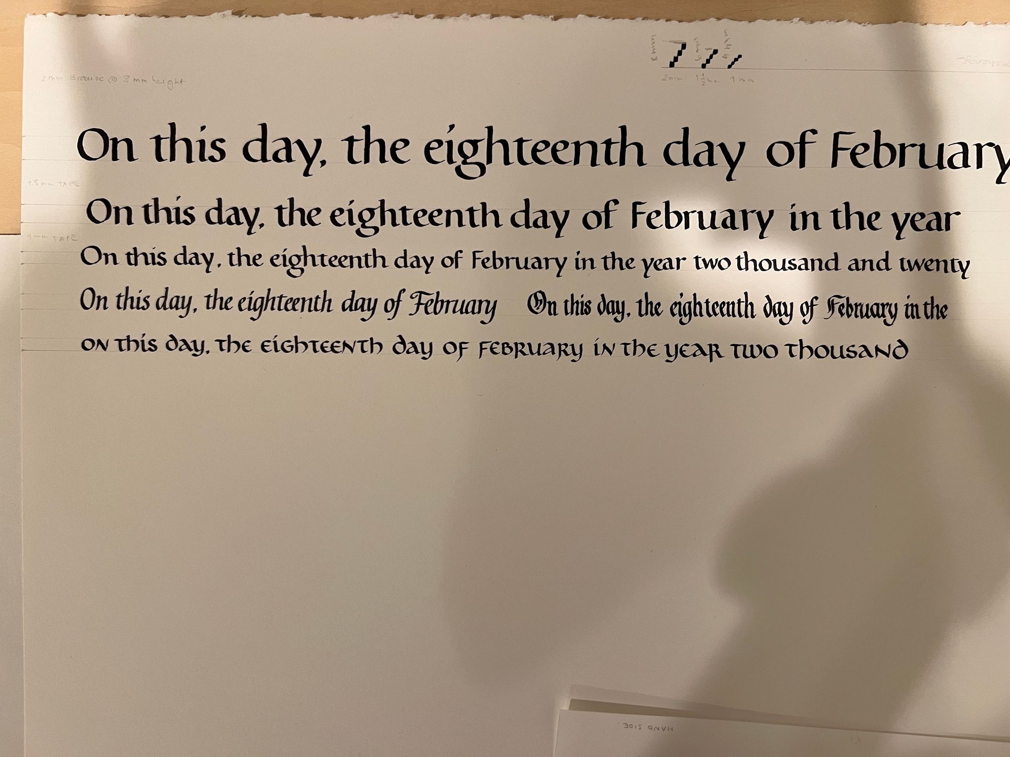
The first two lines were just me figuring out the right size for the text, so the real choices were between line 3, the two options on line 4, and line 5. They decided to go with Foundational (line 3). I would have had fun figuring it out in any of the styles, but in a way, this was an easier choice for me.
It was very important for me to have the correct text, so I would not have to do any last-moment changes to the wording (and consequently layout). After I sent the image above to my friends, they adjusted a couple of things in the text, and I was ready to start working towards the final version.
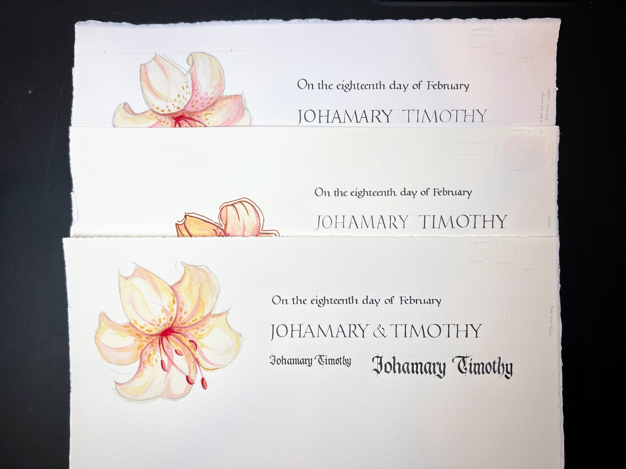
Conveniently, I was taking John Stevens' class on pointed pen Roman capitals, so of course I went ahead and suggested those as an option for contrasting style for the couple's names. It did feel a bit too informal to all of us (so regular Roman caps were selected), but it was worth a try.
I also wanted to make sure I was happy with my paper choice. Originally, I had planned to use Stonehenge (half a sheet is 15x22"), but after going to the store, I also got Arches Watercolor and two kinds of Fabriano Watercolor, cold and hot press. What I was looking for was how the pen felt against the fibers of the paper, and how well the watercolors blended, and how well pencil lines erased. The color was also subtly different, with Fabriano having more of a cream tint to it.
Even though hot press paper feels nice and smooth, I have a very hard time blending watercolor on it, and I feel like it's less forgiving. I ended up settling on the cold press Fabriano for this project, though the texture was a bit challenging for small writing.
My friends also said they would like a centered layout. This meant I didn't have as much room to explore the interesting placements of their names and such, but instead I needed to make sure my measurements were really good, so the text would actually be centered.
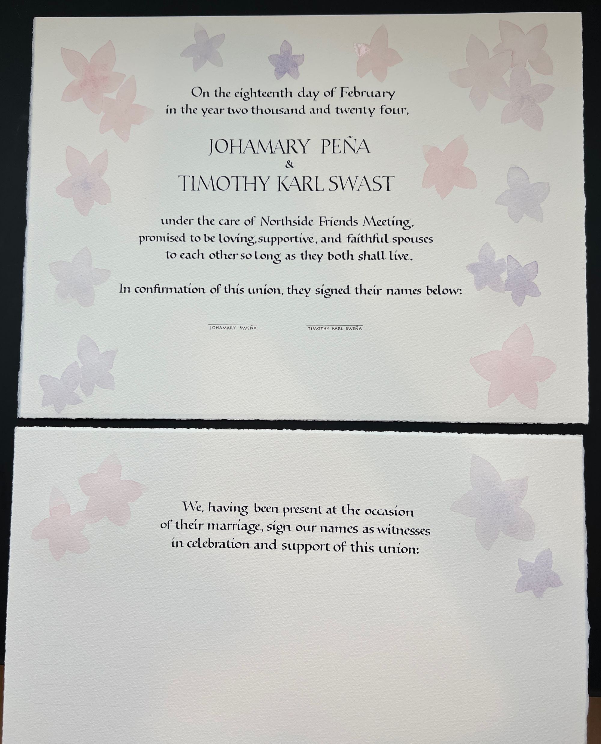
The image below is my first attempt at the layout, with the main purpose of figuring out exactly how long each line would be, so I could properly center everything.
Other than the off-center lines, I thought a couple more things needed to change:
- The spacing between paragraphs and around the couple's names should be larger.
- "and" between the names should be replaced by "&".
- The monoline names below the signature lines should be smaller.
Around this time, I also tested pens that guests would use for signatures, and settled on Pilot Juice Up 0.4.
For the calligraphy, I used W&N Jet Black gouache. I tried sumi ink, but it didn't look as nice, and Higgins was never a real contender (although I used it for the very fist draft). I could have ground up my own stick ink, but I figured there were enough challenging aspects to the project even without that. I'm not including the photo because you can't really see the difference there, but it is obvious if you look at the actual paper.
I took a few in-progress pictures of the more final draft, which I intended to post on Instagram, but my friends asked me to hold off until after the wedding.
In the meantime, I practiced my rhododendron-painting skills on the initial layout sheet.
I also did a whole bunch of pen-and-pencil sketches to get a better idea of what the flowers looked like from different angles.
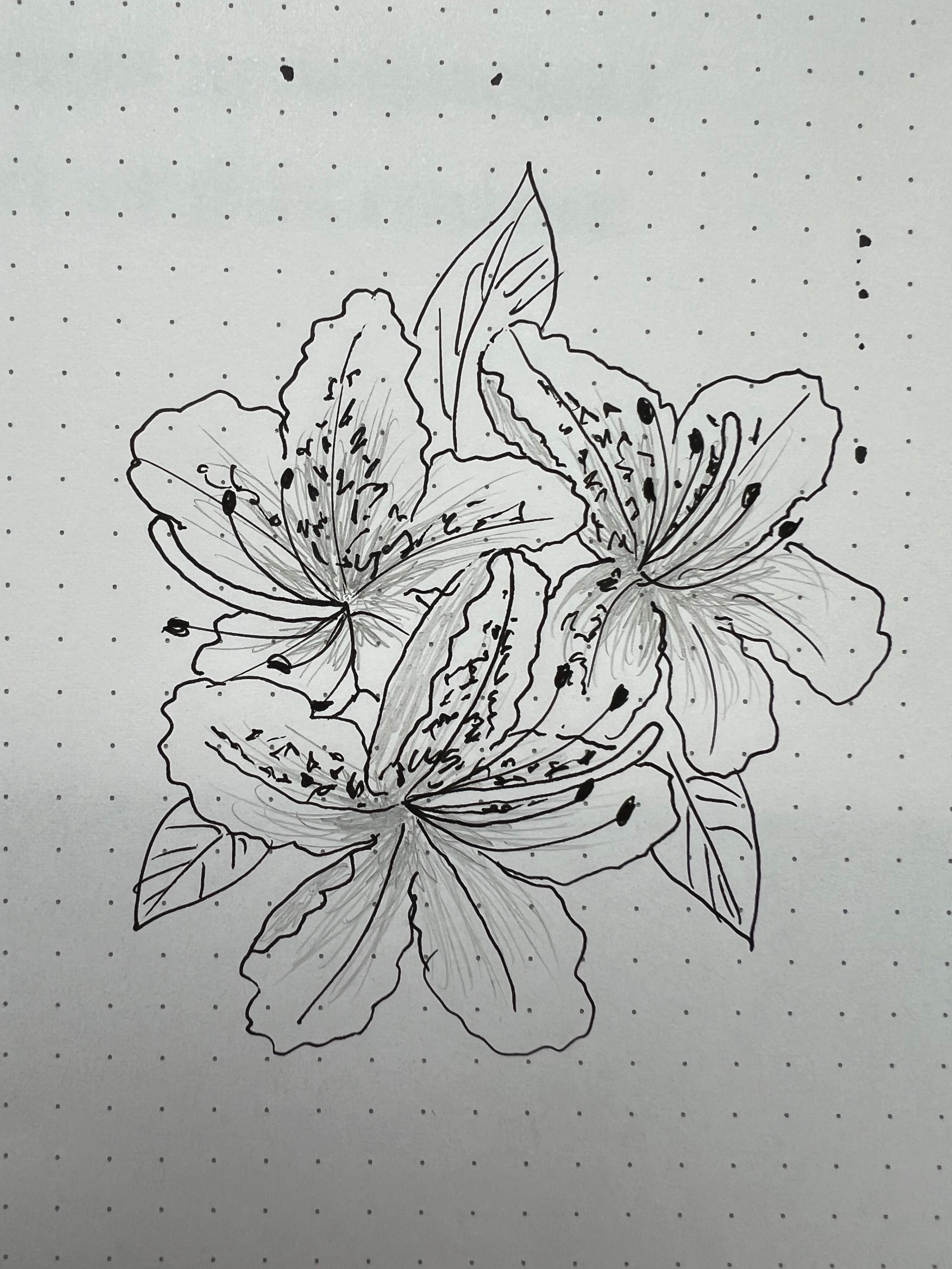
All of these flowers are based on rhododendron photos that I took myself over the years (thanks to Google Photos search feature, I was able to locate them quite easily).
Back to some more lines of writing:
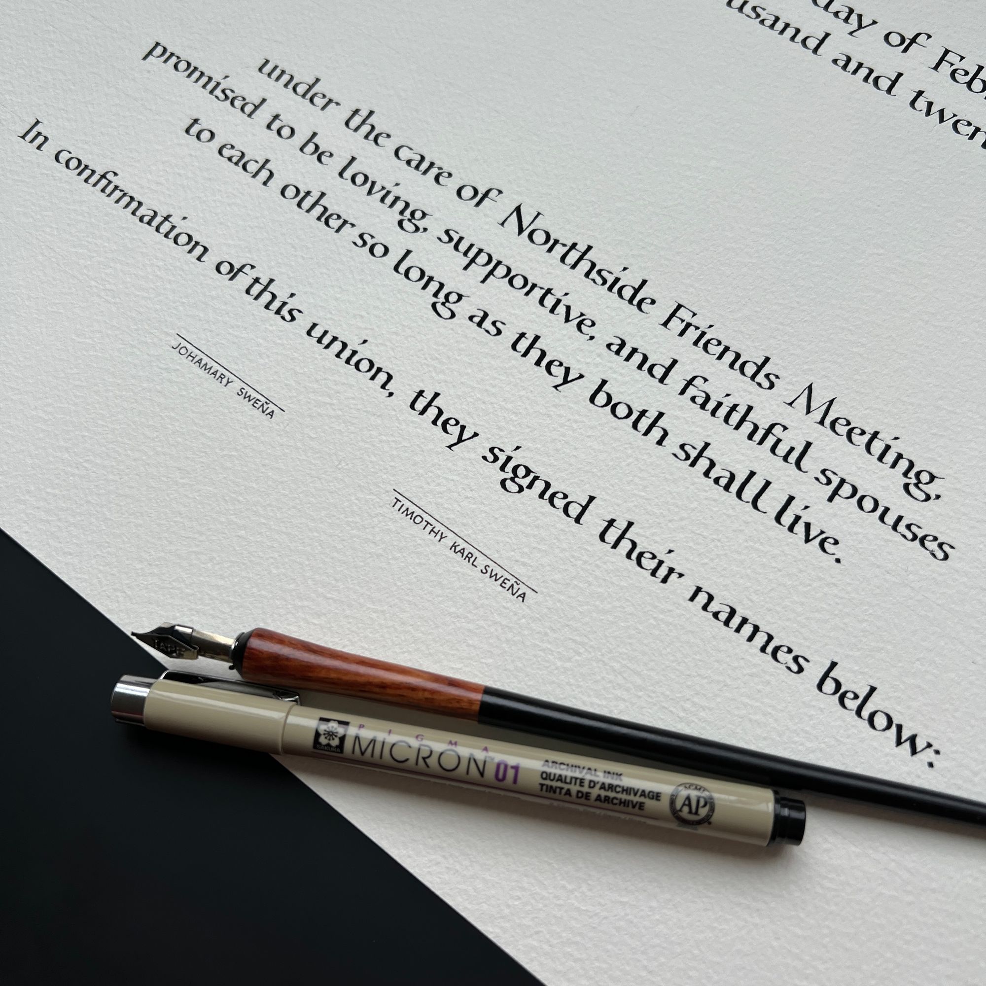
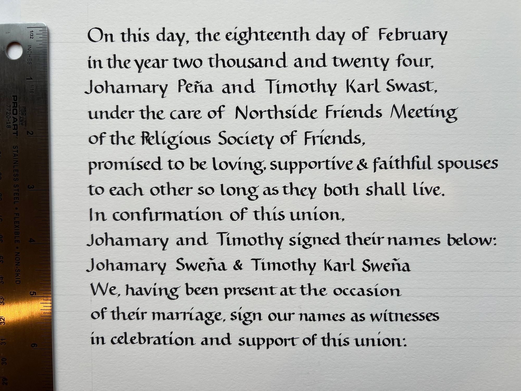
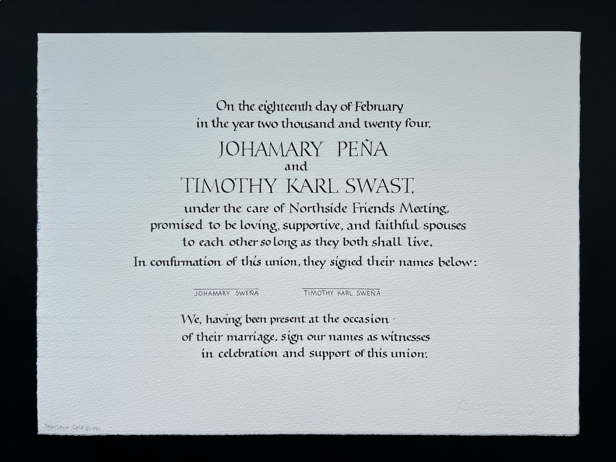
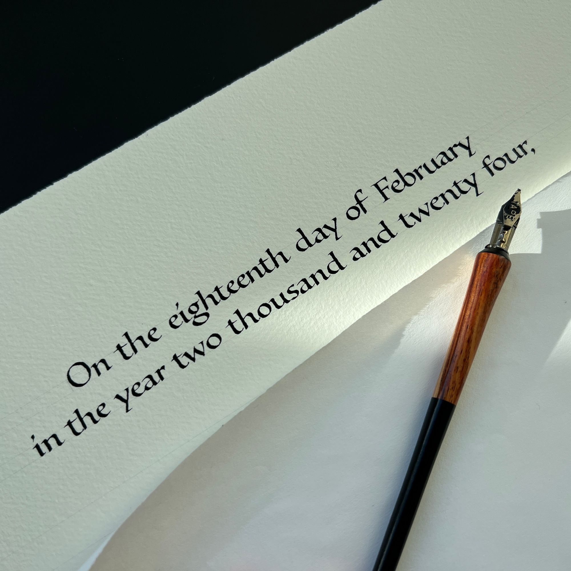
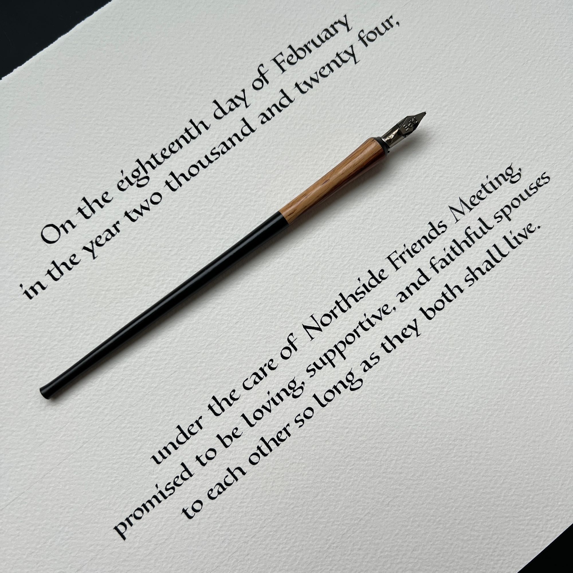
But, of course, things could not just be easy. Since the paper was rather rough, the 1mm TAPE nib I was using for all of the early drafts wore out, and had to be replaced. Which meant all of my measurements for this version were slightly off, and the text was not actually centered!
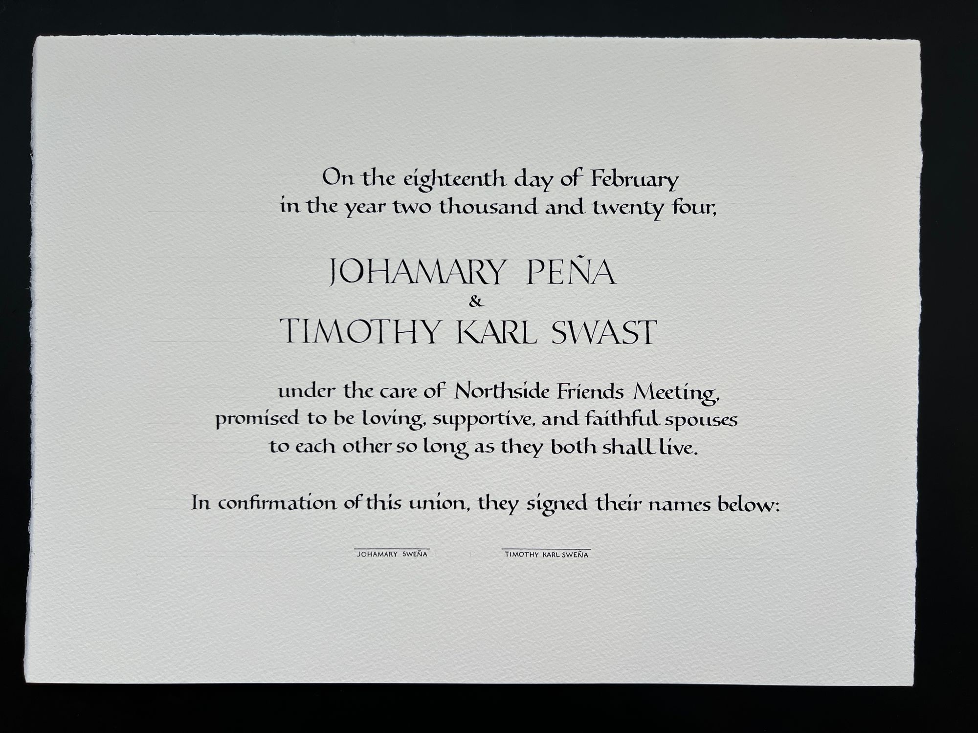
To add insult to injury, the O in "Johamary" came out really poorly. I did fix it up by adding a better shape on top (which is why it looks so blobby in the image above), and then scraping off the unwanted part with a scalpel. The end result of that particular fix looked good enough that I would be willing to keep it in the final version, but I felt like the alignment problem was still pretty bad.
So I went ahead and did it all over again. And it still wasn't quite centered. And by now it was 10 days before the wedding, so I just had to get it done. I had to keep going, and compensate for the layout imperfection with flowers.
Now, you might ask, why did I procrastinate until so late? That's a fair question. I had made a lot of good progress in December, and was hoping to finish by the end of January, but then I had appendicitis, and it kind of ruined everything. I should probably have just told my friends to hire someone else for the job while there was still a month left before the wedding. I didn't anticipate how much trouble I would have staying focused and keeping my hand steady after the surgery. Oh well.
As you can see, the text is centered relative to itself, but it's slightly to the left of center relative to the page. Some letters could certainly be improved as well (O's, I'm looking at you!), but an imperfect finished project is still better than never-quite-achieved perfection, so it was time to move on.
I tried another slightly different approach to rhododendrons, using watercolor pencil for finer details:
Finally, I did a watercolor version of the pixel art jacaranda flowers that my friend kindly made for me:
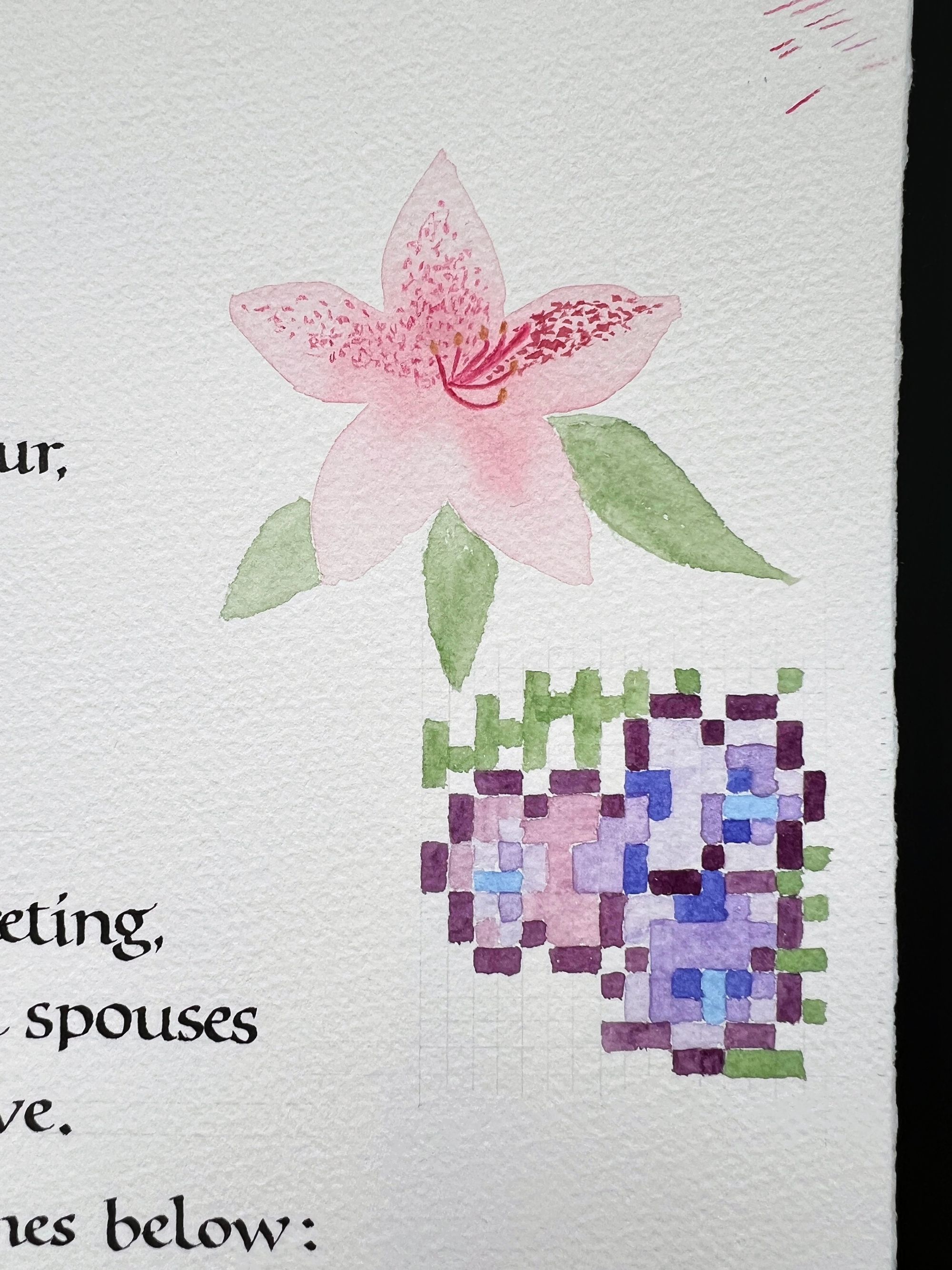
And, somewhat to my surprise, it just didn't fit together. When I did the peony trial very early on, the colors were an exact match, so I thought I could blend the two styles. But at this point it became obvious that the pixel art was a no-go (a designer friend of mine confirmed this as well).
So, I went on to paint a whole bunch of rhododendrons:
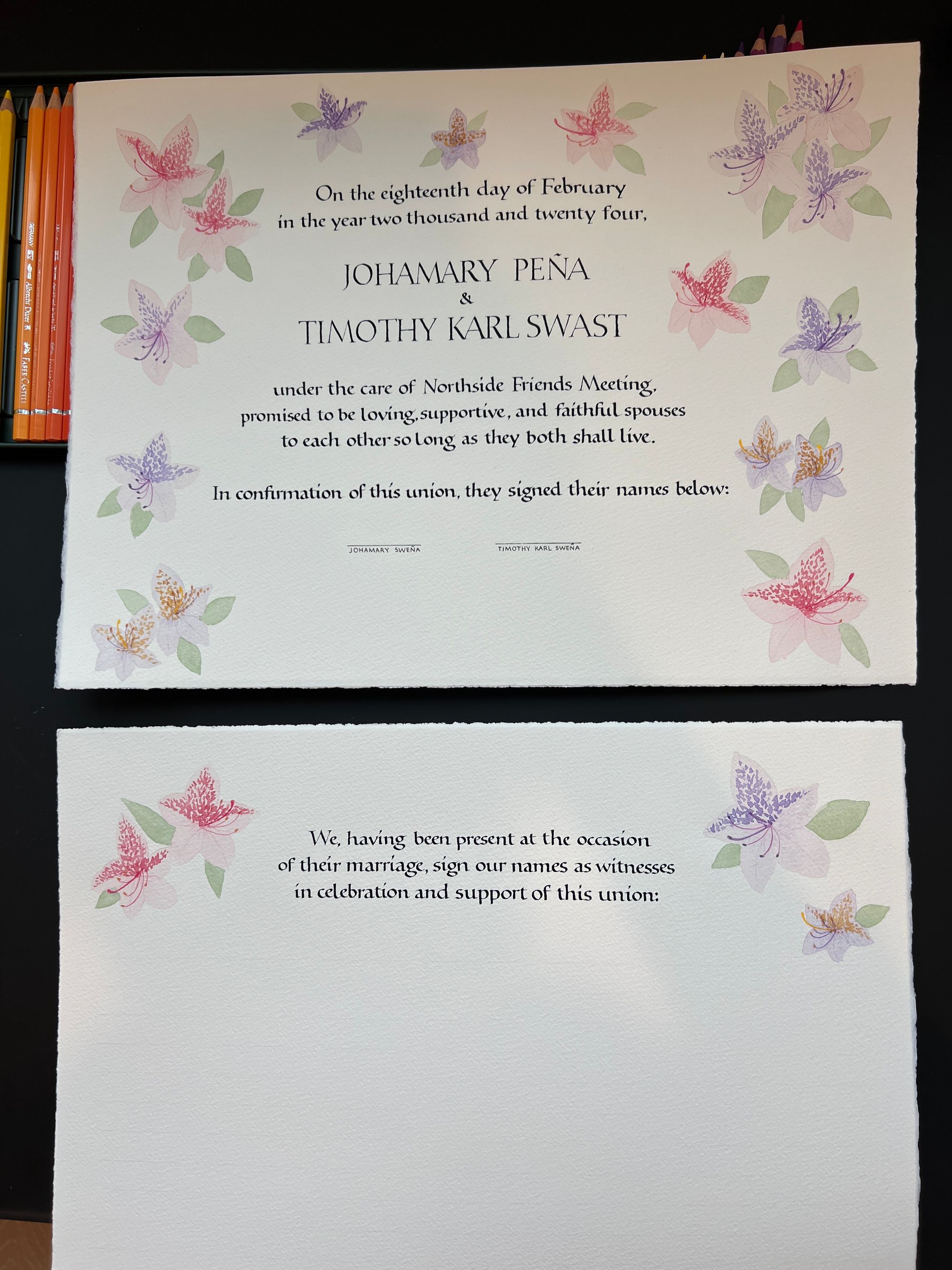
Then, I added one final rhododendron (can you spot where?):
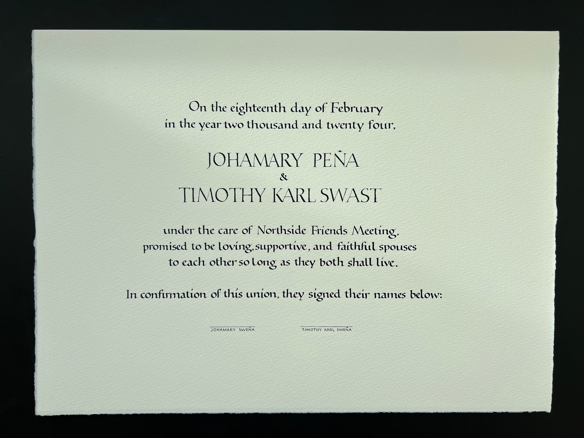
I shipped it to my friends just a few days before the wedding, and it arrived on time and undamaged.
Now, the final part of the fun! The signatures. I carefully drew some light pencil lines for people to sign on, 7 columns of 22 lines, so that everyone's signature would fit.
I brought a portable LED lamp with me to the wedding since I figured people might need extra light to figure out where to sign. Good thinking, but not good enough! About half of the people said something like: "Lines? What lines". It was a mess. The size of the signature spaces didn't matter. Some people had tiny signatures. Others went huge. There was an "up and to the right" trend with the lines. The "Sign here" stickers helped a bit, but only a bit. I have to admit that managing the signatures was more stressful than finishing the piece on time!
In hindsight, I should have printed thick black lines, put them under the signature sheet, and put it on a light box. Then, it would be much easier for everyone.
Here are some photos of the witness signatures in progress:
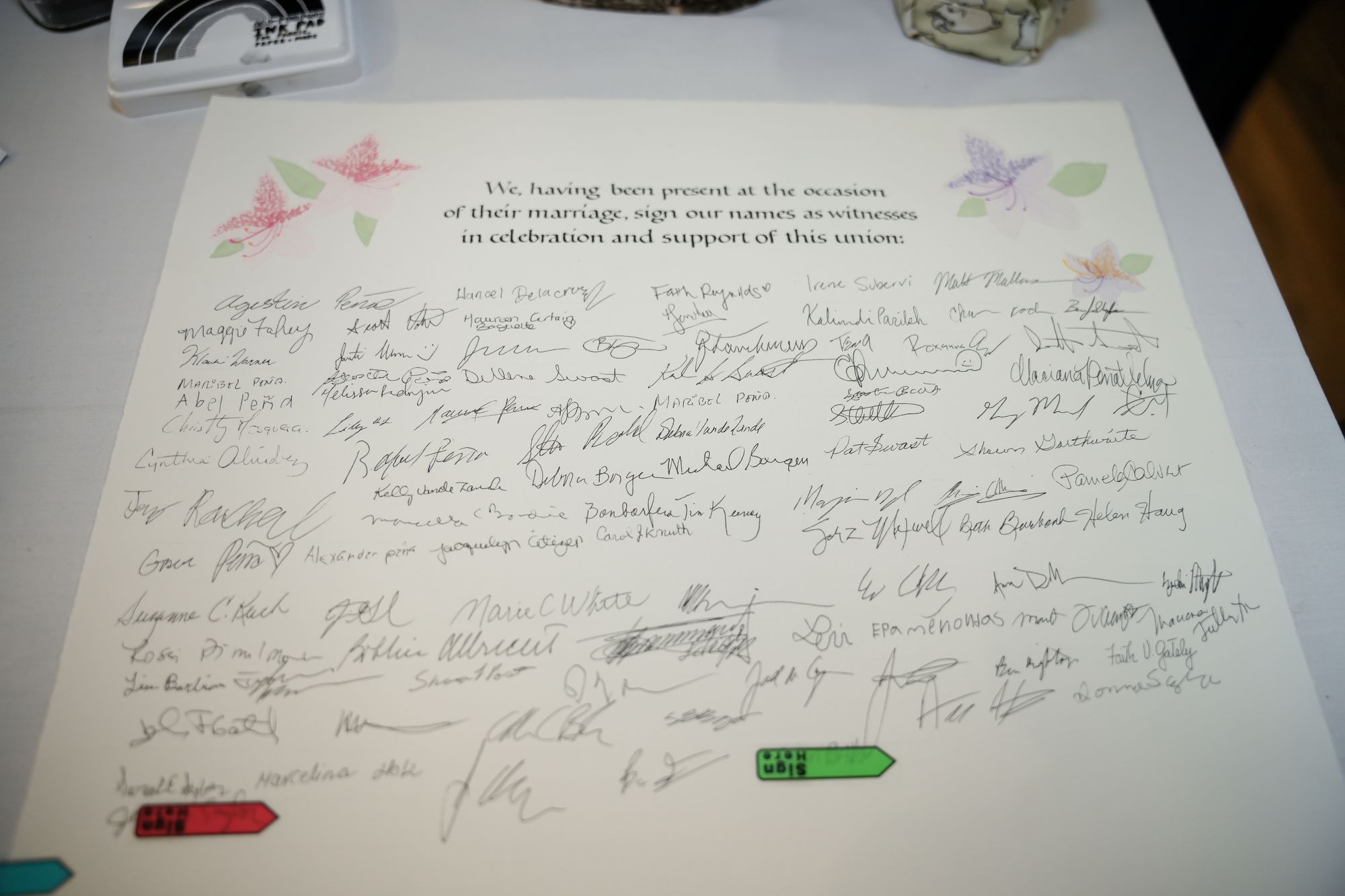
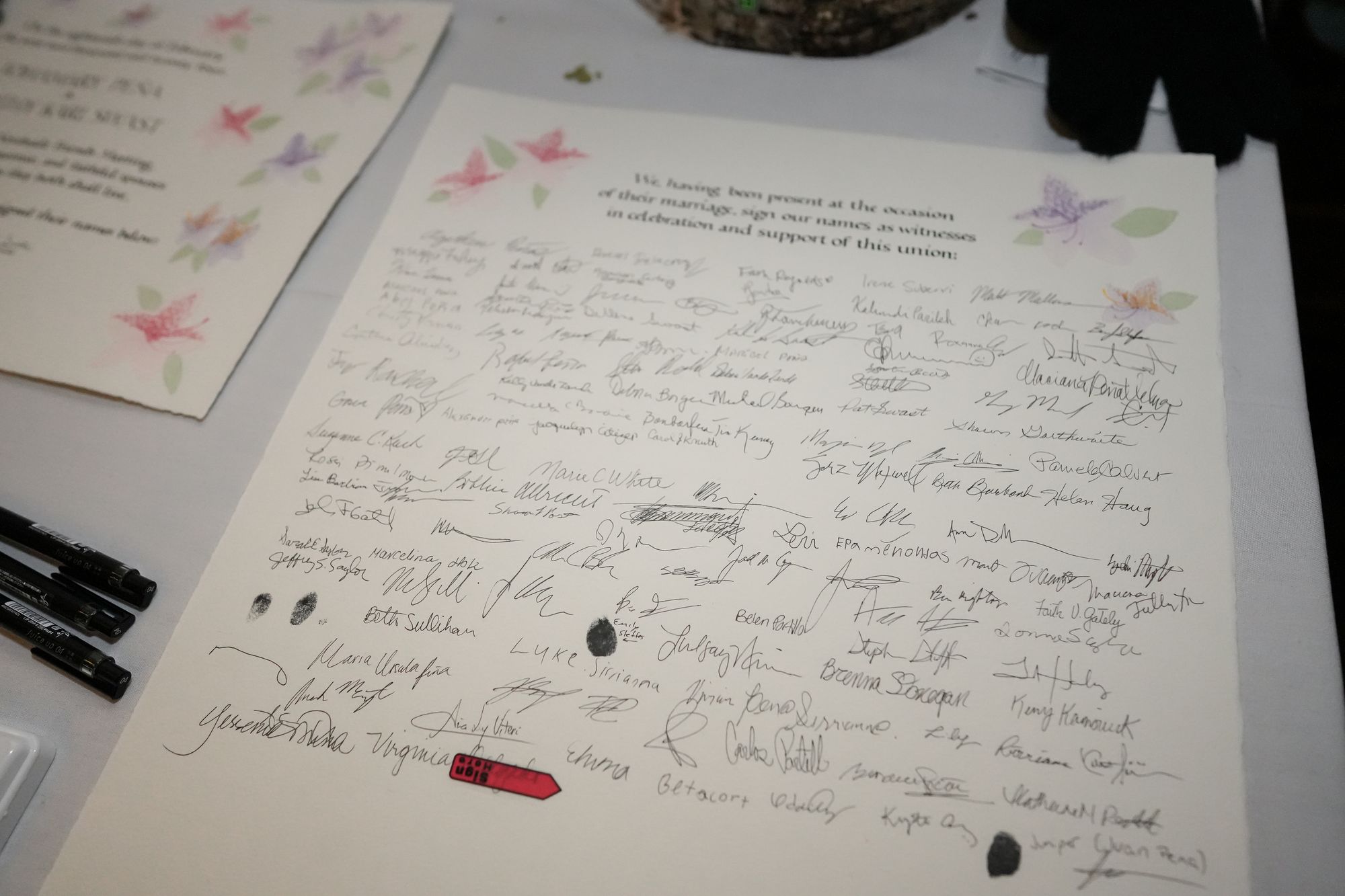
At least one thing I can say the signature sheet is truly authentic. It is what the witnesses made it, and even though I tried to make them adhere to the straight lines and neat columns, it was a lost battle. Hopefully this is exactly what my friends wanted, and I am just overly sensitive :)
Comments