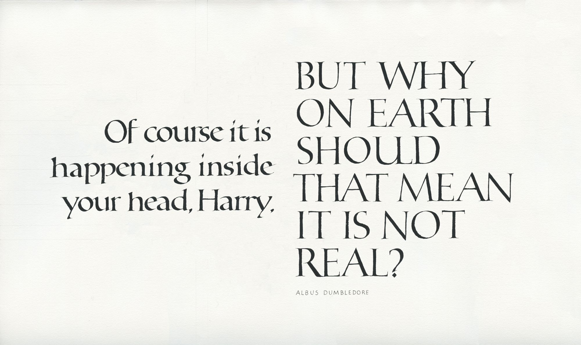
It is real

This was in many ways an interesting project. I feel like I both made really good progress in terms of improving the quality of my letters (especially the O's), and that there are quite a few imperfections in the final version. I am choosing to let it be as it is, and focus on other things for now instead of writing it all over again.
I first got the idea for this layout when I was taking Mike Gold's layout class in... 2021, I think? It's been a while. I knew I wanted to juxtapose the two parts, but wasn't quite sure what writing styles to use.
Eventually, I settled on a combination of Antiqua-like foundational, and Roman capitals.
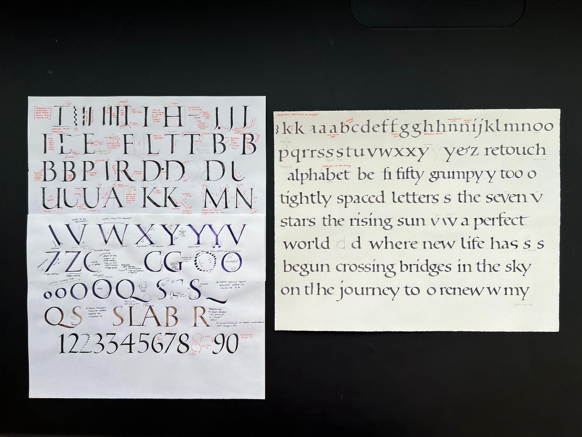
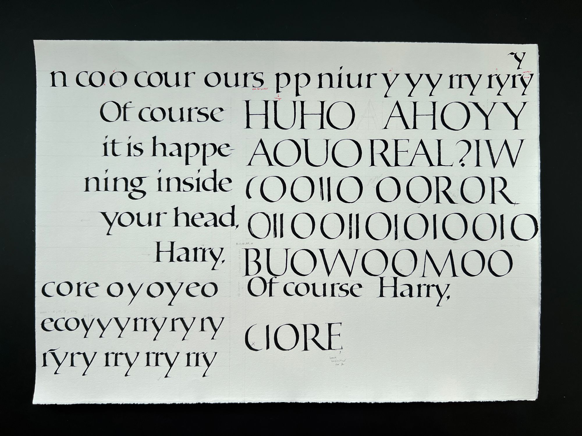
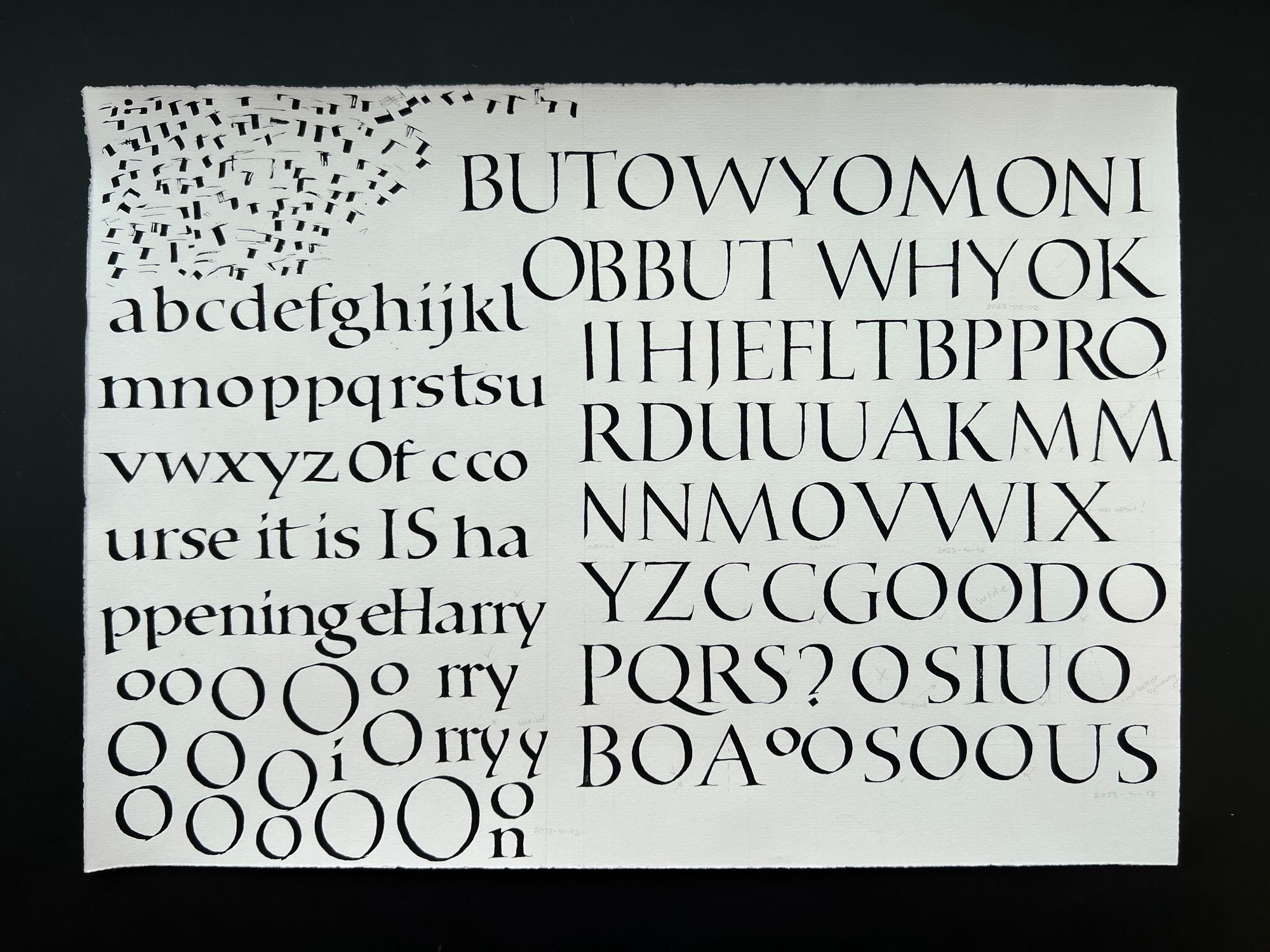
I of course knew that the caps will be by far the hardest part of this project, so I started working on them right away. The earliest practice sheet is from September 12, 2021.
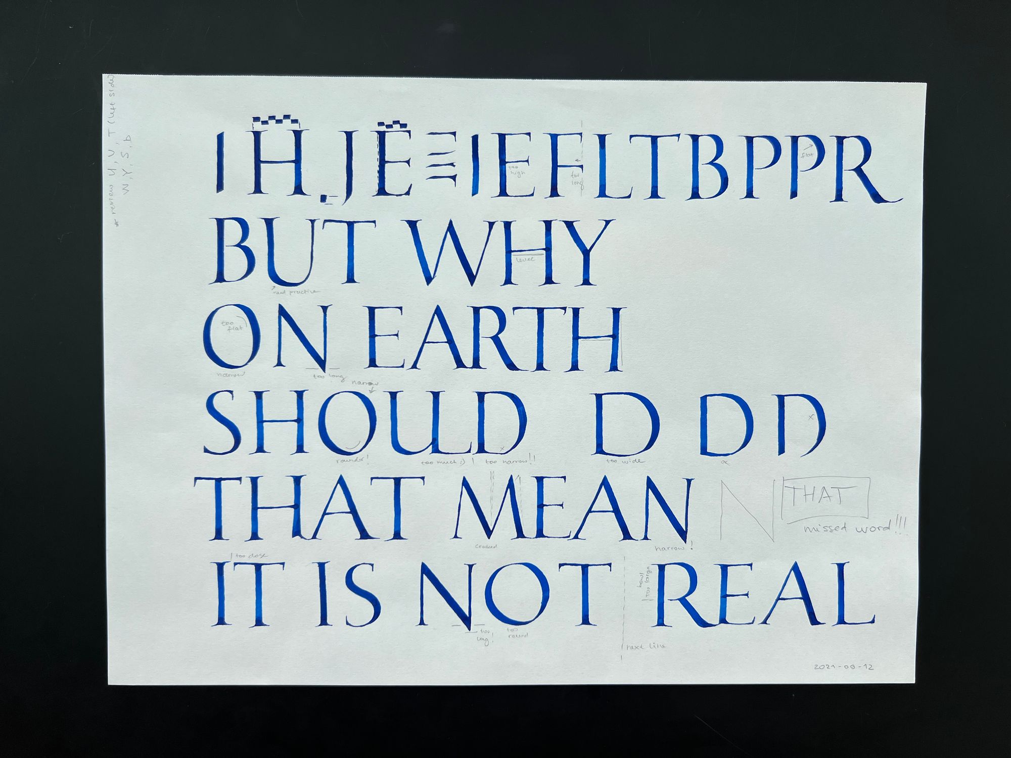
As you can see, I noticed that I had missed a word, "that". I later intentionally chose not to include it because it made the layout more difficult. If I had to put it in, I would have to stack two "that"s on top of one another, and it just would not look good. So I opted to skip it, especially since it does not affect the clarity of the meaning.
I ended up using the "UL" ligature in the final version, although I was not so sure about it in the beginning. Later, I tried a few other ligatures, and didn't like those either, so this one was the most reasonable one in the end. Why did I want to add a ligature? I don't know, just felt like it was the right "fancy" thing to do for this particular project.
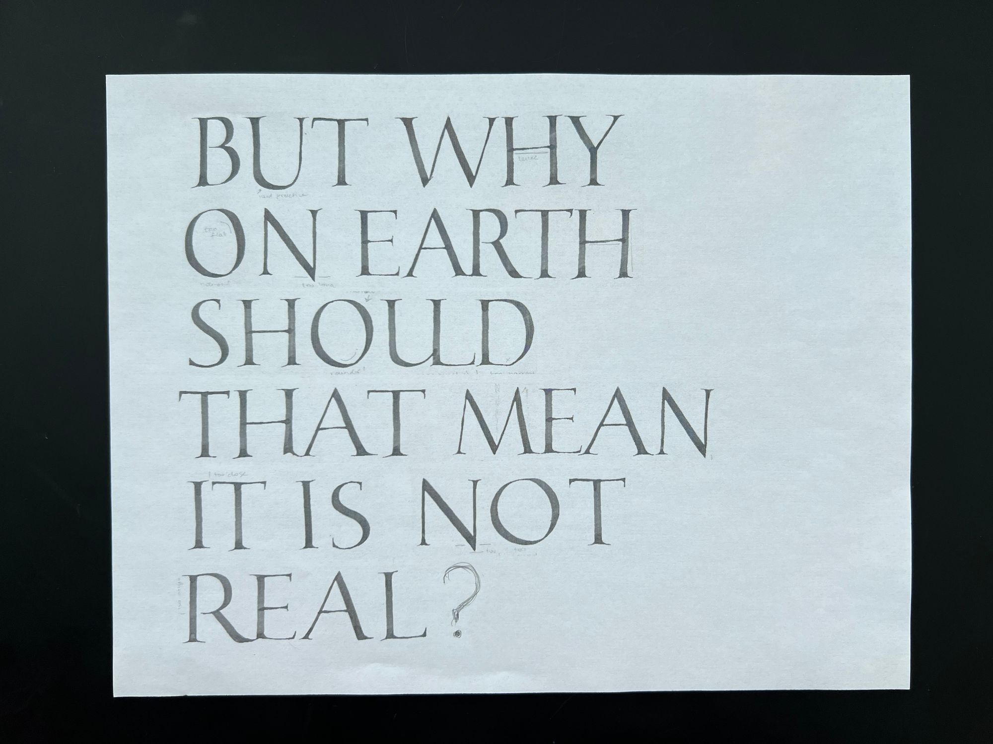
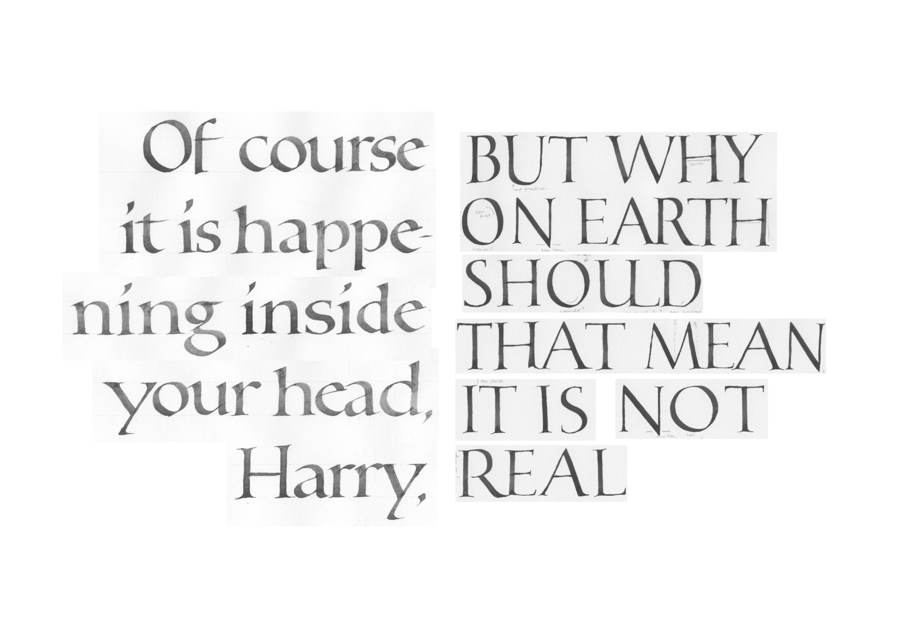
Next, I scanned this sheet, and adjusted spacing between the letters and line breaks to get a better idea of what it would look like. I printed it to use as a reference for the next round.
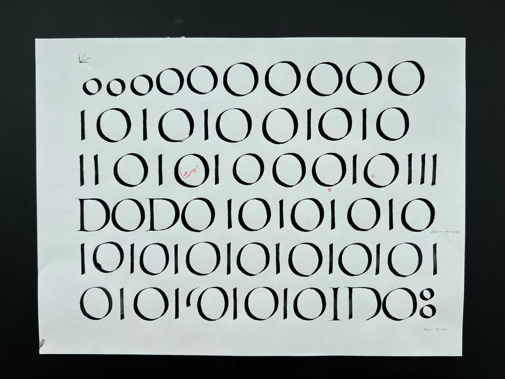
There were several letters O did not feel comfortable with, so I spent some time practicing those.

Then, I wrote out the whole thing again. And you can see the crazy ligatures I ended up not using.
Then, I once again scanned this version, picked the best letters, and arranged them in Photoshop to use as a reference.

I think at this point I decided to take a break and switch over to the other side. At least that is what the dates on my practice sheets seem to indicate. It is now end of October 2021.
I had briefly considered making the left size as large as the right, but rejected the idea after trying it in Photoshop.
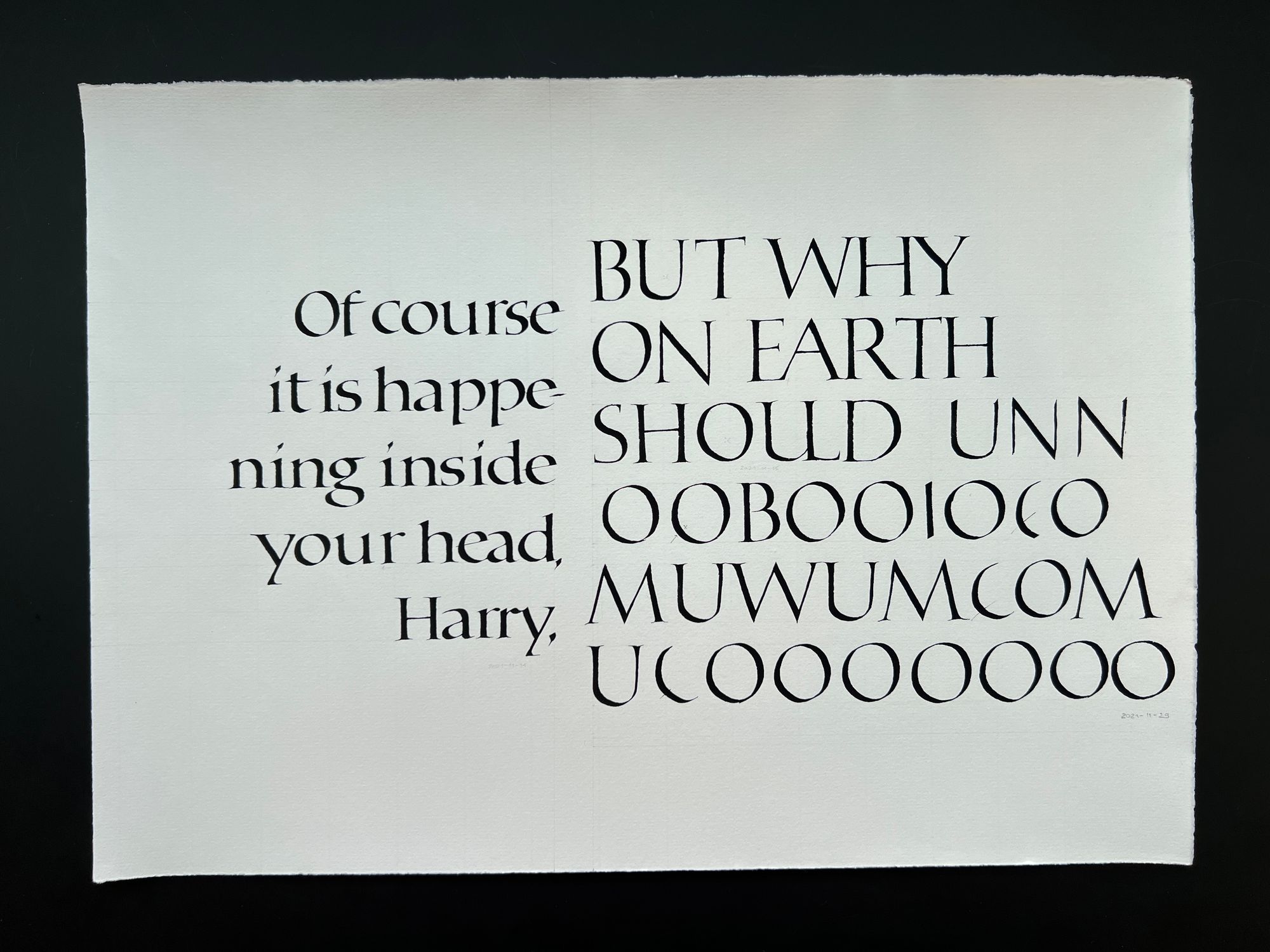
Then I went back to practice on my O's. I even traced a bunch of them from the exemplar, since I was having a really, really hard time with them.
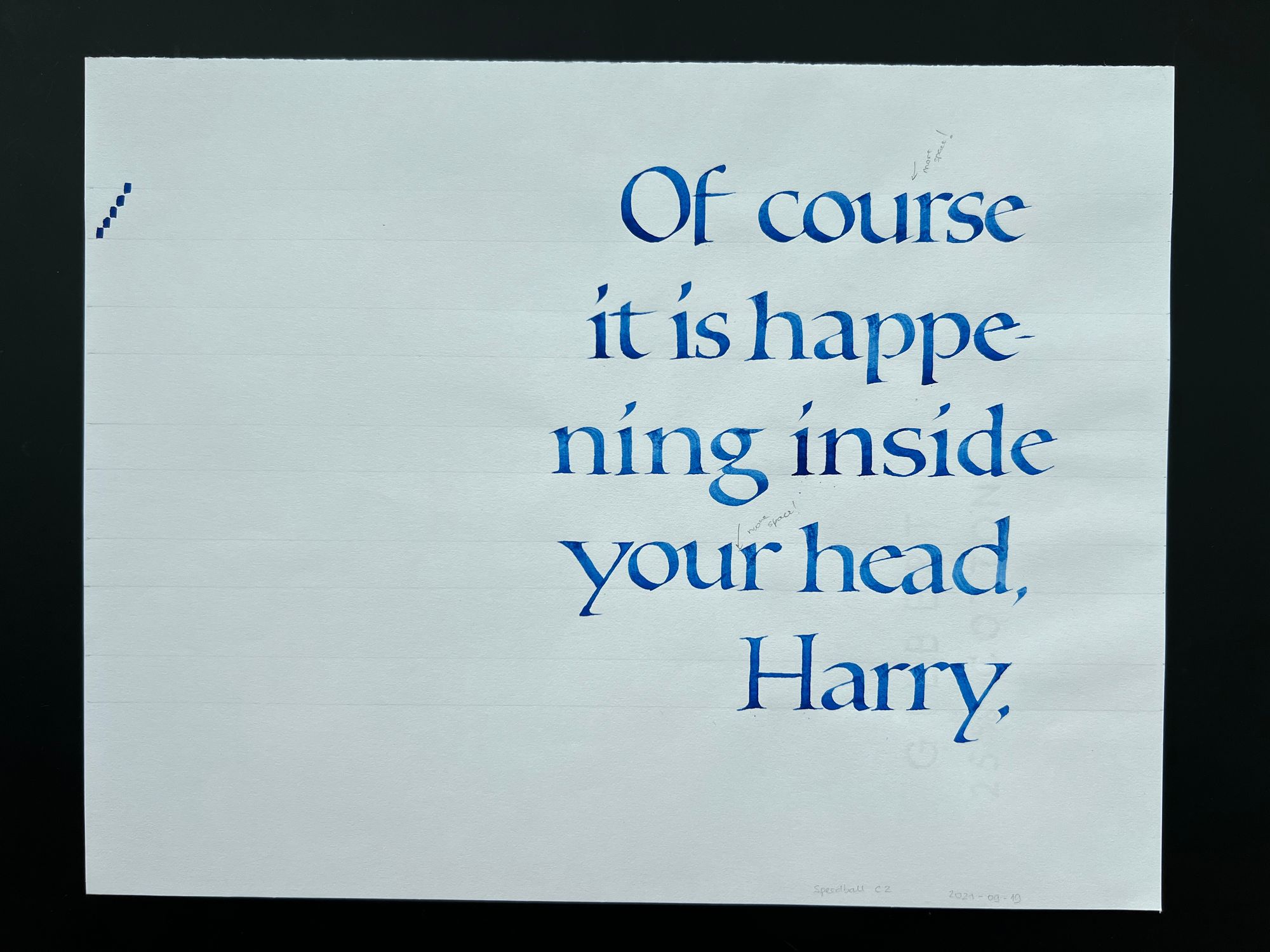
Then, I am not entirely sure what happened. I think I just wrote the right side, then the left side, and basically had a finished piece on November 3, 2021.
I don't have any notes on what exactly I didn't like, but I'm guessing there are just too many iffy letters in this one. It's okay, but not very good, so I decided to keep going. Also, as I was writing this blog and reviewing the layout mockups, I am realizing that probably what I really didn't like about the piece above was that the gap between the left and the right halves was too narrow.
I tried to do a different layout in Photoshop, with only 3 lines on the left, but ended up not liking it either.
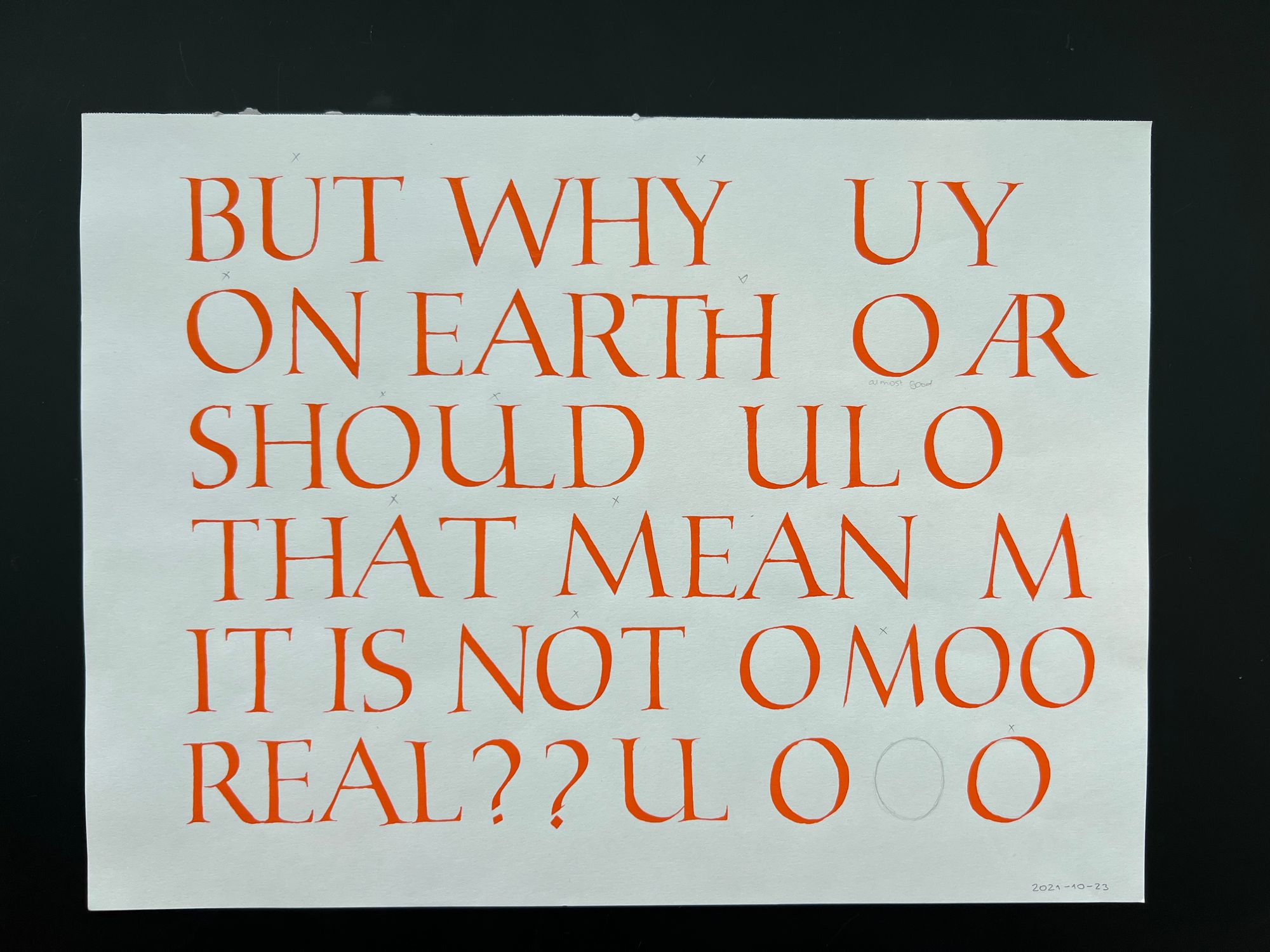
I practiced some more capitals, and figured out how to better arrange "rry" at the end of "Harry".
Then I wrote out the right side one more time, but clearly didn't like it (you can see the little X's next to the letters I found to be particularly bad). I covered up the left side because I later used it as practice paper for something else (shame on me!).

I tried some more at the end of November 2021, but I was still really struggling with those capital O's, even though the left side was coming along nicely.
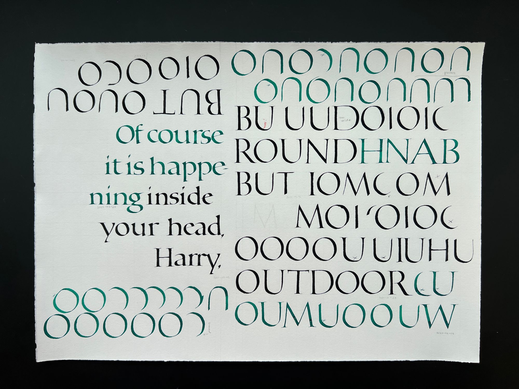
In February 2022, I picked the project back up after a break, and really worked on those letters. Some are upside down because it was easier to reuse the paper that way. I also got a nice gouache color apparently, and wanted to try it.
Then, I didn't have time to work on this project for a while, and picked it up again in mid-October 2023. Of course, I had forgotten a lot of things, so first I reviewed both alphabets. The marks on the top left are from using the same sheet later to test my pen after each refill before putting it down on the final version.
And you know what? Considering how long of a break I had, these aren't bad at all.
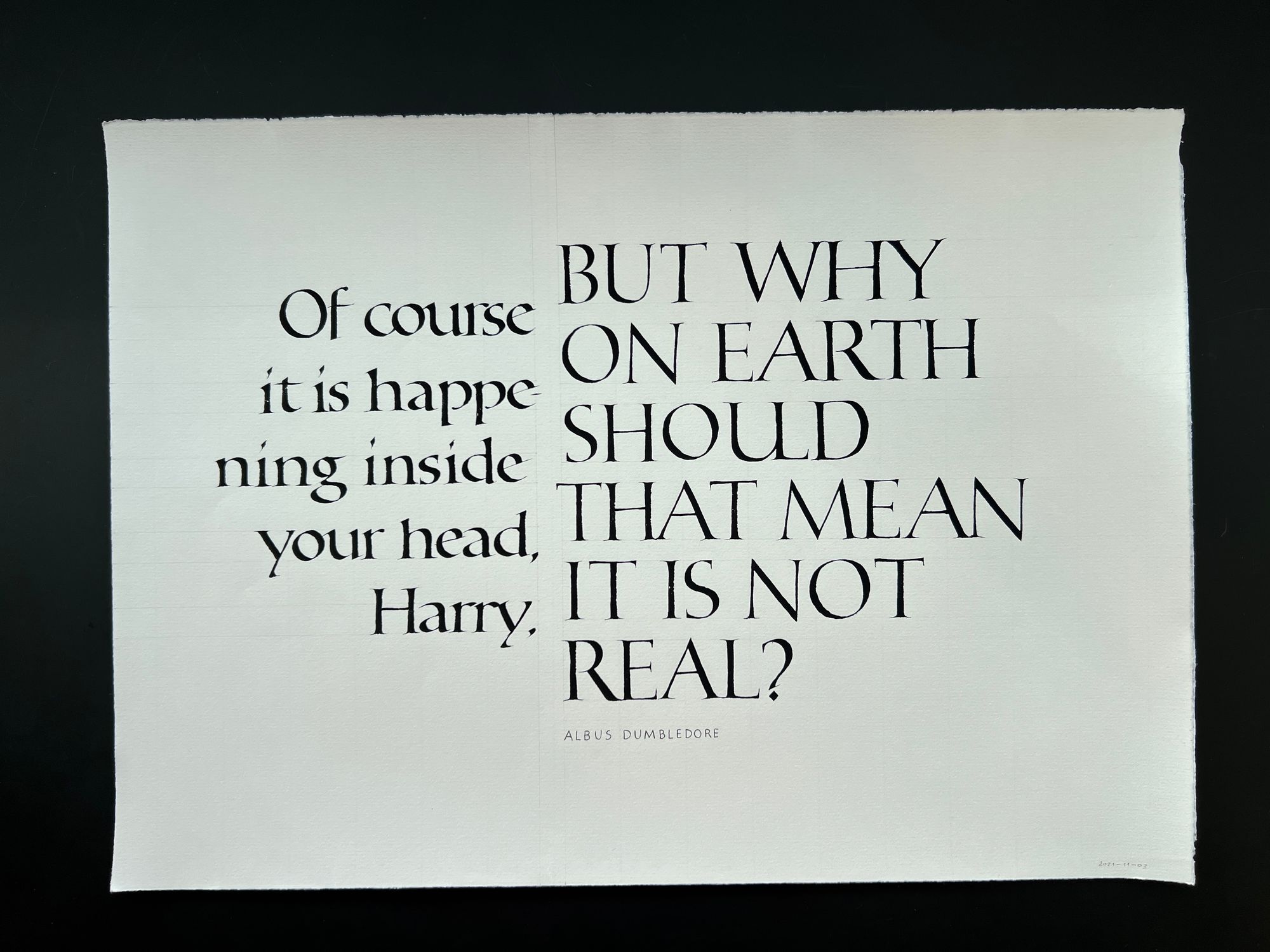
I did a "final draft" version to make sure my layout still worked. It was a bit off, mostly because I got distracted while writing the right side, and the words ended up on wrong lines. I noticed that in the previous drafts, I had carefully aligned the right side so that the letters start visually at the same place, so I would have to apply that in the final version.
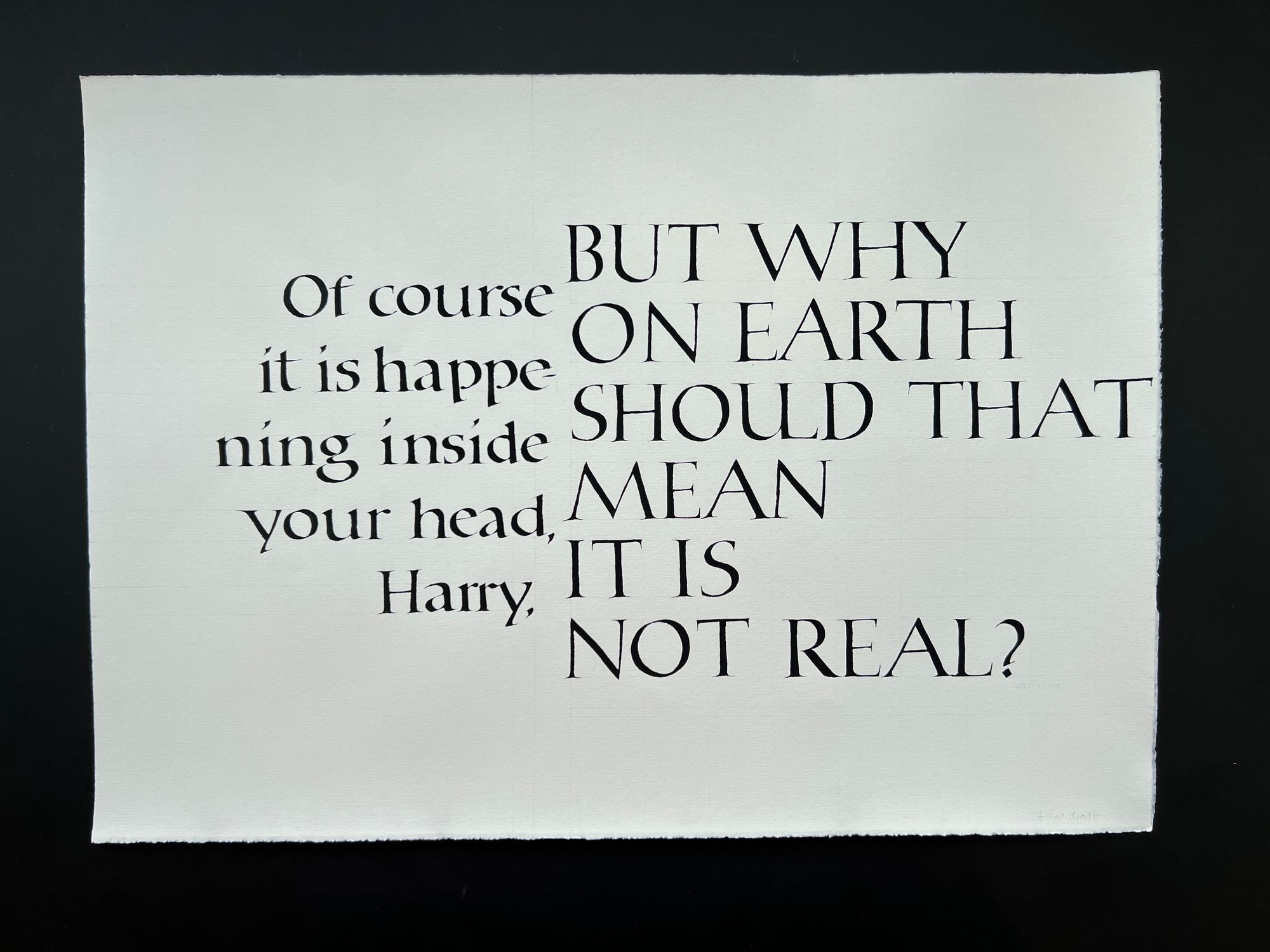
One thing that I completely forgot about was that the Antiqua-style writing was supposed to have condensed spacing. It was in my original practice notes, but since 2 years had passed, I didn't remember about that, and as a result, the left side ended up quite a bit wider than the original version. I only figured it out afterwards, when I was taking pictures of the process. But again, I decided to leave it as is, and not make another final version.
Below is the final piece, accompanied by a fancy pen holder that my friend Hoang made. I felt like it was particularly appropriate for this piece, so I included it in the photo :)
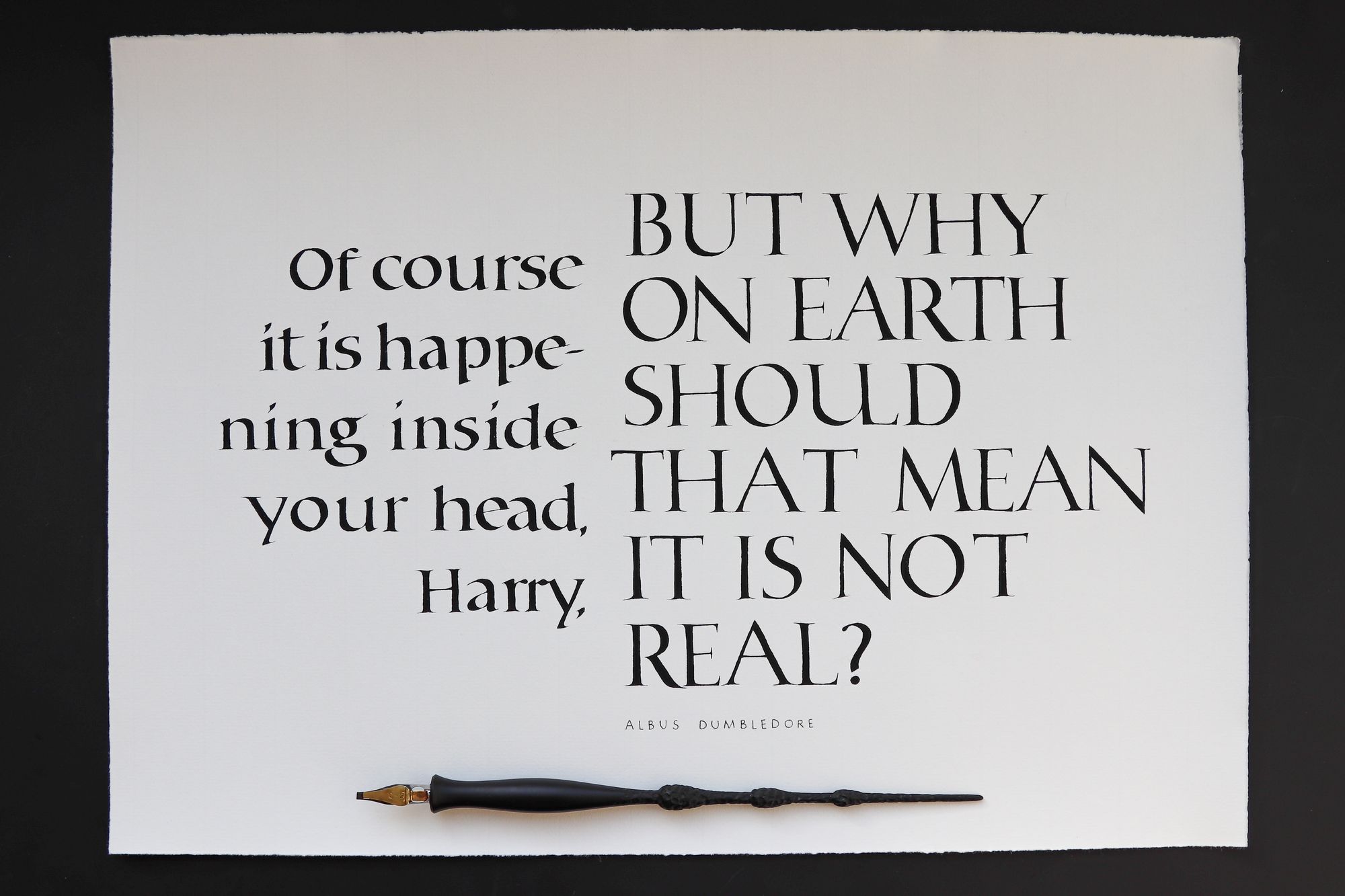
If you compare this to the November 2021 version, it's actually really similar. Some letter forms are better, but it's not a dramatic difference. Some of the spacing could have been better ("your", I'm looking at you!), but hopefully it doesn't ruin the piece too much.
One interesting observation is that I seem to have used more pressure this year than I was using 2 years ago, since the letters seem heavier.
And of course I have enough "good" letters that I could have Photoshopped a perfect version, but why? That's not the point of doing these things for me. Yes, I could pretend like I am better than I am, but what would that really achieve? So there it is, the imperfect final version, and I am off to work on other projects.
Comments