Swiss design?
All throughout college I've heard so much about how awesome Swiss design is. I've also seen a huge number of examples: books, posters, typefaces...
I have to say, though, that generalizations of this kind are harmful. When you call something good or bad based on such a blanket definition, you are invariably not giving proper credit to some things and giving too much credit to others.
A couple weeks ago, I did a post on signs that I saw back in the US. I pointed out that they were not in line with the original Helvetica Man design. While the pictograms were designed in the US, people associate them with Helvetica (which is Swiss) because they have the same simplicity and utility as the type.
Now, I got a chance to experience Swiss design firsthand in Zürich, and what I found out is that it can also be a hit or miss, just like design in the US.
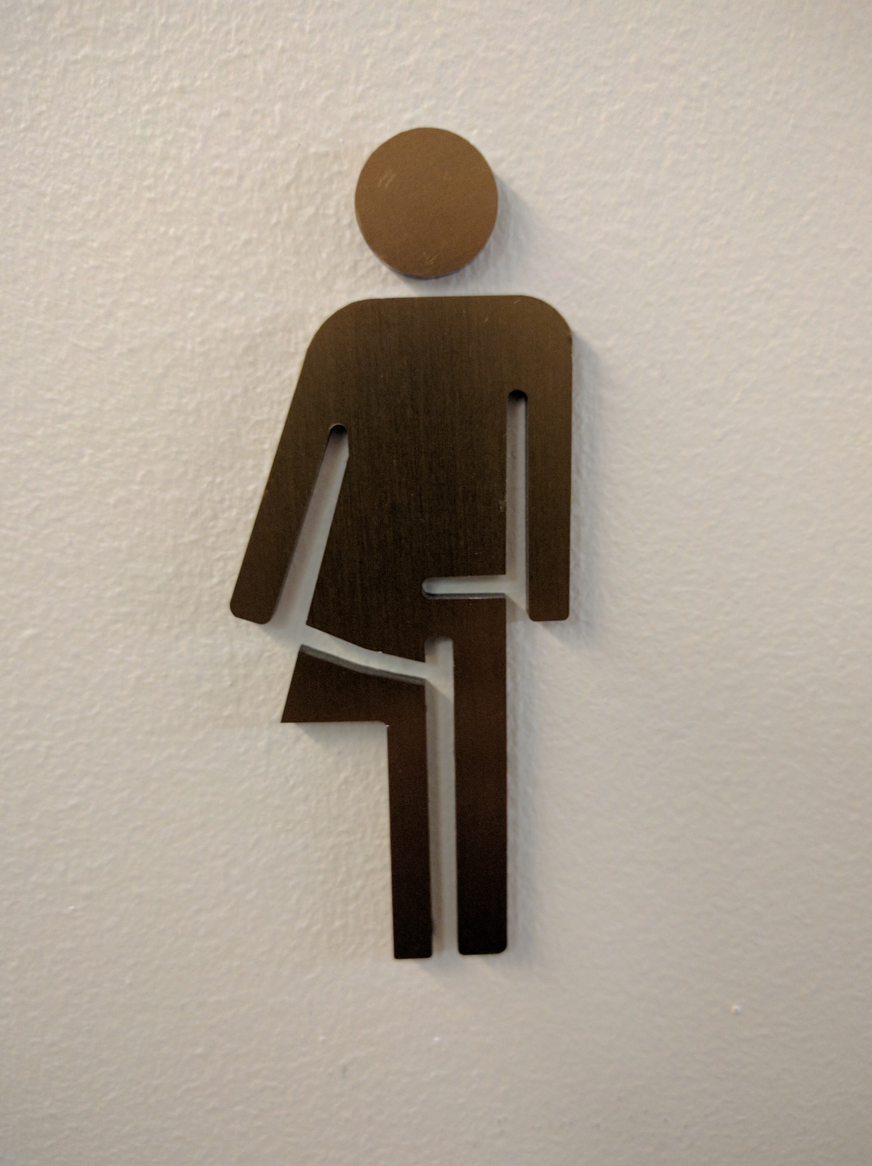
This is a sign in my hotel. Can you guess what it means?

I will admit to you right away that I thought it was a mailman. I could not figure out how and why it was relevant, but it did look like he has a mail bag over his shoulder.
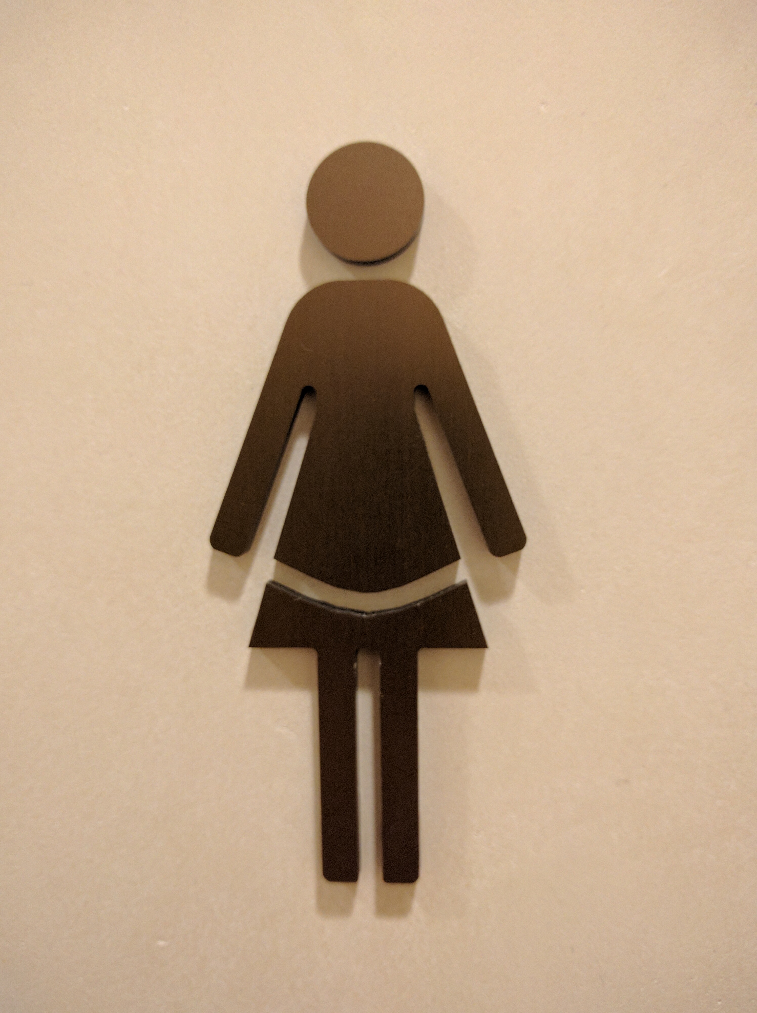
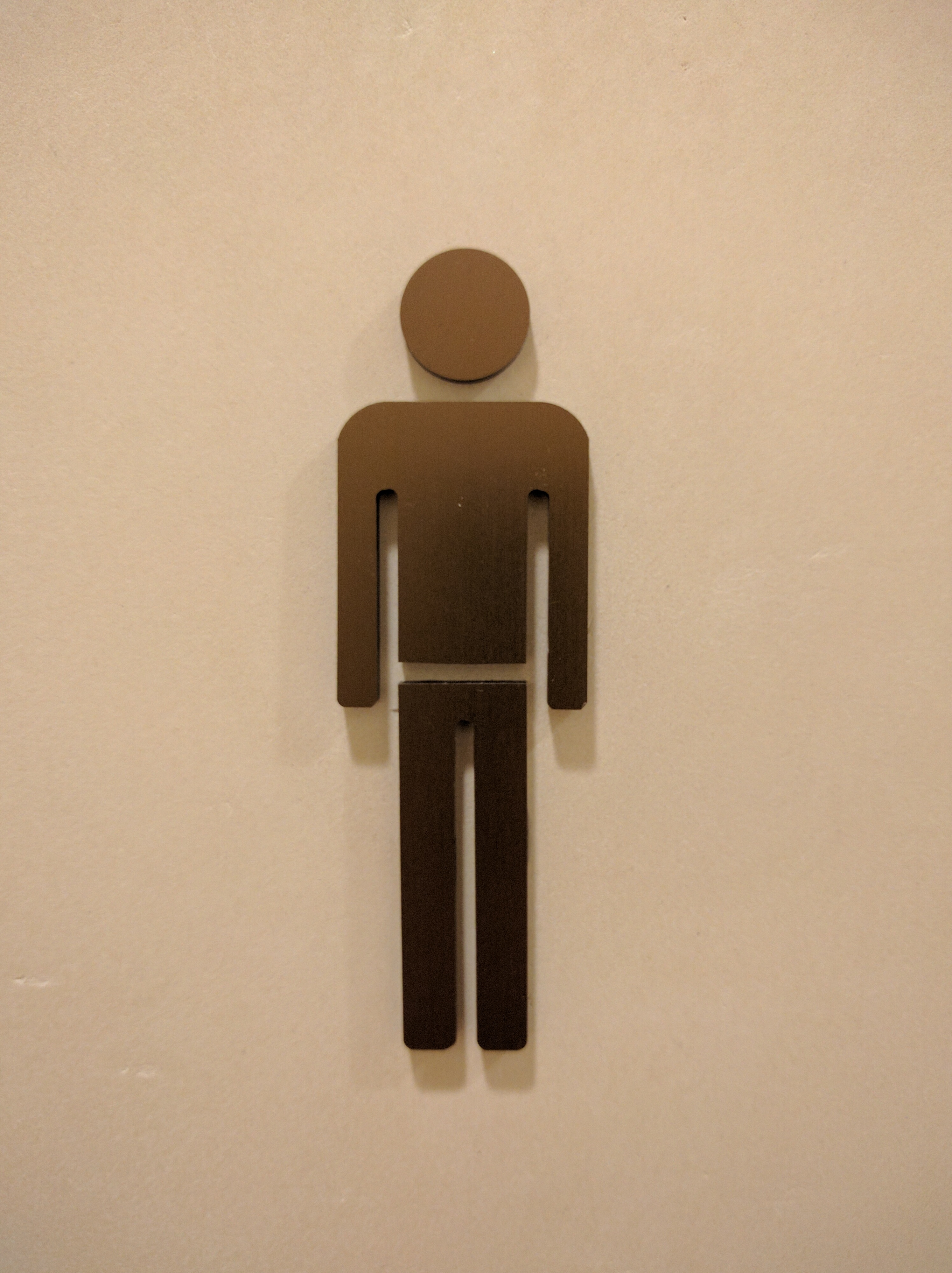
A couple days later, it dawned on me. I found the restrooms, and looked at the signs next to them. Here is what I saw:


The person in the first picture is half-female and half-male. It represents the fact that there are both men's and women's restrooms on this floor. I still don't think that this is obvious, unless you've seen the other two pictograms and have a pretty good imagination.
So, not all Swiss design is perfect, after all ;)

Comments