Not meant to be together
In my previous posts, I've complained about individual signs. That's not because I think all the signs are bad - quite the contrary, there are a lot of them that I like. There is usually also just one or two things that could be fixed to make those signs look great.
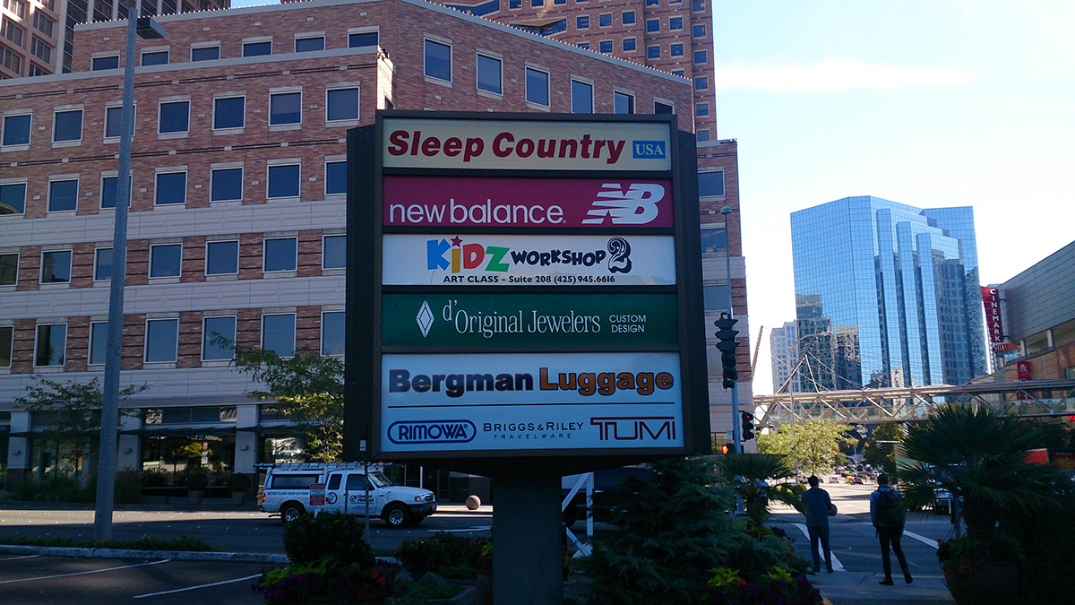
However, there are situations in which fixing an individual sign is not going to work. For instance, look at the image below.
I could say that I would never put my kids in the "Kidz workshop 2" art class because the sign is simply horrifying, but that is not the point.
Each and every of these signs is so different from the others that they just don't look good combined. There is no way they could be arranged that does not make them clash with each other.
What happened here is that each of the stores designed their own sign without considering where it was going to be shown. Even the best designed logo has some rules about where it can and cannot be placed.
The end result is just an unappealing sign, another piece of visual noise in the city.


Comments