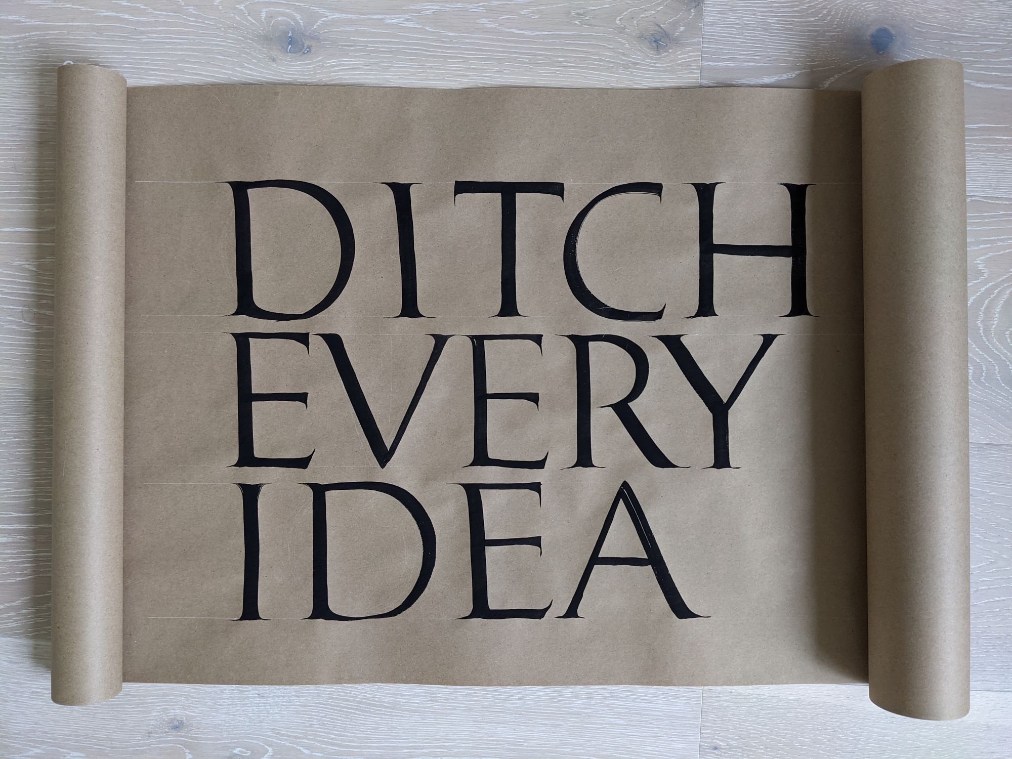
Ditch every idea

Back in January, I took a workshop called "Mix and Match: Calligraphy and Lettering as Design Tools" taught by Aline Kaori and Gui Menga. It was split into 4 sessions, 2 per week over 2 weeks.
What appealed to me most was that instead of studying a particular style of lettering, which is often the case, this workshop focused on the practical aspects of making a finished product.
One aspect I found quite challenging was too much choice for the project itself. When I am faced with "you can do whatever you want", I feel like all ideas flee from my mind, leaving a perfectly blank space. In this case, it was "any word or short phrase", which was only marginally better. True, I didn't have to worry about making a whole book, but I wouldn't mind just being handed a word or a phrase and asked to use it for my project.
Then I had the bright idea of asking some friends for help. As we met that night for some virtual board games, I asked if they had some favorite phrases or short quotes, preferably 3-ish words long, and got a list of 20 or so. While there were a lot of nice options, such as "Never stop dreaming", "Sleep on it", "Accept the mystery" or "Sit up straight", the one that stuck with me most was "Ditch every idea". I don't remember anymore if it was a serious suggestion or a joke, but that doesn't matter. It was perfect. I ditched every wonderful idea :)
Of course, I had to come up with a project brief of sorts. I settled on a "demotivational coaster", both to keep it simple, and to have a physical product in the end.
Stage 1: Exploration
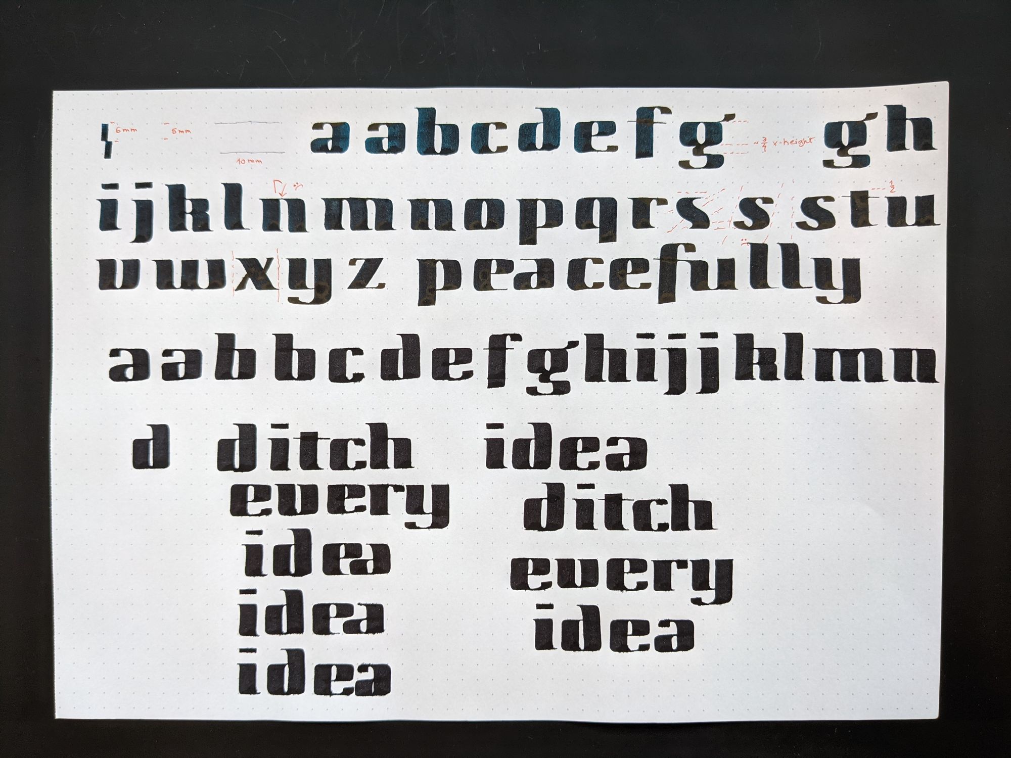
Since my final product was a circular coaster, I knew the words would need to be stacked and centered, but beyond that, I needed to figure out what style to use.
The best part of this stage is that you try to use as many different tools and styles as possible, and quality of writing is not important. Some of the images below make me cringe a little, and that is okay. They don't need to be perfect, they just need to illustrate the ideas.
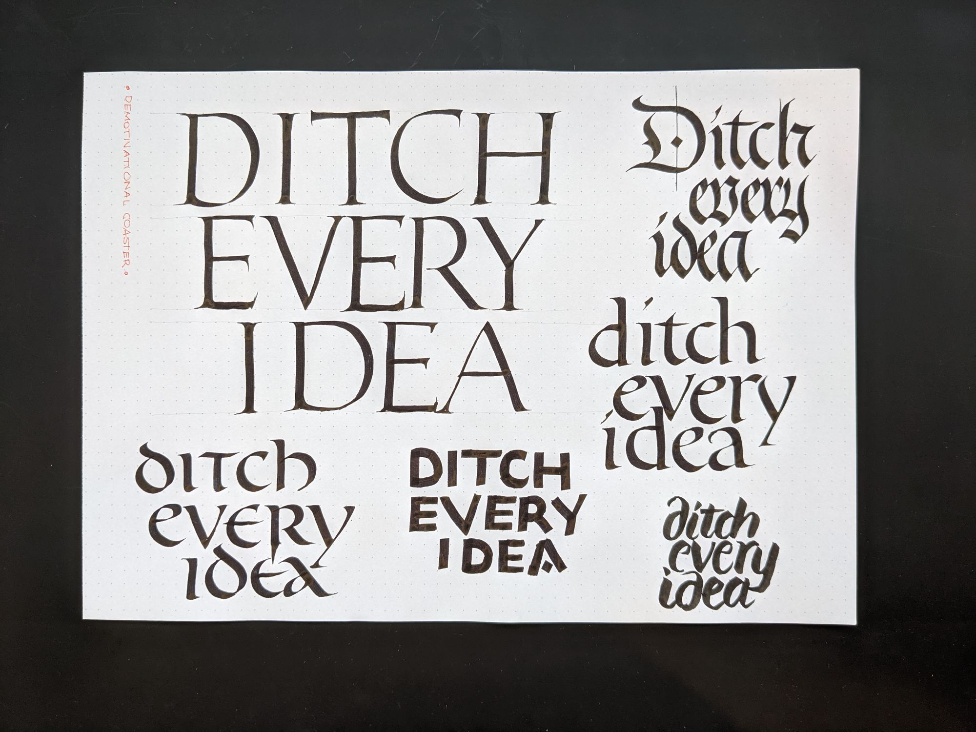
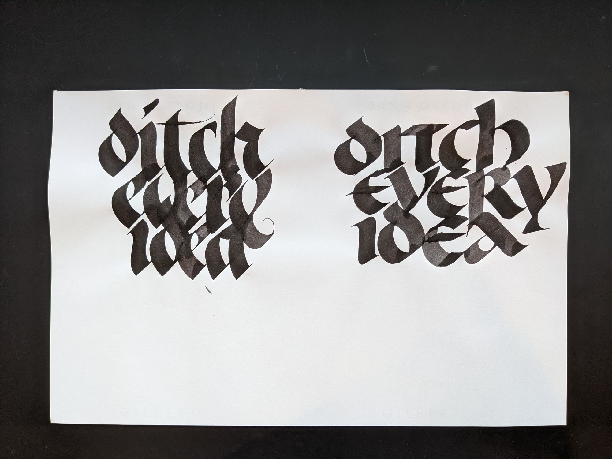
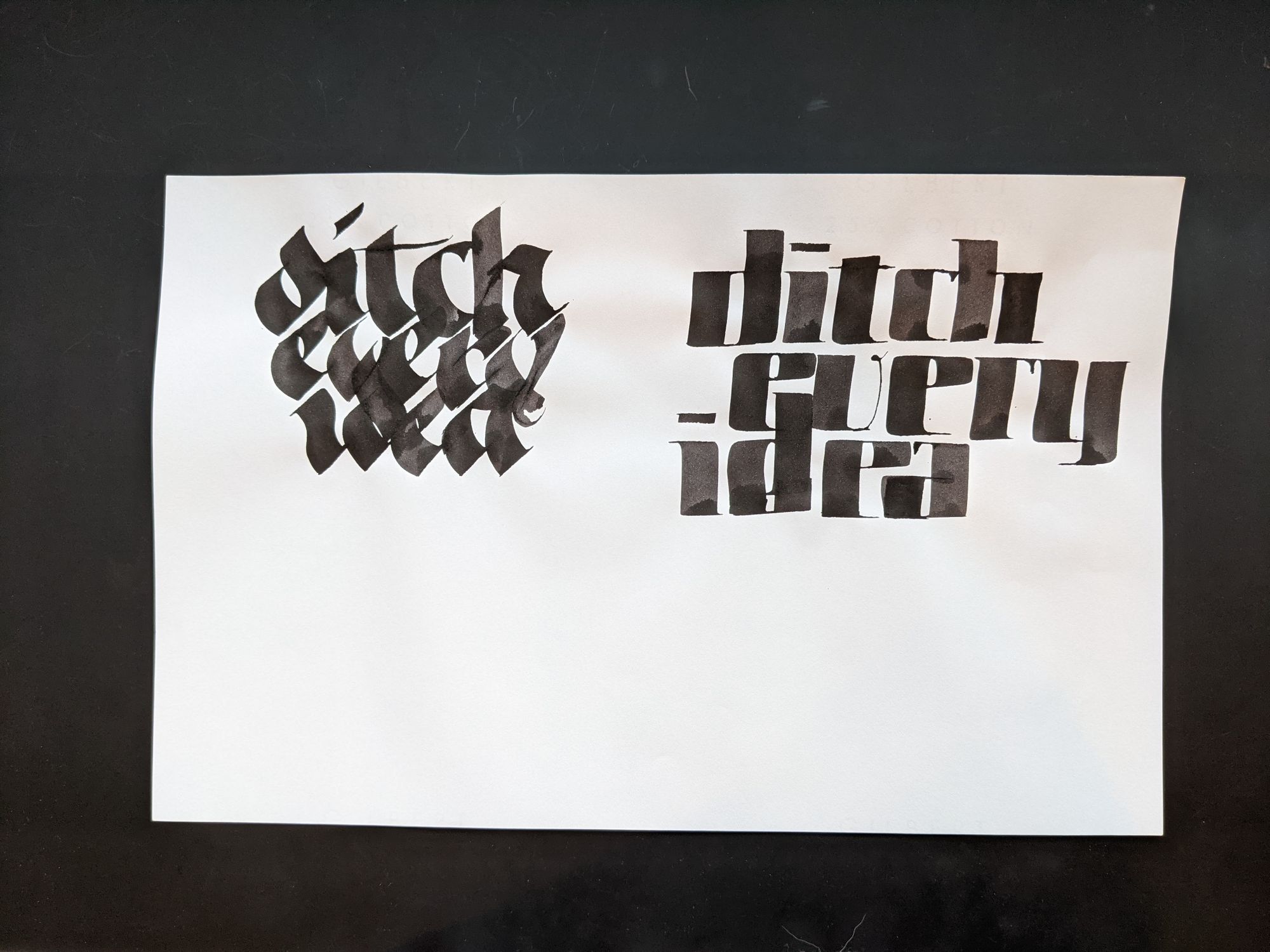
I decided to take the squarish letters, and see what I can do with them.
Stage 2: Refinement
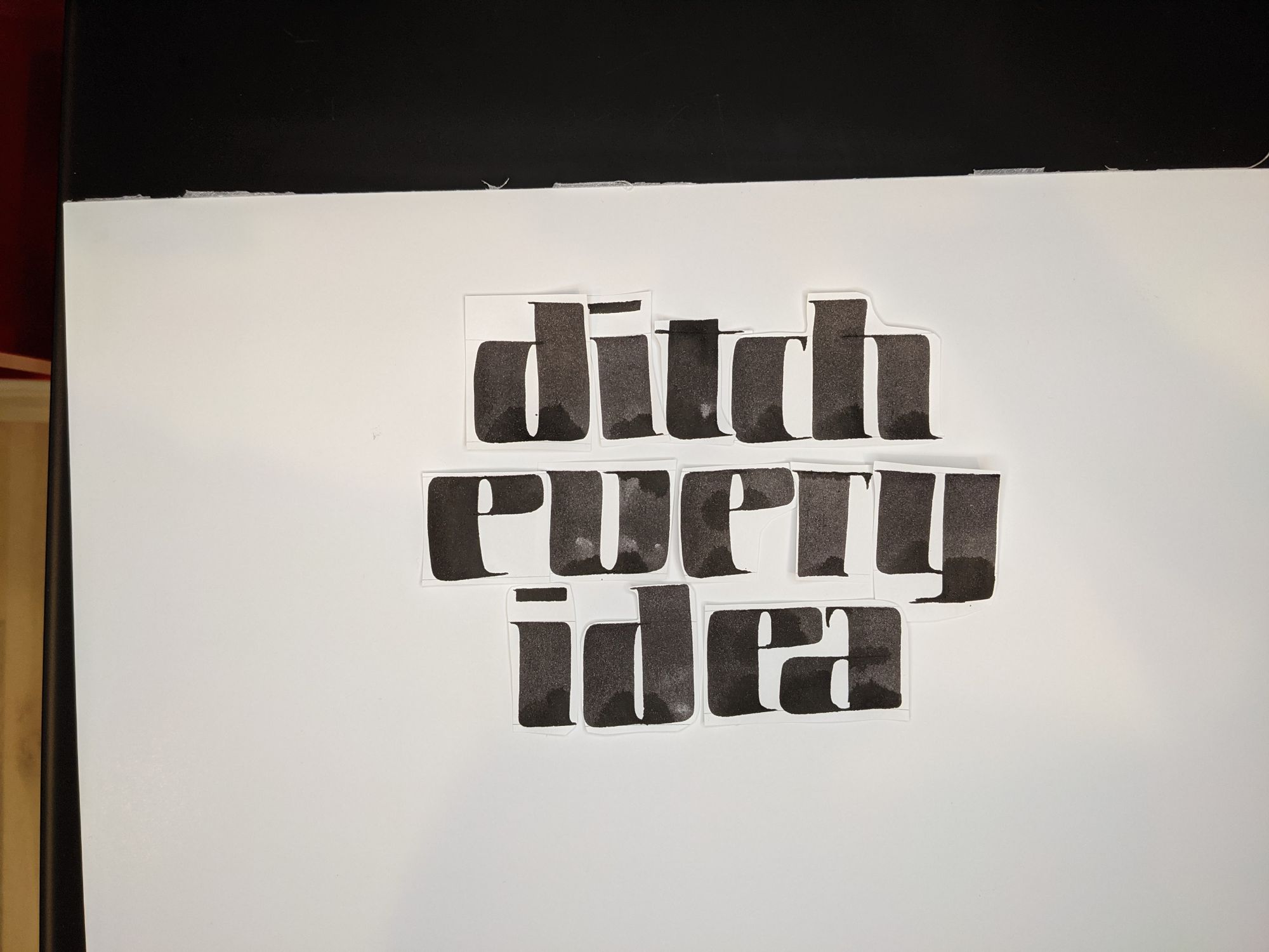
Obviously, the layout in the trial piece was suboptimal, with the D sticking all the way up into the E on the previous line. So I wrote the same letters and cut them out.
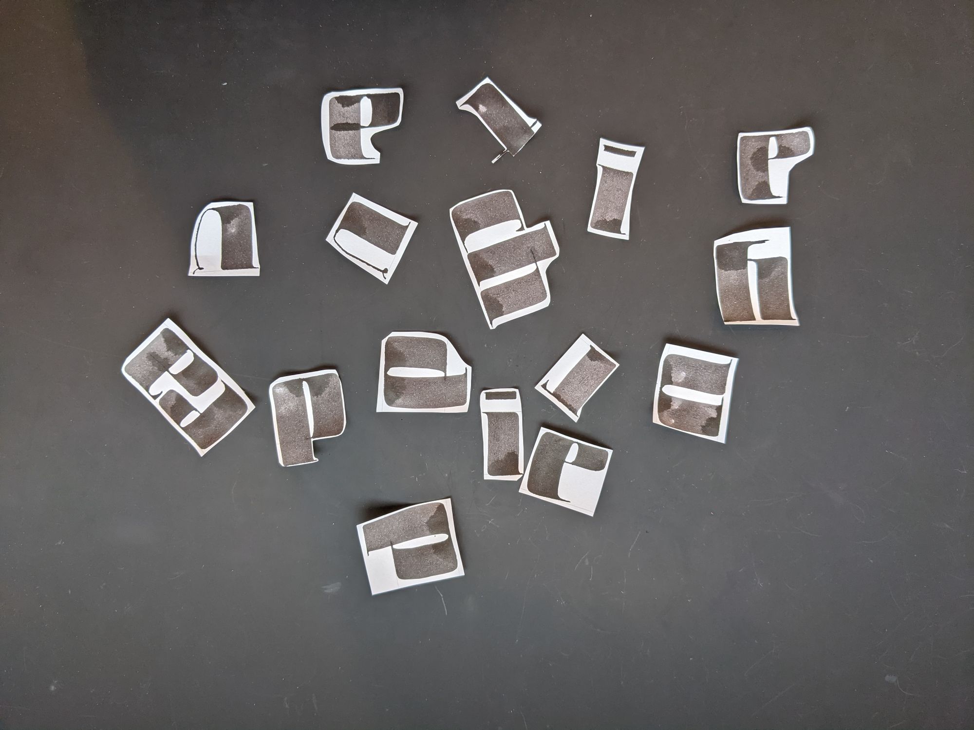
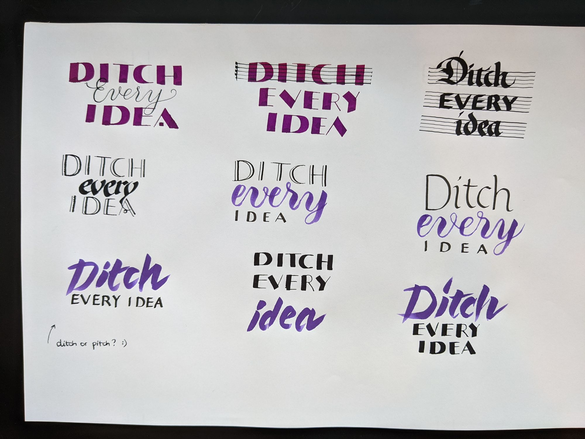
And then I tried a few different ways of arranging them, as well as alternate options for the letter V.
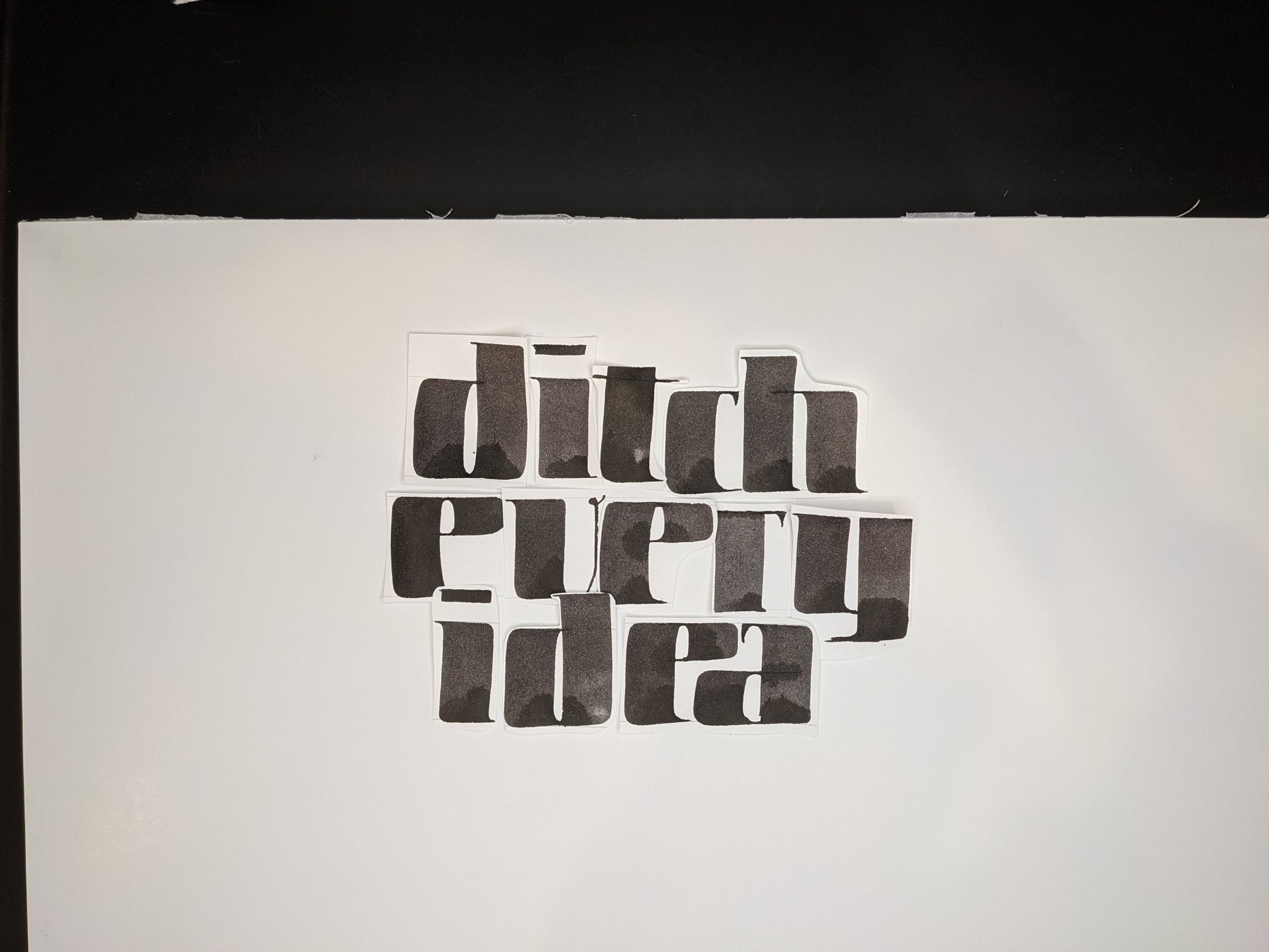
I then cleaned them up slightly in Photoshop.
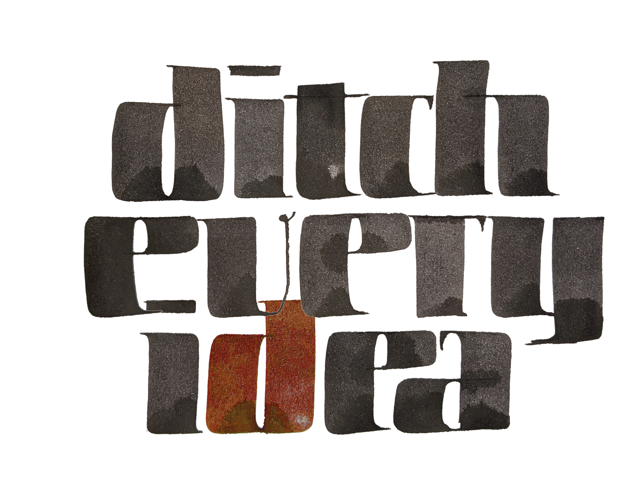
While there was something interesting in that playful V and the overlap, I felt like it wasn't quite working out, even if I added color. I think it's a combination of 2 things: first, the V doesn't really fit in with the rest of the letters; second, the color does not highlight anything meaningful, and random color is confusing.
And so, I settled more or less on Option 2.
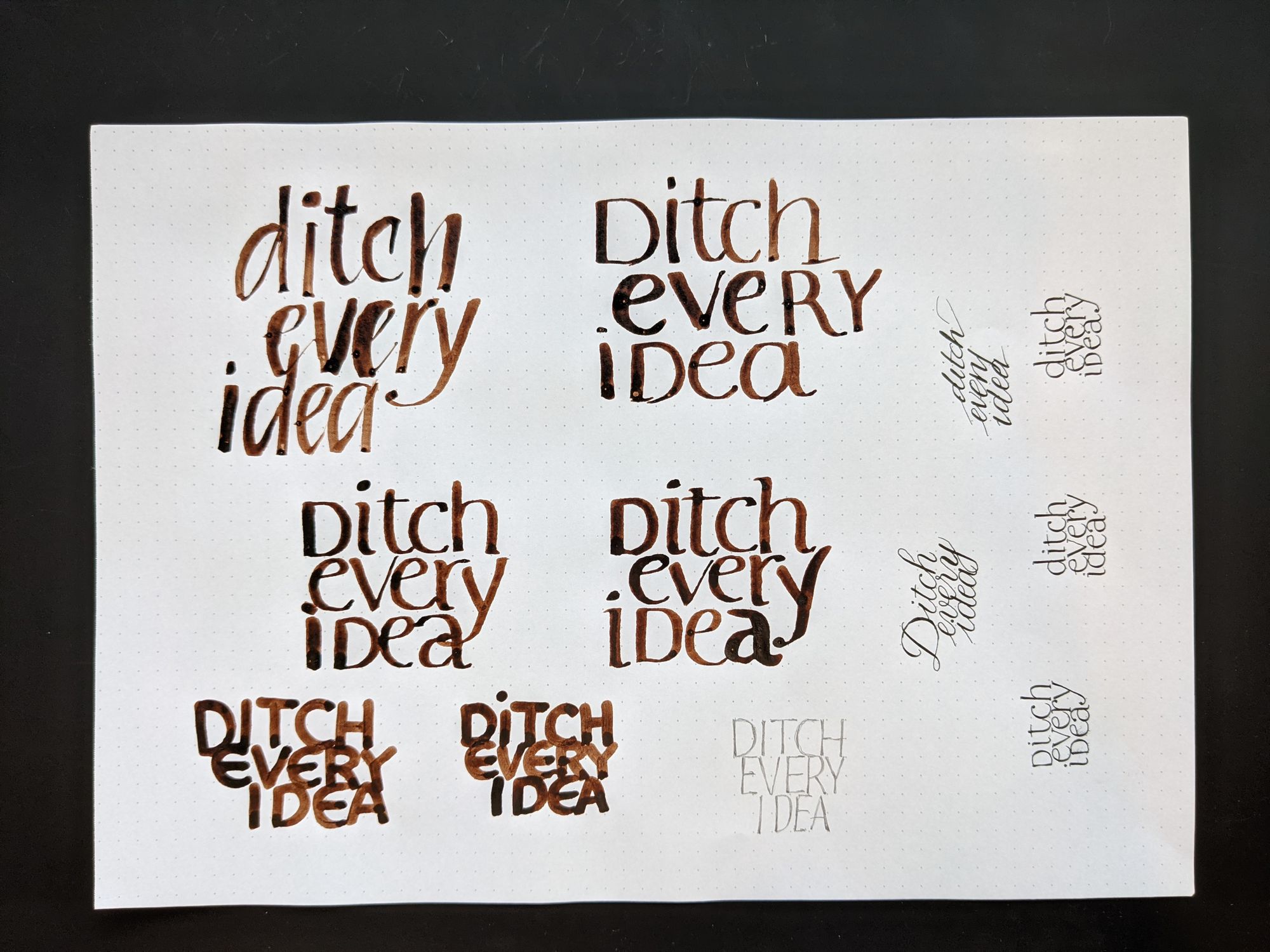
Stage 3: More refinement
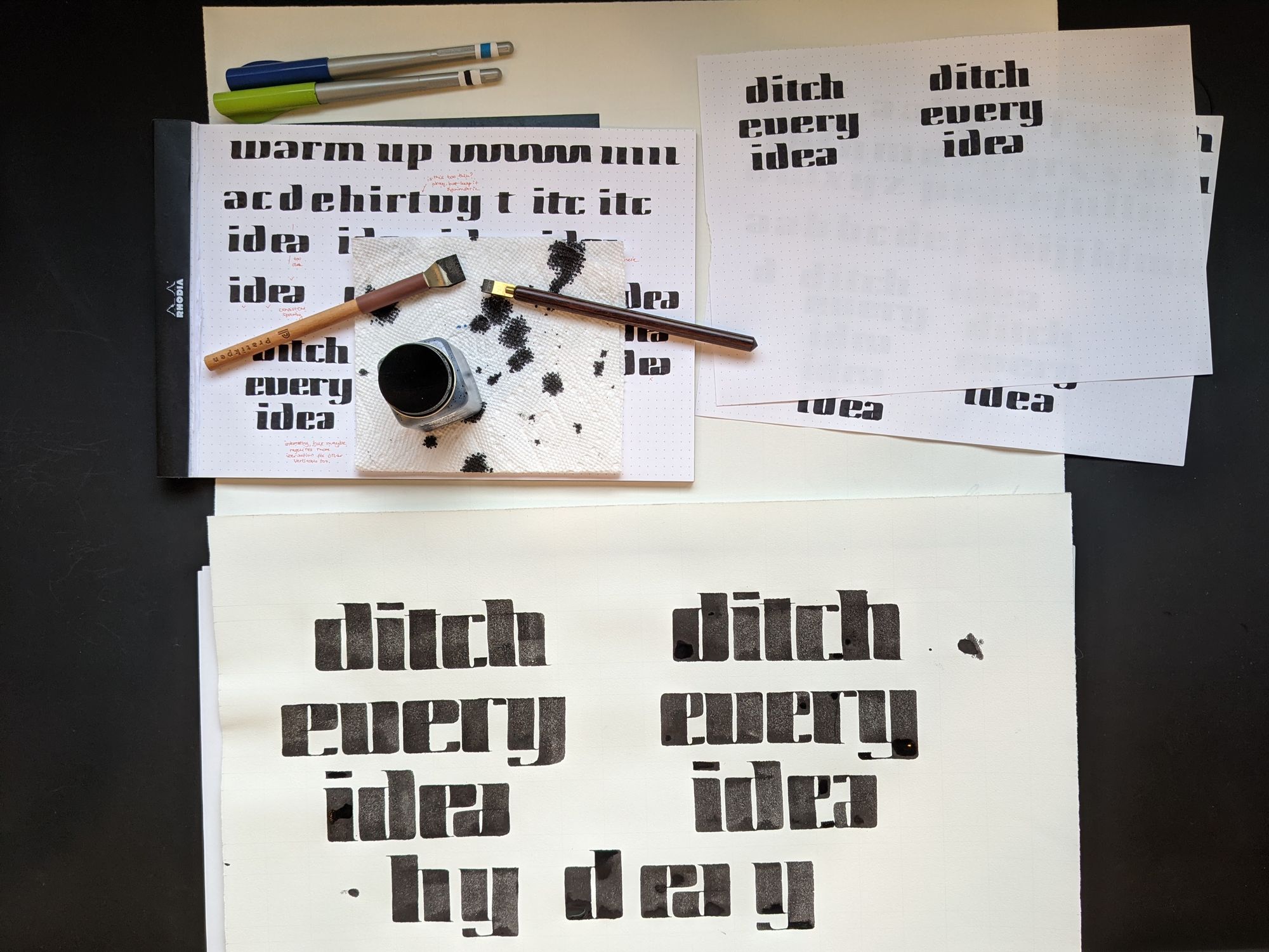
For this stage, I switched to using nice paper, the same as I would use for the final version. I then made 3 more iterations.
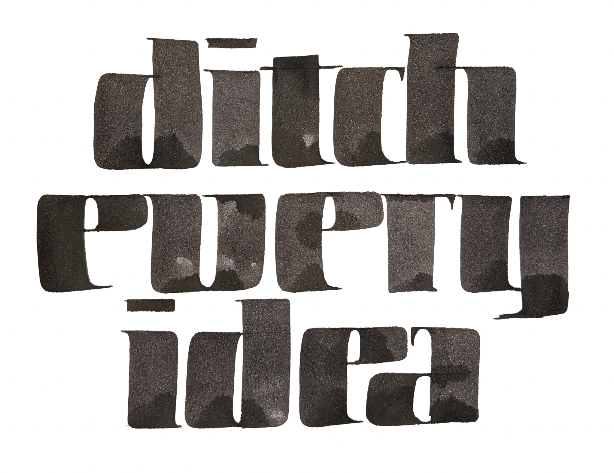
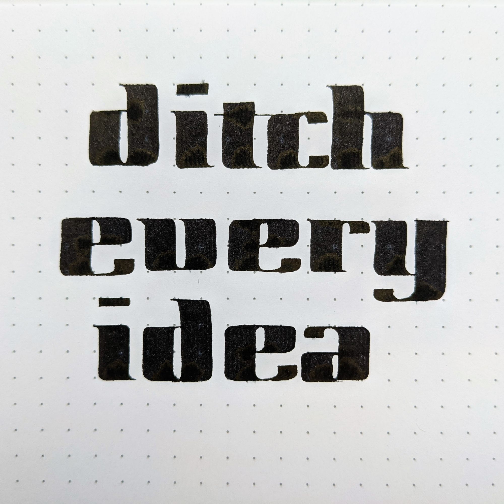
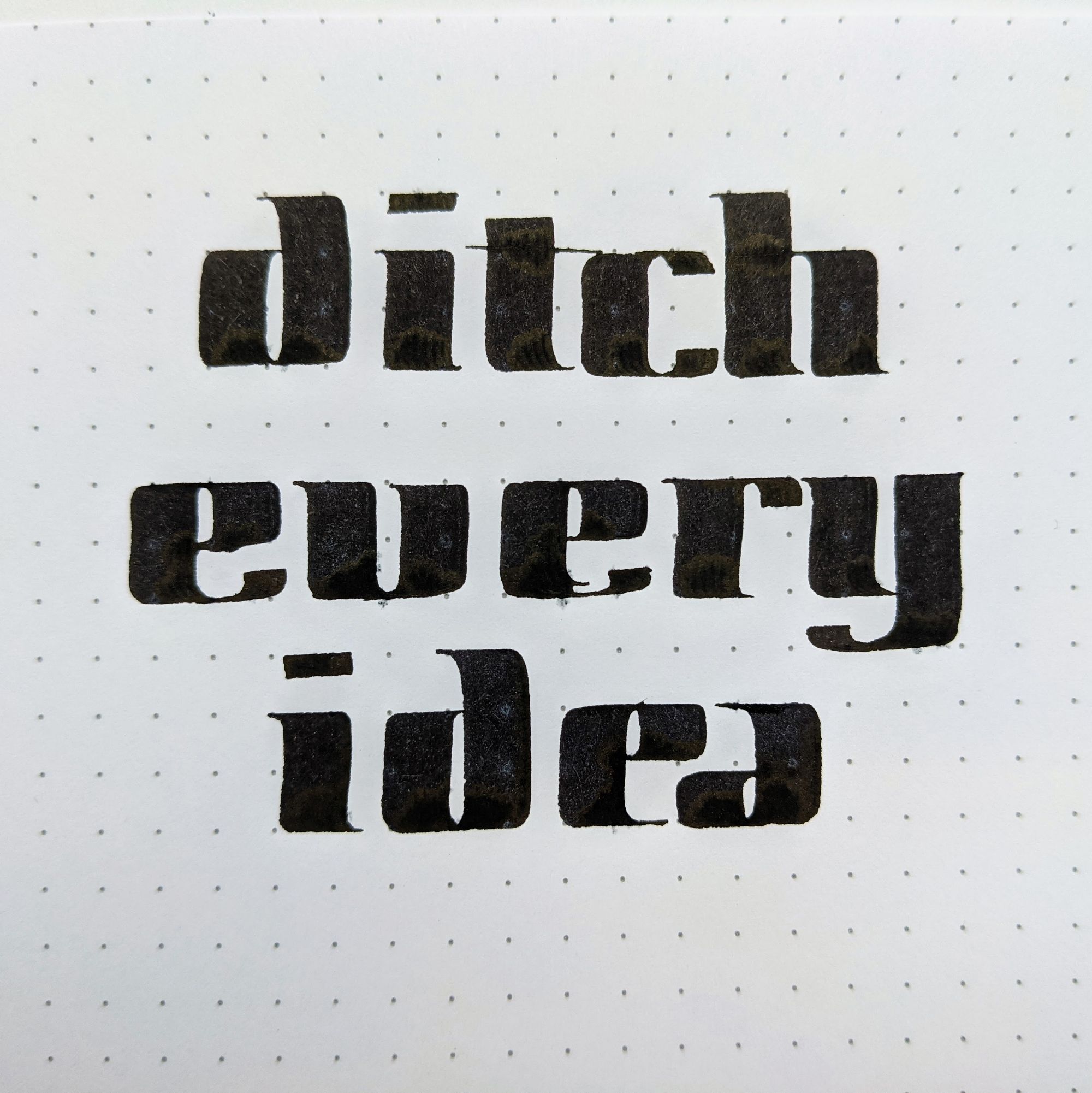
As you will notice, I extended the bottoms of the E's because I felt like there was too much empty space.
I felt like E and A at the end were too close to each other, and the connection between E and V in "every" shouldn't be there.
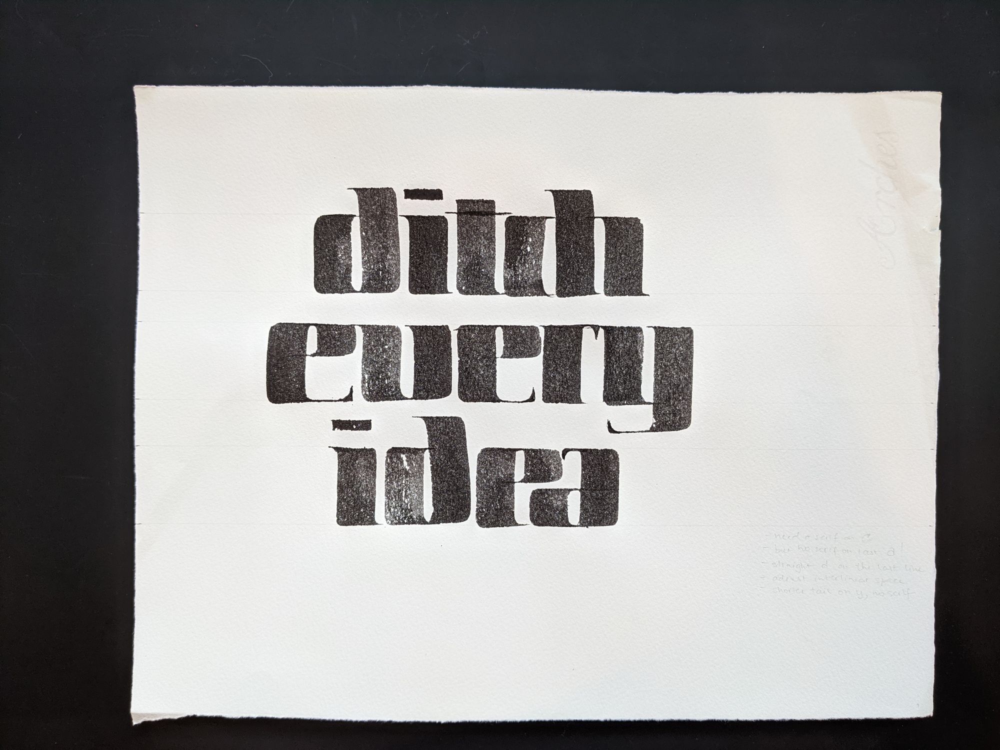
The C without a serif turned out to be a bad idea, it became indistinct. The serif on the last A was too much. The D on the last line turned out crooked. My attempt to adjust interlinear space to be more equal optically made it look less equal. I also felt like the tail on the Y was too long, and doesn't need a serif.
At this point, I was pretty happy, and ready to share my work with the rest of the group.
Stage 4: Critique
There wasn't much feedback earlier in the class when we were just exploring, which makes sense, because none of those explorations are final work.
In the last session, everyone presented their project, starting with the exploration, and ending with the latest current version.
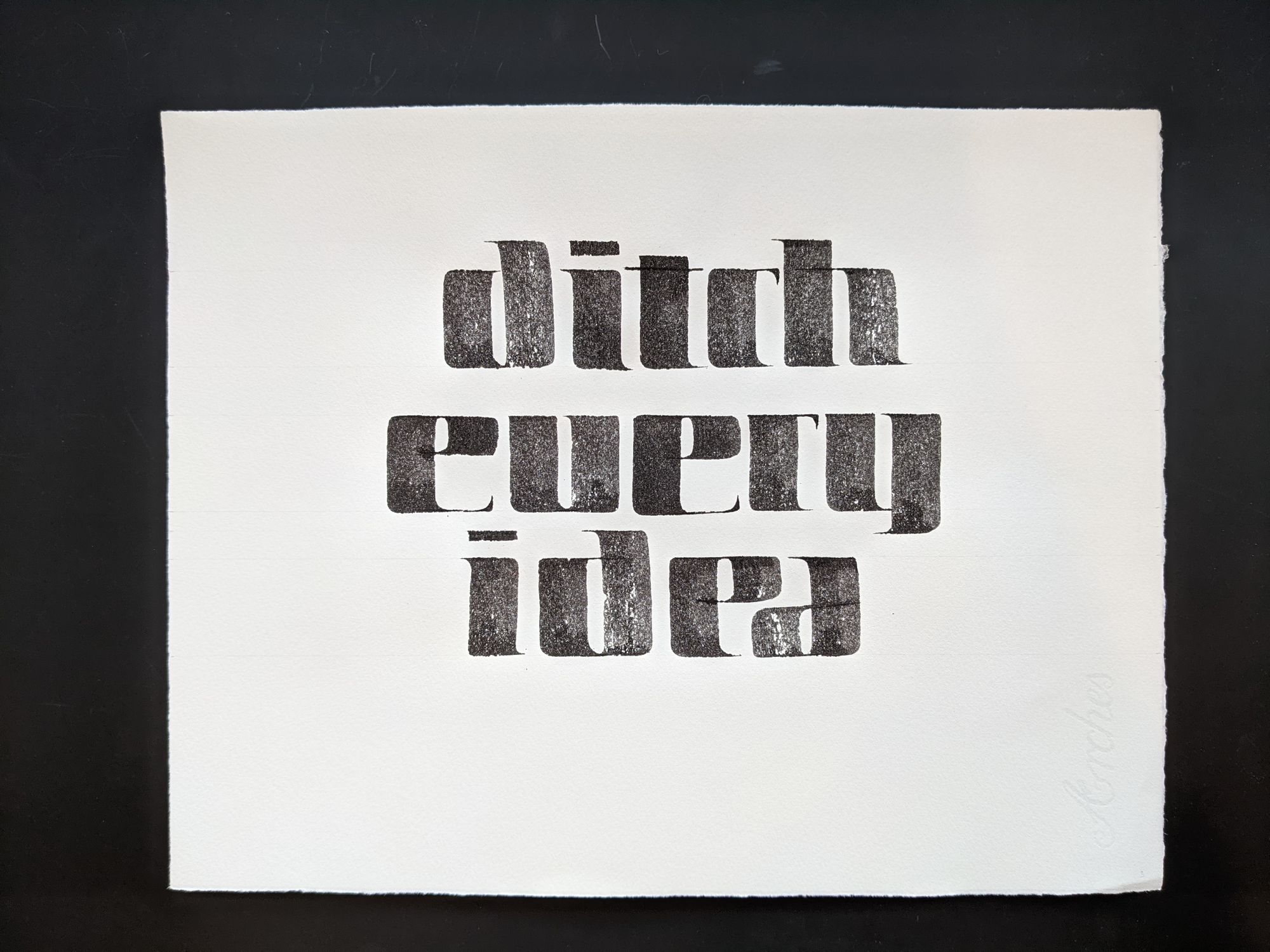
I got some excellent feedback that those skinny pointy serifs didn't quite feel right with the rest of the texture. To address it, I decided to try some chunkier terminals.
At this point, the class was over, so I was free to go on my side quest of figuring out the entire alphabet to see if my new idea would work.
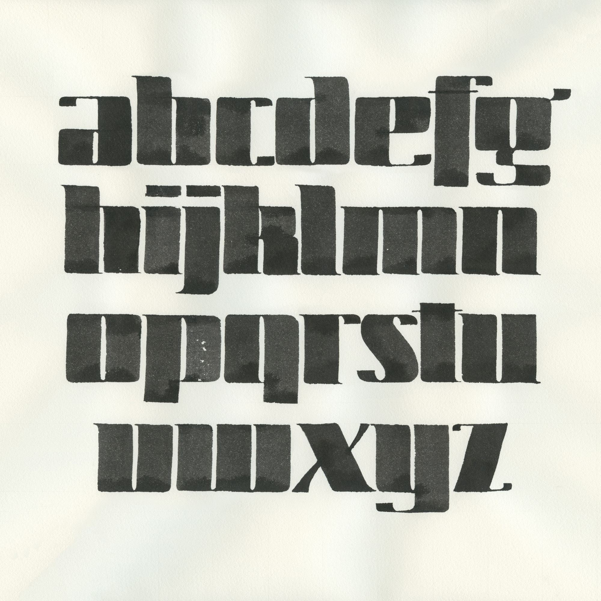
Stage 5: Side quest
I knew I could not make the terminals with the same pen as the rest of the letters, because that would make them way too heavy. So I got a smaller pen, and worked out the whole alphabet.
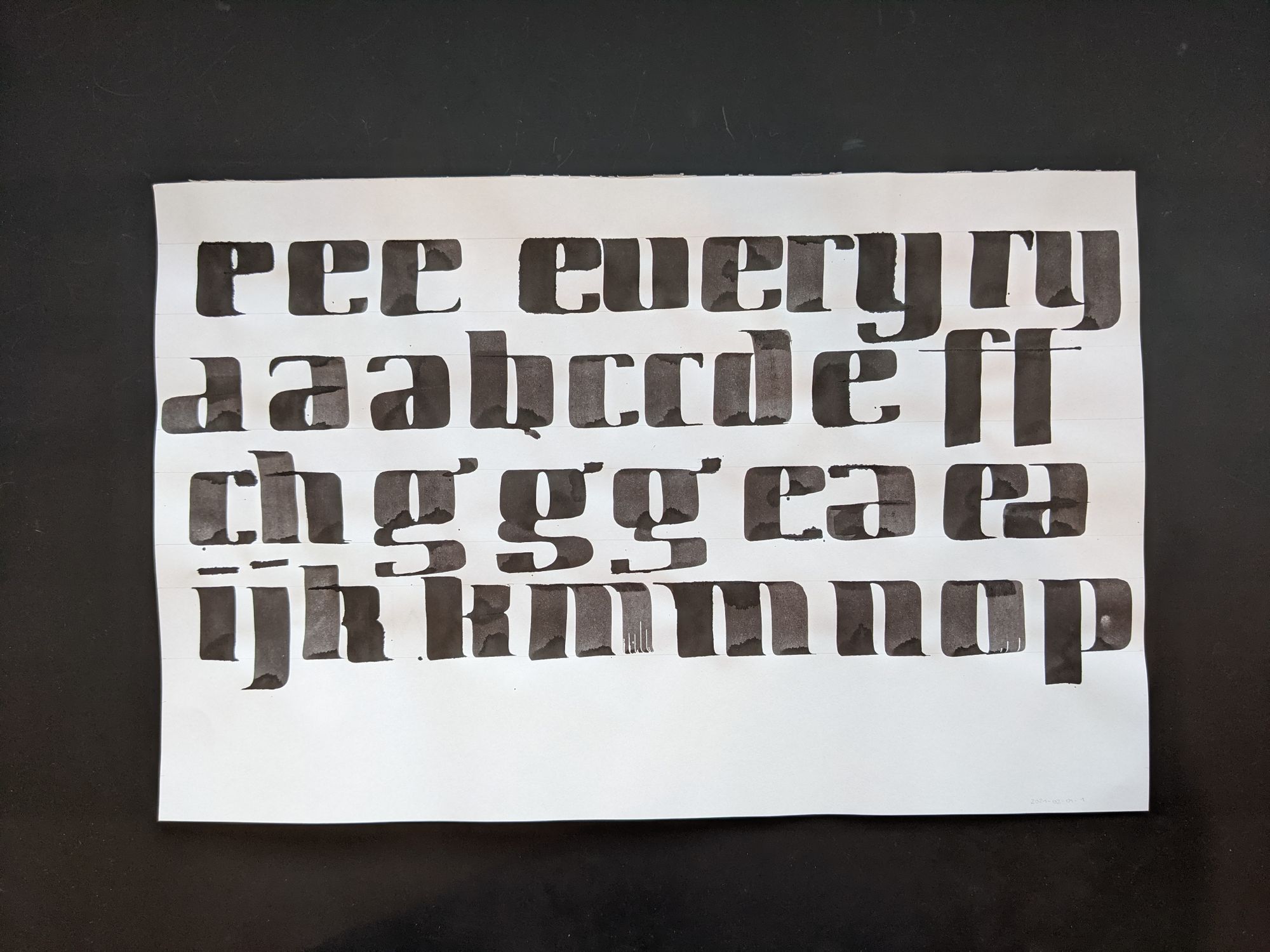
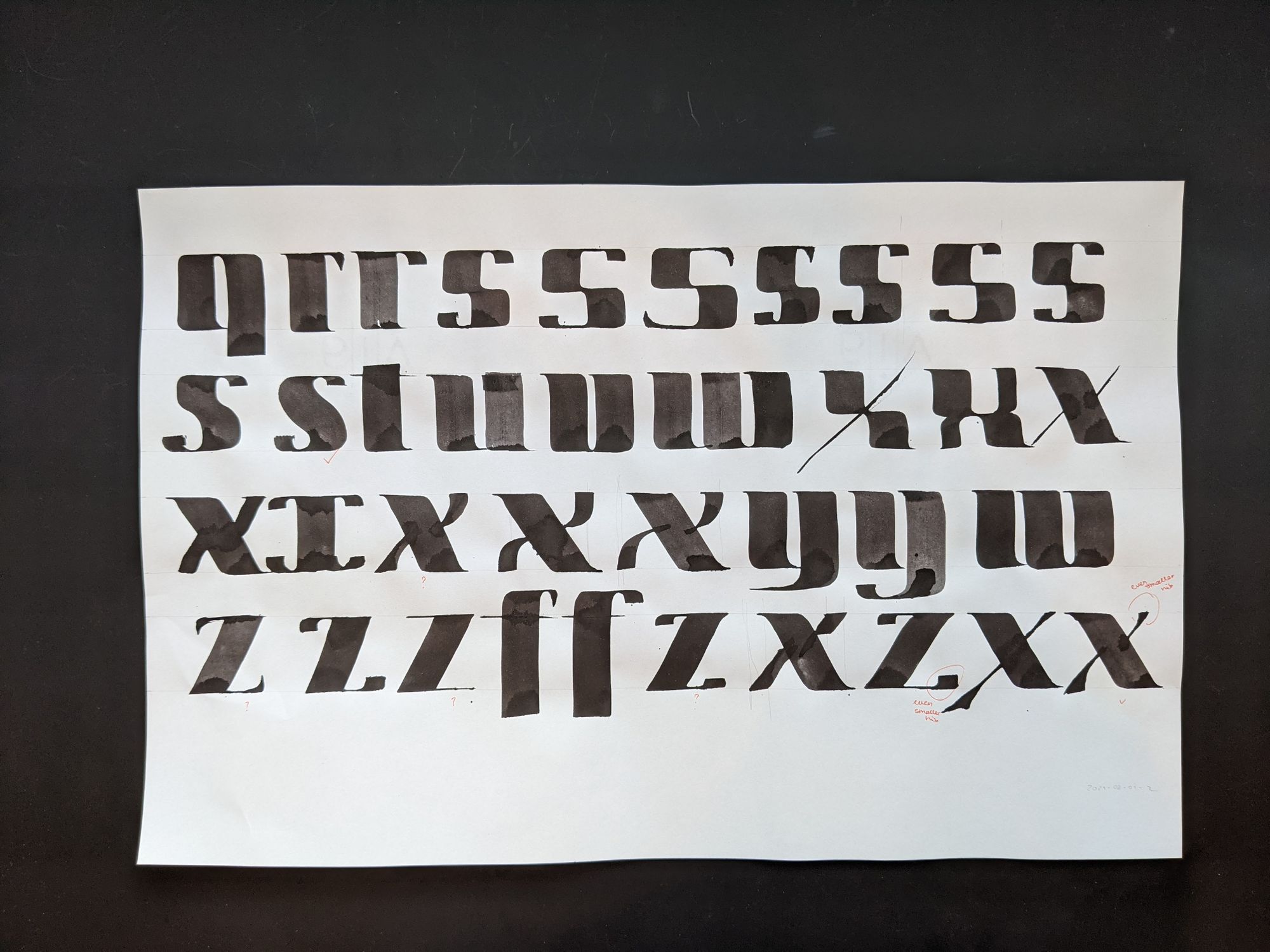
Of course, some of the letters were harder than others, but I was pretty happy with the result. In the end, I had to get a third, even smaller pen size, for the top arm of the X, and for the terminals on the Z.
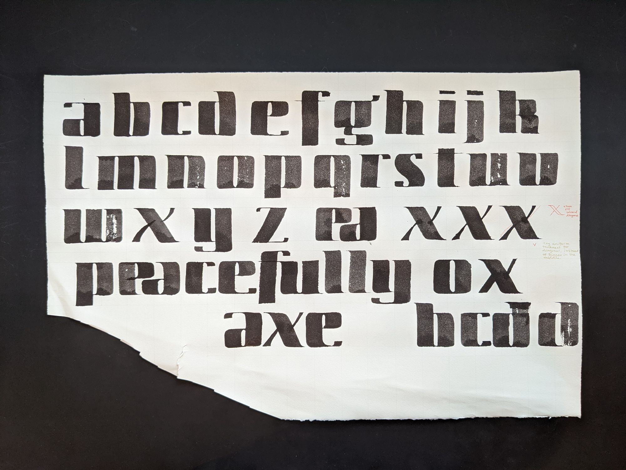
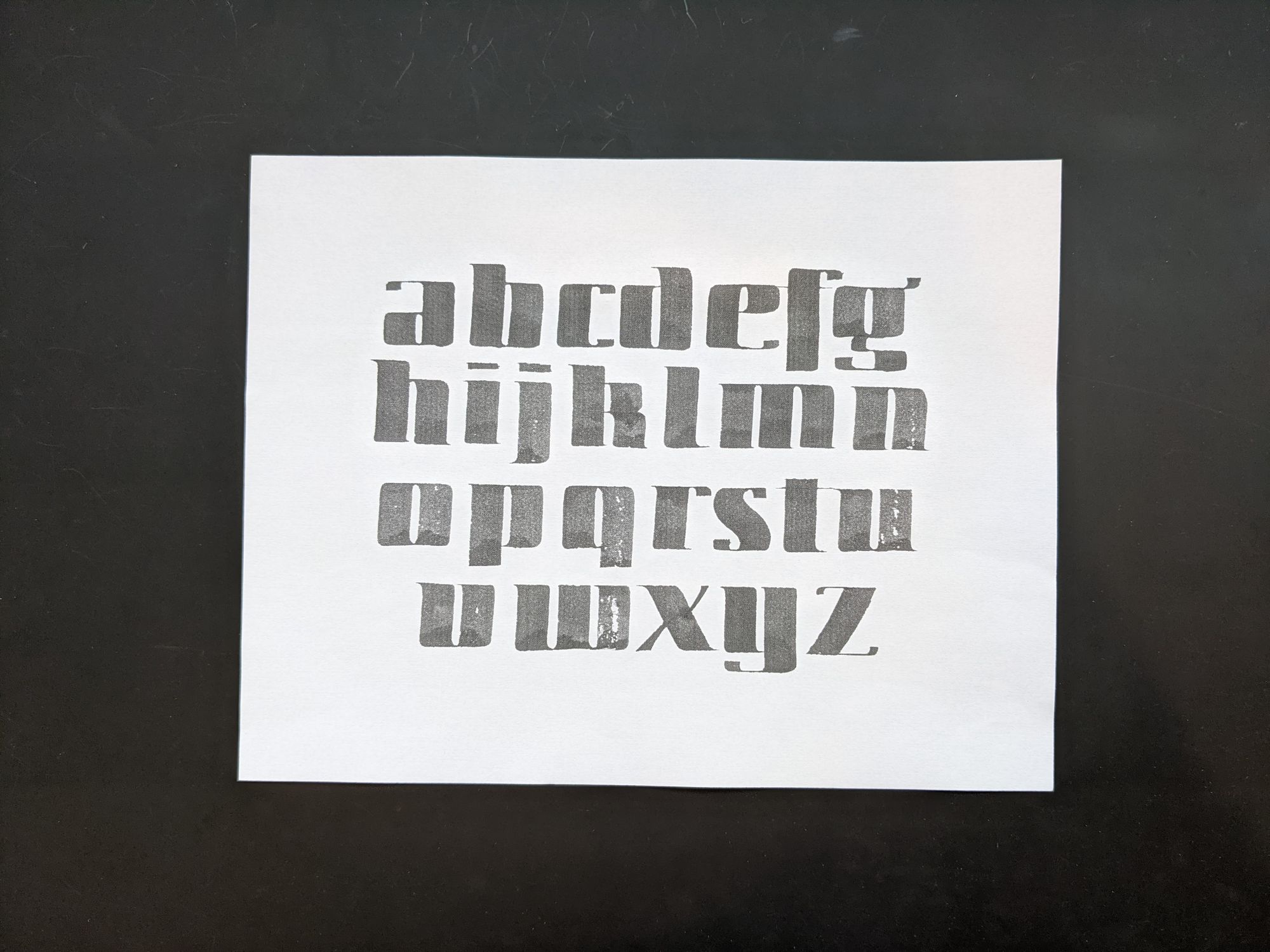
I wanted to write out the whole alphabet in a nicer layout, so I scanned this piece, and arranged the letters in Photoshop to use as a reference.
The final result looked nice when photographed at an angle to show texture.
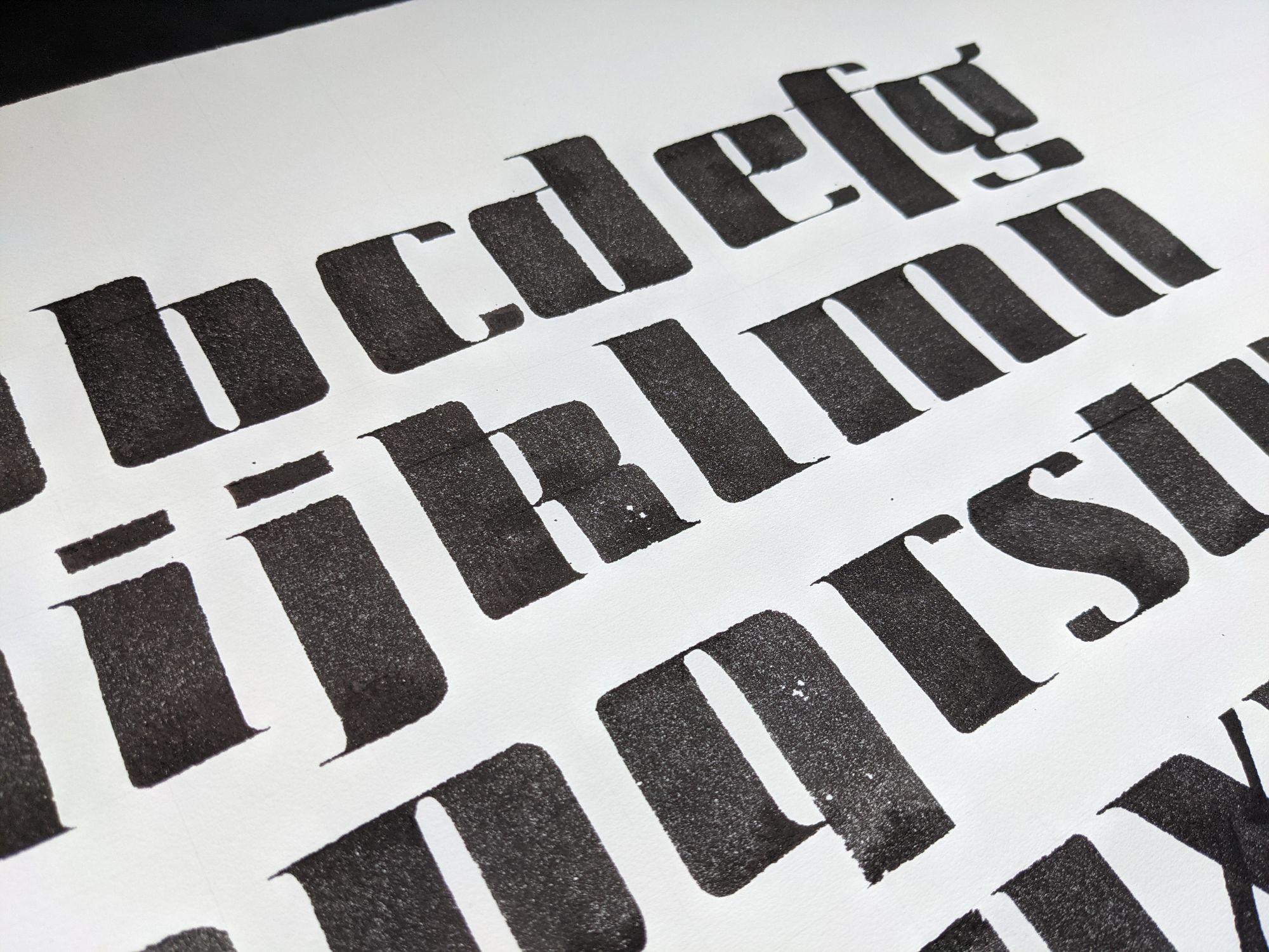
But perhaps not so nice head-on because I didn't get the alignment quite right :)
I decided to leave it at that for the time being, and moved onto my second side quest.
Stage 6: Side side quest
Since I came up with this whole alphabet, I decided to make a YouTube video on who to write it with Pilot Parallel Pens.
Stage 7. Back to refinement
While I was pretty happy with the new E shape, I was still struggling a little with what to do with the E and A at the end. I felt a little torn between giving both letters full terminals, and putting them closer together.
I spent quite a while undecided on how to proceed.
I even tried making narrower E's, as you can see on the bottom right in the picture above. That totally didn't work out.
In the end, I decided to stick with the tightly spaced E and A, since something about that combination felt appealing to me. I can't explain what exactly.
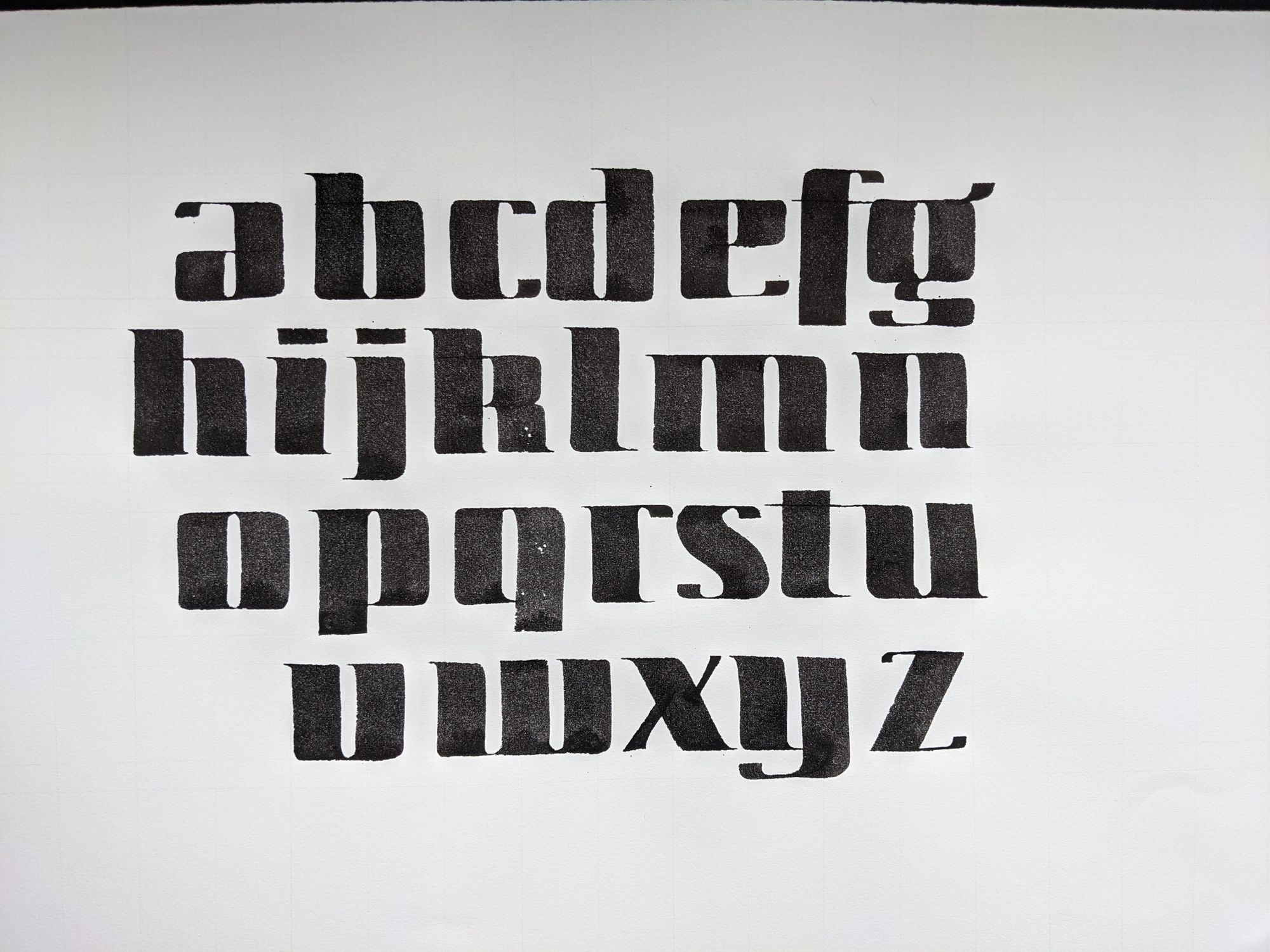
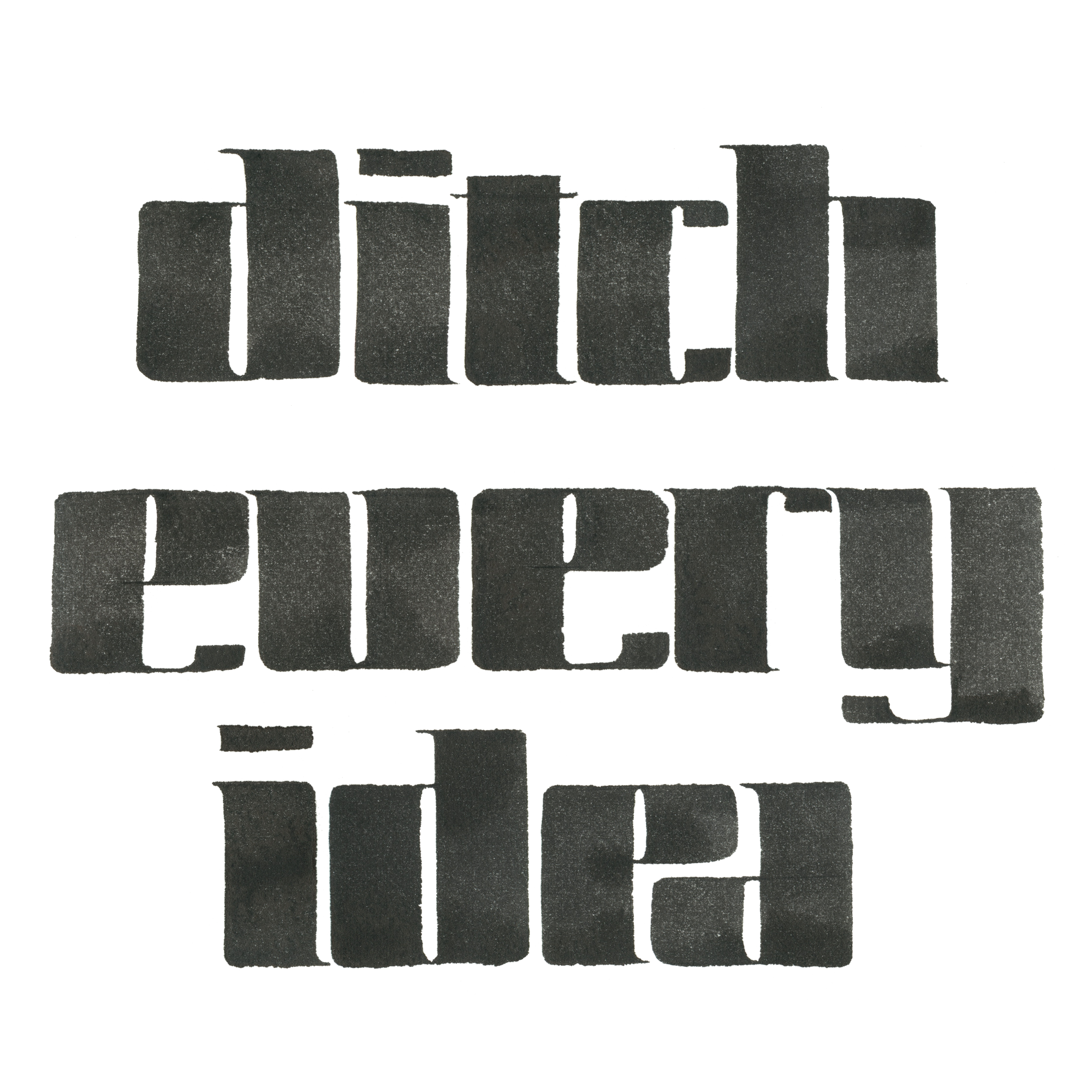
I also went back and made a final-final version of the whole alphabet, with better spacing and alignment.
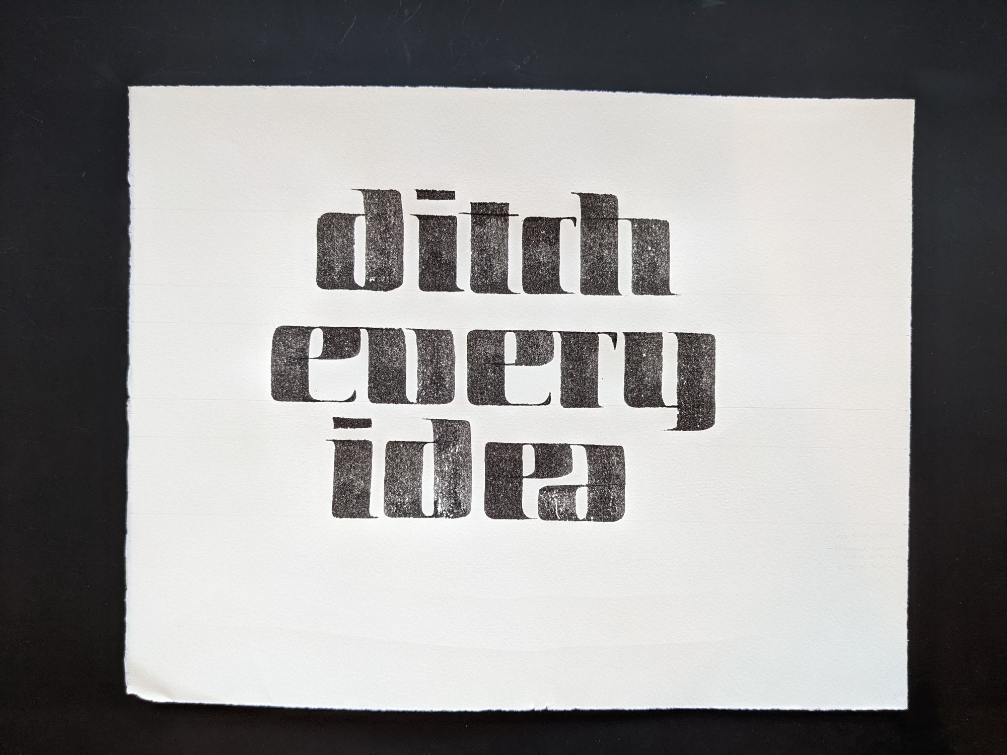
I scanned and cleaned up the last version of the phrase as well, and removed the background so it could be used for laser-etching it on the coaster.
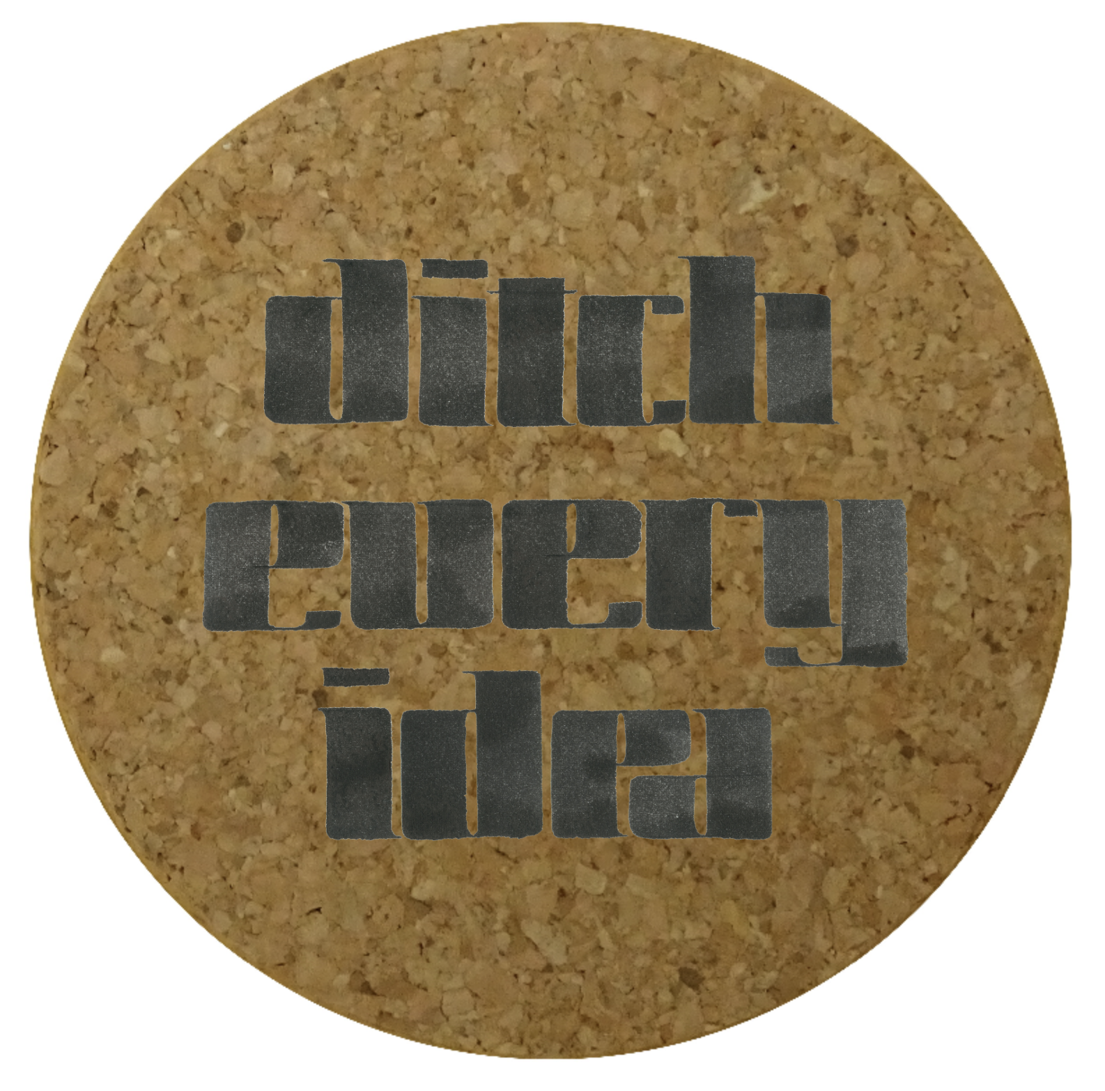
It turned out that a lot of places can print on coasters, but not so many can do laser etching. This is what the preview on their website looked like:
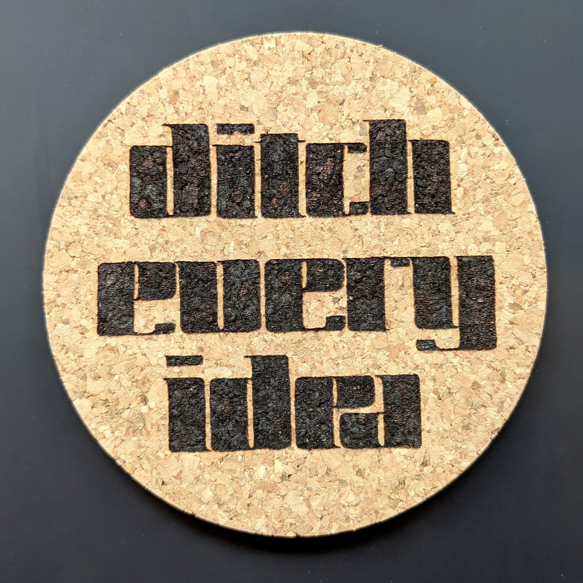
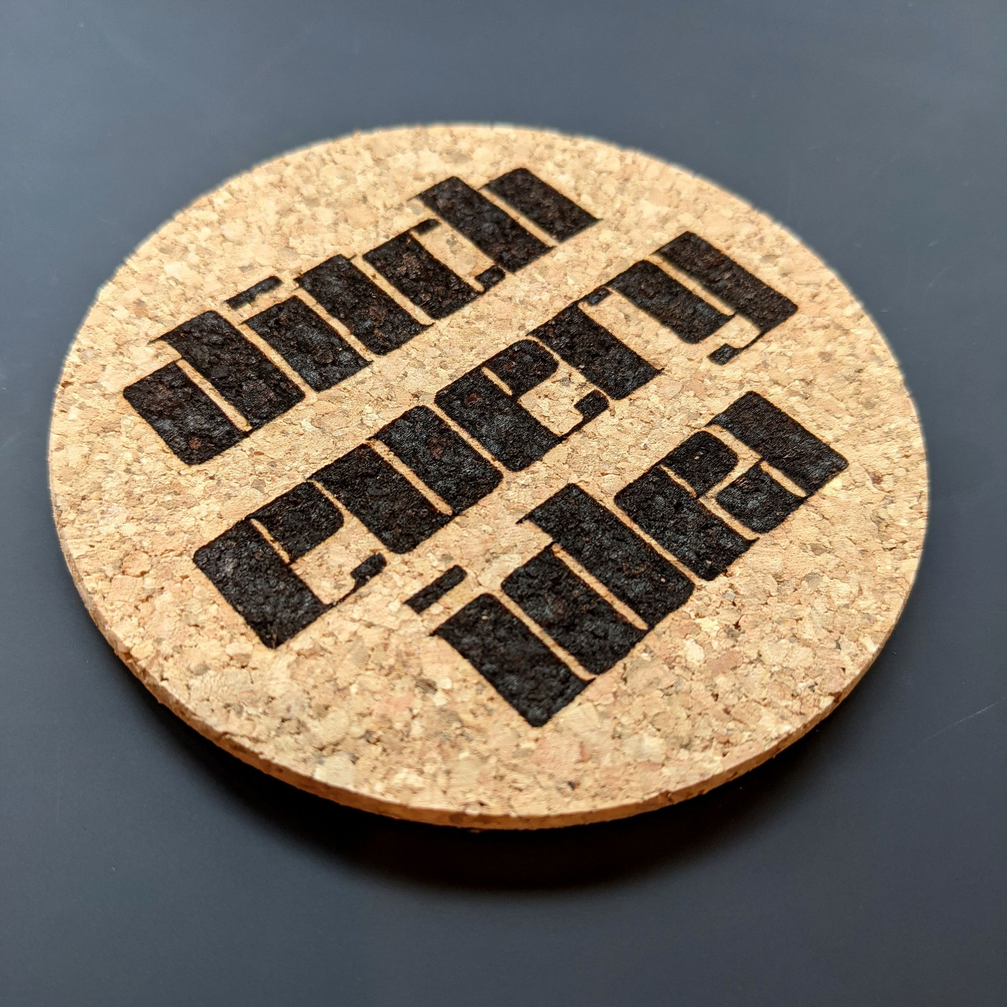
Stage 8. Final product
Got the coasters in the mail! I am pretty happy with how they turned out.
Onto my next project now! :)
Comments