Bratwurst Poster
Today's blog is about a silly poster. Just like all silly things, it has a little back story.
I work at this nice place that provides lunch to employees. Most of the time we get what you would consider "healthy". One day, it was announced that for lunch we will have bratwurst (which is a type of sausage).
My coworkers felt like they had to justify eating something as unhealthy as bratwurst, so one of them pulled out a box of crayons and wrote this lovely memo that he put on the office wall :)
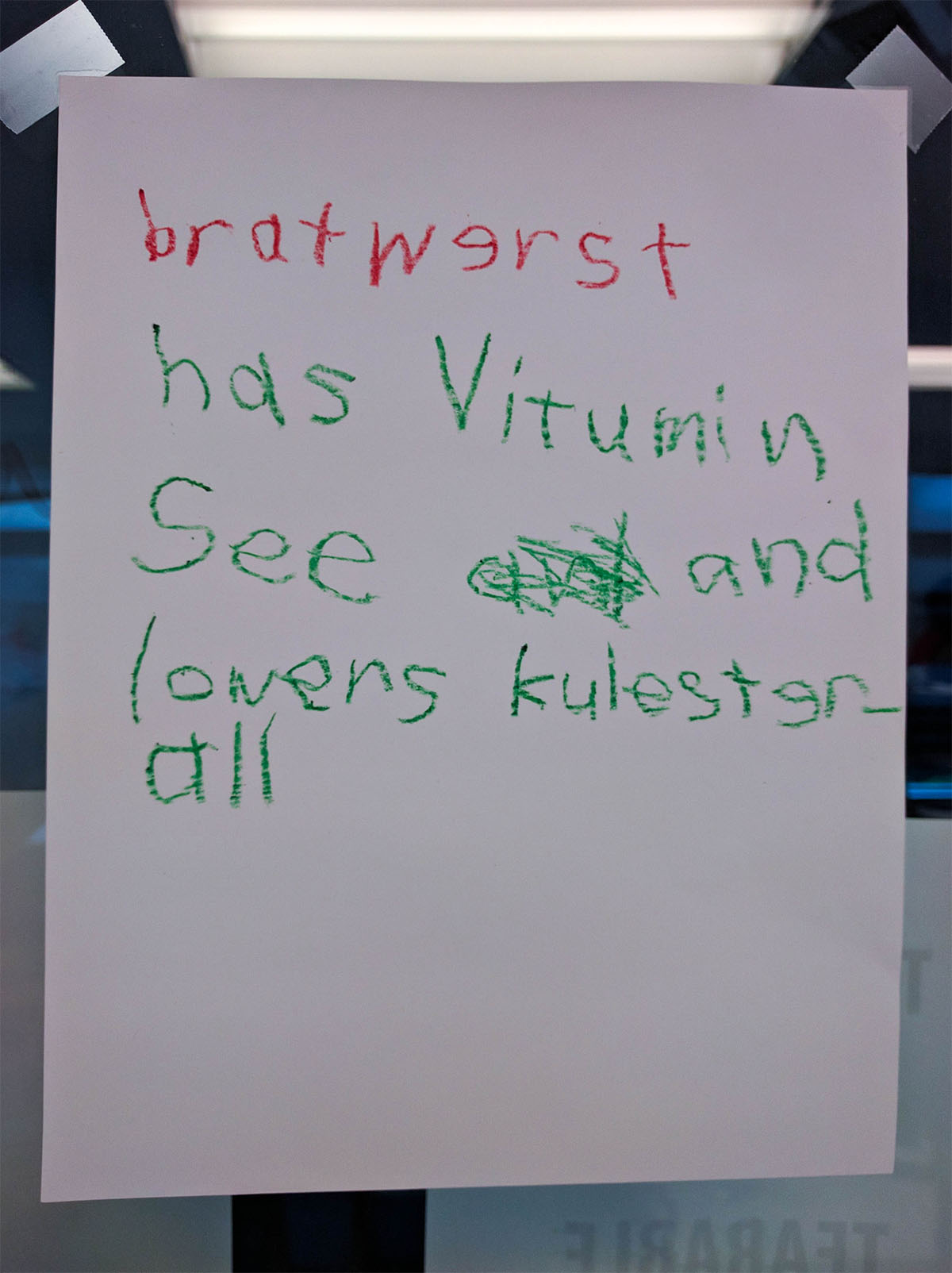
I found this so absurdly fascinating that I decided to make my own "fancy" version of the same message.
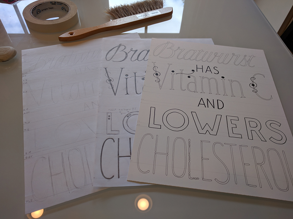
I did a really quick sketch of where I wanted the words to be, and then made a pencil draft.
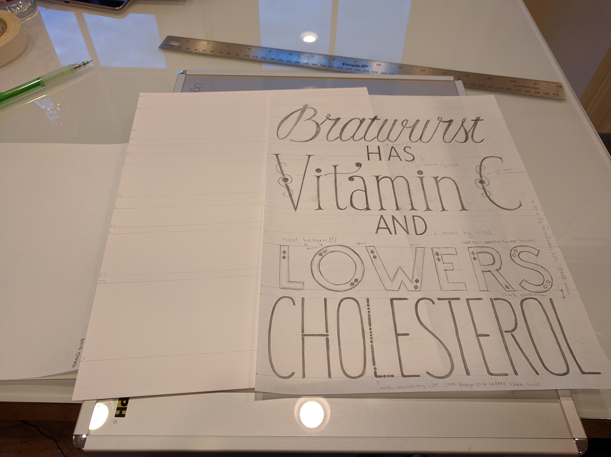
Some things didn't line up quite the way I liked, so I marked what needed to be adjusted in terms of spacing. The letterforms turned out pretty close to what I wanted them to be.
Then, I used my wonderful light box to trace the letters onto thicker paper for the final version.
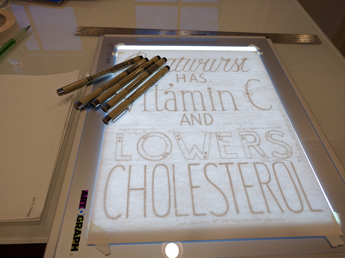
I used a 0.005 Micron pen for the thin outlines, and a Graphic 1 for the thicker ones. You may notice that the horizontal pencil lines do not line up with the letters: I must have made a mistake when I drew those, so I just ignored them.
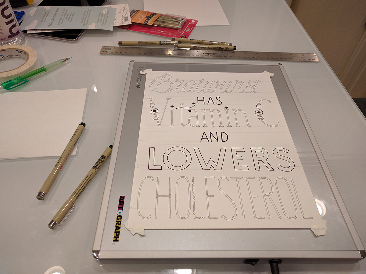
From left to right, this is the rough sketch, the refined pencil version, and the traced version.
Finally, I filled out and decorated the letters, and here is what it looks like:
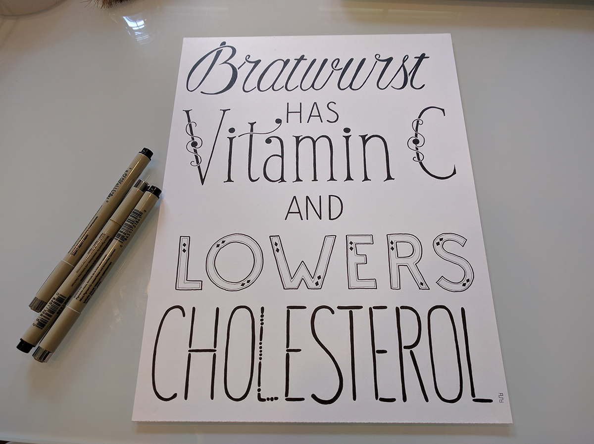
My coworker appreciated the joke, and now my version is also hanging on the office wall :)
P.S. Update on blog theme: in my previous post, I said I would likely have a new theme by this week. It turned out to be much more work than I anticipated. I am making progress, and I finally figured out how to make HTML and CSS lay out the content in the way I want. I think I will write a whole post about what I've learned in the process, but it may not be for another couple weeks.

Comments