Assignment #3: Expression poster (Part 2)
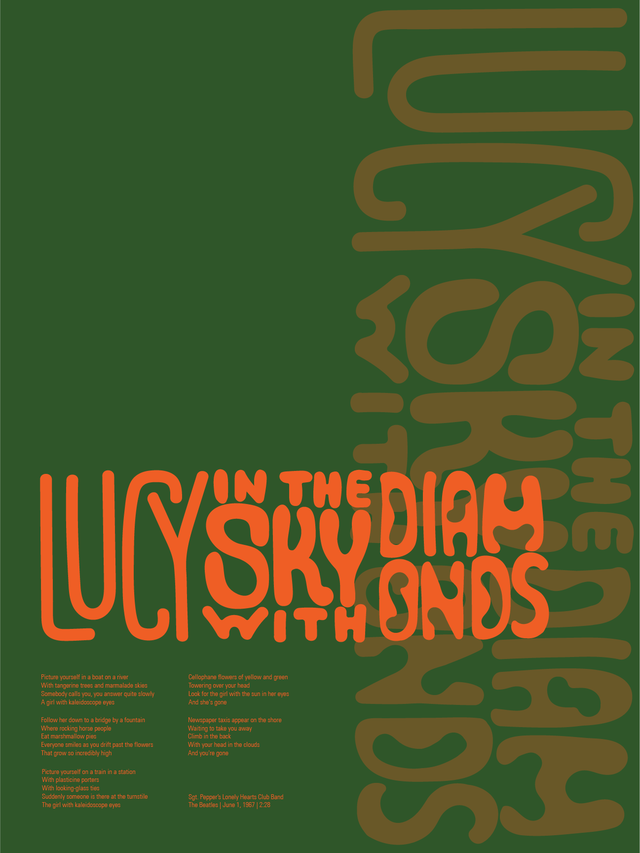
Last week, I came up with two poster ideas that I brought to class with me. Based on the comments that I received, I made some changes and created the final version.
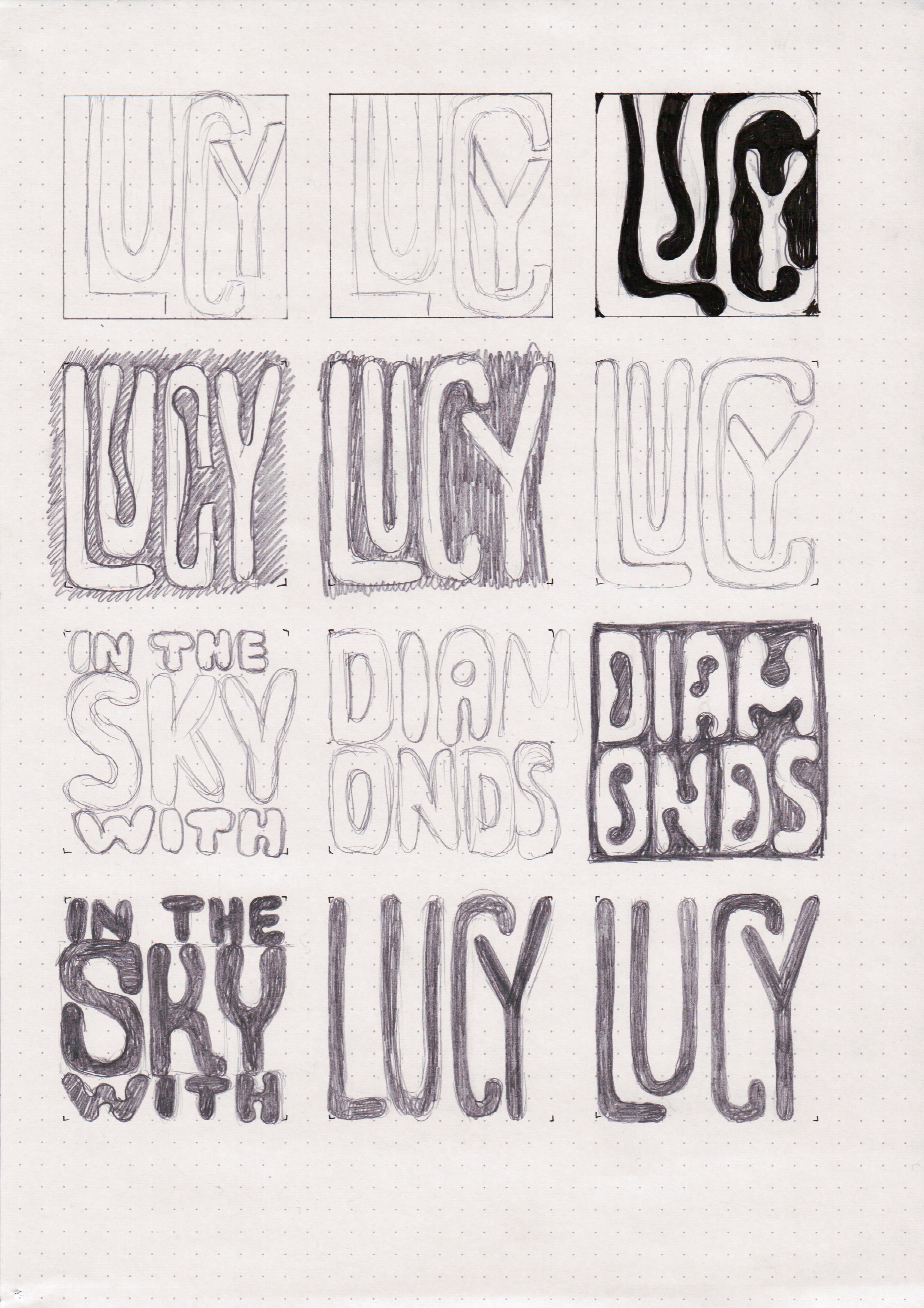
One of the complaints about my initial ideas was that the type was not psychedelic enough. I did some research into what psychedelic posters look like, and decided to do some hand-lettering for the song title.
I knew that I wanted to have 3 boxes of the same size in the title. One of the ideas that my instructor gave me was to rotate them by 45° so that they would look like diamonds, but that only really worked with straight square-ish type, and not with weird fluid lettering.
I had a pretty busy week, so I didn't go into much exploration with the lettering. If I have more time before the class ends, I will revisit this poster to make both the underlying lettering and the traced version of it better.
Since I needed to use crazier colors, I picked bright orange for the text, and forest green for background. After I put in the song title and the lyrics, I realized that the poster felt a bit lonely, so I added a semi-transparent copy of the title at a 90° angle on the side.

The suggestions that I got in class were to use even more crazy colors, and to try putting "The Beatles" on the side vertically instead of duplicating the title.
I still have 5 weeks left in the class, so I will likely revisit this poster while I continue working on other assignments.


Comments