Poem in a shape

This post was originally written in December 2019. In May 2020, I added a new version of the piece, and a section describing it, at the bottom.
I have long been fascinated by the “Butterfly, Marine Mollusk, and Pear” page, which was created by Joris Hoefnagel and Georg Bocskay in mid-16th century.
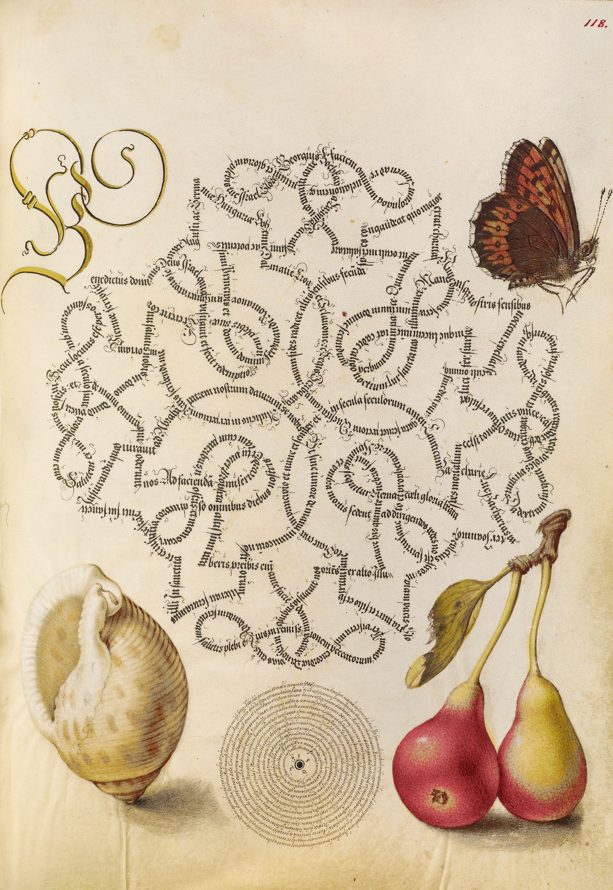
Source: The J. Paul Getty Museum
I wanted to create my own piece of calligraphy that would similarly put letters in an intricate shape, but I didn’t want to blindly copy this page, or make my work appear too derivative.
With this in mind, I purposely did not look at this page for several month before starting my project.
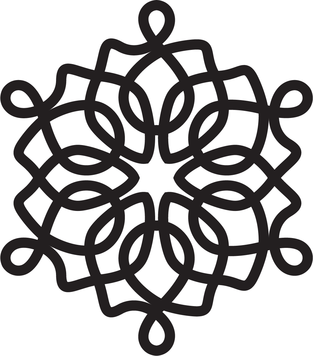
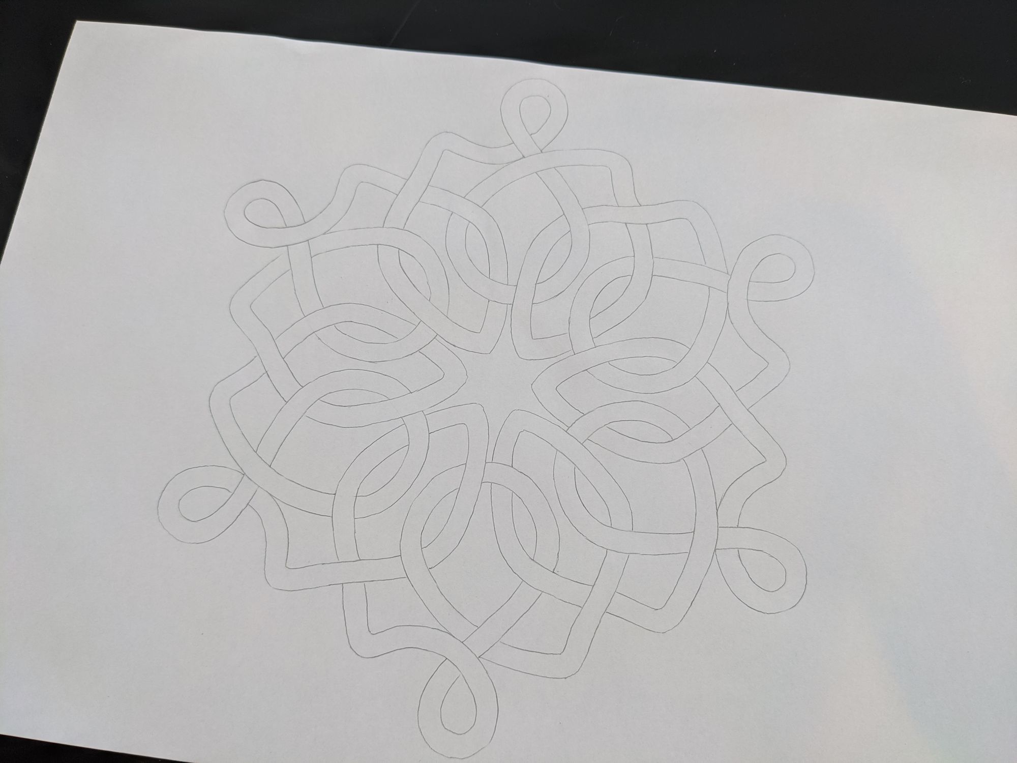
As my first step, I created a symmetric shape in Illustrator:
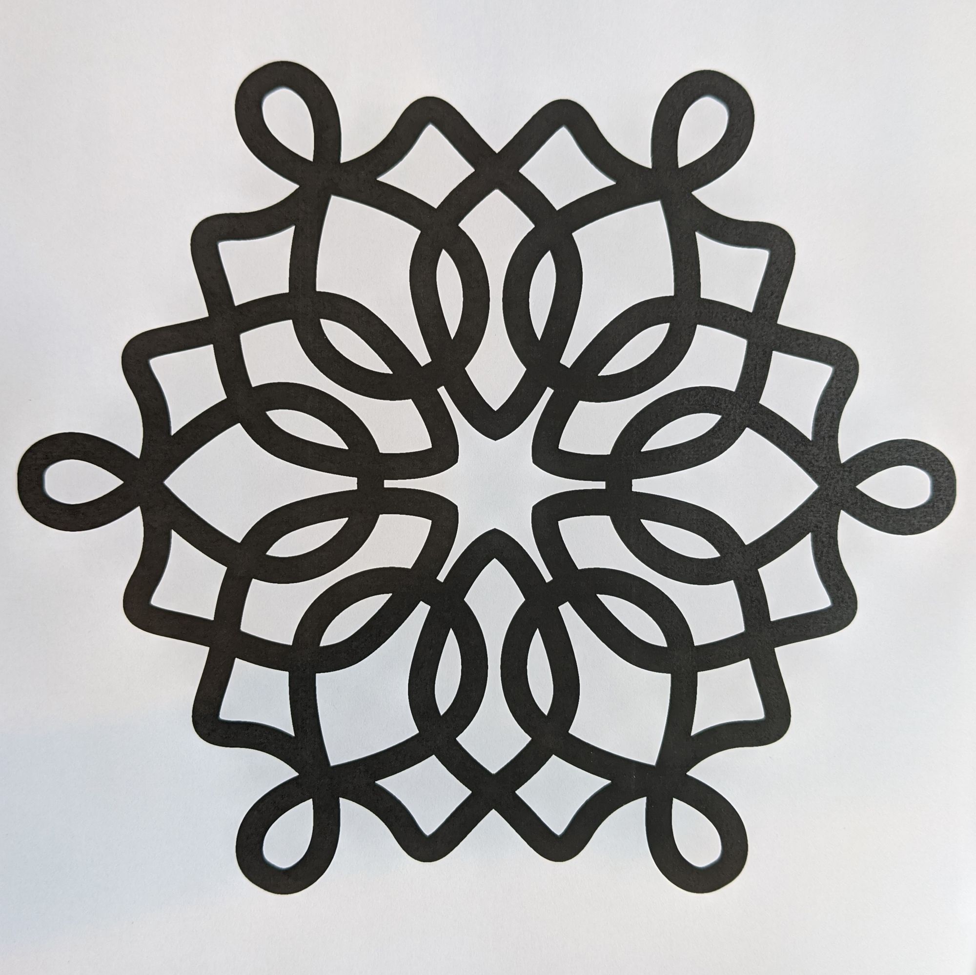
Then, as I was tracing it to create the lines to contain the text, I realized that the “intersections” at the 6 loops on the outside of the shape had too many lines of text coming together:
I updated the shape to make sure that only 2 lines intersect at each point:
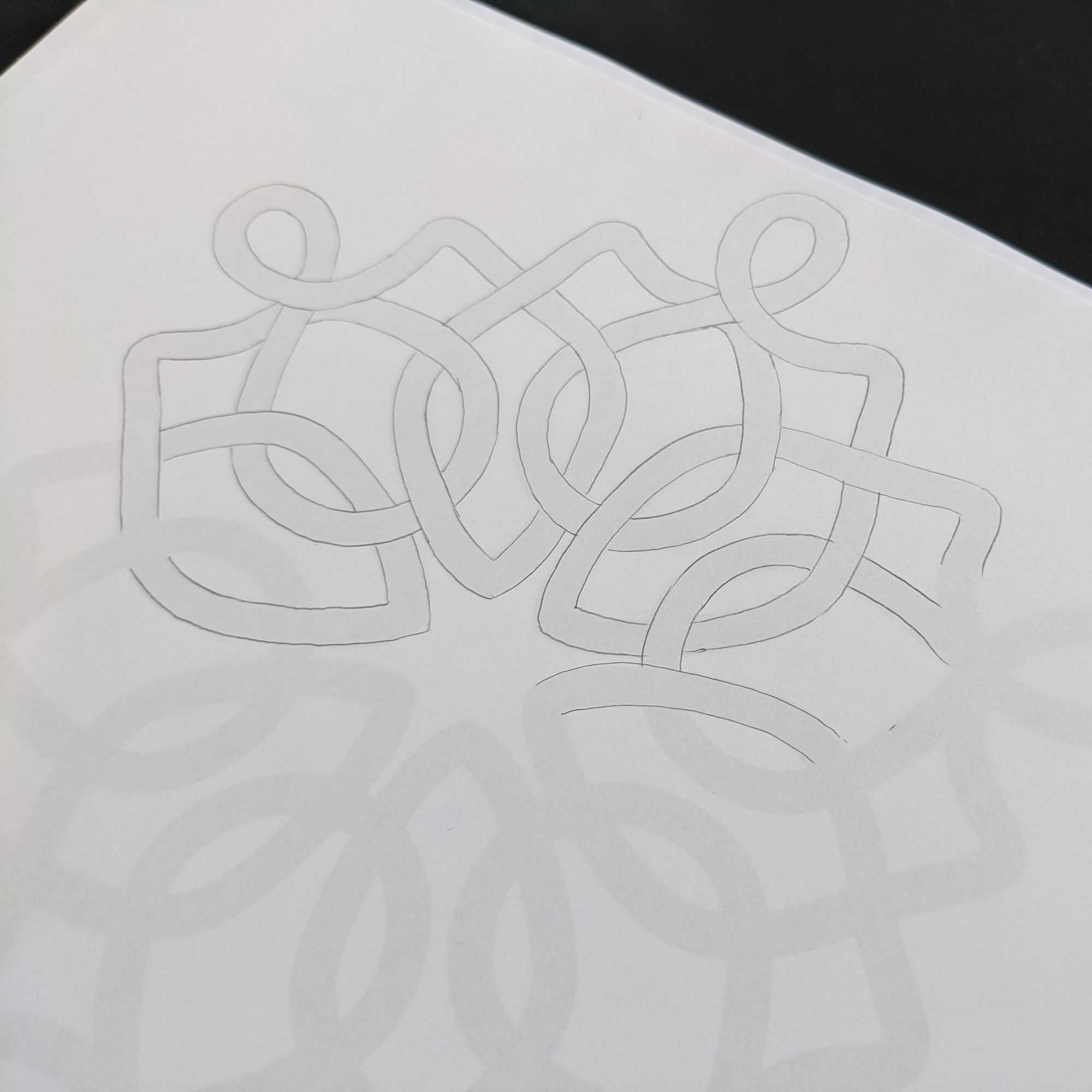
Then, I traced it again, so I would have a clear view of which line of text should go on top, and which one on the bottom, at each of the intersection points:
I didn’t know what text I wanted to use for this shape, so I just wrote out some of the lyrics from a Nightwish song to make a very rough draft:
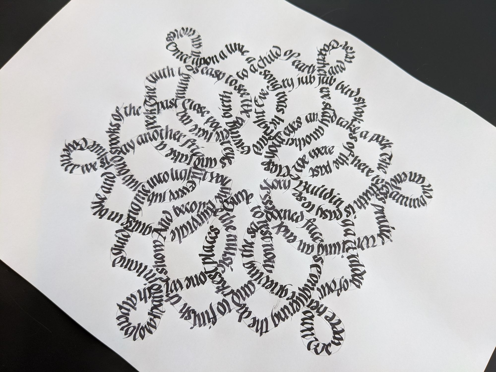
As I was finishing up, I realized it wasn’t the text I wanted to use; besides, it ended at an awkward point, and was neither complete, nor something that could be read in a loop.
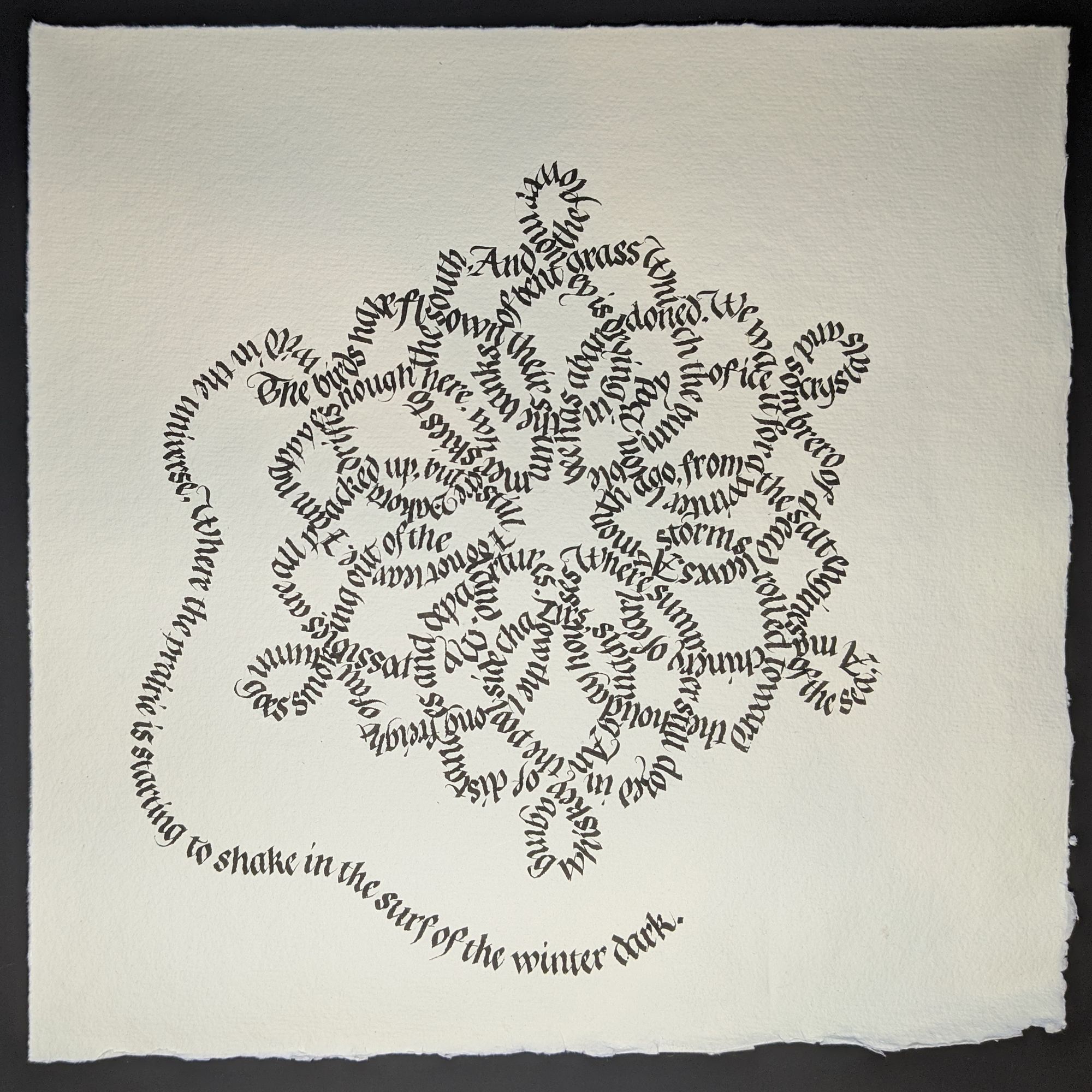
I figured it would be nice to write out some winter-themed poem, so I set out to search for one. The most important criteria for me where length and content. I knew exactly how many letters fit into my test run, so I looked until I found a poem that was exactly the same number of letters long, 681! I know, I know, that is a rather silly way of choosing a poem, but I really wanted it to fit in my shape. It’s “Beyond the Red River” by Thomas McGrath.
I wrote it out on regular lines to get a better sense of any tricky letter combinations, and also to get some practice:
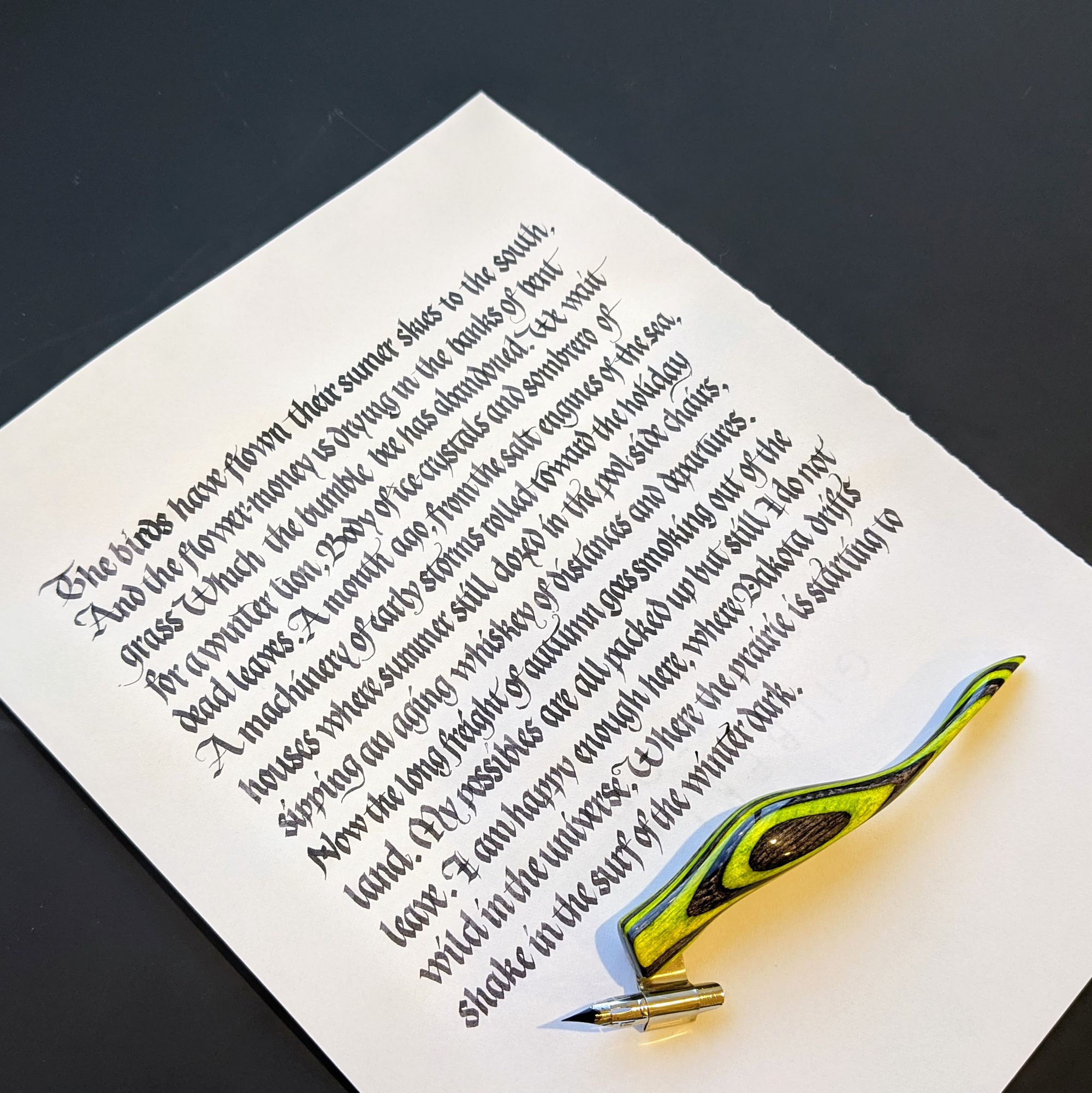
In case you are wondering, no, I didn’t write the whole thing with a pointed pen. I just used it for the flourishes (most of which came out poorly, so perhaps don’t look too closely).
Then I decided to get fancy and write it on rough handmade paper. Bad idea! I didn’t fit at all:
That was rather disappointing, so I decided to do the next round on a smooth piece of paper. Almost immediately after I started writing, I got a smear of ink on the bottom of the page (even though I was trying to be extra careful and used a cover sheet). Even though I knew this one would not be the final version, I wrote it all the way to confirm the entire poem would fit. Indeed, it did. There was even a little space left at the end, mostly because I accidentally missed a “the” in the last line.
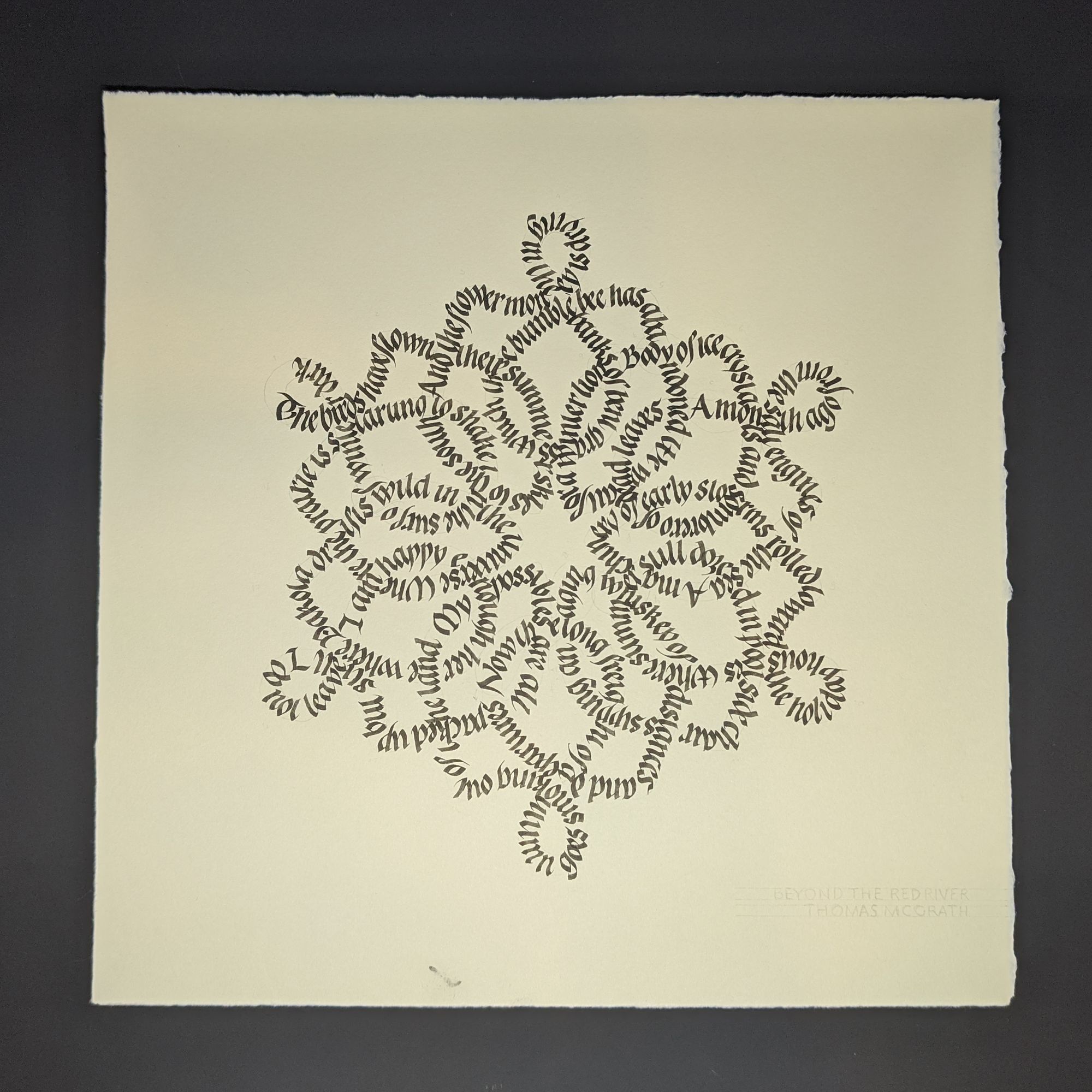
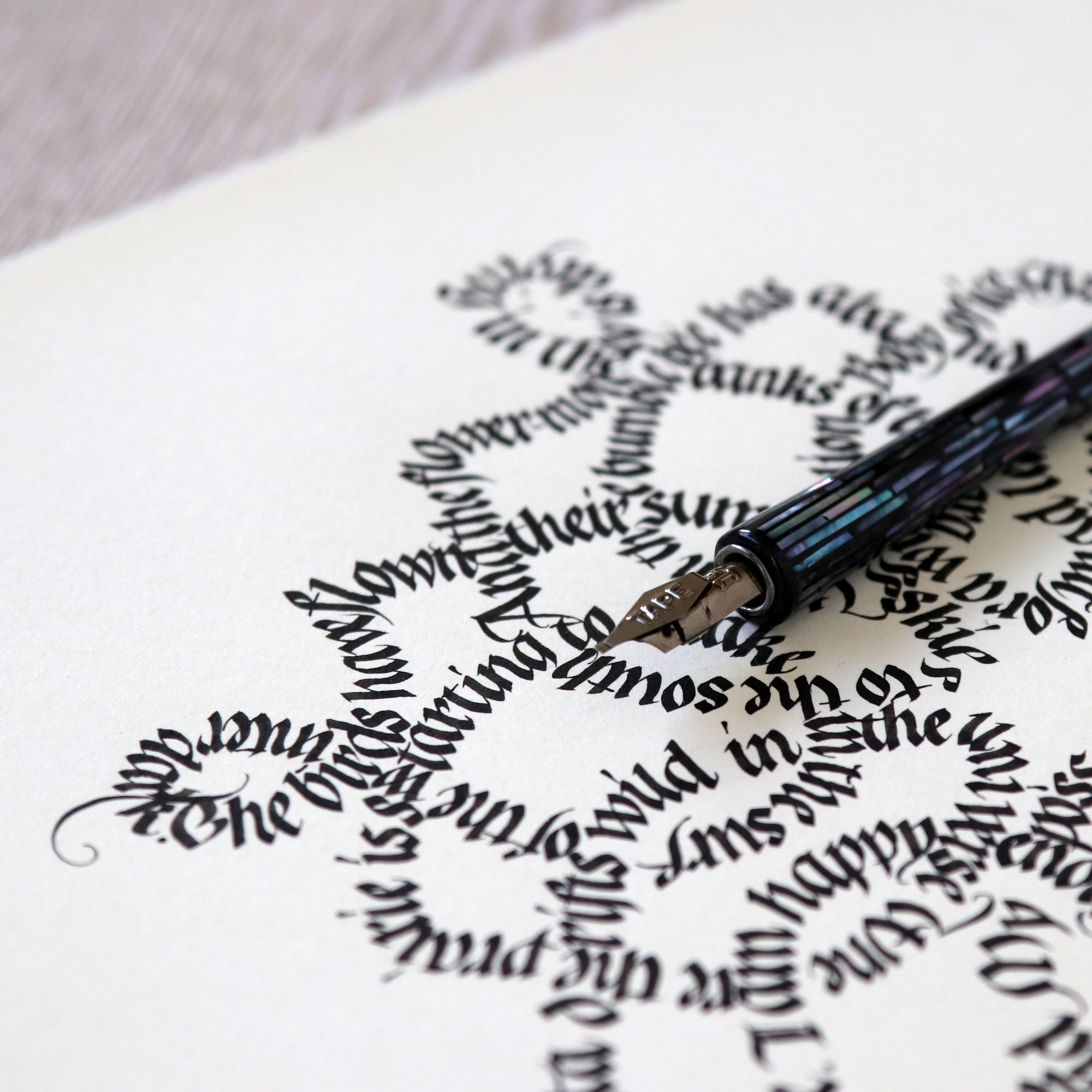
I lined my final piece of paper, and just wrote it out. About halfway through, I realized that my 1.5mm nib I was using needs to be replaced, but I didn’t have another one, and I definitely didn’t want to wait for a new one to arrive in the mail before finishing my project. I was a bit of an uphill battle, and some of the letters did not come out quite as sharp as I hoped to, but at least it’s all finished. The last word ended up intersecting weirdly with the first one:
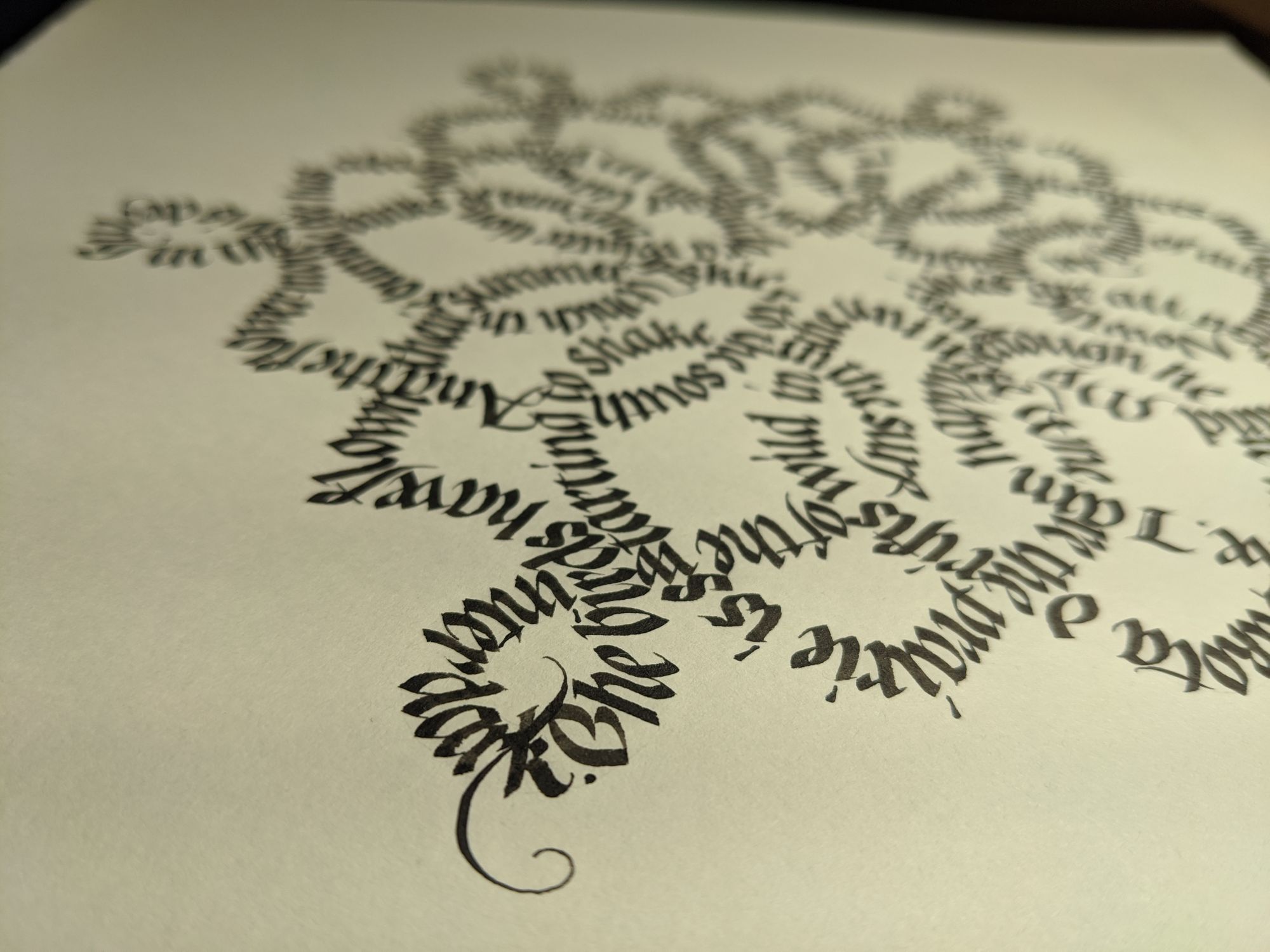
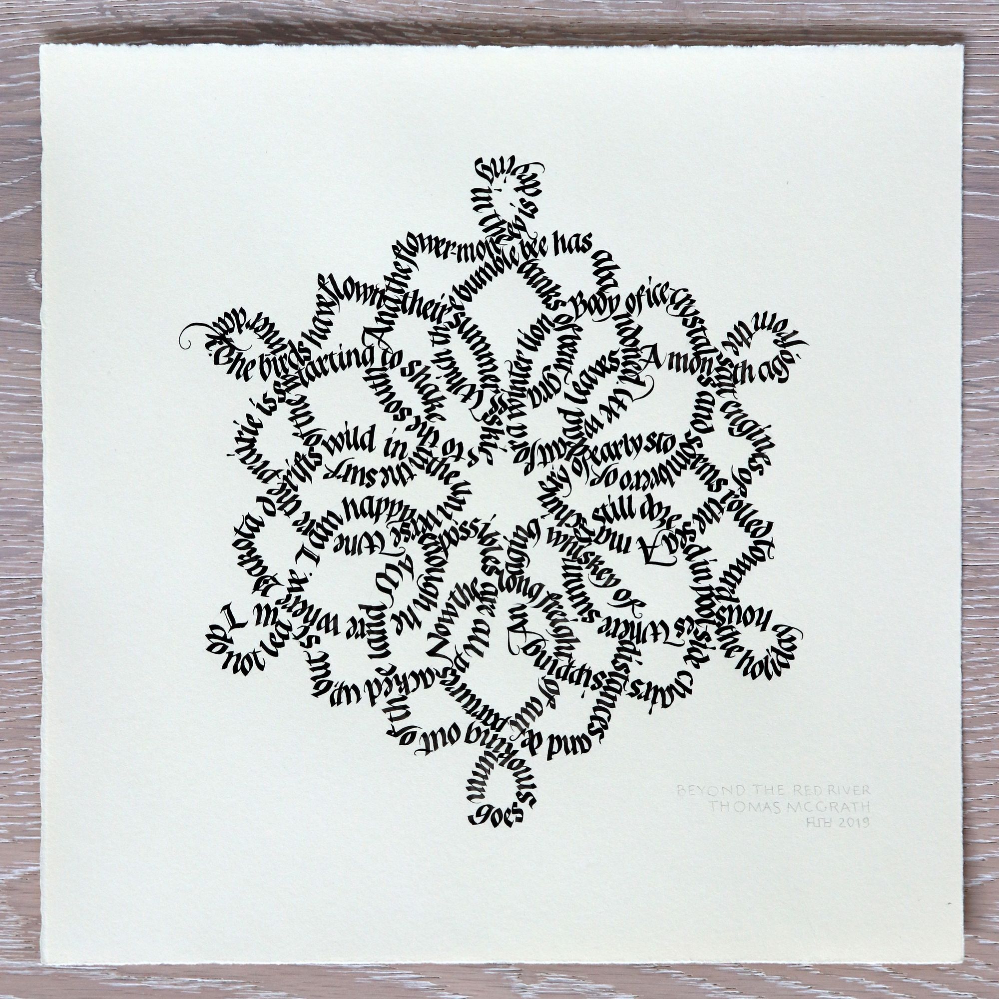
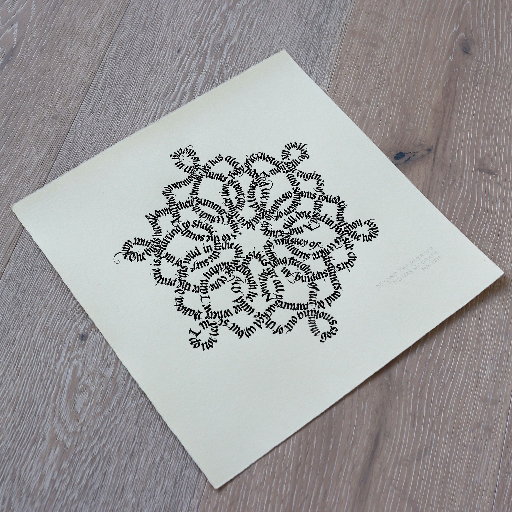
But, on the bright side, it’s done! Here is what the final version looks like:
For whatever reason, I always find that these straight-on shots just don’t look good. There is something about them that becomes too rigid. Perhaps it’s because when you view a piece of work in person, you never look at it exactly at that angle.
And here’s one more with the lovely pen holder I used:
In the end, does it look anything like the work of those 16th century masters? Not at all. I was very sorely disappointed when I put the two images side by side. My version is not nearly as elegant. Part of it is that I used a larger pen and letter size, and I have a lot more “action” on the curves happening with the words. If I were to do this project over again, I would create a shape that is more intricate, but uses thinner lines. I would also use a tiny little nib, so the letters create more of a texture.
Update [2020-05-13]
I finally sat down and did another version of this project.
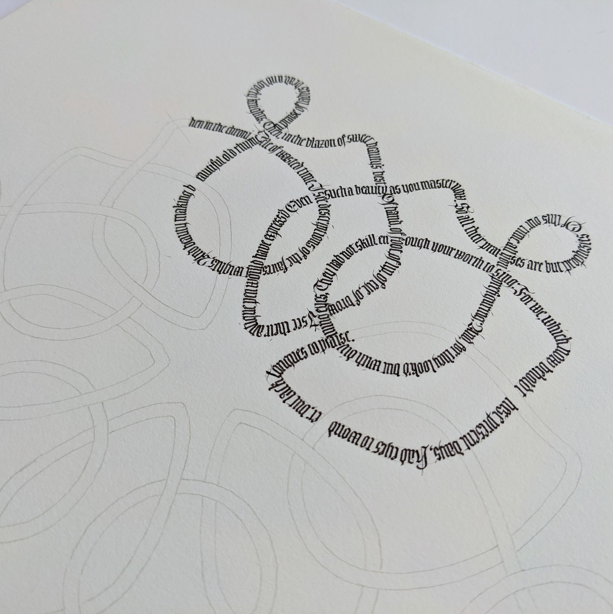
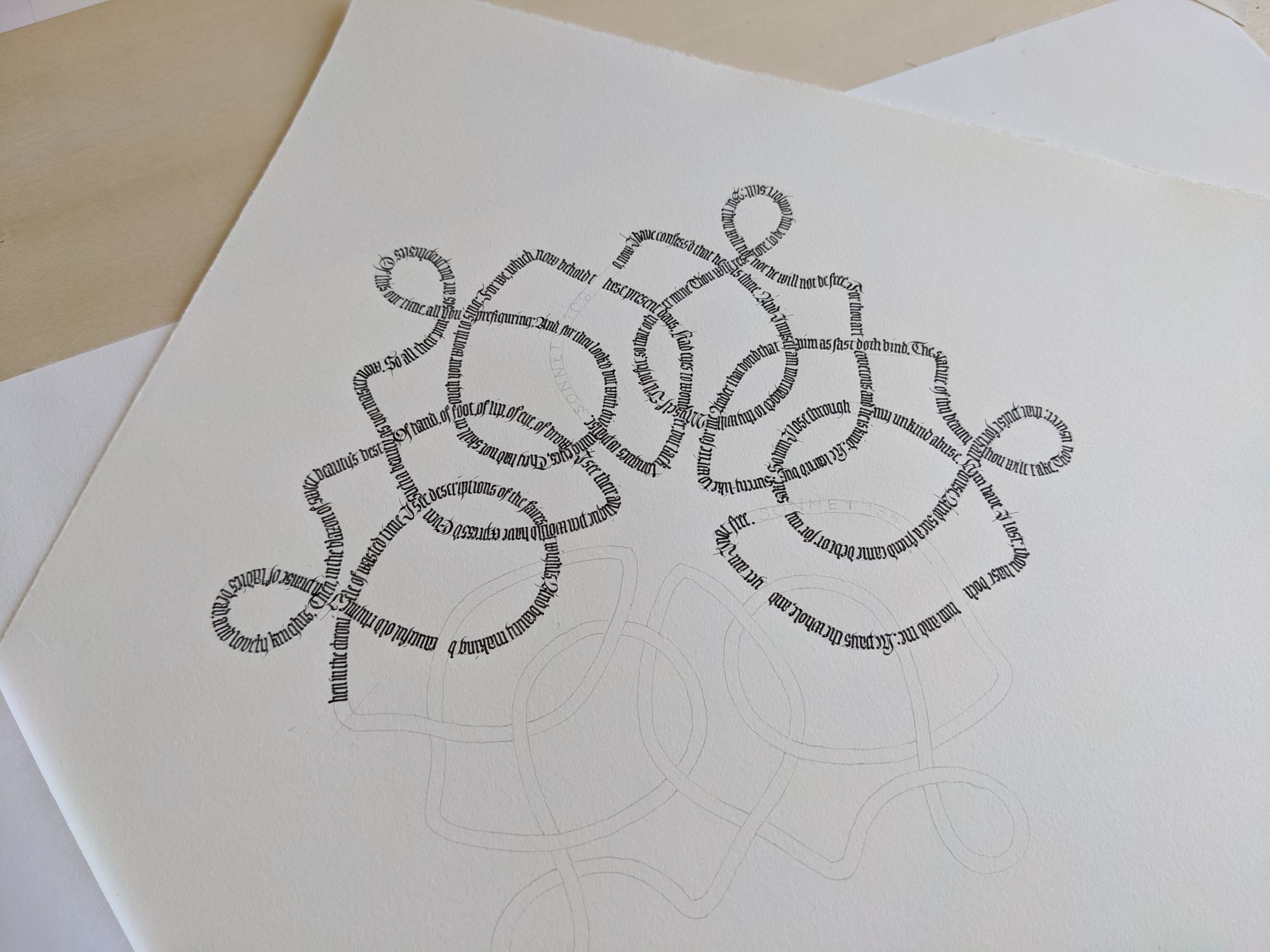
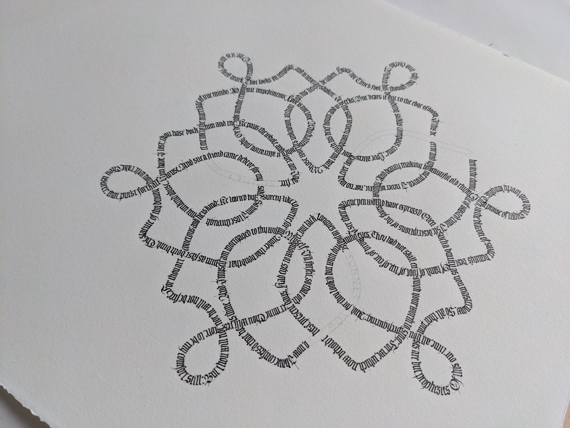
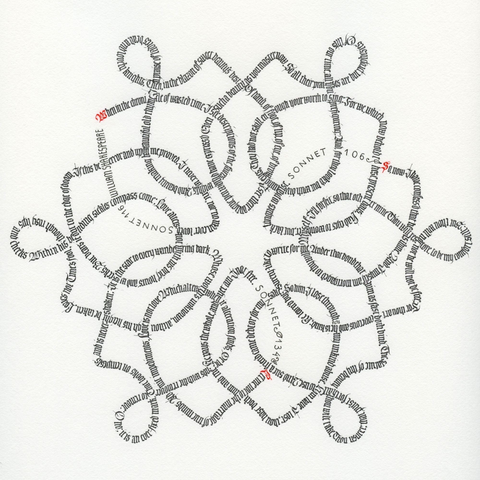
I used the same shape, but made the height of the letters much smaller. Instead of a 1.5mm nib, I used a 0.5mm, and I did sharpen it halfway through. With small nib sizes, it makes a surprisingly large difference!
Since the letters got smaller, I had to pick a different text to fill the entire shape. I ended up settling on 3 of Shakespeare's sonnets.
This version took me 4 days to finish. On the first day, I filled up 1/6 of the shape, and counted how many letters fit to estimate how many I would need for the whole. That was when I decided to use the sonnets, since their length was roughly correct.
For the next 3 days, I wrote one sonnet a day. I took almost 2 hours for each of them, and by the end my hand was so tired I could barely hold a pen. Working at such a small size is really exacting. Now that I have finished this version, I don't think I am ever writing large amounts of text this small again.
Comments