Uncials with Ewan Clayton

The biggest lesson I took away from this class is that there is no single Uncial alphabet, but instead there are different historic variations.
We explored different manuscripts and came up with a self-consistent hand, where pen angle, stroke weight and letterform for each letter match the overall style.
Of course, there are a few letters that do not appear in the manuscripts because they did not exist, such as j, k, v (there was a v, but it looks like a modern u), and w. y may be present in words of Greek origin, but is quite rare.
Step 1: Study the manuscripts
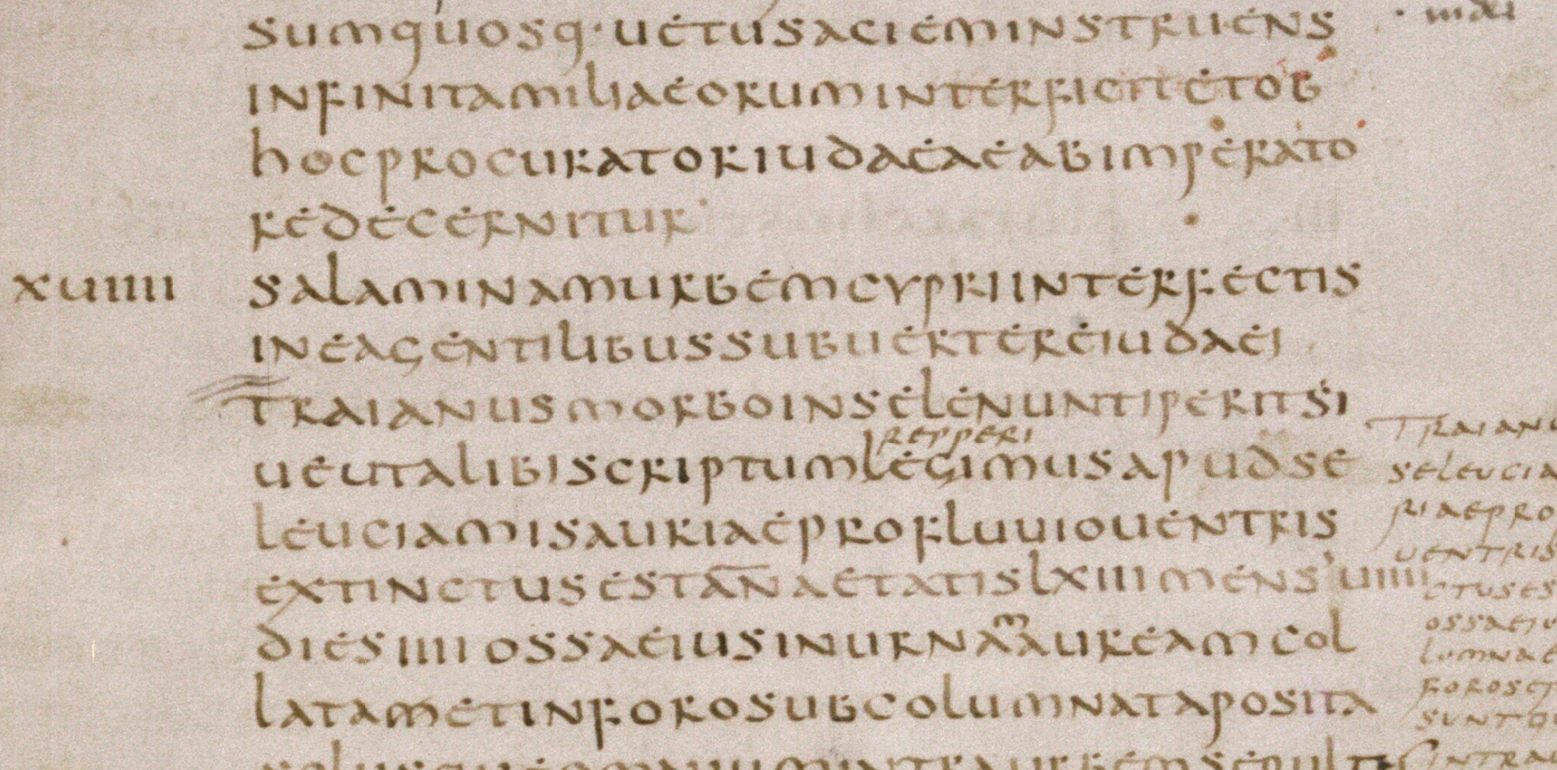
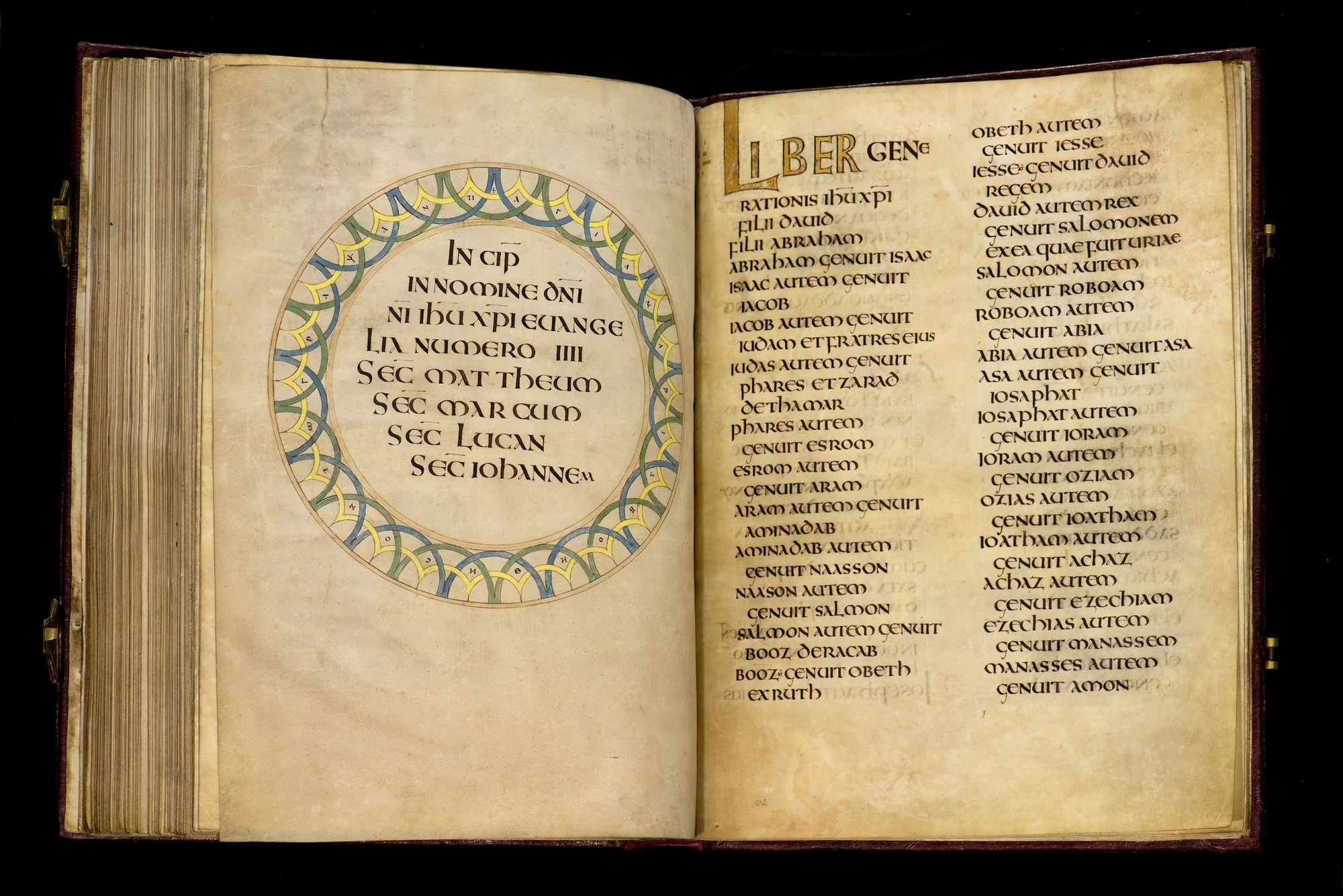
First manuscript we looked at was this one
Source: https://digital.bodleian.ox.ac.uk/inquire/p/acc6c13b-6f8a-4cbb-9d81-7fbe96ed98ab
which dates back to 5th century. It has an interesting characteristic: the tops of e, b, r, and s are not connected to the rest of the letter.
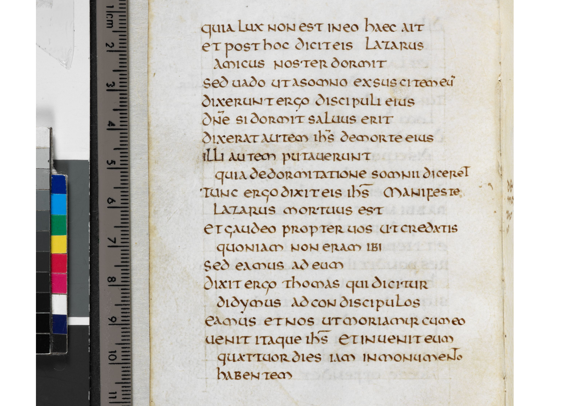
The next manuscript was St. Cuthbert’s Gospel, early 8th century.
Source: http://www.bl.uk/manuscripts/Viewer.aspx?ref=add_ms_89000_f050v
It looks quite different: e has a closed bowl, r and p have larger bowls, the bottom of the l is flat.
Then we looked at some Greek Uncials. The main difference is that they are written with a flat pen angle. Honestly, I was not a fan of those, so I’m not going to include them.
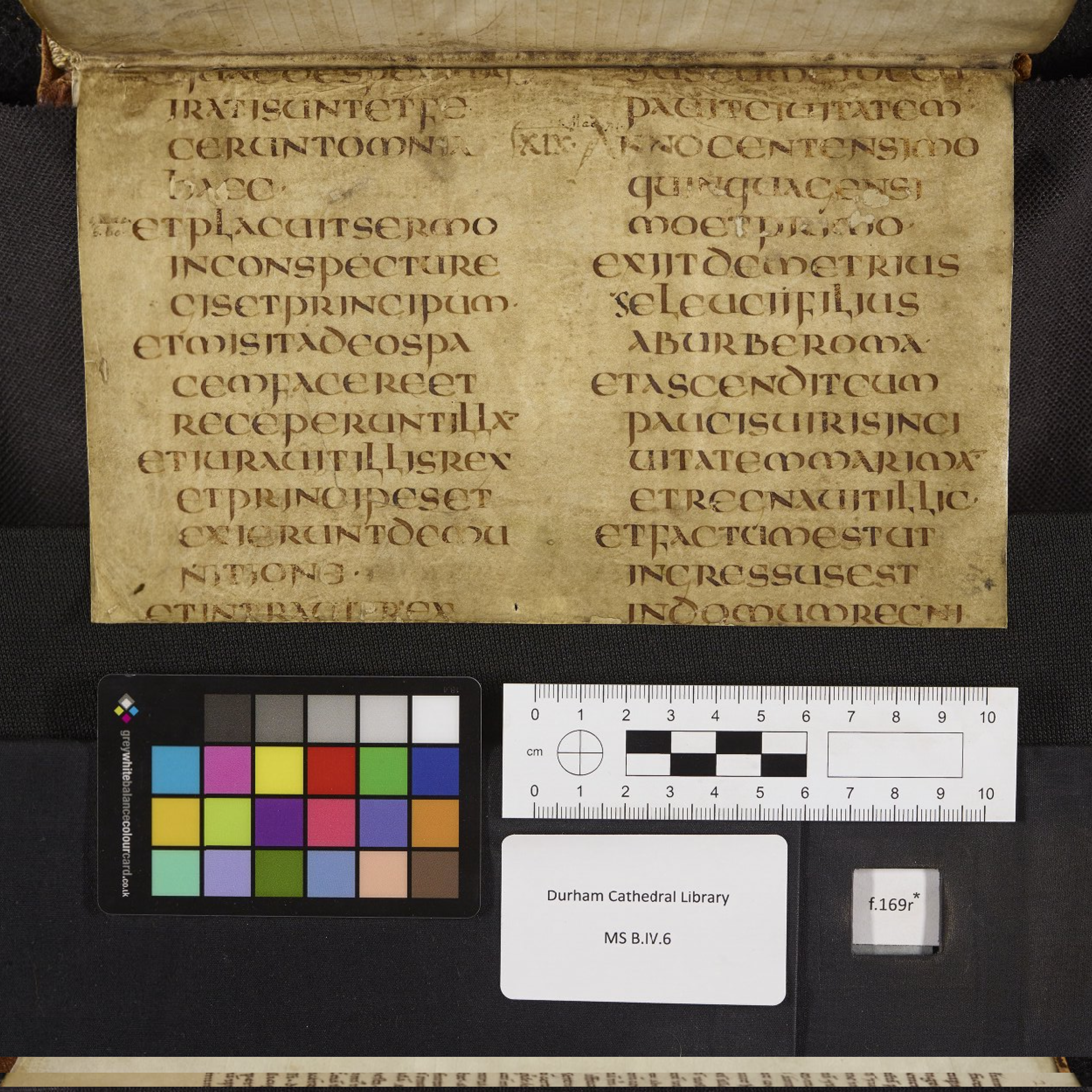
Next, we looked at some examples of artificial Uncial, with lots of pen manipulation. The most interesting example is actually quite fascinating.
It is from Durham Cathedral Library MS. B.IV.6, but you would never think that by looking at any of the manuscript pages, since they are in a completely different hand.
This fragment is just a single sheet that is pasted at the very end of the manuscript, and probably functioned as a flyleaf, and the top line is even partially cut off. Still, it is very beautiful.
Source: https://iiif.durham.ac.uk/index.html?manifest=t1mzs25x866g&canvas=t1ttt44pr26x
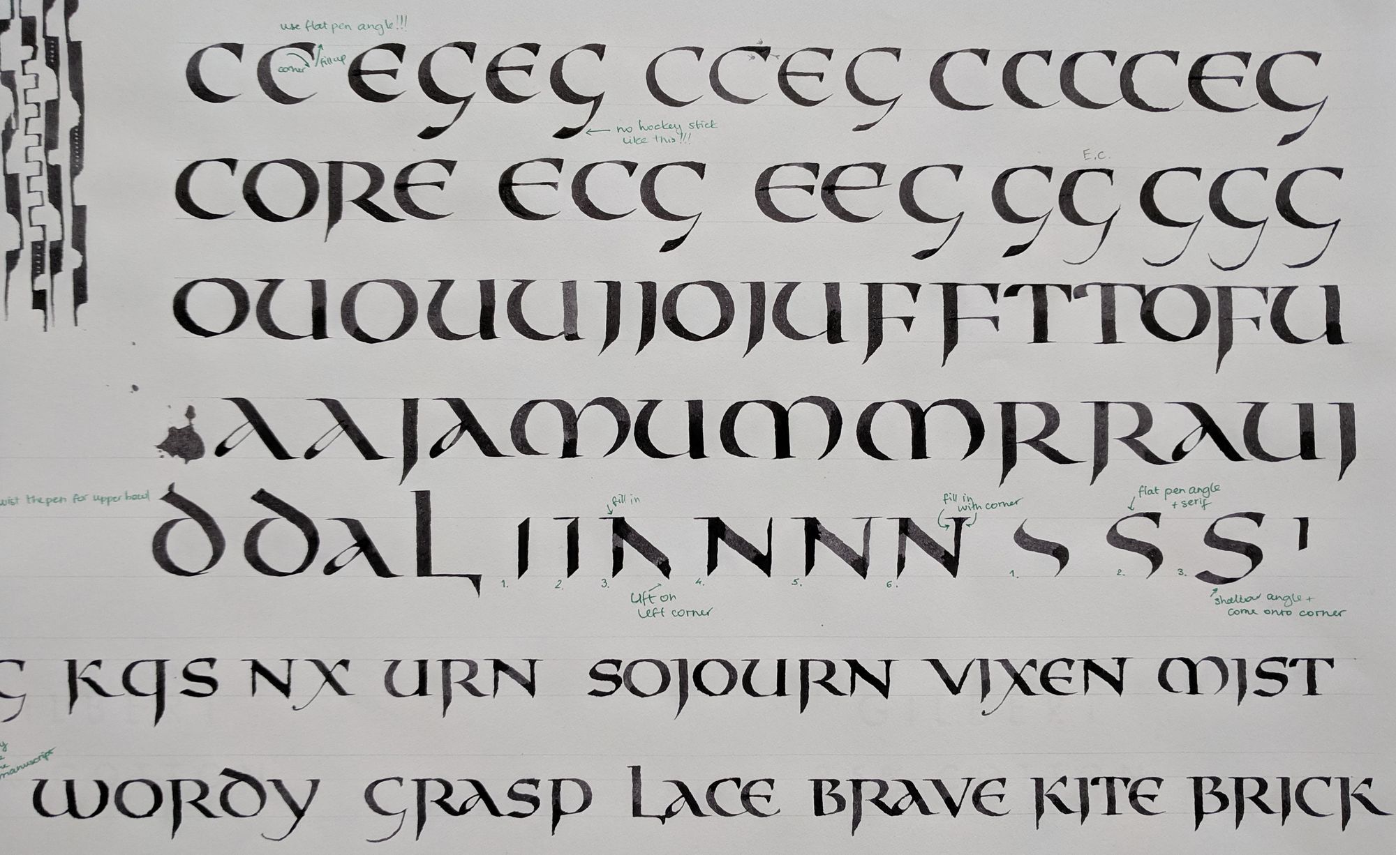
It was quite challenging to copy this one, but also a lot of fun. You can see some of my attempts below.
We also looked at some other beautiful examples, but we didn’t necessarily copy all of them. I was particularly fond of this one:
Source: Utrecht Psalter fol 101v
For each of these, Ewan demonstrated the letters on the blackboard to show the pen angle, the proportions, and any interesting manipulation. I learned from those, but I didn’t photograph them: just like anything else, they are not a perfect be-all and end-all exemplar, and would not make much sense taken outside of the class context.
Step 2: Create your own version
After we copied the manuscripts for a while, it was time to come up with our own alphabets based on what we learned. Since there is no single “correct” alphabet, we were free to combine elements from different sources, as long as they created a coherent story.
I am now particularly disappointed at all the “Uncial” exemplars that I have seen that try so hard to insist on their correctness and authenticity. Usually, they have neither, especially since the rounded form of the t comes from Half-Uncial. Next time I am interested in learning a historic hand, I will first check out the real sources — the manuscripts.
I played around with different shapes and combinations. Initially, I quite liked those disjointed letter tops.
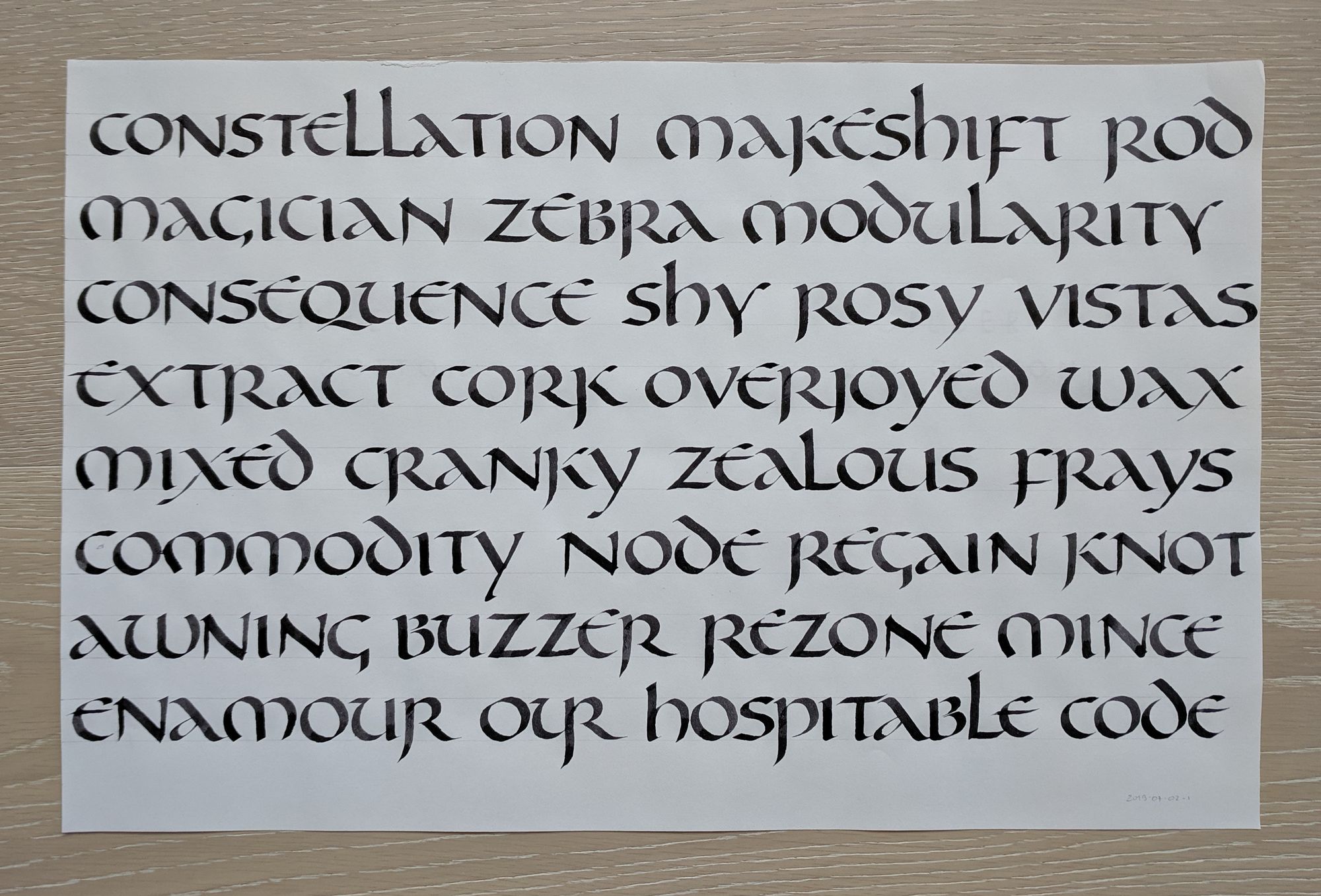
However, I also did try the closed e, and many other things, sometimes quite silly.
Then, I moved onto some larger texts, so that I could really see if my letters work together.
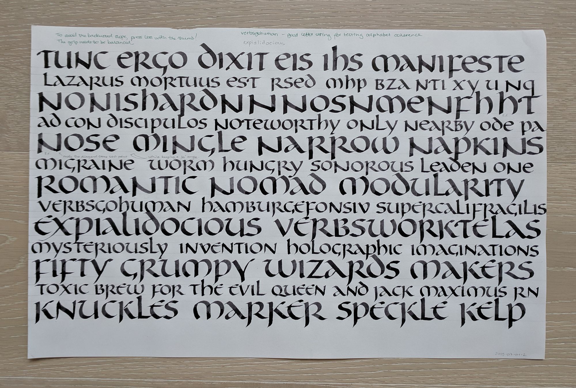
In the example above, I made the ascenders too tall. I also tried to keep some letters open, such as k and d, but that did not work out. The page below uses a slightly revised version of the same hand.
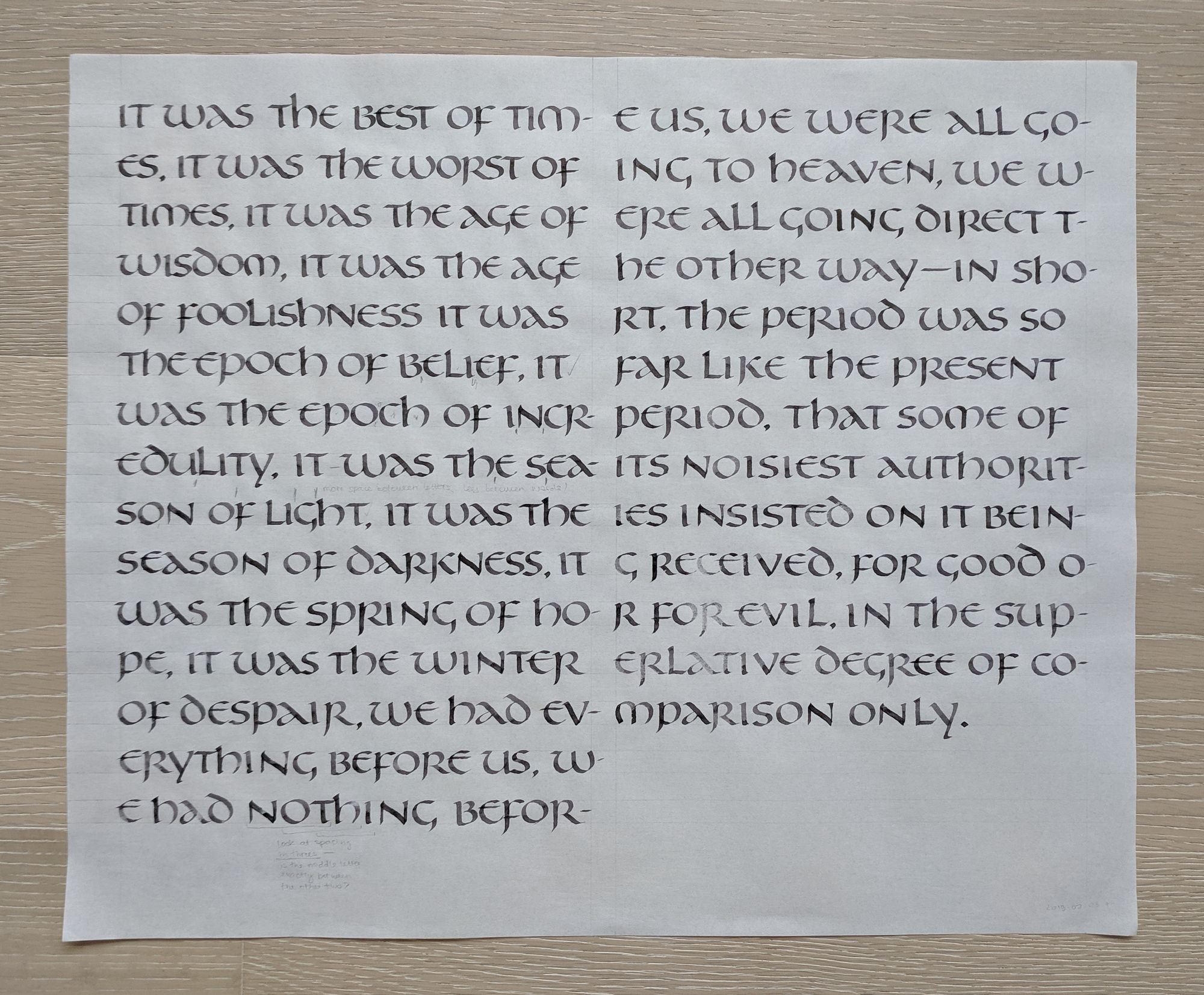
Now that the letter form look more or less sorted out, I still need to work on the spacing.
Step 3: Final project
There was no requirement to make a final project in this class, but doing one made for a really good way to wrap things up.
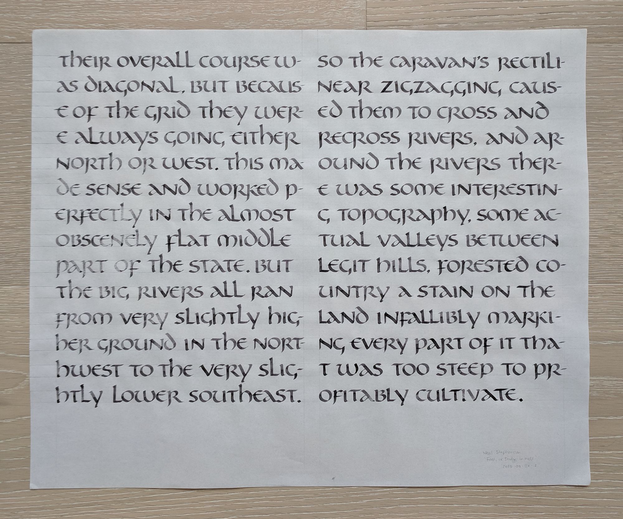
After having slept on those flat-angle letters, I decided to play around with the serifs, and see if I can still have a letter that is written at a 30° pen angle, but also has a flat entry serif. As you can see, I also had a lot of fun/trouble with my n.
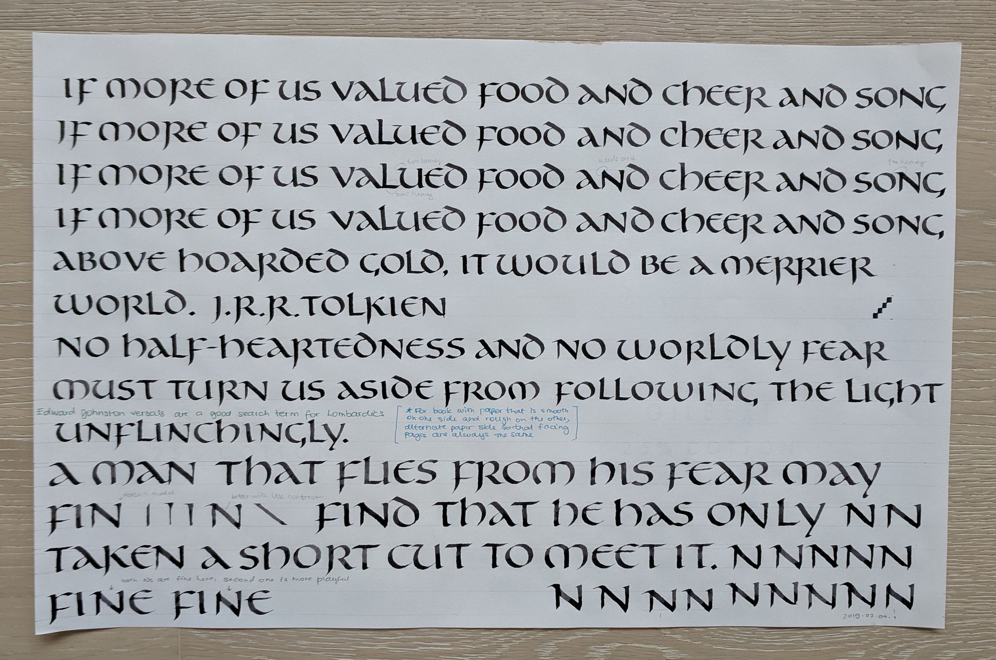
I picked a few Tolkien quotes, since it felt like they would work nicely with this hand. I ended up going for the last one.
In a class like this, every mistake is an opportunity for learning. I had written ha instead of he accidentally, and Ewan gave us a demo on how to remove a mistake using a razor blade. What was interesting is that he said to write the correct letter on top before removing the one from the bottom. It makes sense, but I probably would have done it just the opposite way. Also, even though Arches paper is quite nice, it is not forgiving for removing mistakes like this.

I could not pick between the two variants of the hand I came up with, so I decided to write my quote in both, and see which one I like better.


I ended up liking them both, with a slight preference for the second one.
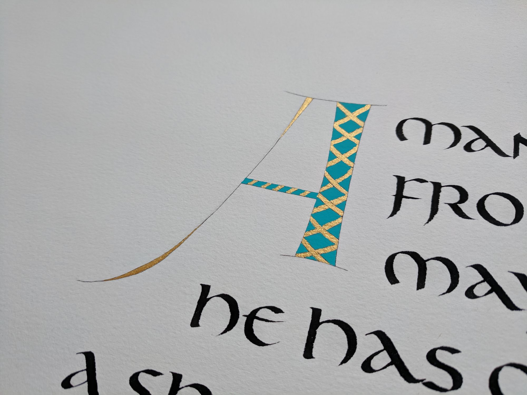
I also had a lot of fun creating a decorated initial letter. This A is not what would have been used in manuscripts of the period, but I really didn’t like the one that Ewan showed us in class. Even the fact that it is historic could not compel me to add it to my piece, so I went with a complete off-the-cuff invention instead.
I used gold and turquoise gouache to color in the letter, and a very small brush that my friend kindly lent to me (thanks Kathy!).
Step 4: Review and take notes
This last step wasn’t part of the class. It’s just something I always do after taking a class, to make sure I remember all the important things.
I went over my notes from the class, copied the alphabets a few times, and then copied them to my notebook. I wouldn’t say all of the letters came out perfect, but at least this gives me a representation of what they should look like.


Now I can come back to this study of Uncials any time I need a refresher.
Comments