Teavana's new labels

At the end of last year, the local Teavana store got a major facelift. Now the teas are no longer hidden behind the register, but can instead be browsed by buyers. I am assuming that similar changes are happening across the other Teavana stores in the US.
Yesterday I discovered that I was running low on my favorite mint tea, so I went to the store to actually buy something for the first time since the remodel.
What I found out is that in addition to changing the appearance of the store, they also changed the labels that they print out when you buy tea by weight.
Below is the picture that has the old and the new labels side by side. The old label is stuck to a container that I use to store my tea. The new one is on the paper bag in which the new tea came.
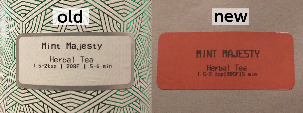
The old label looked appealing enough for me to put it on the storage container. The new one doesn't look nearly as polished. What changed?
It is a combination of a few things. The new label is brick-red, which means it won't look good on many of the containers, since the colors will simply clash. Additionally, it has lower contrast, and thus is harder to read than the old version.
The old label also had a silver border around it, which made it look more decorative.
The most important part that changed is the typography. Look at the last line, which indicates how much tea should be used, at what temperature, and how long it should be steeped for. In the old version, there was plenty of space between those three pieces of information. The new one has them stuck really close together, to the point where it is extremely hard to read.
It also appears that the new label is using a heavier weight of the same typeface, or that the printer is not well-calibrated. Either way, if you look at the word "Herbal", you can see that in the old label, every letter is separate and legible, whereas in the new one H and e are stuck together.
The only thing that doesn't look worse is the name of the tea. In the old label, some of the letters look off, such as the t that appears too small, or the j that is too wide. I have no idea why whoever designed the typeface made such choices, since it doesn't look like there is any physical limitation on the height of each letter. The width could be explained by the fact that this typeface is monospace, but it could still have been handled better.
Overall, the change is still for the worse. The new label is less legible and doesn't look polished. I hope that Teavana realizes this soon and fixes the labels.
Comments