Roman capitals with John Stevens

In October, I went to Cheerio for the first time to take a workshop with John Stevens on Roman capitals.
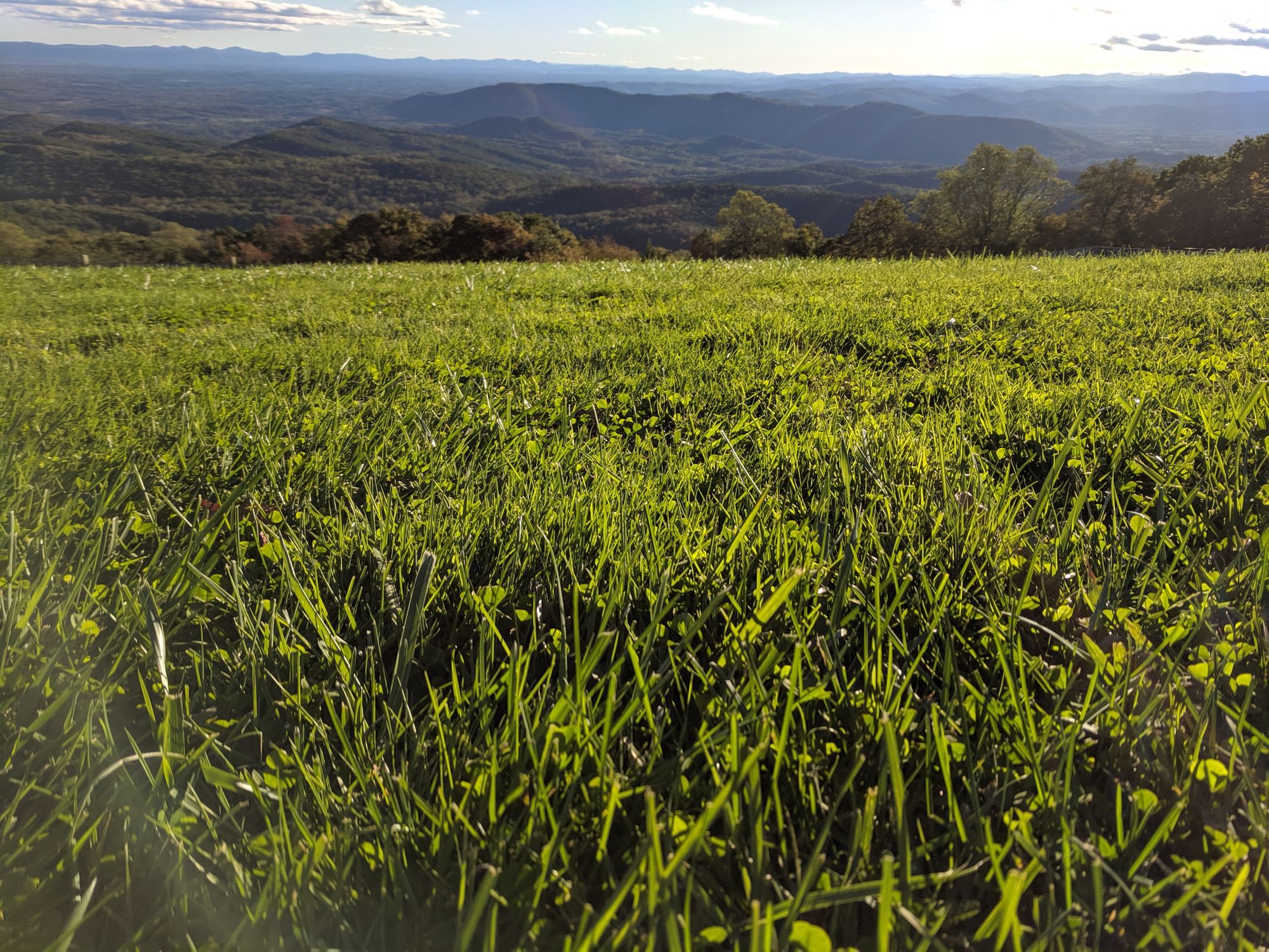
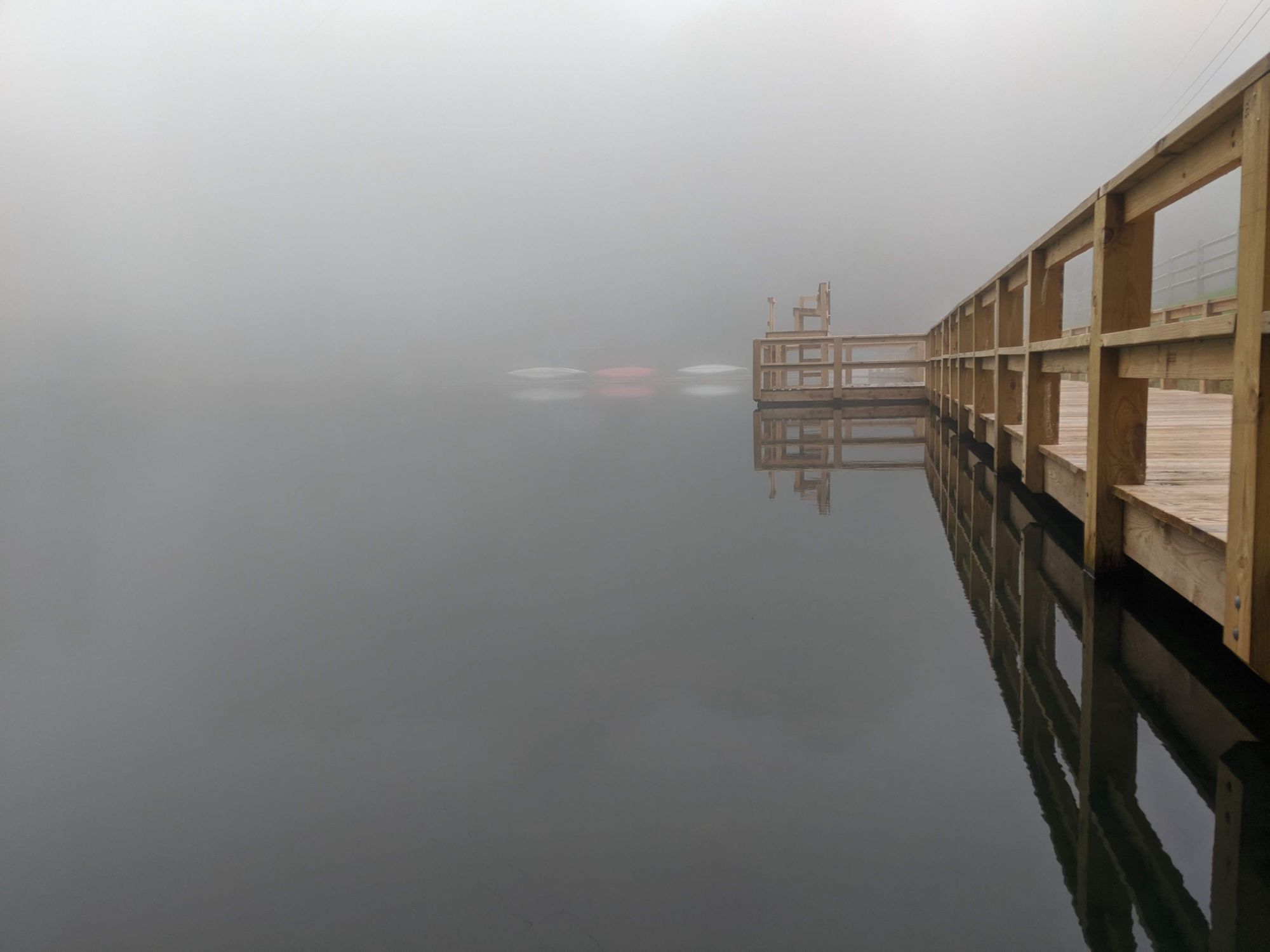
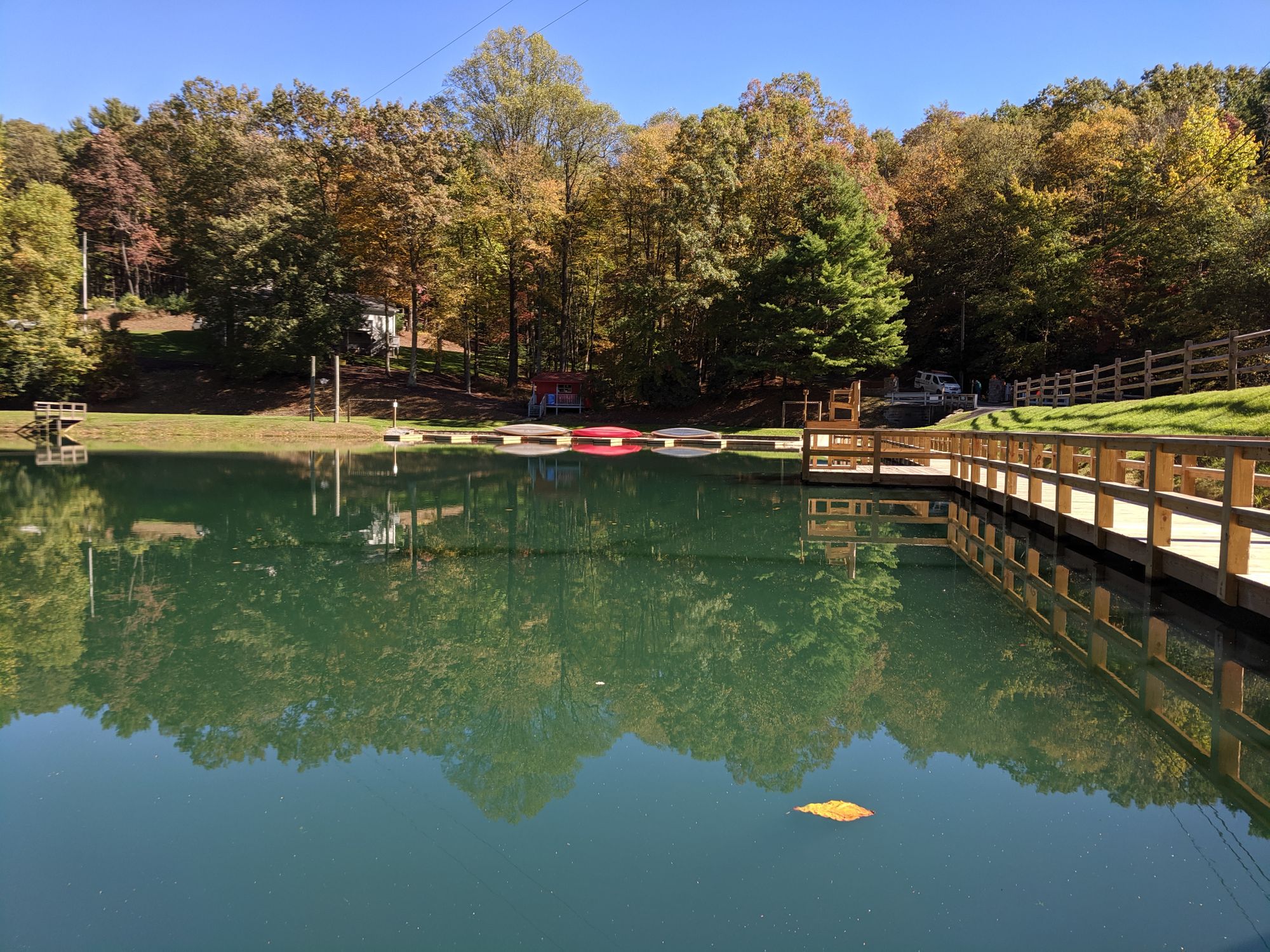
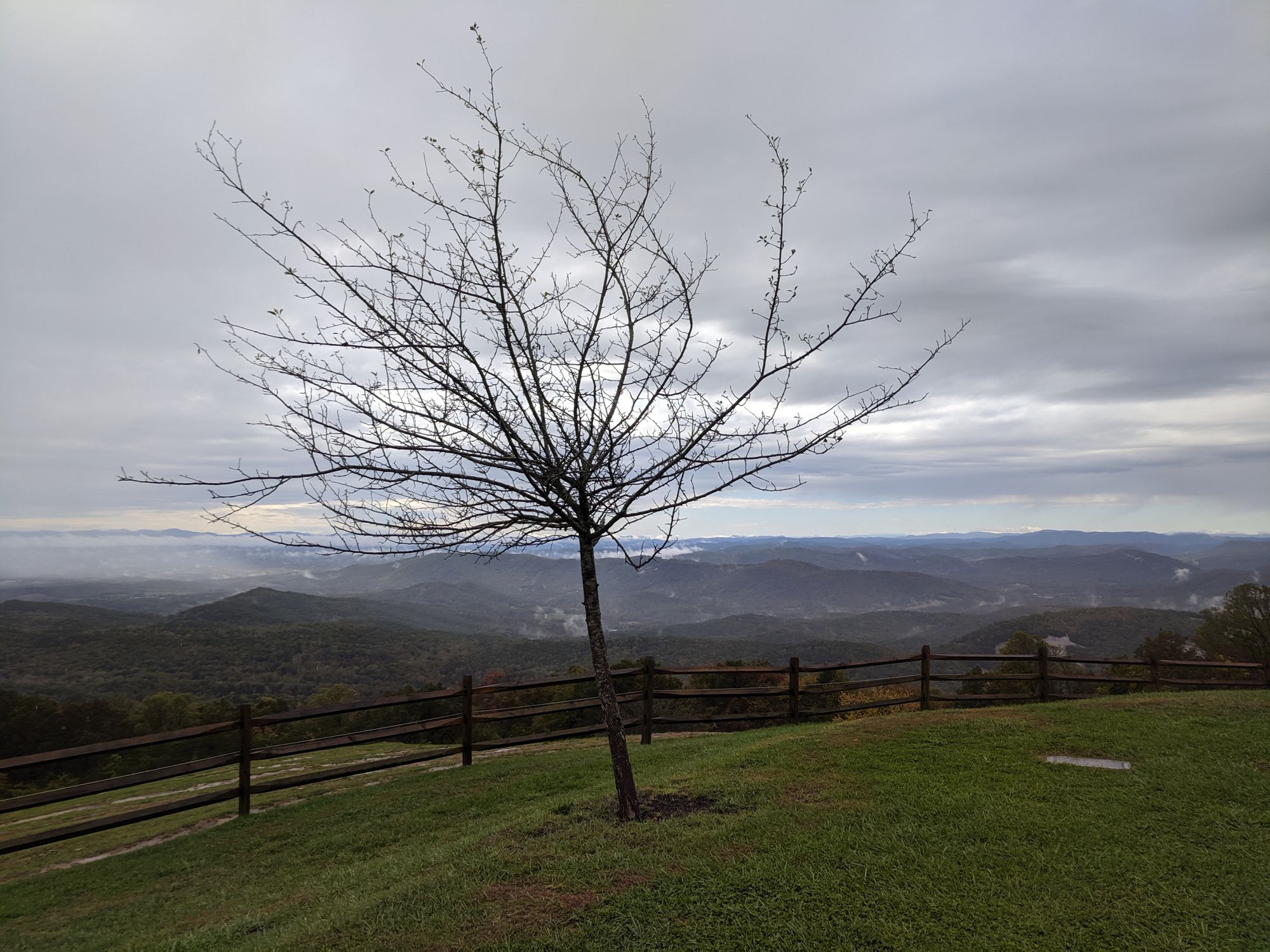
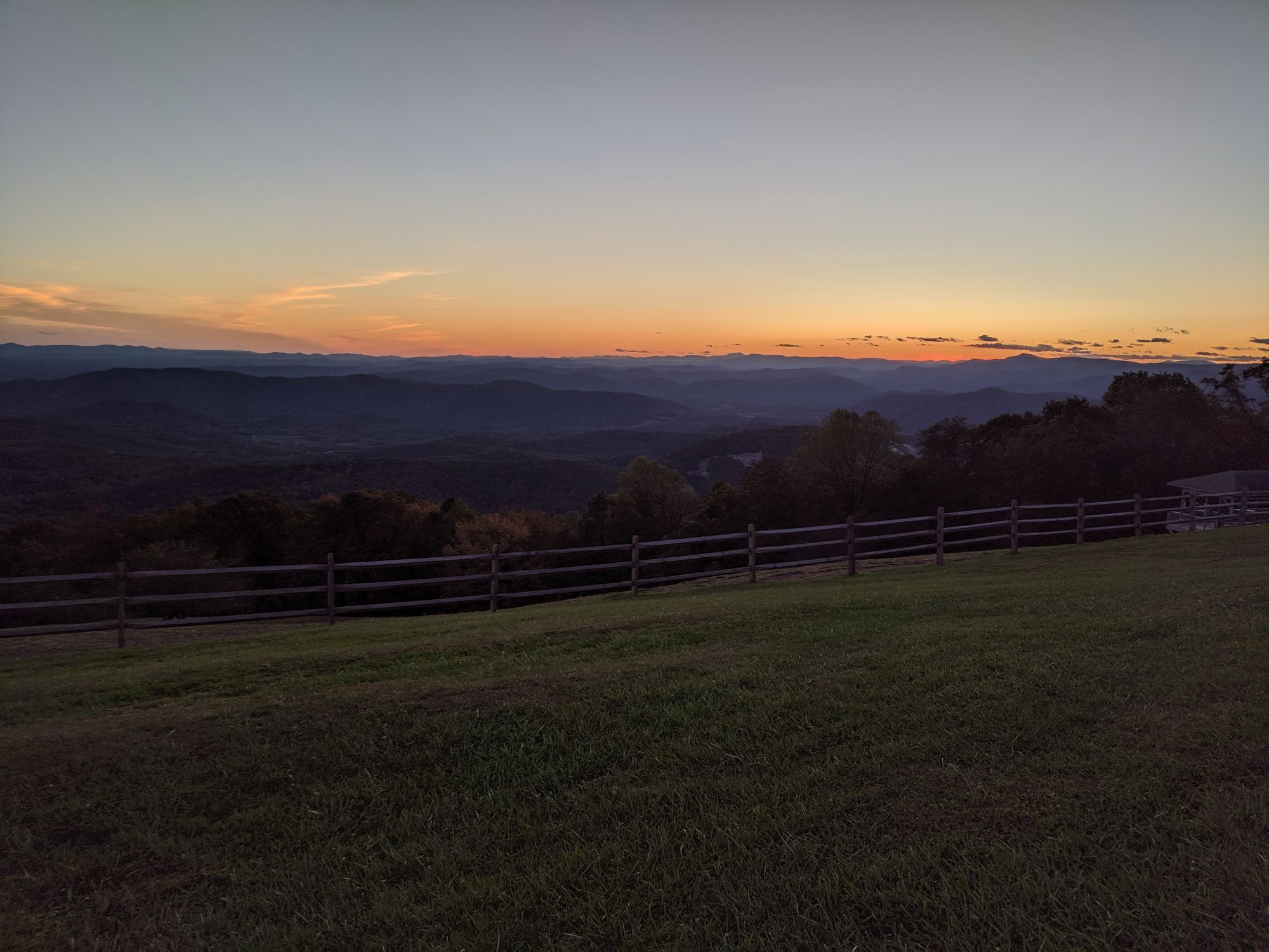
First of all, I would like to point out that Camp Cheerio is in a beautiful place, and the view took my breath away. It was such a joy to be there for the workshop! Here are a few photos to give you an idea.
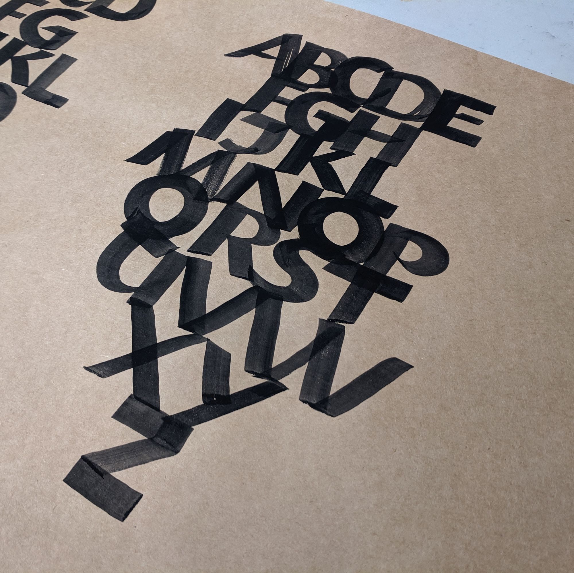
On the first day, we used a 1/2” flat brush to draw some monoline shapes (squares, circles, and triangles), and then to write a Neuland-ish alphabet. The goal was to create a dense texture. I struggled with this assignment a bit, and my alphabet could have been more dense. That’s something I will need to continue working on.
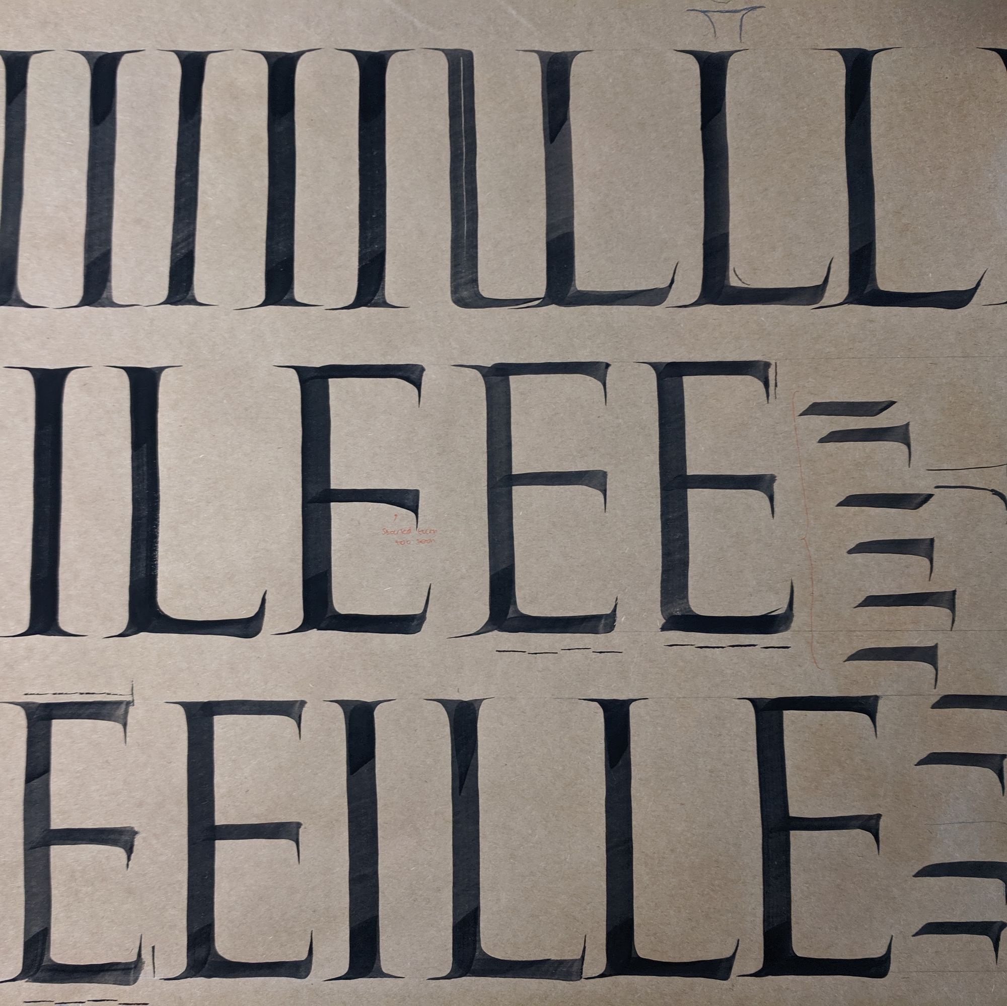
Then, in the afternoon, we moved onto Roman capitals, and stayed with them for the rest of the week. We spent part of the day working on large brush letters, and then we worked on small monoline capitals. One of the reasons for this was to break things up and not let them get too monotonous. Another one was that for the large letters, we had to be standing, and that gets tiring after a while. Having a chance to sit down and work on something else was a welcome rest.
I had once signed up for a brush Roman capitals class, but unfortunately I had to drop it, and didn’t get beyond the basic I shape. This was, therefore, my first real exposure to these letters done with a brush.
It was hard. The first few strokes I made were disappointing. It got better as I continued working, but I had this feeling that I was moving too slowly. Most of my classmates would go through several sheets of paper in the time it took me to fill up one. In the end, I decided not to spend too much energy worrying about other people, since I came to the workshop to learn for myself.
It was a nice change to do some smaller monoline letters, since I felt more comfortable with them.
The days went by so quickly that I can no longer tell which exact thing we did on which day. We just kept going through the alphabet, and learning more and more letters. I could barely keep up.
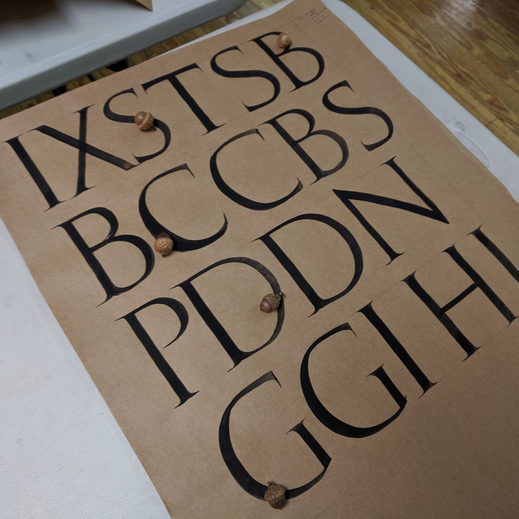
On Wednesday, I went to the forest and picked up some acorns. I used them to hide the parts of my letters that made me sad.
I decided to focus on the most troublesome letters in the interest of time. Controlling the brush, especially its width, proved to be quite challenging.
In addition to the regular flat brush I had, I also tried a Rekab brand one, which has much longer bristles. John said that a longer brush gives more time on the tricky parts. That is true, but it also requires more confidence and control. I can’t decide whether I loved it or hated it.
A moment of revelation came when during one of the demos John pointed out how he “squashes” the brush at the beginning of some strokes. That explains so much! I was losing my mind trying to figure out what angle to hold my brush at to get that stroke width. I had asked him why that was not written down as part of the instructions, and he said it’s just “brush sensibilities”. I suppose I don’t have those: I’ve always thought of the brush as basically the same as the pen, and used it as such. Now that I know the “squashing” secret, I can finally get some decent-looking letters!
At some point, John said we would make books at the end of the class, but told us not to plan anything ahead so as not to limit our creativity. I have to respectfully disagree on this point. I did spend some time thinking about the book structure, and when I only had 15 minutes on the last day to put it all together, I had a plan, and simply executed it. If I did not decide in advance on which side of the paper I was going to write, and which pages I was going to put together, I probably would not have produced a finished book in such a short time.
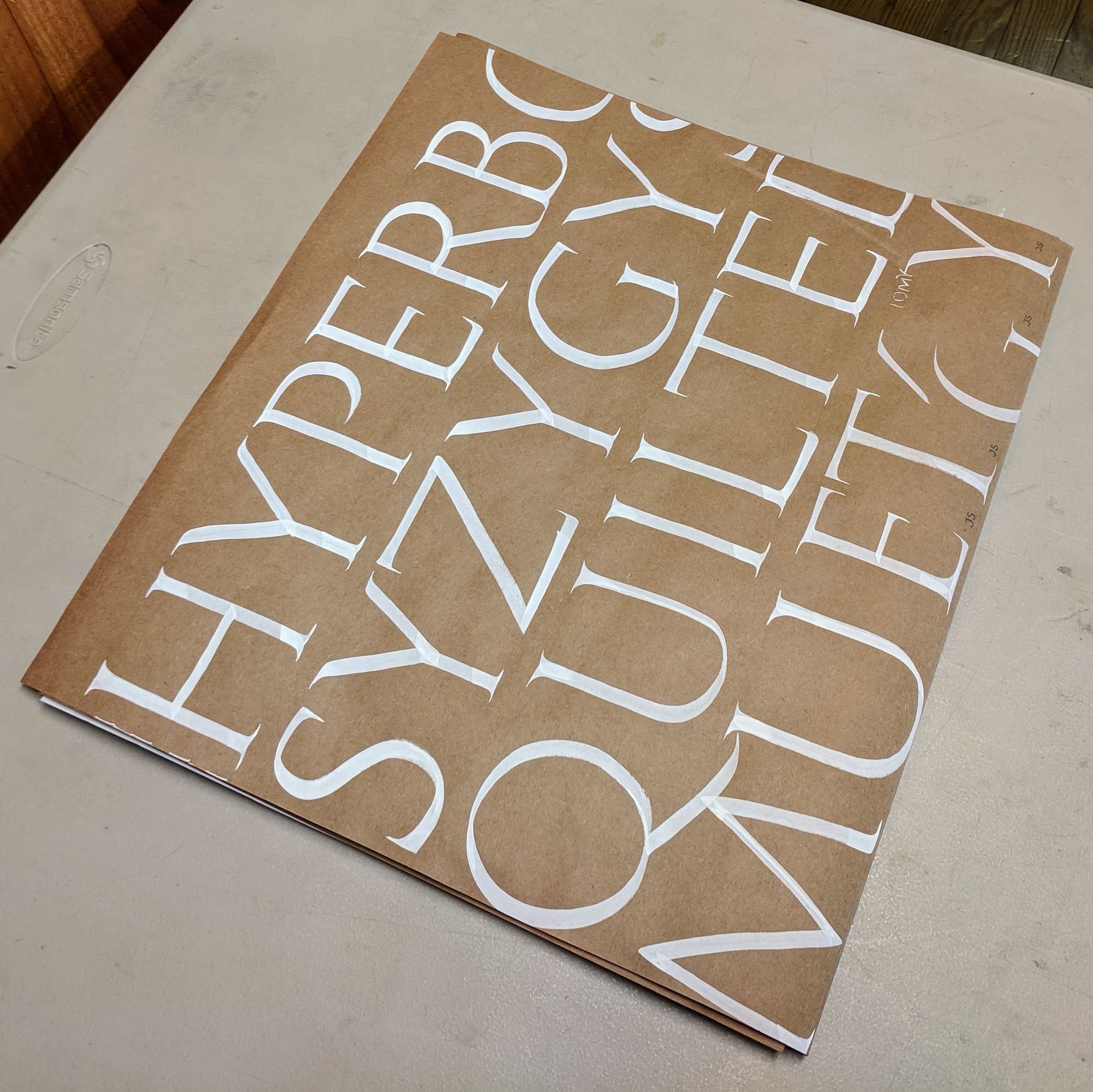
For the cover, I used the page I wrote with a smaller brush:
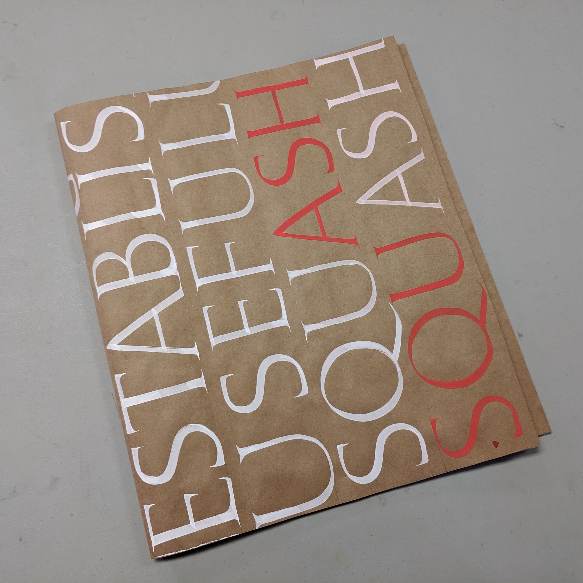
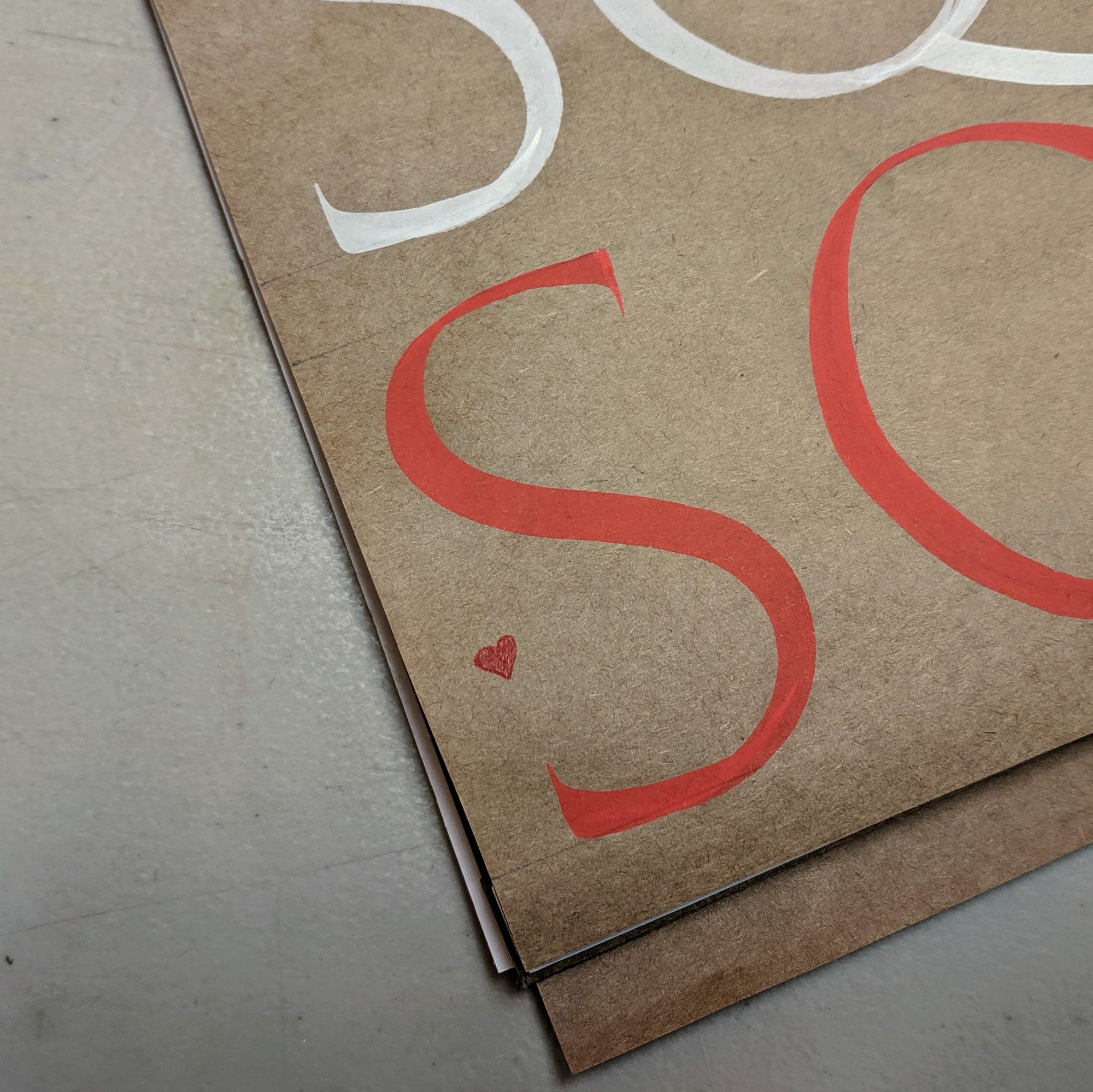
During one of the times when we gathered around the table in the center of the room to share and discuss our work (which we did at least twice each day), John pointed out that some people were overly critical of themselves. He did not call me out on it, but I know it applies. I tend to only focus on what needs improvement, and disregard everything that is “okay” or “good”. In the spirit of not only criticizing myself, but also acknowledging things that worked, I put a little heart next to a letter S that I thought came out particularly well:
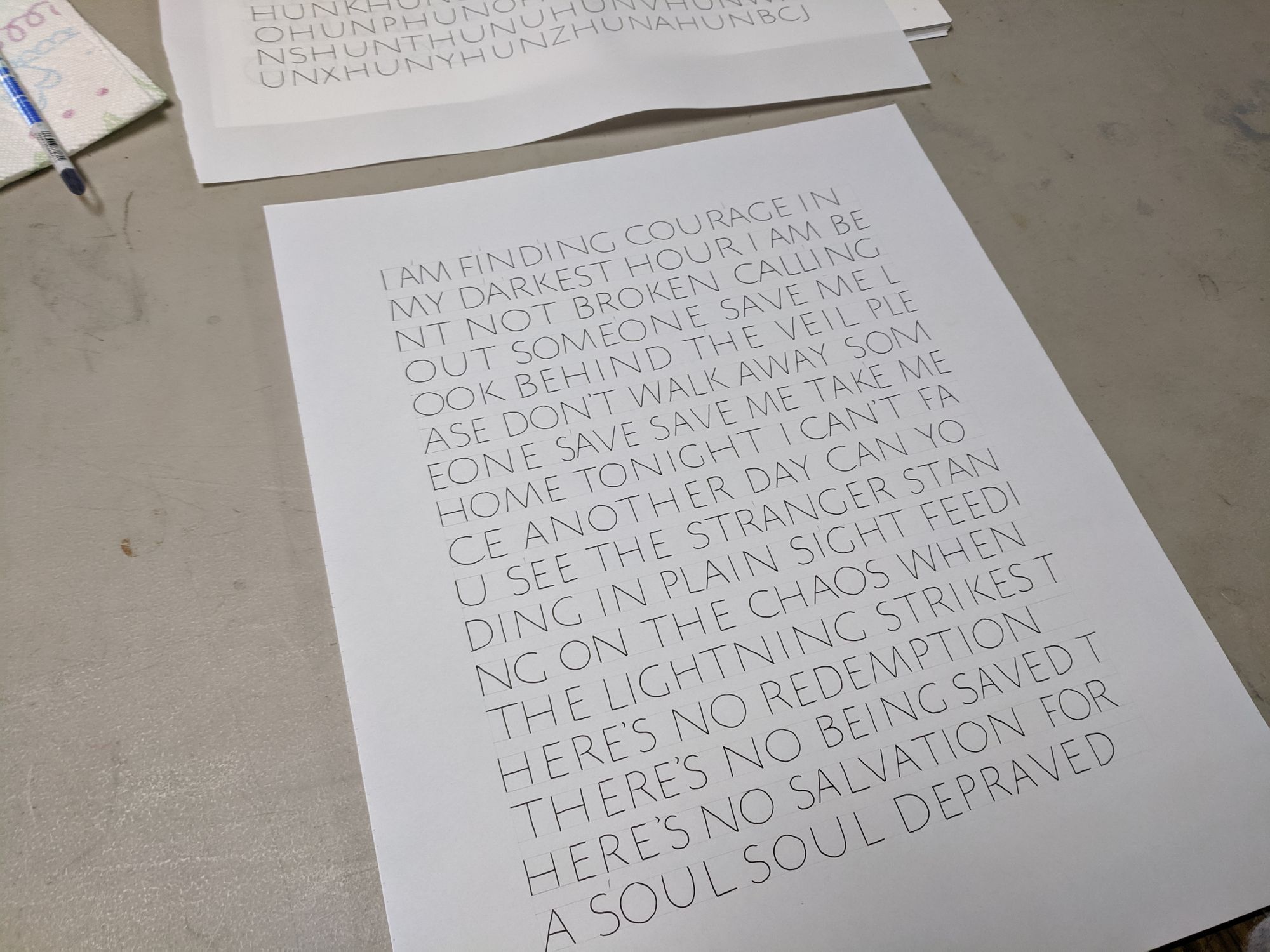
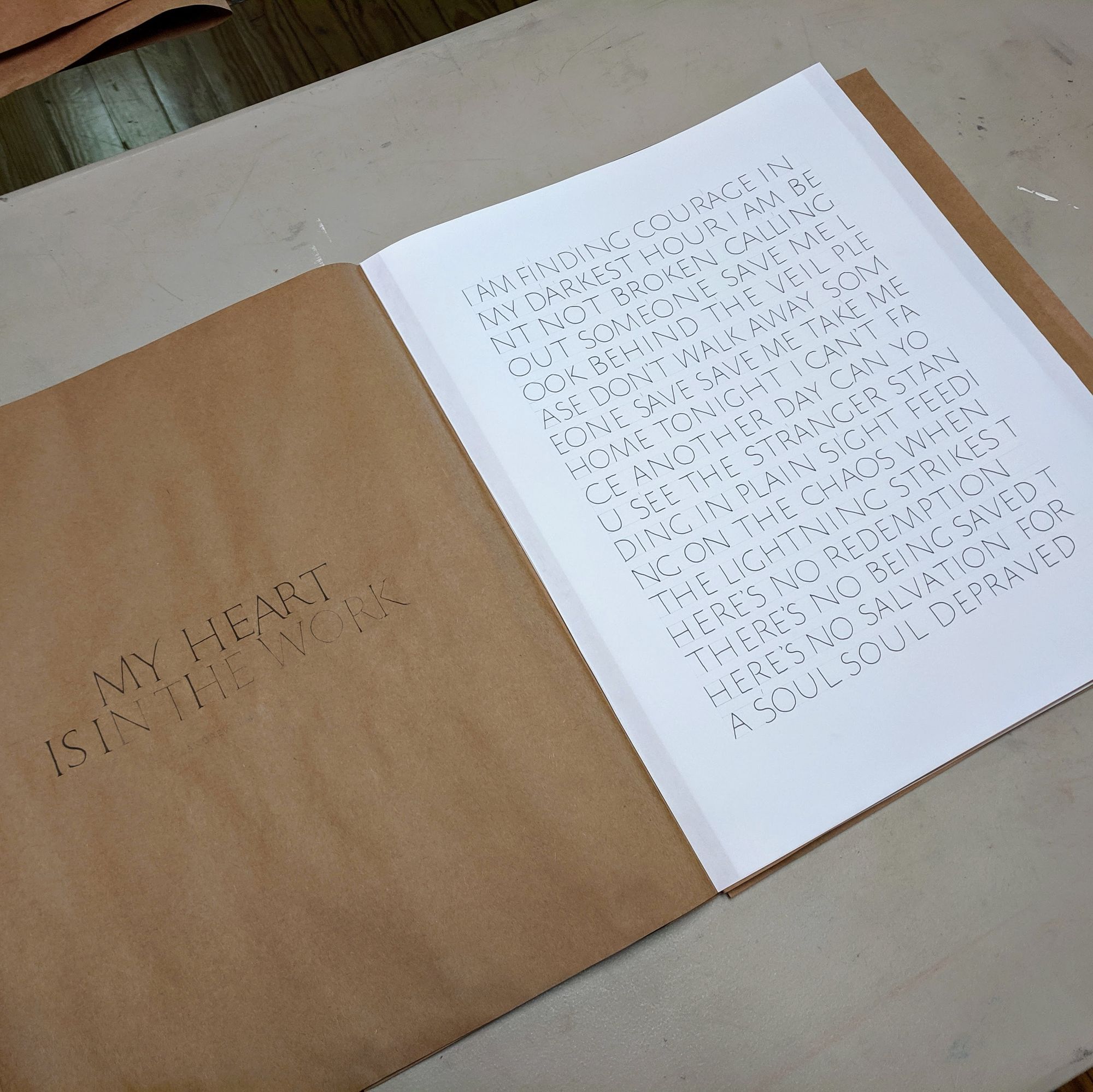
The fist spread of the book shows an unfinished quote done with a pointed brush on the left. I started it in the afternoon of the next-to-last day, and did not realize how time-consuming it would be. My main goals were to create some Roman letters with a pointed brush, and also to give them some “movement”, but not too much. Anything that goes beyond a strict formal letter is always much harder for me, so it was quite a struggle. This is definitely a project that I am finishing later. On the right are some 1/2” tall monoline letters.
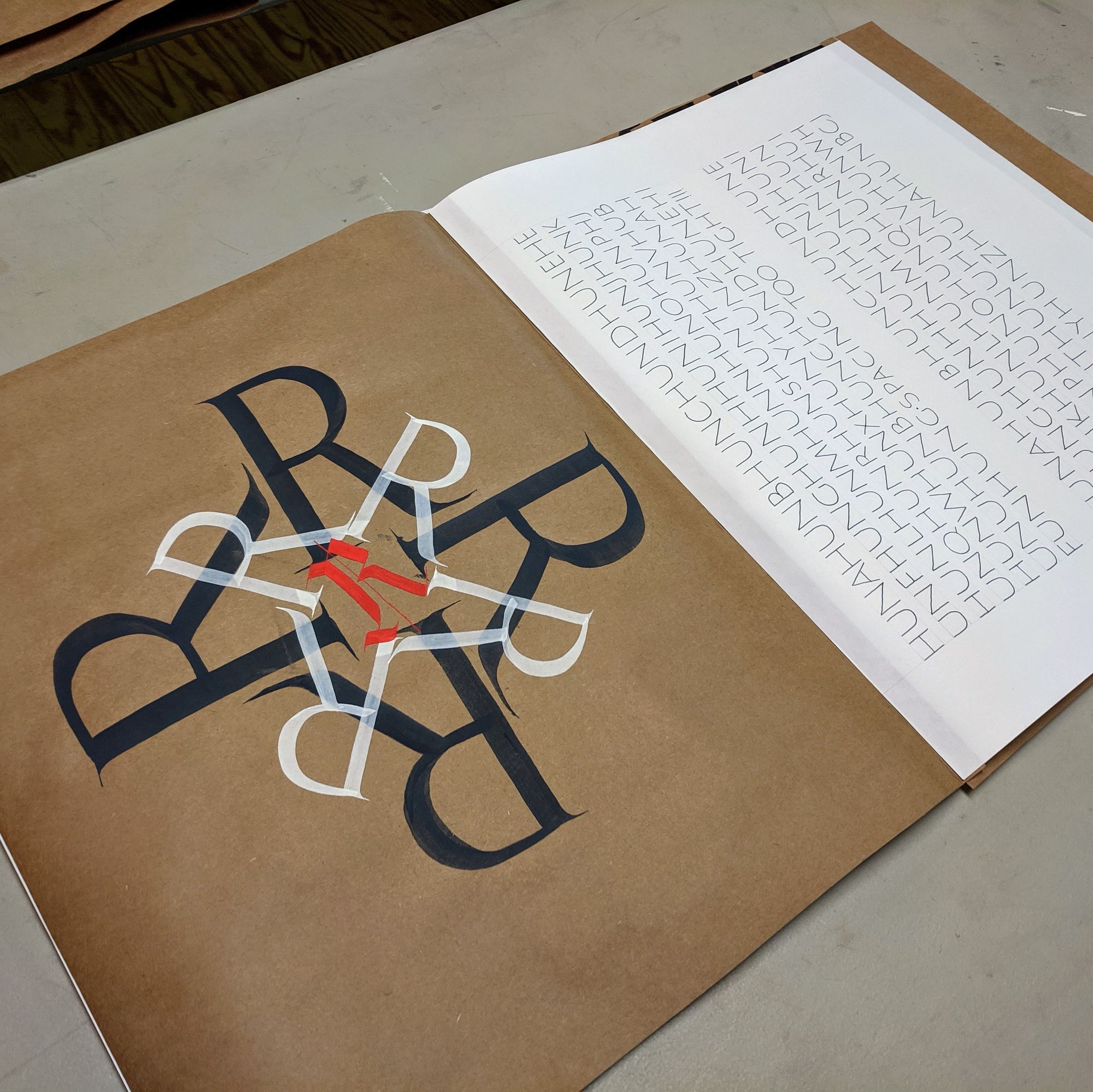
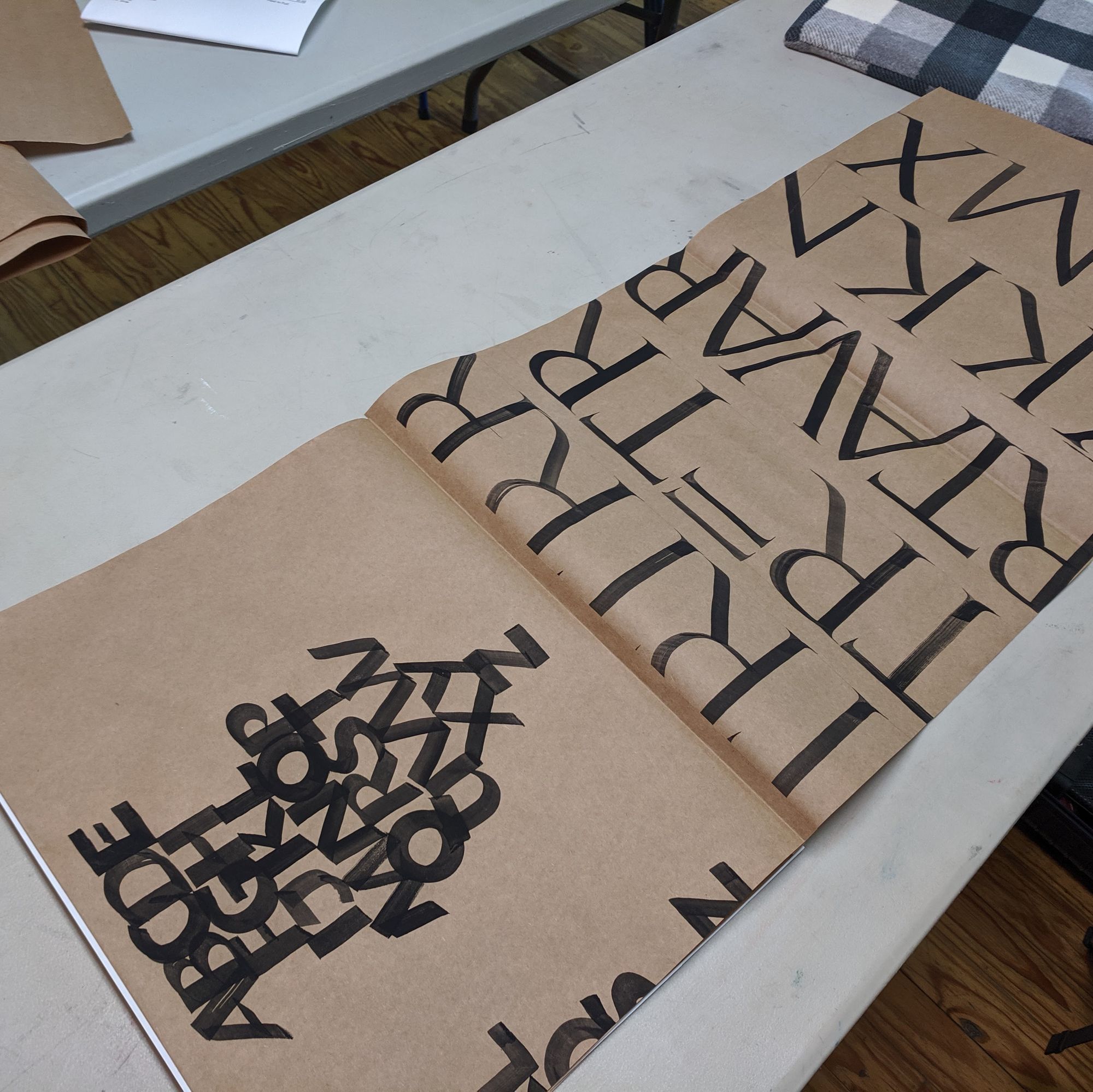
The next spread has a pattern of R on the left, and an early monoline exercise on the right. For the pattern, the assignment was to create a composition of several letters on a page. As I was falling asleep one night, the idea of putting letters in a circle just popped into my mind, and I knew I had to do it. Originally, I was just going to do the two sizes of Roman letters. However, when I finished, I realized the center of the circle looked a bit empty. So I asked my friend Alfredo for his Blackletter exemplar, and added an accent R in the middle.
The monoline text shows a block on top that has bad spacing (it is too tights), and one on the bottom with improved spacing.
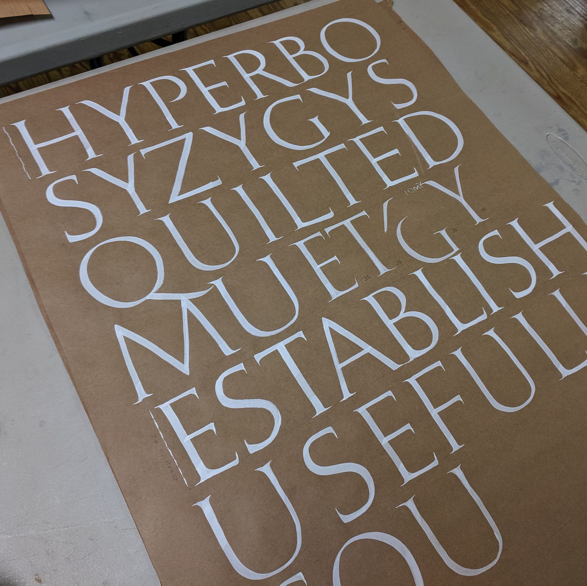
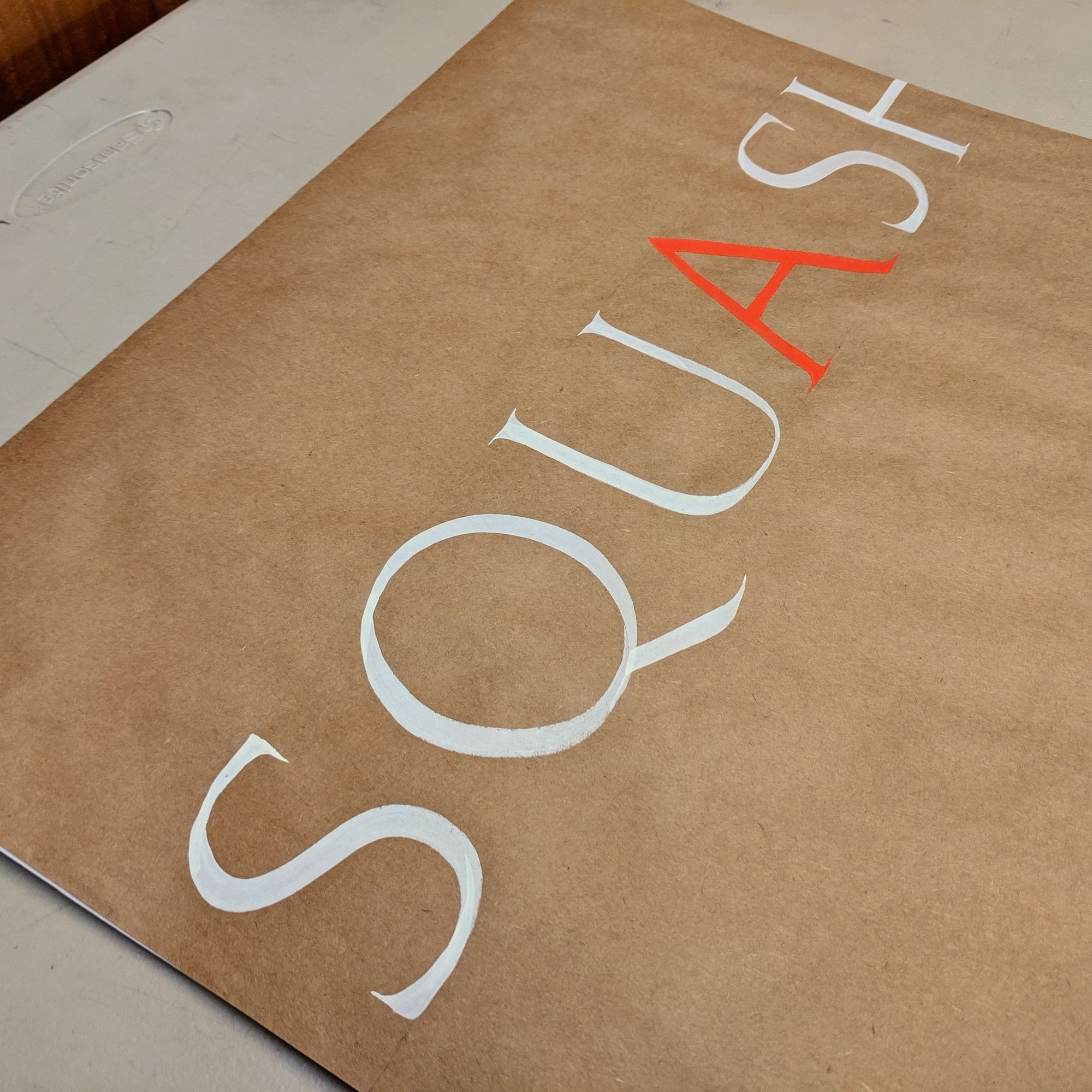
The next page is a single page with a word on it. The goal was to write a single word with good spacing. I thought it was almost perfect, but now I see that the last H could have been just a bit further away.
On the reverse side, I have some shapes and Neuland-ish on the left, and a small block of monoline caps on the right.
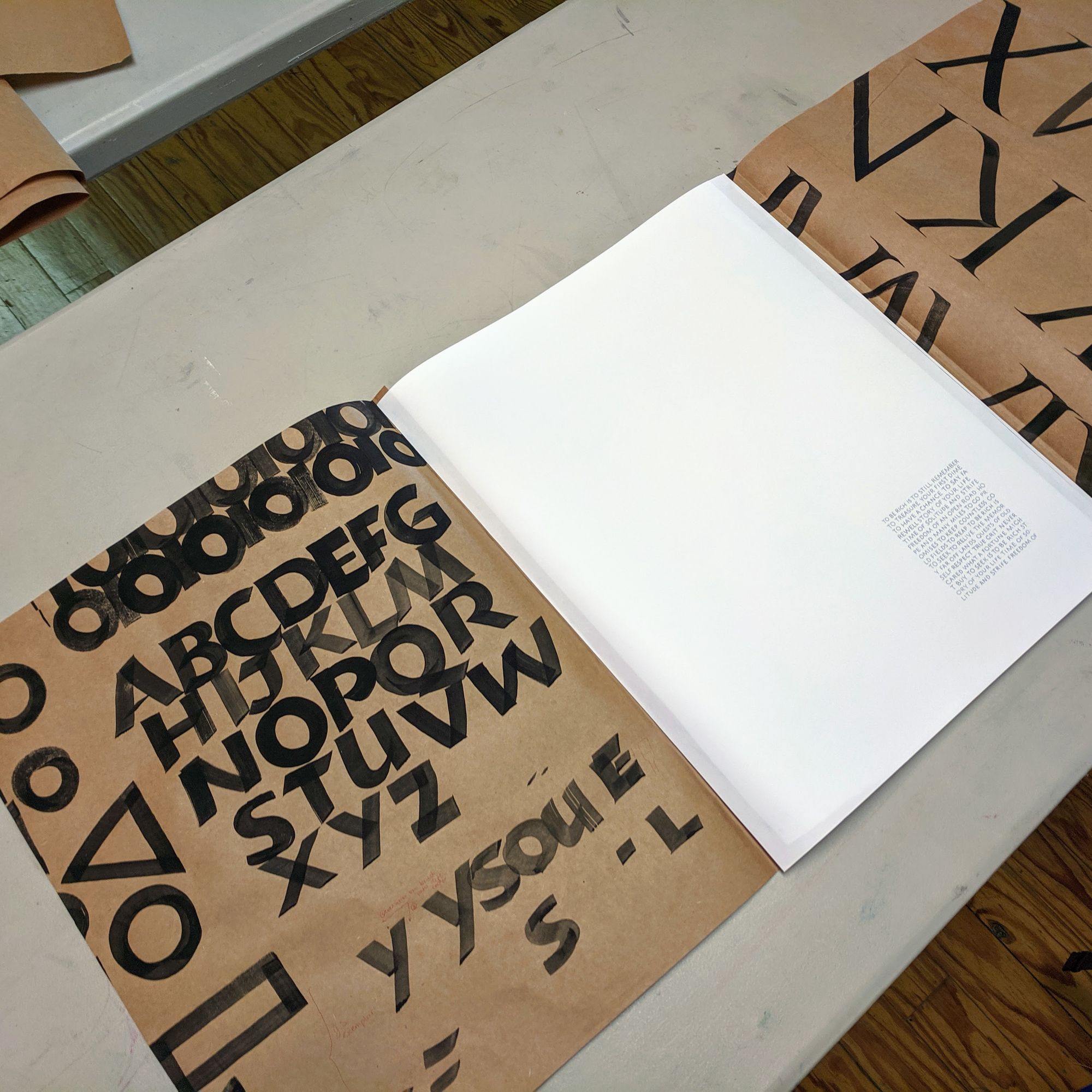
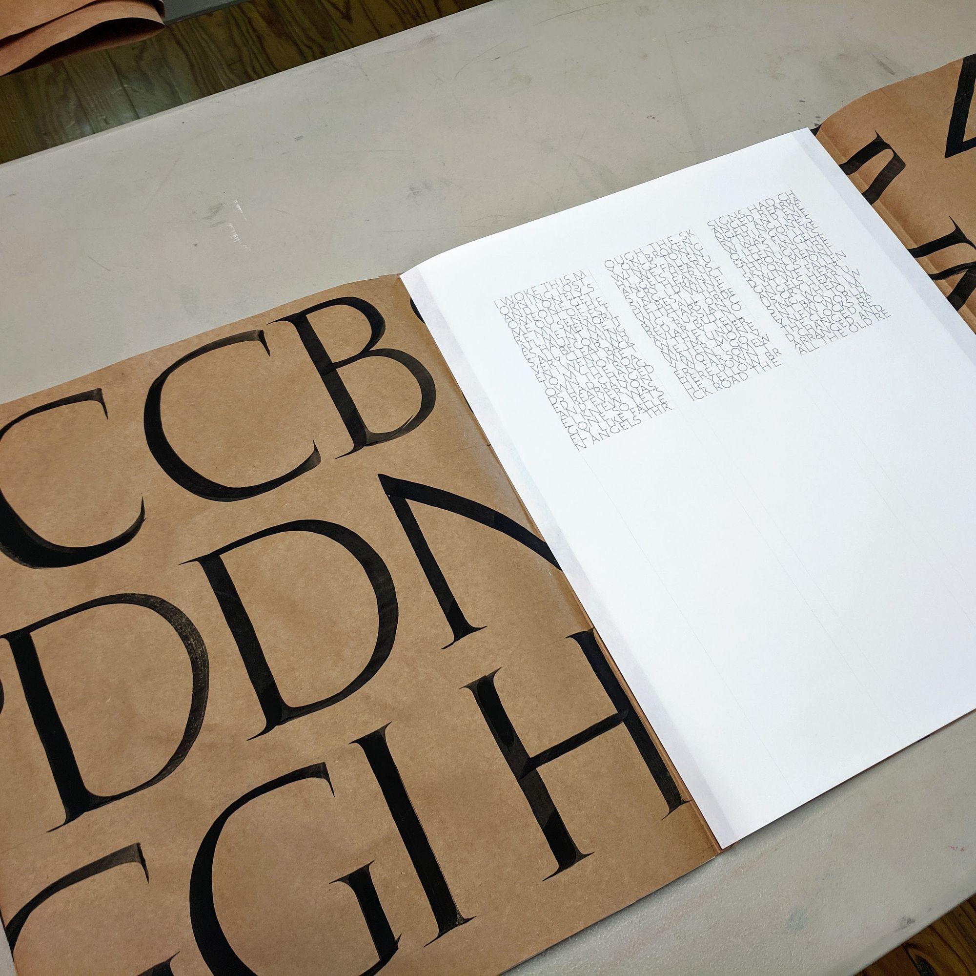
The next spread shows some early attempts at Roman capitals on the left, and a 3 column monoline caps on the right. I knew that we would need to make spreads with a “picture” on one side, and “text” on the other side, and I created the text pages with different layouts so they could be used to contrast the more busy pages with large letters.
The last page has another attempt at a Neuland-ish alphabet, and the inside of the cover, which is some more Romans.
Finally, the back cover is part of the same sheet as the front cover. It even has a few letters that John demoed for me in the corner.
On the last day, John gave a demo of pen letters, but I didn’t have enough time to try them. I was too busy trying to finish the pages for my book. Even though I was looking forward to using a pen, I realized that I can only focus on so many things, and I had to make a choice. I will definitely work on the pen letters on my own, but I probably would not push myself as much with the brush if I hadn’t been at the workshop.
He also gave a demo on grinding down pointed nibs to make tiny broad-edge nibs. I volunteered one of my nibs to be used for it, but unfortunately he dropped it, and the nib snapped in half! It was quite funny, I've never actually seen a nib break before. Too bad someone else got a modified nib, though :)
Overall, I am really happy with how this workshop went. There was a time when I struggled a lot, but I also learned so many things. Of course, all the participants (and the teacher) were amazing people, and I had a great time. I am looking forward to using my new knowledge in future projects!
Comments