Pointed pen Cyrillic

In August, I went to the TypeCon conference in Denver to learn more about Cyrillic typefaces.
The main reason for my interest was that I had tried to write Cyrillic with a broad-edged pen in the past, but it didn't quite work. For Latin, you always hold the pen at the same angle, move it from top left to bottom right, and so on. For Cyrillic, I found it impossible to write some letters that way.
Another problem that I had was the fact that I had no idea what Italic is supposed to look like in Russian. I could not just use my handwriting, since it is far from perfect, and also is upright despite all the attempts of my elementary school teacher.
At the conference, I went to Alexandra Korolkova's workshop on Cyrillic type, where I learned that I was not the only person having trouble writing Russian text with a broad-edged pen. In fact, there is no such thing as historic broad-edged pen Cyrillic!
In a nutshell, Cyrillic alphabet did not develop in the same way as Western alphabets did, and Peter the Great just replaced the old style of writing with a new one overnight. We can only guess what the letterforms would look like had they evolved naturally.
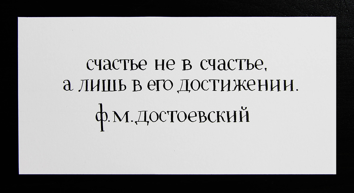
So I learned that Cyrillic is best written with a pointed-pen nib, and of course I decided to give it a try. It is surprisingly hard to write, especially because the spacing between the letters is completely different than the one used in English. Most of Russian letters are rectangular and have heavy vertical strokes, meaning that any odd-shaped letters are really hard to fit. Anyhow, below is the result of a couple hours of practice :)
Comments