Oddly specific

Signs and labels of all kinds are a source of unending fascination for me. Today, I'd like to talk about two of them that I recently saw.
You've probably heard about Helvetica Man (a term coined by Ellen Lupten). Even if the name doesn't ring a bell, I'm sure you've seen him a thousand times. Think back to the last time you visited restroom in a public place. Remember that pictogram that tells you which one is the men's restroom, and which one is the women's?
In 1974, US Department of Transportation decided it was time to standardize the signs that were in use, so that they could be legible and internationally recognizable. Roger Cook and Don Shanosky designed a set of pictograms to satisfy those requirements, and they were widely adopted.
All of the pictograms can be downloaded for free from the AIGA website and used without any licensing restrictions.
Of course, they could not design every single possible sign. This means that when new signs are created, they may or may not use the same design language as Helvetica Man — the language of universal simplicity.
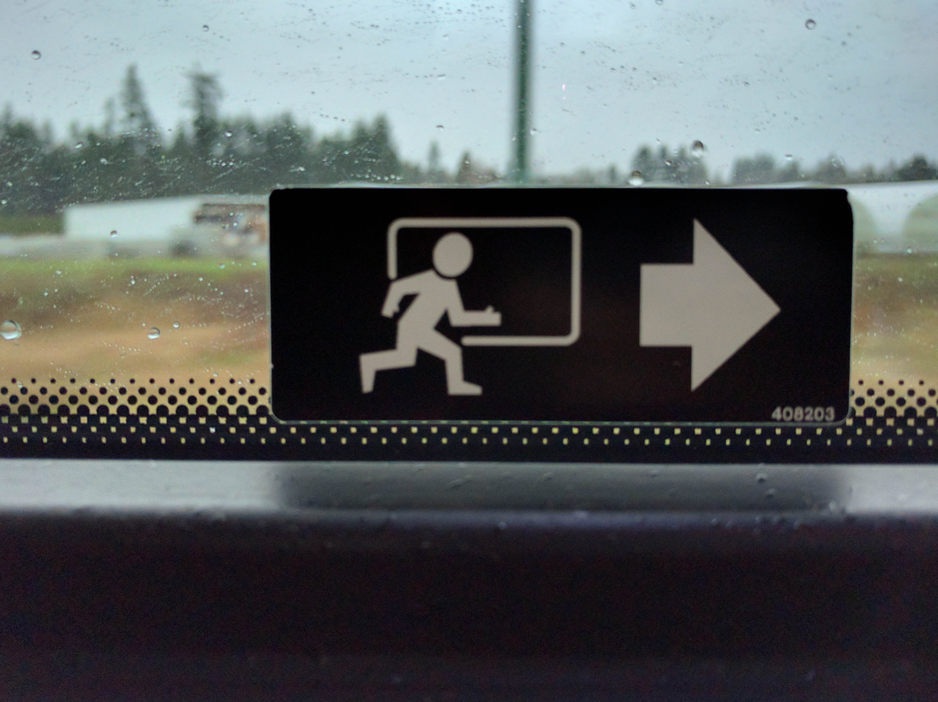
I was on a bus, sitting next to the emergency exit, and this sign made me smile: why does the little person need thumbs? I could convince myself that his feet help point in the direction that he is running, but his thumbs?
I have a feeling that this is the sort of sign that was prevalent before the standard was introduced. Generally understandable, but containing some unnecessarily specific details.
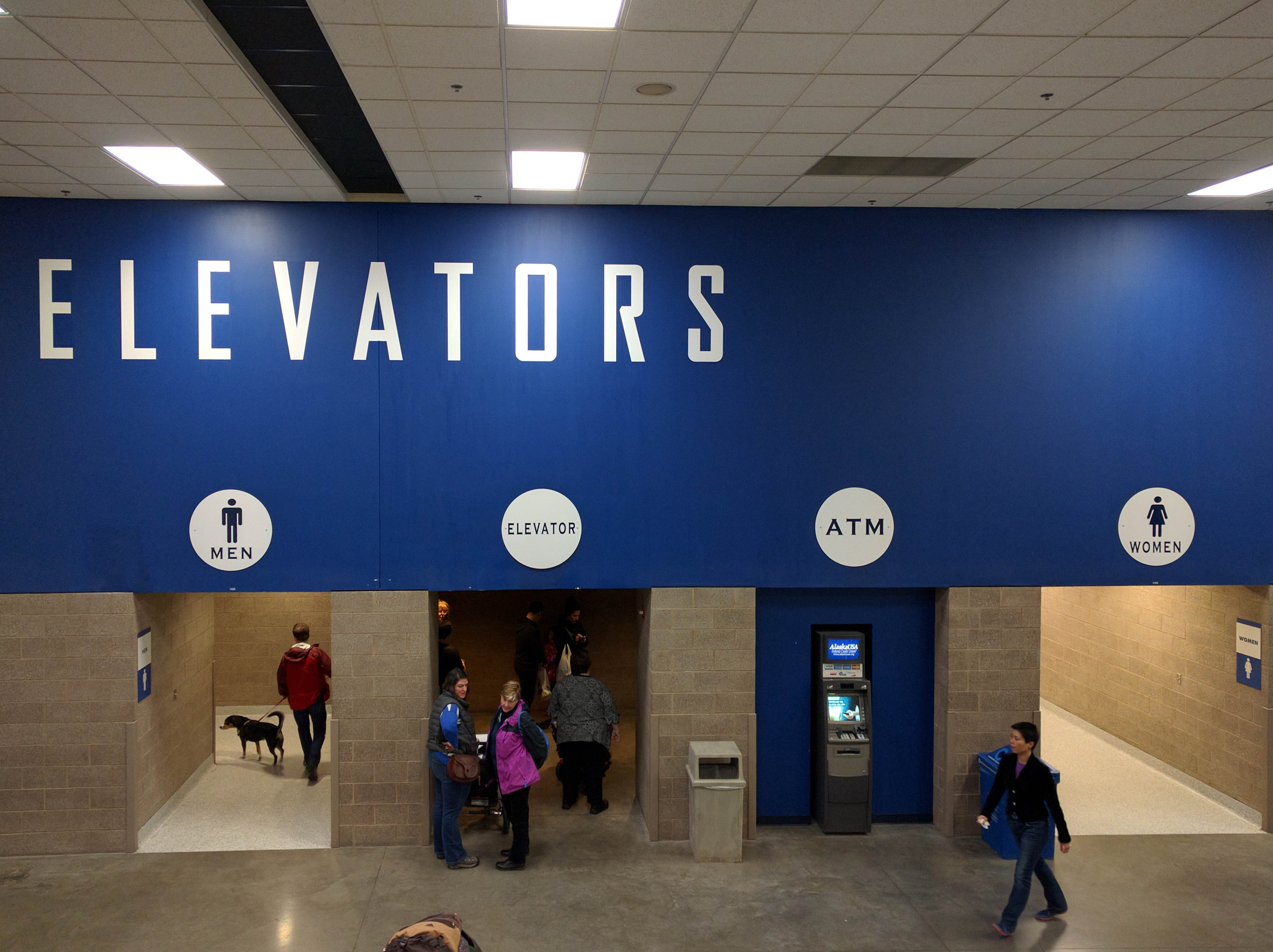
The second sign I'd like to mention is this one:
There are a couple interesting points about it.
First of all, its creators were apparently not convinced that the pictograms for men and women were universal, so they decided to add in the words. I doubt anyone would be confused if they didn't.
Second, they decided not to use the symbol for elevator, even though there is one. I wonder if that was because the word "elevator" would not fit in the circle otherwise.
Finally, when I saw the large "Elevators" title at the top, and then the icons for men and women at the bottom, I thought for a moment that they had separate elevators for men and women :D
Of course, that idea is absolutely ridiculous and is not what they intended, but that is how the sign reads. The word "Elevators" gives context to the rest of the information, and creates confusion.
Overall, I think it is great when designers use universally accepted designs. That's what they are for. Using them in a subtly wrong way, or course, is an entirely different matter.
Comments