My heart is in the work

When I was at the Cheerio workshop, there was one exercise that I did not finish. I had started working on a quote done in a pointed brush, but I simply ran out of time. This is what it looked like as part of my final project:
When I got back home, I decided I would make a new copy, and complete it. This quote by Andrew Carnegie is near and dear to my heart as a CMU alumna.
As it turned out, it was easier said than done. When I was in the workshop, I used a size 0 brush and Higgins Eternal ink (which I was told is really bad for brushes, so I had to make sure it did not dry up). The advice I got was to use stick ink and a size 0 “extra pointy” brush, so that’s what I tried at home.
I discovered that the stick ink was much more viscous than Higgins (or not black enough if I add more water). I also found it harder to use the pointier brush.
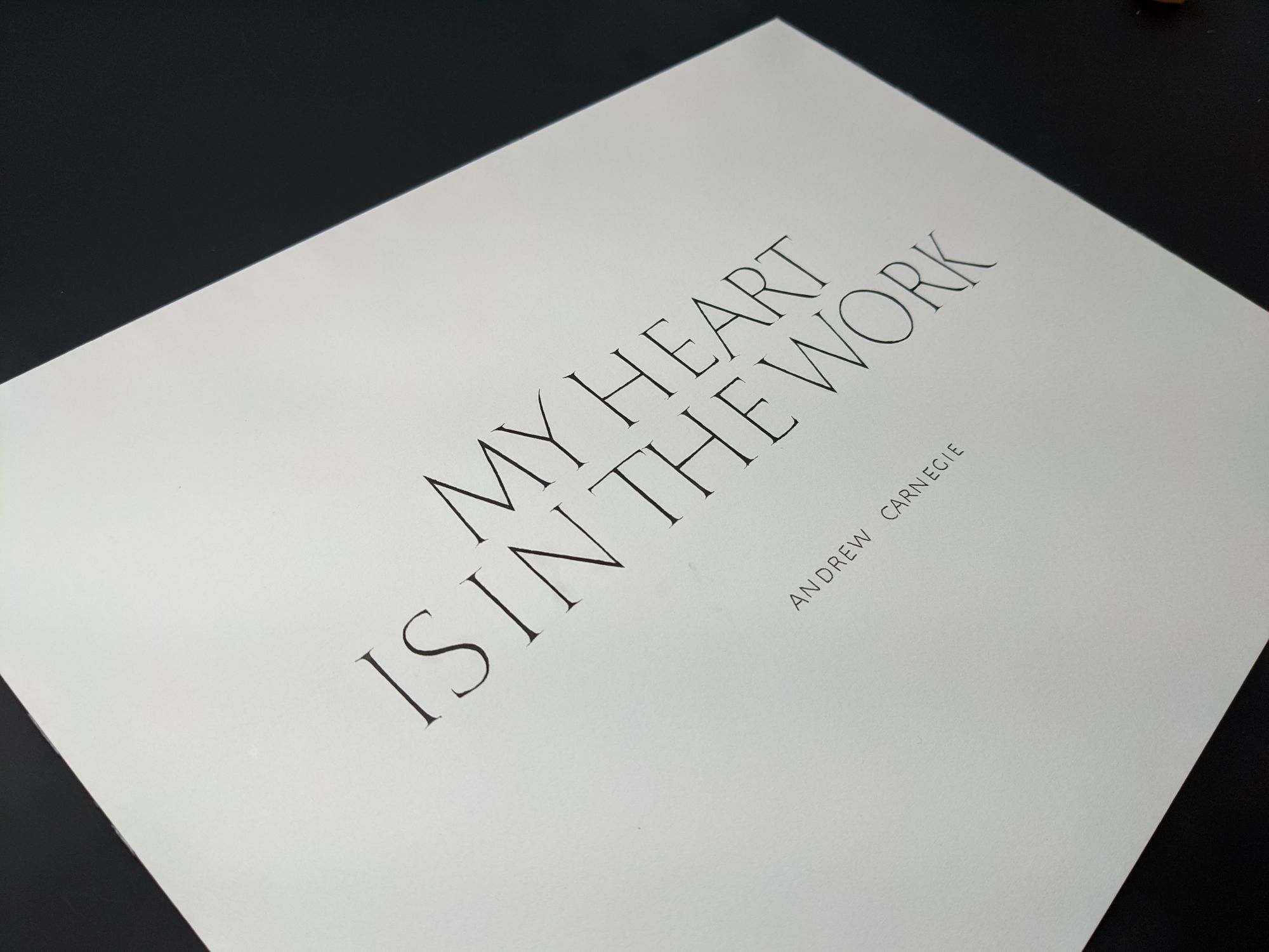
If you look at “the” in the picture below, you will see that the h is not as black as the t. This was at the point where I went back to Higgins for a bit just to see if it would work better.
Another problem I encountered was line weight. I kept making accidental marks with the extra pointy brush that stuck outside of the normal strokes, so I tried to cover them up by adding a bit more weight to the letter. Obviously, that technique can only go that far, and I ended up with a piece where some letters are clearly “bold” compared to the rest.
I also overdid the “slight bouncing” this time around. There are too many places where the letters have height variation, and it’s too much.
Finally, I was not at all happy with how the spacing turned out. It looked okay when the letters were penciled in, since they were monoline, but adding weight changed everything.
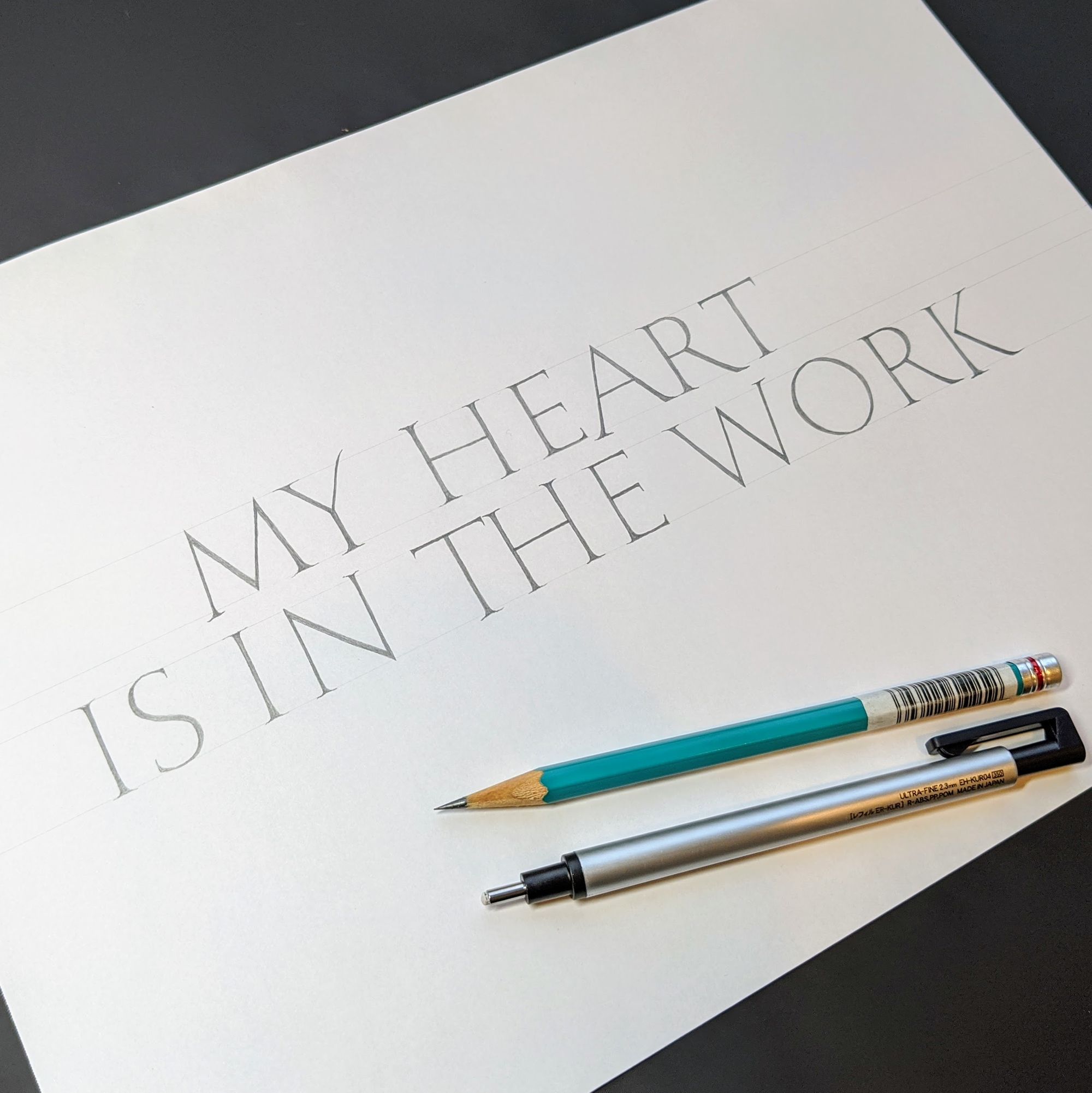
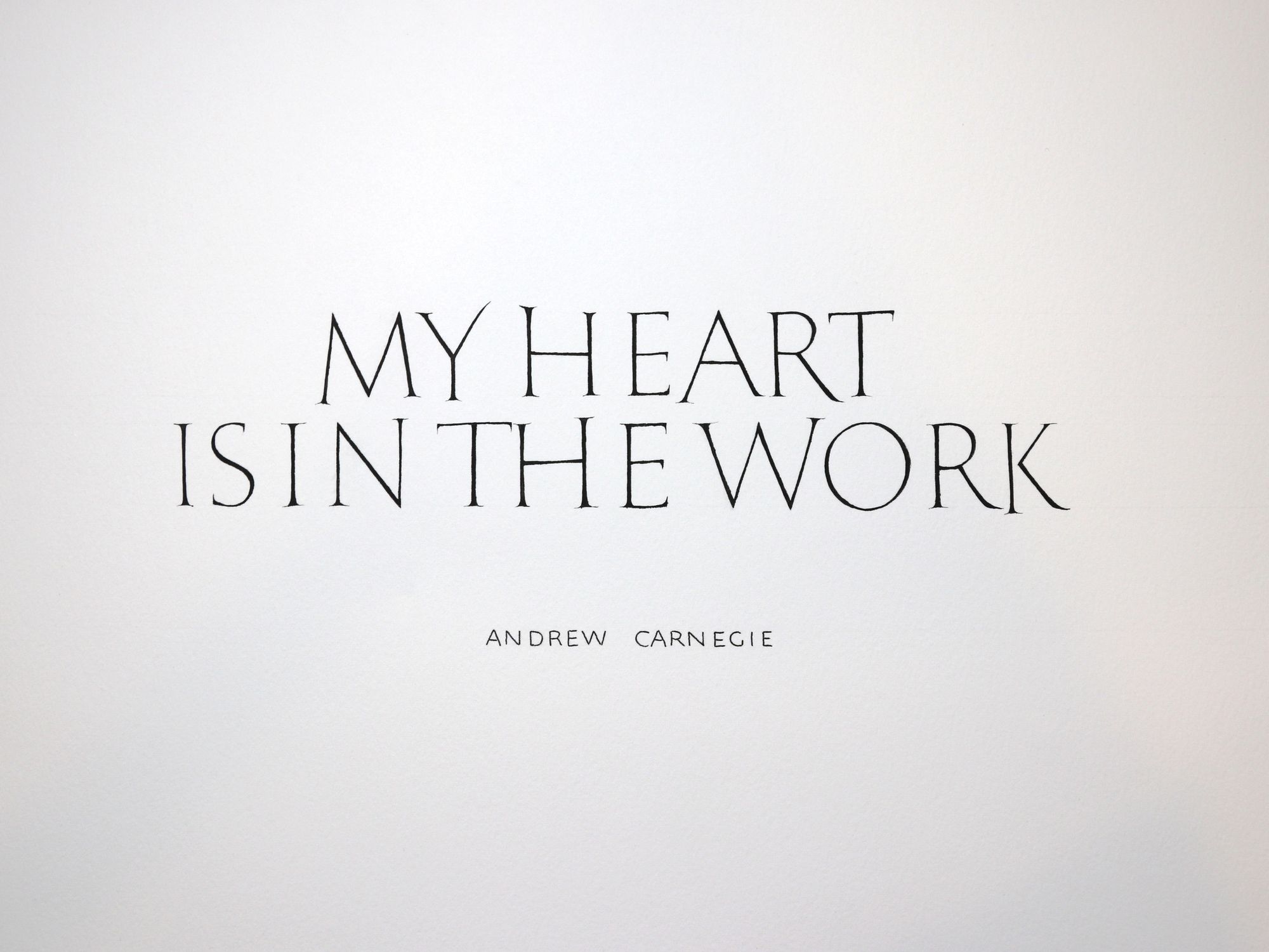
For the next iteration, I decided to focus on the issues I described above, and also to use a pencil to make it easier to improve the problematic dimensions of the piece. I am quite happy with how it turned out.
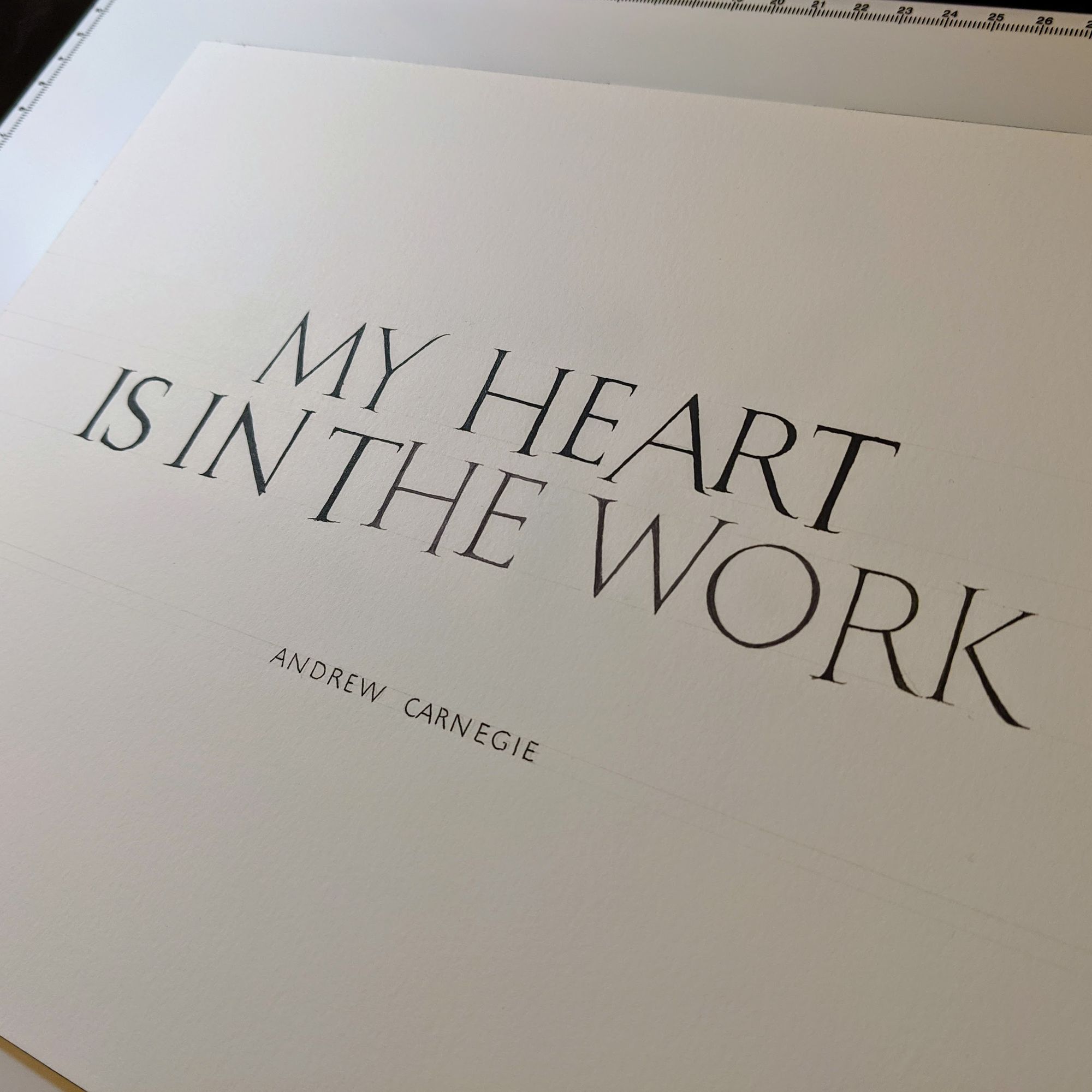
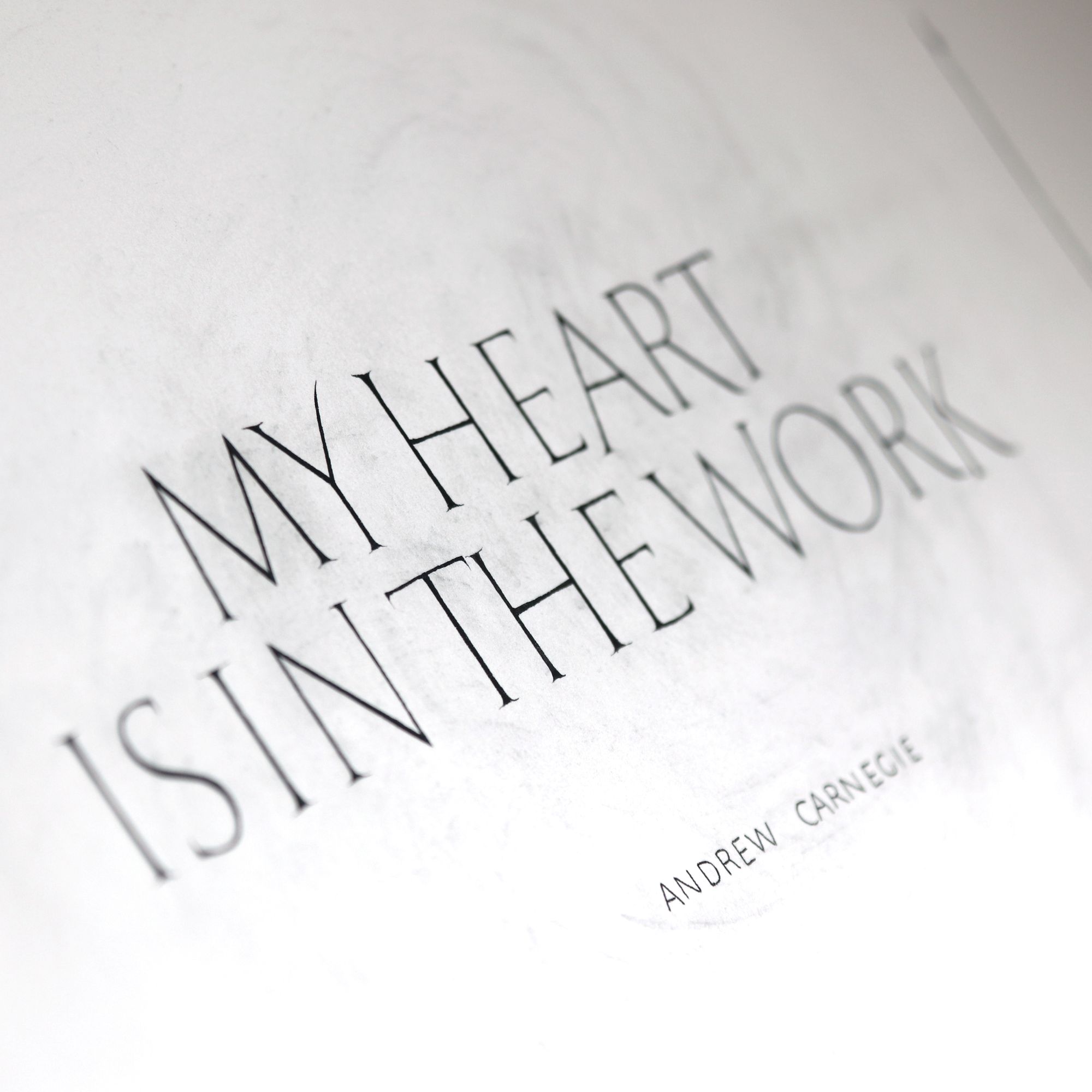
Now, only one last step remained: doing it again with a pointed brush. I used the stick ink, but opted for regular brush instead of the pointy one.
Overall, it was going really well. And then I accidentally got some dirty water on my pinky finger and put a few smears on the page. I tried to get them out, and did lighten the stains a bit, but not enough that a first-time viewer would not notice them.
At first, I decided to Photoshop them out, which I did quite successfully.
But… it just didn’t feel right. If I were to publish this nice clean image, I would still have the smeared original in my physical portfolio. I could never show it to anyone with a straight face.
Therefore, I decided that if the spot cannot be cleaned off, I just need to add more spots. Perhaps, there was a better solution, but I chose not to dwell on this problem for too long. I definitely wasn’t going to do it all over one more time.
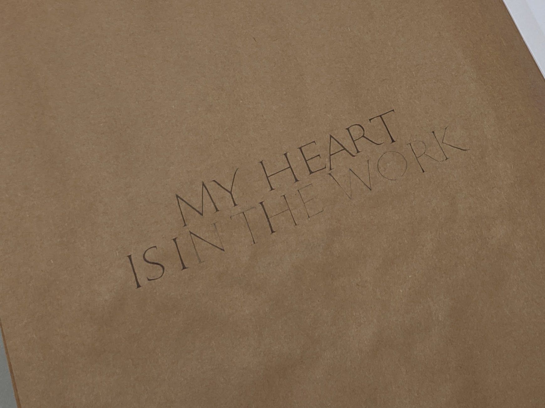
I sprinkled some powdered graphite on the piece and smeared it around with a paper towel. I am going to pretend like there is a special meaning in this. Andrew Carnegie owned a steel company, which required a lot of coal. Steel, coal, sooty buildings in Pittsburgh… In reality, graphite was the only thing I could think of that would reliably cover up my ink stains.
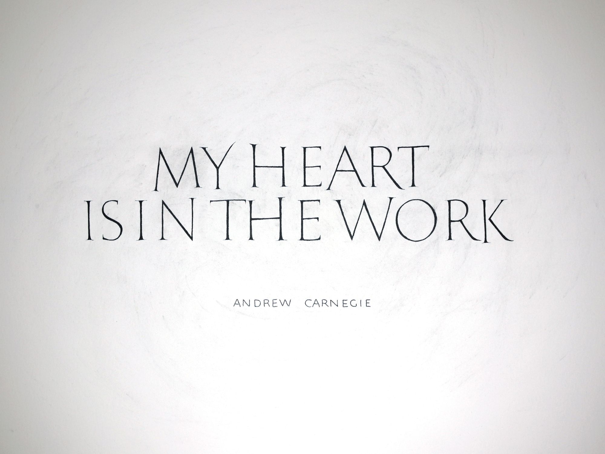
Here is what the final version looks like:
Comments