Material matters

Signs of all sorts surround us. Some are good and clear, such as most of street signs, while others can be hard to read and confusing.
However, typography is not the only thing that makes a good sign. It is true that bad typography will likely make it bad, but that is not my point today.
What sometimes matters even more is the appropriateness of typography. Scale and material are two of the most important factors in this regard. For instance, using type that is too ornate or otherwise hard to read on a small plaque is a bad idea, since people won't be able to figure out what it says.
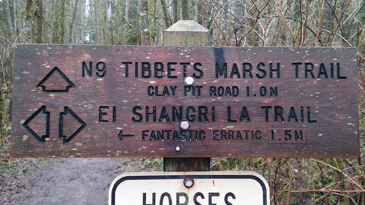
I saw an interesting example of how material affects typography in Cougar Mountain Park. The park has some 38 miles of hiking trails, and there is a little sign at every intersection, which indicates the trail names and distances to trailheads. The park has a lot of marshy lands; the trees are old and covered in moss; the trails have squelchy muddy stretches for most of the year. The trail signs are made out of wood, which means they are very susceptible to moisture and moss.
Most of the signs are actually in great shape (although I don't have a good idea of how old they are). Look at this one: even with all those caterpillars crawling all over it, it is still perfectly legible.
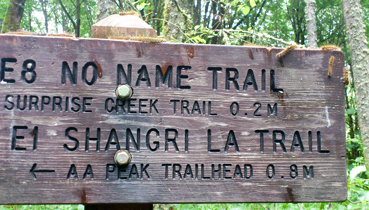
The letters are simple, but sturdy. They are cut fairly deeply into the wood and blackened to improve legibility.
As time goes by, some of the signs are replaced. There is a little installation next to the ranger's house that is made from old signs. Here is one of them.
As you can see, some of the skinnier letters and numbers have become so weathered that they are almost impossible to read. I'm sure this sign looked great when it was first made, but nature has not been kind to it.
Another type of sign that I saw has the letters filled with white paint instead of blackened.
Well, let's just be honest and say this doesn't look great. The paint bulged out and fell out in places, making the sign look older than it actually is. Compare this image to the first one from this post — which of them looks more appealing?
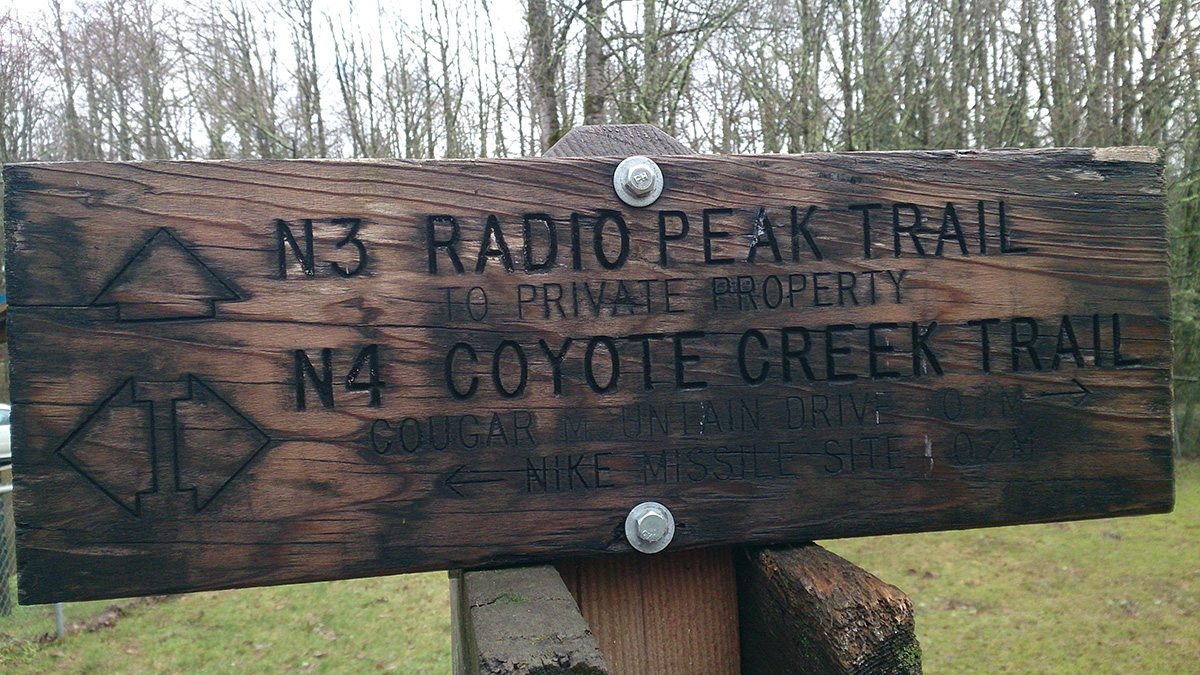
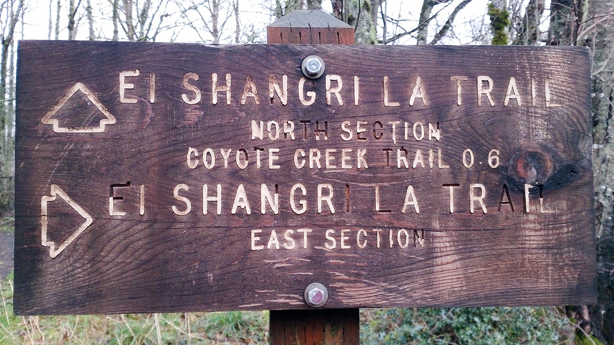
Below, I have two more examples of signs with simple blackened letters.
I think the bottom one has a higher chance of surviving another couple years before it becomes illegible. The skinny letters in the top one are already starting to fill up with moss.
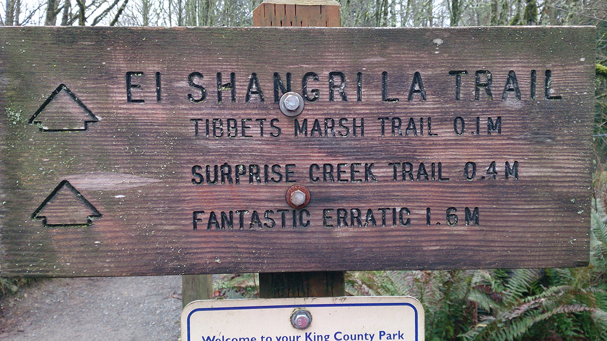
I mentioned at the beginning of this post that I do not know how old the signs are. Given the conditions, I would estimate between 5 and 10 years. There is one sign that I saw recently, though, that I know is less than a year old. It has a brand-new design, and the wood is still light.
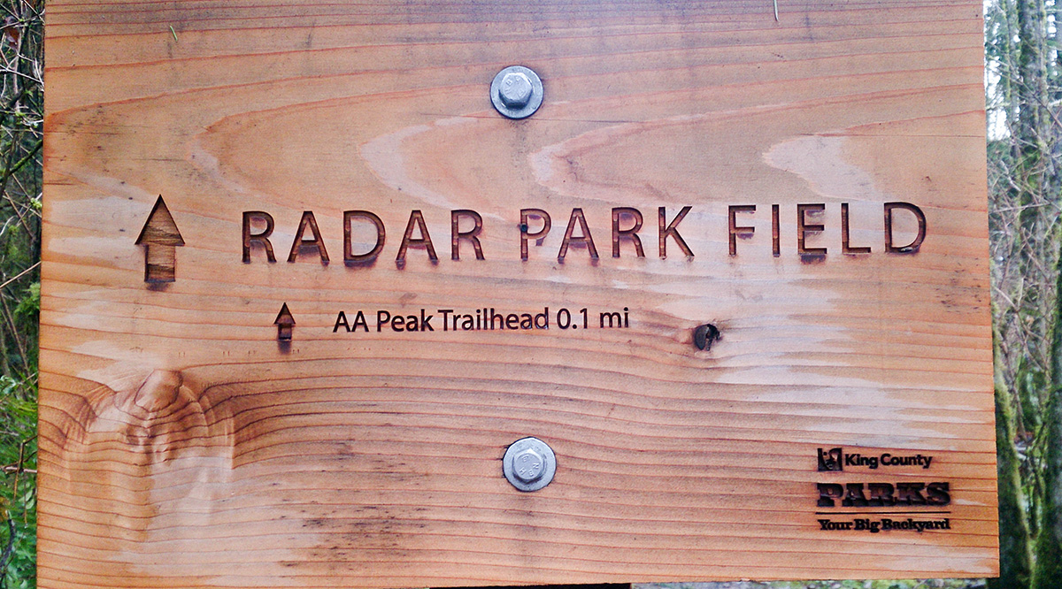
This one is all laser-cut and fancy, with the King County Parks logo in the corner... But how many months is it going to take before that tiny "AA Peak Trailhead 0.1 mi" line becomes completely unreadable? I'm not even betting years on this one.
It also illustrates the issue with scale quite perfectly. All of the older signs have nice large letters that you can see from a distance. In order to read this sign, you have to be standing 3 ft away from it. The distance, which is a very important piece of information, is extremely tiny and had to find.
When I look at this sign, all I can see is someone trying to make it fancy without even looking at the other signs in the park, or thinking how well it is going to survive the wet, mossy environment.
Comments