Luck favors the alert mind

This was another fun quote assignment for my class with Carol.
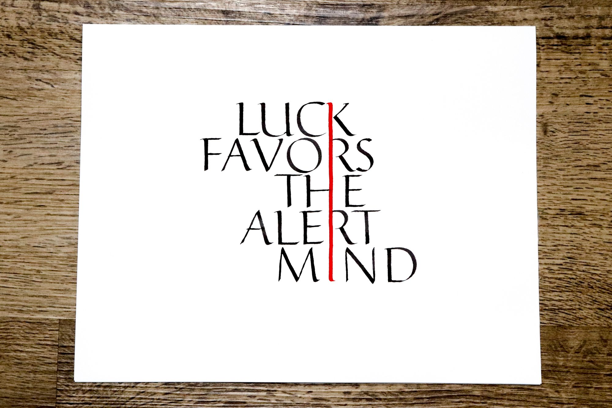
We started working on it during a class session, and by the end of it I had come up with an obligatory folded pen version:
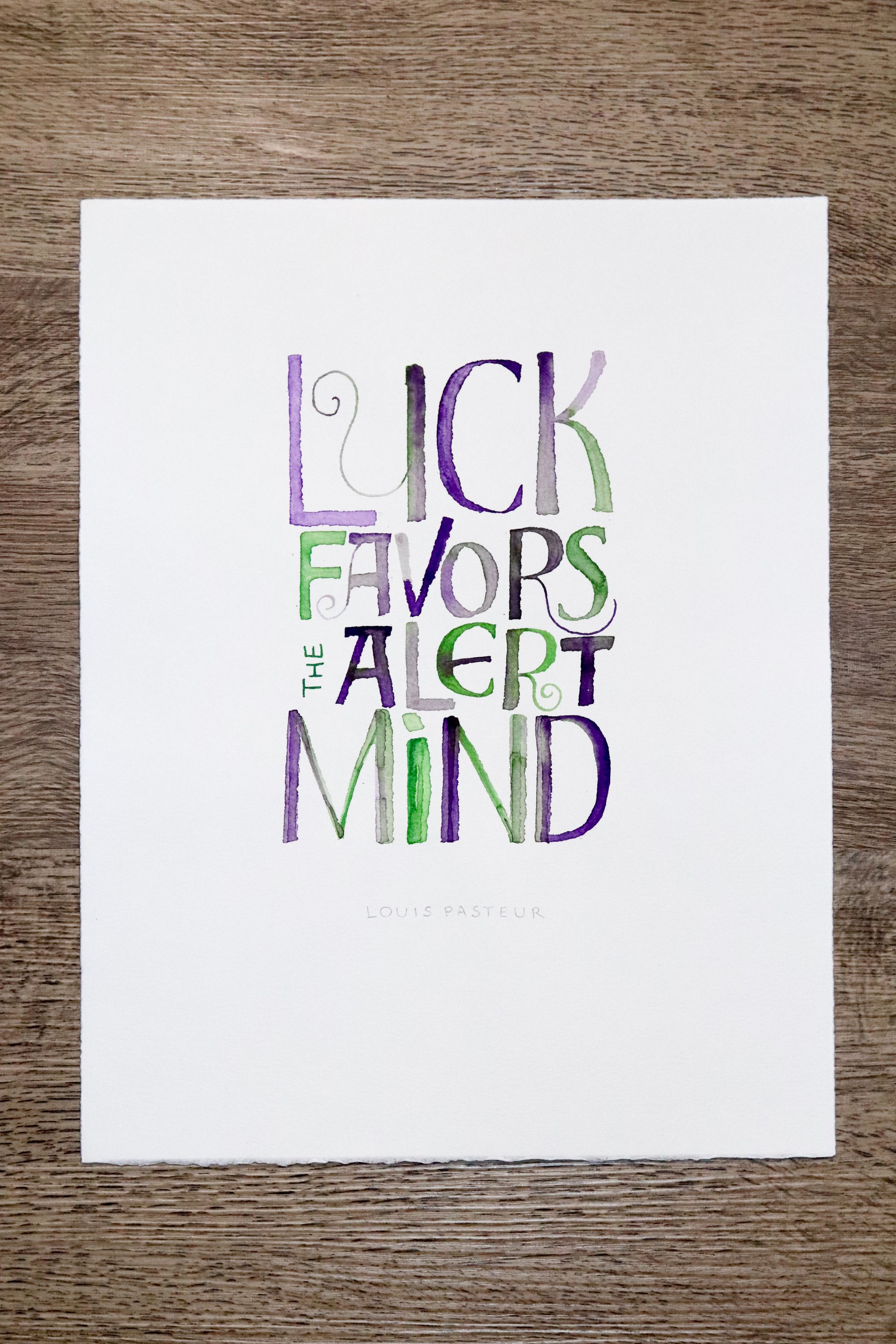
Even though it was generally liked by my classmates, it just didn't speak to me. And, let's be honest, those colors are icky.
On my way home, I had an idea on how I can make my work really stand out. Quite literally. I remembered that a while back, I took a typography class with Juliet Shen, and one of my classmates, Chuong Tonnu, made this absolutely gorgeous box for her project that had 3D letters on it. I still remember asking her: "Wow, how did you do it?" and getting a very simple and honest answer: "I just cut it with an x-acto knife, and used foam tape to add volume." I felt humbled.
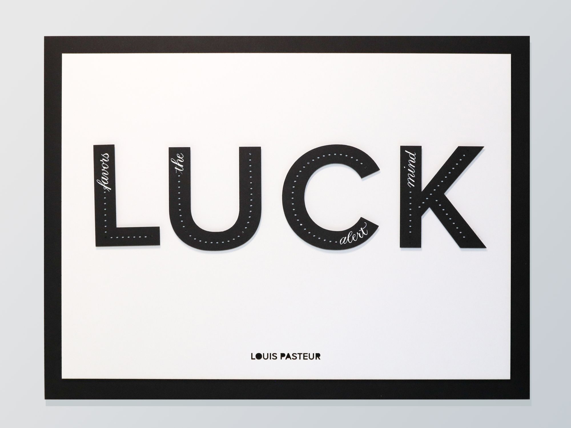
Now was the time to try the foam tape trick, except I decided I would use a laser cutter instead of hand-cutting the letters. I'm not that handy with anything but the simplest straightest lines, and besides, a laser cutter is so much cooler!
I didn't make any sketches, but went straight to Illustrator and created the letter outlines. It was quite easy to create a mock-up of the final piece as well.
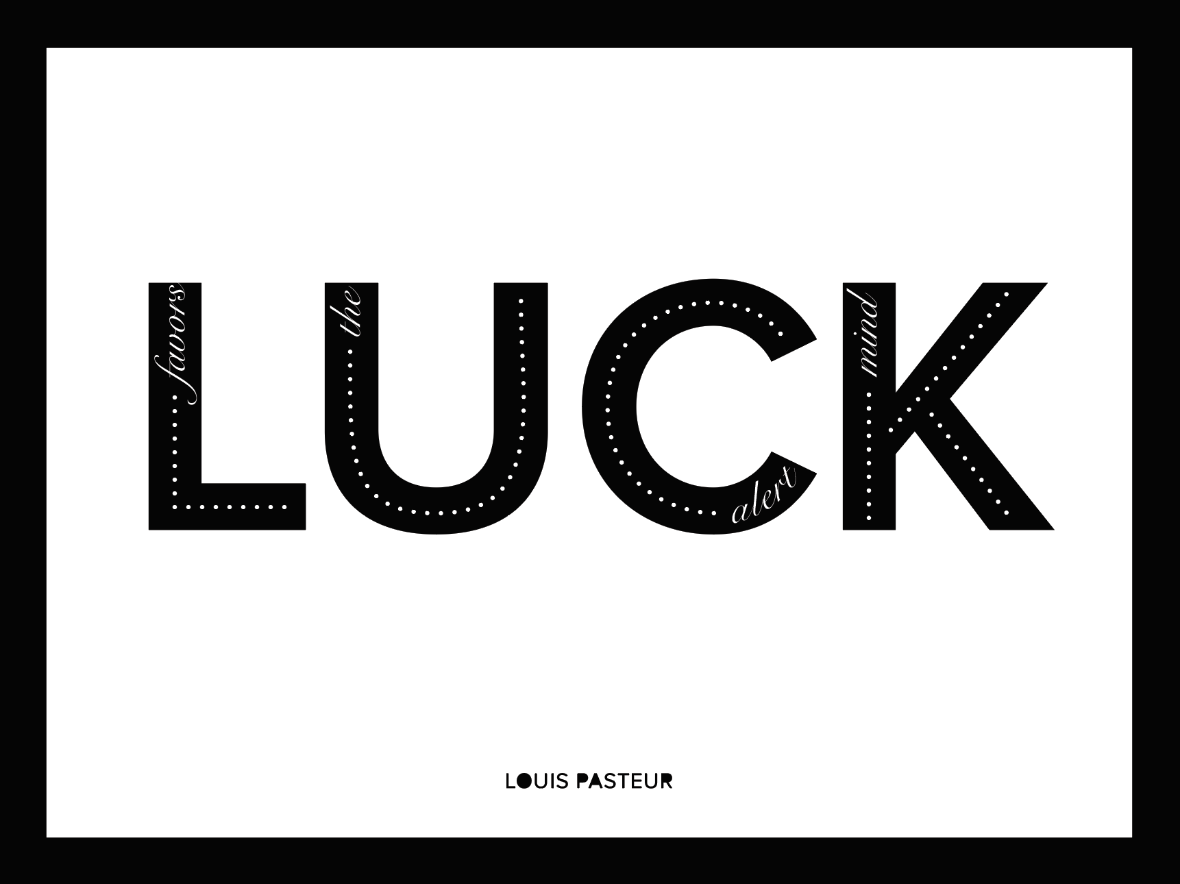
The white dots in the black letters are cut through. I would say, that part was the most challenging to get right, because the printer didn't cut them as perfectly as I had hoped on the first attempt. I also had some minor setbacks from paper shifting after a letter was completely cut through, so I had to cut the holes first, and the outlines of the letters later.
Another thing to watch out for are the laser settings. Set them too high, and the paper will catch fire. Set them too low, and you will end up with a shallow cut (or just a scorch mark).
While I was working with the laser cutter, I got a really nice piece of advice from someone in the maker space. He suggested that I put some blue tape over the parts of white paper that are going to be cut, so that the smoke marks would be on the tape and not on the paper, and could be easily removed.
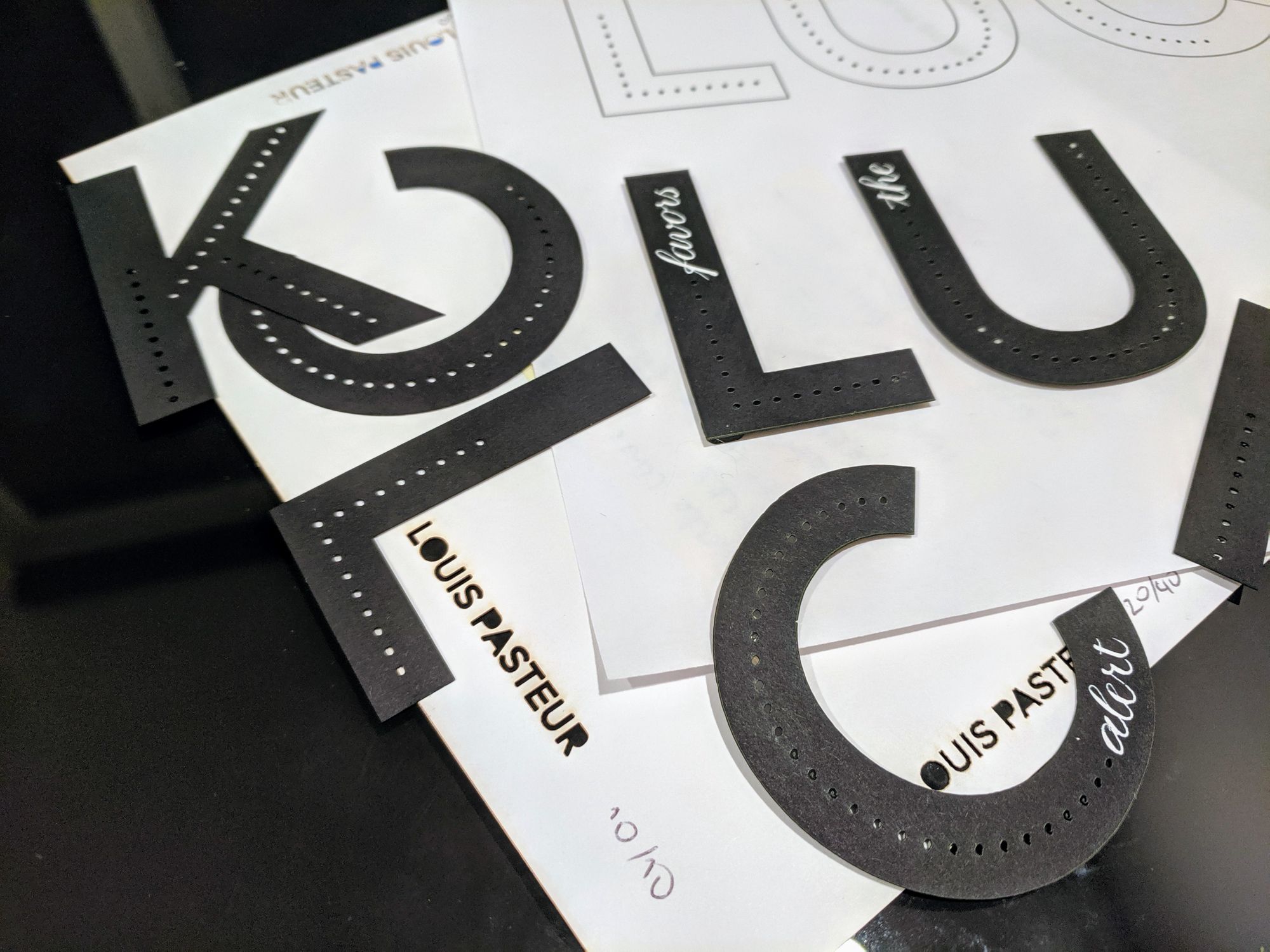
That was a really solid piece of advice! As you can see in the picture above, cutting without tape left these brown marks around the letters, which I avoided in the final version with the blue tape trick.
Also, in the image above you can see that I tried to use 2 different color of foam tape: black and white. I ended up going with black in the final version because the white stood out too much (the holes don't look nearly as white because of the shadow).
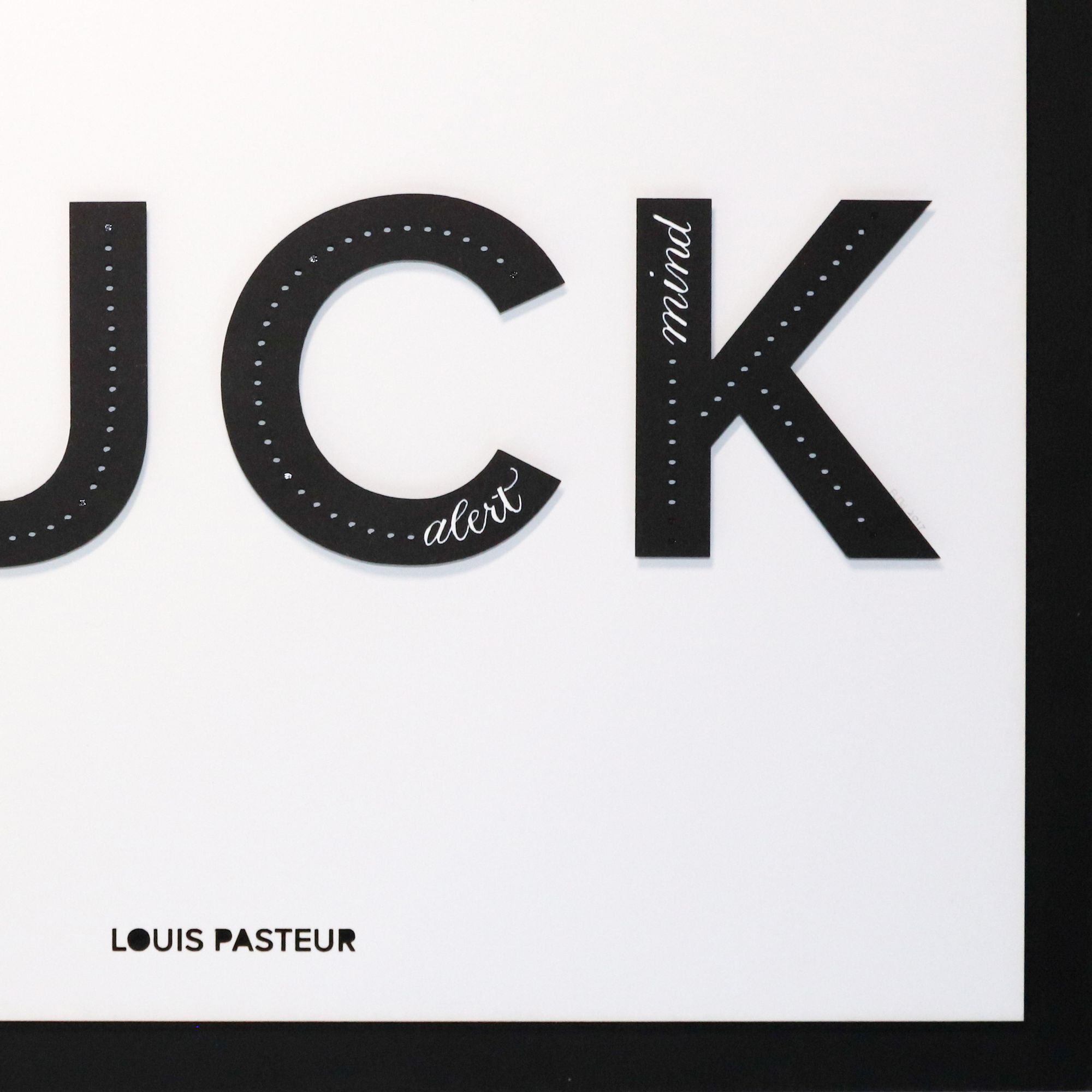
And, of course, here is the final product!
I was quite happy with it. The pointed pen lettering could be improved, of course.
And then, when I came back to the class, I got a little extra assignment: do another version based on my classmate's sketch.
Still, I like my 3D version best :)
Comments