Insular adventures

Inspired by my summer class on Uncials, I decided to apply the same approach of studying manuscripts carefully, and coming up with a hand that is grounded in history, and yet not archaic, to learning some insular majuscule.
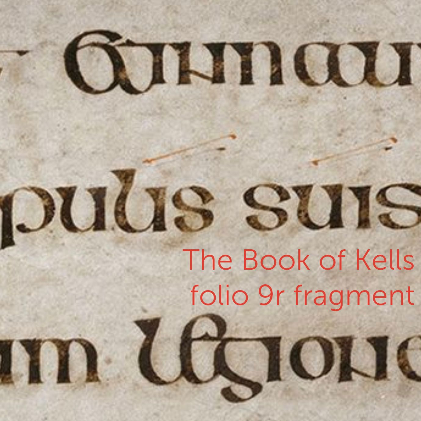
The Book of Kells is a magnificent manuscript to learn from. Not only is it breathtakingly beautiful, but also every single page is available online in high resolution on Trinity College's website.
I printed out several folios, and started collecting the alphabet letter by letter. I studied not just the letterforms themselves, but also their relationships to other letters. For example, the a may look slightly different based on how much space is between it and the next letter. If there is a lot of space, it almost looks like oc written closely together.
Some letters did not exist yet, so I had to invent them, and make sure they fit in reasonably with the rest of the alphabet.
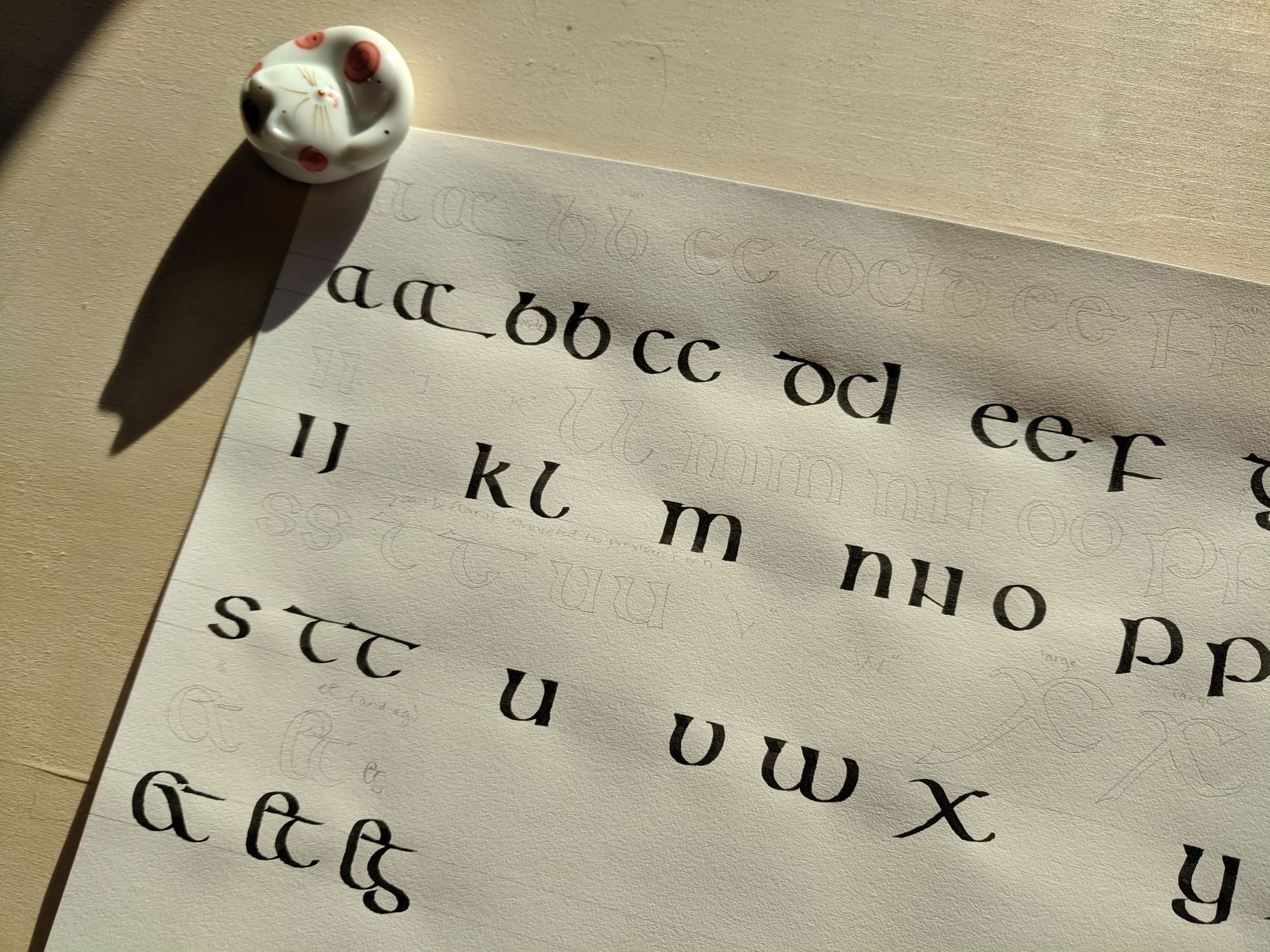
There are a lot of interesting ligatures. For example, in eg and et, the e is made much taller than it would normally be. The top of the t may have darts on it, or it can be a straight line, depending on what letters surround it.
To me, the defining characteristic of the script is not so much the individual letter shapes, as the way they flow together to create strong lines. In a way, my little exemplar is nonsensical, since it takes the letters out of context.
The counter spaces inside the letters are ovals slanted to the left. It may not be immediately obvious when you look at a line of text, but once you notice it, it’s everywhere, even in the s, where the oval is cut in half and shifted.
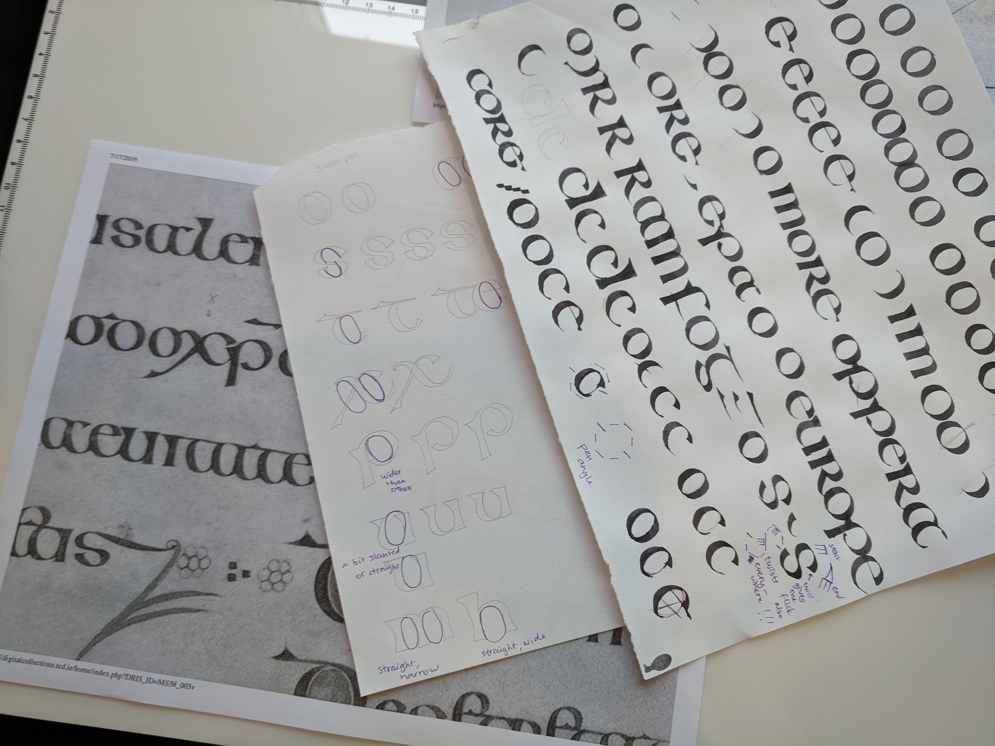
In fact, the s is a most curious shape. I spent a long time trying to re-create it.
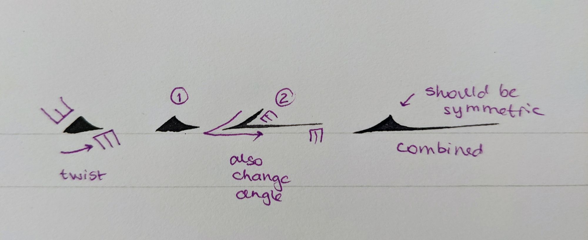
Usually, an alphabet is written at a particular pen angle, and the angle remains unchanged throughout the letter. It is not quite the case with insular. Even though most letters appear to be written at a 0-10° angle, it is not the case that the angle remains constant. These letters have a lot of pen manipulation in them!
Here is a rough diagram of how the angle changes in the s:
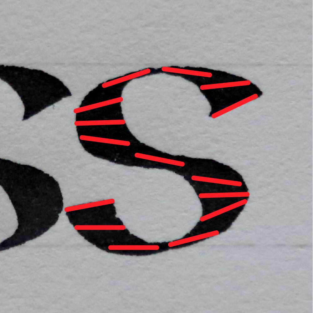
It starts at 10-15° at the top of the curve, flattens out, then goes to negative 10-15°, then flattens out again, and goes back to the starting point. In other words, the thickest part of the curve is at 0°, but in order to create the oval shape of the counter, the angle needs to be constantly changed. The little serif at the top of the letter also comes from a twist of the pen. It happens automatically when the angle changes, but would be very hard to get any other way.
Once I discovered the slanted ovals and the pen twisting, I was able to replicate the letters much better.
One more thing that gave me a lot of trouble was the top bar on the t (and g). It has a dart at the beginning, and sometimes a dart at the end (when the letter is the last one in a word). The ending dart was quite effortless, since it is formed by rolling the pen onto a corner. The starting one is not that simple.
If you look carefully at the Book of Kells, you will see that the front dart of the t is almost perfectly symmetric, and looks like a triangle with two of its sides caved in a little. I had a hard time keeping it the right size and the right shape without just drawing it. Even though the scribes appear to have spent an inordinate amount of time on this manuscript, I doubt they were carefully drawing every single dart with the corners of their quills.
Perhaps, using a quill creates this shape more naturally. I really wish I could travel back in time and see how it was done. Since my goal was to create a modern version of the hand, it had to work with my modern tool, the steel nib, so I did not do any quill exploration.
I looked online to see if there were any explanations of how it was done, but instead I found a lot of exemplars with darts that don’t look anywhere near as elegant as the ones in the manuscript. I even reached out to someone who teaches this hand, and she sent me copies of several books she has on the topic. I dare say, they were all somewhat evasive on this topic, and I wasn’t able to get a good result following the directions. Perhaps I am too much of a perfectionist.
I was able to find a way to make more or less the right shape with two separate strokes. It’s probably not how the scribes did it, but it looks close enough, so I will go with it.
The reason I started studying this hand in the first place is my book project, for which I will be writing text in several different hands. I felt that insular was a good fit for it.
At some point, a friend of mine forwarded some information about the Book of Kells Art Competition. Since I was already working with the manuscript, I decided to enter. It doesn’t matter to me whether I win or not (I don’t think it’s likely, especially since the category is “art” and not just calligraphy), but I think it’s good to have a goal in mind for a finished piece.
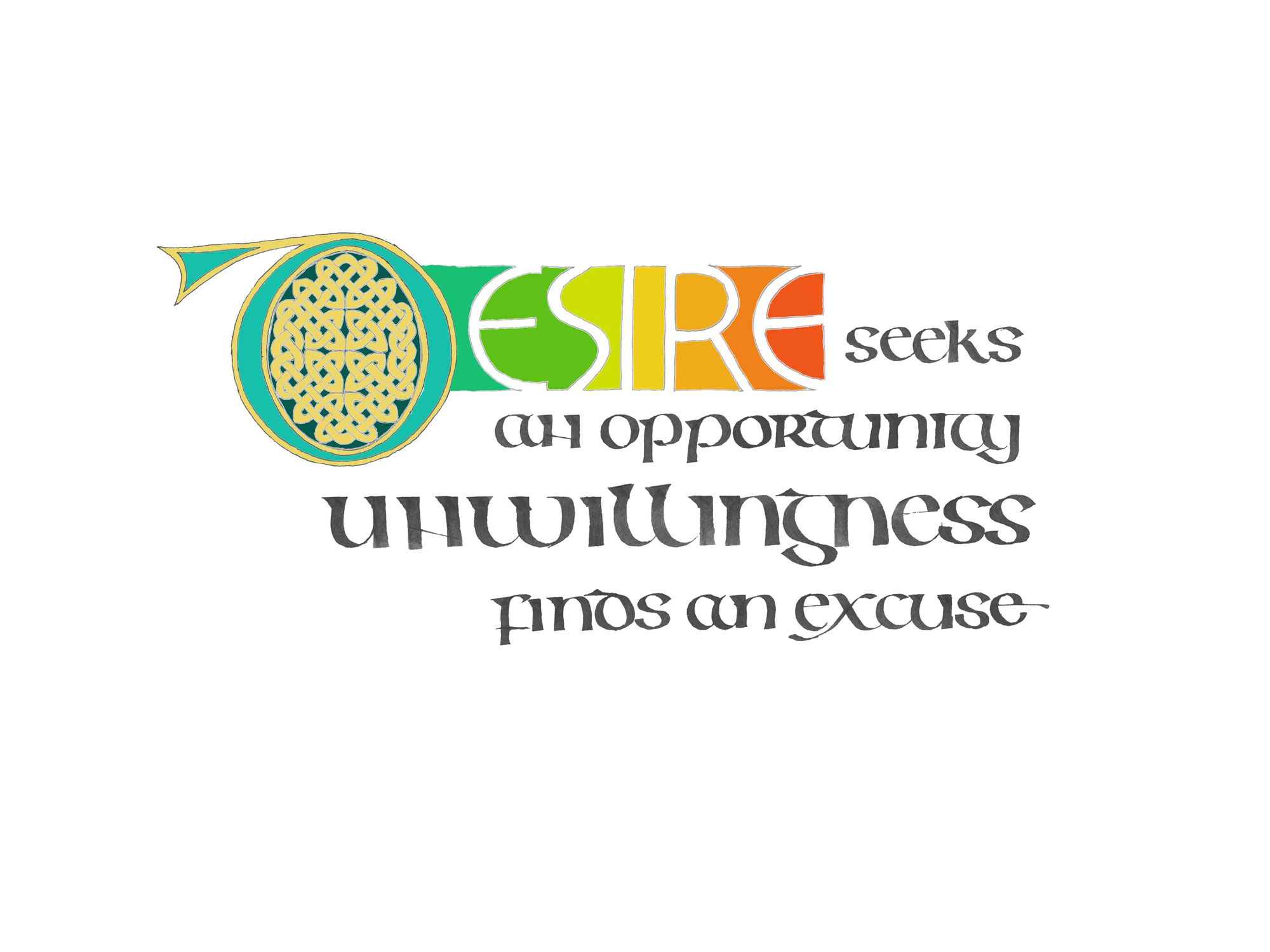
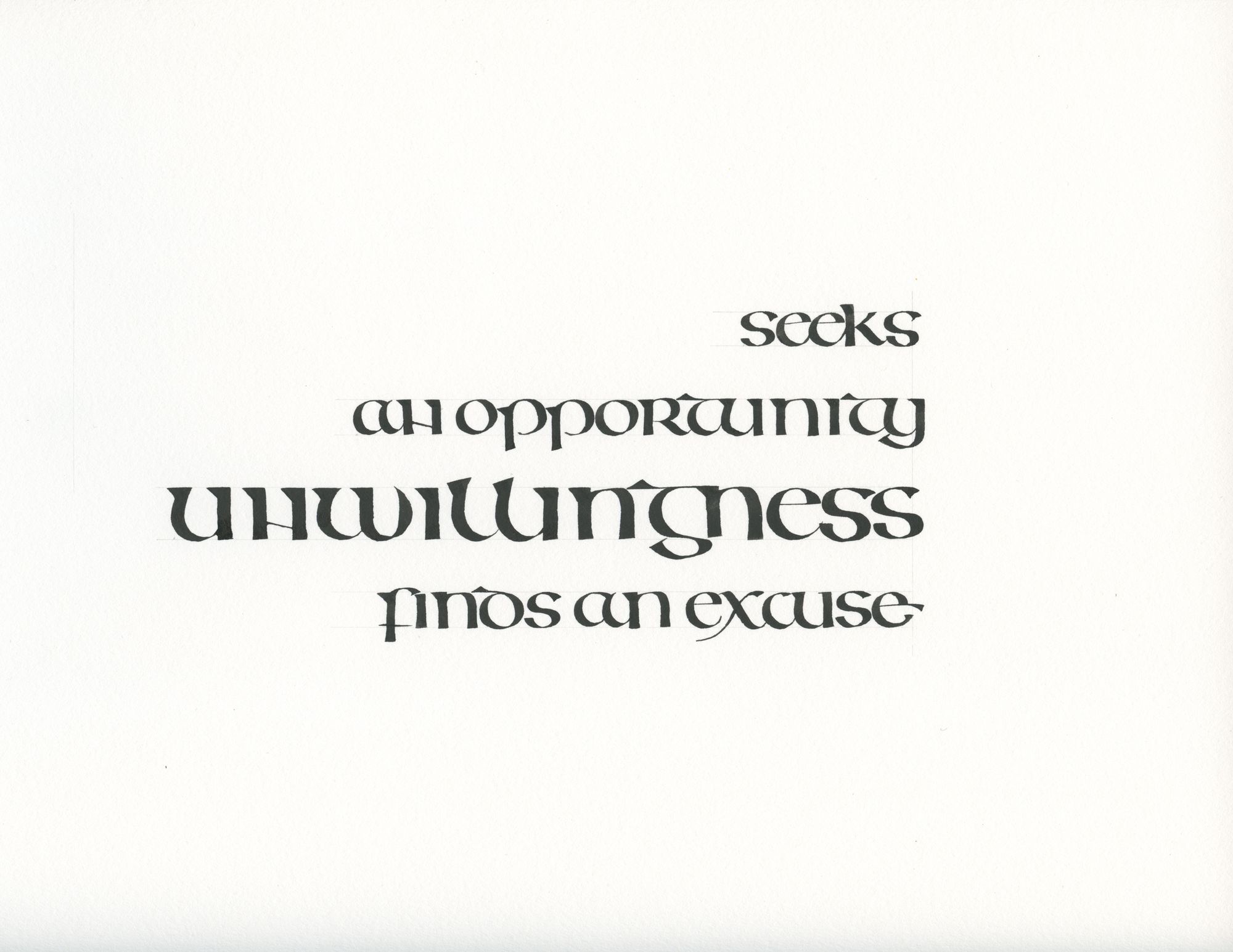
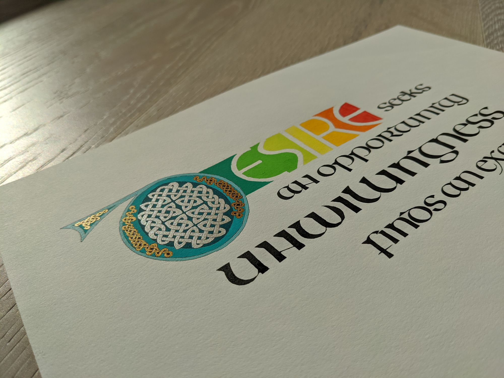
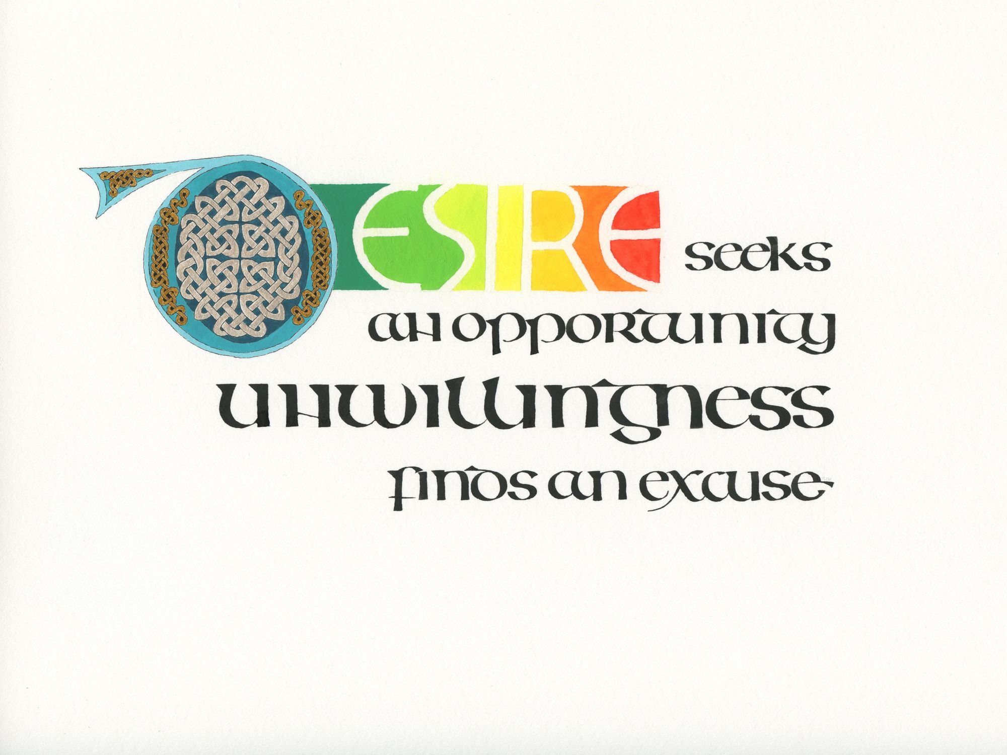
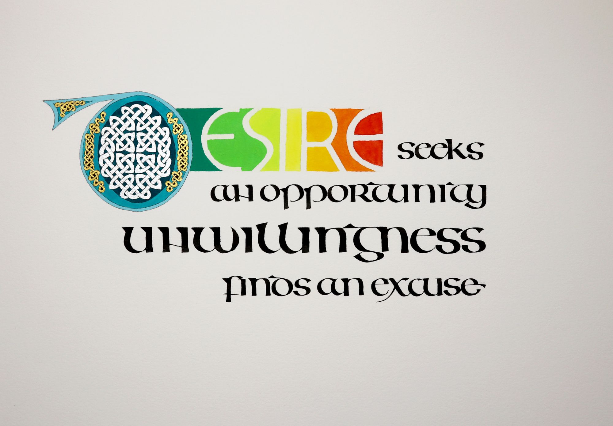
The text that I chose for this project is a quote by my dad. “Desire seeks an opportunity, unwillingness finds an excuse”. Every time I said as a kid that I really wanted something, but had an excuse for not doing it, he would say these words. Back then, it made me mad. Now, I can see exactly what he means. If something truly is your heart’s deepest desire, you will find a way to achieve it.
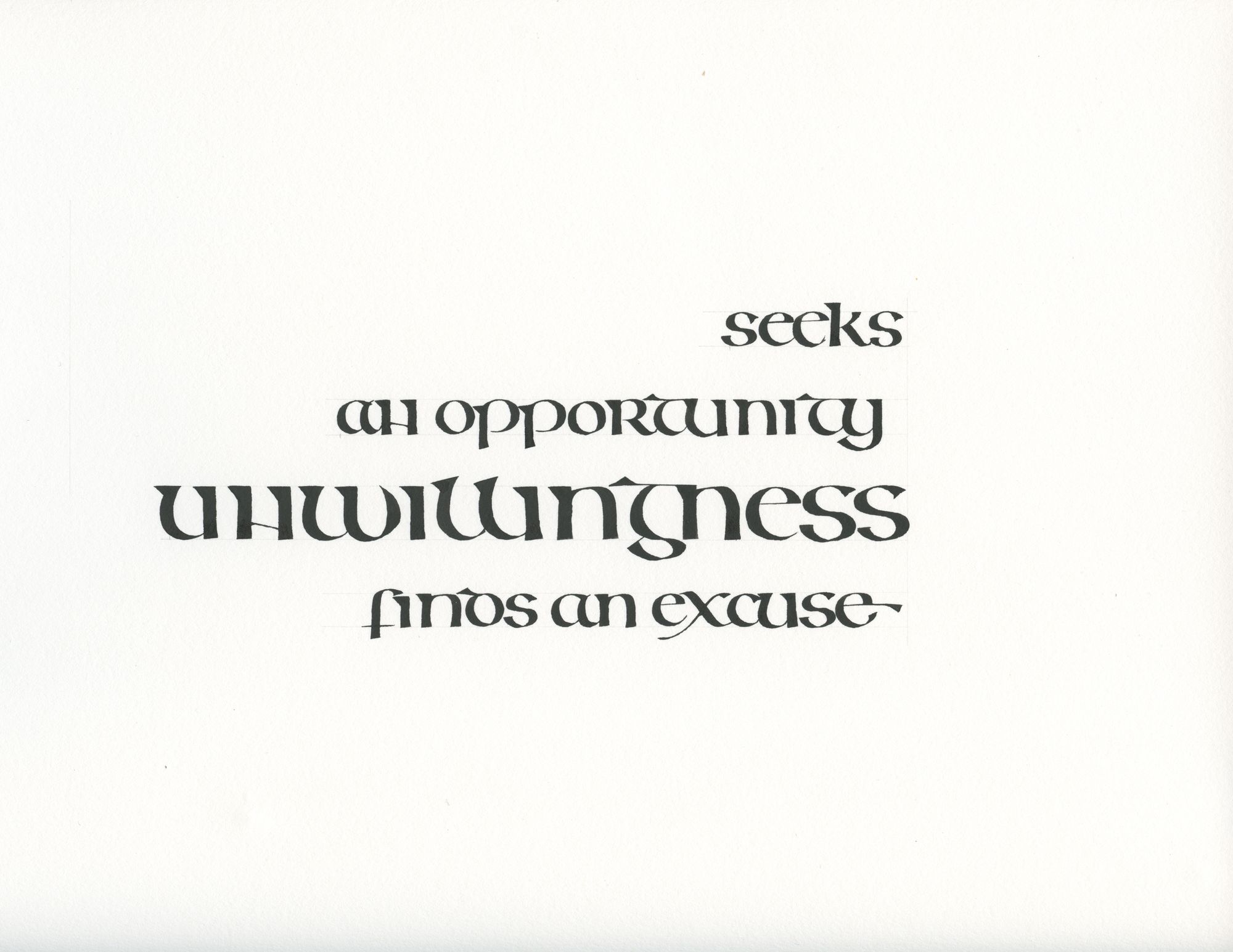
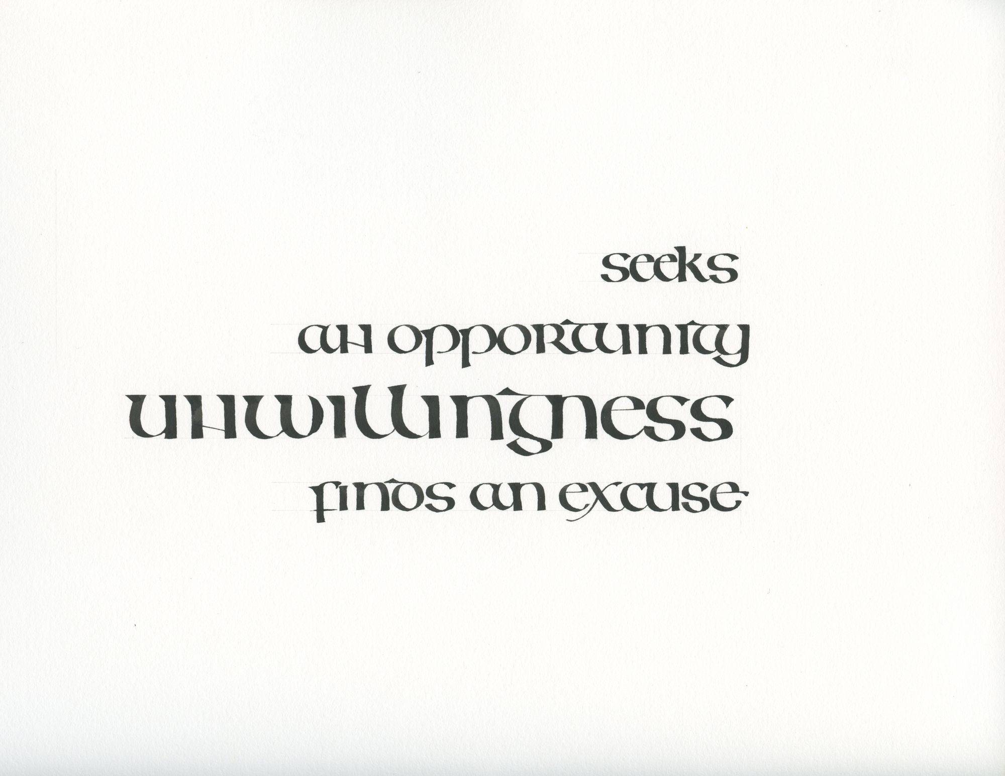
I had a rough idea that I wanted some of the words to be larger, and other ones to be smaller. I wrote them out to get a sense of scale.
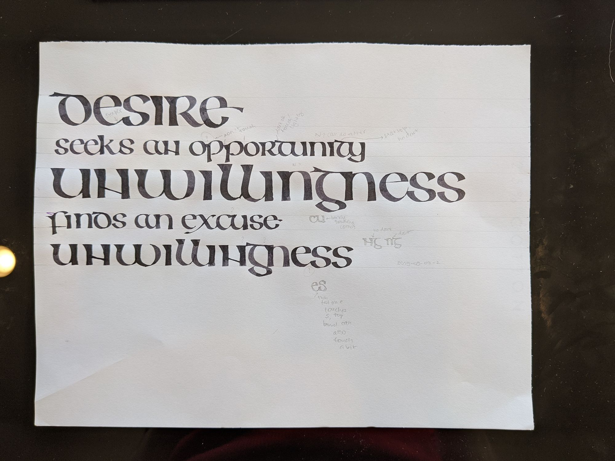
I immediately knew that “unwillingness” would have to be in a smaller size to have a reasonable line length, which is why I wrote it out once more at the bottom.
To come up with a layout, I cut up the page into words in Photoshop, and moved them around until I found something that I thought was interesting.
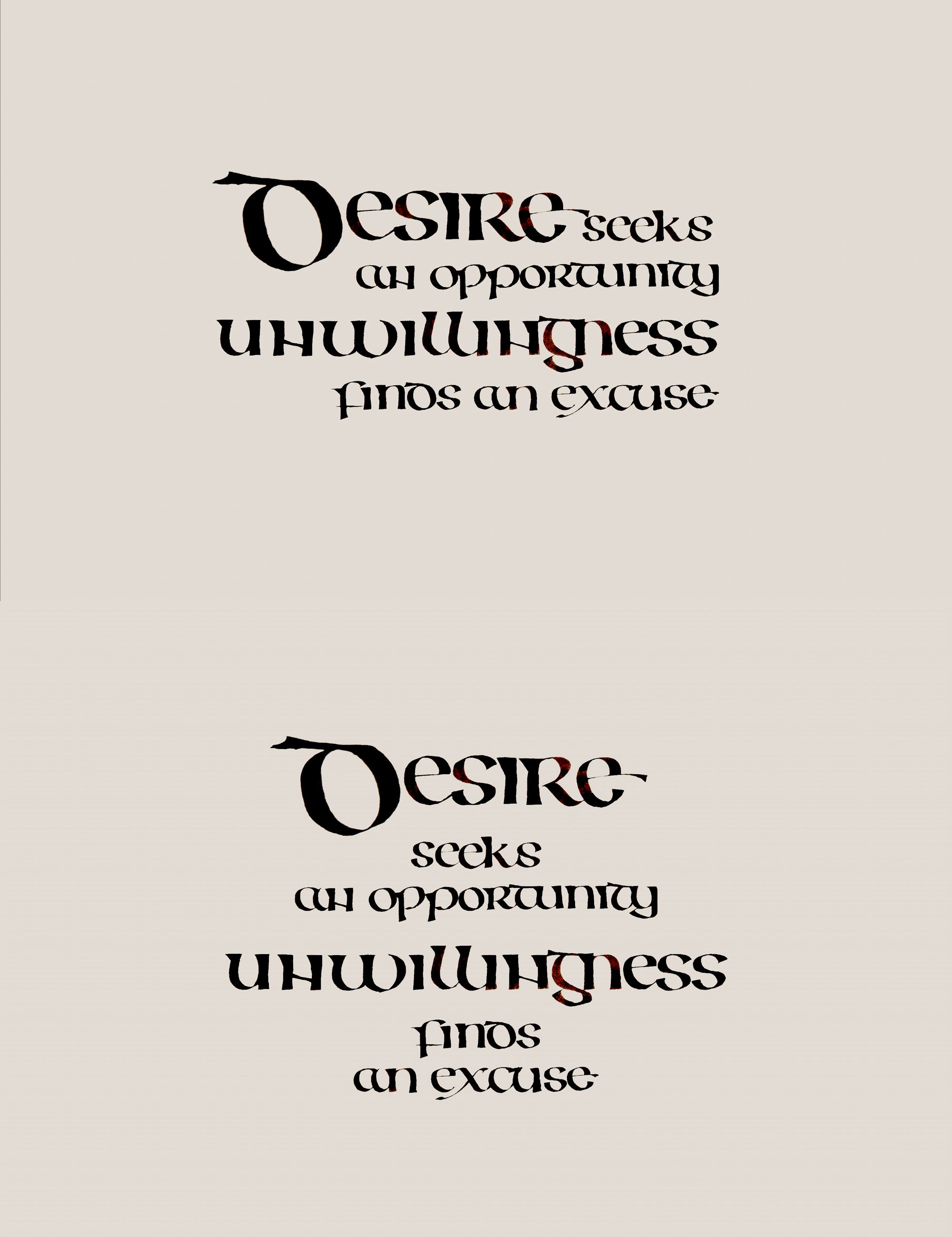
I had two options initially, but the top one definitely has a much stronger composition, so I went with it right away.
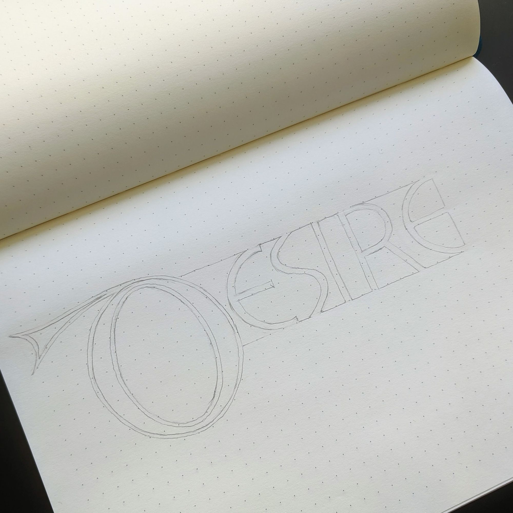
As I looked through the Book of Kells, I realized it would be cool to make not just the first letter decorated, but the whole first word.
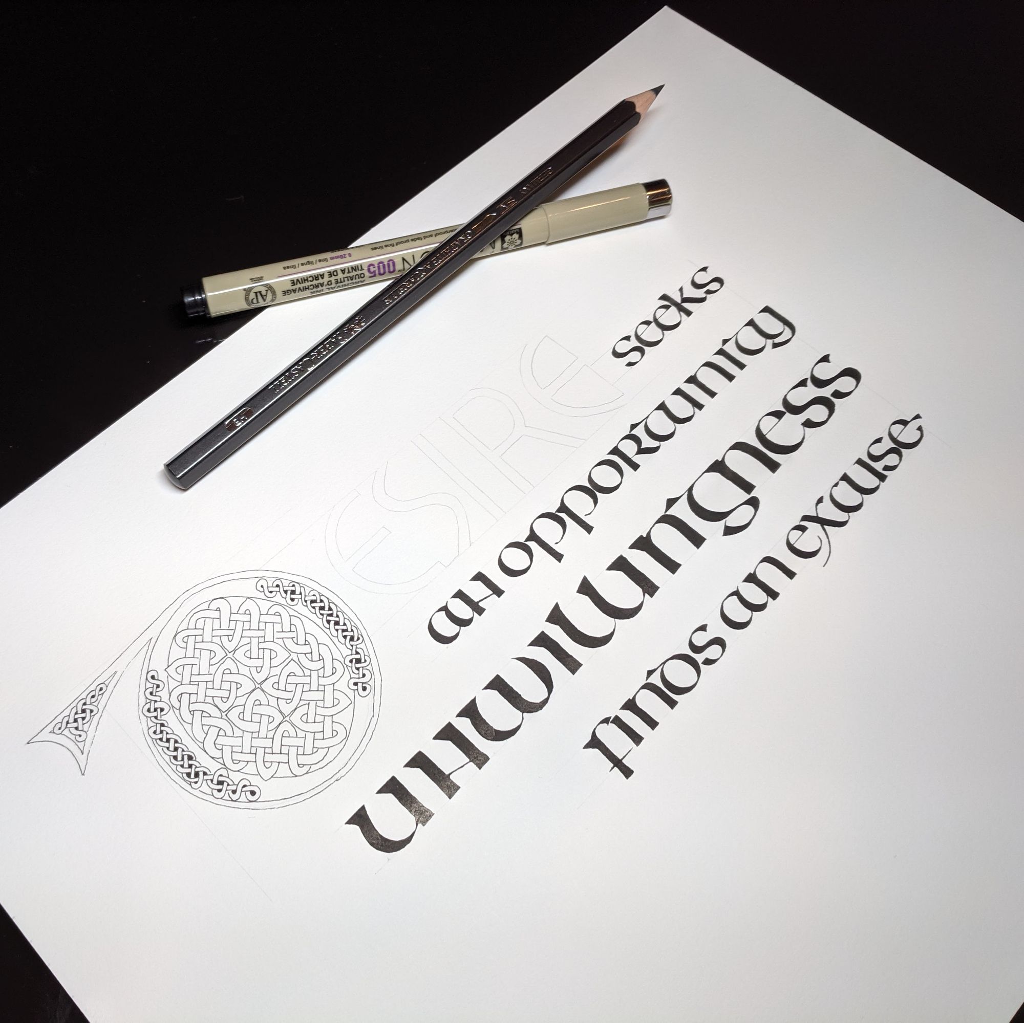
I wrote out the rest of the words to create the layout I wanted, and quickly sketched in the word “desire”.
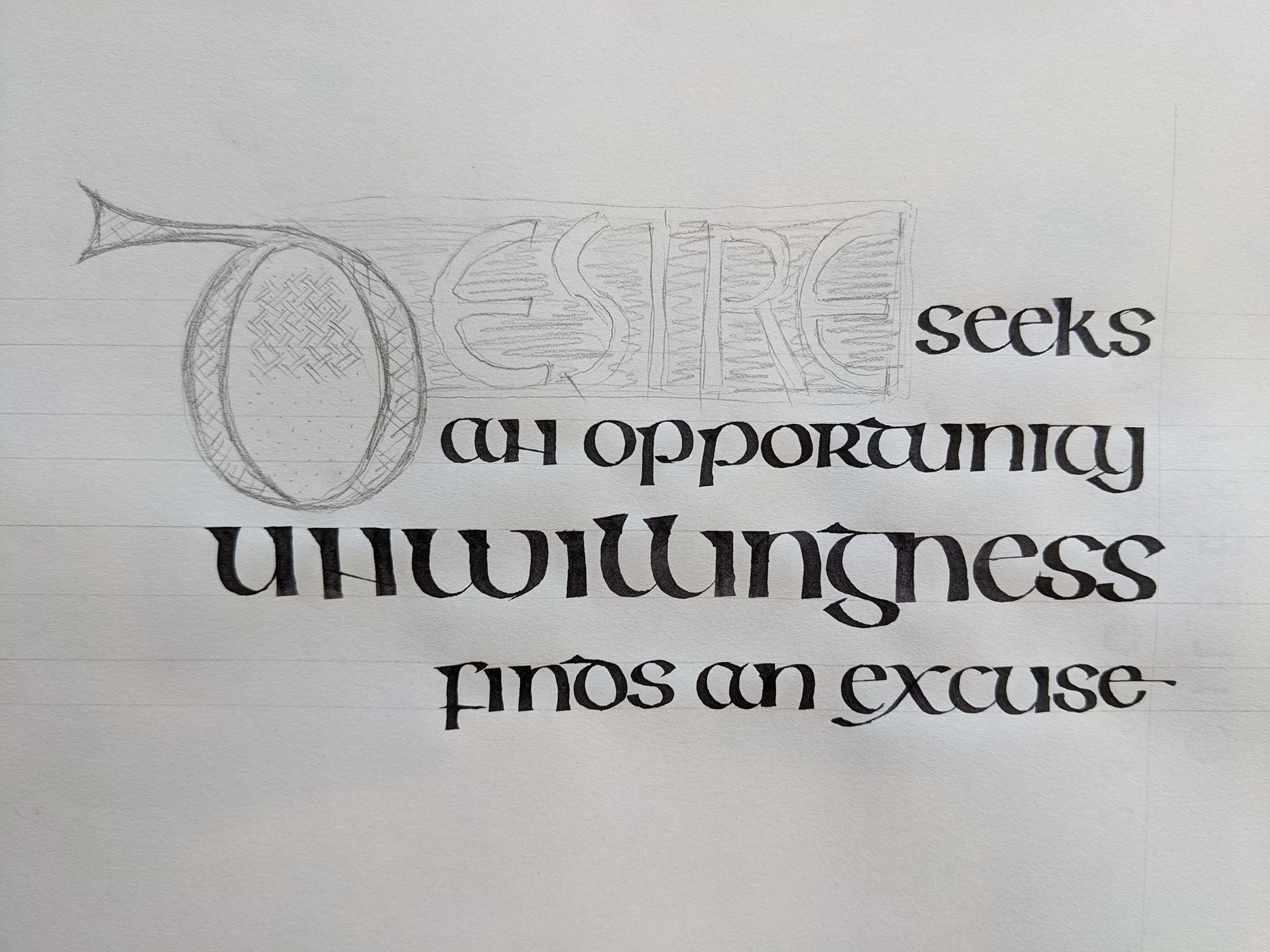
I then went on to refine the letter forms for the letters, and to create the pattern for the initial letter.
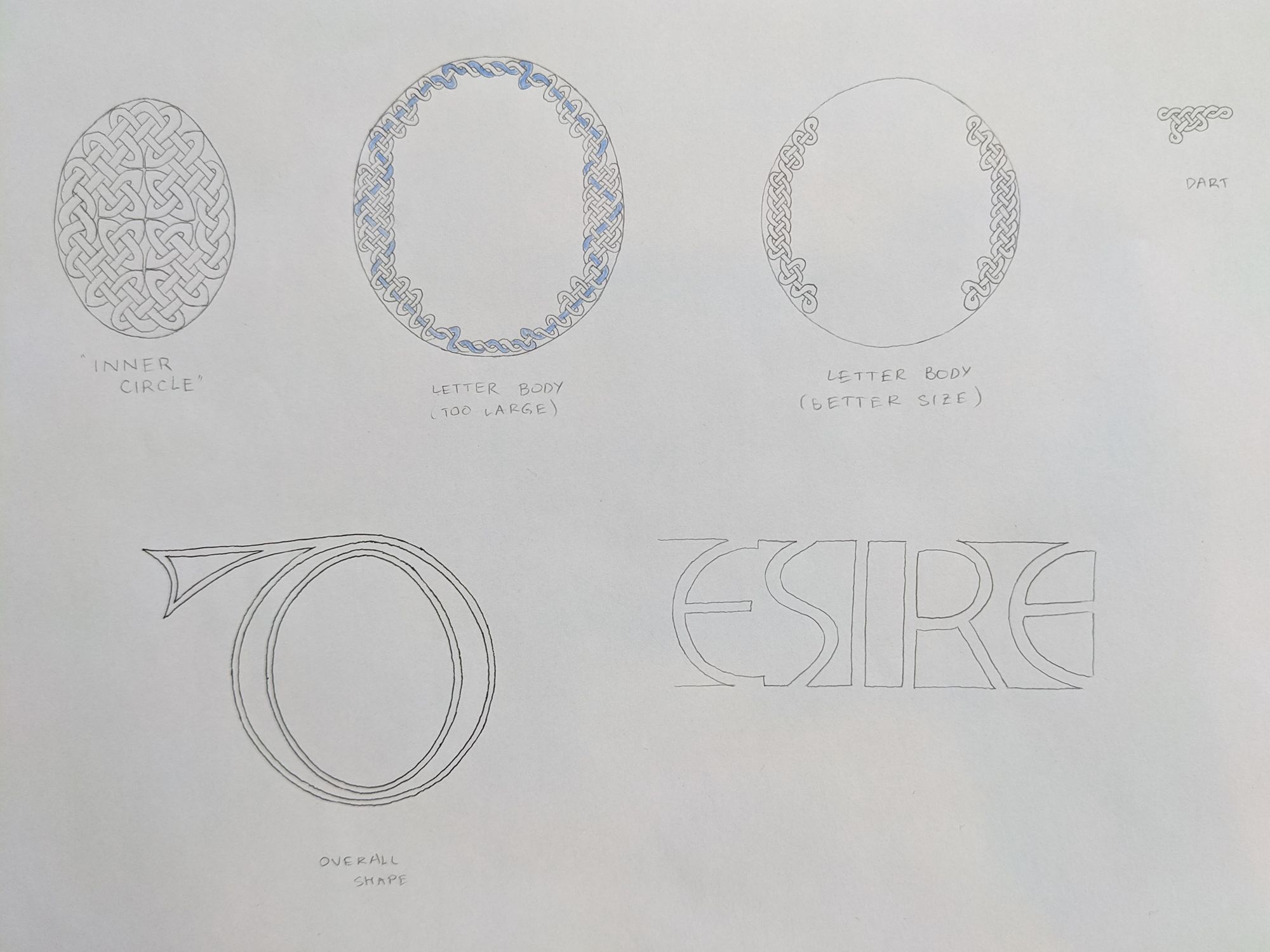
My first attempt to fill the letter with a pattern resulted in something that was too large, so I had to create a more delicate version of the knot work.
I put the main text and the decorated letters together in Photoshop, and added some color.
Now, just the simple thing remained: putting it all together. I spent some more time practicing the letter forms before writing out the final version.
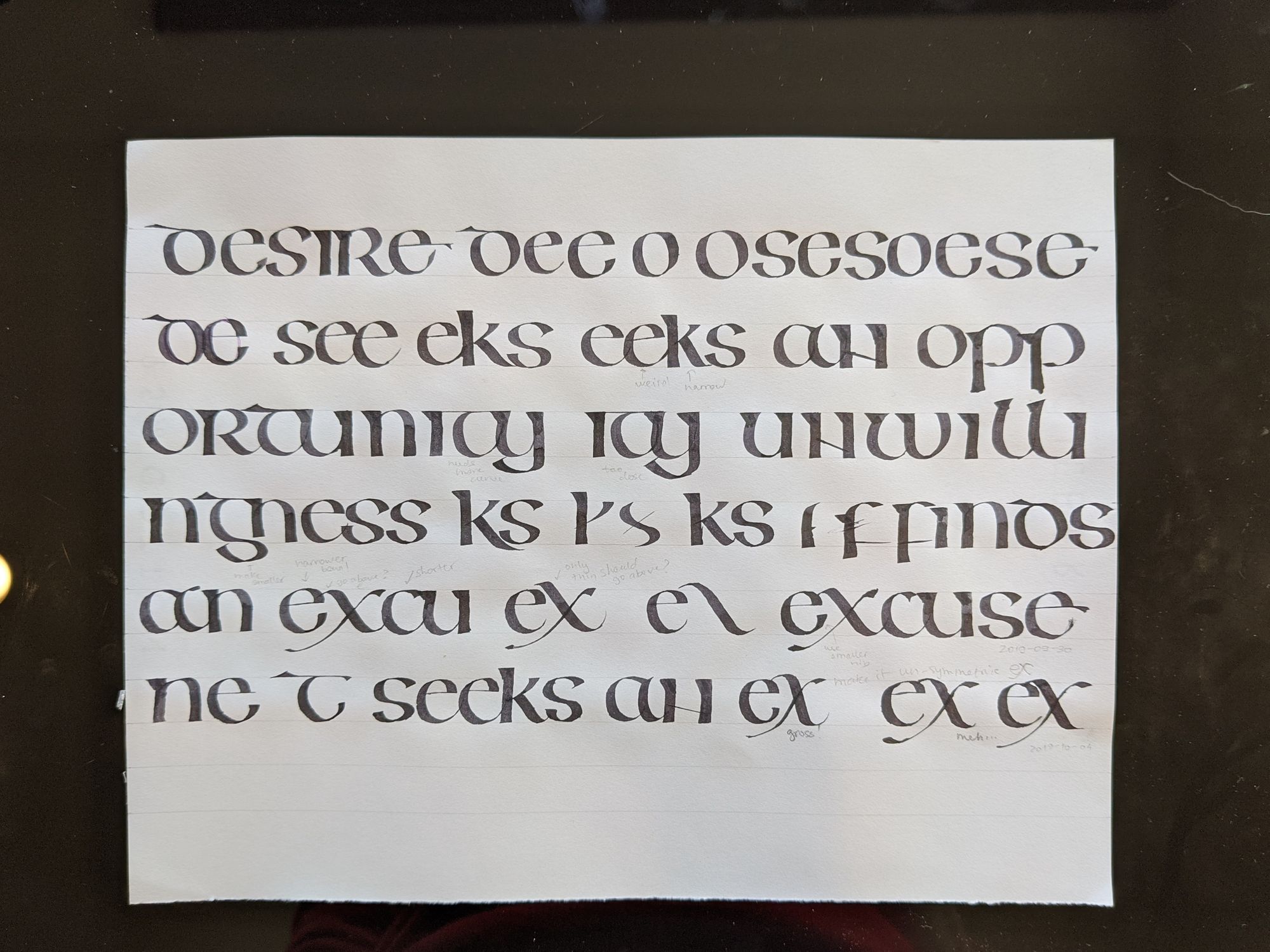
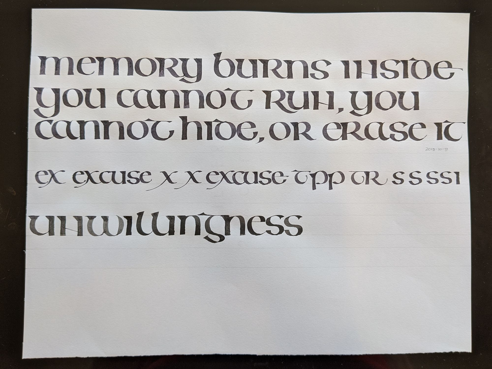
I also wrote out some unrelated text to make sure I wasn’t practicing just the few letters I needed. I like how it turned out, even though it was a warm-up piece, and I have no intention of going any further with it.
Finally, I felt ready to write out the text, and did it 3 times.
To my eye, each of them has some defects in it. I decided to go with the version that had the best alignment, even though some of the letters could be improved. I chose not to make yet another version, since I wanted to finish this project, even if it turned out a little imperfect.
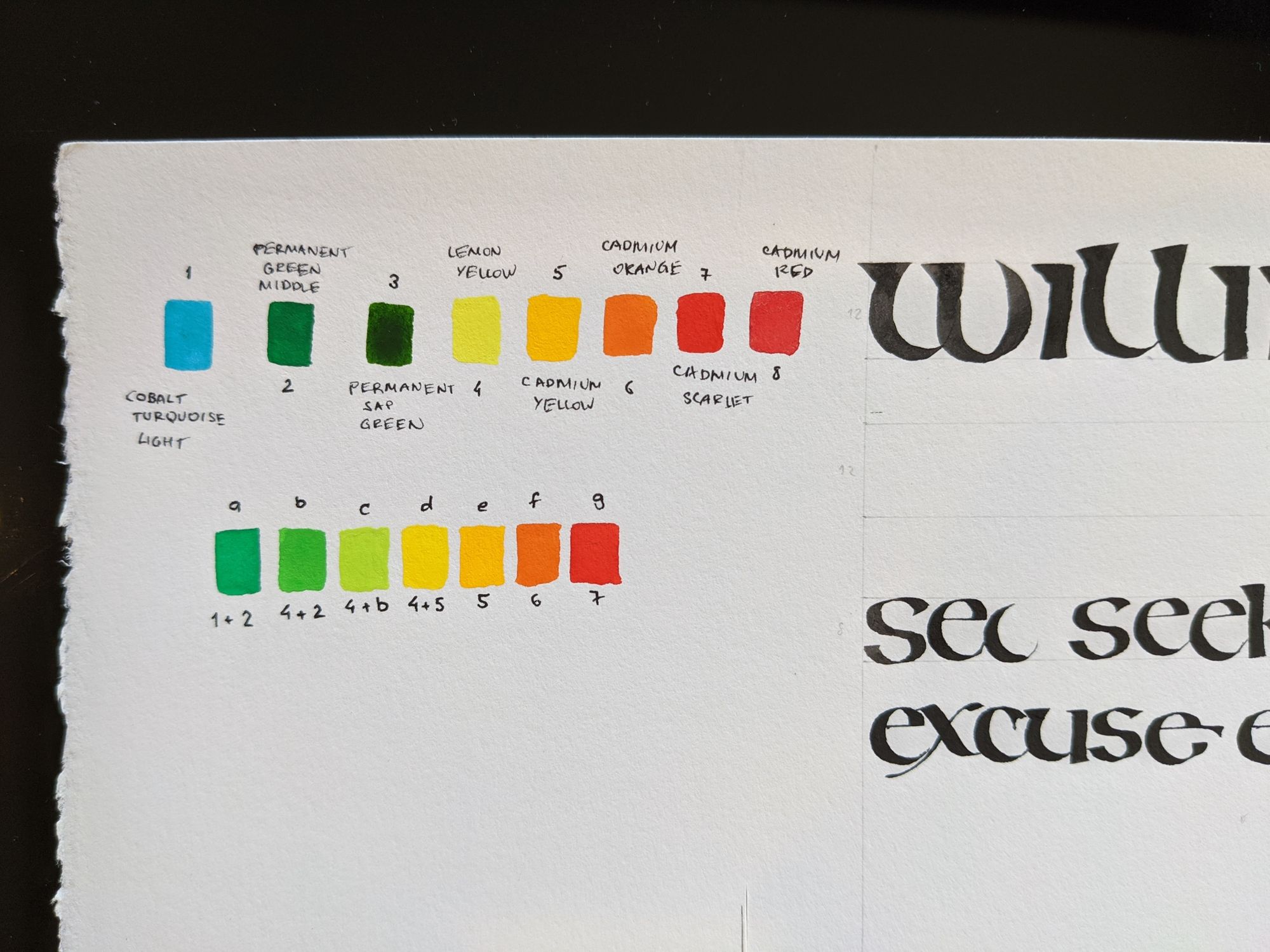
I also spent some time figuring out how to mix the gouache and watercolors I have to get the colors I want. In the end, I made a small mistake, and one of them was much thicker than others, but it doesn’t show too much after the piece dried up.
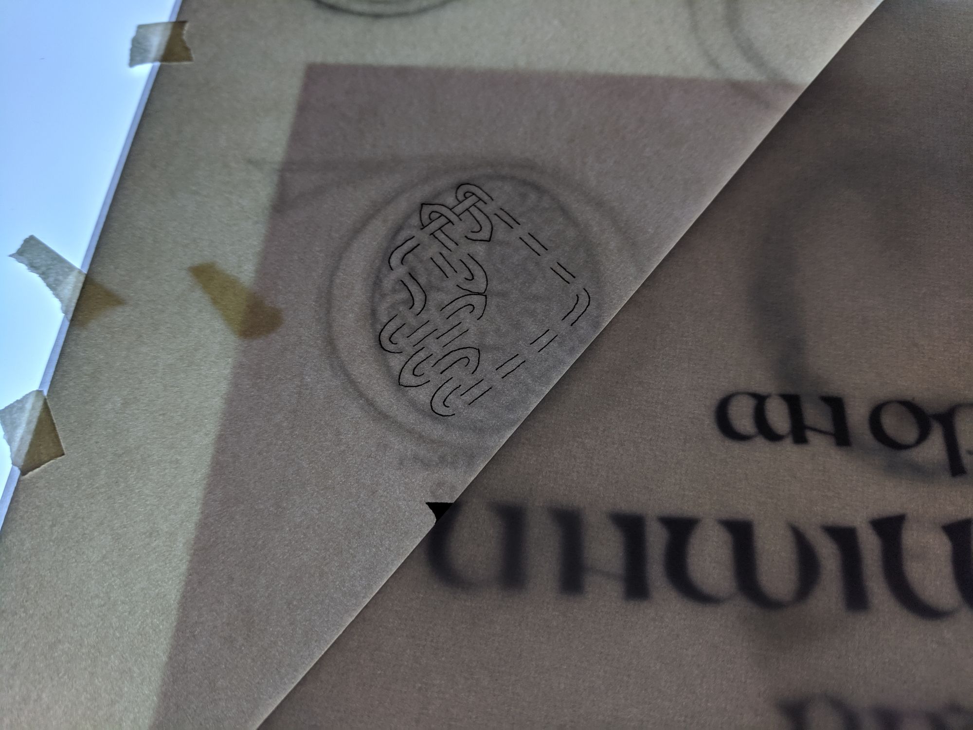
I traced the decorated letters onto the chosen version.
Then, I filled the letters that I wanted to keep white with masking fluid.
Next, I filled out the spaced between the letters with color.
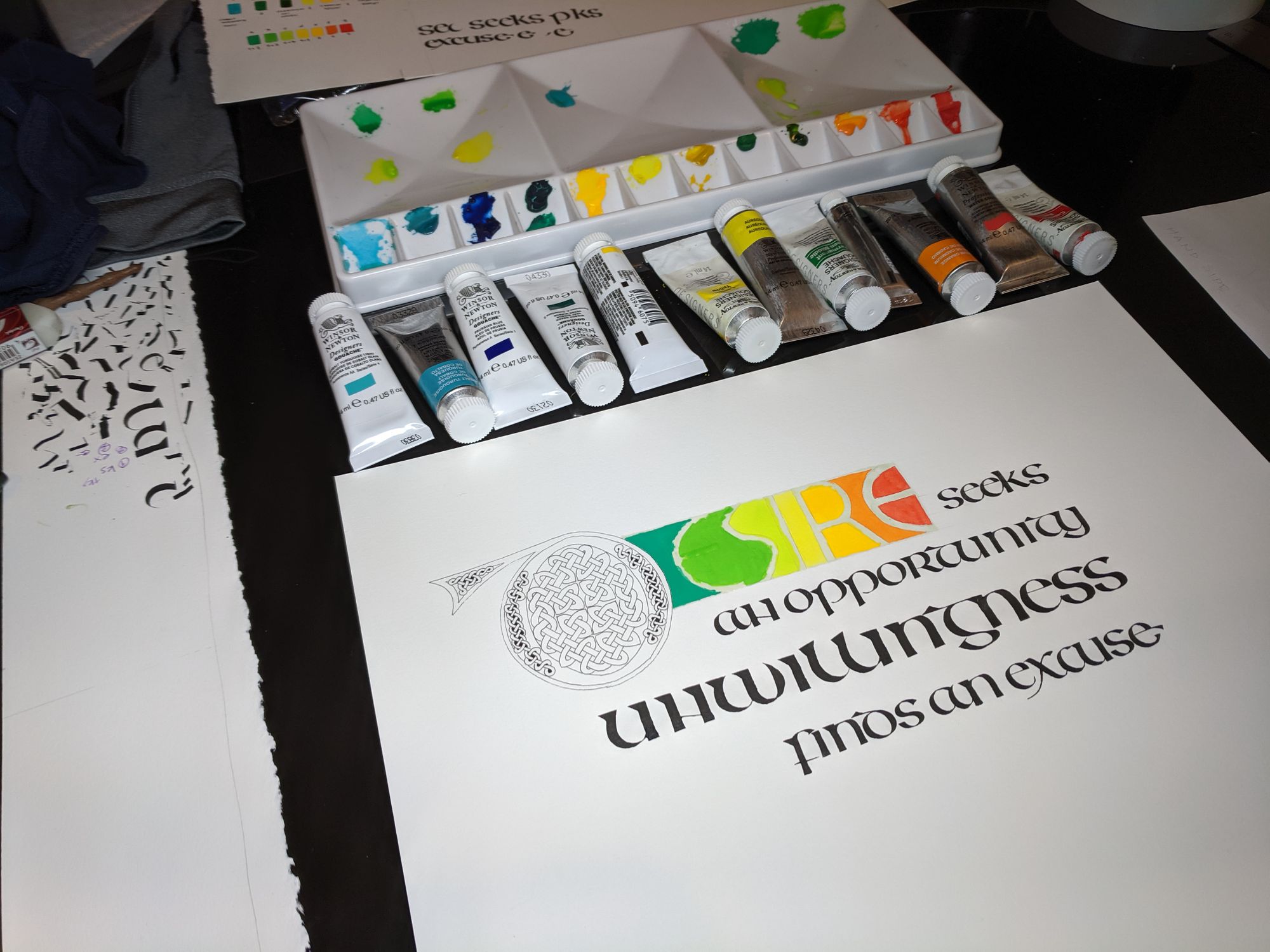
The final part (that probably also took longest) was coloring in that letter “d” at the beginning. I used turquoise, silver, and gold colors for it.
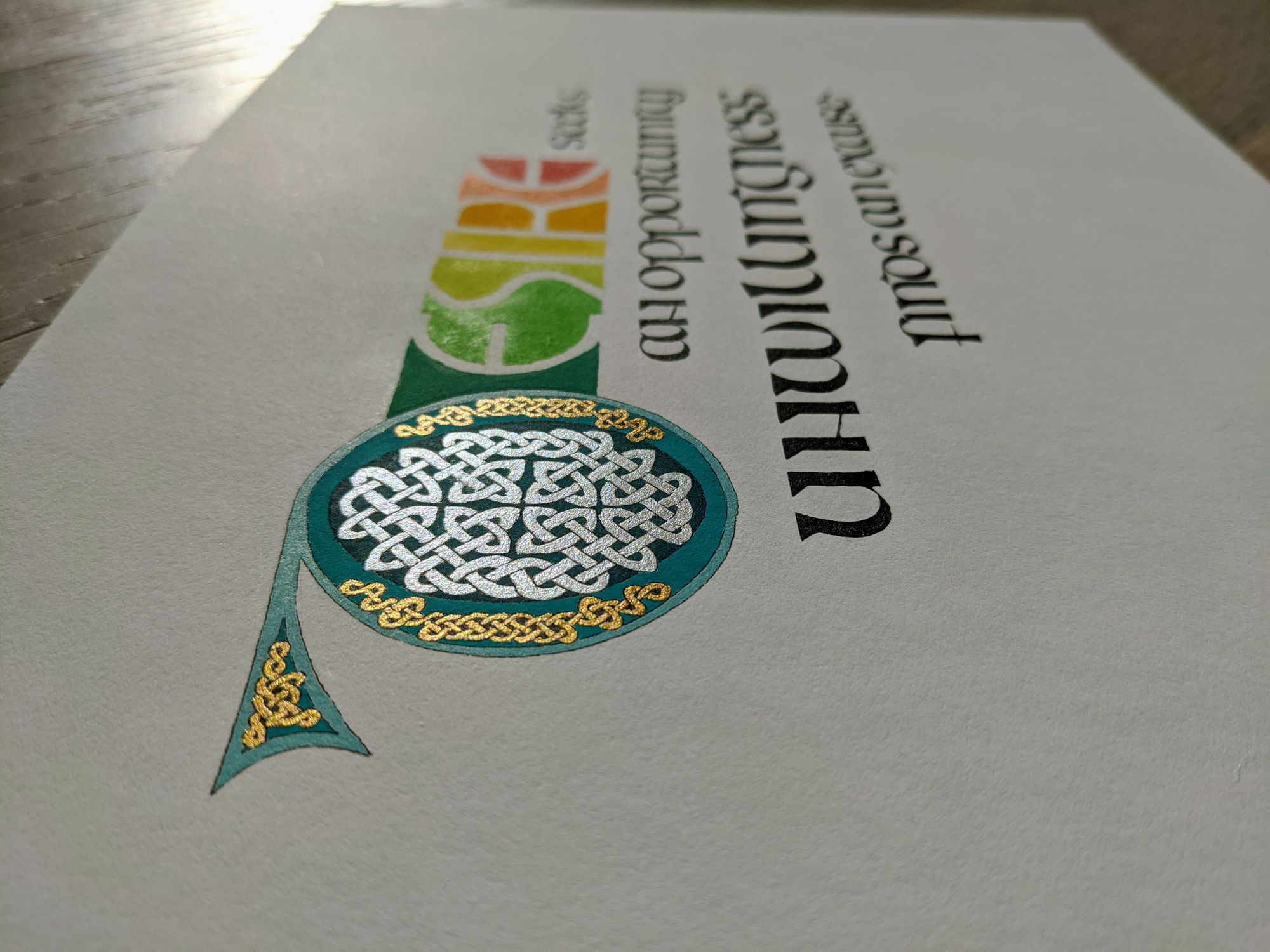
In the scanned version, you can see the piece straight on, but the silver and gold don’t look as good in my opinion.
And if silver and gold look good, that means they are the brightest thing in the image, so the white has to be not-as-white.
Comments