How to photograph calligraphy
When you create a beautiful piece, and want to share it with others, you need to take a good picture of it. While the photography part may sound daunting to some, there are actually just a few simple things to watch out for.
I'm going to go over the dos and don'ts, and also share some tips using my latest piece (white letters on indigo background) as an example.
Remember, you want to take a shot that will require as little editing as possible, but skillful editing can make a huge difference.
- Do I need a camera, or can I use my phone?
- Clean your lens!
- Angle and alignment.
- Lighting.
- Editing tips.
Do I need a camera, or can I use my phone?
It depends on how you are going to use the photo. If it's just going on Instagram, of course use your phone. If you would like a high-resolution version (for example, to create prints), you still need a DSLR (or a scanner) as of 2020. The phones have become much better in the past few years, but even top-of-the-line ones are not quite there yet.
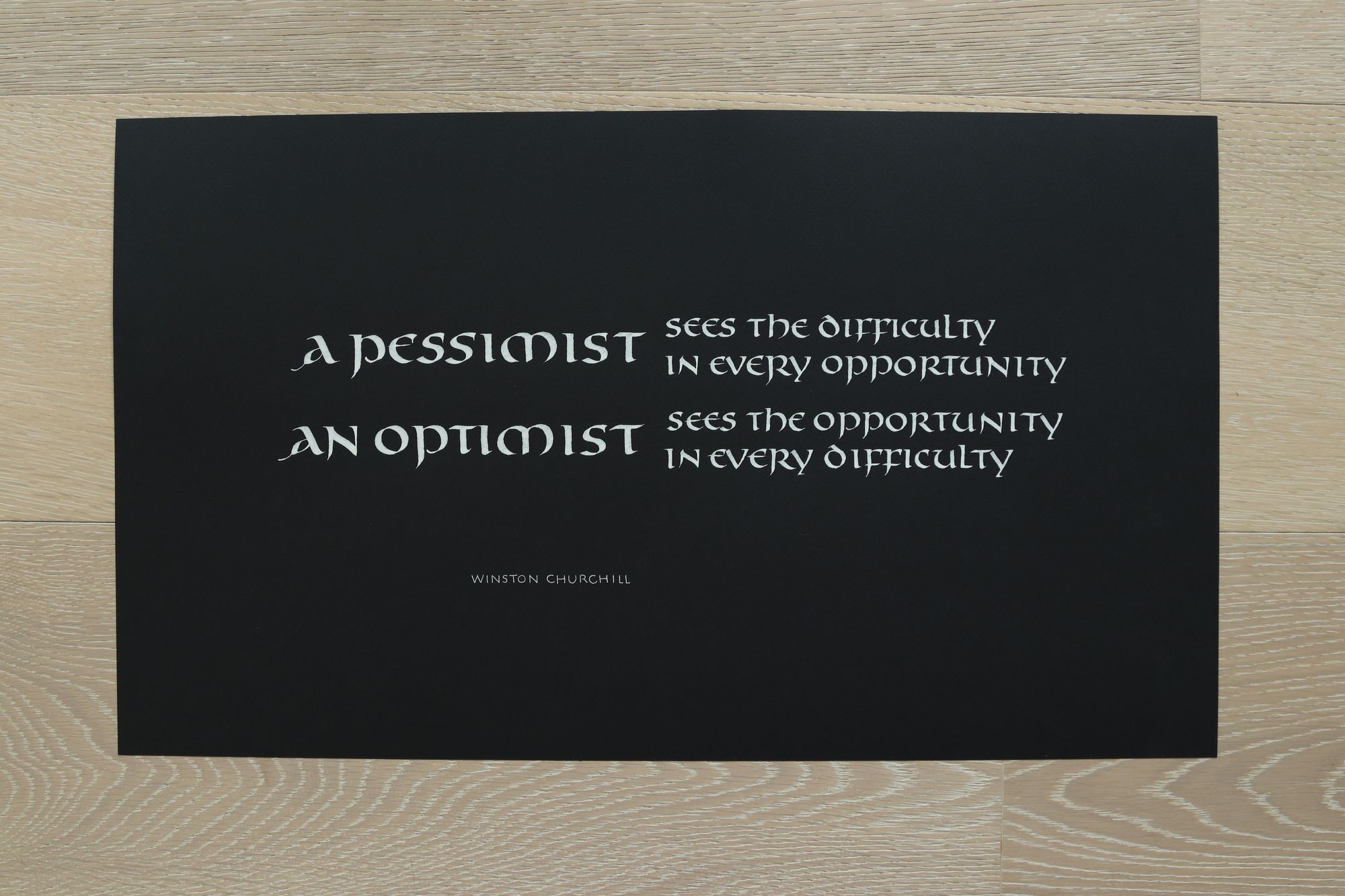
This is a photo I took with my camera:
And this one is from my phone:
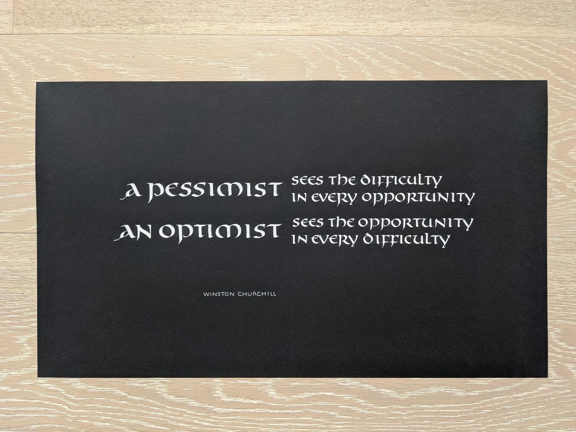
At a first glance, you may think that the phone one looks better because the colors and contrast are more attractive. That is true, and if you were to just use these without further editing, the phone photo would be better.
Here are fragments of both images at 100% resolution:
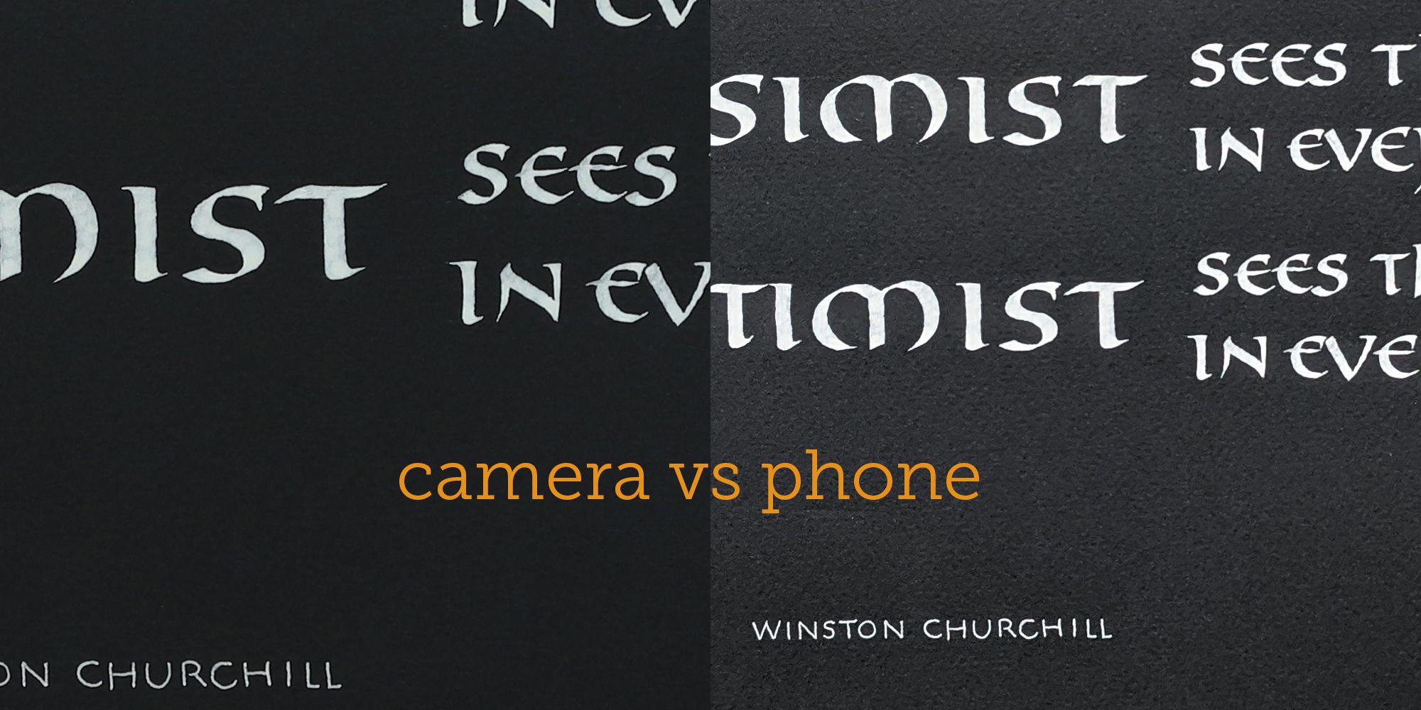
A couple things to note:
- The camera has a higher resolution.
- The paper looks excessively textured in the phone photo.
- Even though the contrast in the camera photo is worse, it can be adjusted quite easily.
A note on scanners
You can get a much better resolution and sharpness if you scan your piece instead of photographing it.
However, there are 2 issues I have noticed with scanning:
- If your piece is too large to fit in the scanner (the one I'm using as an example is 11x19"), scanning a piece at a time and then combining the pieces is very annoying.
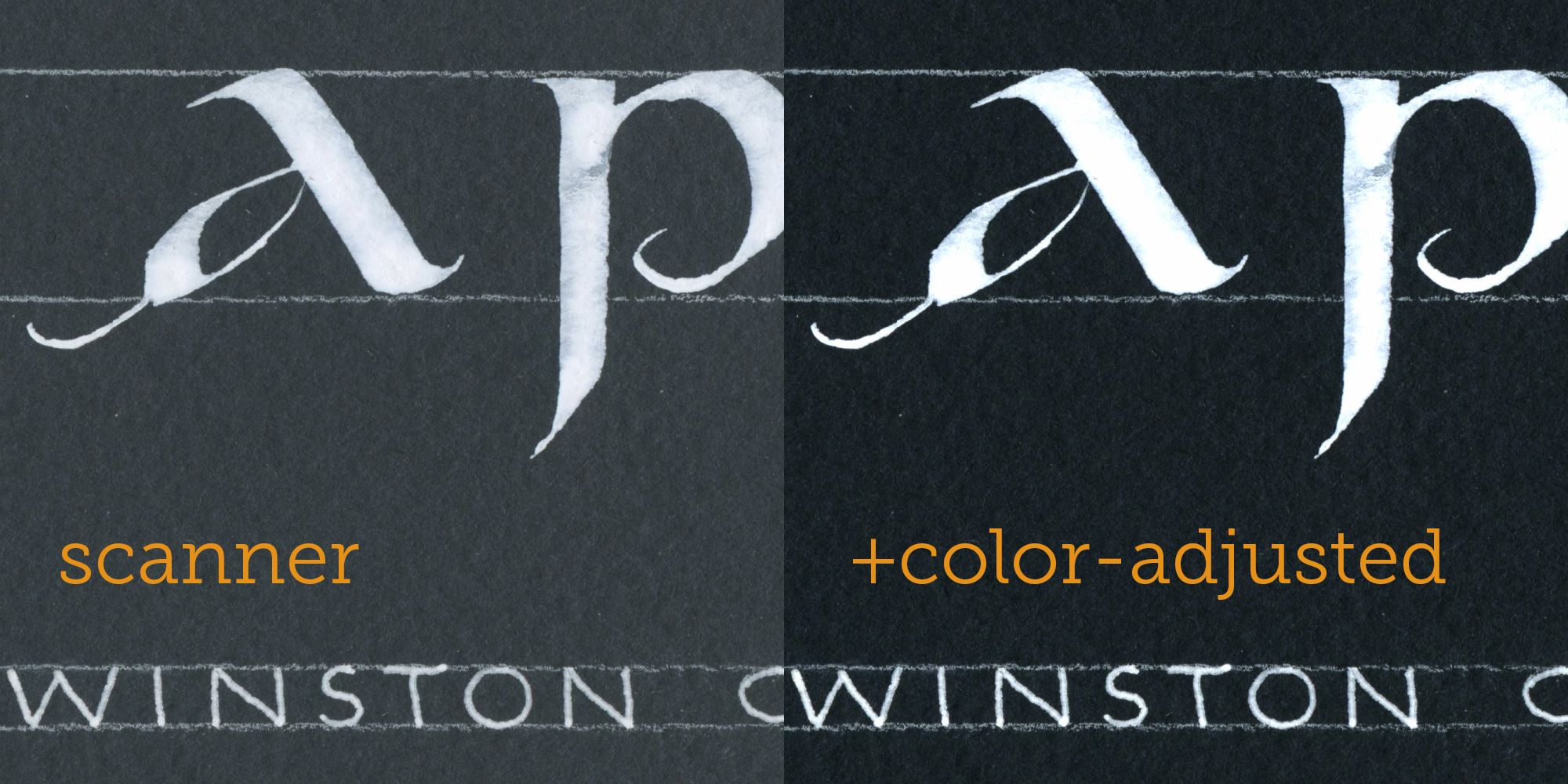
- Sometimes the scanner "bleaches" the colors too much.
Below is a scanned fragment of a piece of scrap paper from my project. As you can see, the sharpness and resolution are better than what my camera can do, but the paper color looks faded.
To give you another example, here is a different piece that I scanned (this is an unedited version straight from the scanner):
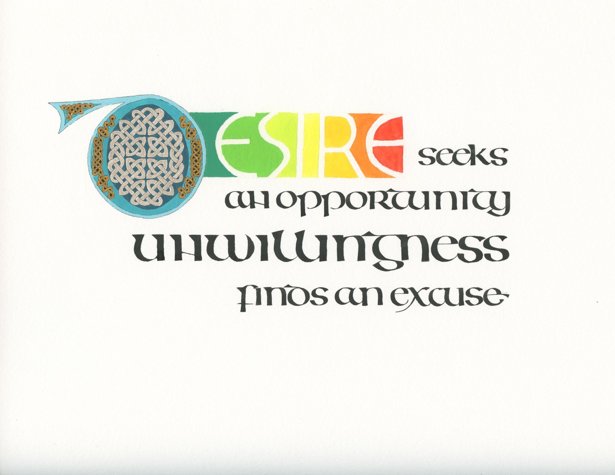
The silver and gold in the initial D look very flat, especially compared to an angle shot:
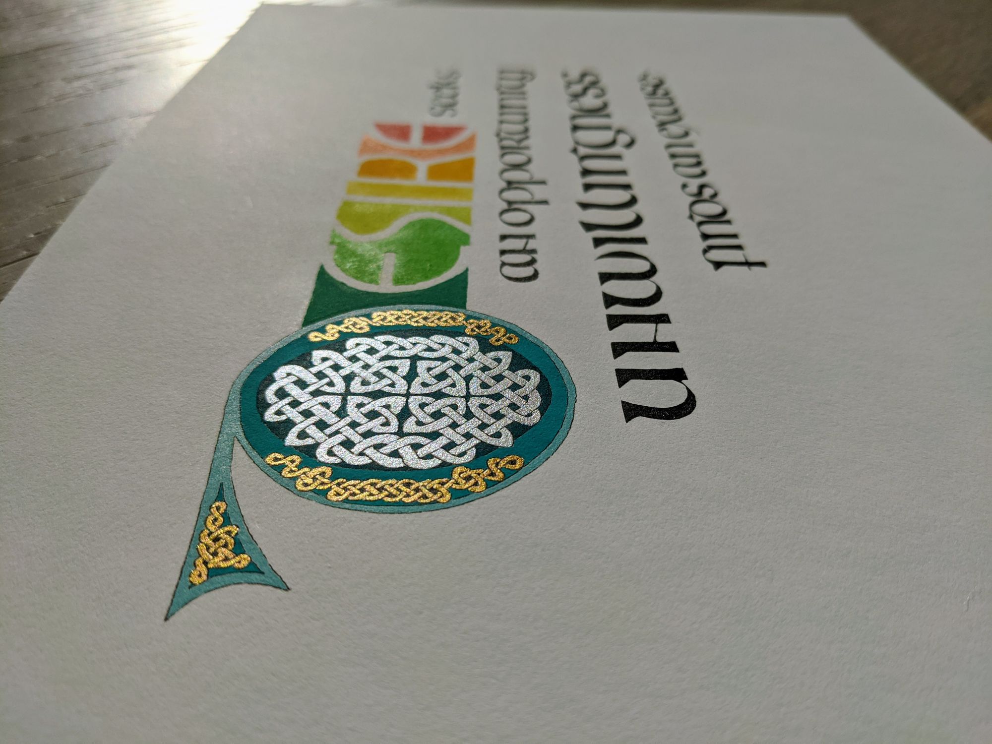
The bottom line is, you may need to try a few different tools, and see which one works best for your piece.
Clean your lens!
If you are taking the photo with your phone, make sure the camera lens is clean, and does not have any smudges on it. If the camera is dirty, your photo will look bad no matter how well you apply all of the other techniques below.
It's best to clean the lens with a clean, soft and dry cloth, so you don't scratch it. In a pinch, the hem of your T-shirt will do :)
Angle and alignment
Once again, these will depend on how you intend to use the image. For an artsy Instagram shot, any attractive angle is fair.
For my piece, I could have done something like this:
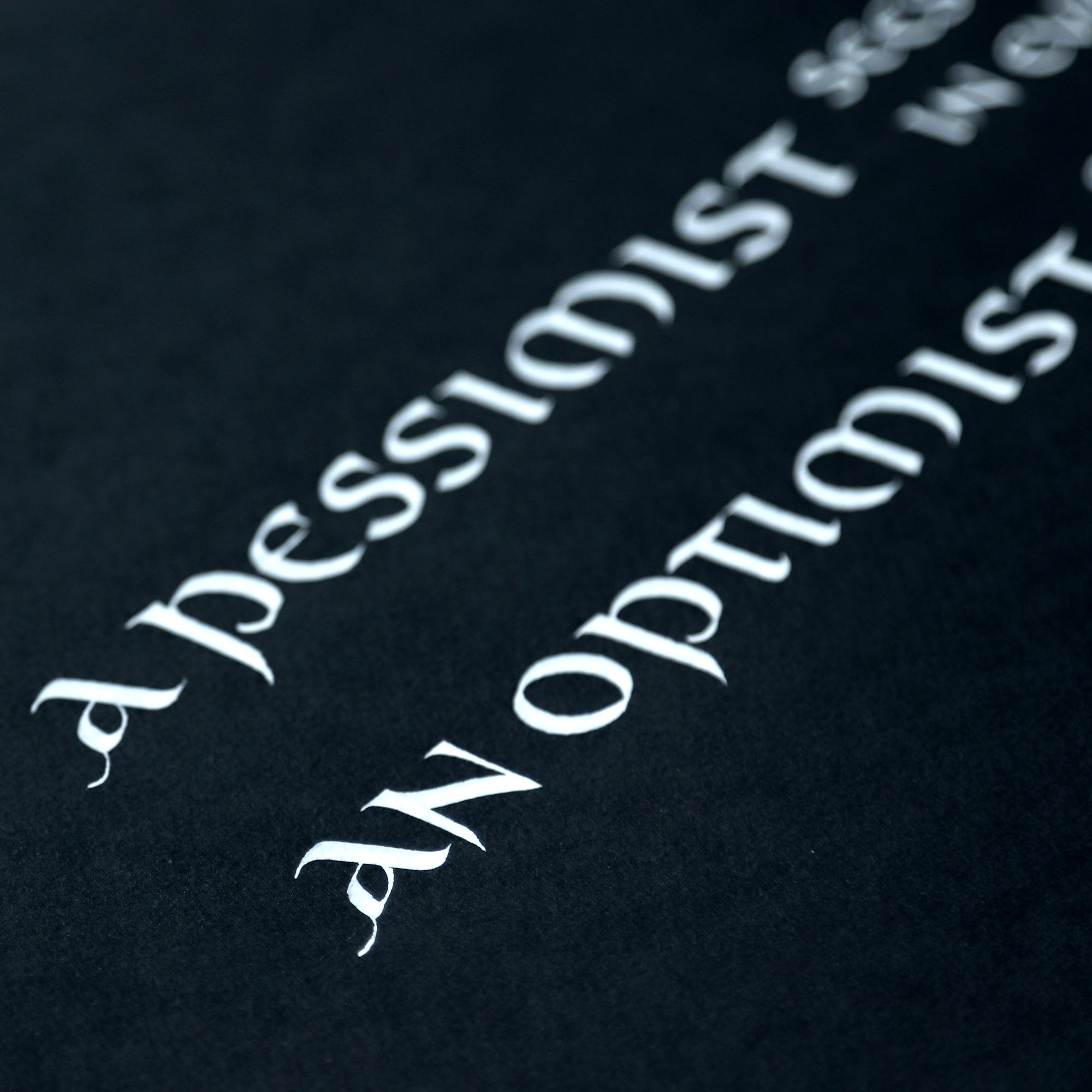
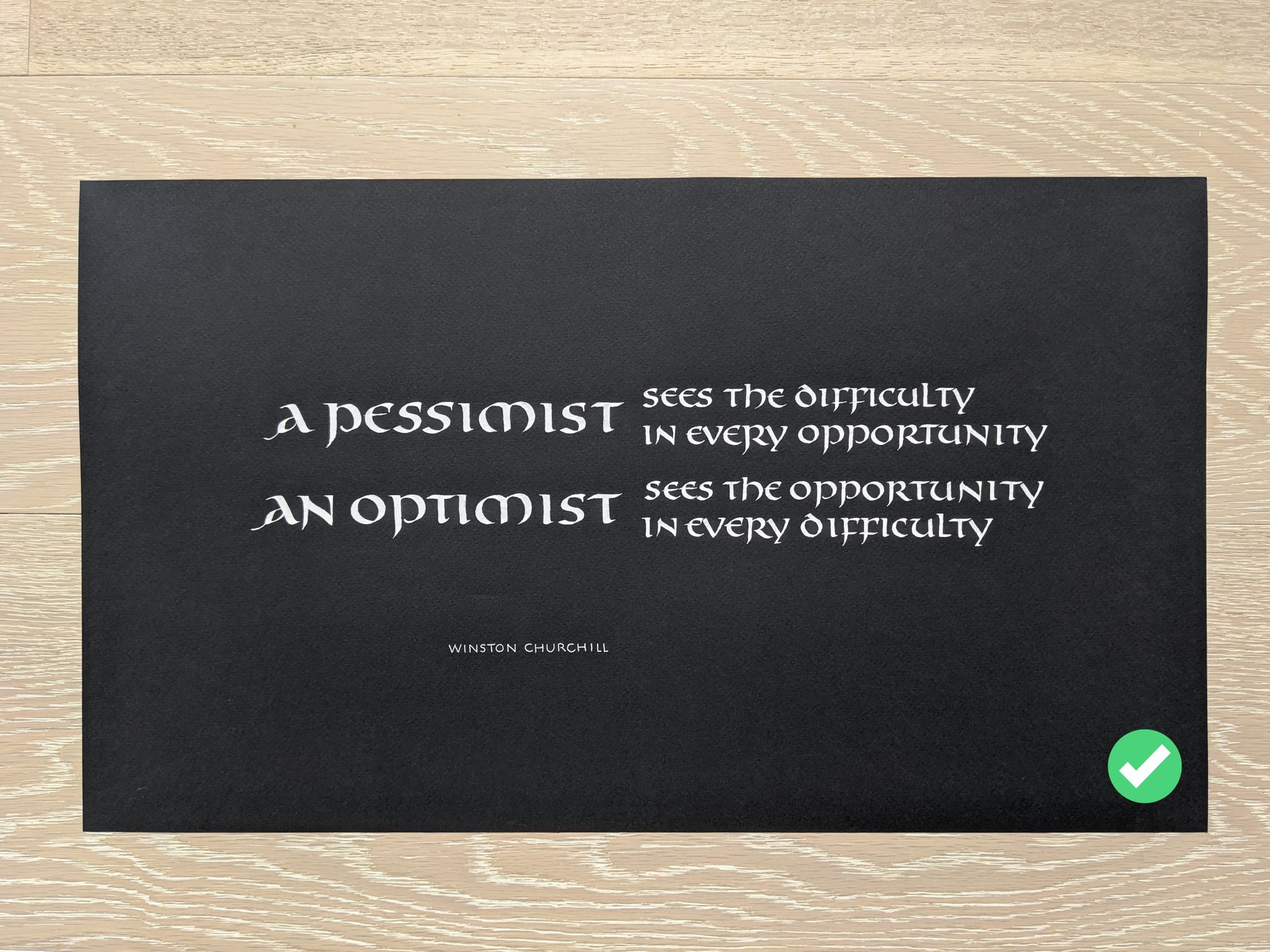
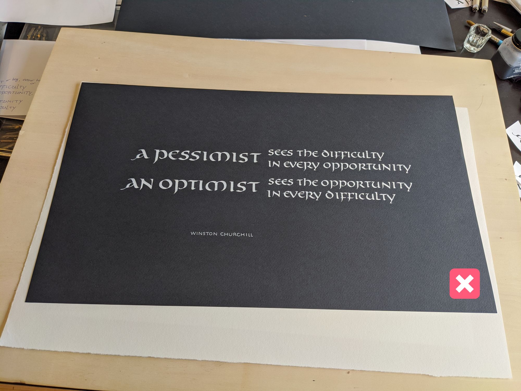
However, if you are looking for a "straight" shot that can be reproduced, and has the same geometry as the original, avoid tilting your camera. You want to take a photo that requires as little editing as possible.
Good example
Bad example
Lighting
Always take photos of your projects in good lighting! This will help you avoid wrong colors and grainy images.
Here is how I would rank different lighting options:
- Diffuse natural light (such as during a cloudy day) outside works best.
- If going outside is not an option, pick a spot by the window, but out of direct sunlight.
- Bright artificial lights may be made to work, but will never produce as good as a result, even with best editing and color correction.
- Poorly lit room will result in bad photos.
- The worst is when you have a shadow of yourself or your phone over the work.
Now I'm going to illustrate the difference by showing different shots of my piece taken in different conditions.
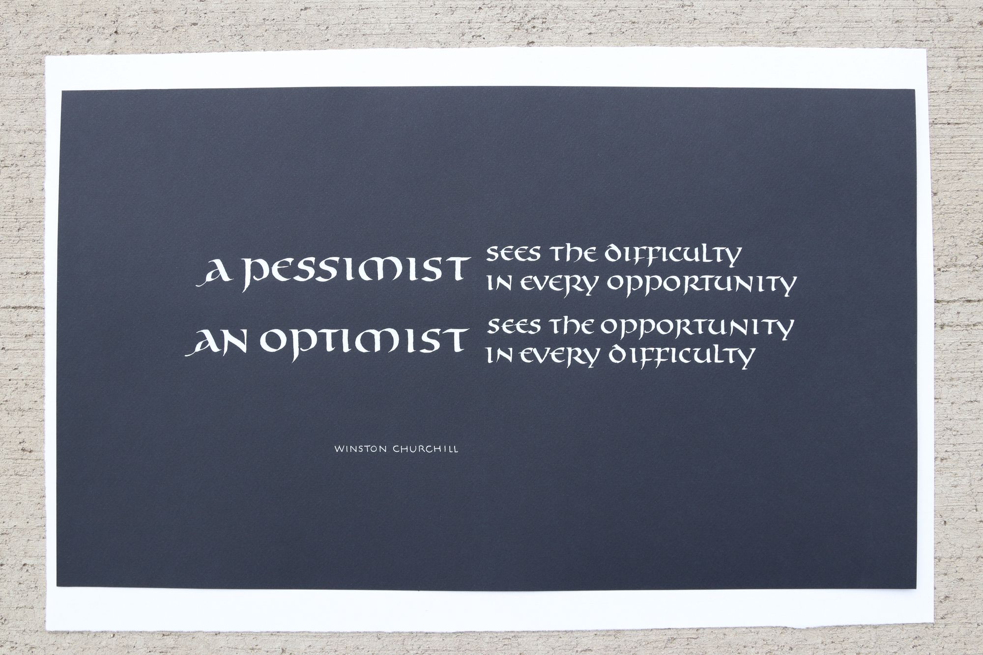
Natural light outdoors
Note that the color of the paper is most accurate in this shot.
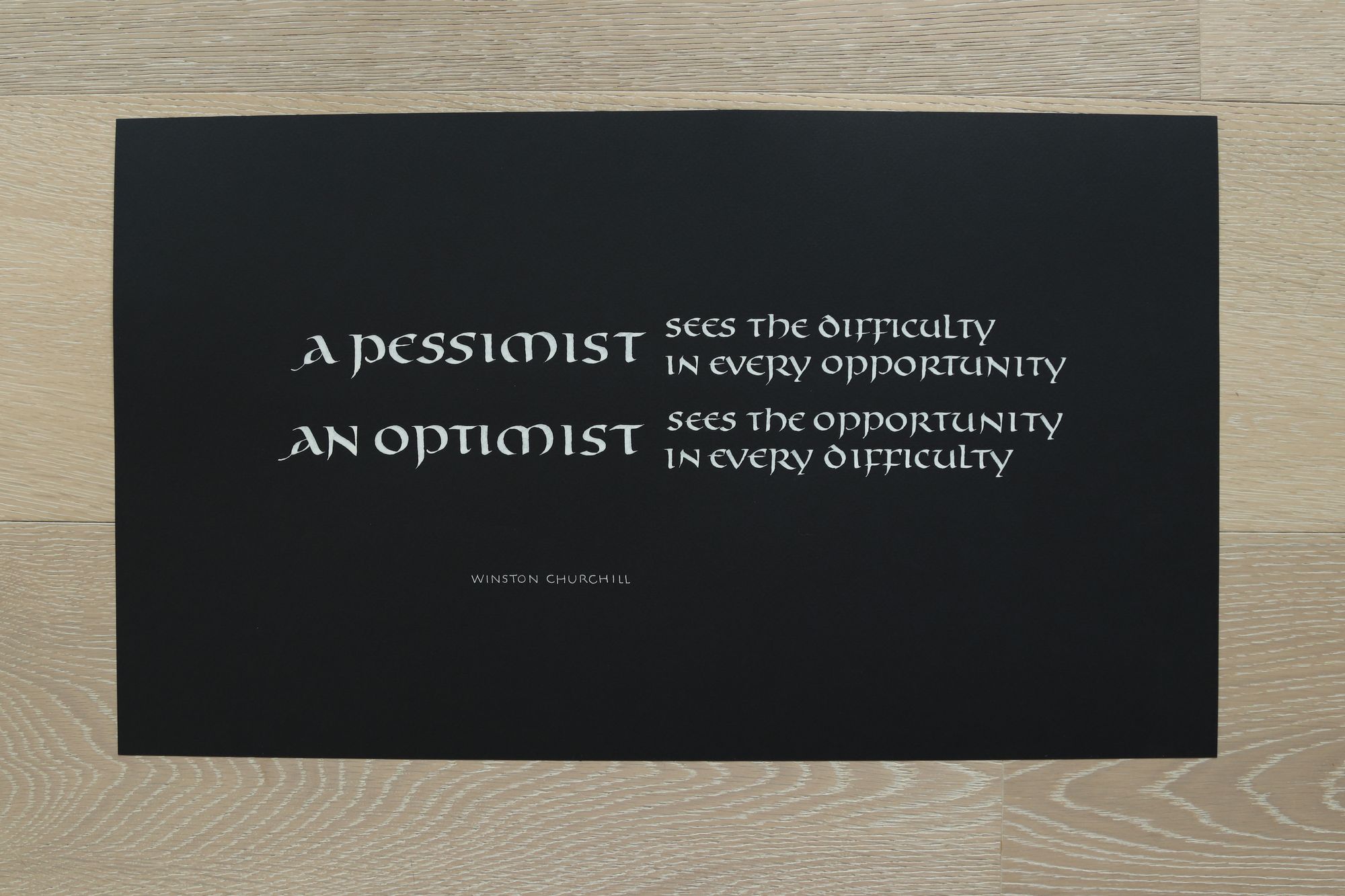
Natural light indoors
See how the paper looks black, even though it's indigo. In this case, the color is not very important, so I would be okay with using this shot.
Bright artificial light
If you must photograph your piece by artificial light, you will most likely need to attach it to a vertical surface. Otherwise, you may not be able to avoid dropping a shadow on it.
In the picture below, I propped the piece up against the wall to give you an idea. If I were trying to use this photo for the final version, I would use painter's tape to attach the back of the piece to the wall, so that it's completely straight and flat.
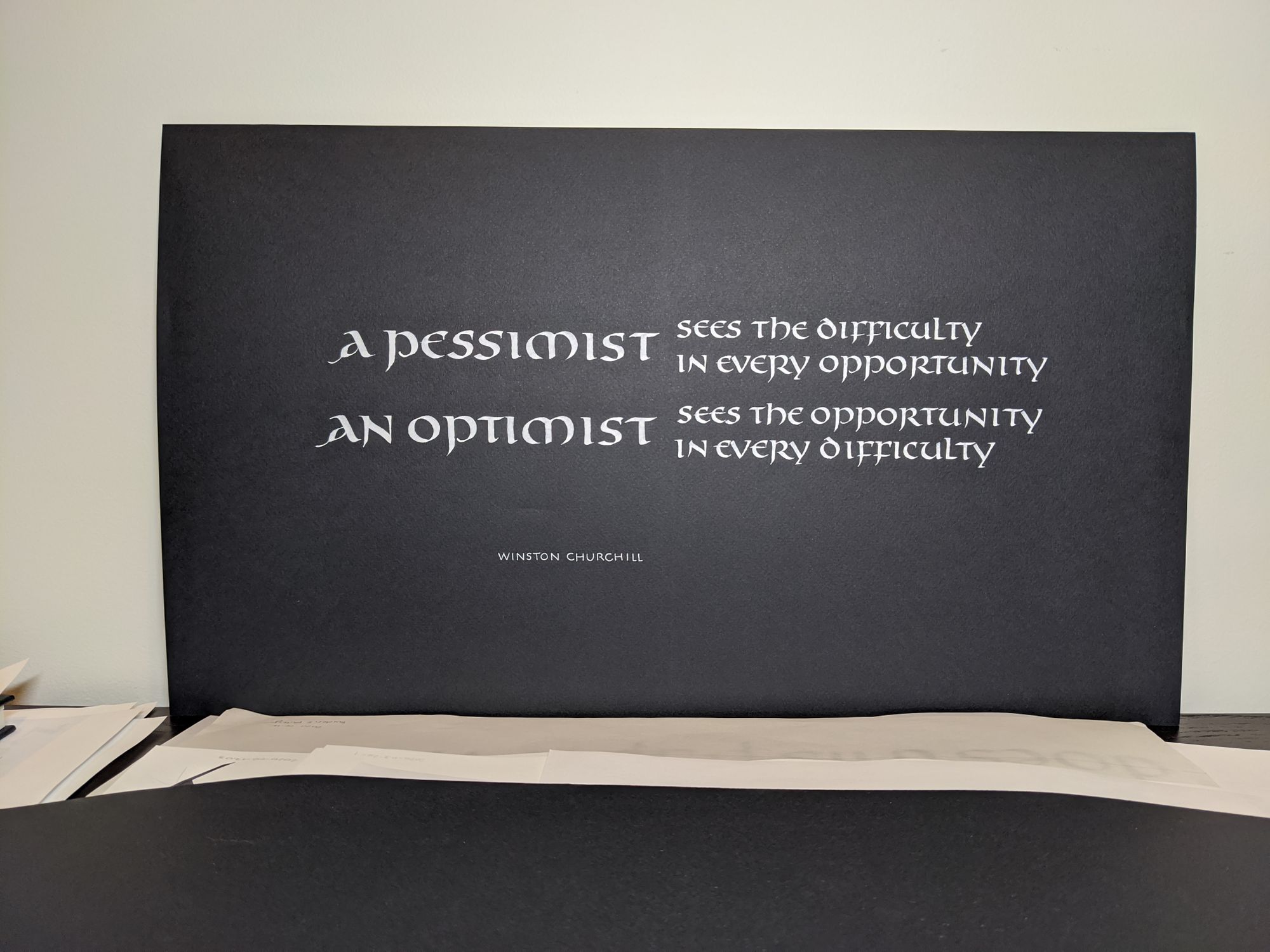
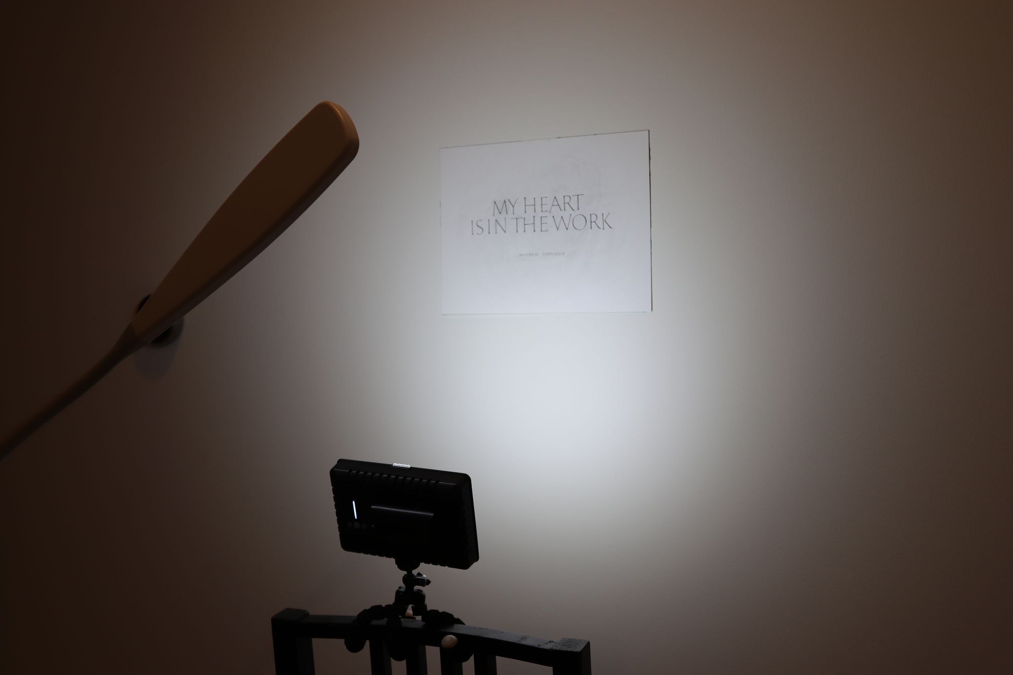
Note how there is an "orb" of light in the middle of the image. That is the problem with artificial lights: they are close enough to the artwork that you can actually see the edges of light. You may be able to compensate by using multiple strong lights, but it's never going to be as good as a daylight photo.
In this photo, I am using additional light sources. They are so bright that it looks like the lights in the room are off (but they are on, and I have 4 100-watt bulbs in the ceiling, so they are pretty bright).
But the color temperature in the photo is still likely to be wrong, and colors may appear yellowish:
The final result for this one was ok...
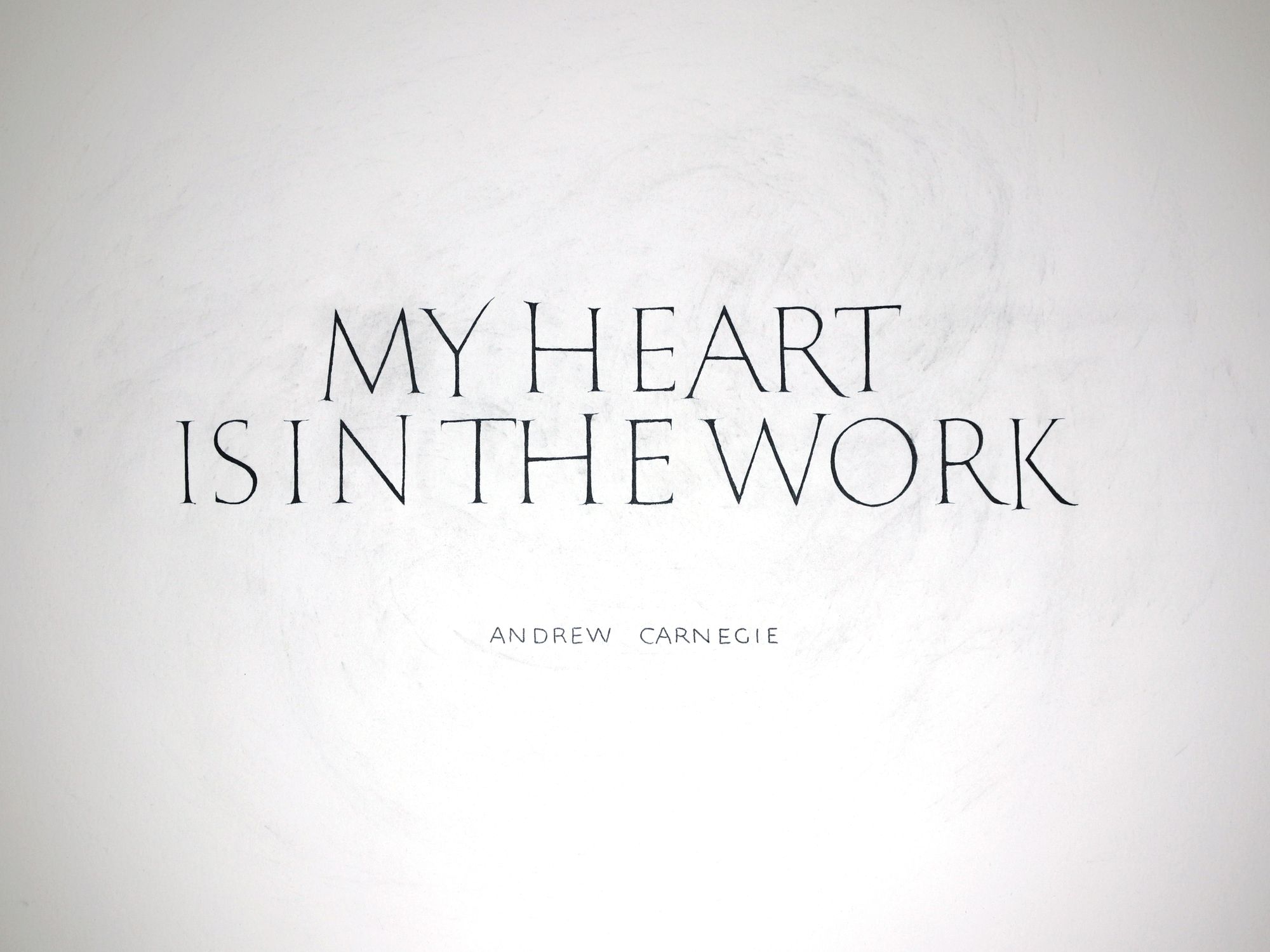
...but I could probably improve it a lot just by using a daylight photo:
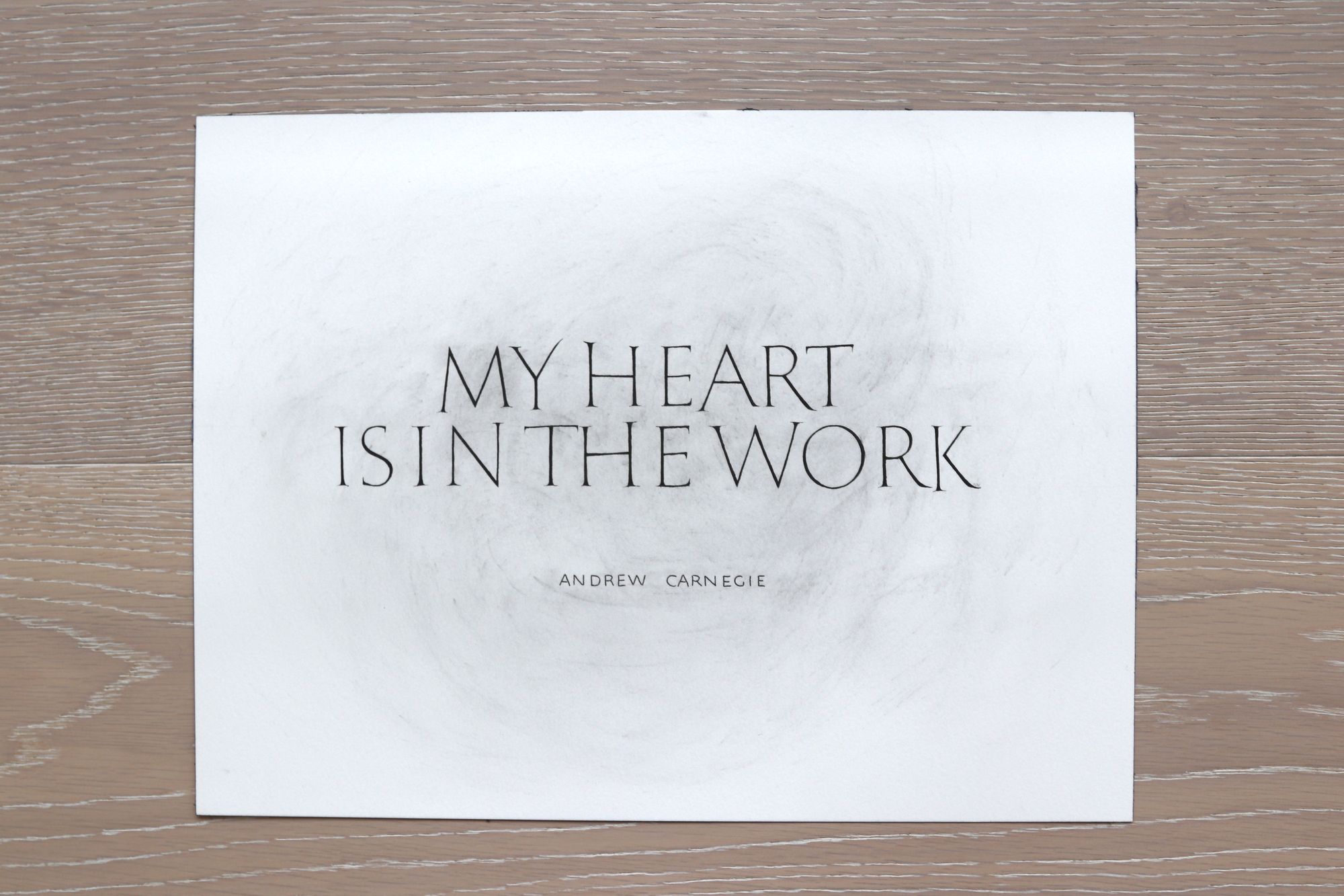
Poorly lit room
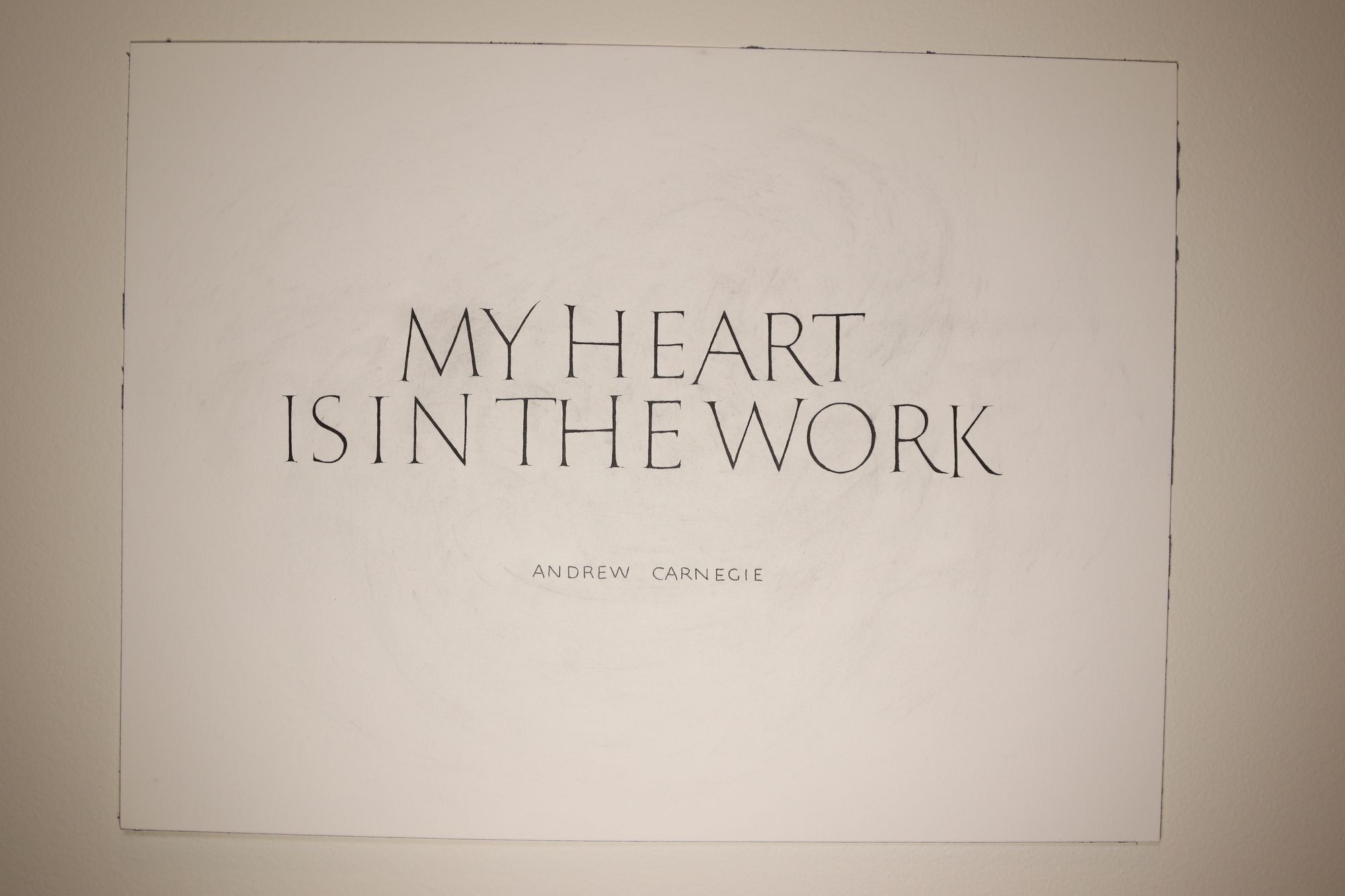
My phone is apparently so good that this photo does not look as awful as I had hoped :) I took it on a bathroom counter with the lights off, and the bathroom has no windows.
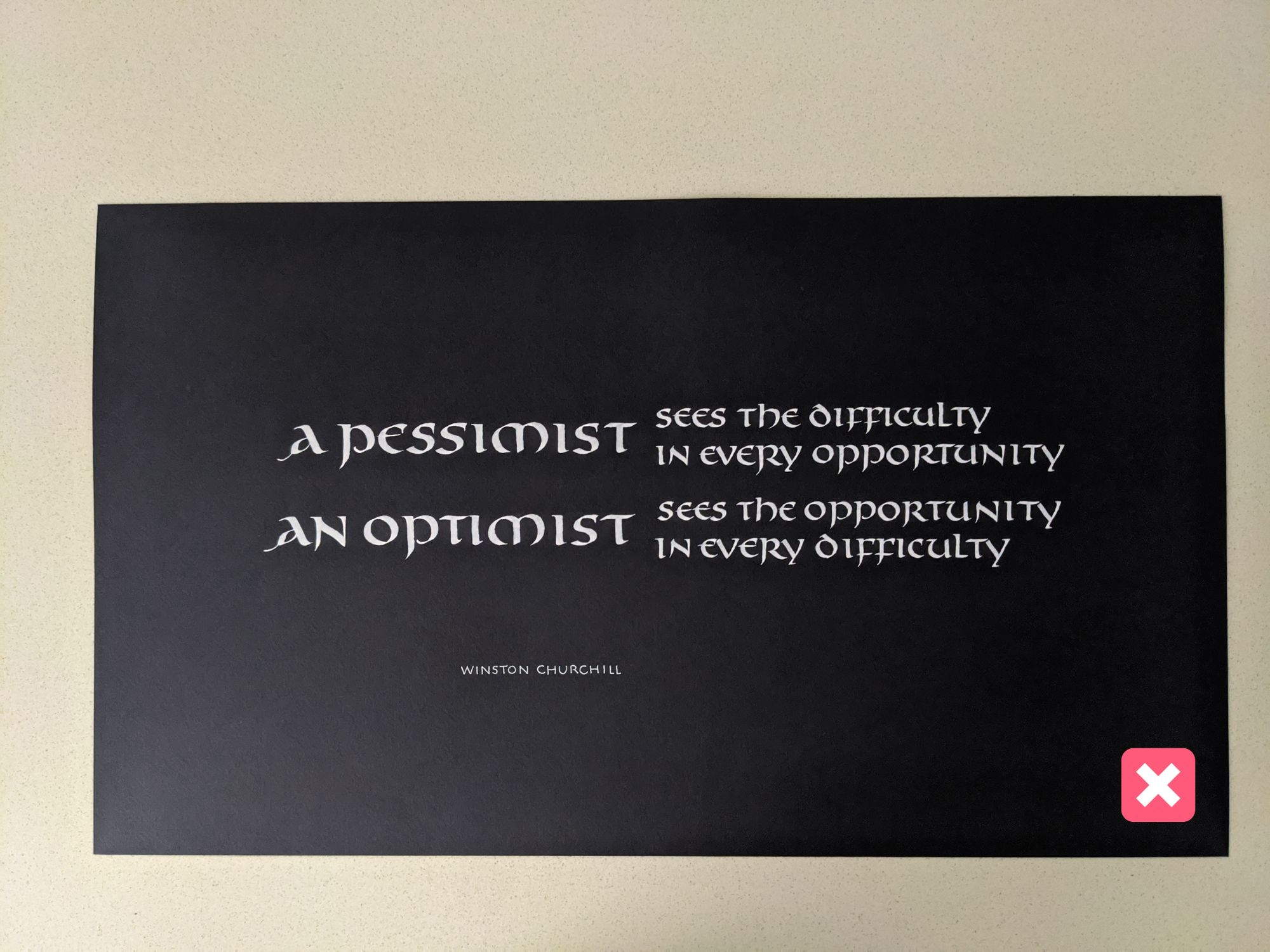
However, if you look more closely, you can see the difference. The image taken in the dark room is more grainy and blurry:
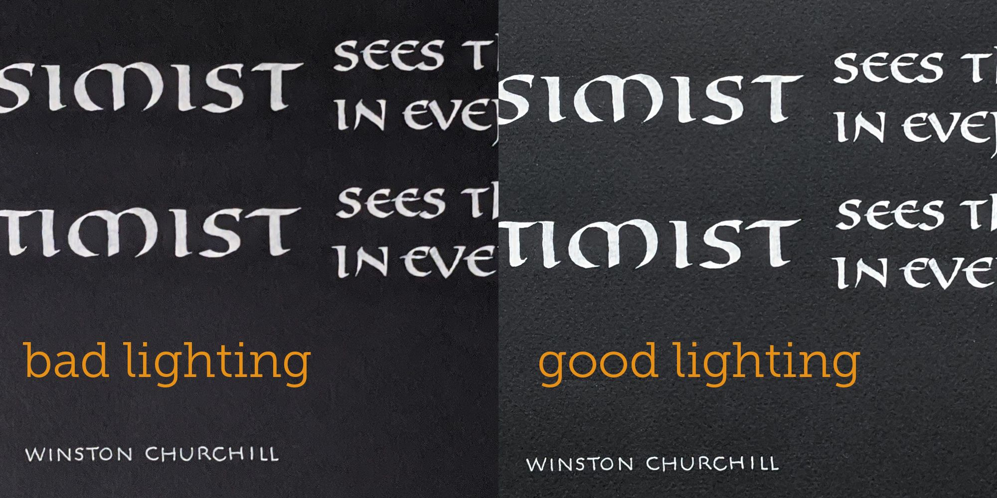
Here is another example of an image taken with low lights:
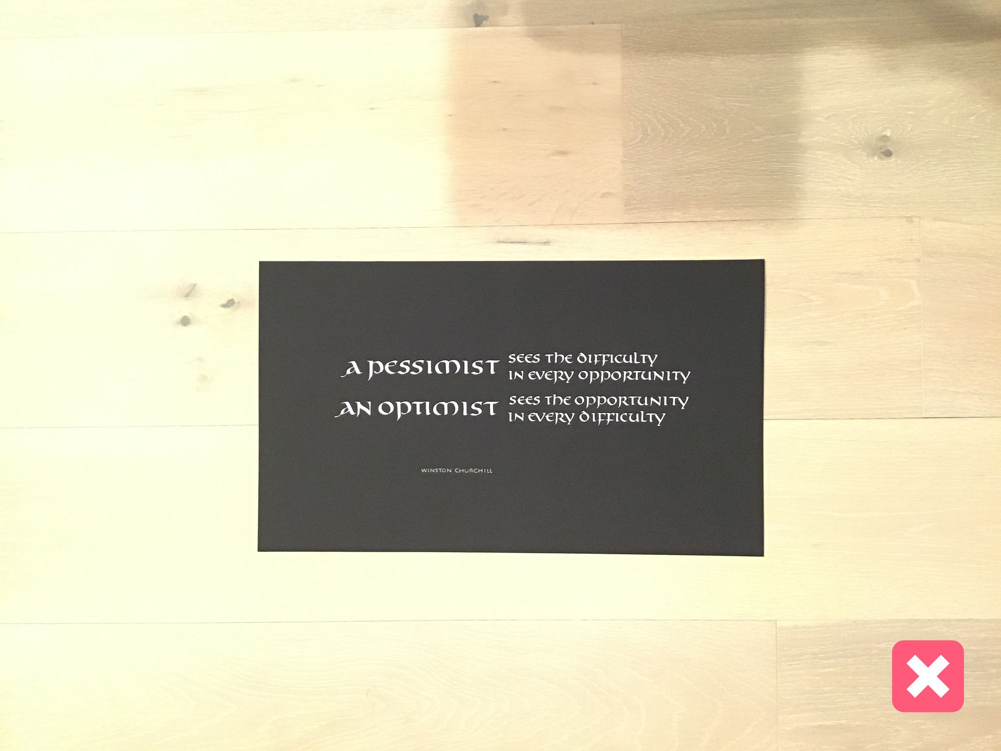
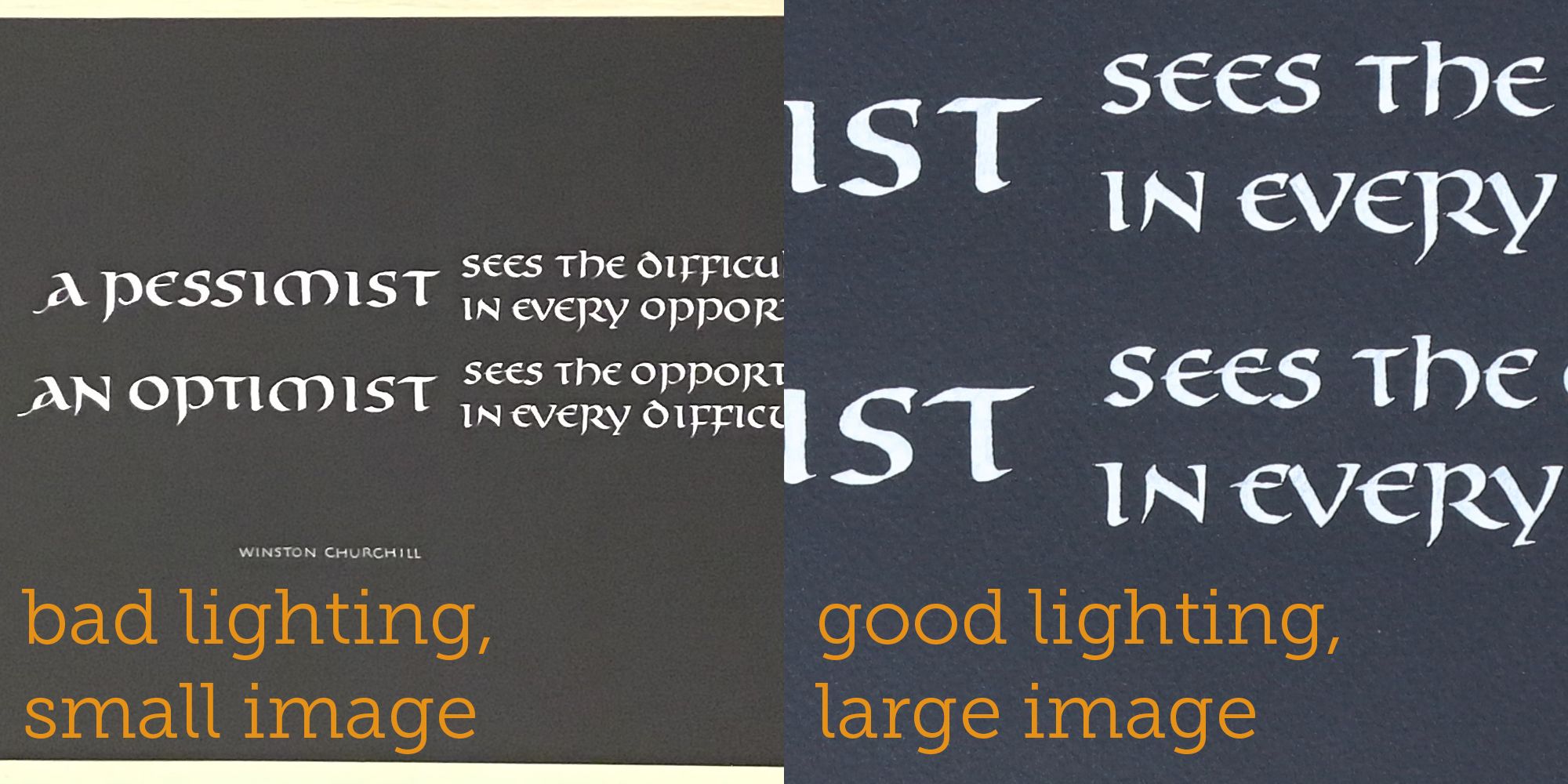
This one has an additional problem of being too small: the artwork itself is only taking up a small part of the image, so its actual resolution is low. Compare to fragment of the same size from the camera image:
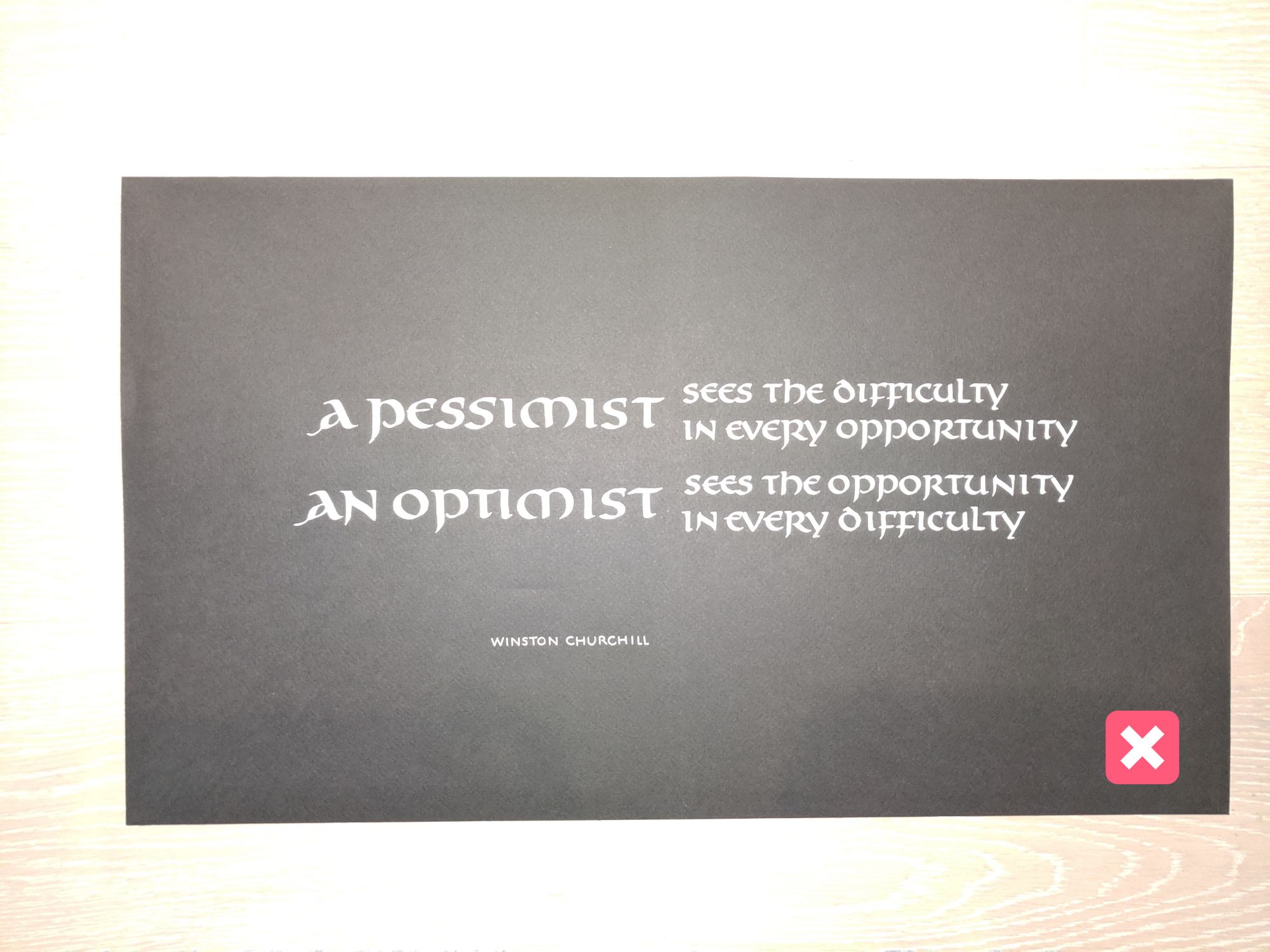
Don't use your flash!
It's not going to solve your poor lighting problem:
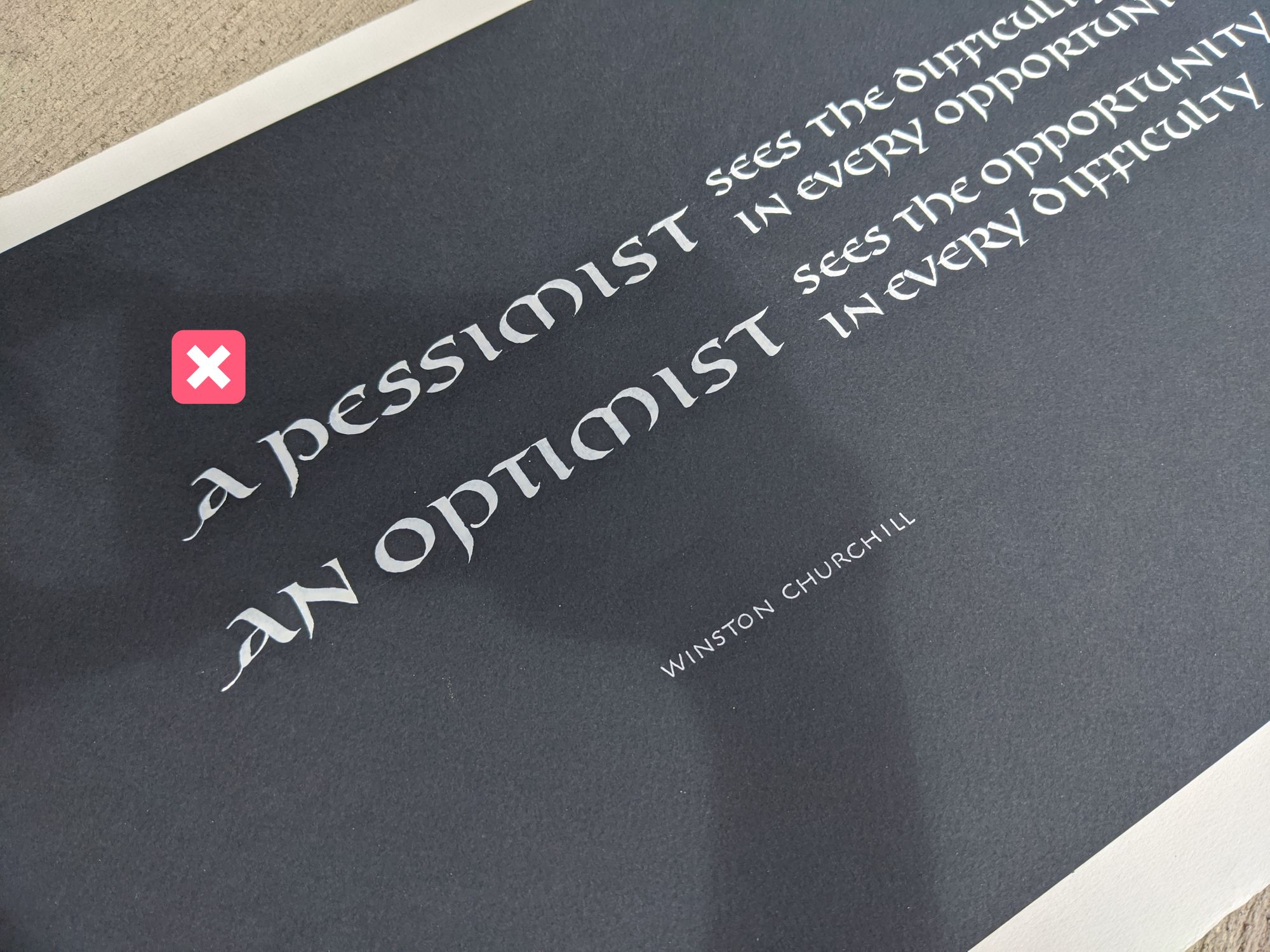
Shadows
Make sure there are no weird shadows on your piece:
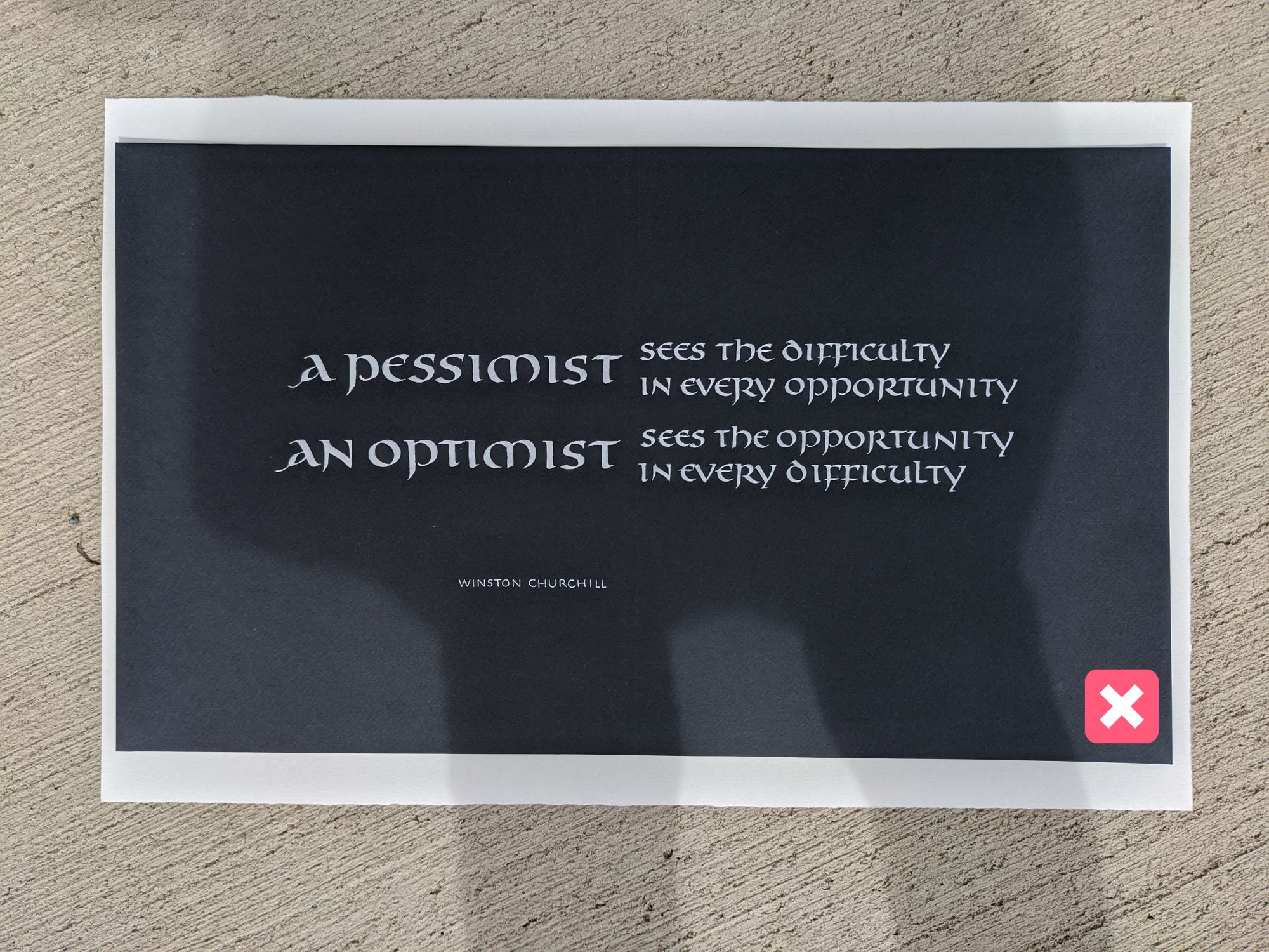
Especially avoid the shadow of your phone. To notice it before it's too late, make sure to look at the page not only through the camera, but also just with your eyes. Shadows are usually more obvious that way, and you can avoid this type of embarrassing shot:
Direct sunlight
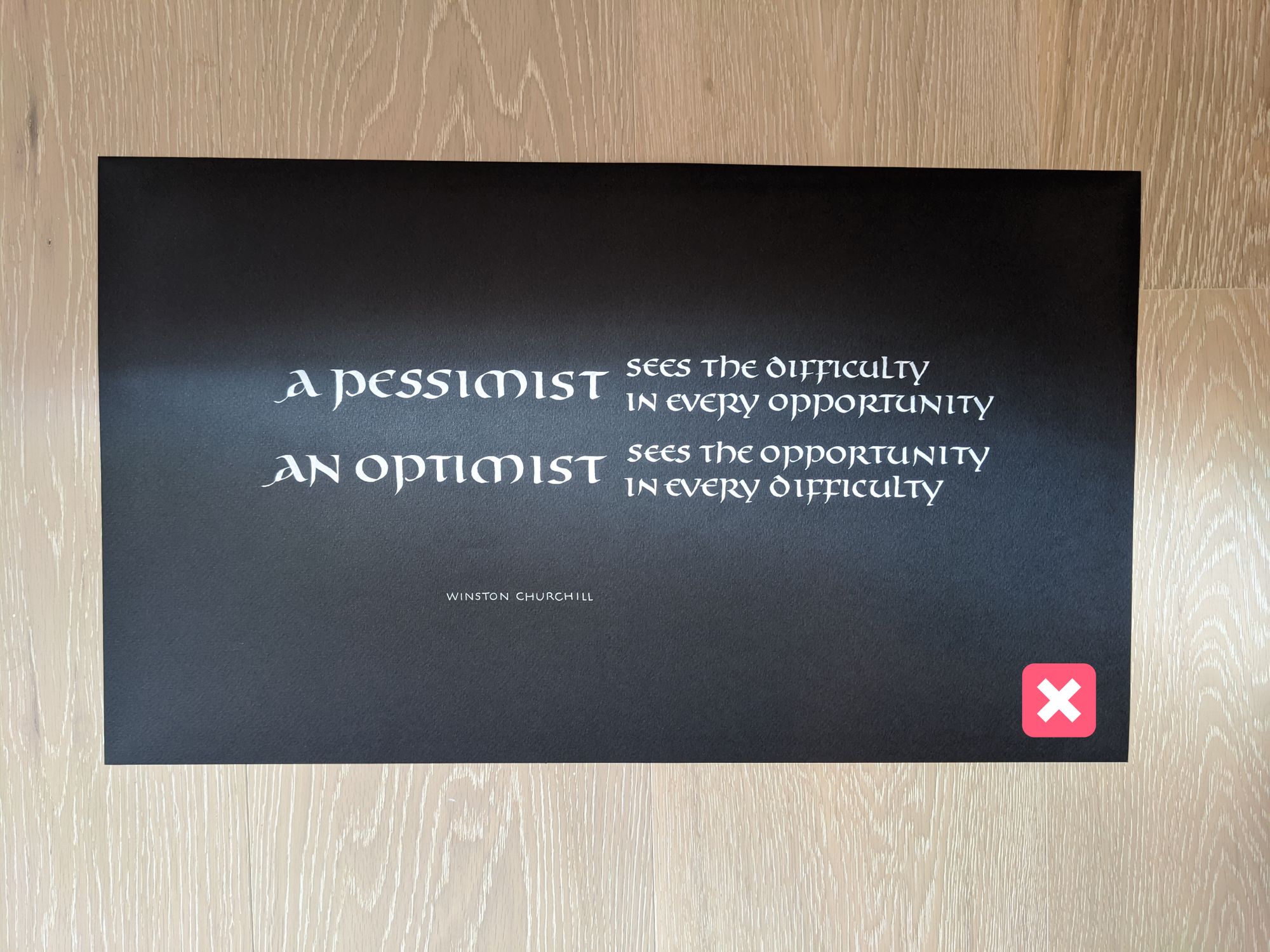
While diffuse light is excellent for taking photos, direct sunlight and sharp shadows are not so good.
Avoid placing your piece in direct sunlight, especially if only part of it is in the light, and the rest is in the shade:
Uneven lighting
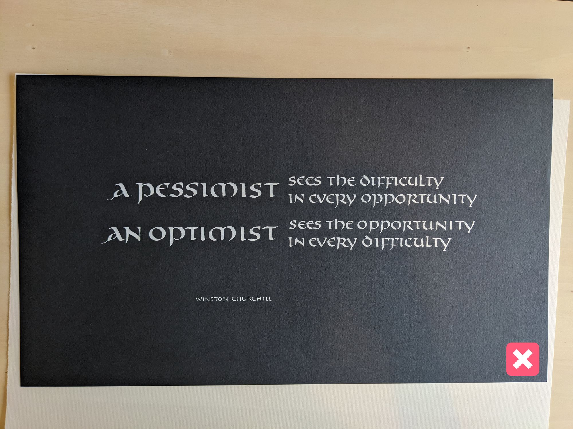
Another tricky problem with light is uneven lighting. It happens less frequently with natural light, and is very likely with artificial light.
It creates an unintentional gradient throughout your piece, making one side significantly lighter than the opposite side.
See how the right side is much lighter than the left side in this picture:
Editing tips
You made it this far! Your picture is straight, the details are sharp, the colors are decent, but there is one more step.
You don't want any of that background in your final image, right? :)
I am going to go over the few final steps that I usually do in Lightroom for my artwork photos:
- Straighten.
- Crop.
- Remove distractions.
- Adjust color.
Straightening the photo
Even if you did a really good job holding your camera straight, you may sometimes end up with a small distortion.
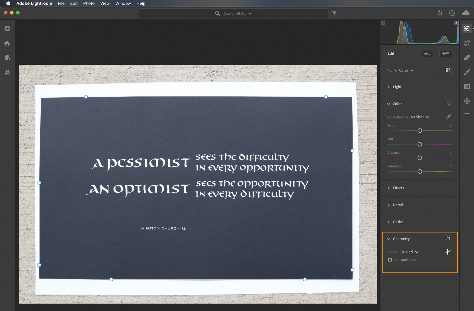
It is very easy to fix with Lightroom's "Guided Upright" feature. Essentially, it lets you draw 4 lines along the 4 edges, and then adjusts the image so that the angles are all square. It's a little bit like magic!
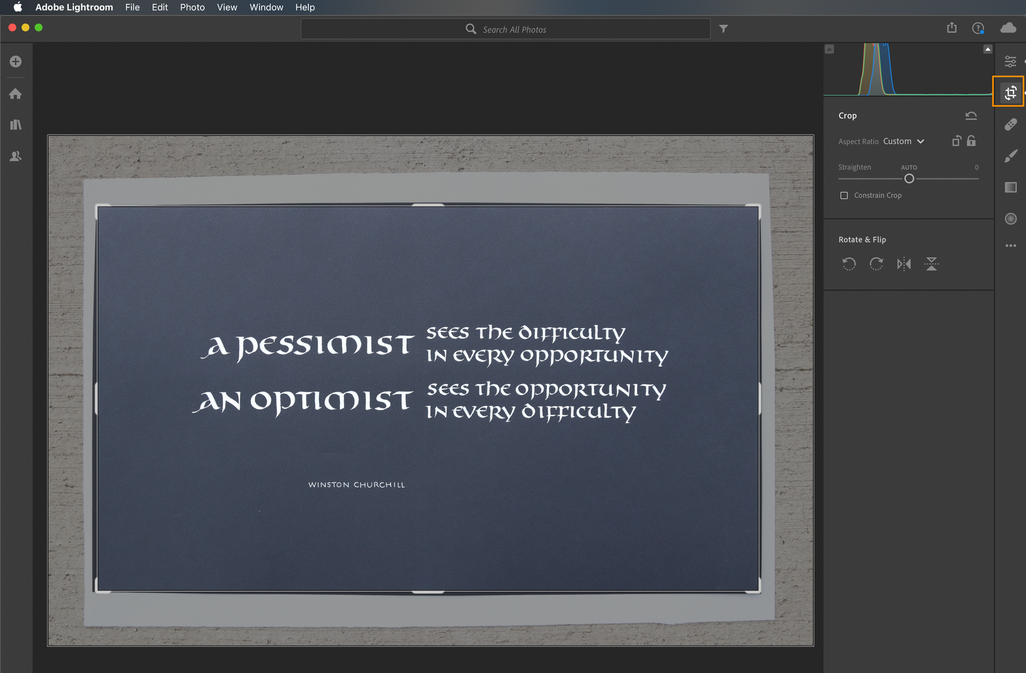
Cropping
Even if your content is perfectly straight, the edges might still be distorted. In the case of my image, the distortion comes from the camera lens, which is completely normal, and you would not notice it unless I took a picture of a rectangular piece of paper.
Cut off the background and any uneven edges so that all you have in the image is your artwork:
Cleaning up distractions
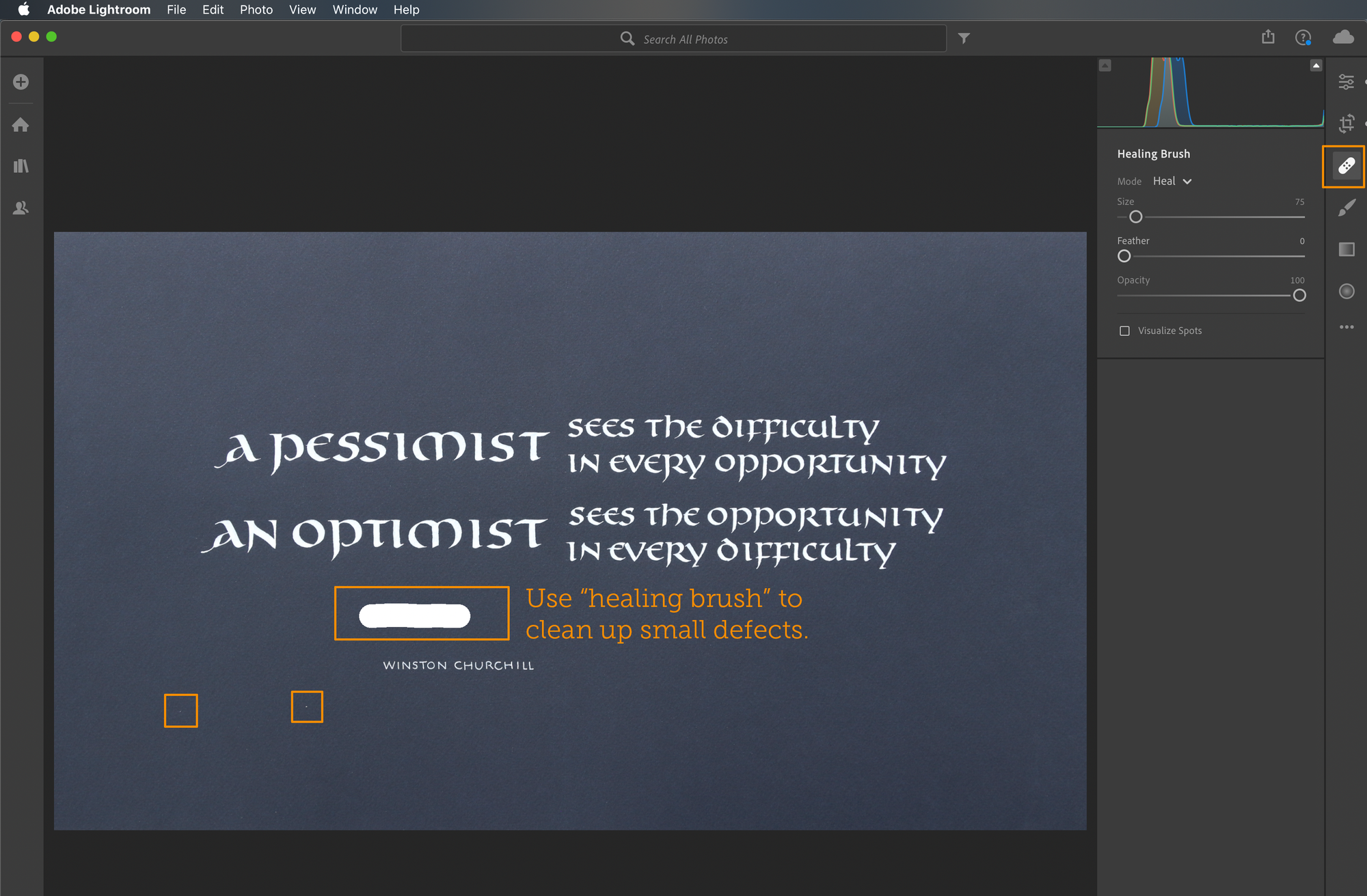
If you look carefully at the image above, you will see a slight crease in the paper above "Winston", almost halway up to the line above it. There are also a couple small white specks (there was some dust on my camera lens, unfortunately).
When you are looking at the actual piece, even if it has imperfections like this, they don't matter. However, once it's been digitized, they tend to stand out much more. That's why it's best to remove them from the image.
Note that I'm not suggesting you "fix" a "bad" piece of work — just remove unnecessary distractions.
Adjust color
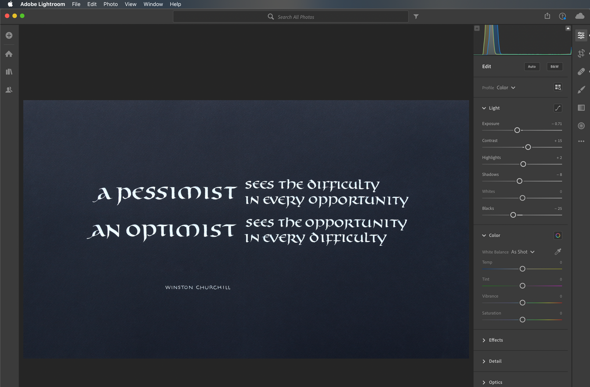
Finally, if the contrast or colors are not quite right, adjust them. There is no single "right" way a photographed piece should look, so use your judgment, and try a few things. Compare to the original frequently to make sure you didn't make it worse.
Final result
I went through the entire process with 2 of my photos: the outdoor one (top), and the indoor one (bottom):
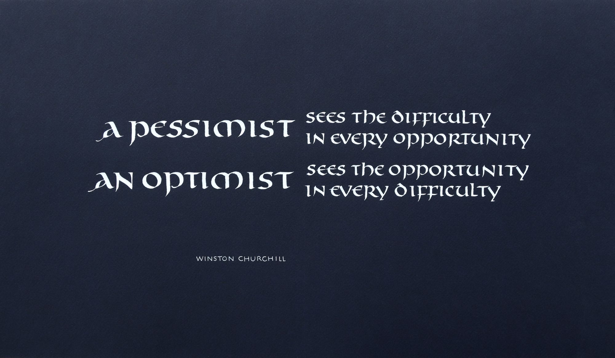
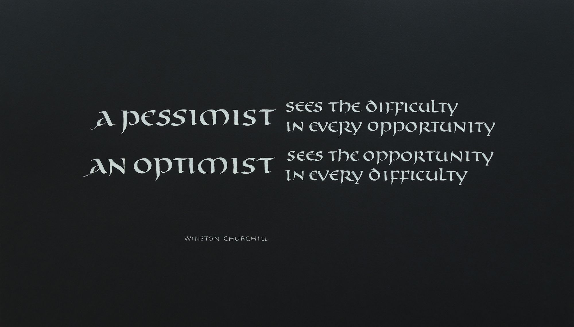
I think they both came out looking quite good, even though the color is different. The lighter background has a slight gradient, but the color itself is also prettier.
I also made a version of the second image with higher contrast:
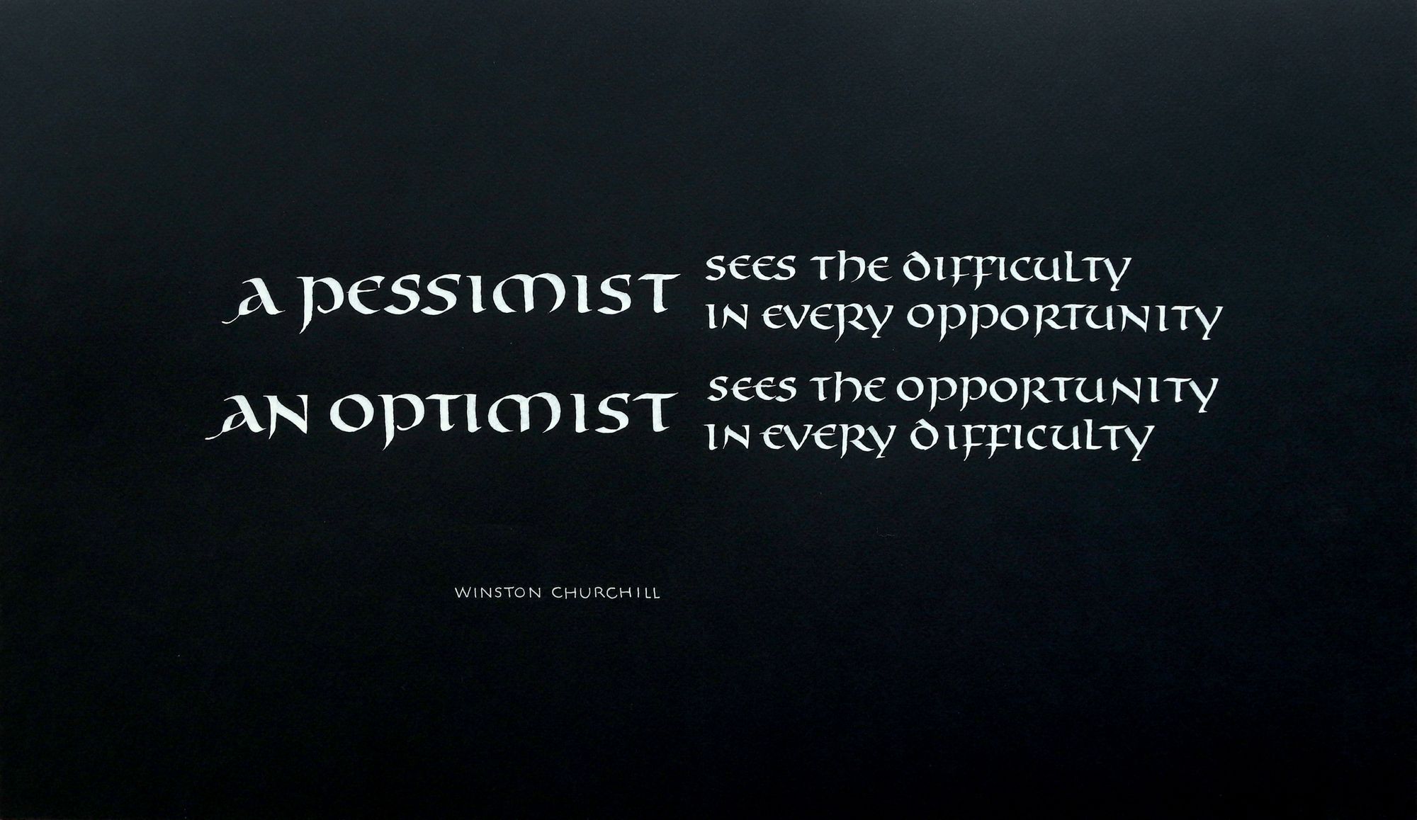
Once again, at this point we are not talking about the difference between a successful and a failed shot, it's just the small adjustments in appearance, which are frequently a matter of personal preference. I bet out of these 3 edited images, you would pick a different "best" one than I did :)
Taking good photos of artwork is an art in itself, and it is still very much a work in progress for me.
P.S. I have to admit that after I published this post, I went ahead and scanned this piece anyway. It was a bit of a pain to assemble it from 3 pieces (since it would not fit in the scanner), but here is what it turned out like:
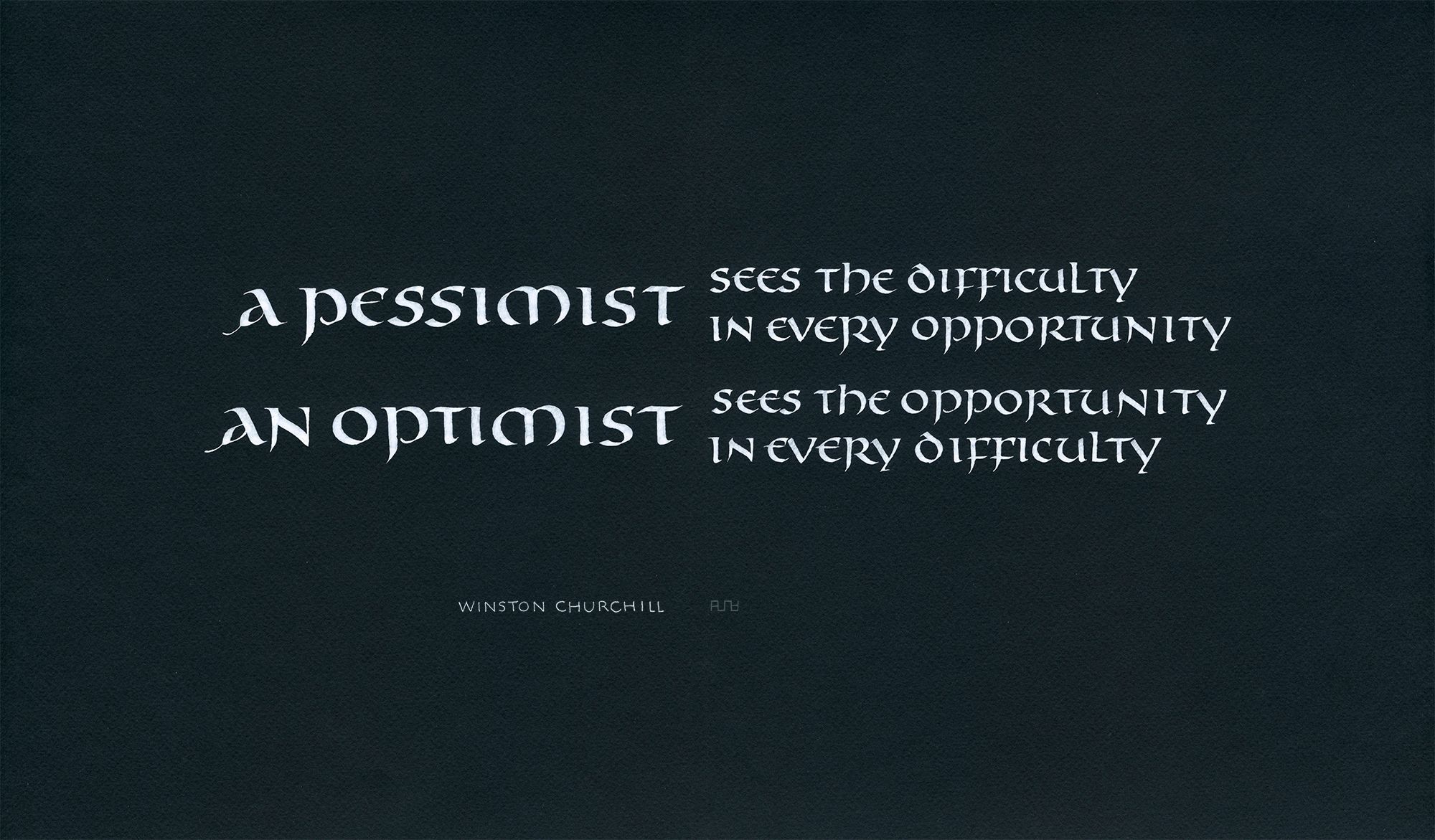
It has more fine detail, but at a glance, it does not look that different from the camera photos.

Comments