Flat file project

I needed a place to store my paper, so I found some used flat files online. They were operational, but a little beat-up on the outside. Given that they only cost 1/10 of what they would cost new, it was a pretty good deal. Still, looking at them made me a bit sad.
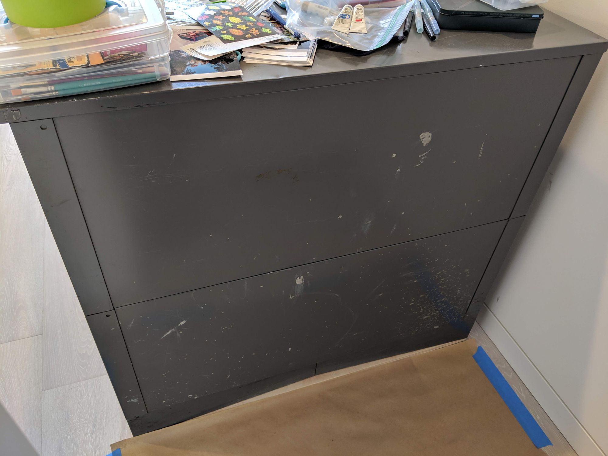
After my friend shared a photo of a piano that she had custom-painted with acrylic, I decided to paint my files too. However, I’m not that good at painting, and I didn’t think I could pull off a landscape like she did. I’m also not too much into bright colors, which means I don’t really know how to use them well.
I thought about it for a little bit, and realized how I can solve both problems: I can paint letters, and I can use black and white paint!
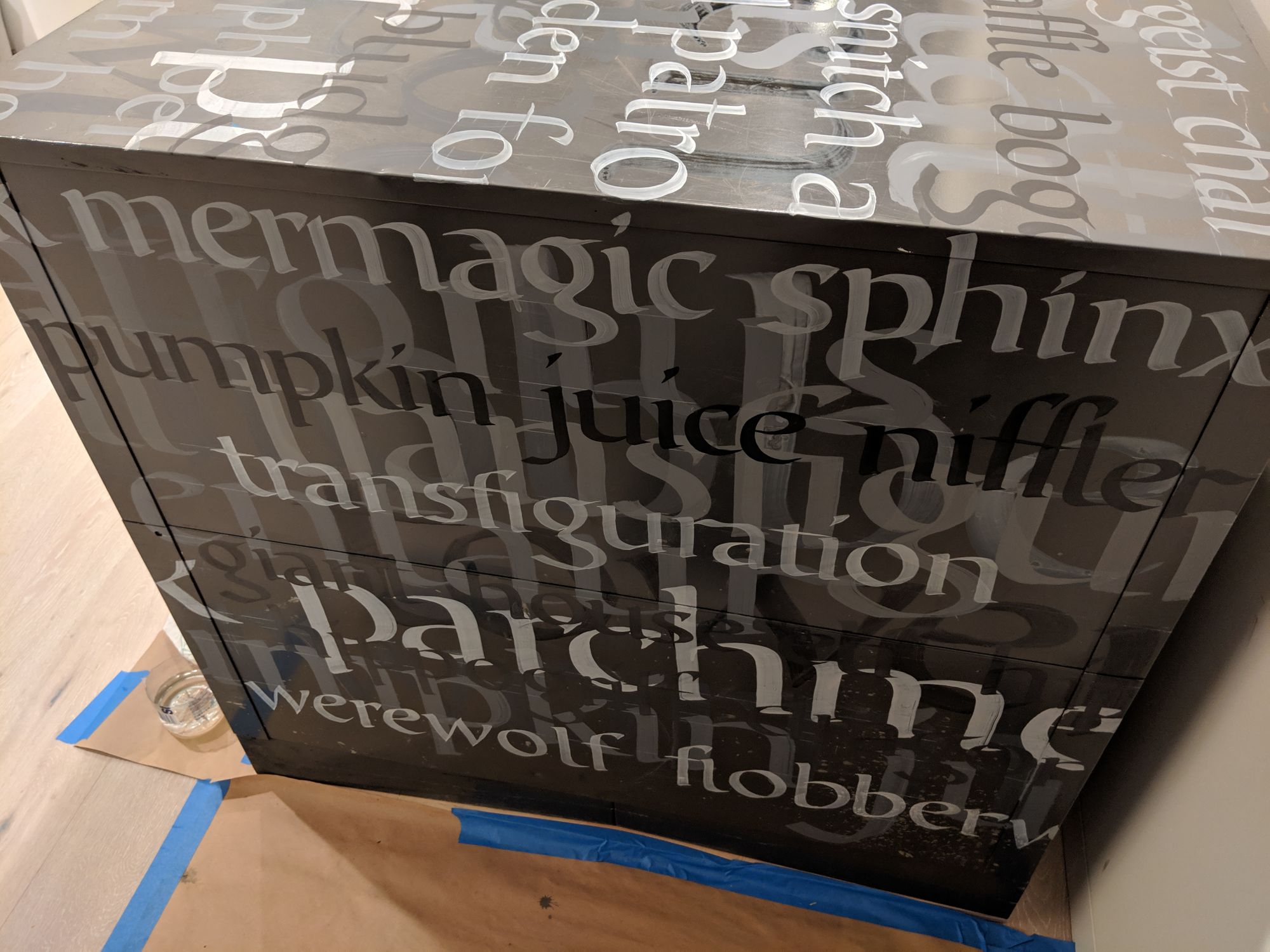
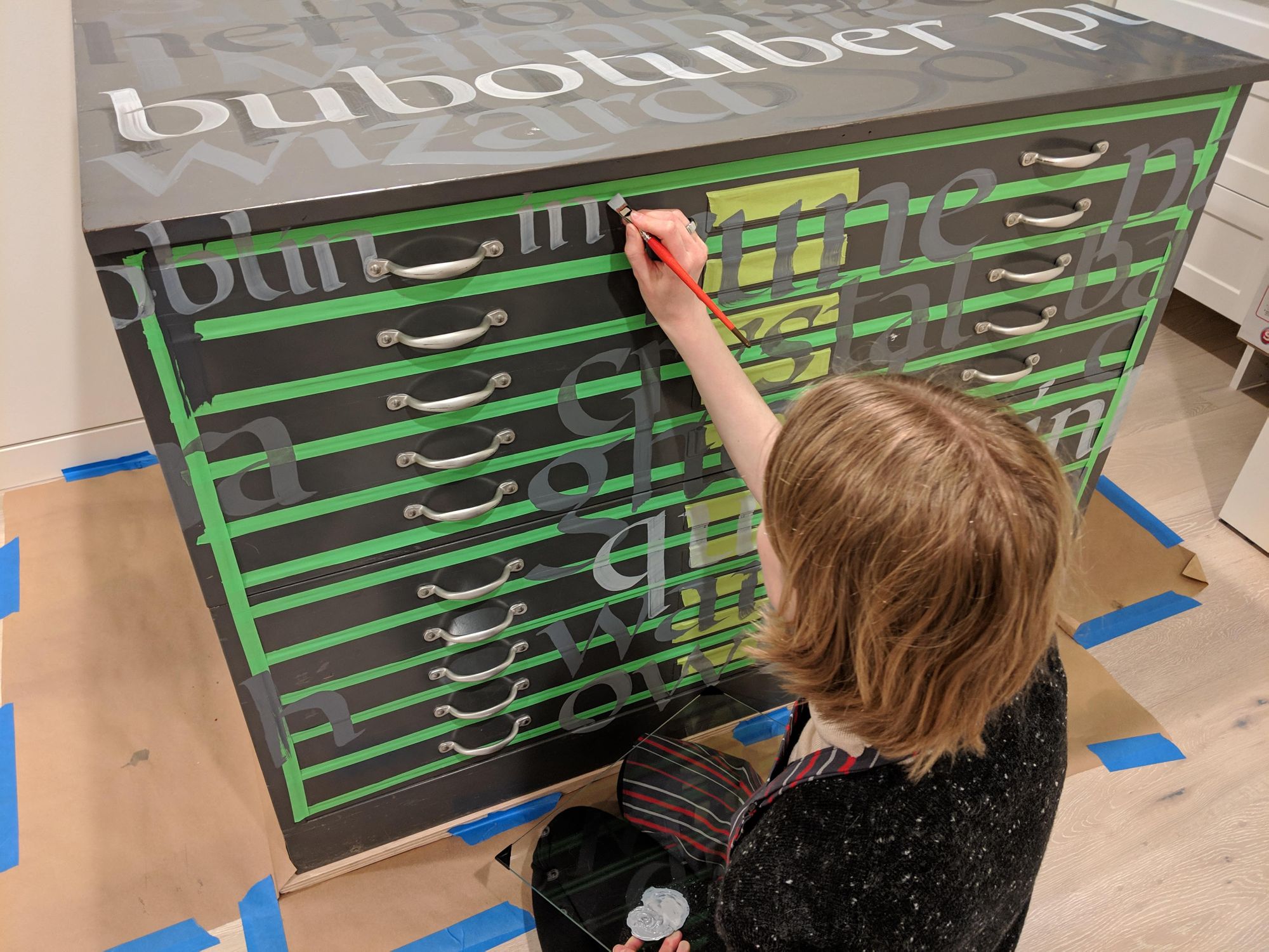
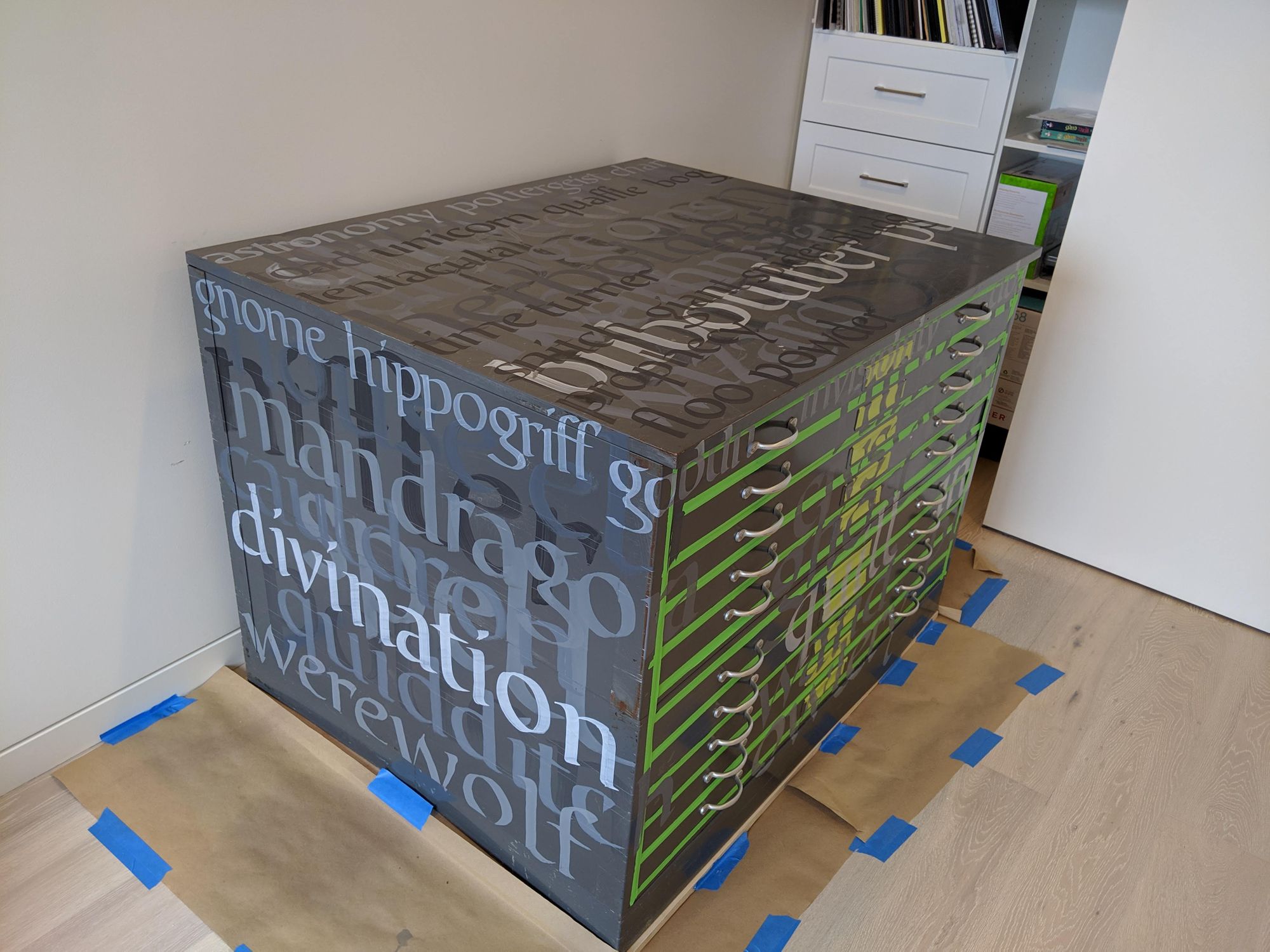
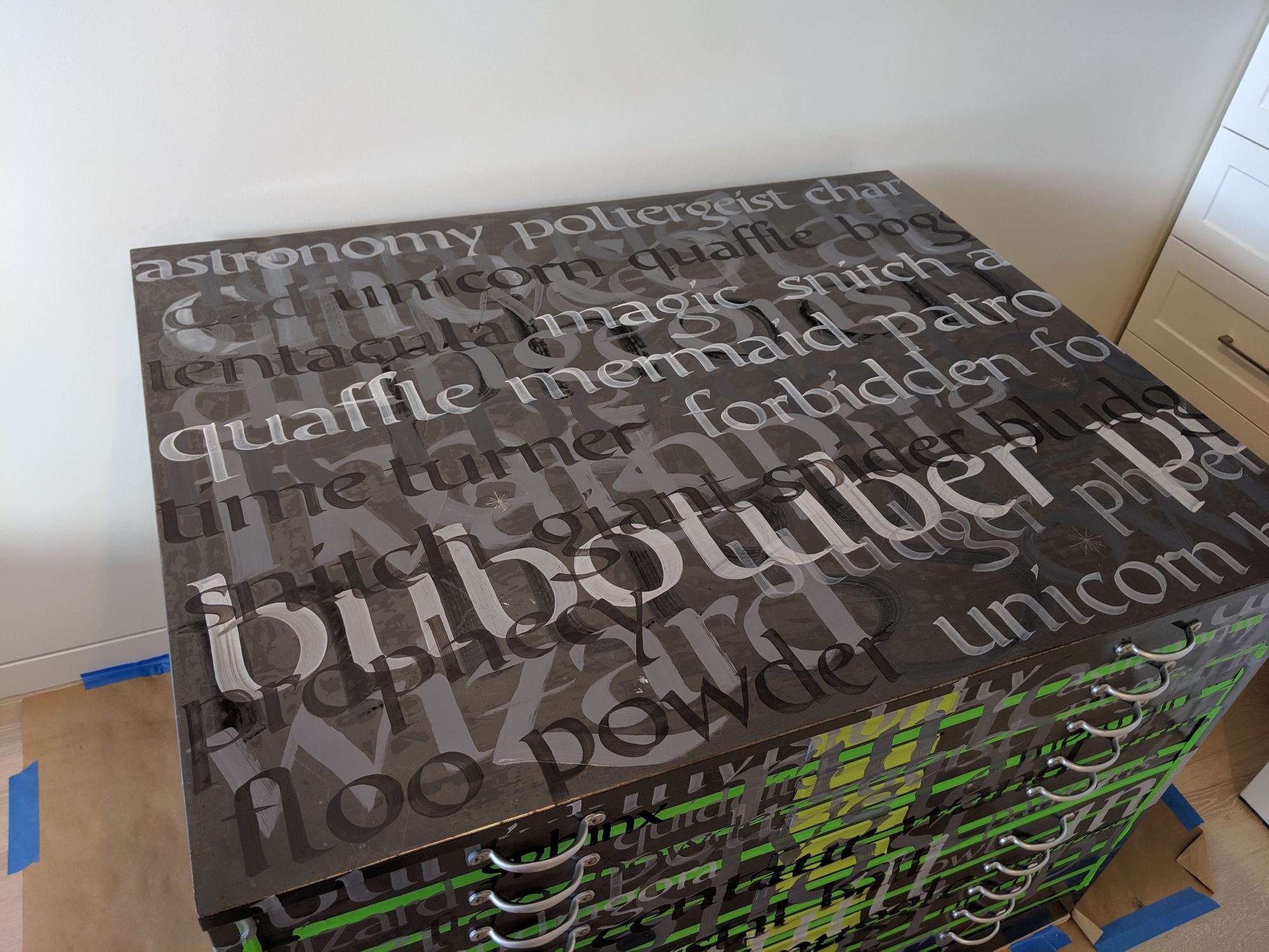
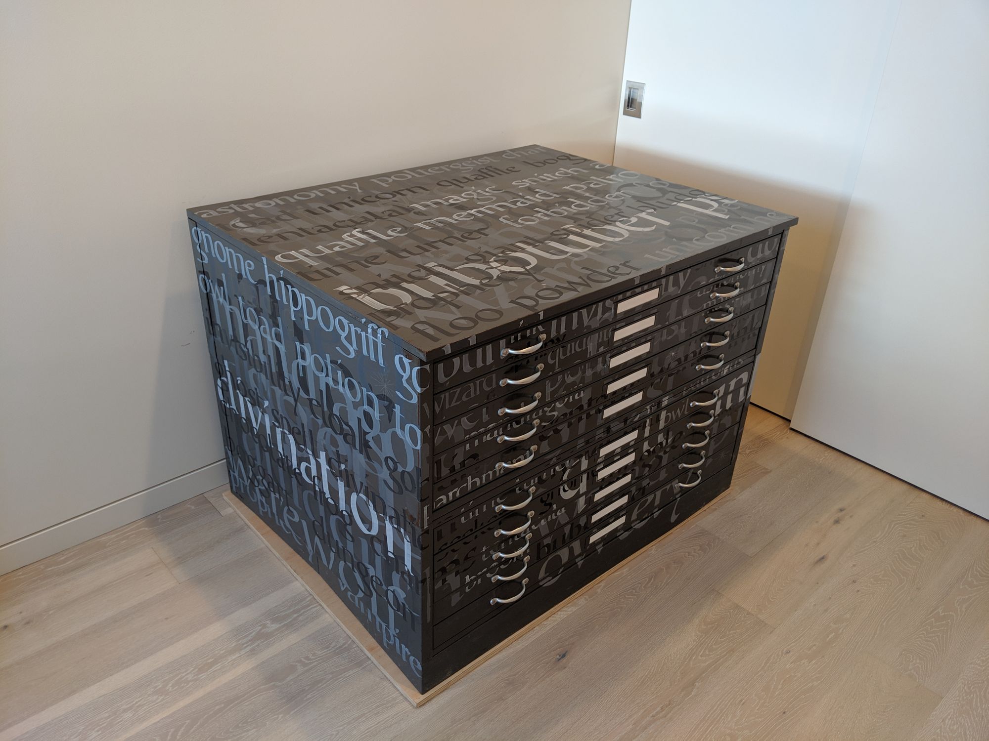
And then I was hit with the perpetual existential question: but what should I write? I considered doing individual letters in various sizes, but it would be harder to make a good composition, and also to achieve amazing letter shapes. Thus, I decided to write some words. Since great artists steal (right?), I stole an idea from the same friend. Last year, she did a Harry Potter theme for Inktober. I am a fan of Harry Potter also, so I got my theme. Some of the words were supposed to be capitalized, but I made an executive decision to keep it all lower-case.
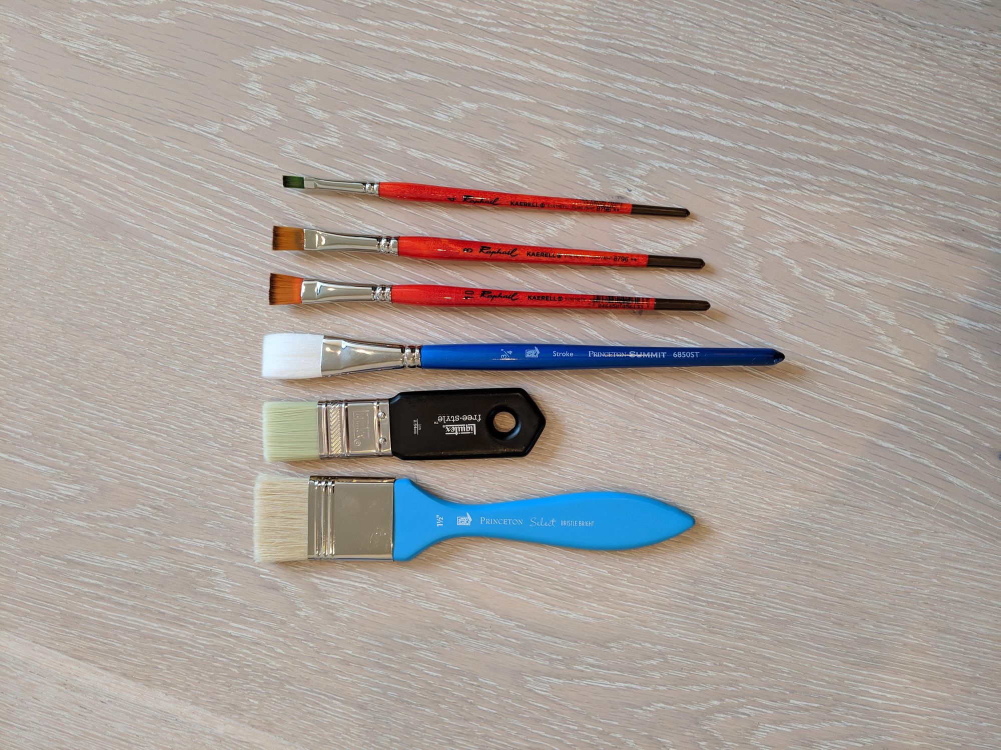
I picked some brushes and ordered some paint.
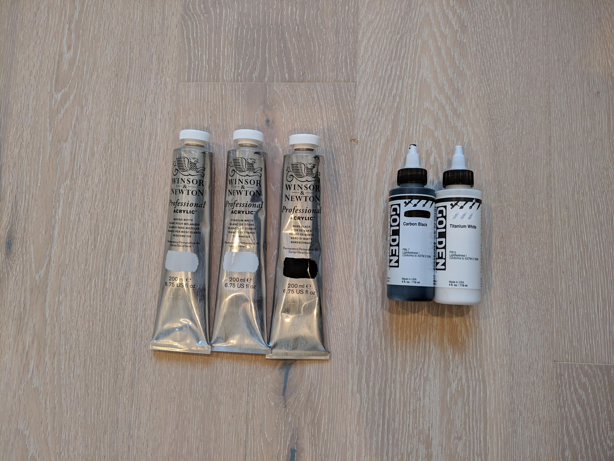
Lesson 1: It does not take that much paint.
I definitely did not need to get 200mL tubes of acrylic. It is ridiculous how little of it I actually used. I could probably paint all of the walls in my studio with the remaining paint.
Lesson 2: Cover up the drawer seams.
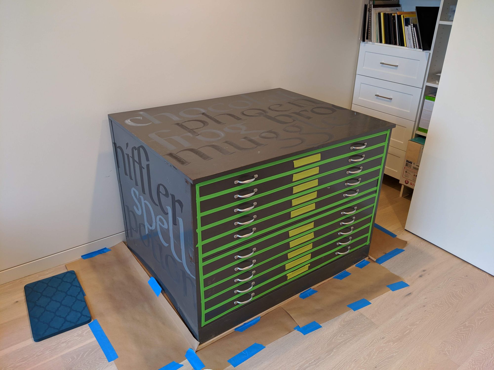
I was fortunate enough to think of this one ahead of time. If I had not put tape over all the drawer openings, the paint would have flowed inside, and potentially caused buildup and other annoyances.
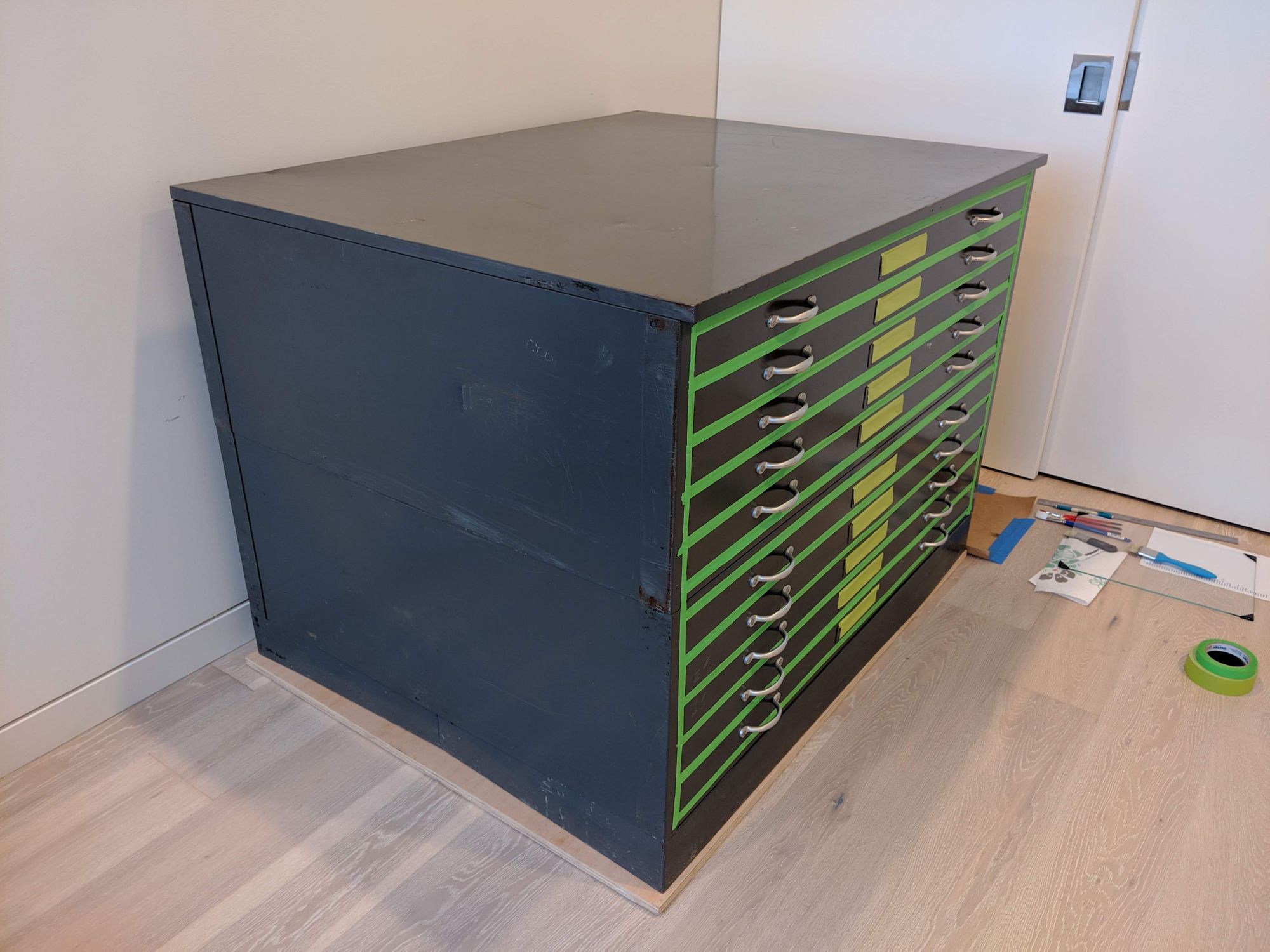
I could have used thinner tape (then more of the lettering on the front would remain after tape removal).
Lesson 3: Just go for it!
I did the first word on the first side. It came out kind of awful.
I figured, there is nothing to worry about. It will get covered up, so I kept going. I’m really glad I did not obsess over all the letters that went embarrassingly wrong. The truth is, nobody is going to notice them, unless they are scrutinizing the piece and looking for faults.
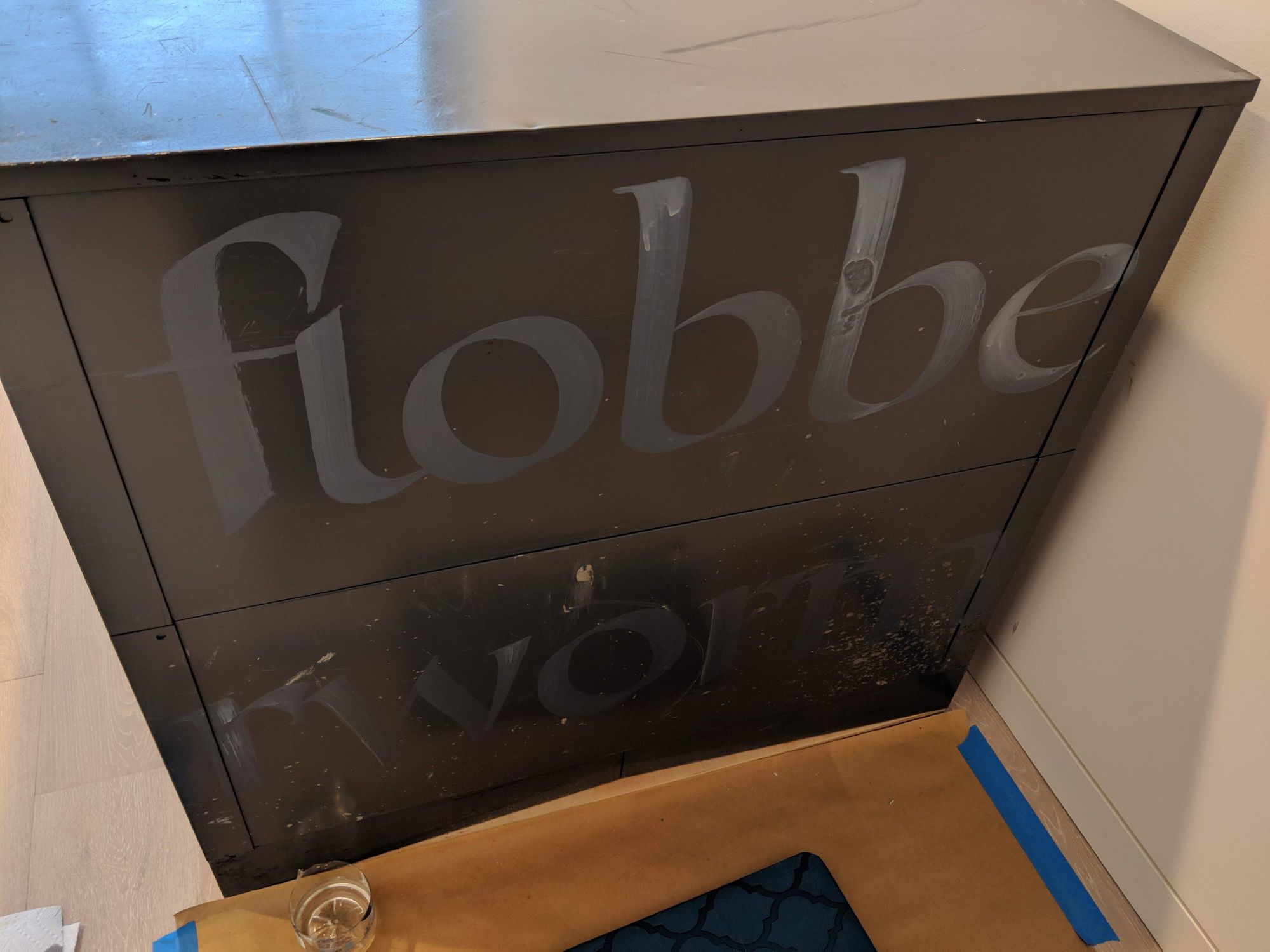
I even have a few entertaining misspellings, like the one below:
Lesson 4: Acrylic is hard.
I’ve never used acrylic on painted metal before, so I learned a few things about it.
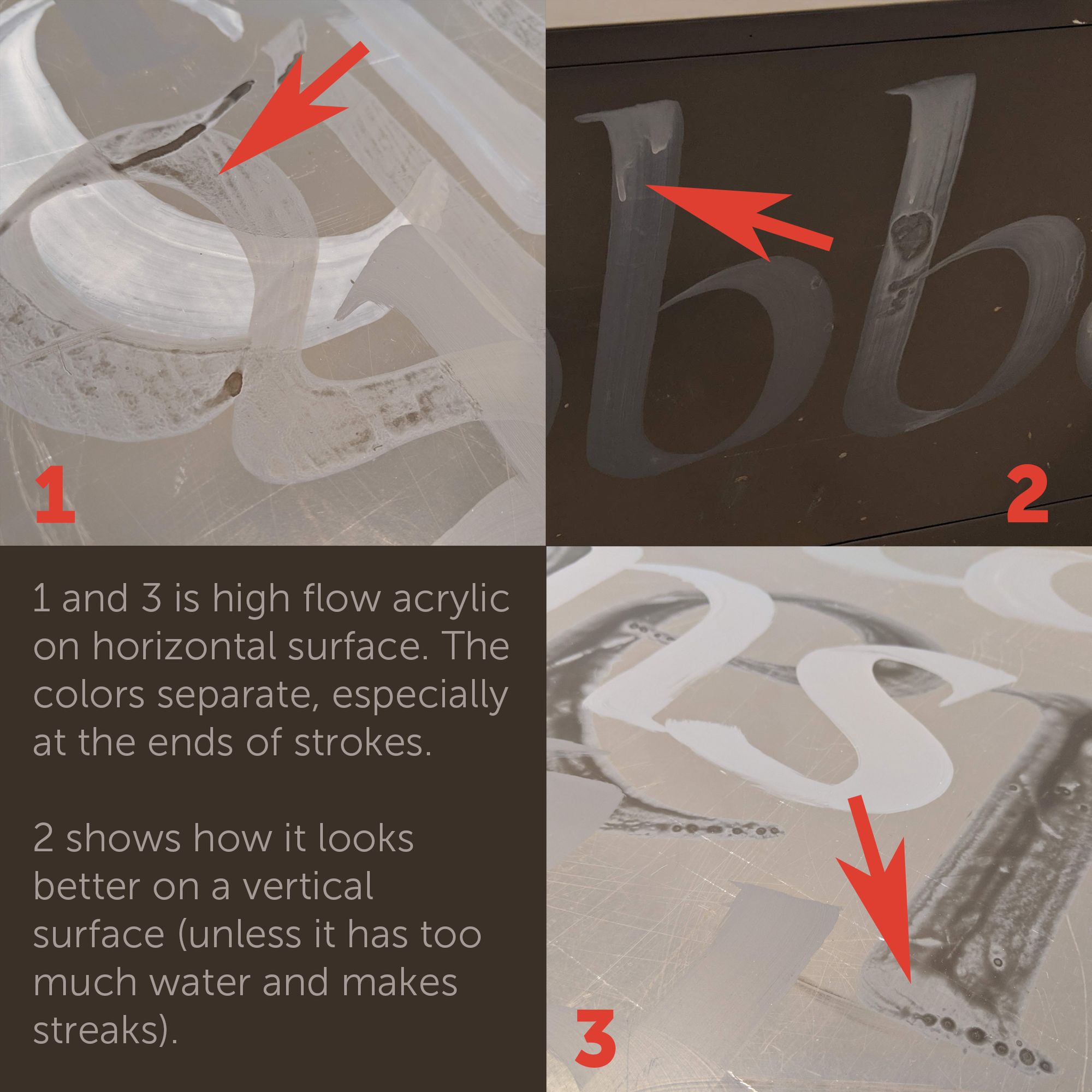
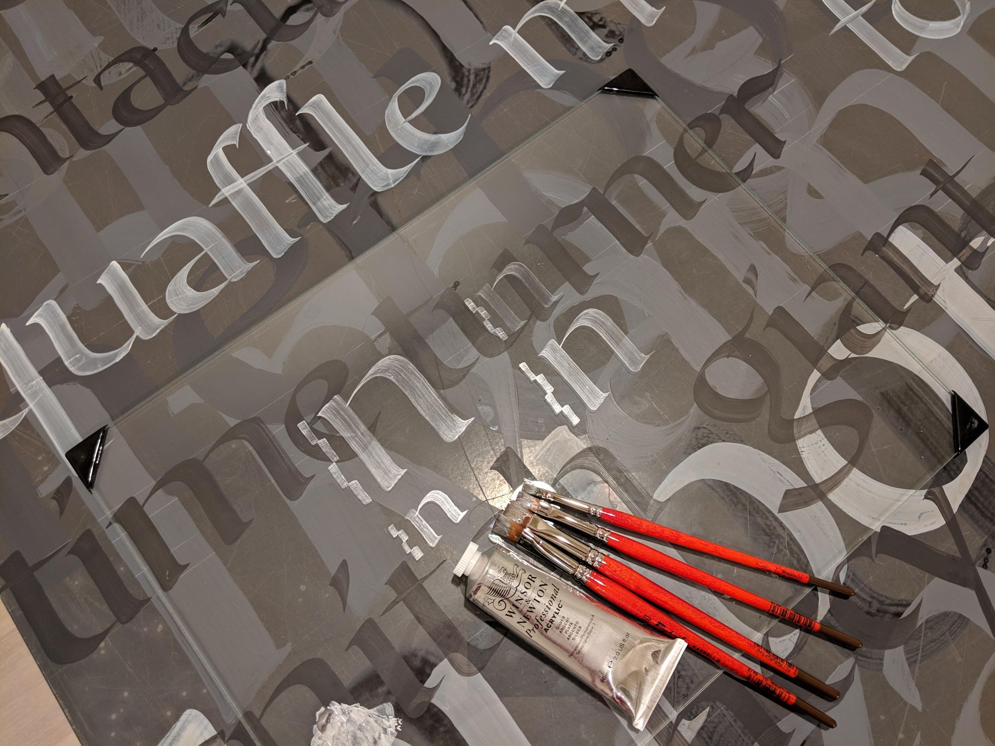
- For this project, Titanium White worked better than Mixing White. Since the files are a pretty dark grey already, diluted black doesn’t stand out that much, and it all looks about the same color regardless of the amount of Mixing White.
- Adding water to high flow acrylic was stupid. It’s already flows too much!
- Colors looks quite different when they dry. I am glad I kept it to black and white, since very little could go wrong there.
- It is challenging to get a good consistency of acrylic for writing. Adding too much water causes colors to separate. Without water, it’s too thick to write with.
- Writing on metal is generally file, as long as it’s not on a seam.
Lesson 5: Watch out for the corners.
Unsurprisingly, it is rather hard to wrap words around corners. When I did it for the first time, I got lucky, and it worked. The second time, not so much. Check out the poor centaur below that “lost” the c.
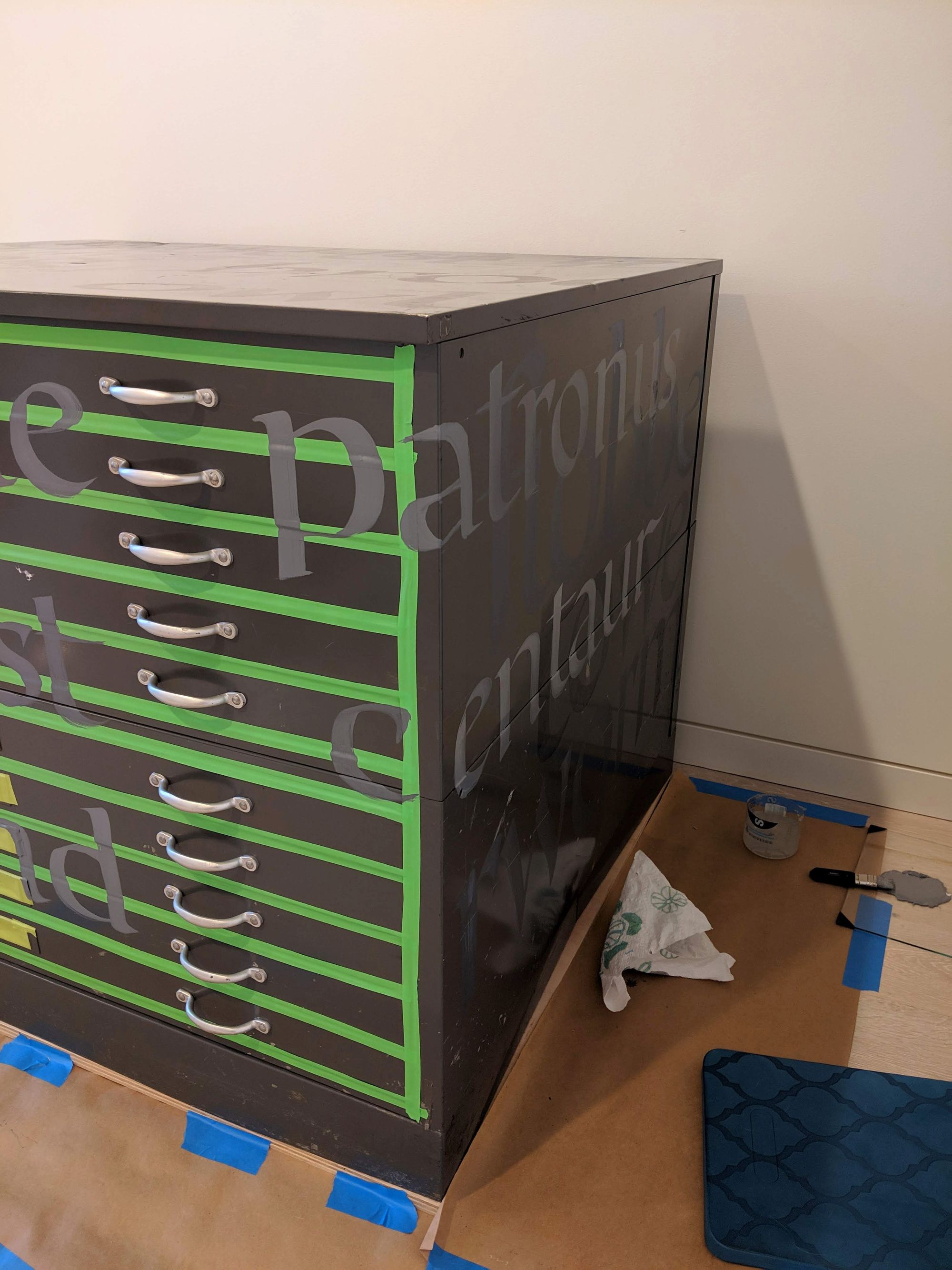
Wrapping letters around corners is hard, but it’s easier than trying to space letters correctly on the corner. It gets easier with practice too.
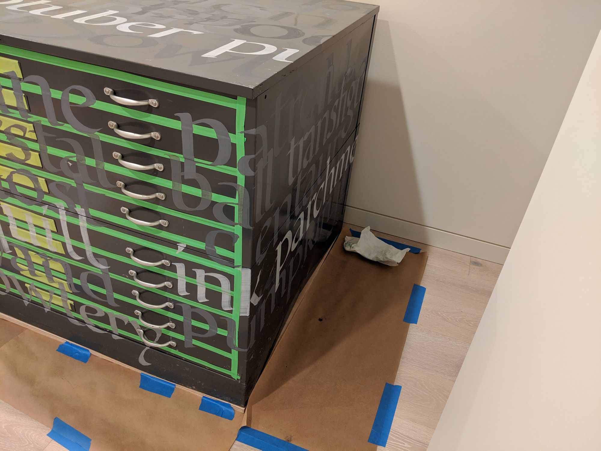
Lesson 6: Writing close to the floor is HARD.
I thought I knew it would be annoying. To be truthful, I had no idea. When you have no space for your arm, and your elbow, and you have to make letters with no support at all, or with support in weird places, it is very challenging.
I was going to write on the very bottom as well, but decided not to do that given that there is no comfortable arm position (or in general no comfortable body position).
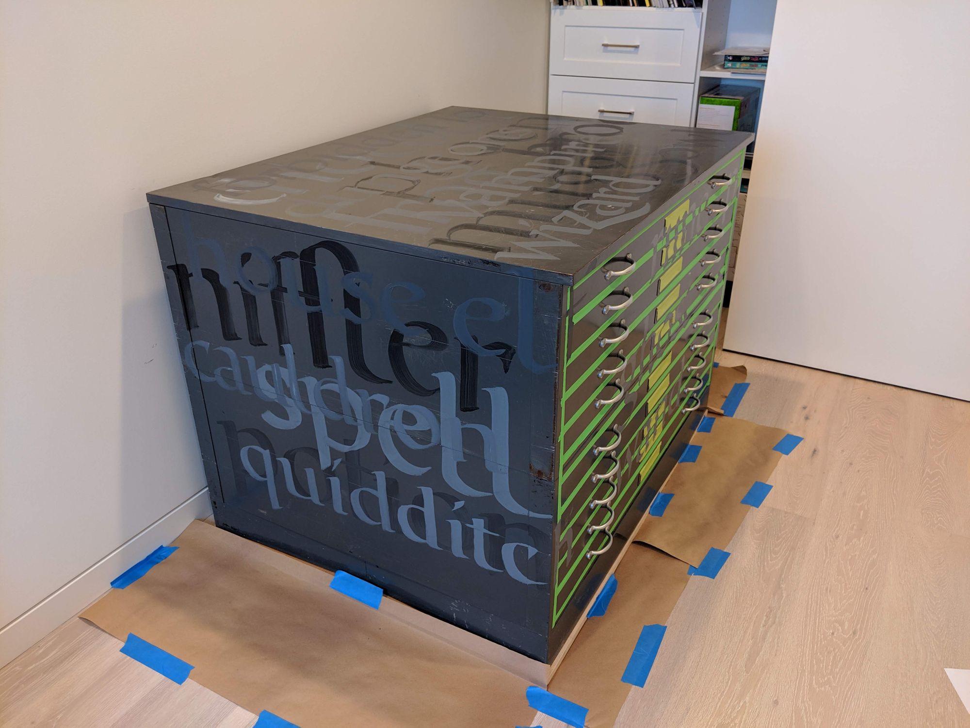
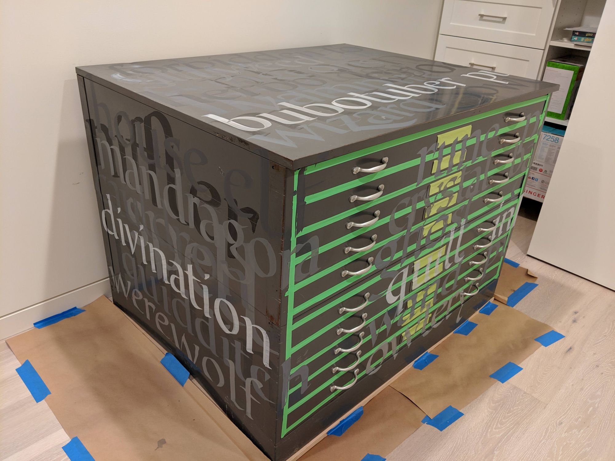
Lesson 7: Know when to stop.
I originally planned to use 6 brushes, but decided to go down to 5, since 1” and 3/4” ended up producing roughly the same stroke width.
I also discovered that writing with the smallest brush was hardest since I did not have as much control. I was considering throwing in a smaller one as #6, but thought better of it.
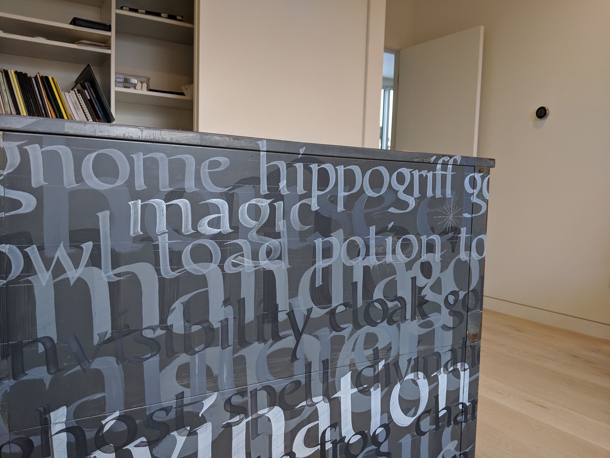
At some point, it was very clear that I need to add more words.
However, as I added more, and considered adding more words in a silver paint, I realized I have to stop before I overdo it.
I added just a few words and sparkles in the silvery color, but did not add whole lines of smaller text with it, or anything like that. Had I done it, I would have gone too far.
Conclusion
Overall, this project was not nearly as hard as I thought. I worked on it for a bit every day, and in two weeks, it was all done.
Comments