Callivember 2020

In November I participated in a calligraphy/lettering challenge. A list of 30 words was provided, one for each day.
I did most of the prompts a day or two ahead of time, since there is not much daylight in November, and it is much harder to get a good photo of a piece in the evening. There were a couple days when I almost didn't finish a prompt, but I decided to post what I had anyway.
In this post, I want to share a bit about the process (or lack thereof) for each of the pieces.
Day 1: Ambitious
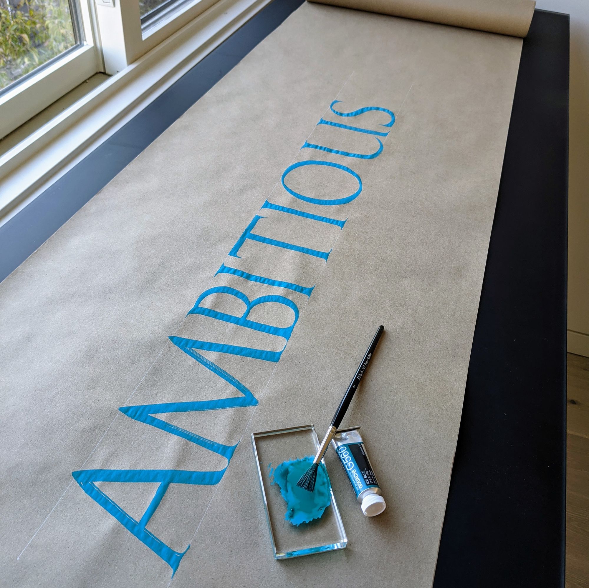
What could be more ambitious than writing large letters with a brush? I figured, not much, hence this piece. I wrote a few letters to warm up before doing the final version, but there wasn't much preparation or planning. I am about 70% happy with the outcome. The spacing between B and I is pretty bad, and some of the letter shapes could use improvement. The angle of the photo helps conceal some of the badness, so this was entirely a strategic choice on my part :)
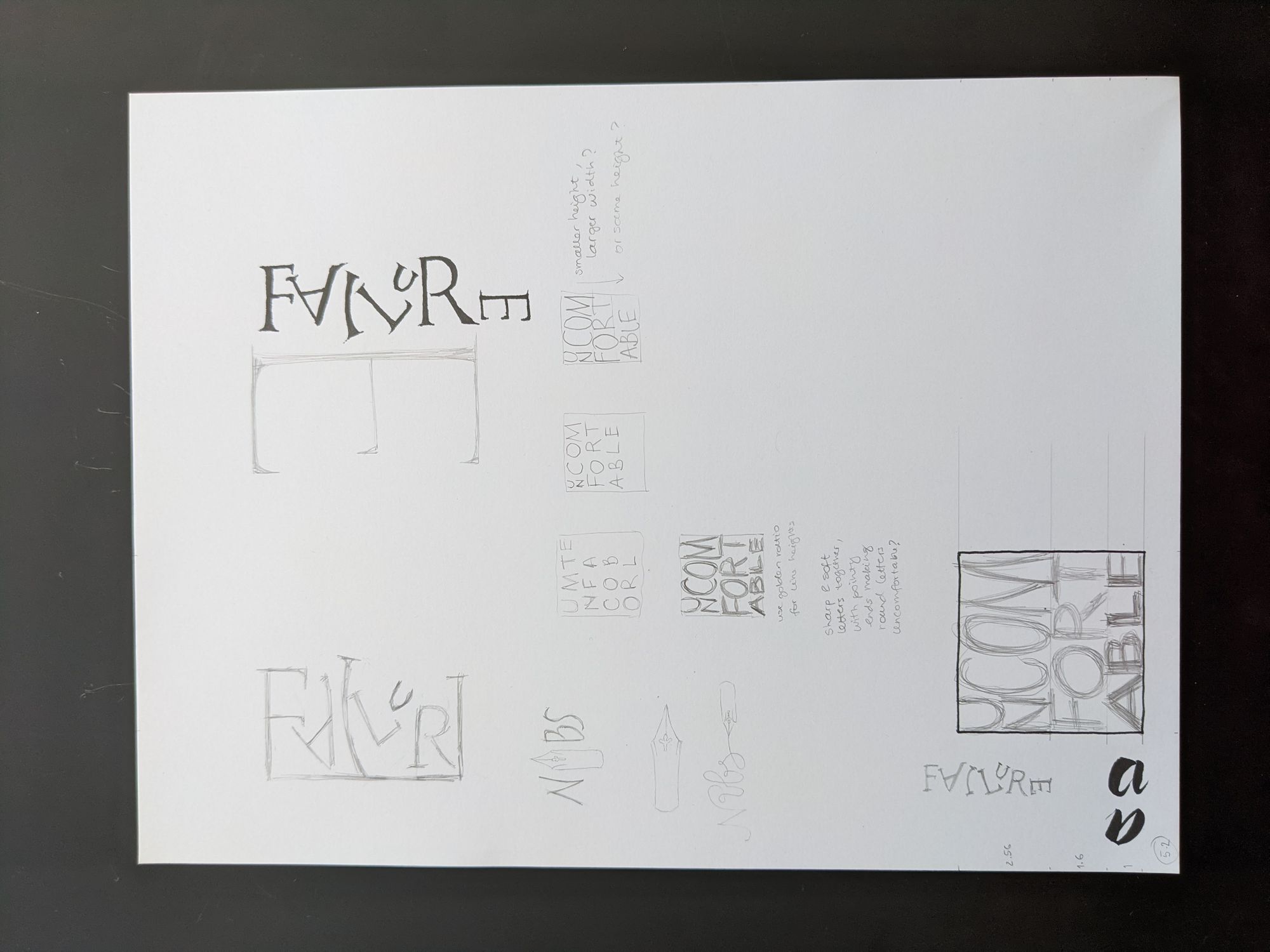
Day 2: Failure
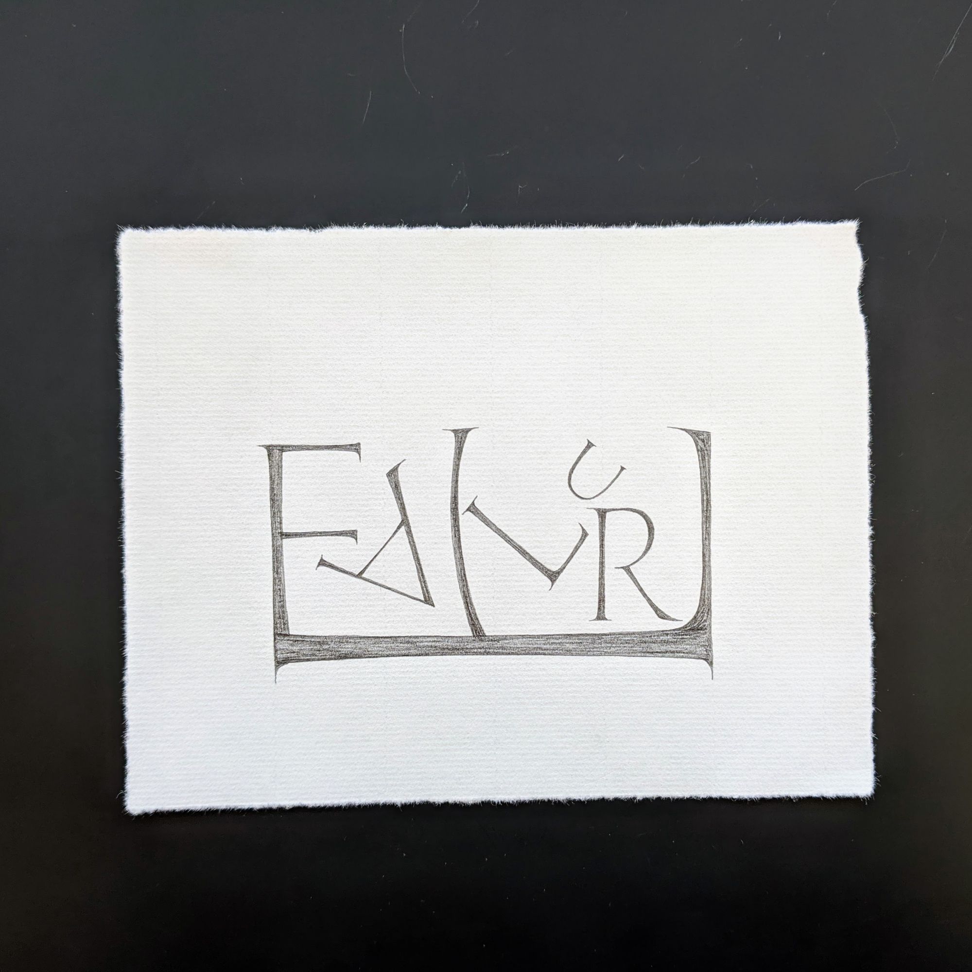
For this piece, I didn't want to do something crossed out or really badly messed up, so instead I put the letters into a promising, but ultimately unsuccessful layout.
My drafts for this piece are intermixed with drafts and ideas for some of the other pieces. I initially wanted to do an E at the end that fell over completely, but decided it would be more exciting to stuff the rest of the letters into it instead.
Day 3: Nibs
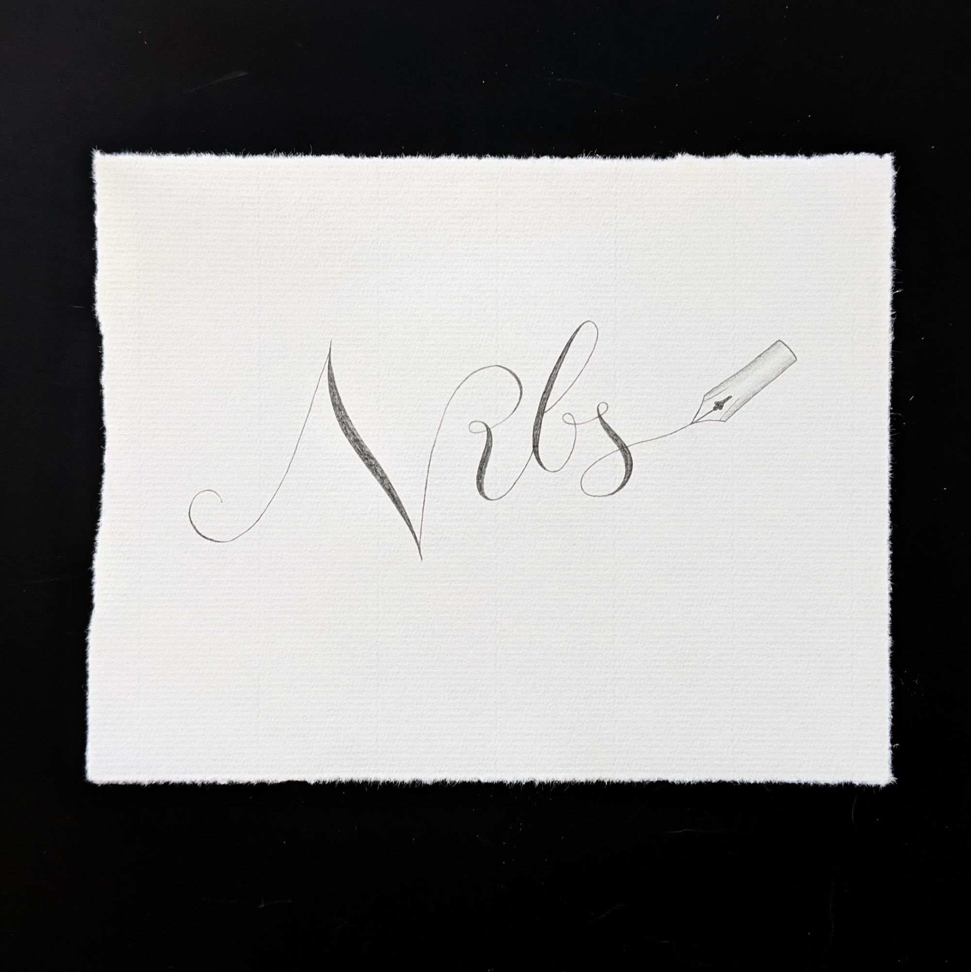
I decided to go just one step away from the obvious "nib instead of i", which you can see in my draft above.
Originally, I was going to do this piece with a pointed pen, but ended up doing it in pencil to save time.
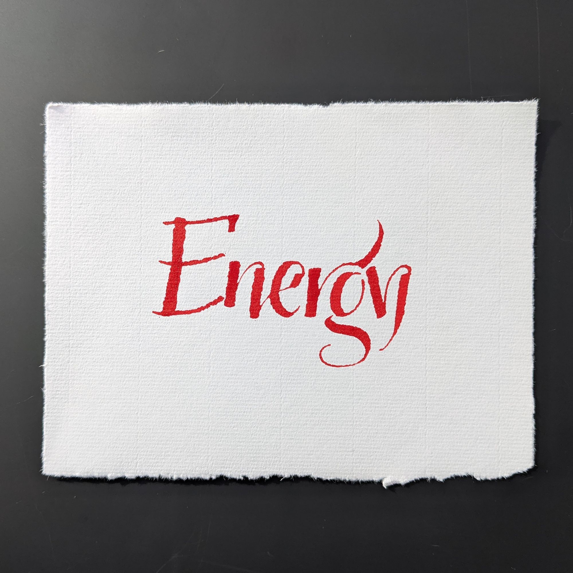
Day 4: Energy
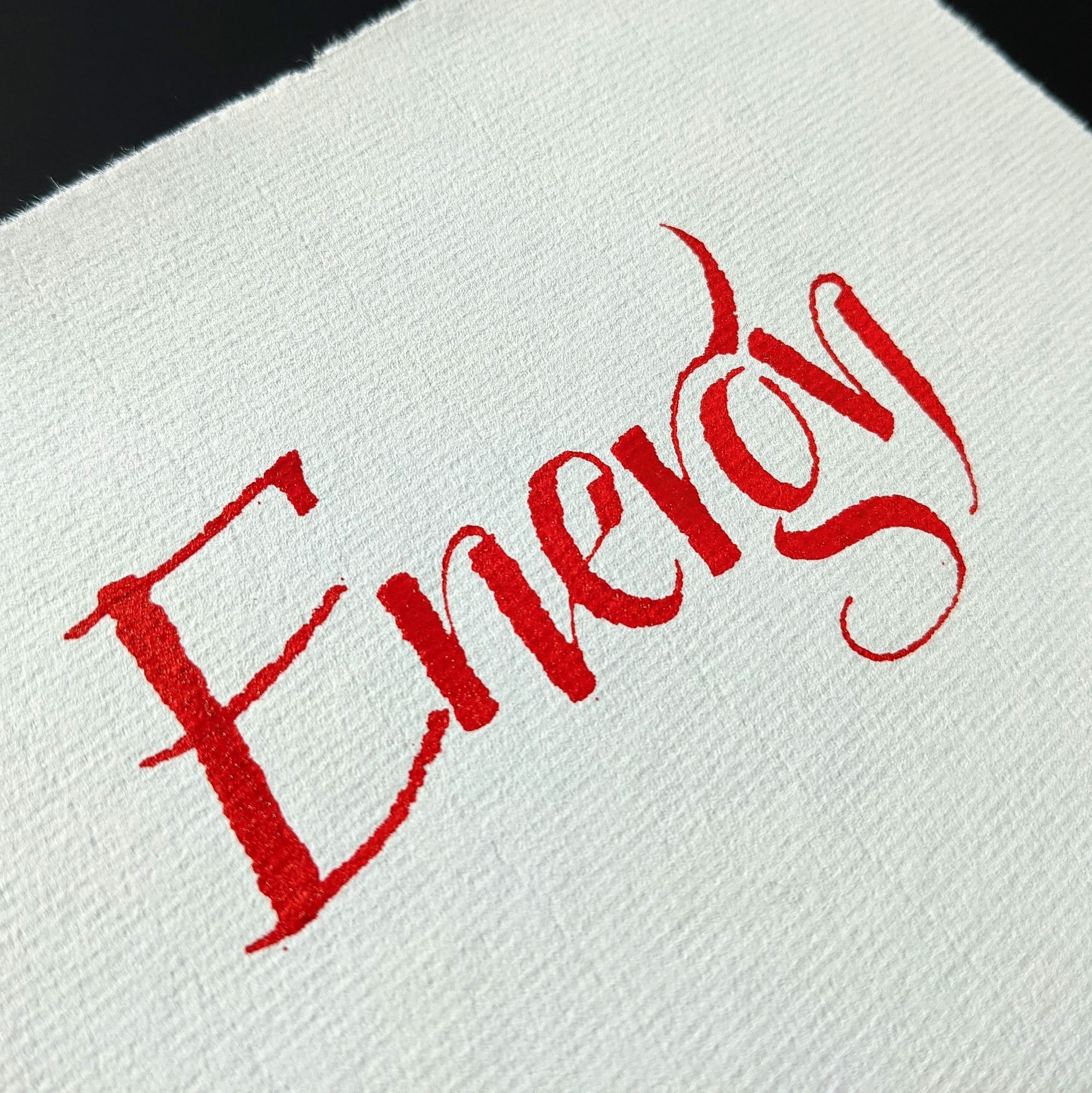
I really wanted to do this word with a folded pen, since I felt like it needed to be very expressive. I don't use folded pens much, so every time I have to figure out how to make things look reasonable. I probably spent more time warming up for this piece than I did on the previous 3 from start to finish.
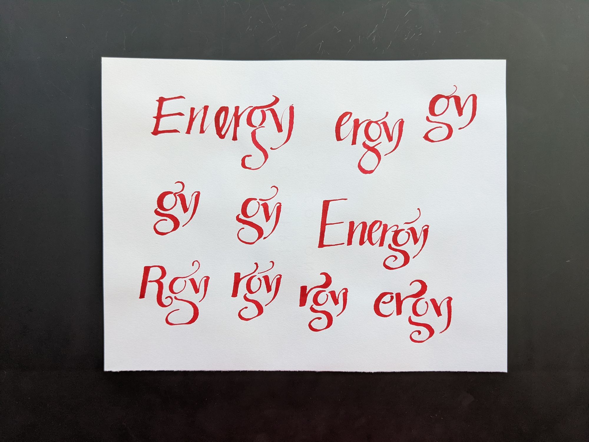
Just as I promised, the first page is pretty bad. I kind of knew what I wanted to do with the Y, but not really any of the other letters.
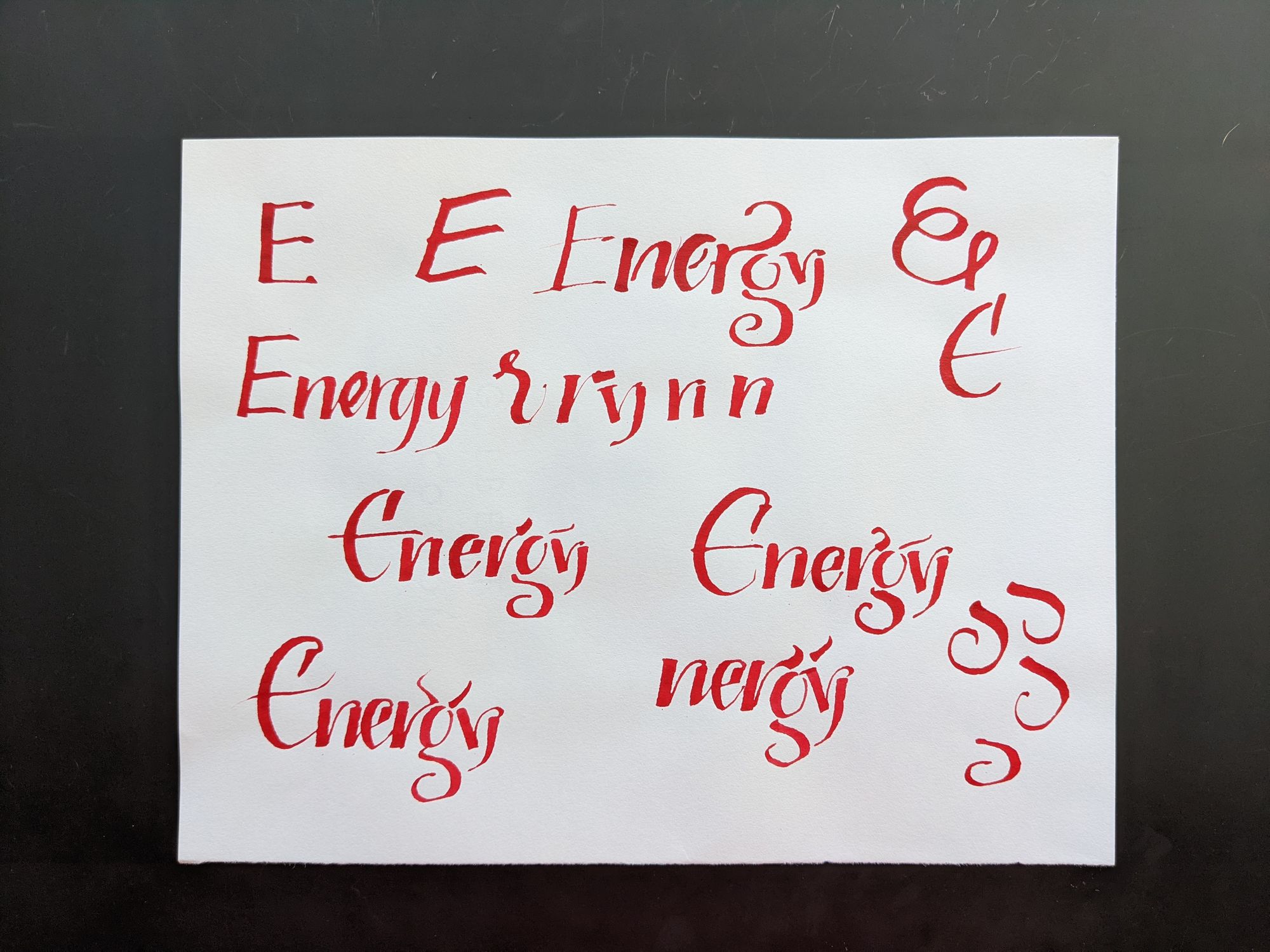
Next, I decided to explore some E's, while still figuring out what to do with the rest of the letters.
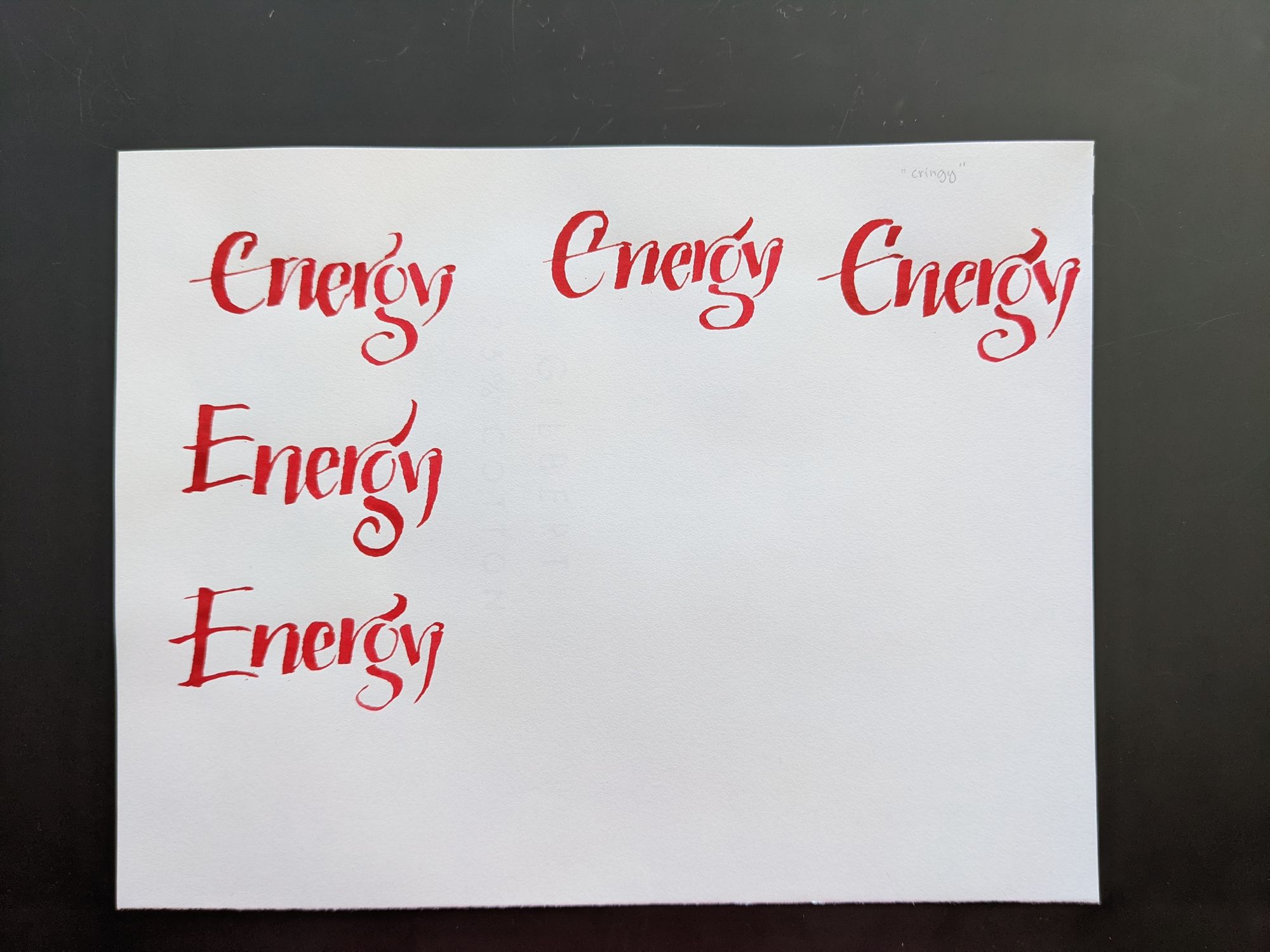
I started feeling pretty good about the top of the page, until I realized the word doesn't read clearly anymore, and could be mistaken for "Cringy". So I went back to the regular E.
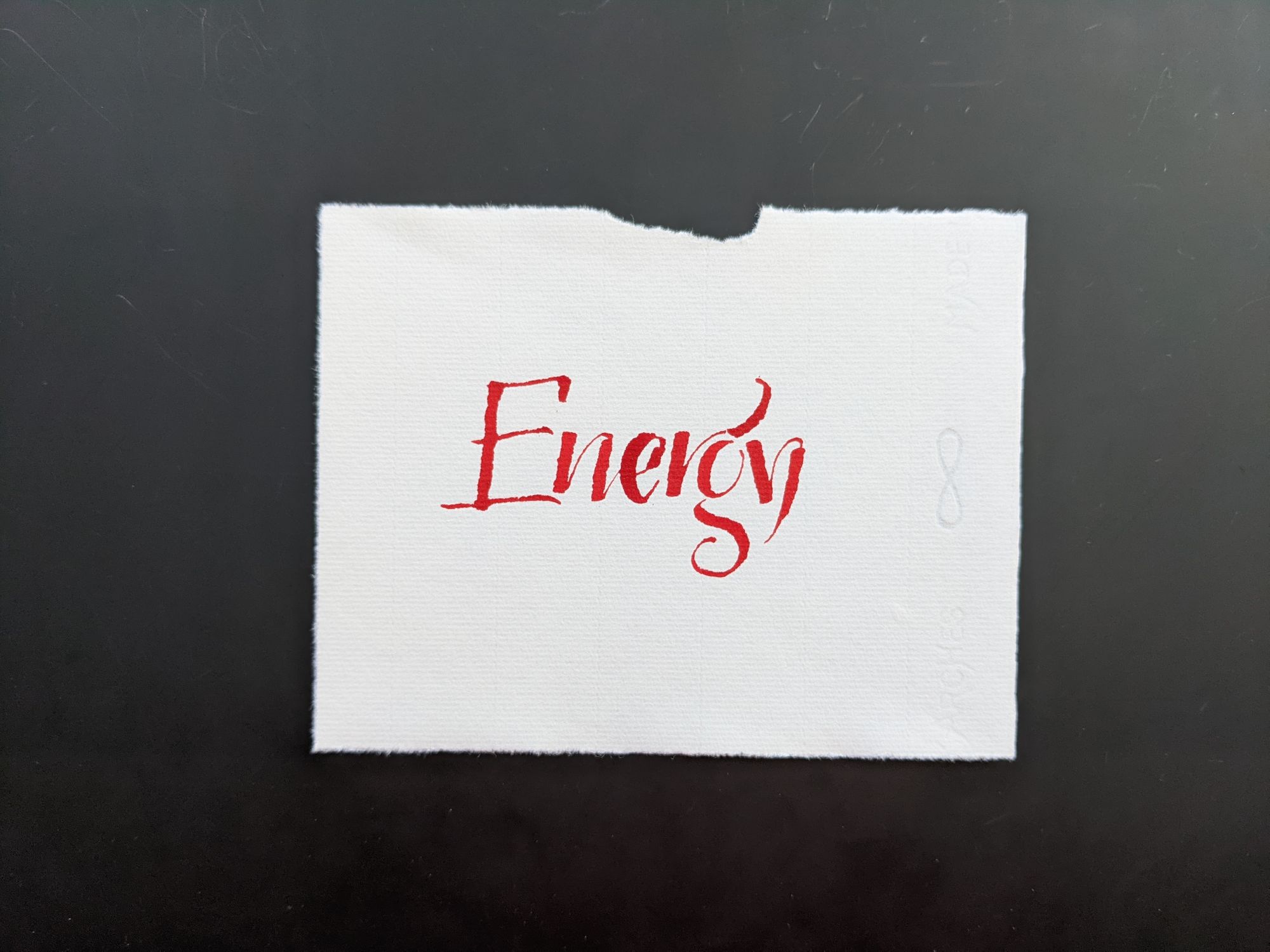
This was my draft on good paper. I wasn't intending to use it as a final, so I used a torn piece of paper. I think that the combination of E and N worked out better than in the final piece (included below), but I chose not to make another copy.
Day 5: Uncomfortable
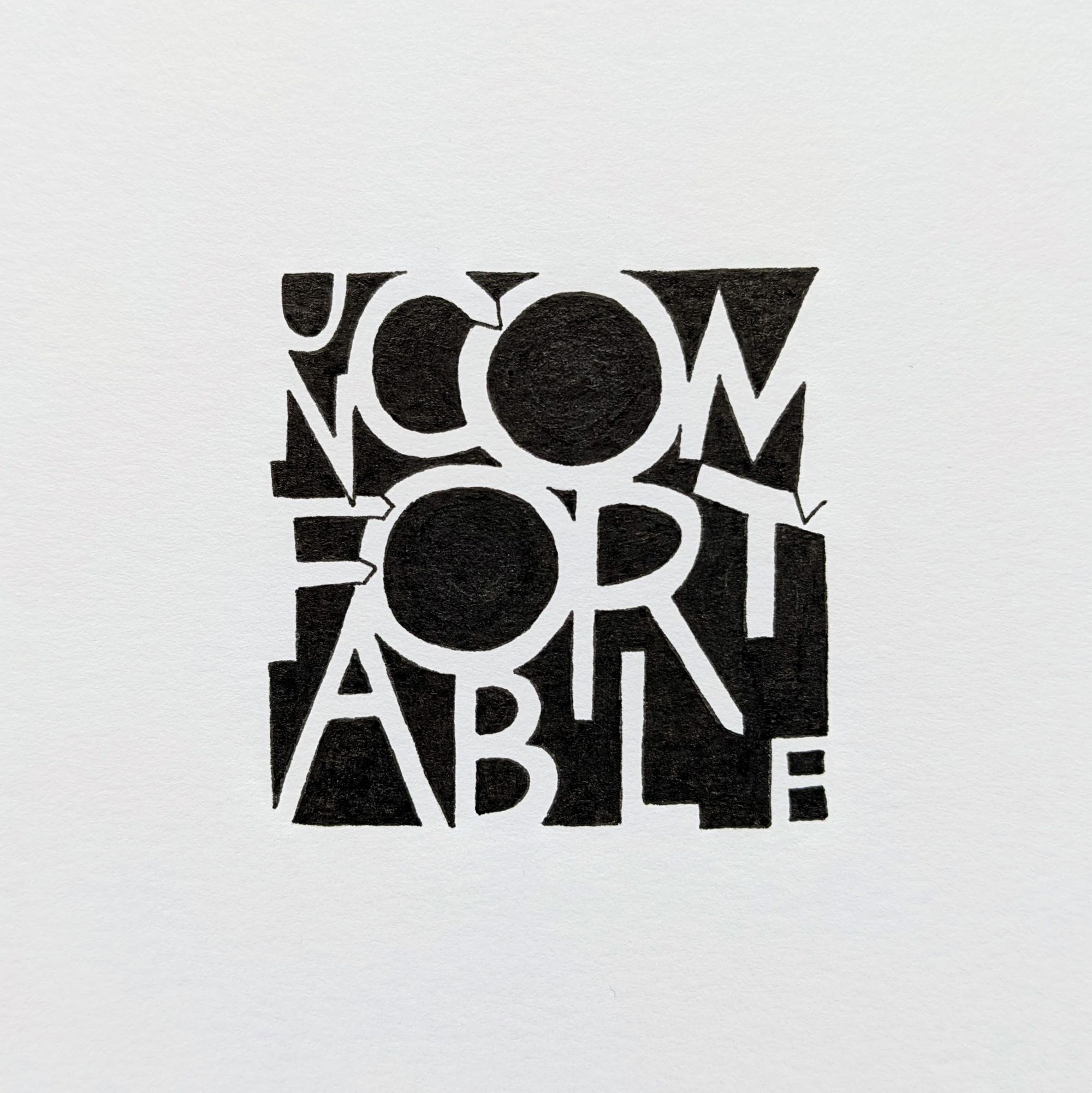
This was an interesting piece in that I had the idea what I wanted to do right away, but it took a lot of attempts to transfer it to the real world.
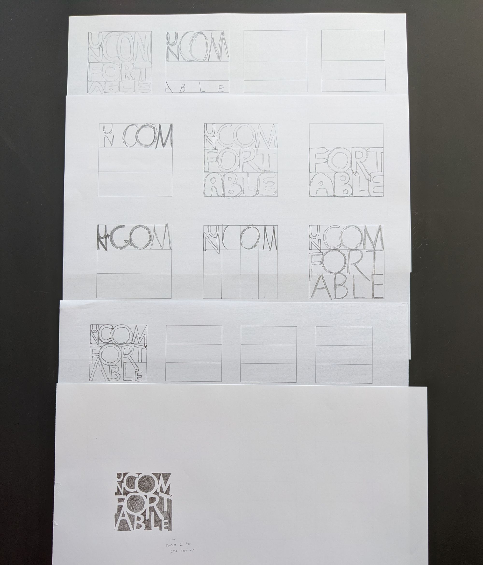
I wasn't sure if I wanted the lines to be of the same height, or different heights, or how exactly I wanted the letters to feel "uncomfortable". Let's just say I had high expectations for this prompt, but the result was only okay.
Day 6. Consistency
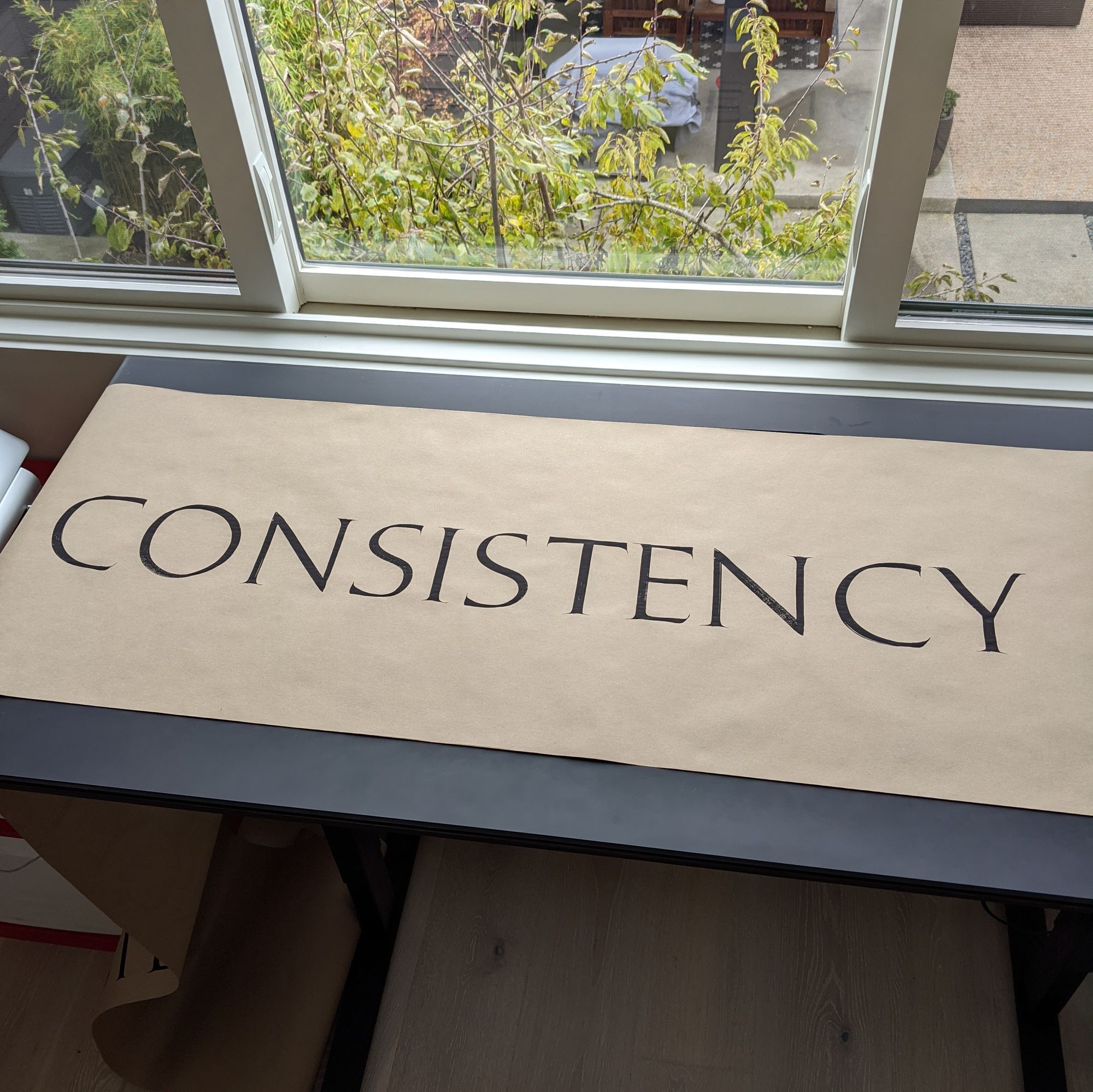
This piece could benefit from a little more consistency :)
To be honest, I was in a rush to get it done before the sun went away, and I wasn't having a particularly good day. The O is sad. And if you look carefully at the picture, you can see how much of the paper is on the floor with some practice letters on it. I'm not going to post pictures of those because they are simply not good.
Day 7: Focus
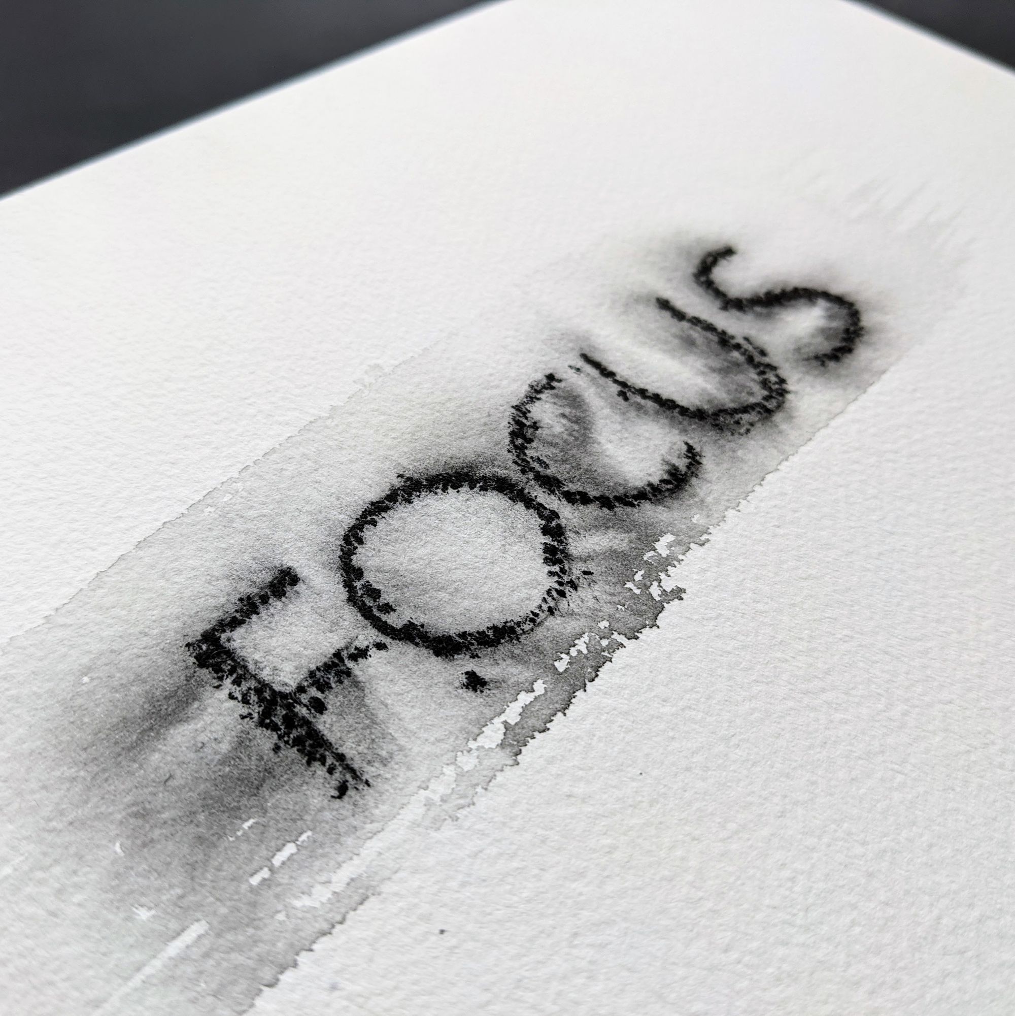
Shortly before the challenge started, I took a workshop on graphite effects. What a better way to practice what I learned than to use it in an actual piece? I wrote the word lightly in pencil, then brushed the paper with water, and then wrote it with water-soluble graphite on top.
My original plan for this piece was to make all of the letters appear blurry (so they would be out of focus, yes), and I was going to just use a regular pencil and a blending stump to achieve that effect. It turned out so poorly that it went straight in the trash, and I did not take any pictures.
Day 8: Loop
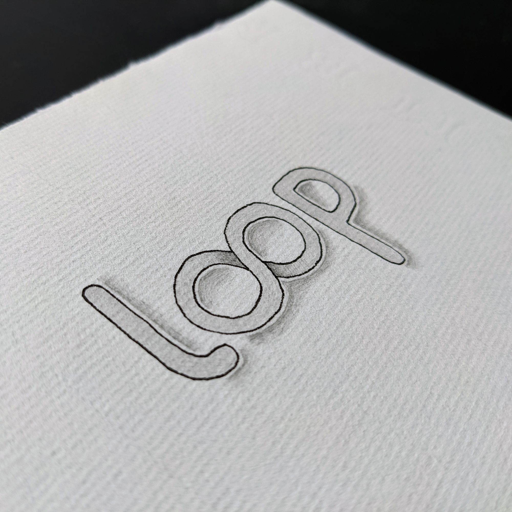
I just sat down and drew some letters, and then added a shadow to them. Nothing fancy this time. Still recovering from the fiasco of the previous day :)
Day 9: Sacrifices
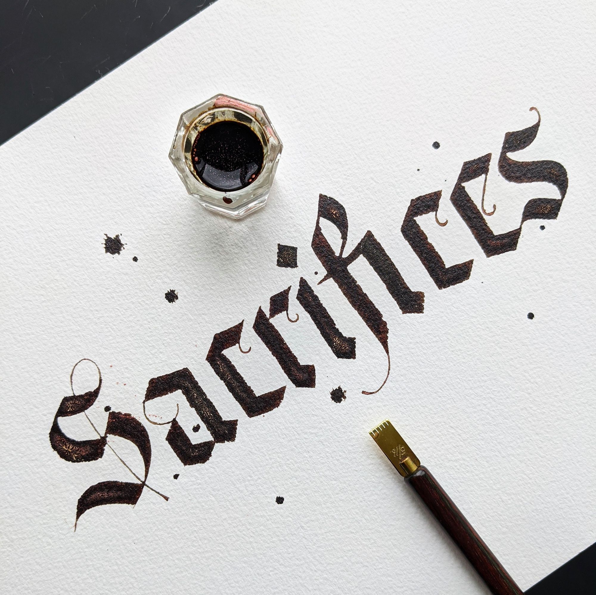
Nothing speaks sacrifices like good old Blackletter, right? :D
I also remembered that at some point, I saw a piece where the artist used walnut ink mixed with PearlEx powder, and the effect was really nice, so I decided to try it myself.
Of course, first I needed to warm up (and also to write the word incorrectly a few times because I was distracted).
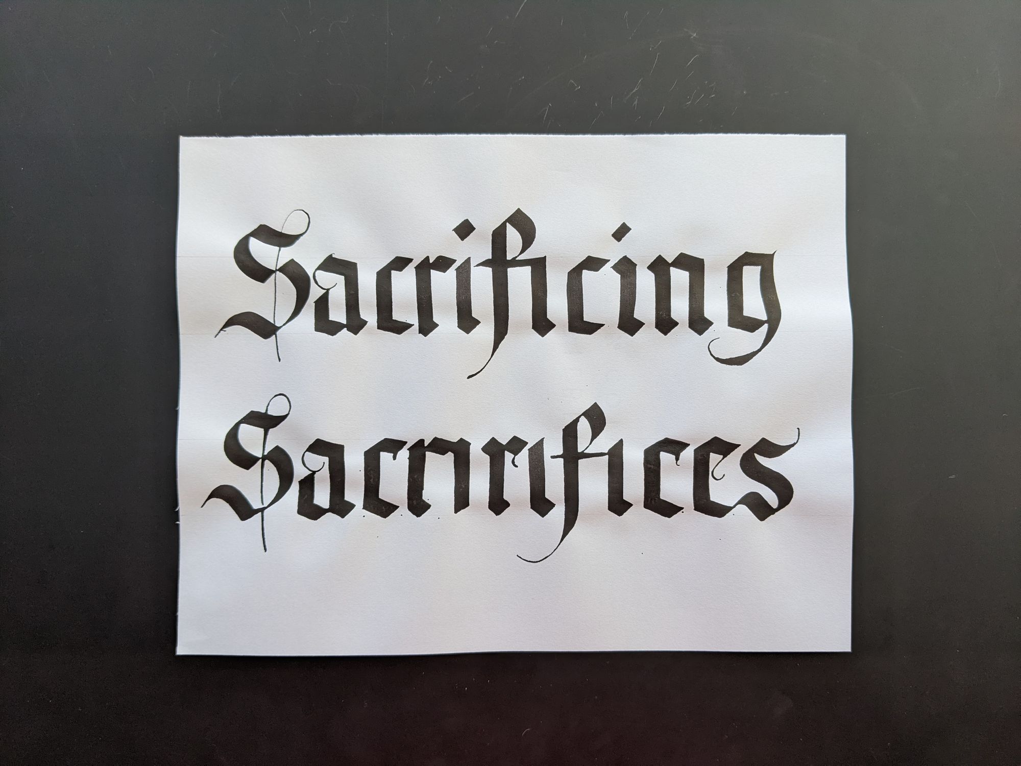
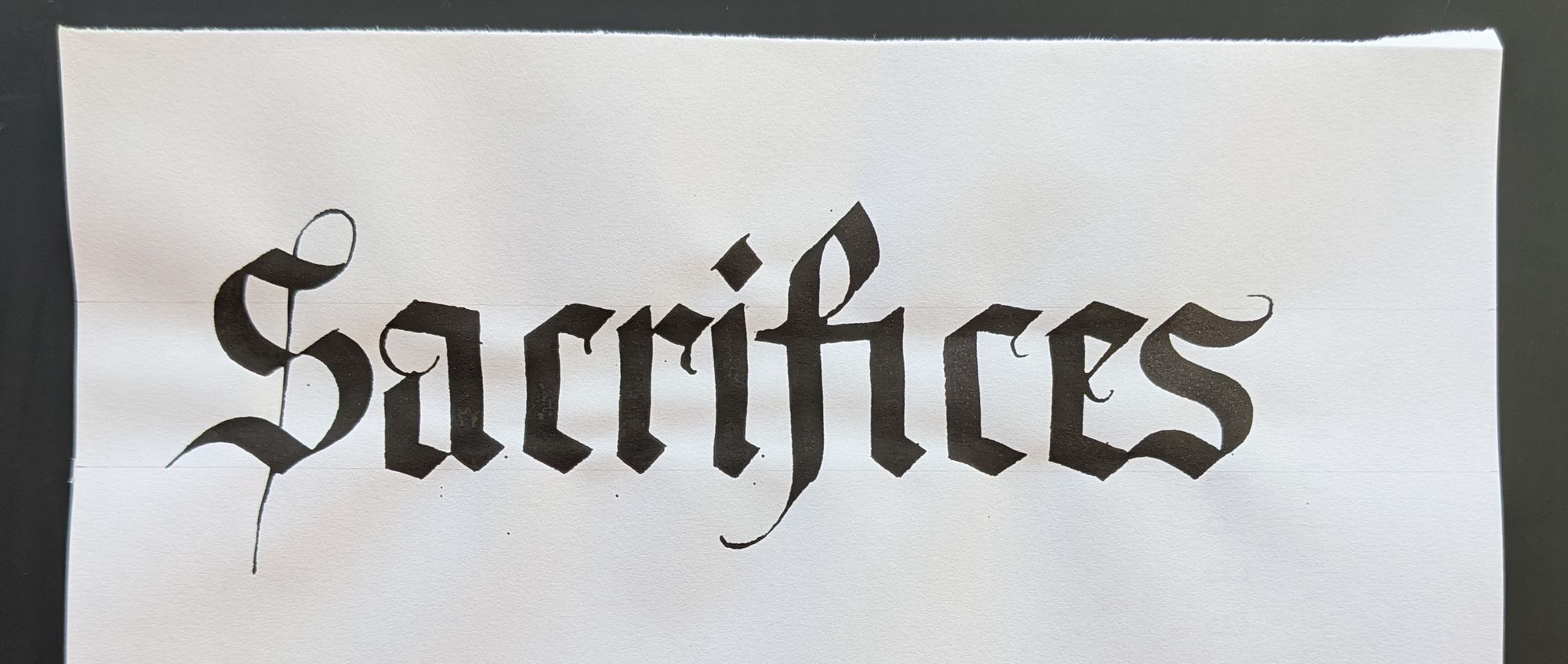
The final version looked really cool when it was wet, but something went wrong as it dried, and all of the ink cracked. Also, it doesn't look as sparkly as I had hoped.
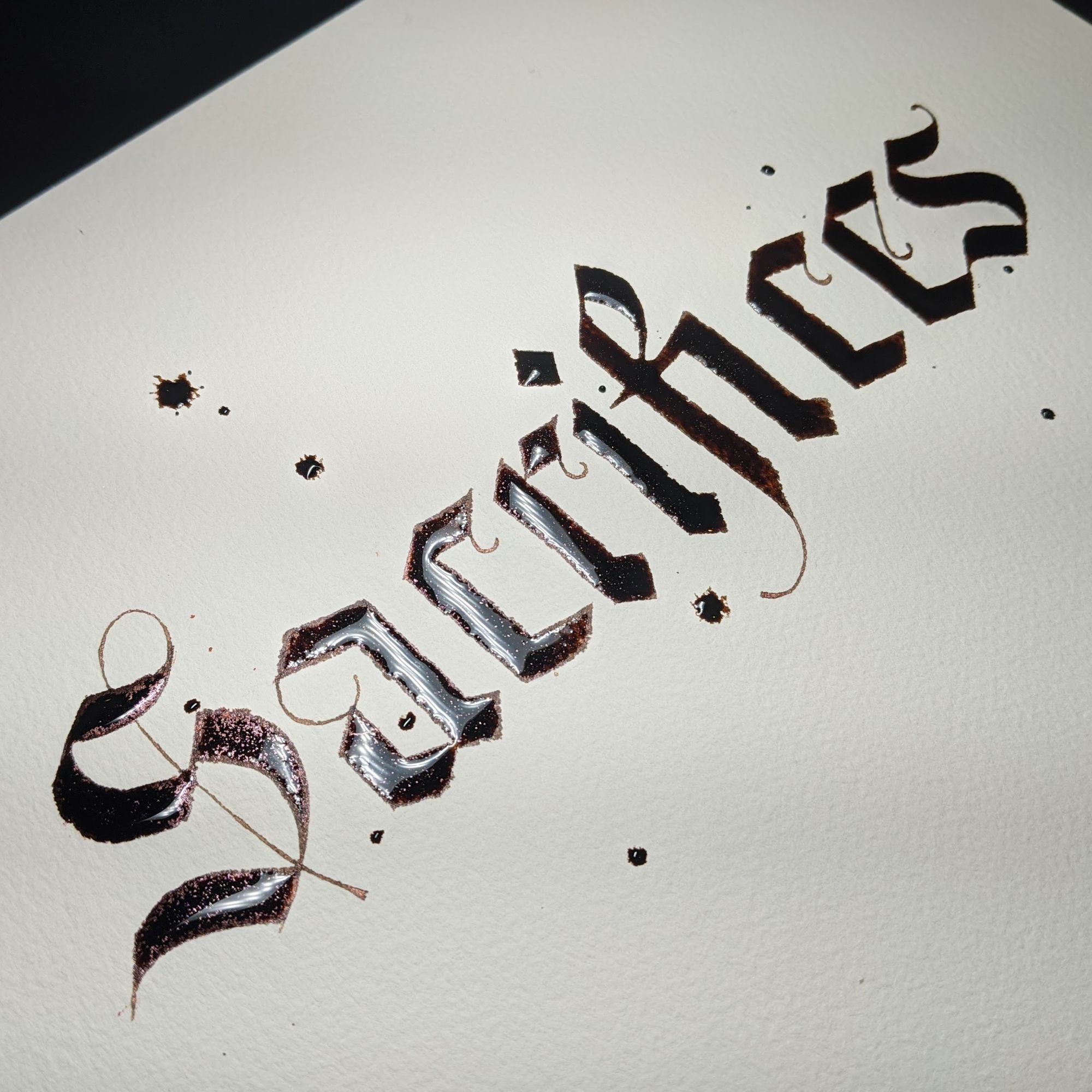
One thing that I do not remember is whether the ink blobs were intentional, or whether the first one was accidental :)
Day 10: Impossible
I had posted this one as a video, so for blog purposes I will include a photo that shows the whole piece instead.
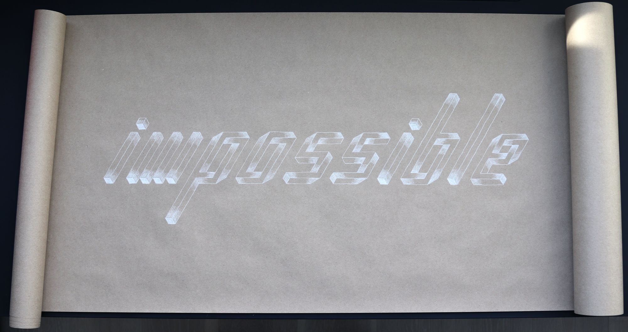
This is my second favorite piece of the month. I don't think most people really got it, but I felt quite smug all the same.
When I saw the prompt, I immediately thought of M.C. Escher and optical illusions in general. I thought to make the O based on the "impossible triangle", and while I was researching how to draw it, I came across "count the bars" illusion, which conveniently looked similar to the letter M.
I did some initial exploration of shapes (you can also see the next day's prompt at the bottom).
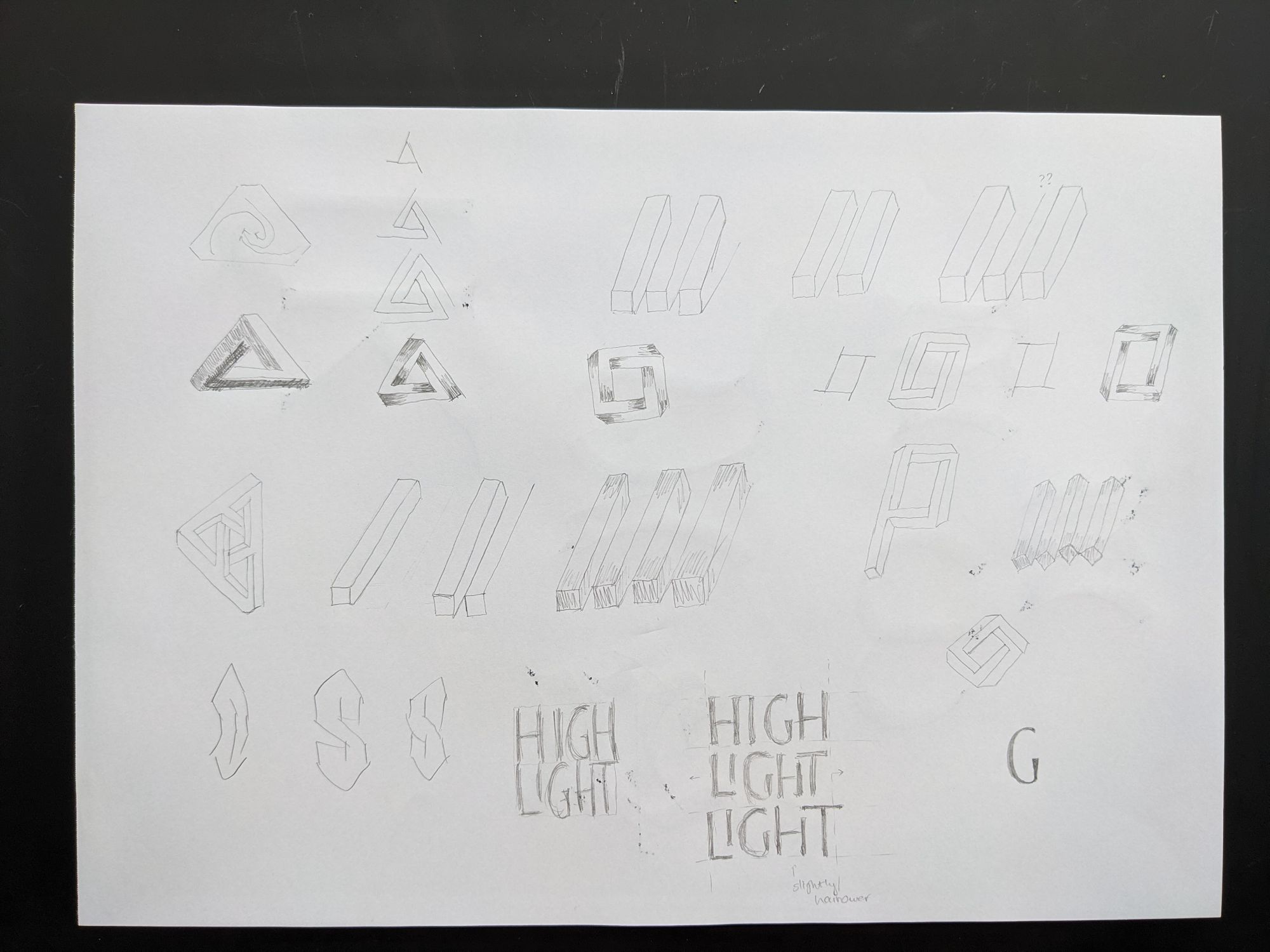
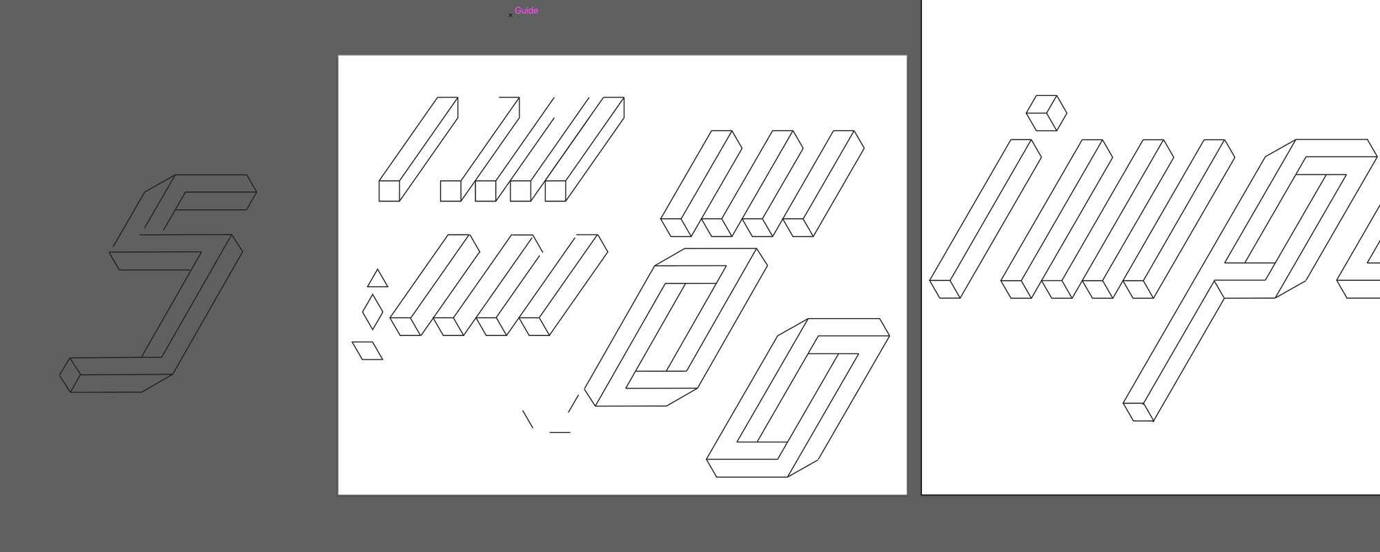
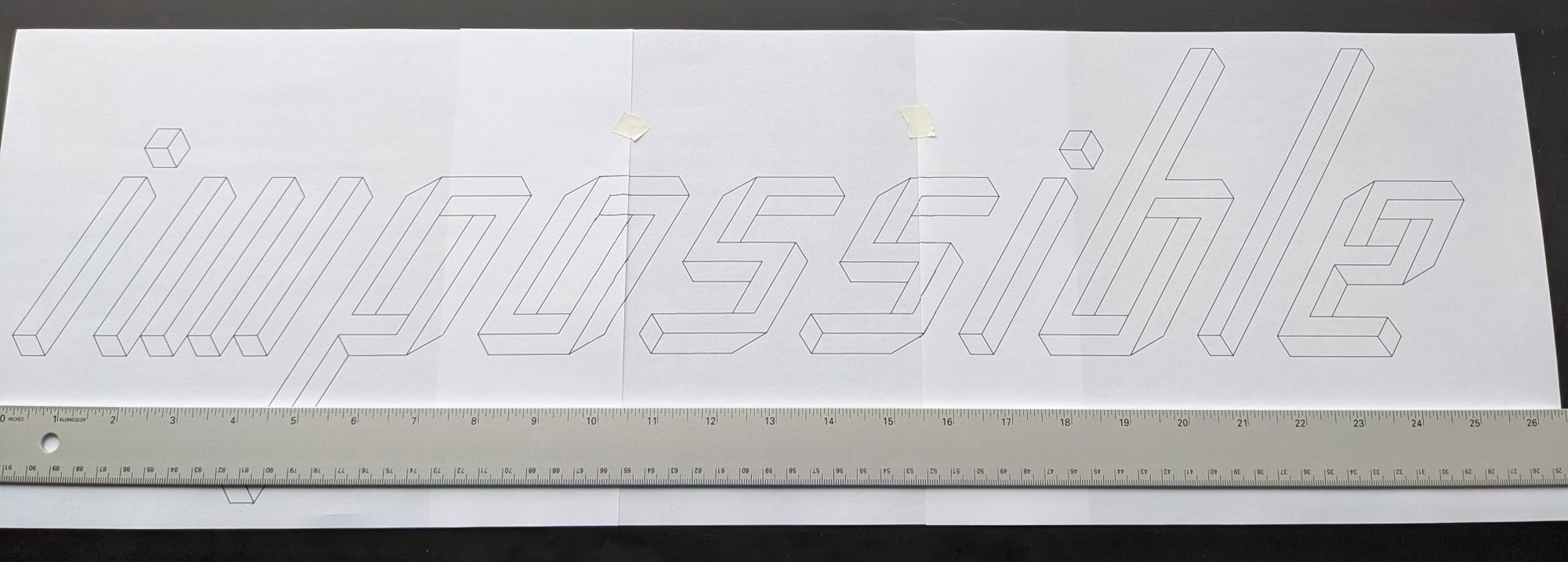
Since I wanted to make the letters pretty large and also slanted, instead of using paper for my drafts, I constructed the letters in Illustrator. This allowed me to have consistent slant and weight, and also to figure out how to make an S by reflecting the O, and now to turn a P into a B.
For the final piece, I printed the word out, and used it as a guideline that I traced with a pencil.
Day 11: Highlight
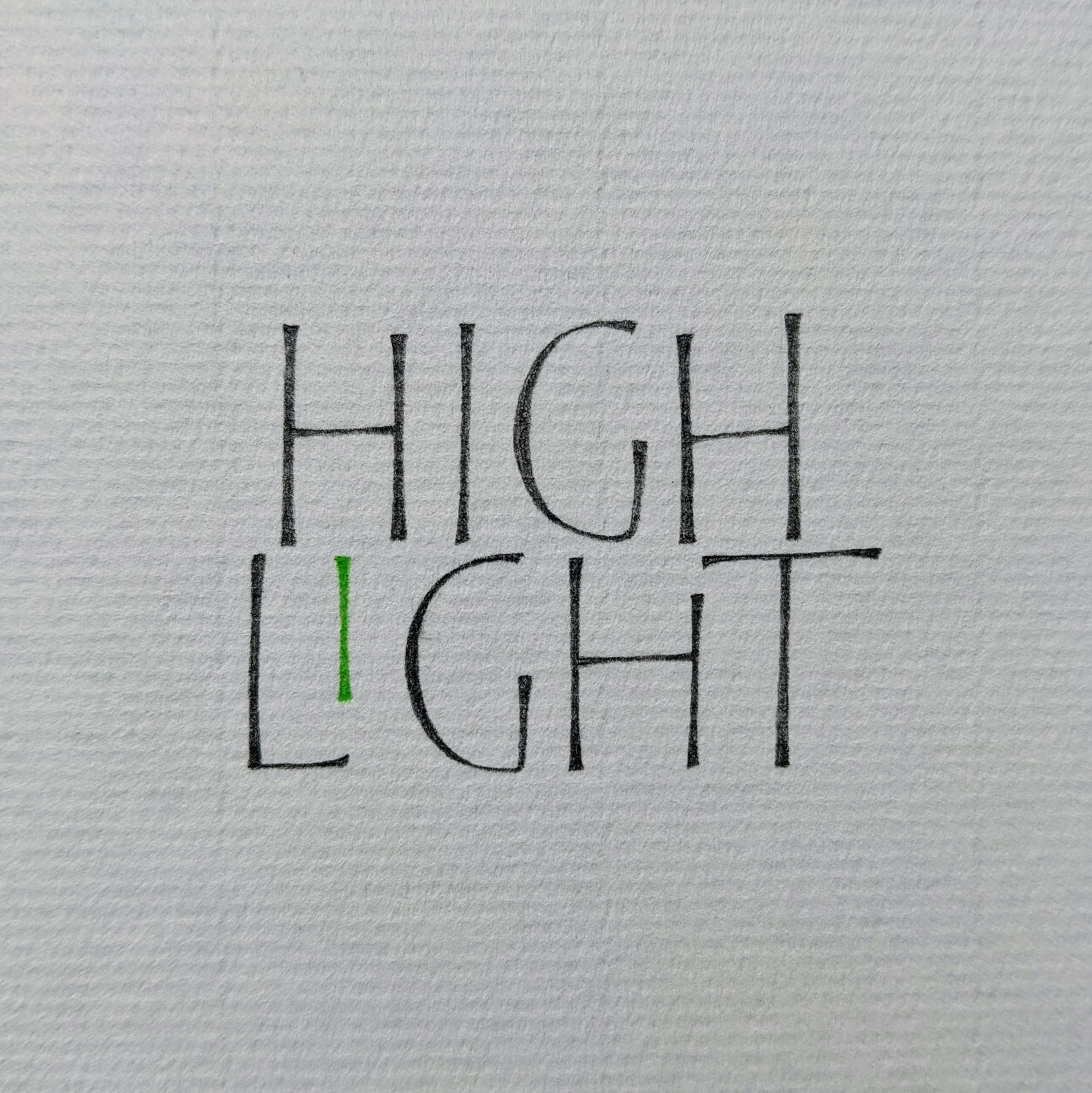
I didn't have any particularly amazing ideas for this prompt, so I made this piece in about 10 minutes. Surprisingly, many more people liked it and even commented on it than I expected.
Honestly, I have no idea what is so special about it :)
Day 12: Freedom
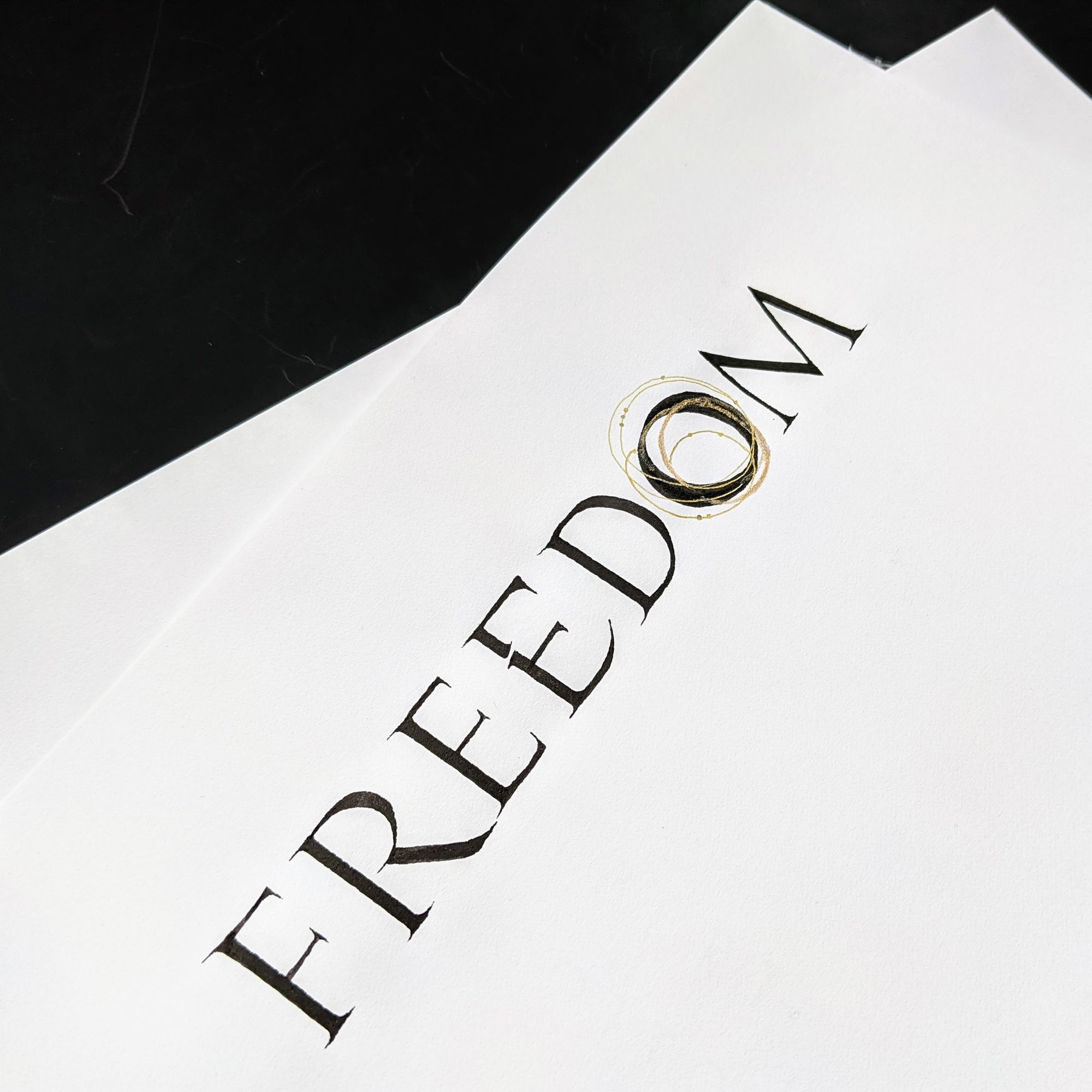
For this one, I actually have an interesting back story.
I had signed up for a workshop on Roman Capitals with Elmo van Slingerland, and I was hoping to write this word in those same capitals after the first session, which was from 10 am to noon local time for me. My plan was to take those 2 hours off, and come back to work later in the day. Of course, plans never go as expected, and I ended up having to leave the workshop about 10 minutes in for an important work thing.
By the time I was free again, it was almost noon, so there was no point trying to rejoin the workshop. Disappointed, I decided to do the prompt anyway, using just the handouts as a reference.
The first 3 letters went well. Surprisingly well, given that I did not warm up, and was generally upset. On the second E, my pen just slipped, which is why it has that "totally intentional break in the steam". The D was narrow, but I figured I'd just keep going. The O was even worse, so I decorated it with some golden lines to pretend like that was planned all along. This is probably one of the worst pieces of the month for me.
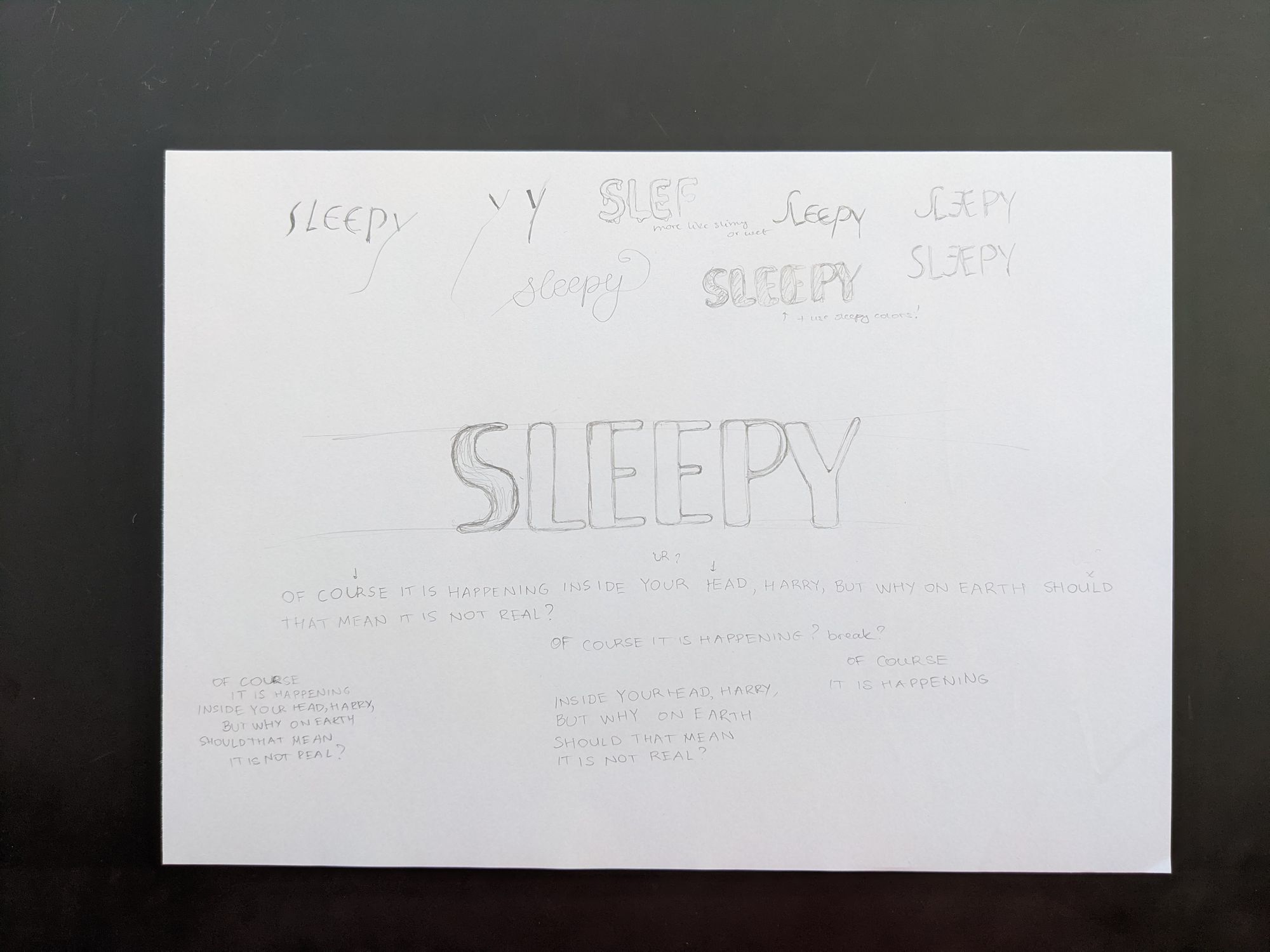
Day 13: Sleepy
I was feeling tired and sleepy, and I was almost running behind schedule for this prompt. I did a few quick sketches, but nothing seemed to convey sleepiness, so I went with simple letters and some lavender instead. The bottom half of my sketch is completely unrelated.
Day 14: Persistence
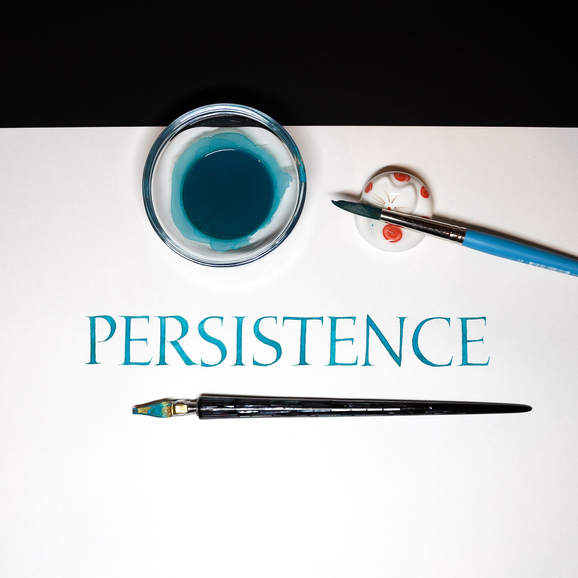
Now that I finally attended the second day of the workshop, and watched videos for the first one, I felt that nothing says "persistence" like good old Roman Capitals.
This is a one-shot piece. No preparation, no warm-up, good enough, post it!
Day 15: Wet
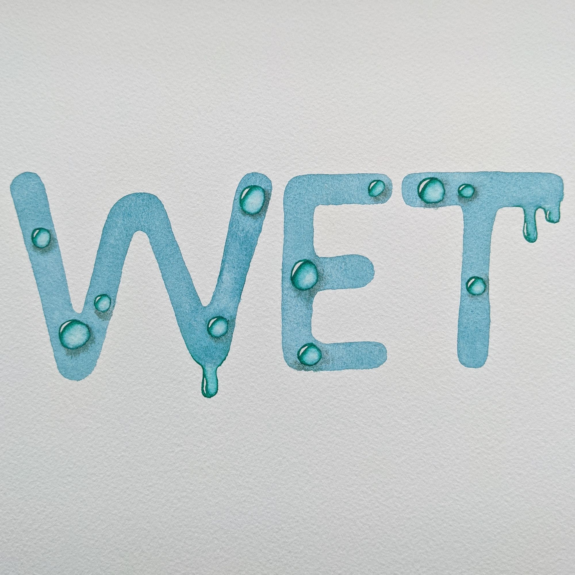
My third favorite piece of the month. I am by no means an expert on watercolor, but I really wanted to paint the water drops, so I did. I just found some YouTube tutorials, and applied what they said.
Day 16: Growth
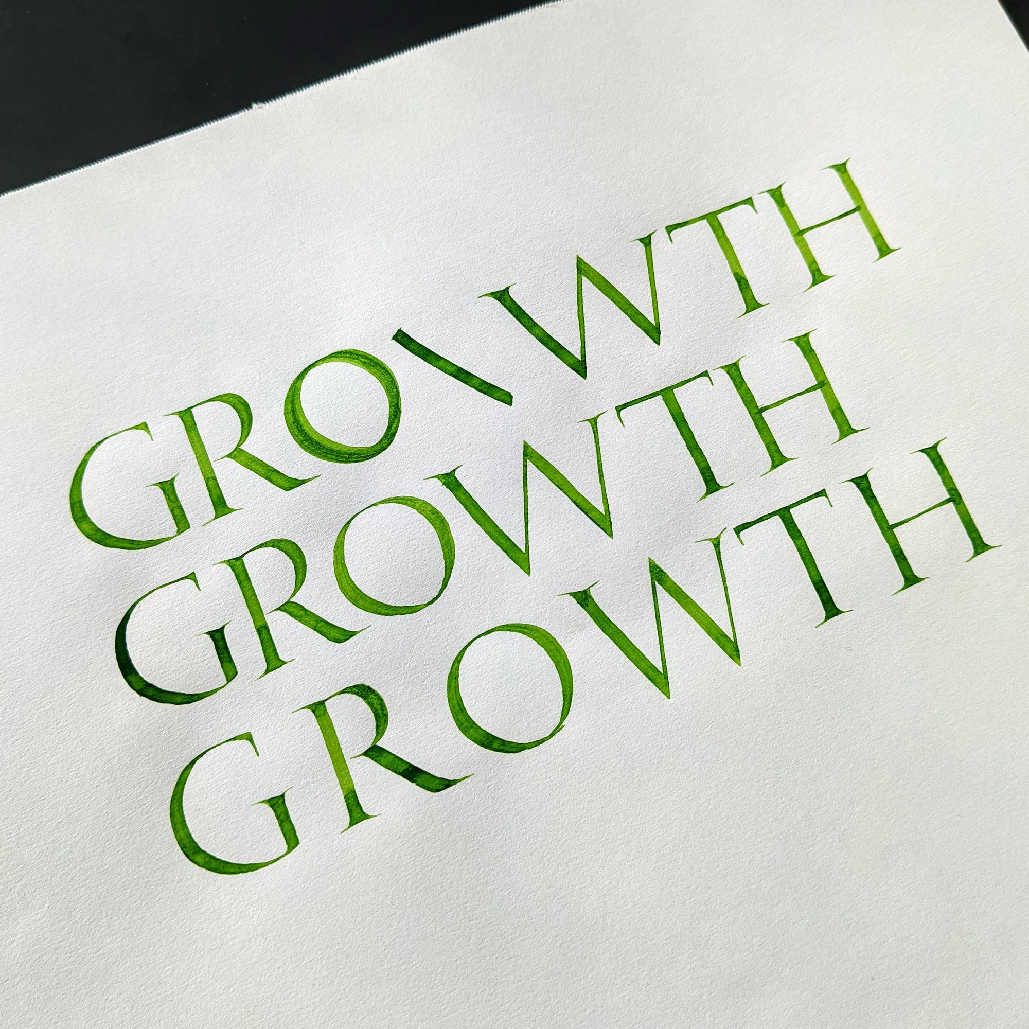
Let's just agree this piece is mediocre at best. What I was going for was showing that nobody is perfect, and how by practicing one could improve. It didn't work out, just looks like a poorly written piece. Next, please!
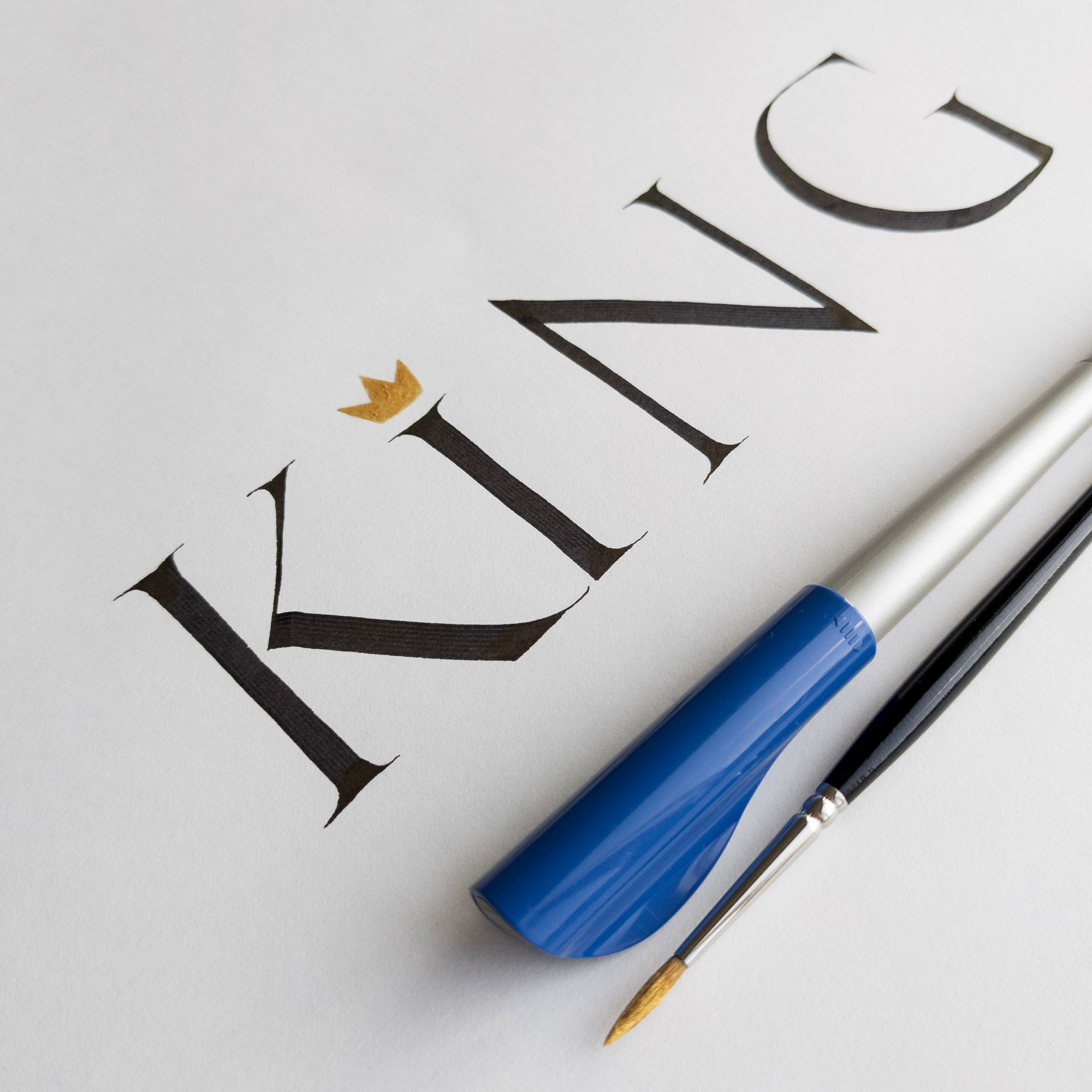
Day 17: King
Since I am being completely honest here, this is what the piece actually looks like:
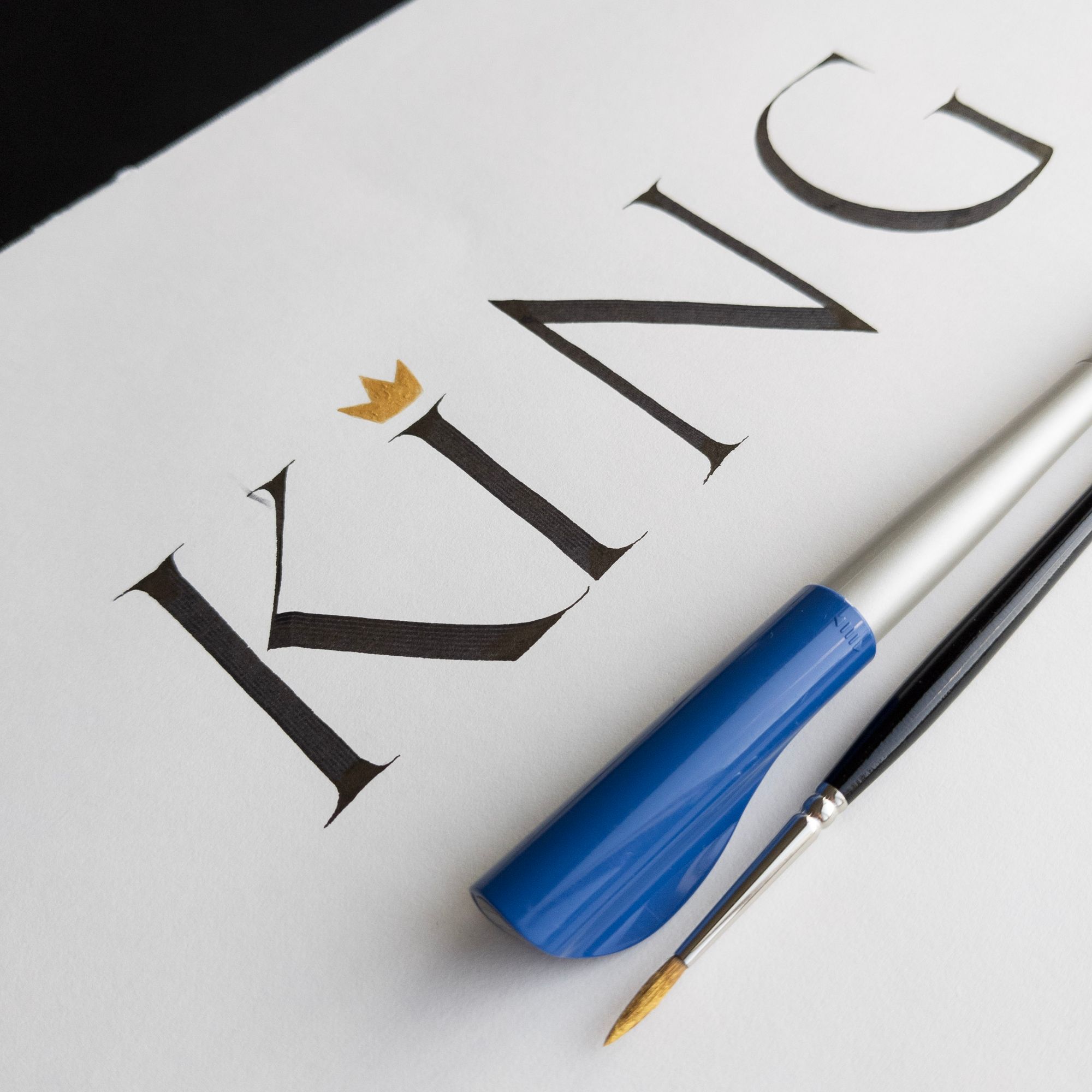
I was really mad at myself for smudging the ink while erasing the lines. I should have known to wait longer, but I wanted to be done with it, so I paid the price. Good thing there's always Photoshop! And while I was at it, I fixed the edge of the paper too :)
Nothing special about this piece, really. Same old capitals, just done with a 6mm Pilot Parallel Pen. The crown was a lot of pain because the gouache I used for it was chunky. Not sure what exactly is wrong, maybe it's just an old tube or something. I bought it because other people were raving about it, and forgot to use it for a few years.
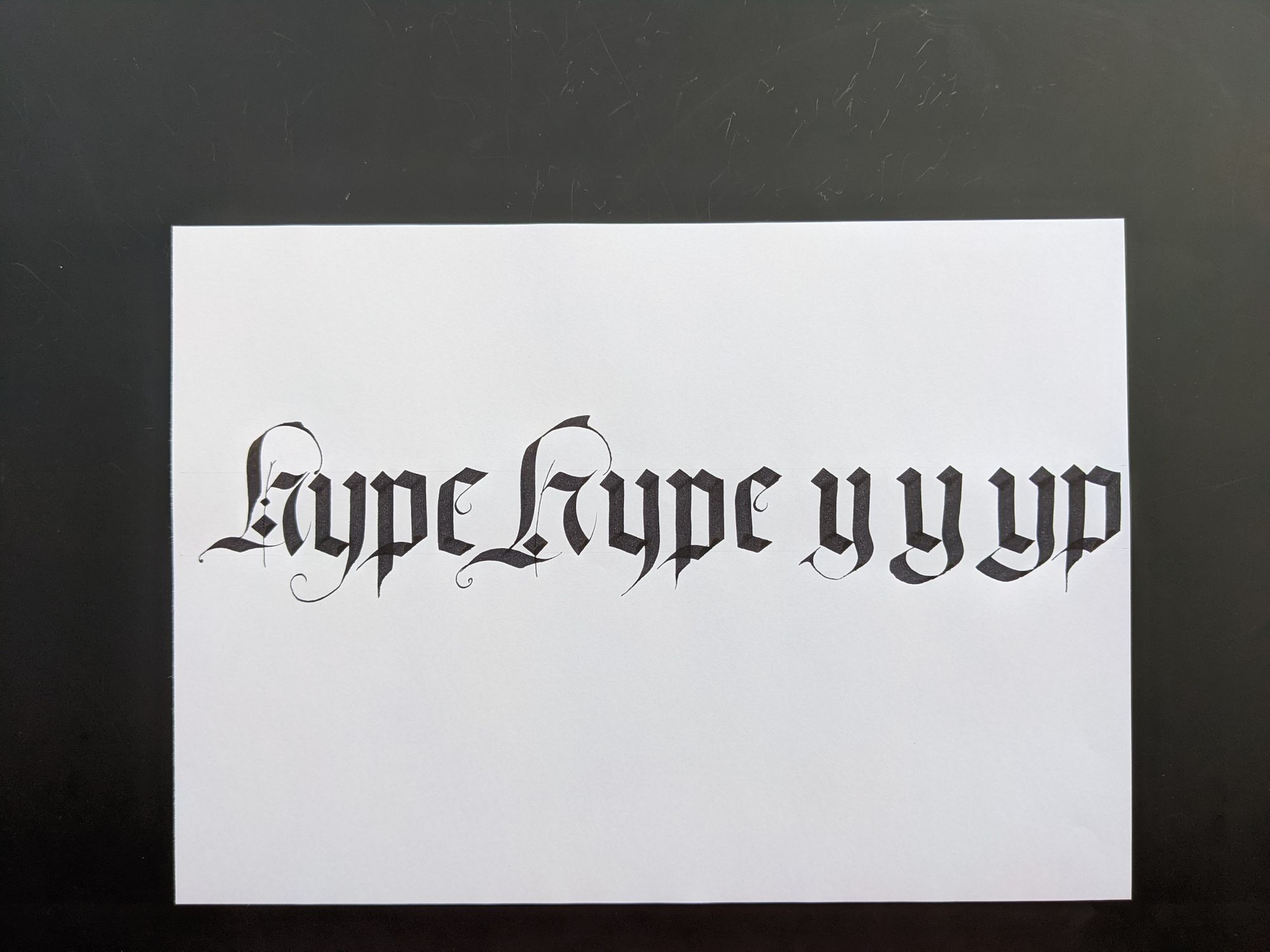
Day 18: Hype
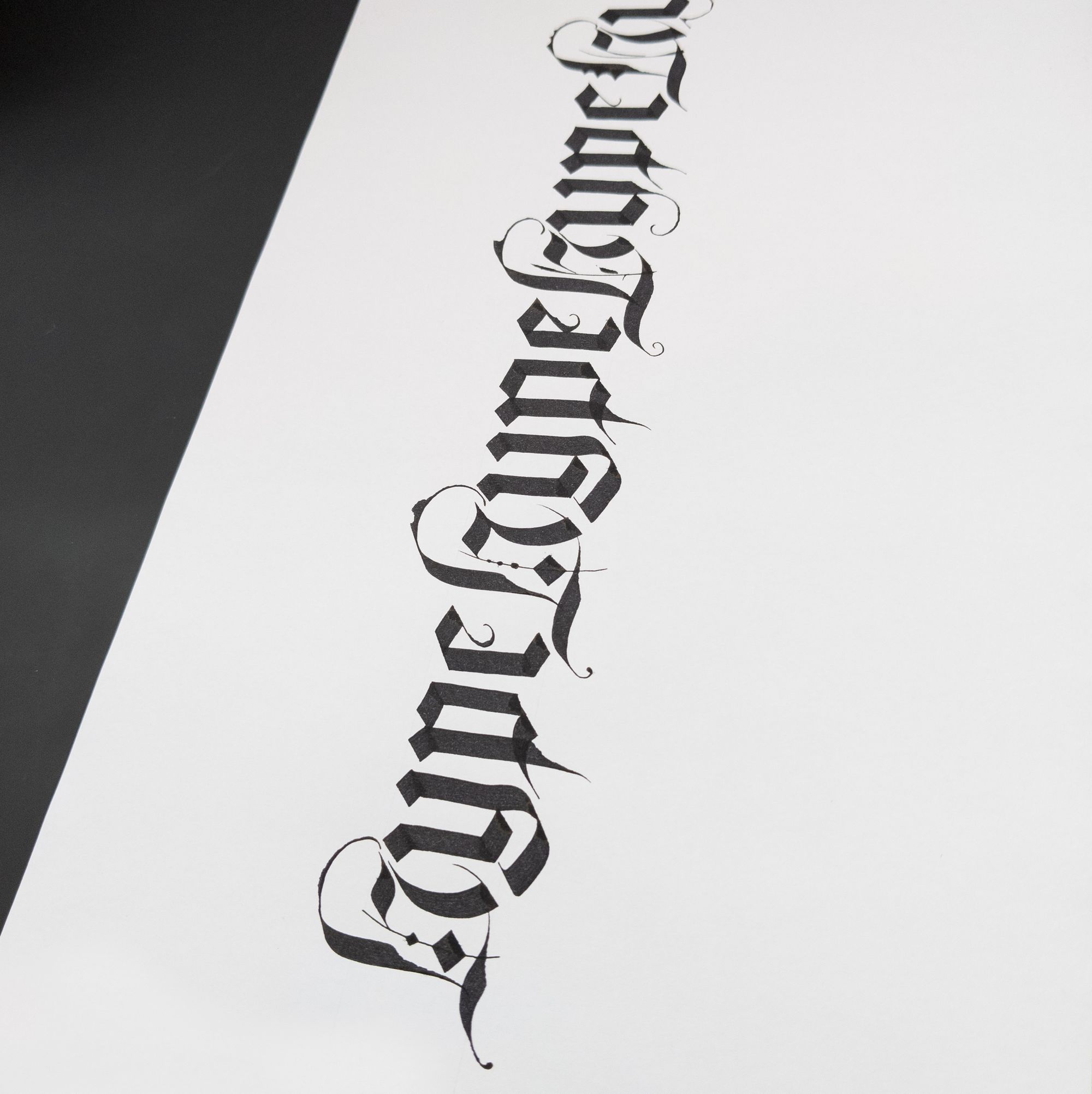
In my opinion, there is too much hype around Blackletter, which is what I tried to reflect in this piece.
I was initially considering an elaborate H, but I didn't actually have enough expertise to do that. I also thought to use "pointed gothic" or "gothicized italic", which is almost equally hyped, but it would look too weak for such a short word.
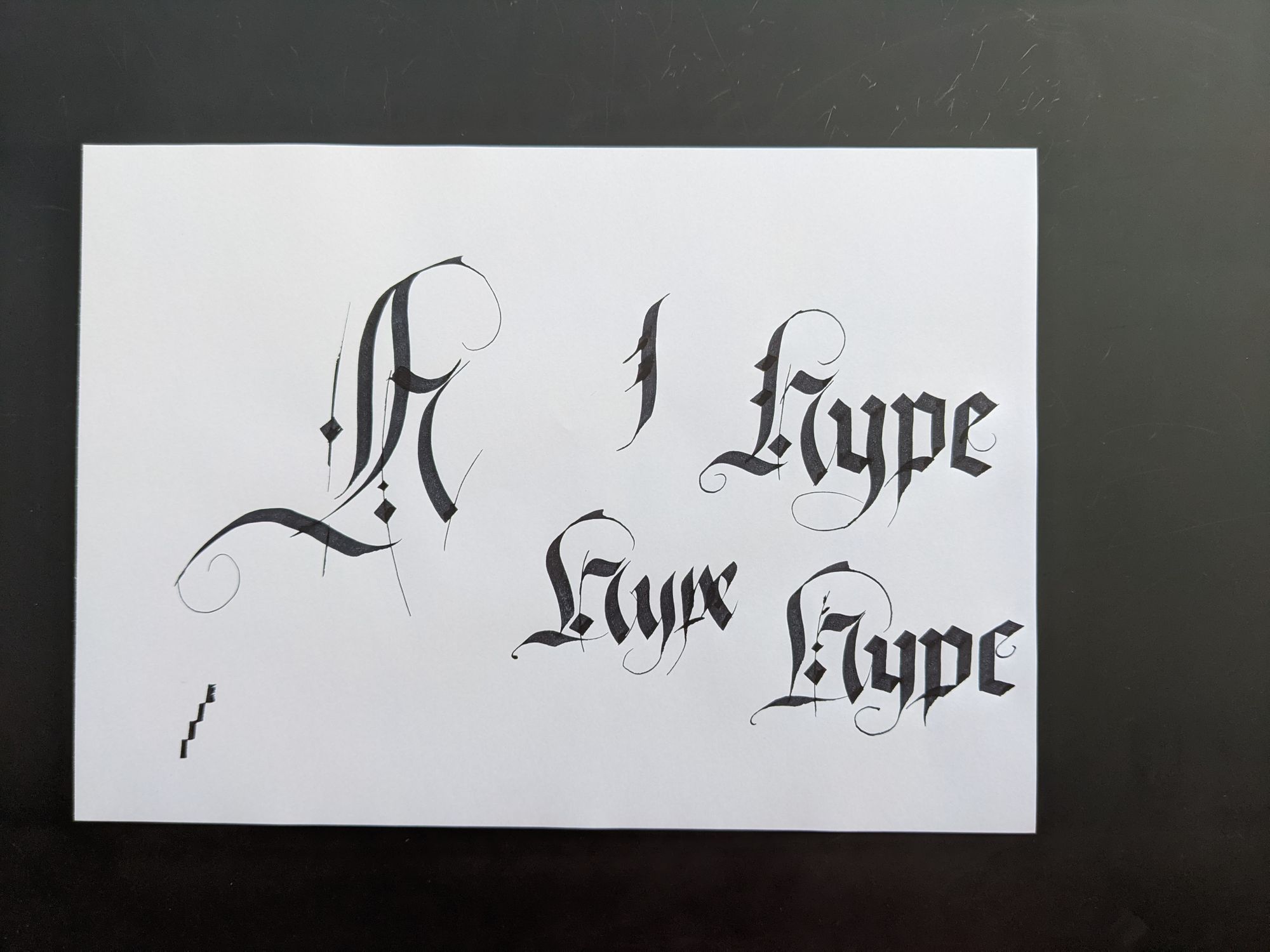
So I decided to go with repeating the word a few times instead.
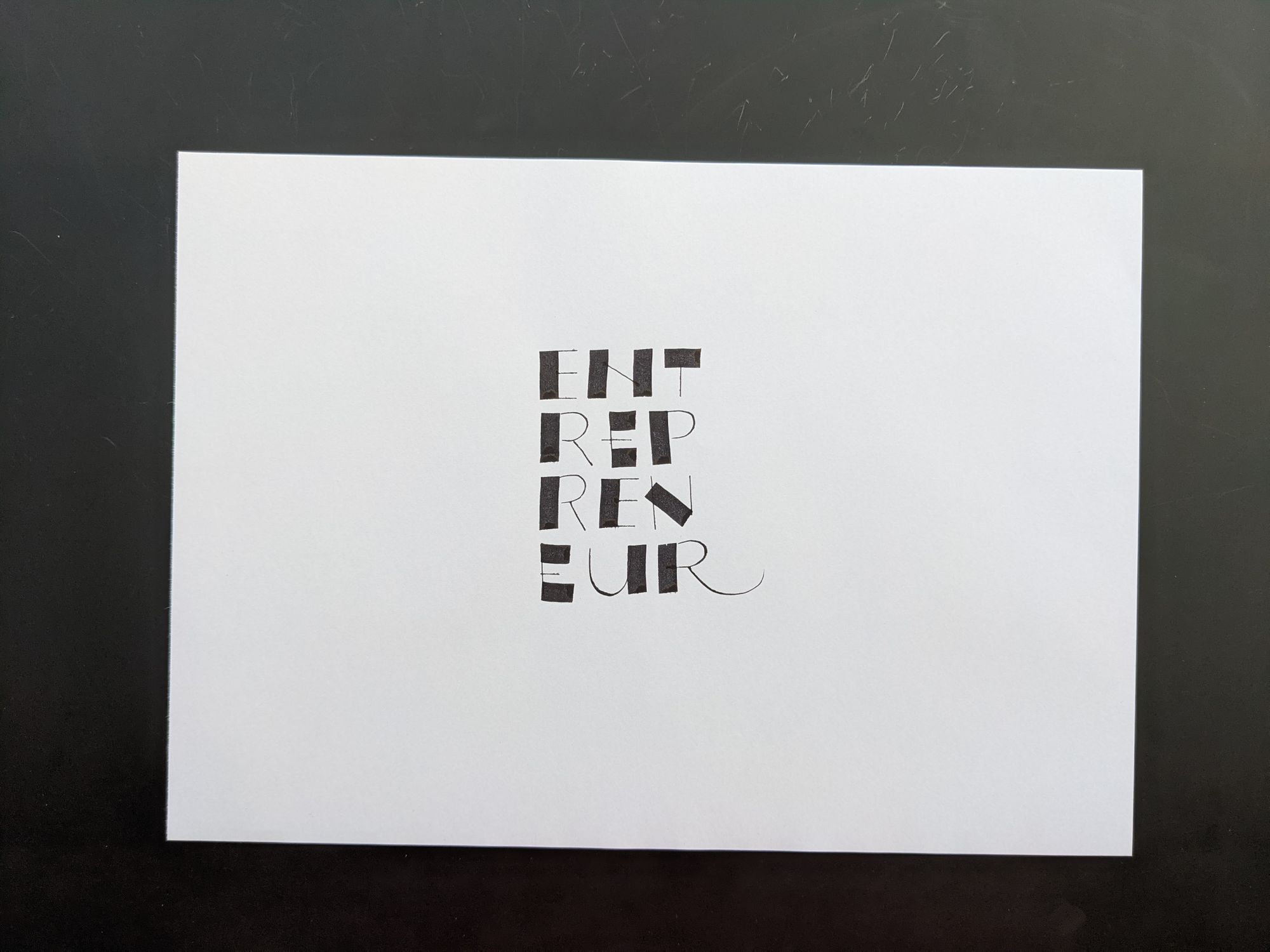
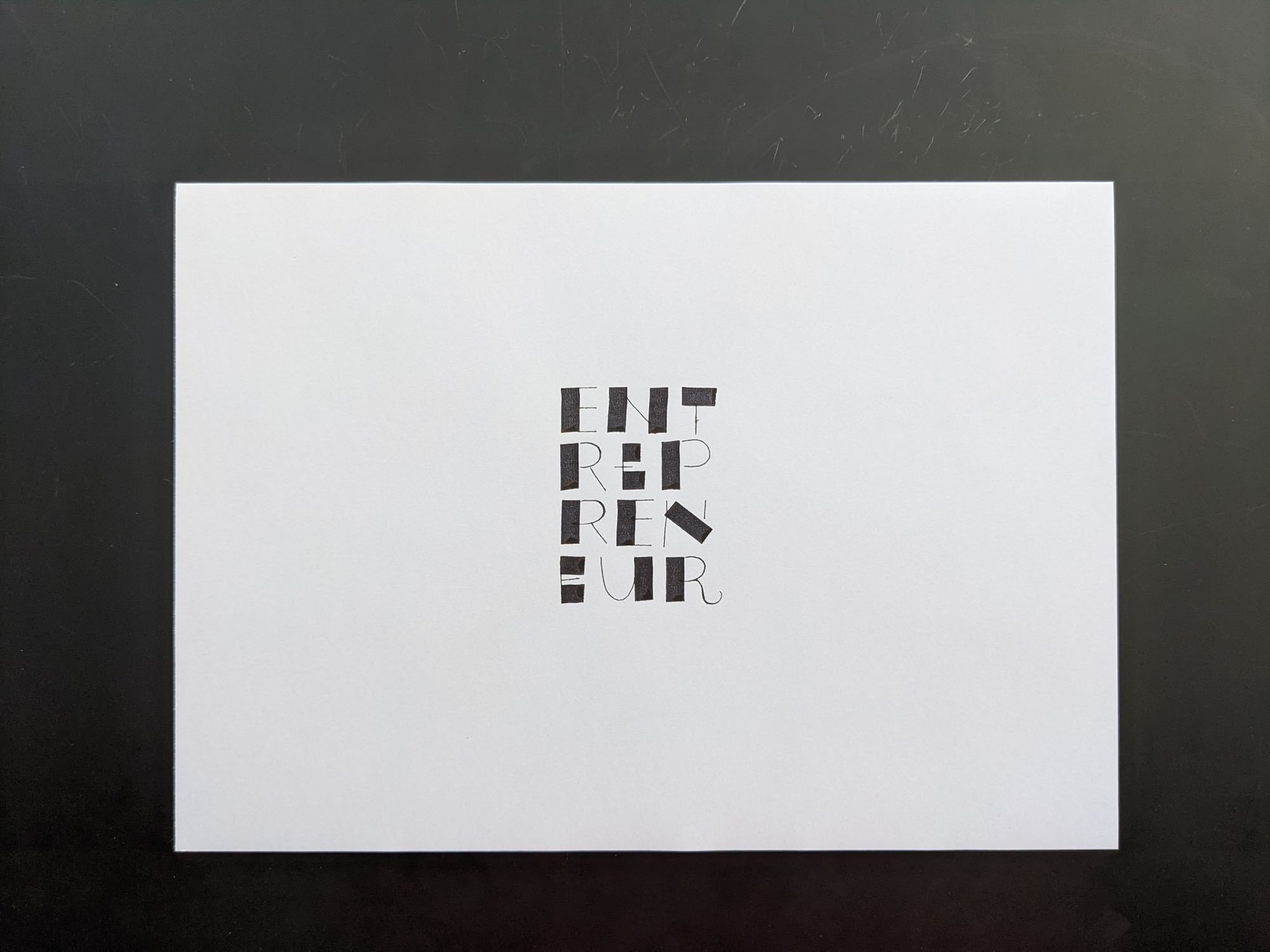
Day 19: Entrepreneur
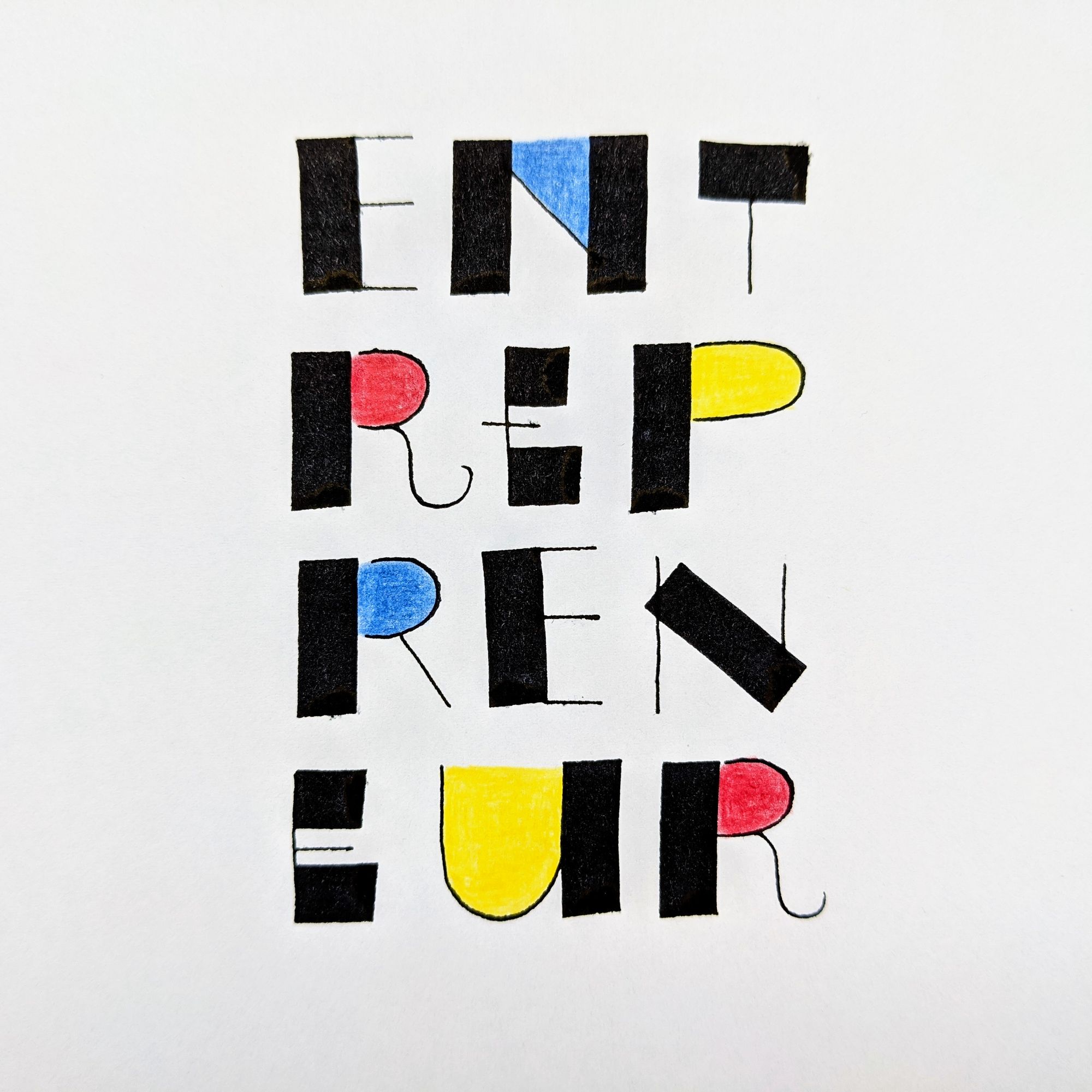
I like applying what I learn in classes and workshops to real-life projects, because that is the only way to understand how useful the new skill is, and how likely I am to need it again in the future.
I was taking a Layout class with Mike Gold at the time, and this piece is inspired by one of the exercises for the class.
For some reason, I really like the page with the exploration, maybe because the word is repeated multiple times with subtle differences:
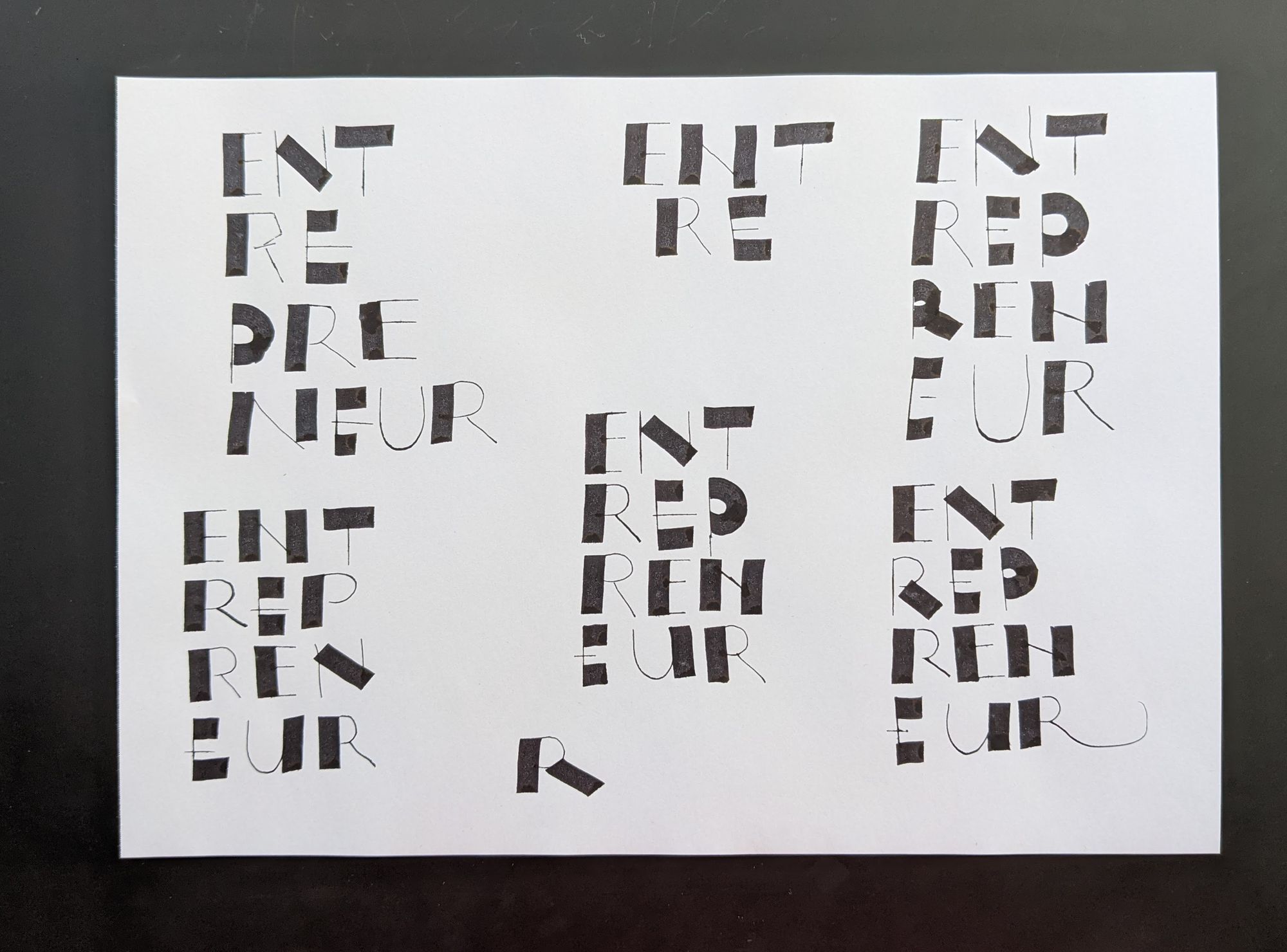
I also have 2 attempts that did not become the final version:
In the top one, the last R is too crazy. In the bottom one, the two stacked R's on the left are too similar.
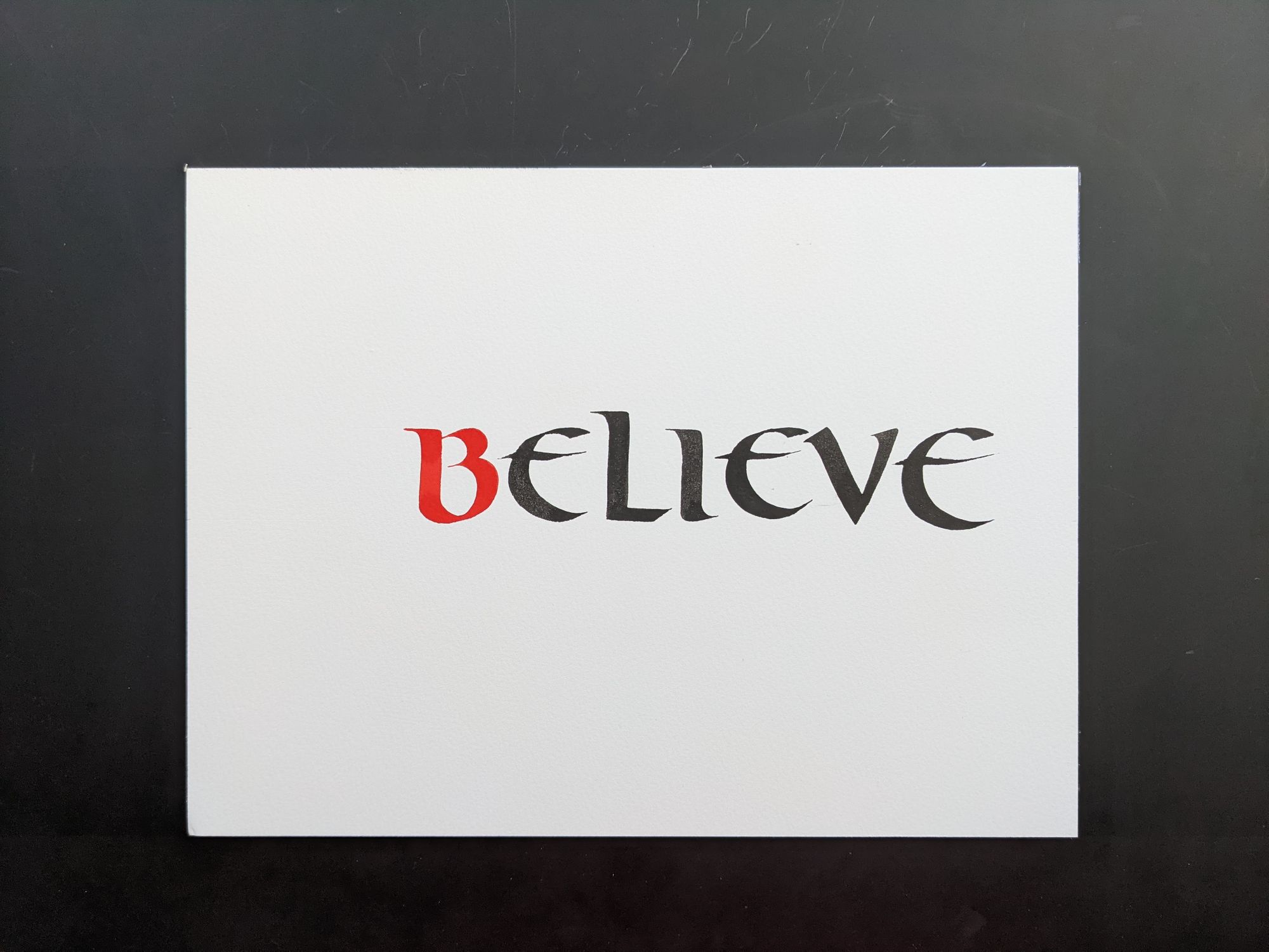
Day 20: Believe
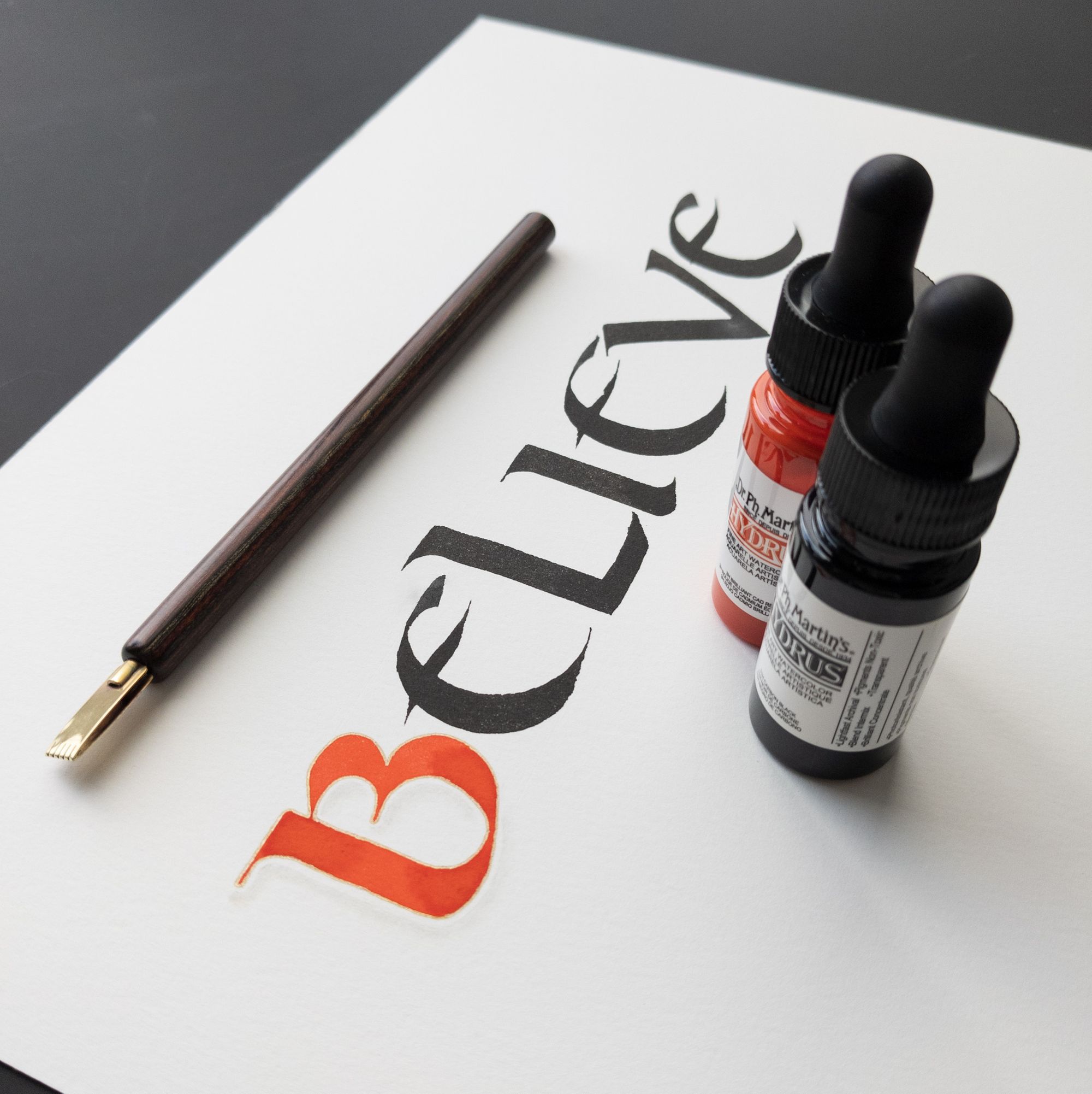
I feel like the prompt should really say "Don't believe anything you see".
This piece was born of suffering, and the horrible ink I used for it never dried (at least, not overnight), so it smudged all over the place (and you don't see the smudges courtesy of Photoshop). You'd think that I would have learned my lesson from a few days ago with not letting the ink dry long enough. I did, but I did not expect 12+ hours to still be not long enough. I am not at all happy with the letter forms, and I added a golden outline and a shadow to the B just because it appeared smaller than the other letters (the size is the same, but the color made a bigger difference than I anticipated).
I put the inks in the picture to distract the viewer from the poorly executed piece.
The first version I did ended up not centered at all, and the last E is actually too large, and the first E has a weird kink in the curve. Ugh!
Day 21: Victory
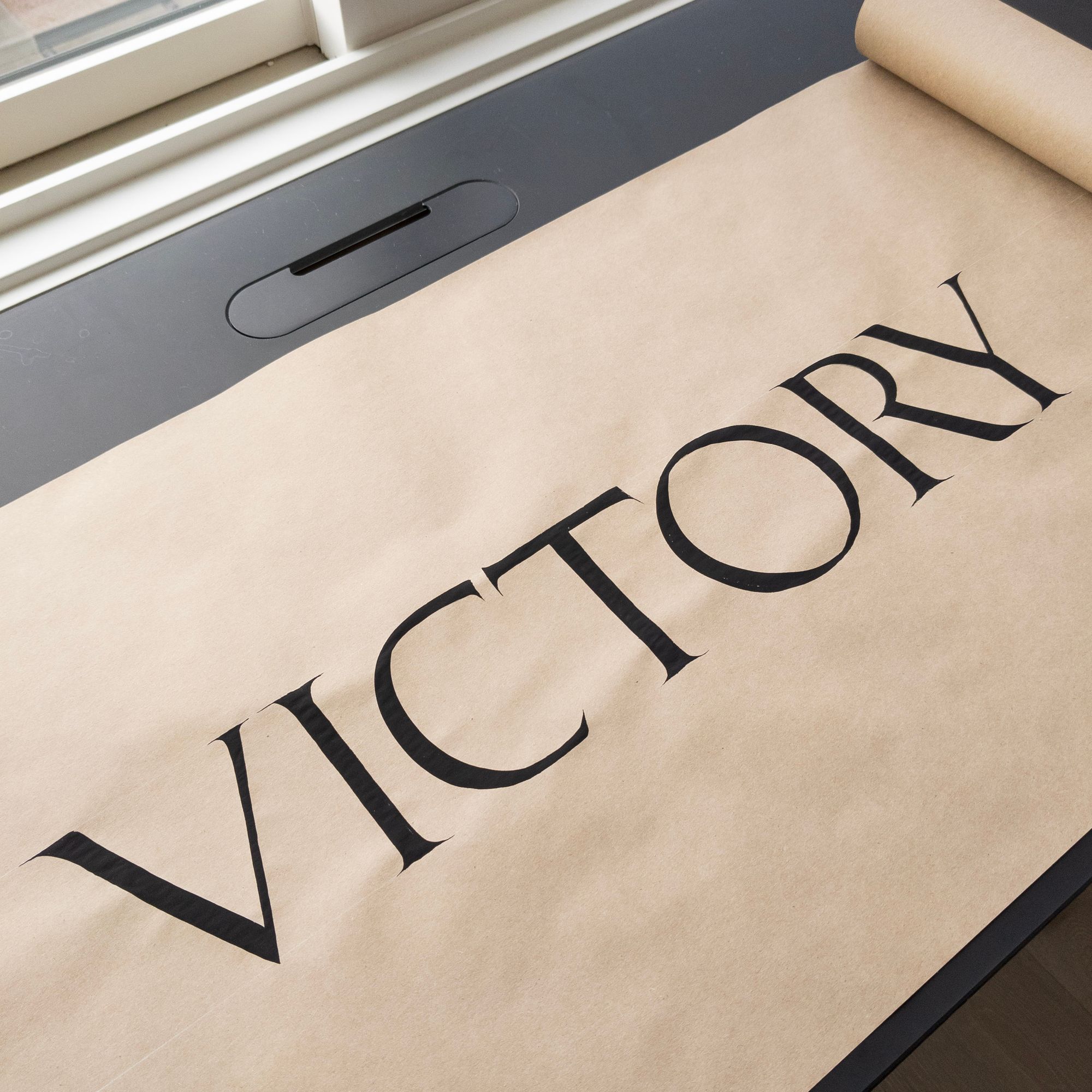
I am grateful for brush capitals that helped me restore my faith in myself. All things considered, this piece is decent. There are a few letters I did for warm-up and to make sure the ink had the right consistency, but other than that, I did just one attempt at the final word.
Day 22: Light
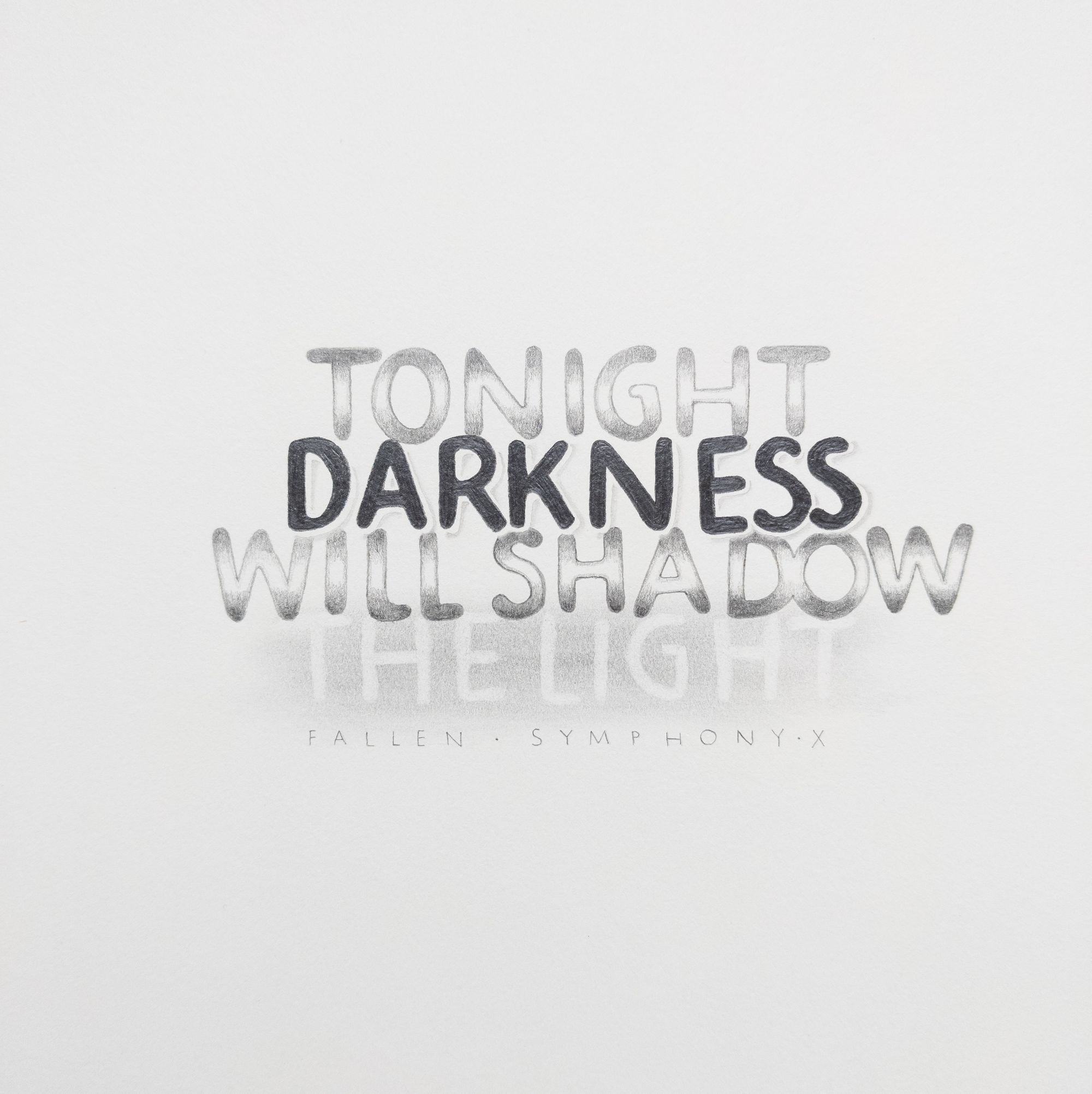
This piece was not made for the prompt. Rather, I've had the idea for it for a few months, and since it was not yet finished, but had the word "light" in it, I thought it would be convenient to get it done.
This line from a Symphony X song sounded like a good fit for a pencil piece, and I've had a vague idea for it since earlier in the year.
Then, I took a pencil class with Amity Parks, and with refined technique, I felt ready to try to put it on paper. I had started working on it in October, but didn't finish right awsay because I got so busy with the Callivember prompts.
I wanted to make the letters monoline, which was much easier to achieve using a pen than a pencil.
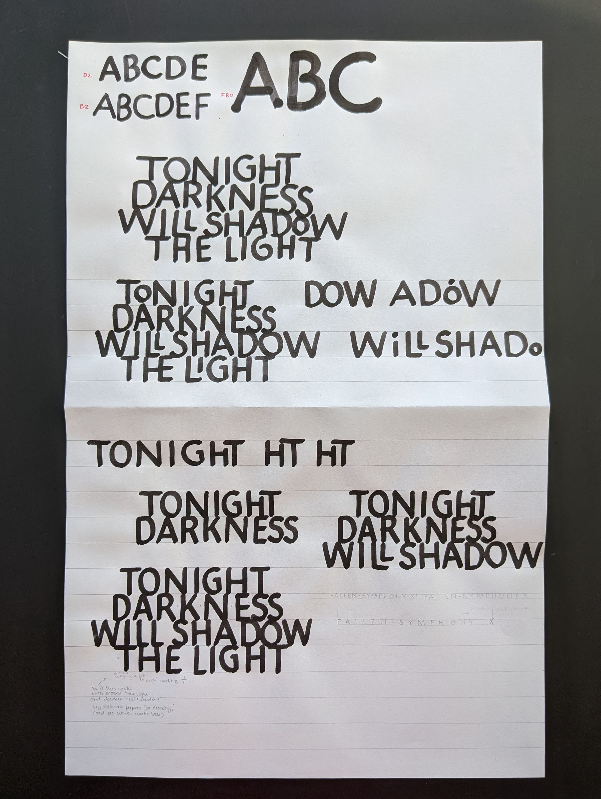
I settled on the Speedball D nib, which has an oval tip, as opposed to the round Speedball B. A few days ago, I found out that the D nibs are vintage, so I guess I am lucky I had one :)
Then, I tried different pencils to make sure what I had in mind would work.
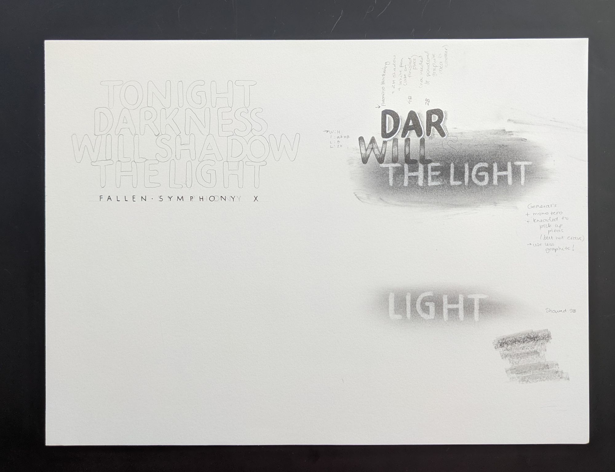
I also did a really quick mock-up in Photoshop to check that I liked the overall feel of the piece.
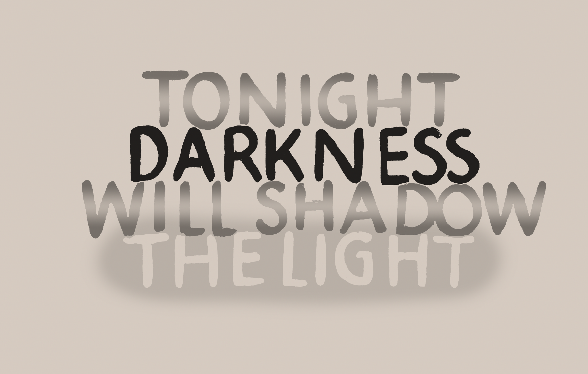
It turned out okay, but not great. The contrast on the "light" is a bit low.
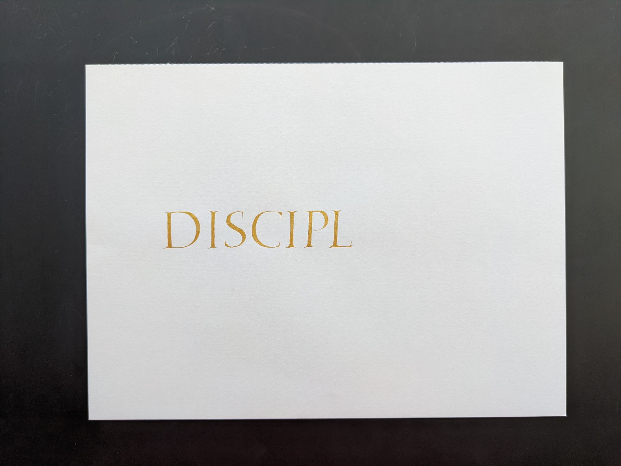
Day 23: Discipline
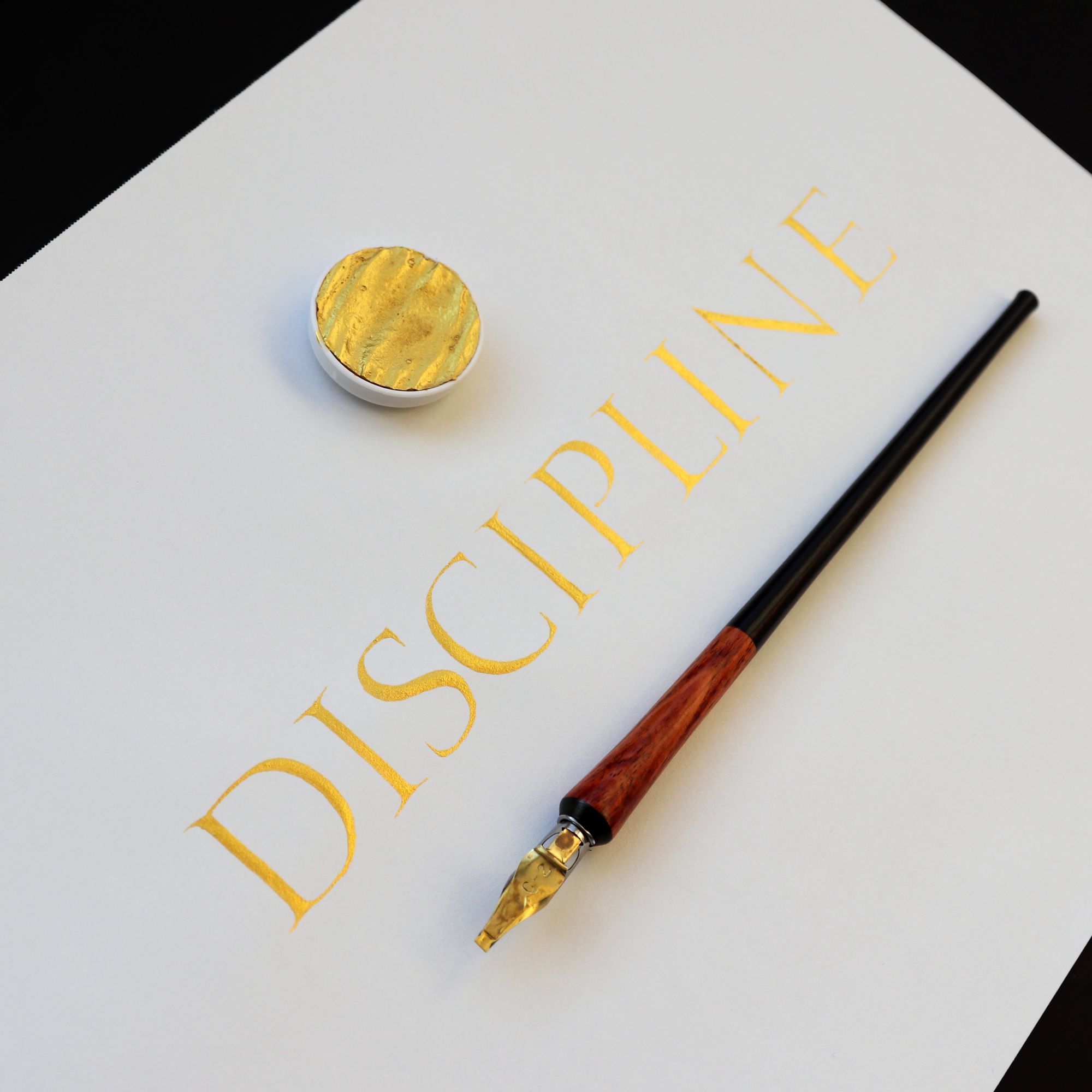
The piece itself is okay, but it was such a pain to photograph! I could not get both the shining gold effect and all letters in focus at the same time.
Here is a slightly different angle:
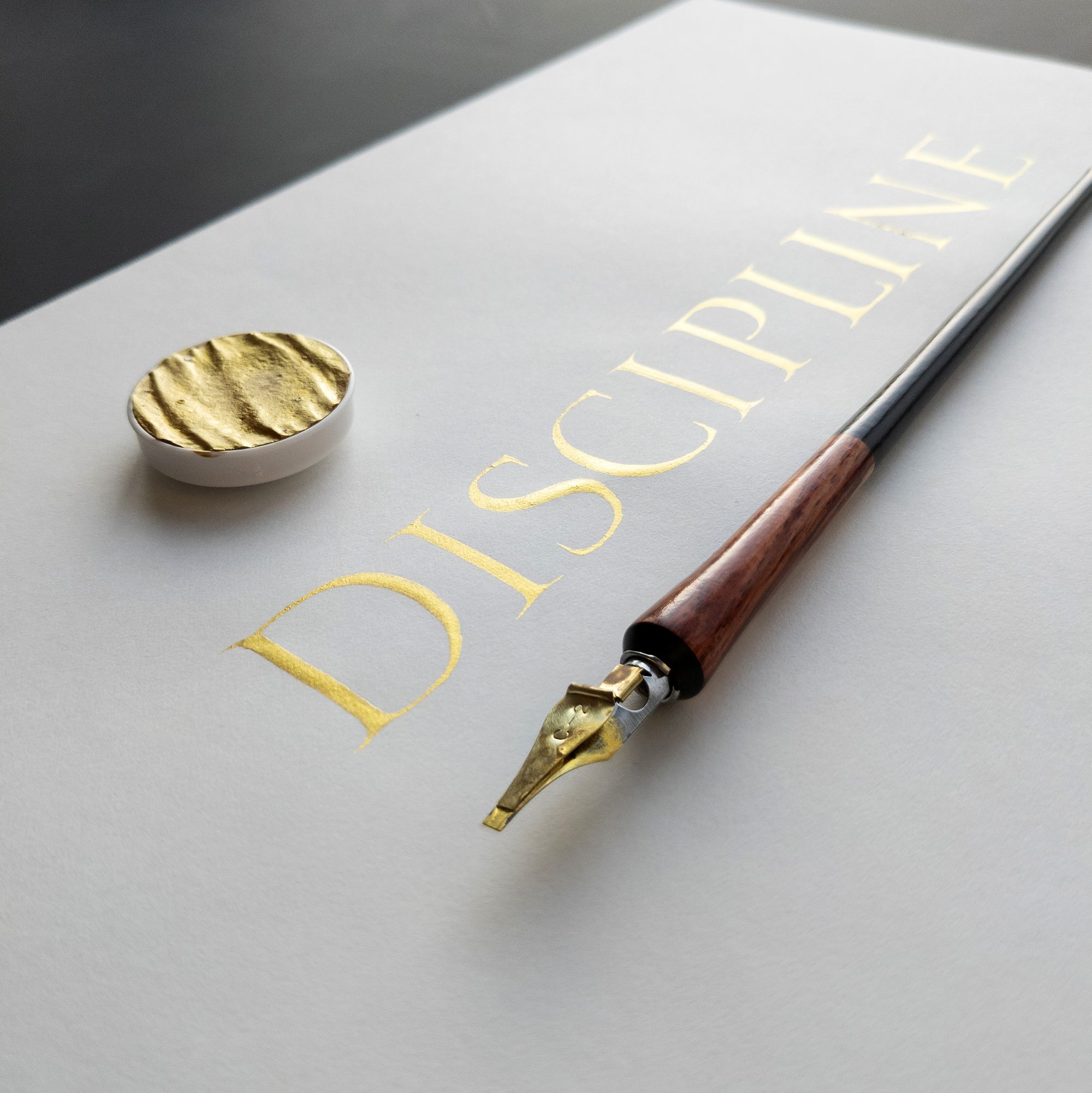
It was one of those pieces where I really liked my idea, and thought it would look great, but then it fell a bit short of the expectations. The golden watercolor was a bit challenging to work with as well. Make it too thin, and the paper shows through. Make it nice and thick, and it clogs up the pen. It was rather frustrating trying to maintain that balance.
This was almost a one-shot piece, but halfway through attempt #1 I noticed that my letters had started falling over to the right, and had to restart.
Day 24: Queen
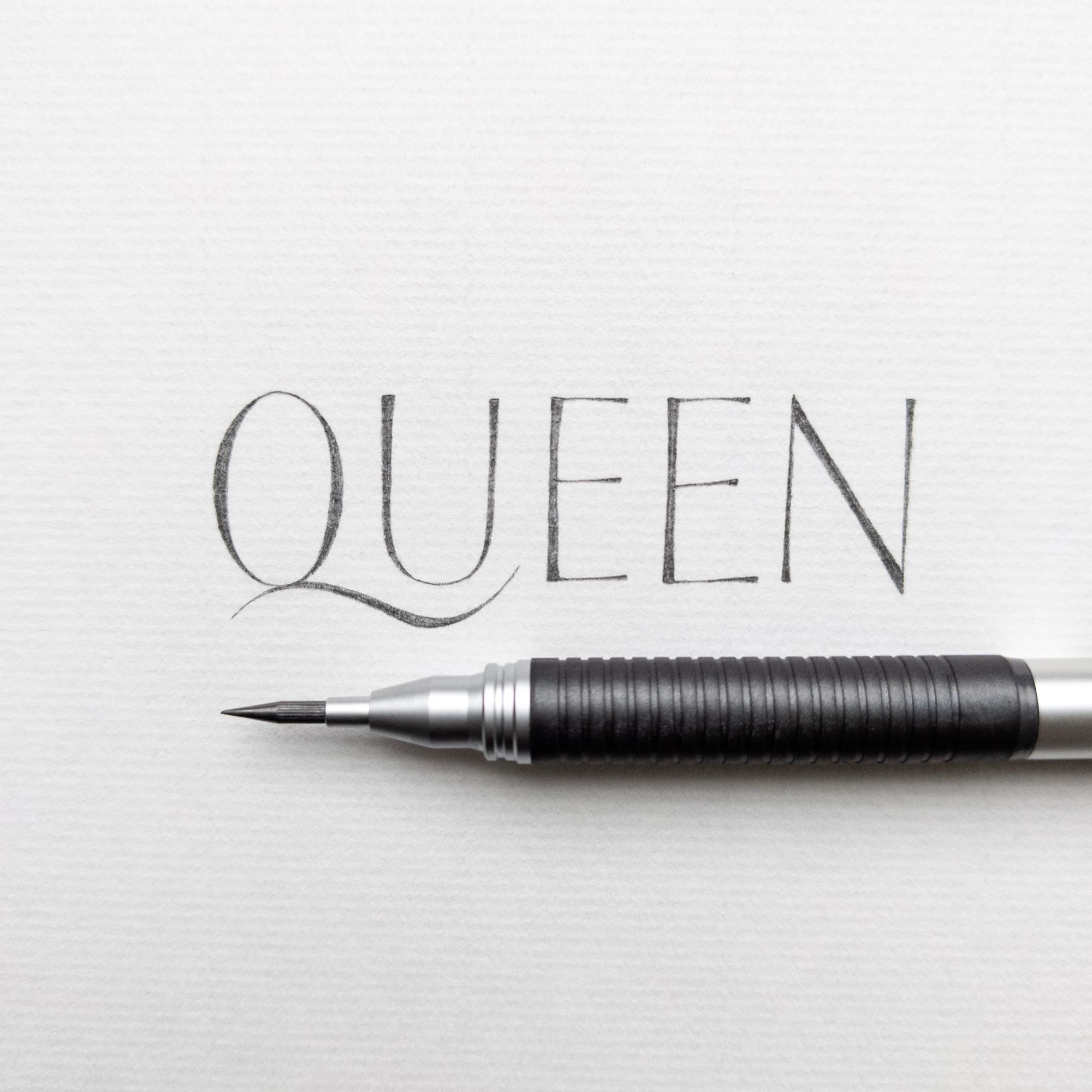
To be honest, I was getting pretty tired by this point. I didn't want to make "queen" too similar to "king". I also noticed that people seem to like my pencil capitals (not sure why, I don't think they are particularly amazing, but whatever). So, I made it easy for myself, and created a simple pencil piece for this prompt.
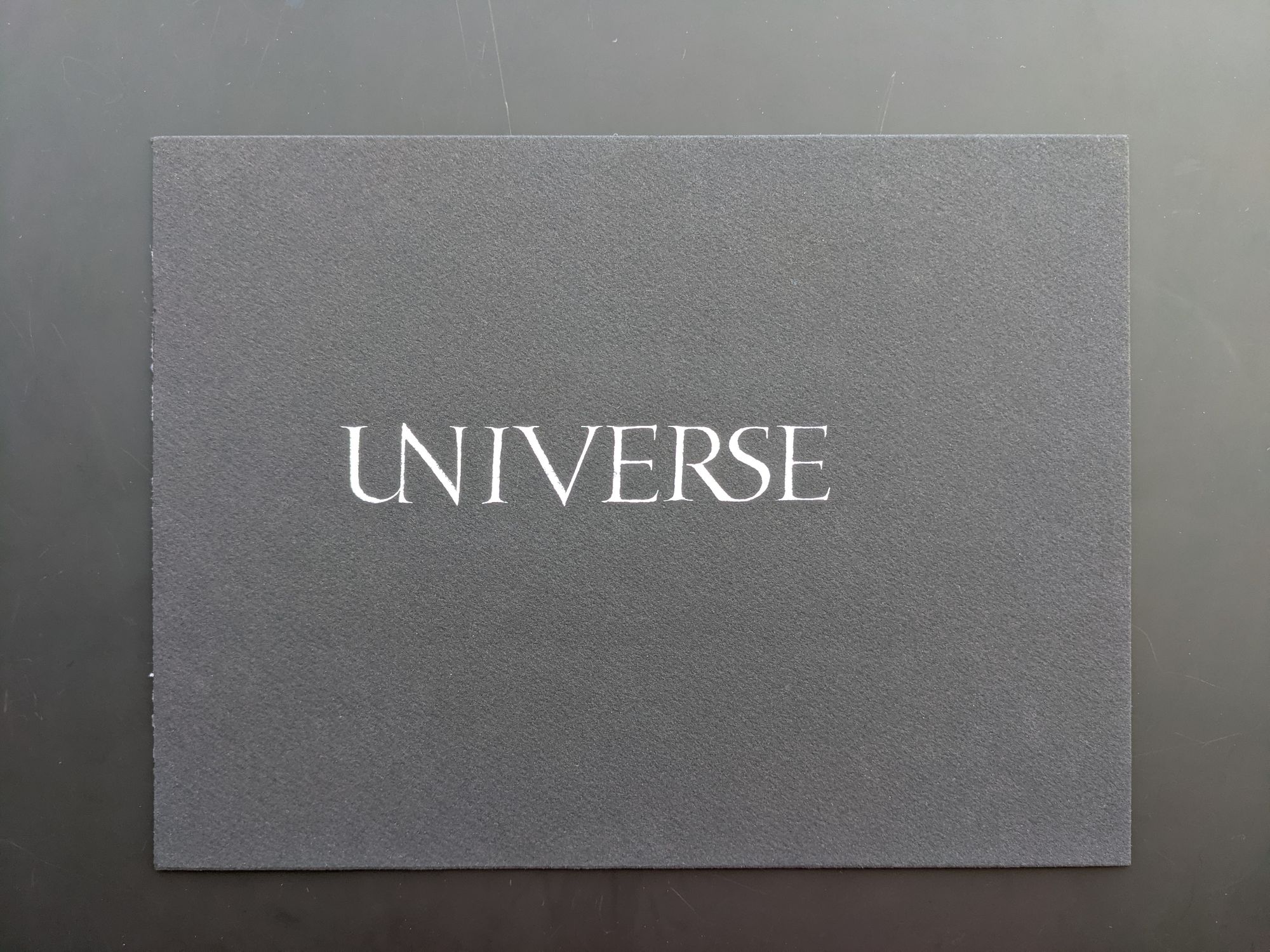
Day 25: Universe
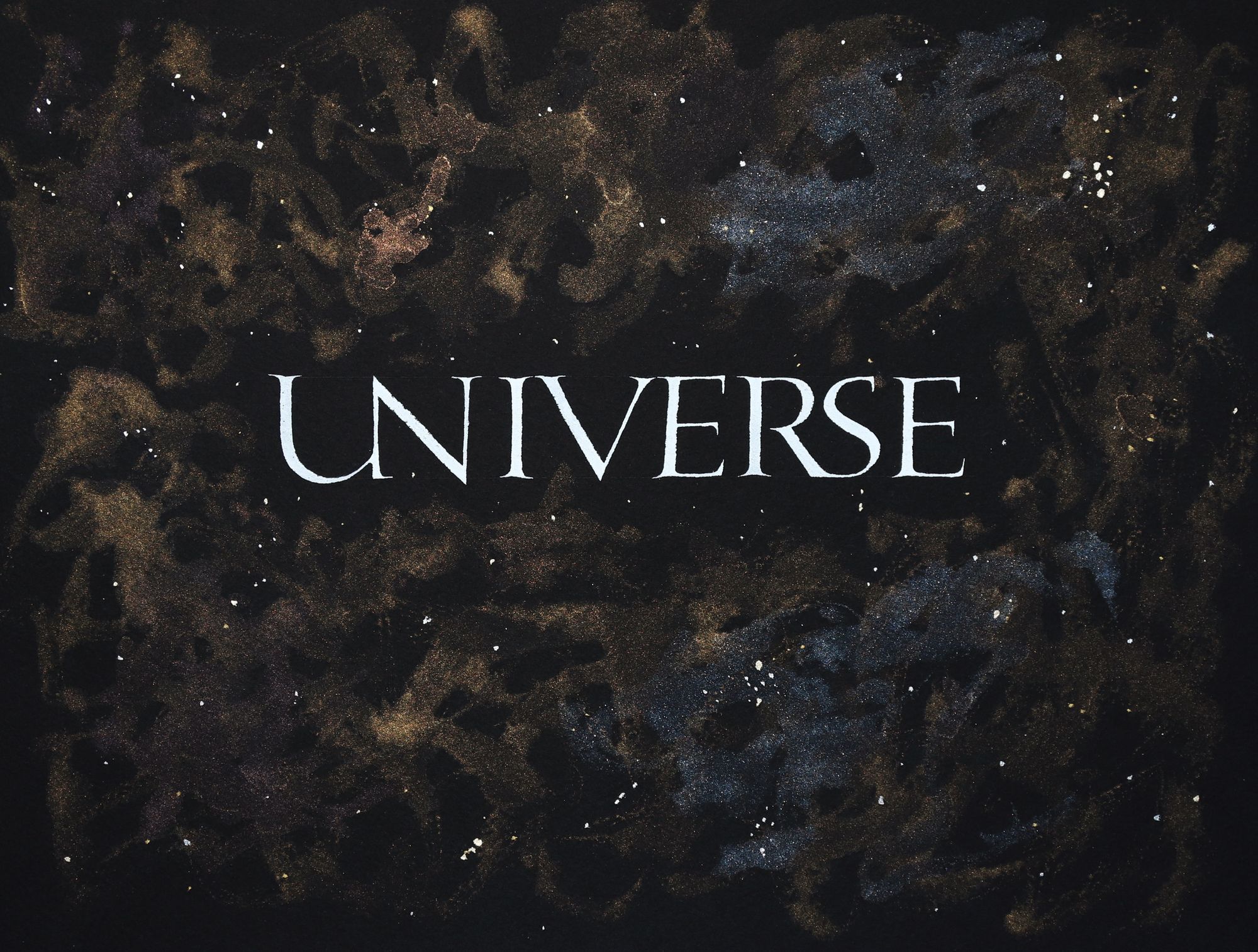
This is my favorite piece! I had so much fun making it, even though it was at times challenging. A funny thing I noticed is that the pieces I really like tend to get fewer likes from other people. Maybe they are too weird, or maybe I am too attached to them because I enjoyed the process or liked the idea. Who knows :)
I knew right away what I wanted to do, and although I was not expecting to make this piece in one shot, I aimed to execute every attempt as well as I could.
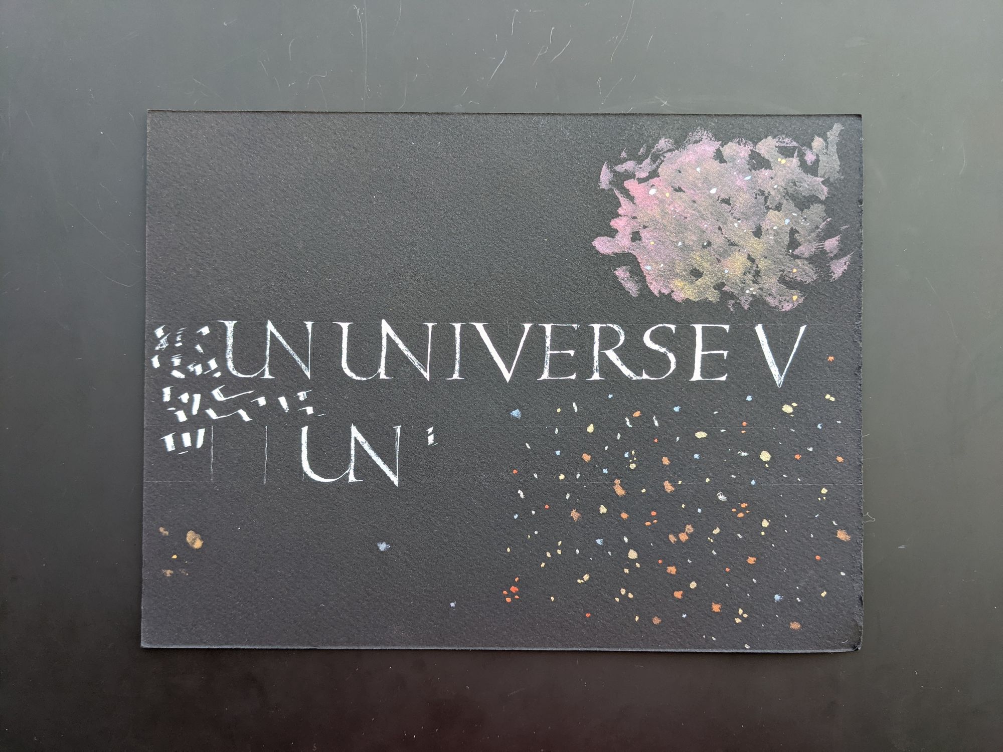
First time around, my ink was too thick, and the V turned out crooked. I later used this sheet for figuring out the UN ligature, and also for exploring options for the background (more on that later).
On the second attempt, I knew right away that the first U was too narrow, and that the word would likely not be centered properly, but I chose to write it all the way through to make sure there are no other sticking points.
Then, I tried a few ideas for the background. I wanted to have some nebulae, but on the first try the watercolor was not diluted enough, as you can see in the top right corner. I was also going to add a lot of stars of different colors, but I didn't like the look, and ended up with fewer stars and fewer colors for the last piece.
And, just for fun, here is what the photo of the final version looked like straight from the camera, before I applied some perspective and color correction, and cropped it:

Day 26: Action
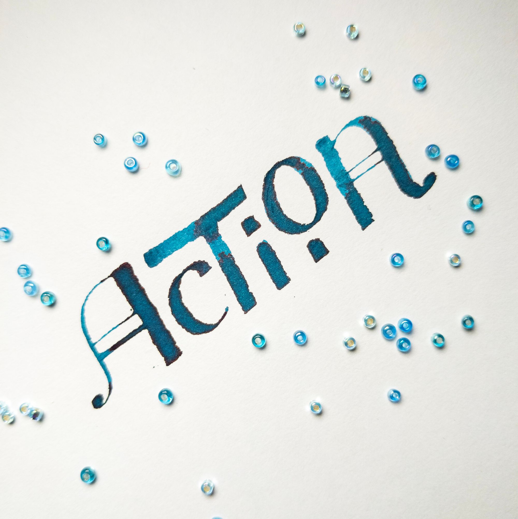
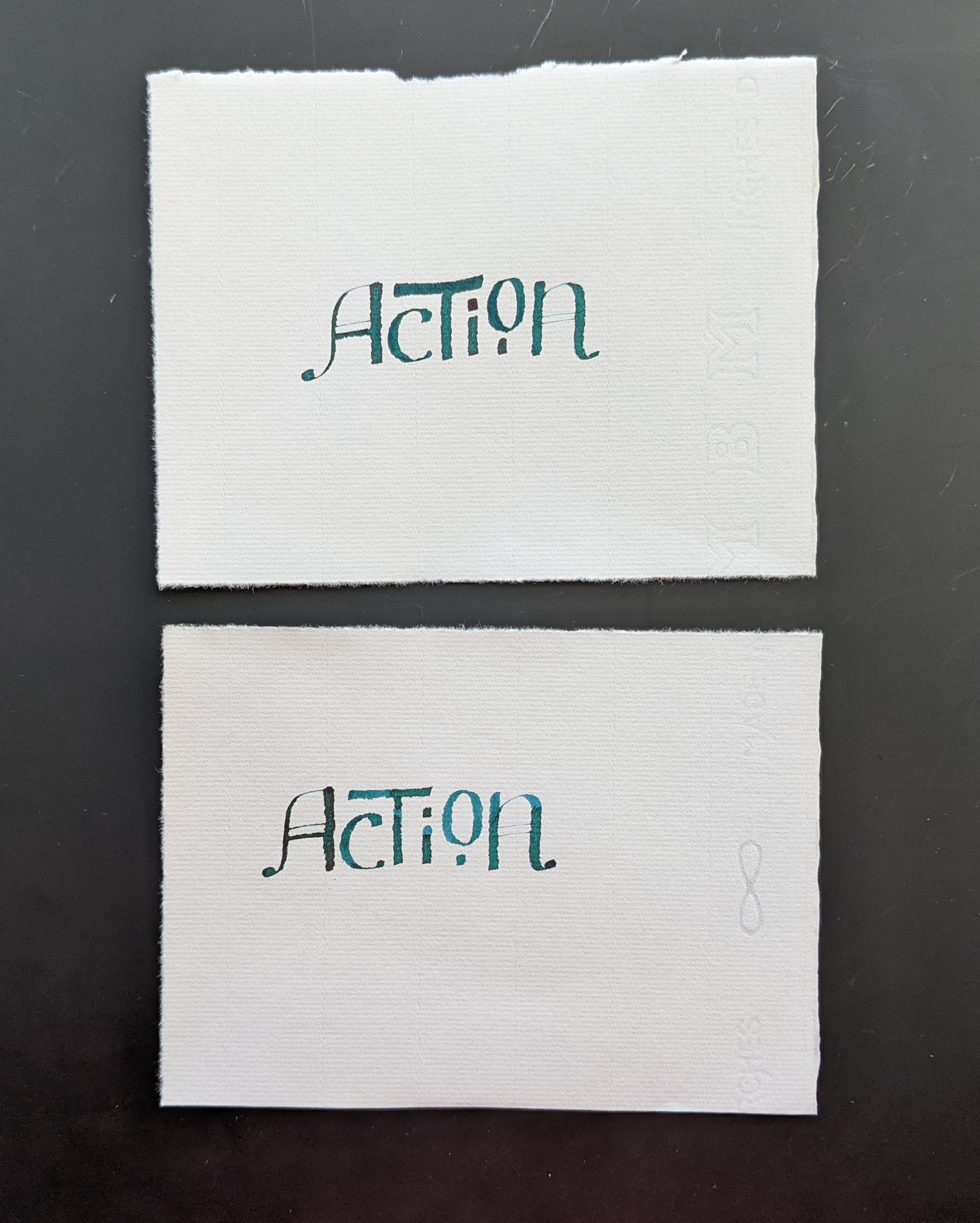
I wanted to make this piece cool, but it just didn't work out, hence the beads around it to provide some distraction. I had actually spent quite a bit of time on it, and have multiple versions that didn't become the final version.
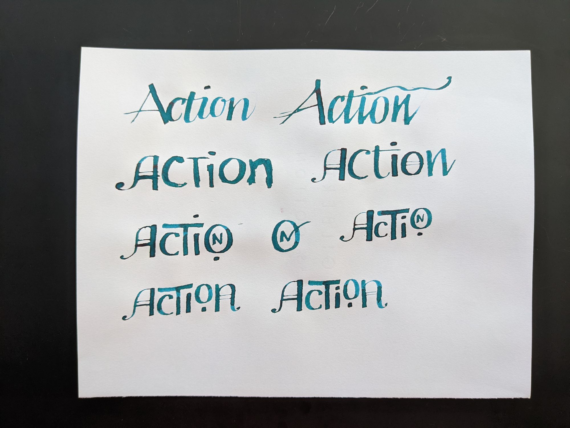
I almost liked the last version, so I decided to go with it. First, I wrote it on nicer paper, but I realized I did not like the change in color, or how the thick lines got thinner, so I abandoned nice paper after two attempts:
Coming back to the same practice paper, I wrote another version, but I didn't like how it slightly curves upward.
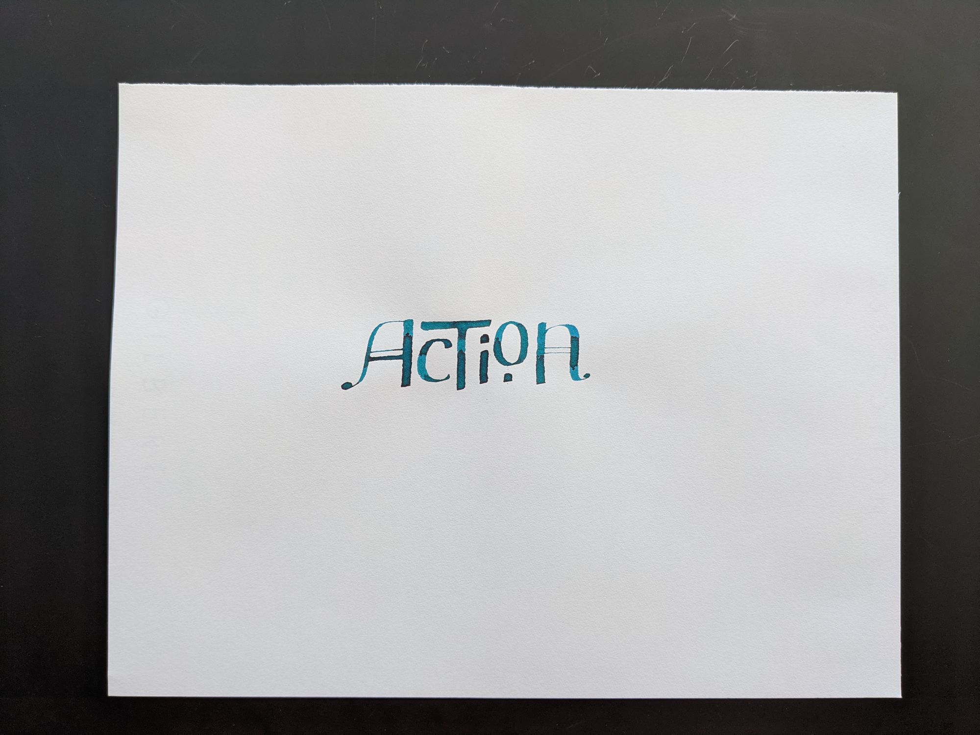
Can't say that I particularly like the final version either, I would probably try something entirely different if I did it all over again.
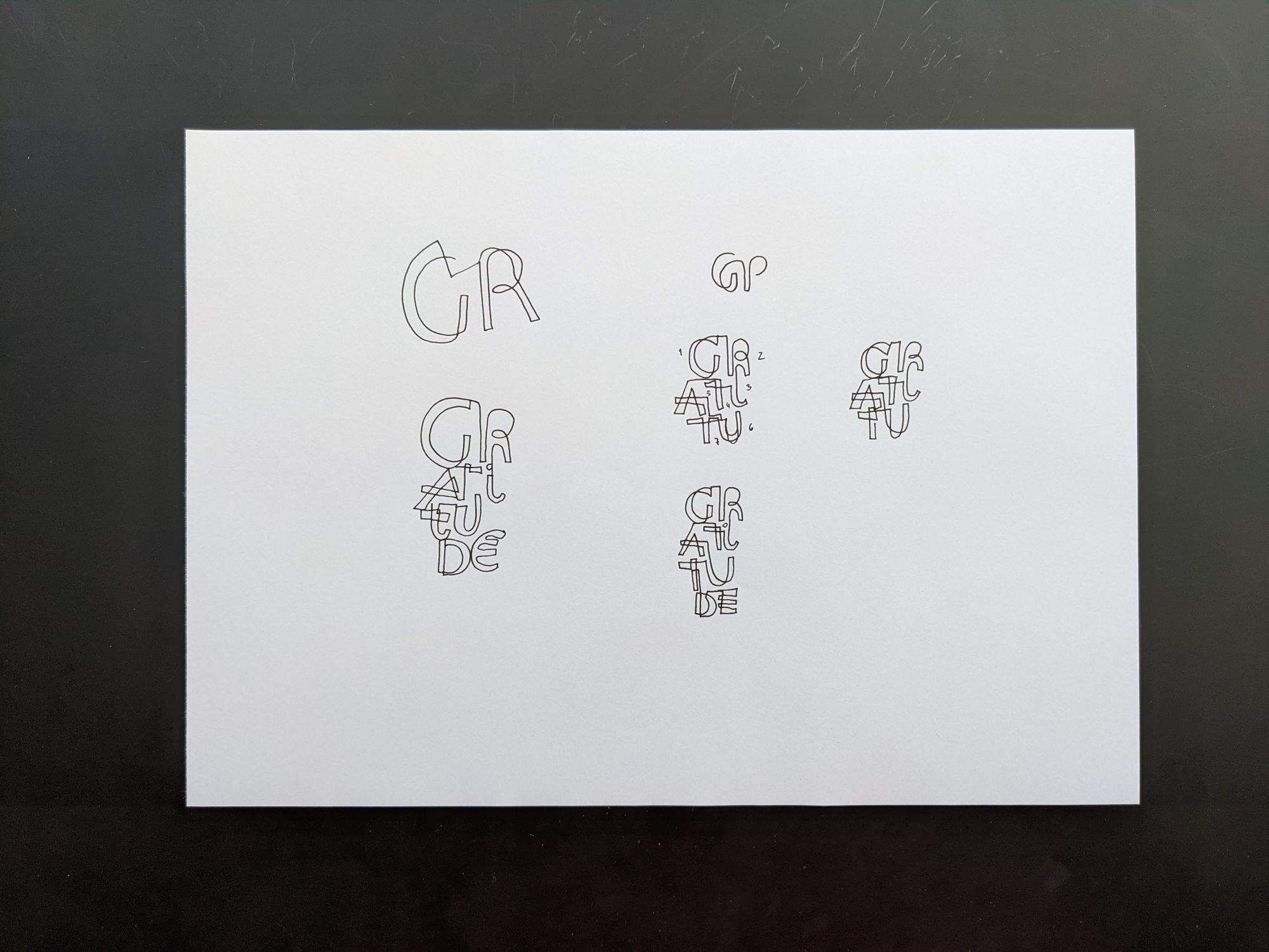
Day 27: Gratitude
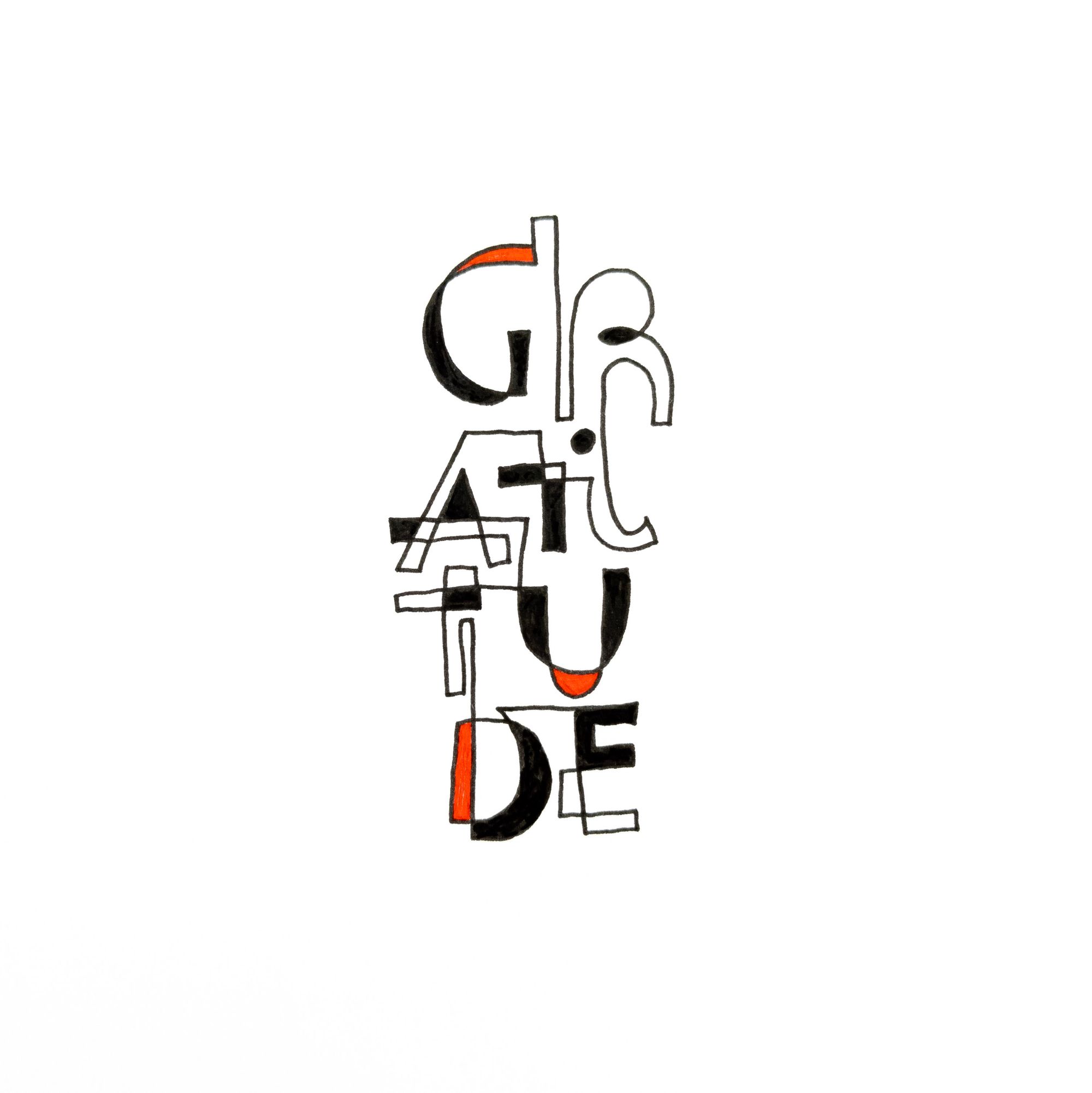
This is another instance of me combining homework with a prompt. For the Layout class, I was watching the module about "taking letters for a walk", the assignment for which was to write a quote using a single continuous line, and then filling it come of the counter spaces.
I did just that for this prompt. It turned out to be much harder than I thought, and it took me a few attempts to figure out which way the line should go to produce a reasonably readable result.
Day 28: Content
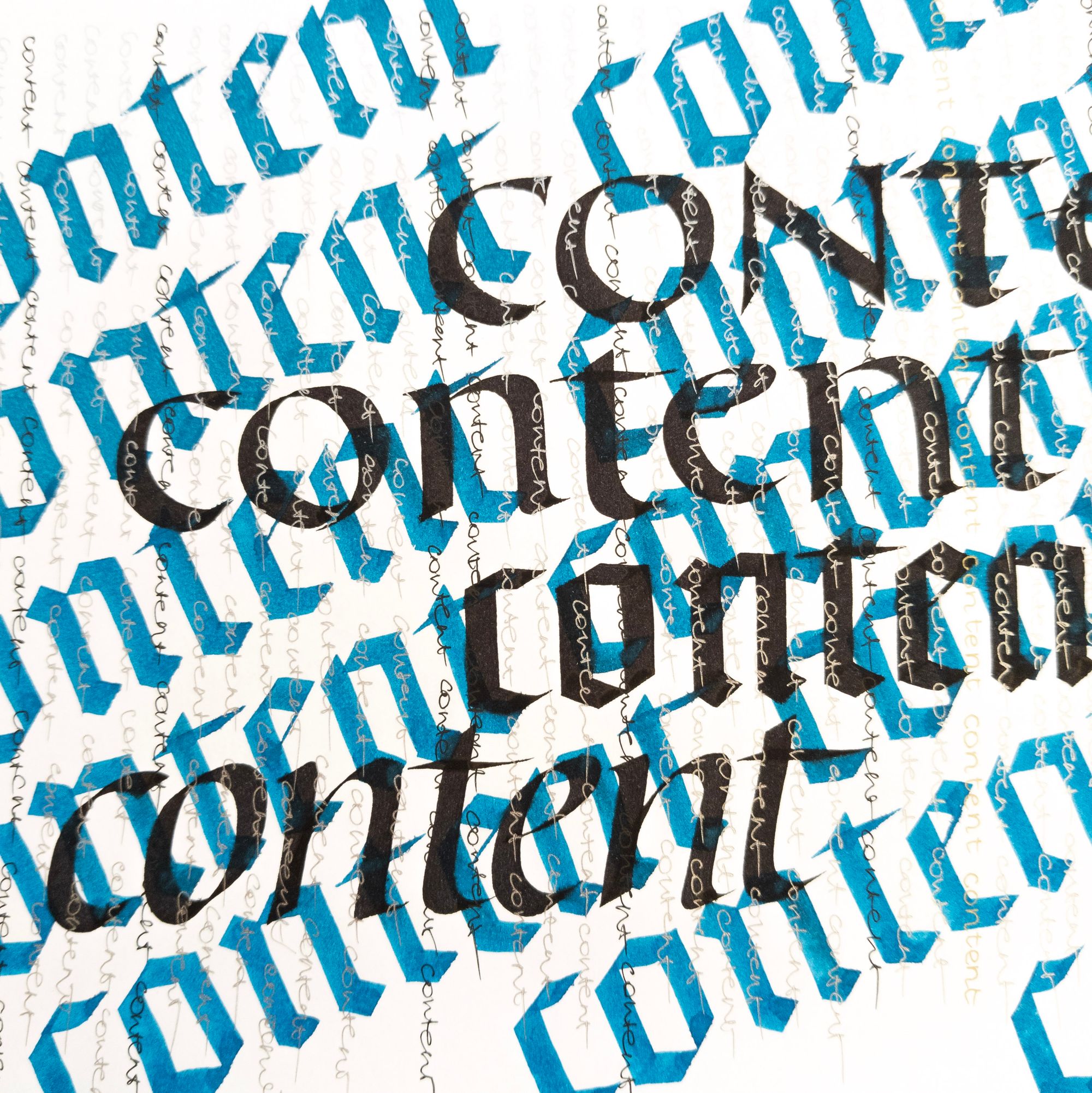
This prompt was a perfect opportunity to play around with the meaning. Which one should I pick?
- /kənˈtent/ adjective, in a state of peaceful happiness
- /ˈkäntent/ noun, information made available by a website or other electronic medium
Obviously, one of these is much easier to represent, so I went for #2, and produced a lot of content, sometimes of questionable quality, and piled it all on.
This particular piece is not about the letterforms, but rather about the message that there is so much content these days. Some of it may be good, but it's frequently obscured by vast quantities of mediocre content, and it can be hard to find what's important. I feel like the Internet has become a much worse place than it was 20 years ago, when most people cared about the quality of the stuff they were putting out there.
Day 29. Handwritten
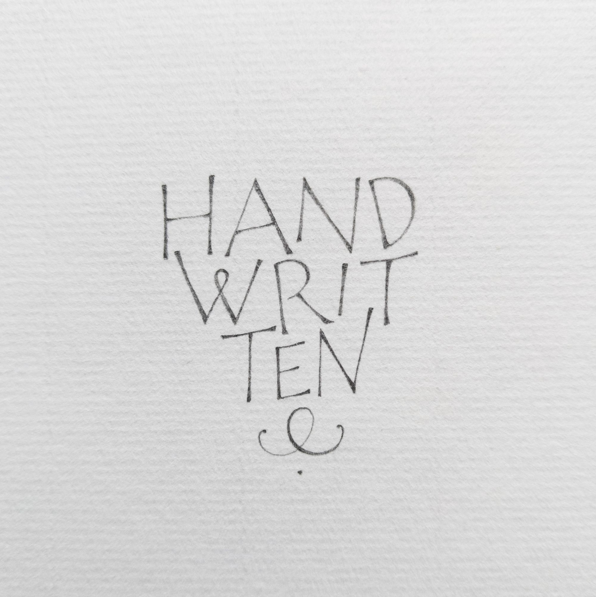
Tired, so tired, but finally winding down. I was out of ideas, so out came another pencil piece. At this point, I just wanted to be done.
Day 30. Beginning
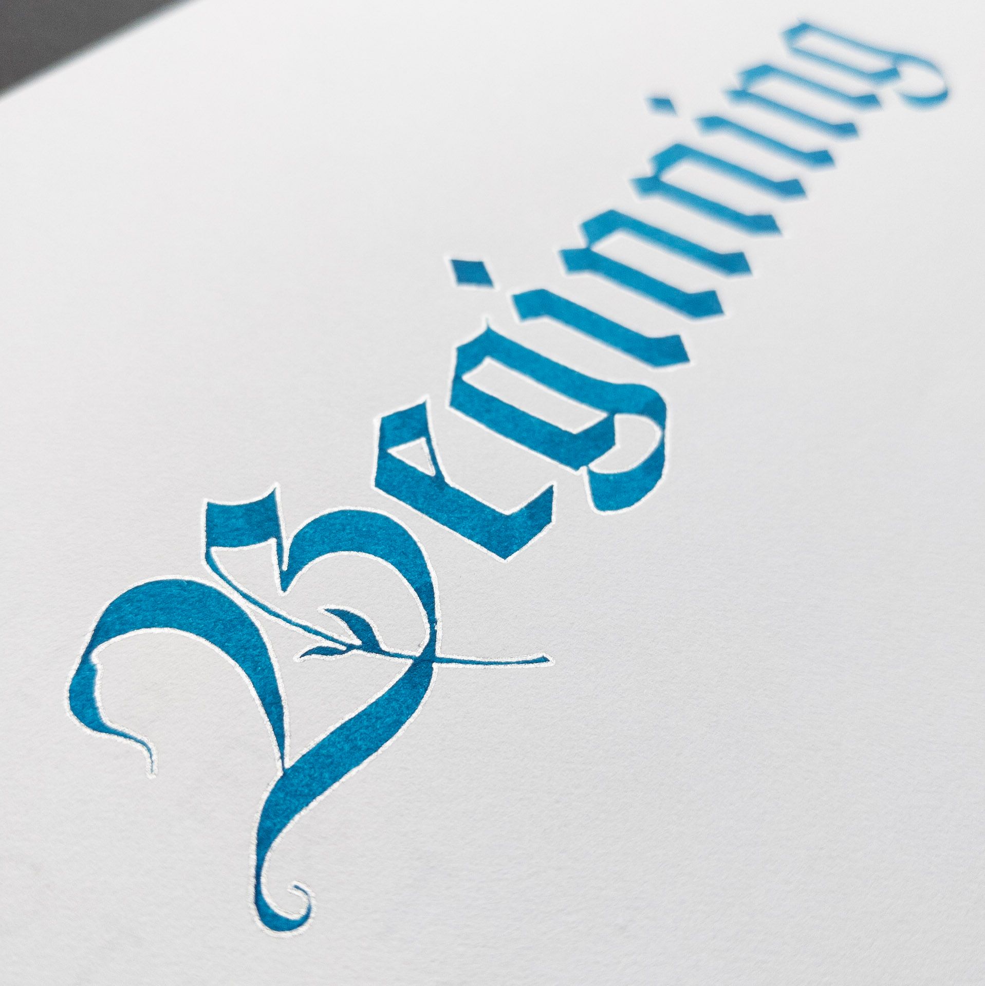
Beginning? End? Beginning of the end?
If you think the silver outline is intentional, it is not. I used a cheap piece of paper. The ink bled. I was too lazy to do the piece over, so I covered up the fuzzy edges of the letters with a gel pen.
Here is the practice sheet, where you can see the same issue:
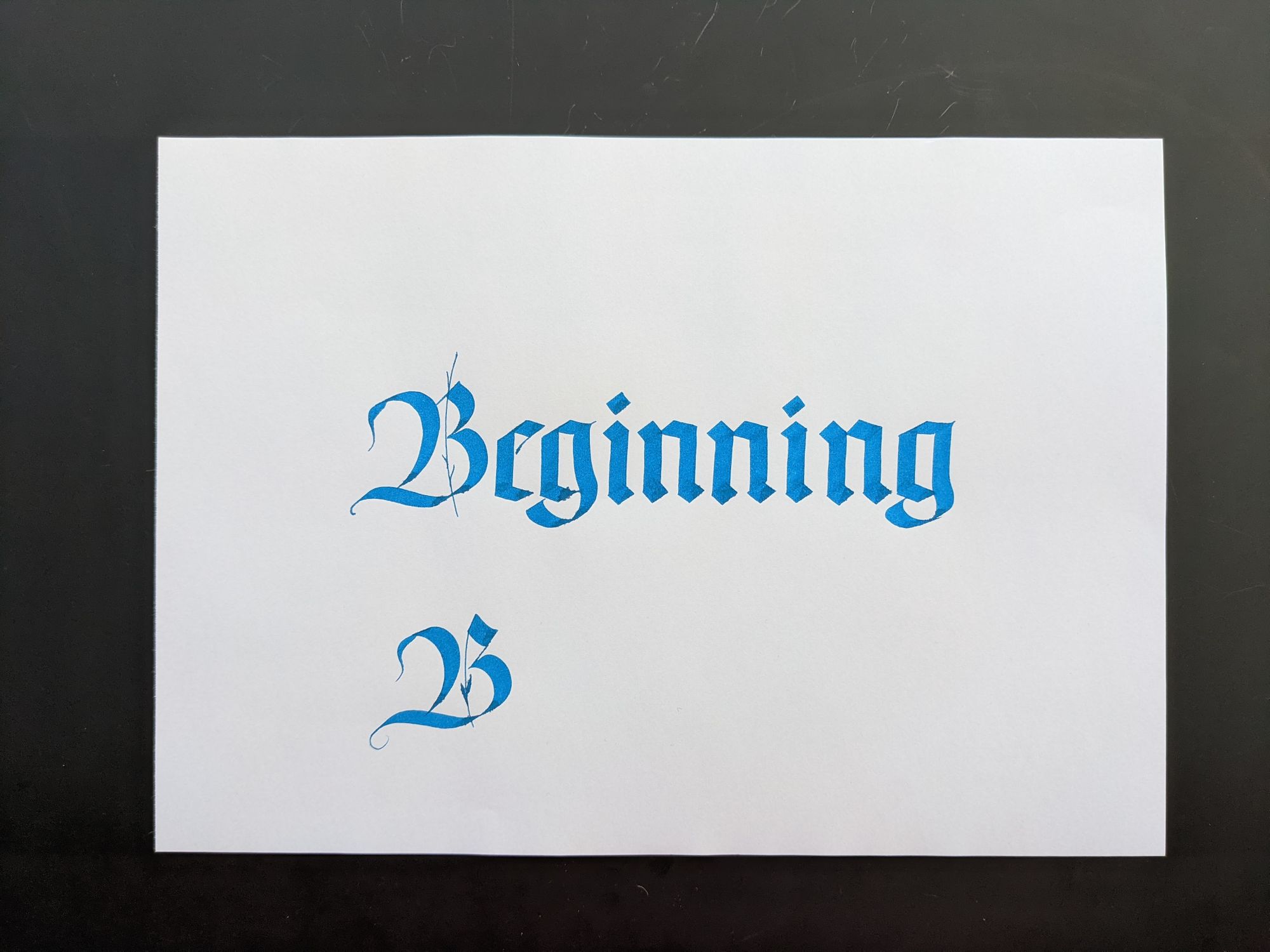
For the final day, I wasn't even trying to be fancy. I just wanted to be done.
Overall, it was fun, but so exhausting. This month was also a good learning experience. I explored some new techniques (some more successfully than others), and enjoyed making most of the pieces. It was both liberating and challenging not to have the same style for every piece. I might try that next time, but I suspect it might be boring.
Comments