Calligraphy Conference

This week I was at the International Calligraphy Conference in Swannanoa, North Carolina. It is the first calligraphy conference that I've gone to, and it has definitely exceeded my expectations.
It was held at the Warren Wilson College, and I got to (once again) sleep in a dorm. I can't say I missed the experience :) My classes were held in the science building, and one of them was even in a Chemistry lab!
There were about 200 attendees, and about 30 different classes to choose from. Some classes lasted the whole 5 days, while others were 2.5 days long, so that you could take two. The instructors were well-known and respected calligraphers. In fact, I was amazed how easy it was to just casually chat to superstar calligraphers at lunch or dinner.
Each of the classes was unique in both content and the skill level that it targeted. For some, you had to be pretty advanced. For others, no prior knowledge was required. Some of the classes focused on perfecting the letterforms, while others were more concerned with mixing colors or finding new ways of self-expression.
I ended up taking two classes, one with Massimo Polello, and the other one with Christopher Haanes. They were both great teachers, even though the classes could hardly have been more different than they were.
My first class was with Massimo. It was called "Beautiful Alphabets". At the beginning, we were given a choice of several manuscripts to copy (not actual manuscripts, of course, but photocopies of them). We had to write as closely as possible to what was in the manuscript.
After that was done, we needed to write out the complete alphabet, so that we could use it for the rest of the class.
Then, we started altering the letters by stretching them vertically or horizontally, using different tools, drawing some of the lines multiple times, washing the paper in the sink (I've never heard of "sink art" before, but turns out it's an official term), and so on.
All of this was done on huge sheets of Arches Text Wove paper, that we cut in half, folded, and combined into a book on the last day.
This was absolutely incredible, even though at times frustrating. Let me show you what the book ended up looking like.
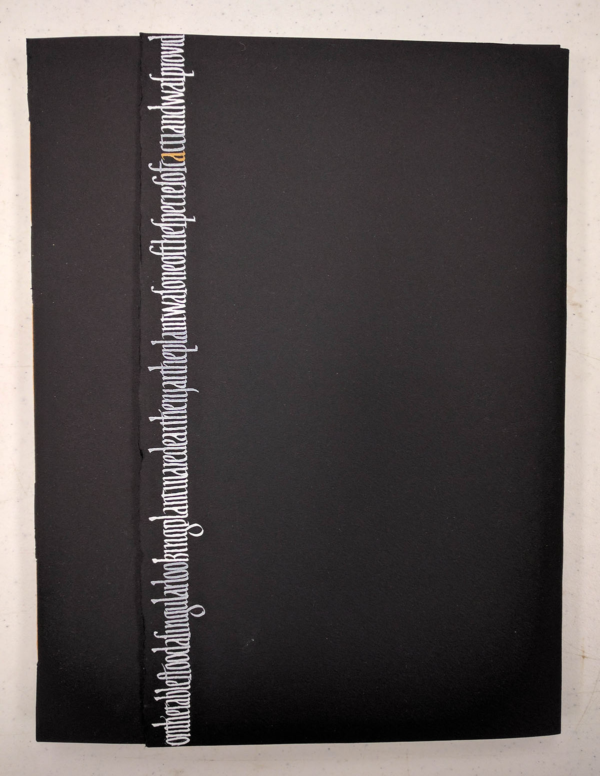
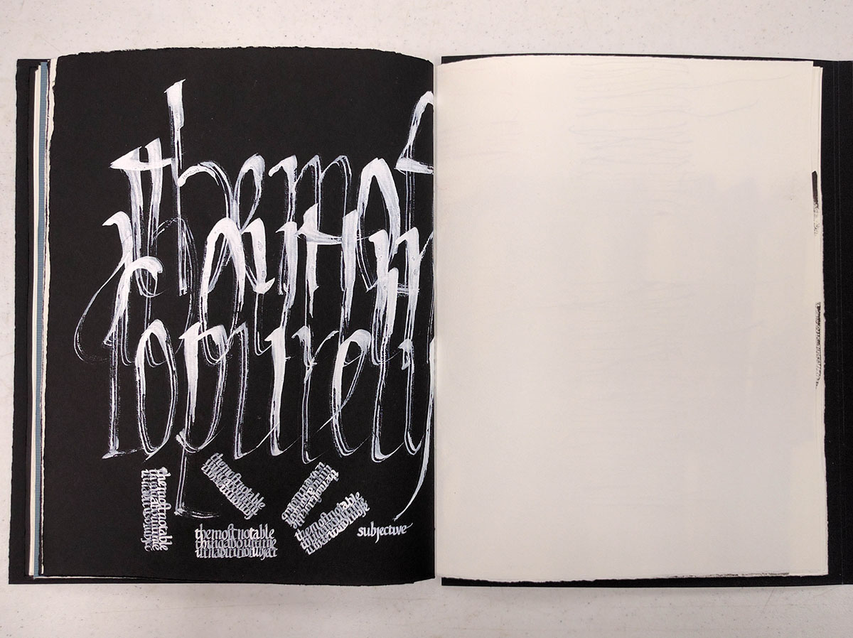
This is the front cover. The writing is a modified version of the original script: each of the letters is much taller and skinnier. The text that I used in the book was partially from O. Henry's "Cactus", and partially just made up of silly alphabet sentences.
An interesting note: the original alphabet had a different letter s than the one that is used in modern English. It is usually referred to as "long s", and looks kind of like f without the bar: ſ.
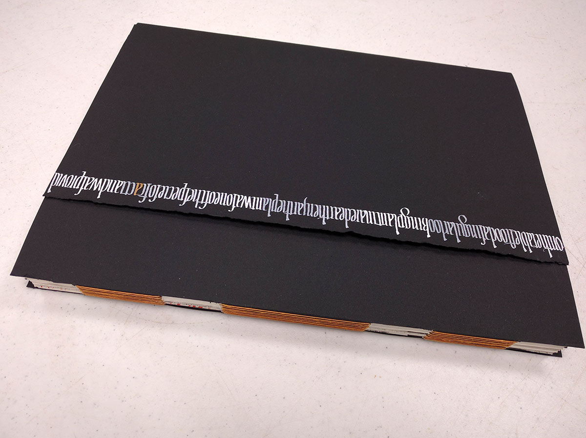
Here, you can see both the cover and the spine. I cut out rectangular holes in the spine to show a little bit of the pages inside, and used orange thread to bind the book.
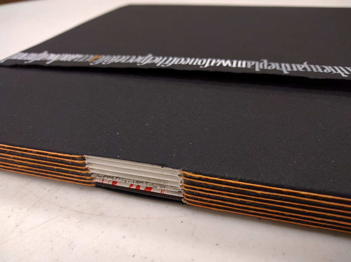
This is a detail shot of the spine. I dare say, binding the book was the easiest part of this class.

The book is kept closed with little round magnets that you can see on the corners of the cover.
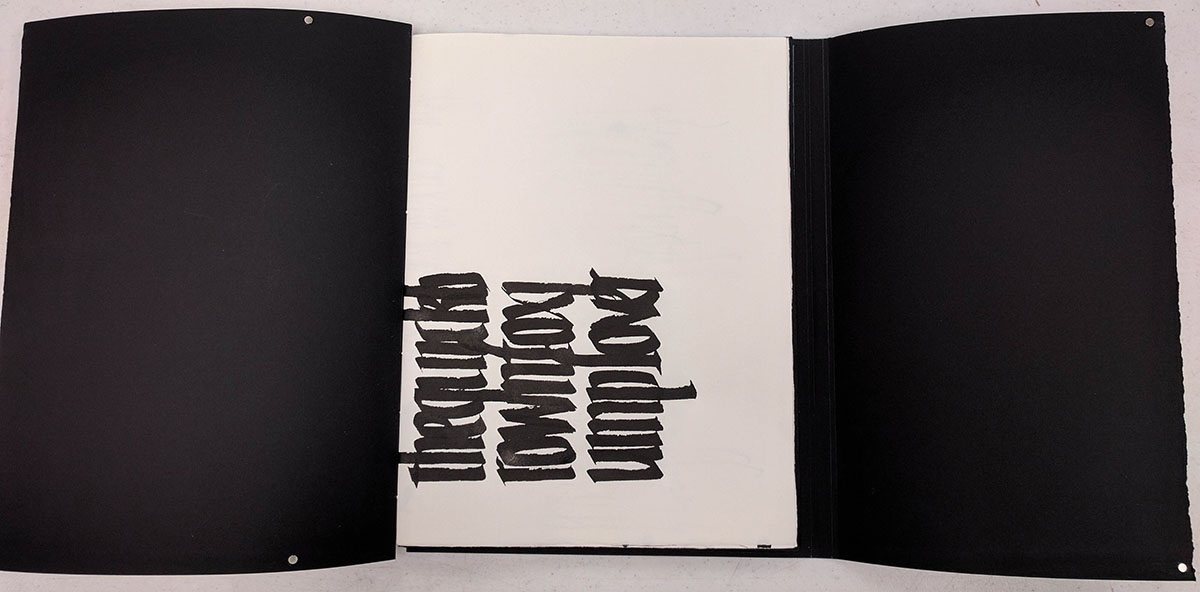
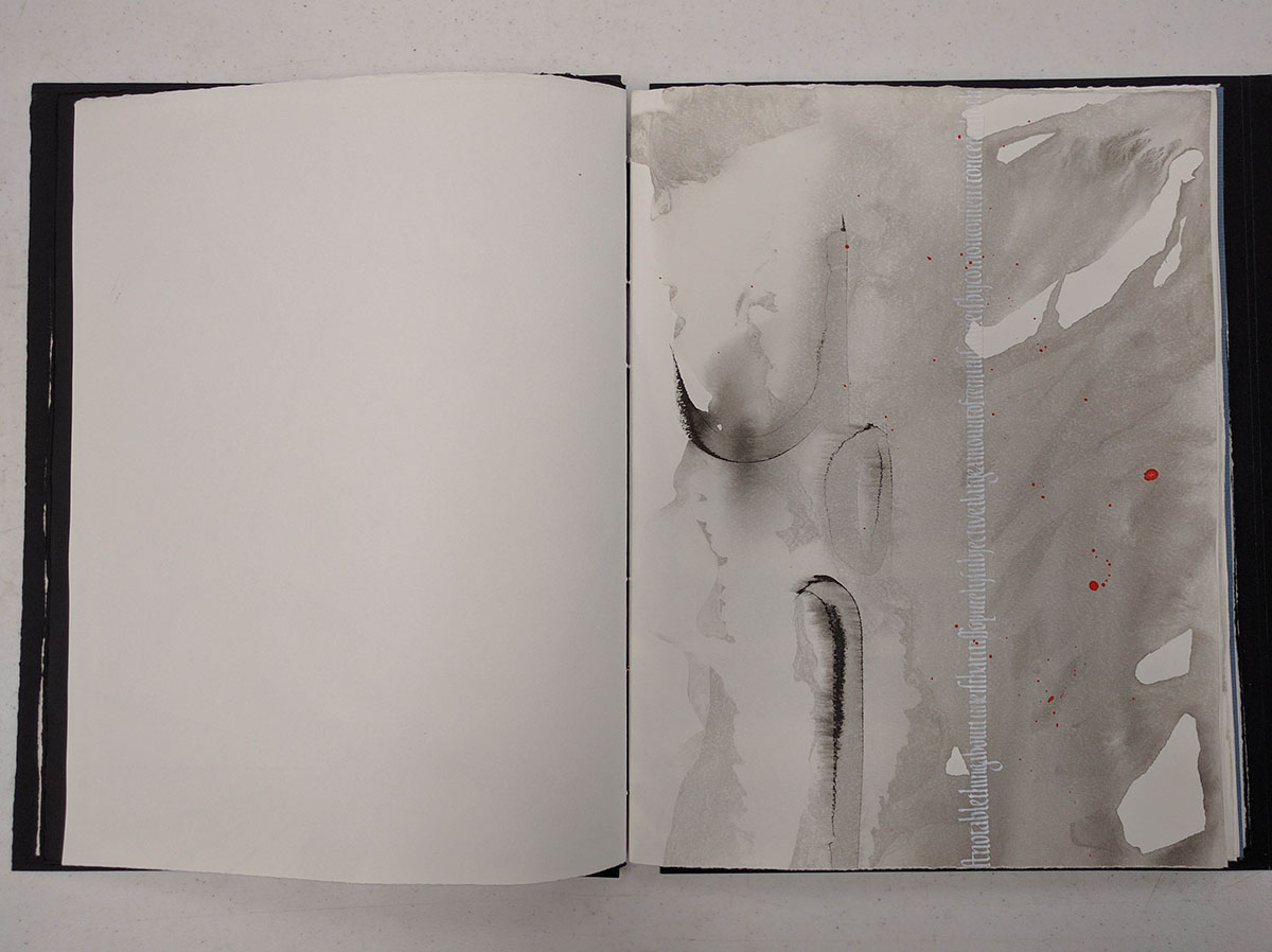
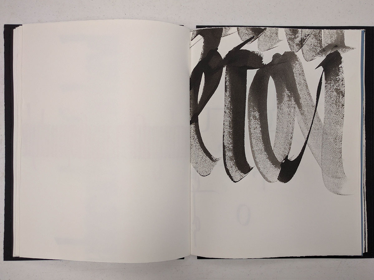
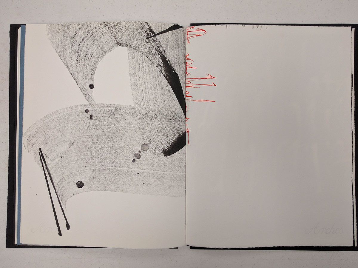
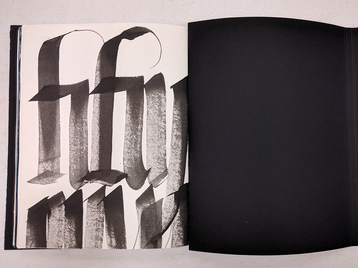
This is the first page that you see when you open the book. The goal of the writing exercise was to use a thick pen and to make the letterforms condensed and heavy. The fact that they are sideways is both intentional and accidental: even though Massimo told us we would be making a book at the end, he refused to give any details on the page orientation so that we would not be planning too much. As the result, some of the pages are sideways or even upside down.
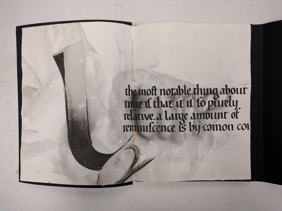
The large letter l on the left side was written with a really broad brush (about 2 inches wide) in sumi ink, and then the entire page was washed in the sink and left to dry. After it was completely dry, I added the text on the right (wish is a slightly compressed version of the original hand), and splashed some white gouache on the page.
On the left is a fragment of the a written using a piece of balsa wood (about 5 inches wide). Some of the pages were intentionally left blank since I needed quite a few to have enough to bind them into a proper book.
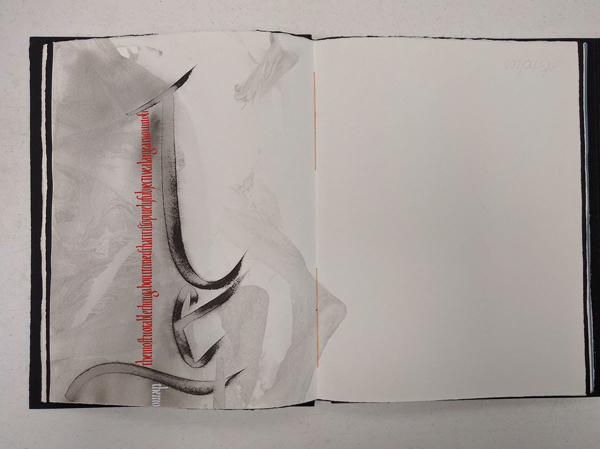
This is another crazy washed page with some condensed red and white text that was added after the paper was dry.
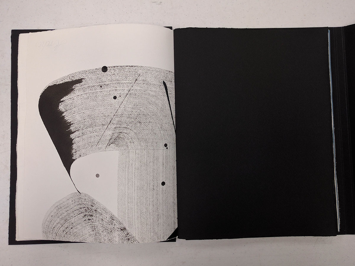
More of the same giant letter a. There were three overlapping ones on the original sheet. The sharp fanning out lines were added on top of the letter. Some of the ink drops were accidental, but I probably added some more just for fun.
This is part of the same page as the previous-previous spread. I remember quite well how I was getting ready to write something red, and ended up dripping the gouache on my page while thinking of what text to pick :)
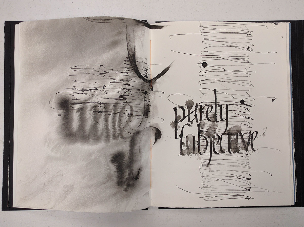
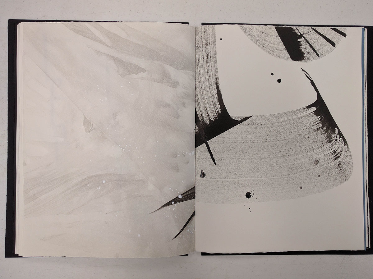
One of the crazier pages. The left side was washed in the sink, and then written on while it was still wet. Then the whole thing was dried, and written over in super-skinny hand written with the ruling pen. Then I thought it was lonely, and added some text in a slightly compressed hand. I didn't like how it came out, so I splattered some water on it. That sounds about right :)
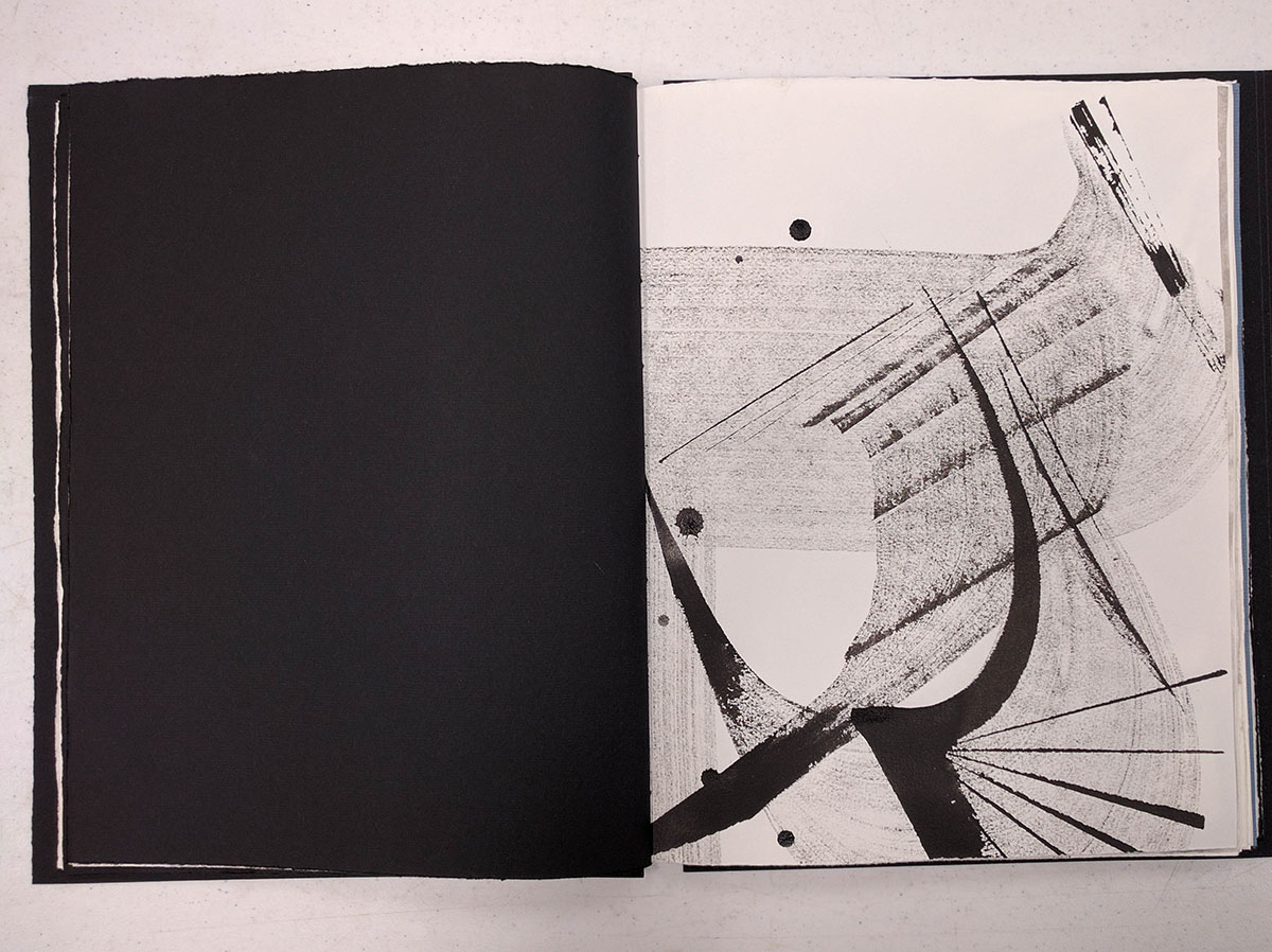
Some more giant brush writing washed in the sink.
Here, I was supposed to use a wide pen to make the writing condensed and heavy, and then to use a narrower one to make it tall and skinny. Some of the skinny letters needed to be stretched horizontally at random intervals to create a more interesting texture.
Some more balsa wood.
And even more.
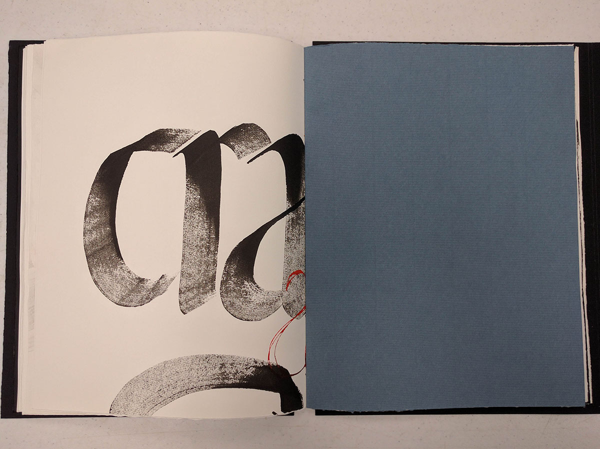
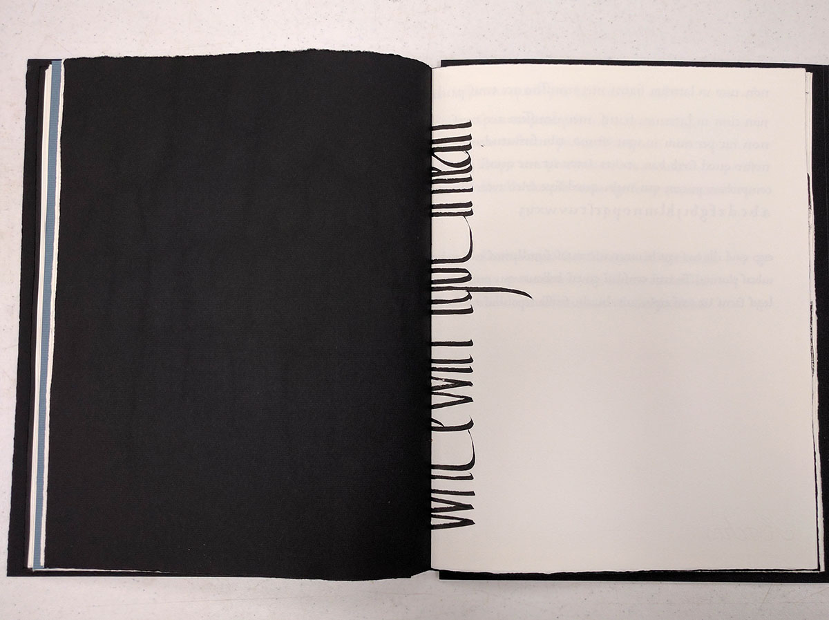
This one is a bit of a favorite. He told us to write one of our strengths in a thick, bold way with a piece of balsa, and one of our weaknesses with a ruling pen, making multiple lines. I put in a blue piece of paper in the middle of the signature to make it a bit more exciting for the reader.
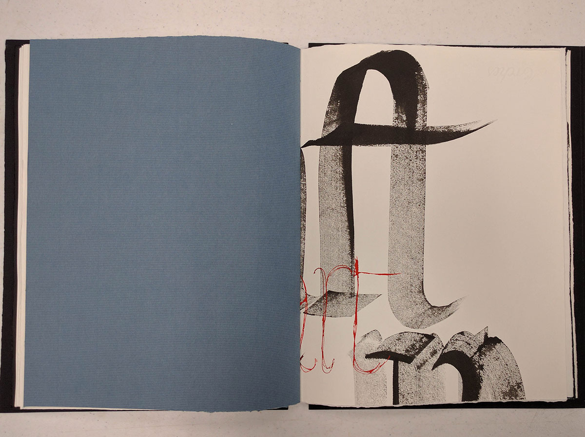
Here is the right side. Now you know one of my strengths and one of my weaknesses.
The spiky lines on the right ended up so close to the fold accidentally, but I kind of like how they turned out in the end.
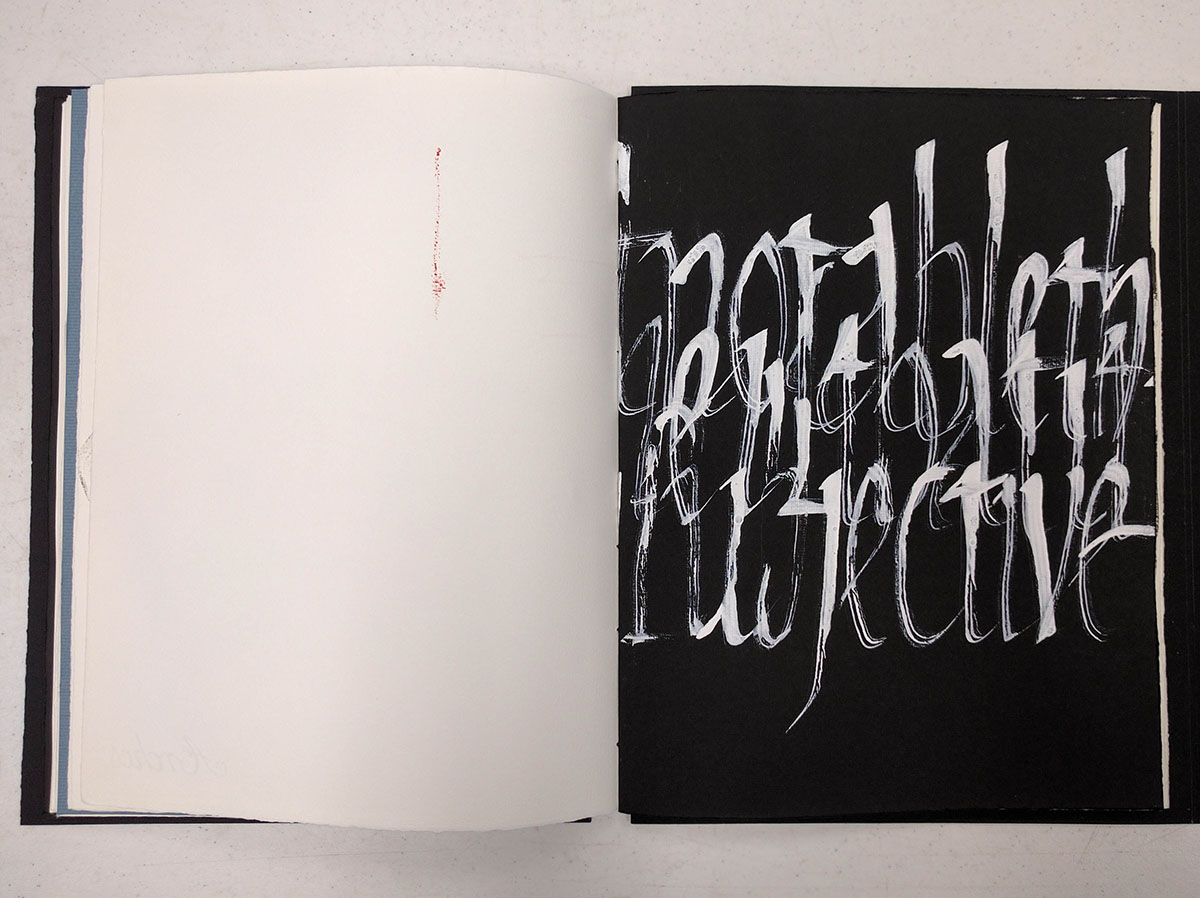
Some white on black, because how can you not try some white on black? Of course, I had brought the wrong ink with me, so it didn't exactly flow smoothly. To save the day, I just wrote the next line partially over the first one. And then I went to the store and bought proper while ink.
Actually, that was one of the amazing things about this conference. Both John Neal and Paper & Ink Arts (the two major online retailers of calligraphy supplies) were on campus the whole time, and you could easily get any missing supplies, along with many more cool supplies that you saw in the store and simply could not resist. I'm sure you know what I am talking about.
Neat accident. They look better cut in half, I swear.
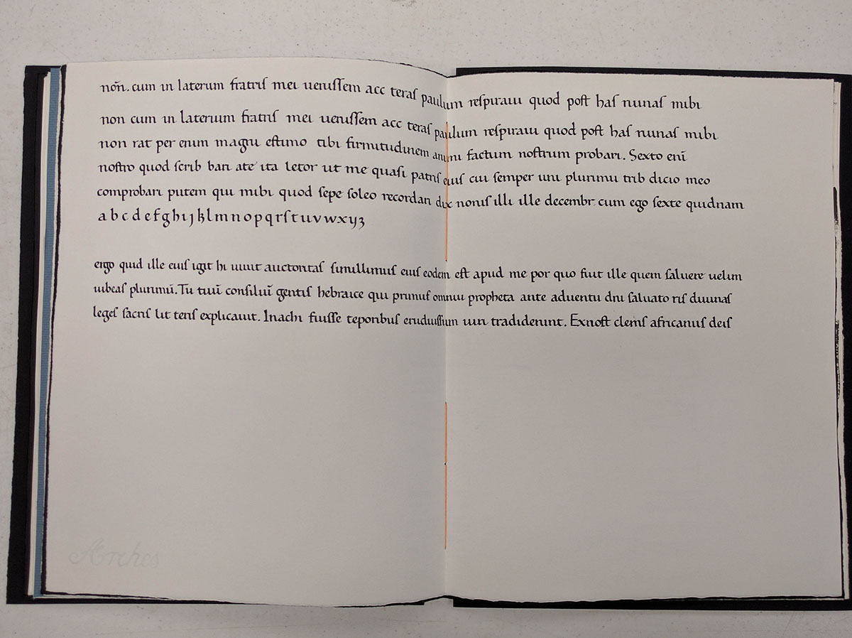
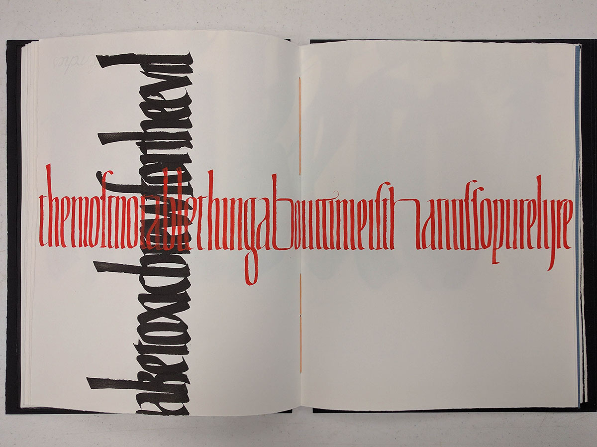
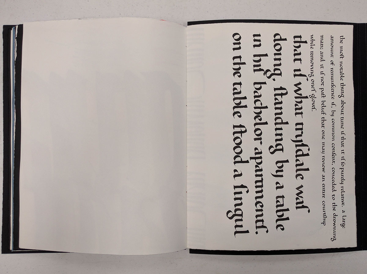
Finally, an accurate copy of the original manuscript, the alphabet, and the slightly condensed version below it.
When I signed up for this class, I was expecting that this is what we would be doing for the entire 2.5 days. Boy, I was wrong. What we did was much more challenging, at least for me. I've never washed my work in the sink before.
The other half of white-on-black.
English text written in the original hand and size, and then in a larger size, but still the same hand.
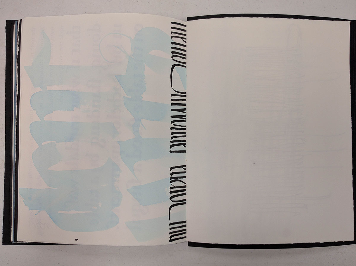
Condensed text with some light blue balsa in the back.
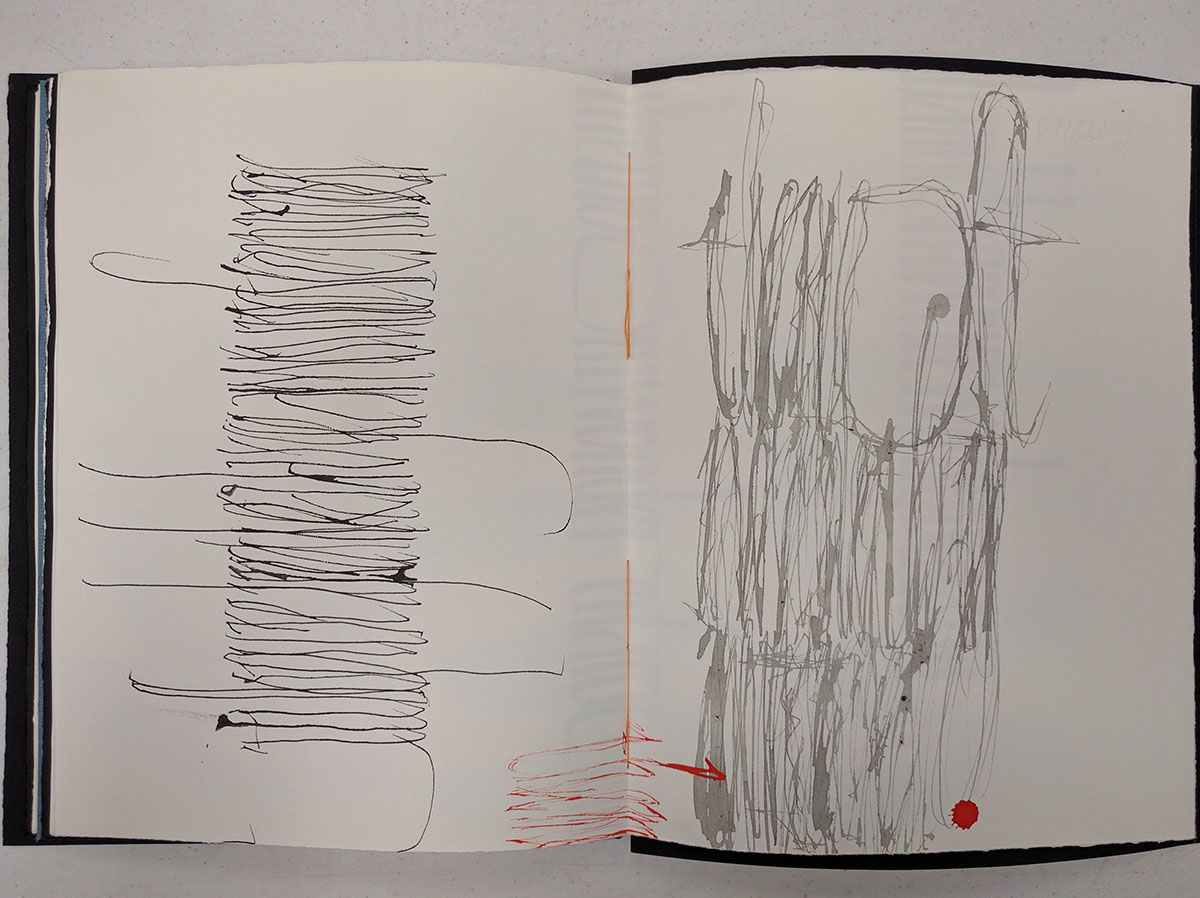
Some crazy, shaky, multiple-line letters. This is still real text, but readability was not one of this class' goals.
The last page and back cover.
Believe it or not, this was just the first class. It was fun, but challenging. And it in no way prepared me for what to expect in the next one.
The second class was simply titled "Rediscover Italic", and was taught by Christopher Haanes. In hindsight, I should have practiced some Italic before going into it, since it has been a couple years since I last touched it. Oh well...
The class was quite intense, and focused on the details of each letterform. I learned a whole lot of advanced techniques I did not know existed. Now I feel like all I have been taught about calligraphy was a lie :)
Anyway, I was rather unprepared, and it took me all of the first two days to get anywhere close to decent. I'm not going to show any of my work because it was embarrassingly bad. In fact, it was so bad, that when he walked around the class to look at people's writing, he didn't even comment on mine. He told some people what was good, some people what was bad, and passed me silently. I guess it must have been worse than bad. He sat down a couple of times and wrote some letters for me, and I struggled to replicate them for hours.
The class ended at 4:30, and dinner was at 5:30. I would stay in the room all the way until dinner, quickly eat, and then come back and write, write, write until almost midnight for those two days.
On the morning of the last day, as he was making his rounds, he stopped behind my back. Then he just stood there for about 30 seconds without saying anything. Finally, he asked "Did you come in to practice last night or something?"
As silly as this may sound, this was the best compliment I could have gotten. My writing was still not perfect, but I worked hard and improved it enough for him to notice.
In a way, I've learned best from strict teachers like Christoper in the past, and I knew what to expect. Some other people said that his personality was hard to handle, but I found it just fine. I would rather be told what is wrong with my writing and how to fix it, than get empty praises and excessive admiration from people who believe in encouragement too much. His writing is beautiful, and I am going to practice until I can be better than him.
Both in my classes and during meals, I met so many incredible people. Everybody at the conference was so talented. My roommate's personal journals were so beautiful I wanted to curl up and cry. One of my fellow classmates makes his own pens, and they look stunning. Many others had absolutely beautiful writing. I don't even know where to start. Every single person was completely different, and yet all possessed the same kind of vibrant positive energy.
This entire week was a blast, and I cannot wait to go to next year's conference in Ogden, Utah.
I am both exhausted and energized after this trip. It is the strangest thing. I feel so inspired to continue working. I am going to do my best to keep this momentum going.
Comments