Built-up Capitals with Yves Leterme

In the spring and early summer, I had signed up for a Built-up Capitals class. Based on my previous experience with Yves' online classes, I figured I would not be able to learn all of the material presented, but at least I would learn something new, and improve my skill.
Honestly, I don't know if anyone could truly follow the pace of this class. Some of my friends did better than myself (as evidenced by their Instagram posts of the assignments), but you just can't squeeze a lifetime of experience into a 7-week class. It felt like trying to drink from a firehose. Perhaps my expectations are too high, and I should have been happy that I got more than 10% out of it :)
During the first week, we reviewed monoline Roman capitals (aka Trajan capitals), and then took them through a series of transformations:
- Compress and slant the letters. This turns the Roman caps into Italic caps, which are the basis for the class.
- Add gentle movement. Start or end some strokes above or below the line, give horizontals a slight upward slant. The trick is to not overdo it, since you don't want the letters jumping all over the place.
- Use pressure and release. Apply less pressure to the parts of the strokes that would be thinner in the classical Trajan capital.
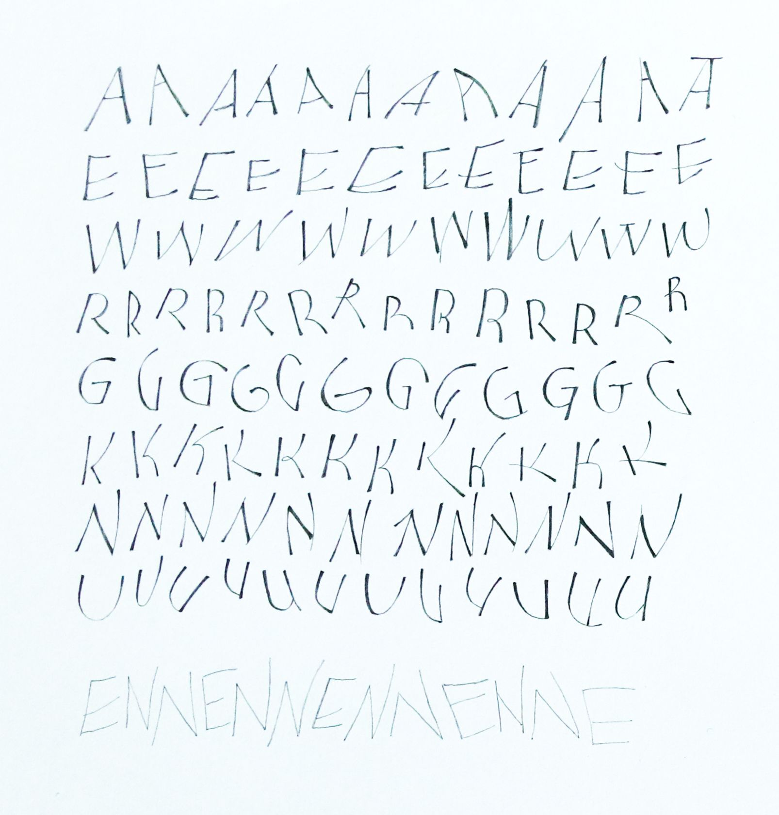
It look about 3 weeks before my practice sheets stopped going directly into the recycling bin, and I still could not reach my target of just 90% perfect :D Despite my best attempts, Yves said my A's were still too bouncy.
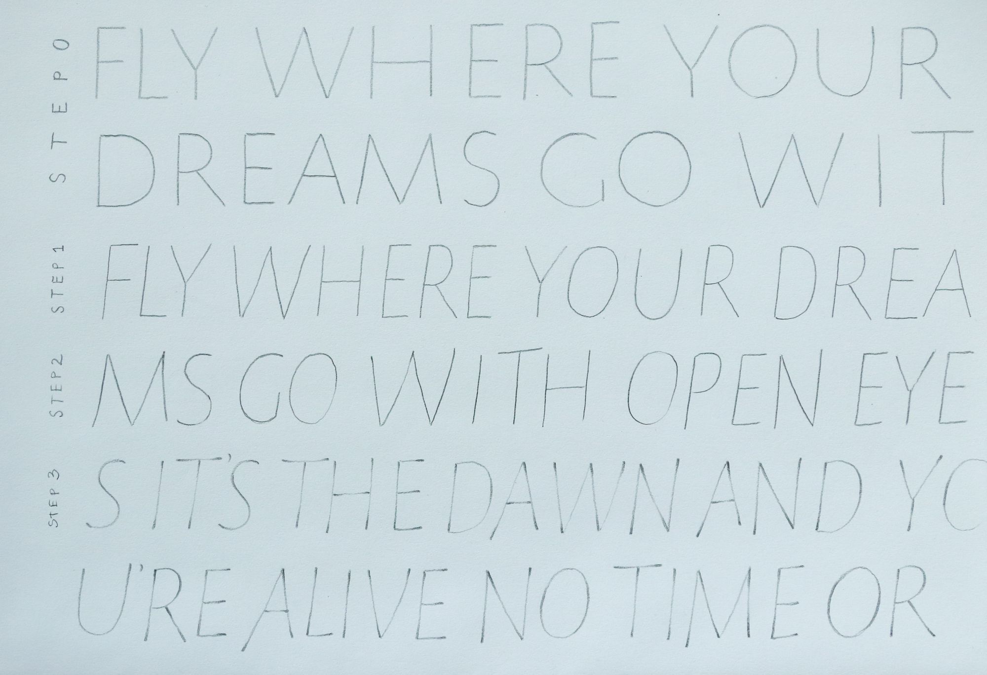
Next, we started adding weight to the strokes, building them up with pencil. Keeping a consistent weight is always a challenge, and making larger letters (the top row in the image below is 2cm tall) takes a lot of time. I even got reasonably comfortable with a tool I had not used before: a mechanical pencil with a really thick lead, which needs to be constantly sharpened to a point. I understand now why you can't do these letters with a regular mechanical pencil. It just doesn't have enough precision.

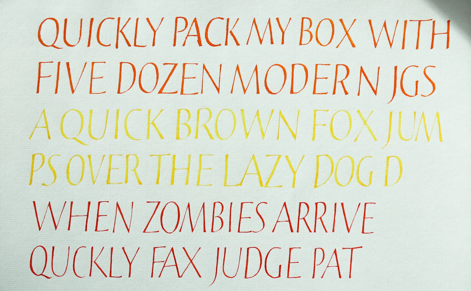
Naturally, if you can add weight, you can always add more weight, so the next assignment was to show a "weight gradient". And also to try using a fine liner instead of a pencil. If you have ever wondered who uses those 0.03mm liners, you now know: it's the people who are into built-up letters. It's not that different from using a pencil, except you can't erase your mistakes if you mess up.
Then, we moved onto using nibs. I was just starting to feel like I had a grip on this! But no, of course there is always more. Yves explained how even though it can be convenient to use a larger pen size to make fewer strokes, it also means having less room for accuracy and delicate strokes, so it's always a trade-off.
By this point I had thoroughly lost track of which class week was being taught at the moment, but I am pretty sure the next assignment was to write 3 words using 3 different tools. And the file name I have for it on my desktop contains "week 2", so... It was probably indeed just week 2, even if it felt like week 5 to me.
After this, we went to distortion and "accordion rhythm", or making some letters wide, and some narrow, while still feeling like a cohesive whole. I will be completely honest with you, this material was not just outside of my comfort zone, but also outside of my competence zone. I've never been good at anything "gestural" or "spontaneous", and I could keenly sense that these exercises were headed into that territory. The practice sheet below is based on the exemplar, so I did not come up with any of the letters. I just copied them as best I could.
The next assignment was to write something using these variations. There may have been more assignments, but that was the one I picked. My idea was to write a list of "things I believe in", and highlight some of the letters so they spell out the title of the piece. I think it turned out a bit too subtle, and I doubt anyone other than myself knows that the darker letters actually mean anything.
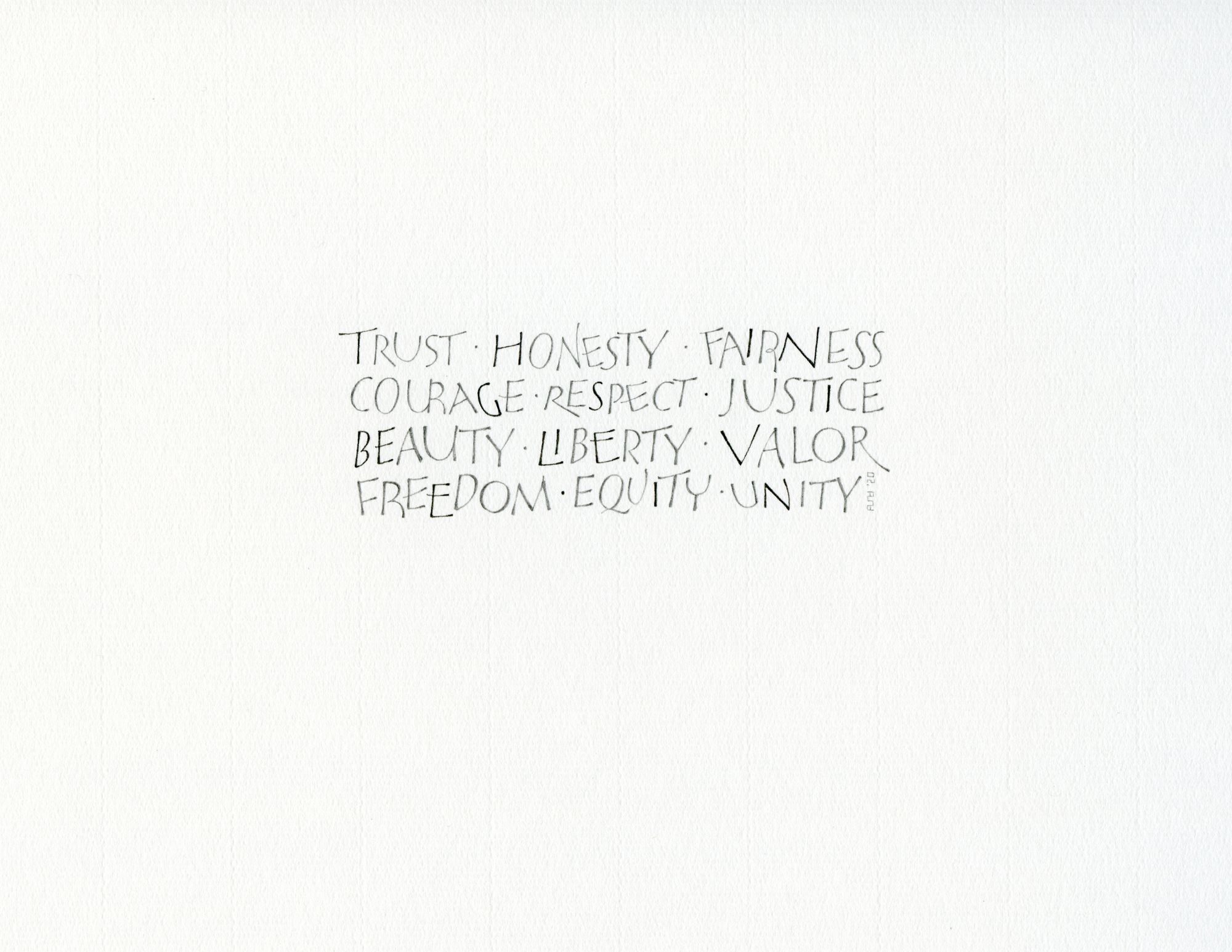
I sighed with relief when Yves said it was okay overall. The R in "valor" should not have a tail that long, and he immediately identified it as an attempt to fill up the space to improve balance. And there I was, thinking how clever it would be to do that :)
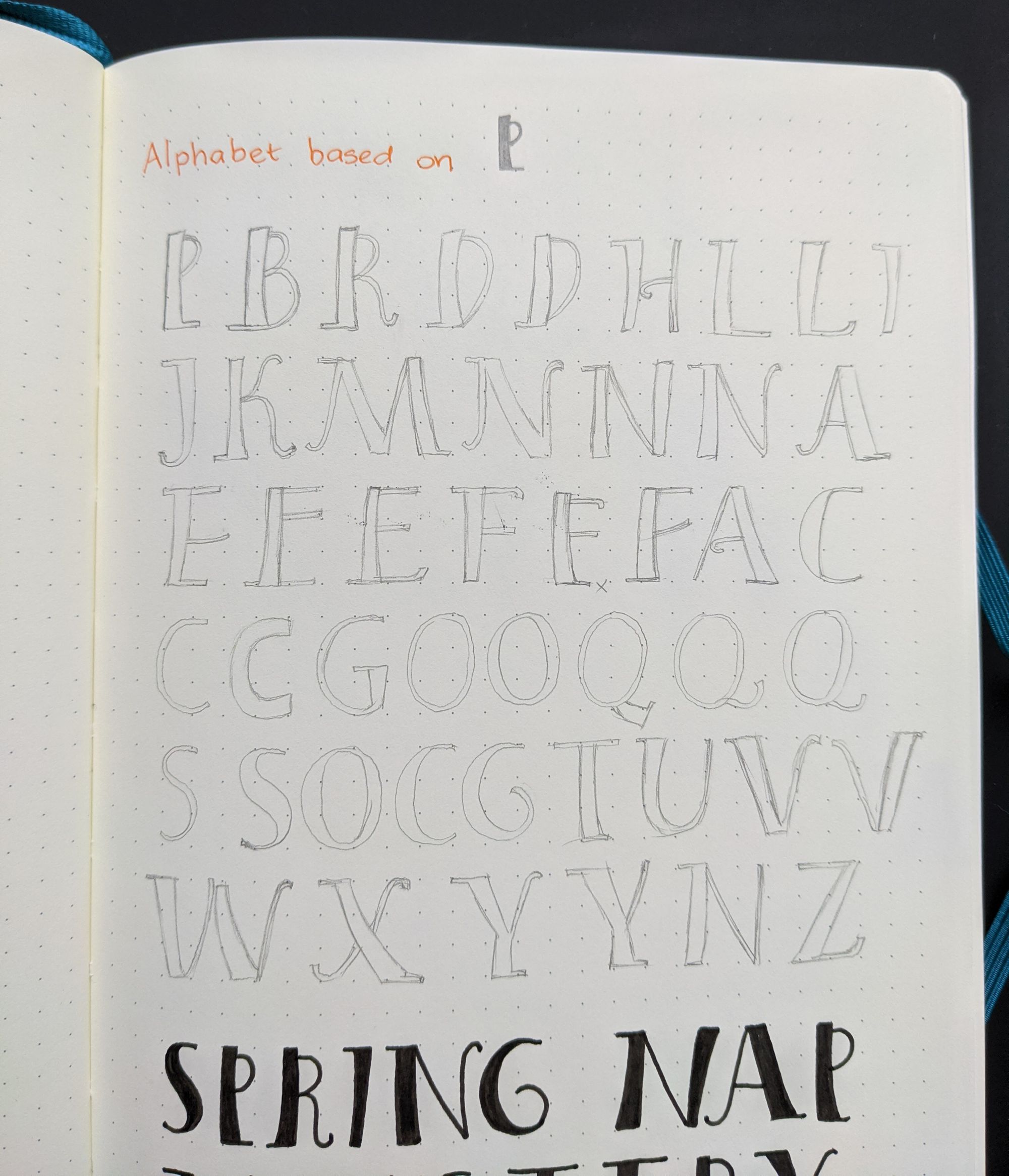
The final part of the class covered techniques for a more spontaneous look, and probably a few other things that went right over my head at this point. There was one last assignment (out of several, naturally) that I thought I could do: create an alphabet based on a letter "P" that Yves showed in the video.
I felt like it would be a nice challenge, so I put together an alphabet, and tried writing out a few things with it. I played around with variations, as instructed.
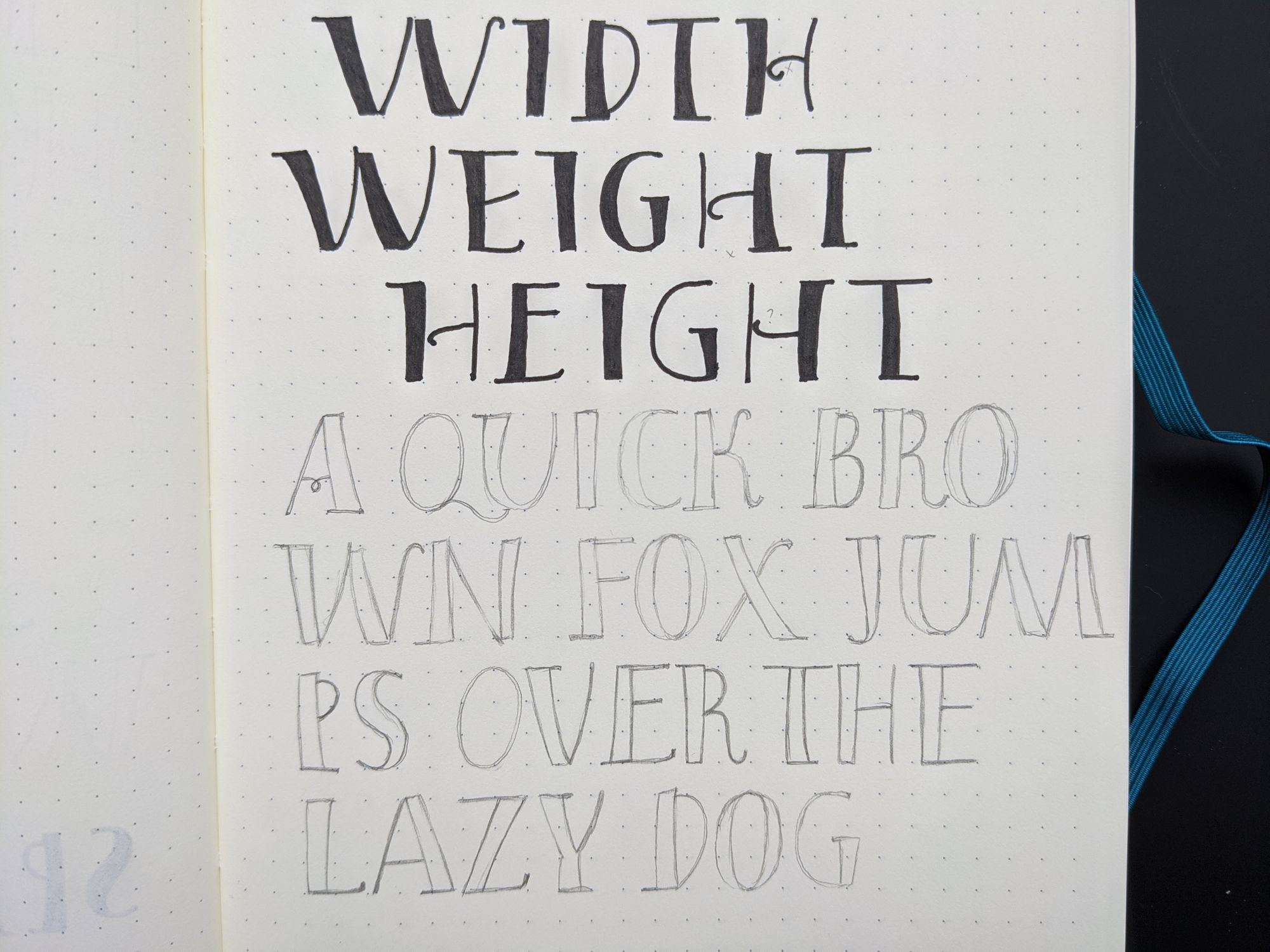
Then I thought it would be nice to write it as an outline, and add some watercolor. I have to admit, I was pretty proud at how it turned out. I thought I was finally getting a little better at this whole "informal" look.
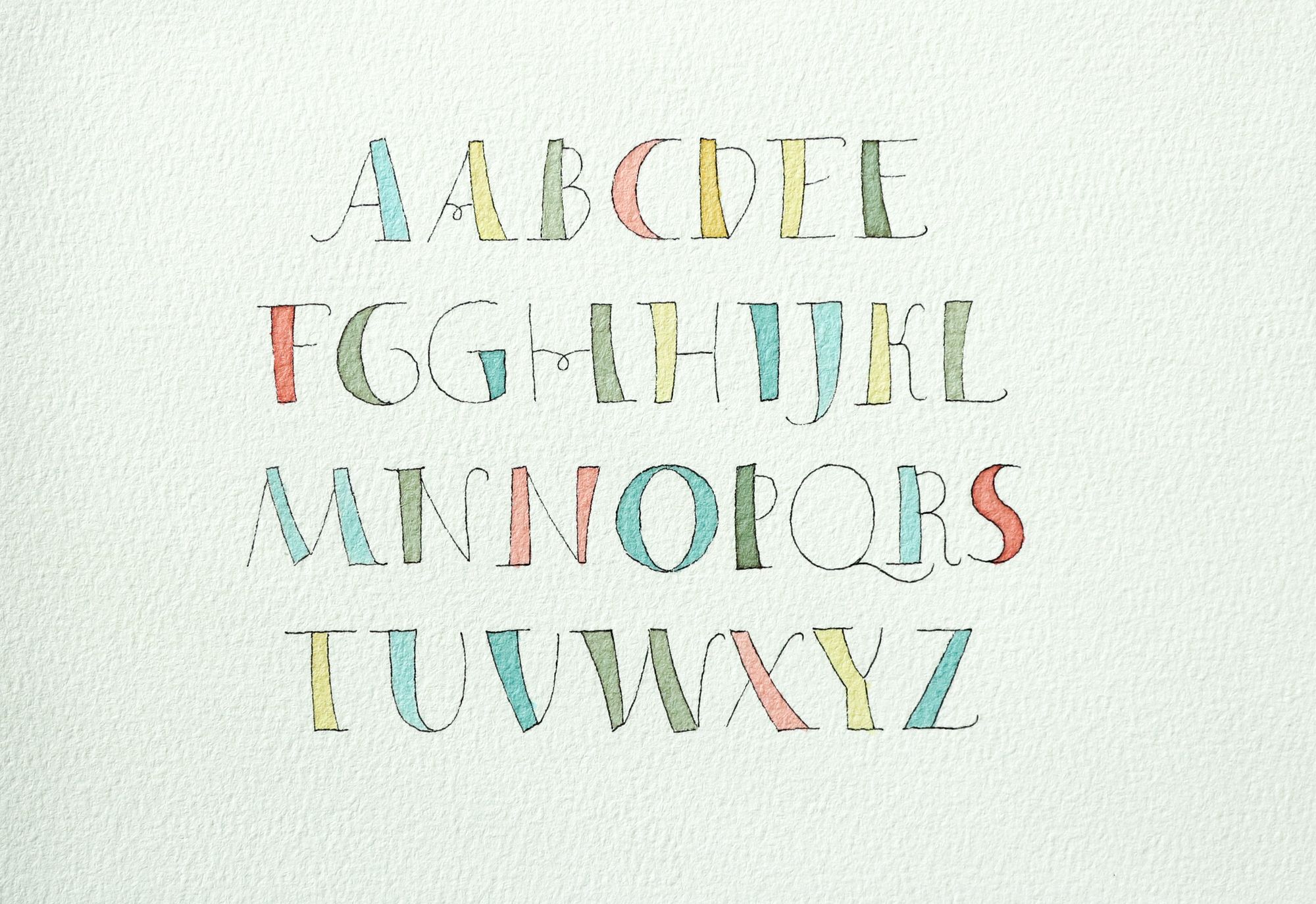
And you know, I'm not one of those people who only accept positive reinforcement. I am perfectly fine with critique. In this case, I guess, I just didn't know what to expect, and it was a bit of a shock. He did point out that the O and the Q didn't necessarily fit in well with other letters (which I did know, but could not solve), but then... Well, he just said the whole piece felt too amateurish. Great, exactly what I was aiming for... And then some other kind soul on the forum said my lettering might look nice in a child's bedroom. Touché.
Let's just say I accept my defeat in this area. Perhaps one day I will understand why people think that one random scribble across the page looks good, while the other one doesn't. To me, those will often look the same. I'll just stick with things I can understand, so I won't embarrass myself in front of the connoisseurs.
Comments