Brush class with Carl Rohrs

There is one tool that I have always found to be particularly challenging: the brush. I became especially aware of this after taking a sing-painting workshop, and seeing how all of my letters were complete garbage.
When Seattletters conference came around, I decided to challenge myself, and finally learn some brush discipline.
Carl demonstrated a large variety of hands, using both flat and pointed brushes. For me, the pointed brush stuff was way too hard, because it's all artsy and gestural. I am not good at gestural, and probably also just not yet ready to study it because I simply do not see the appeal in it.
I won't include my sad pointed brush attempts in this post, since they are really sad.
The flat brush presented its own challenges too. In the first day, it was just not working for me. I was really close to giving up. It even shows up in my choice of words!
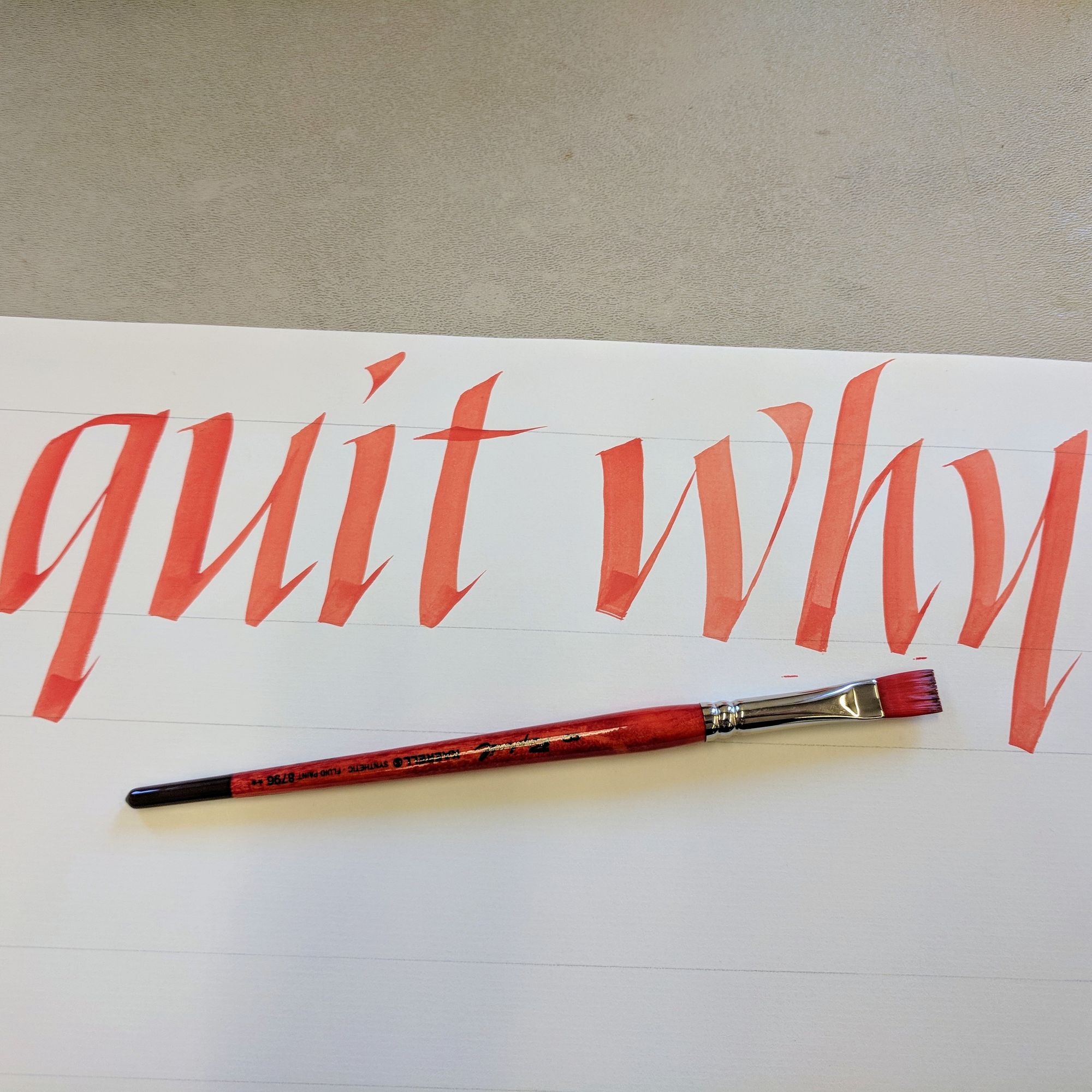
As the workshop went on, I decided I really don't like this sign-painting brush stuff. And it's not that I dislike Carl's work — it is gorgeous — it's just that I am too critical of my own skill, and cannot forgive myself the fact that I'm just not good at it.
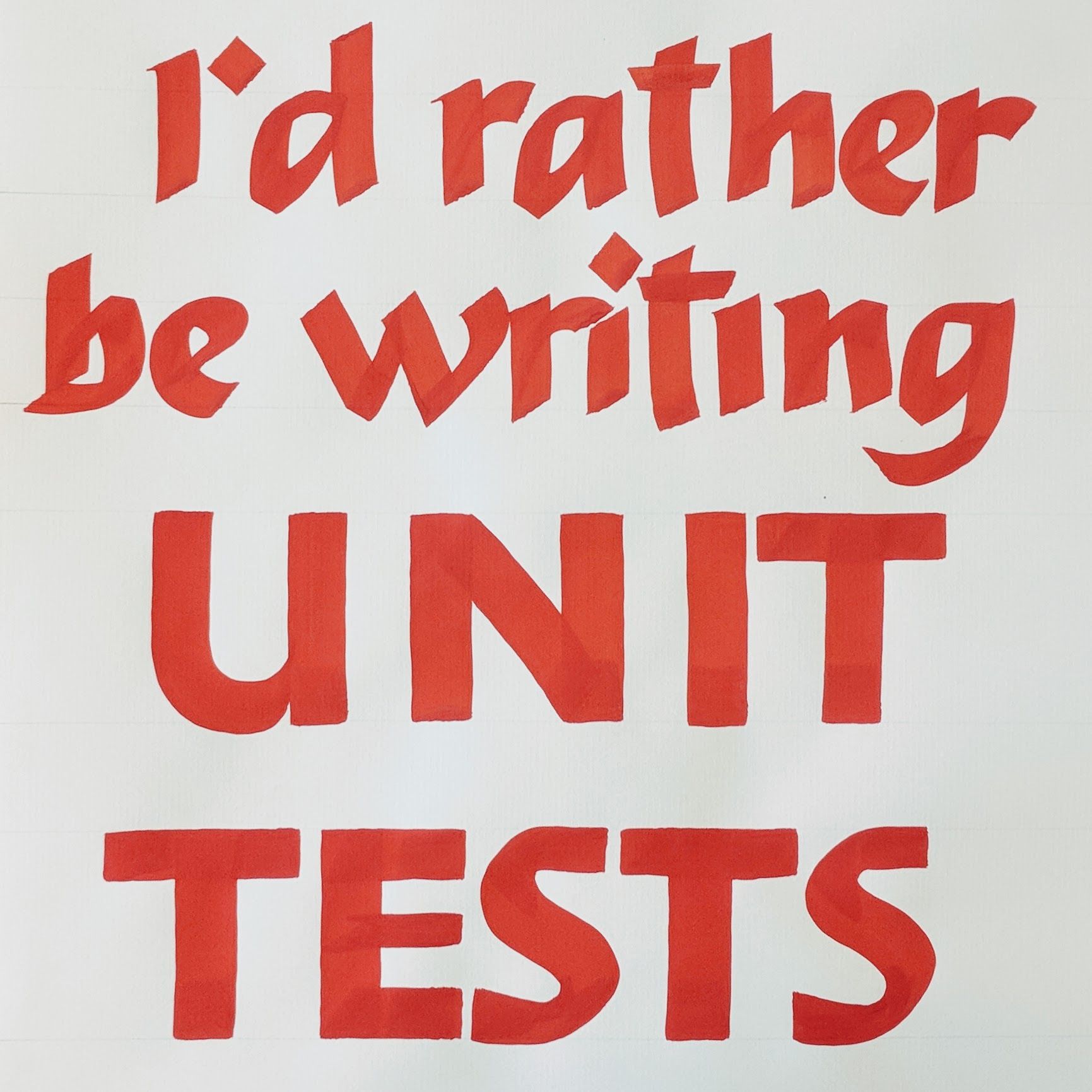
So I decided to make a little project to reflect this sentiment. While writing, I was thinking:
I'd rather be writing unit tests.
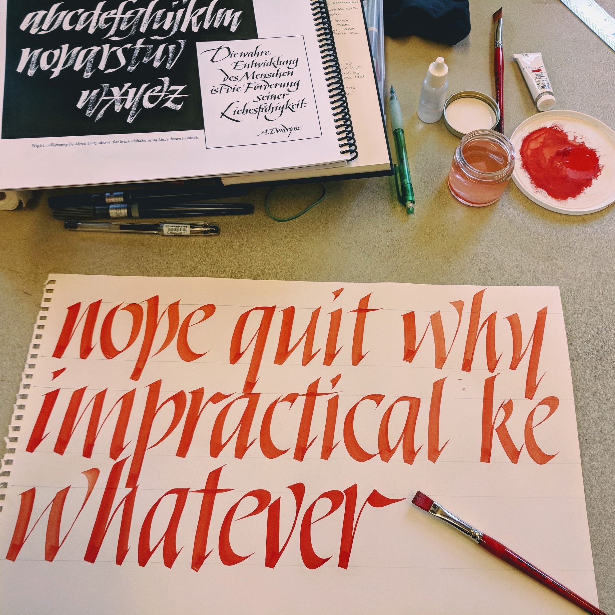
Of course, I hate writing unit tests. They always take so much time, and have weird issues that need to be debugged. You don't know what unit tests are? Trust me, you are better off for it :)
I wasn't quite happy with how this version came out, so I worked on refining the letterforms. I especially hated how the S came out.
Turns out, it's a hard letter! And really anything with curves in it is hard, especially if you try to maintain a consistent thickness.
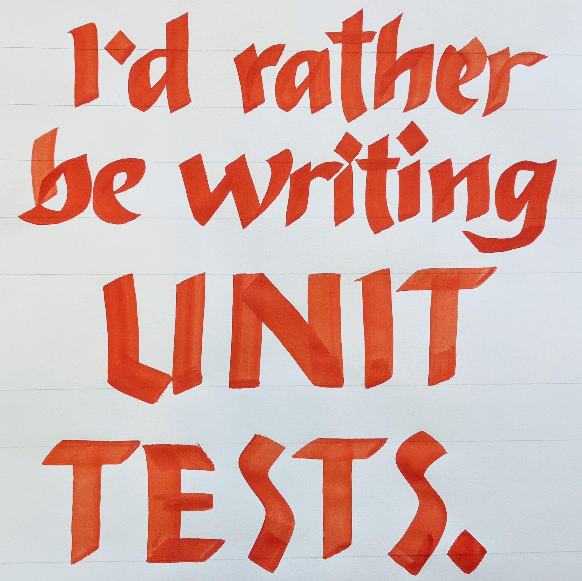
In the end, I had what I would say is a tolerable version. It's not brilliant, but at least it deserves to not go straight into the trash can. I'll settle for saying that either this is not my style, or I am not ready for it yet.
In the last 2 days of the class, I opted for a "comfort project". We were supposed to write out a longer text, which I did. I used a 1/4" flat brush for it. However, I chose Italic instead of any of the new hands I learned, just because I wanted something simple and familiar.
I did a practice run, and it came out quite decent:
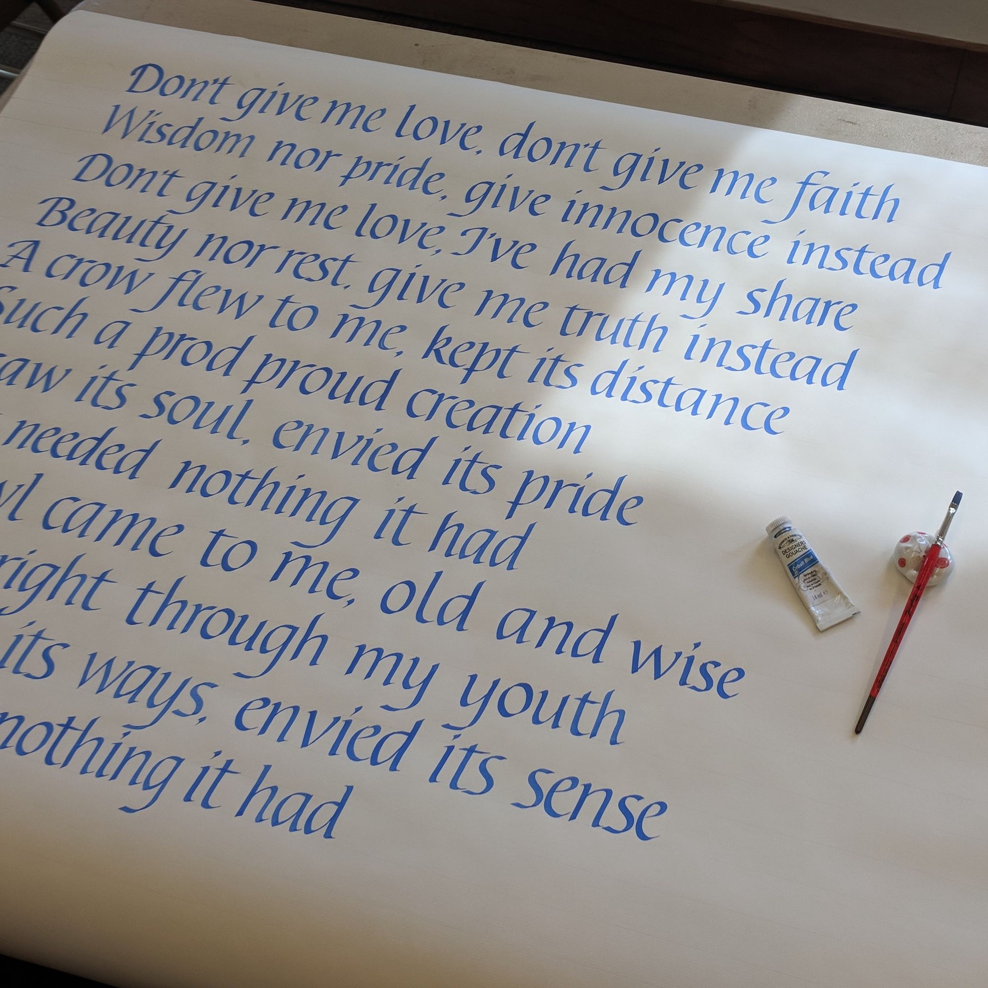
This project kept me so busy that I didn't even take any pictures of the progress. And, one more thing: I do not recommend working at a low desk standing. It really kills your back! Do anything you can, but don't bend over for several hours at a time. By the time I was done, I could barely walk, or move in general.
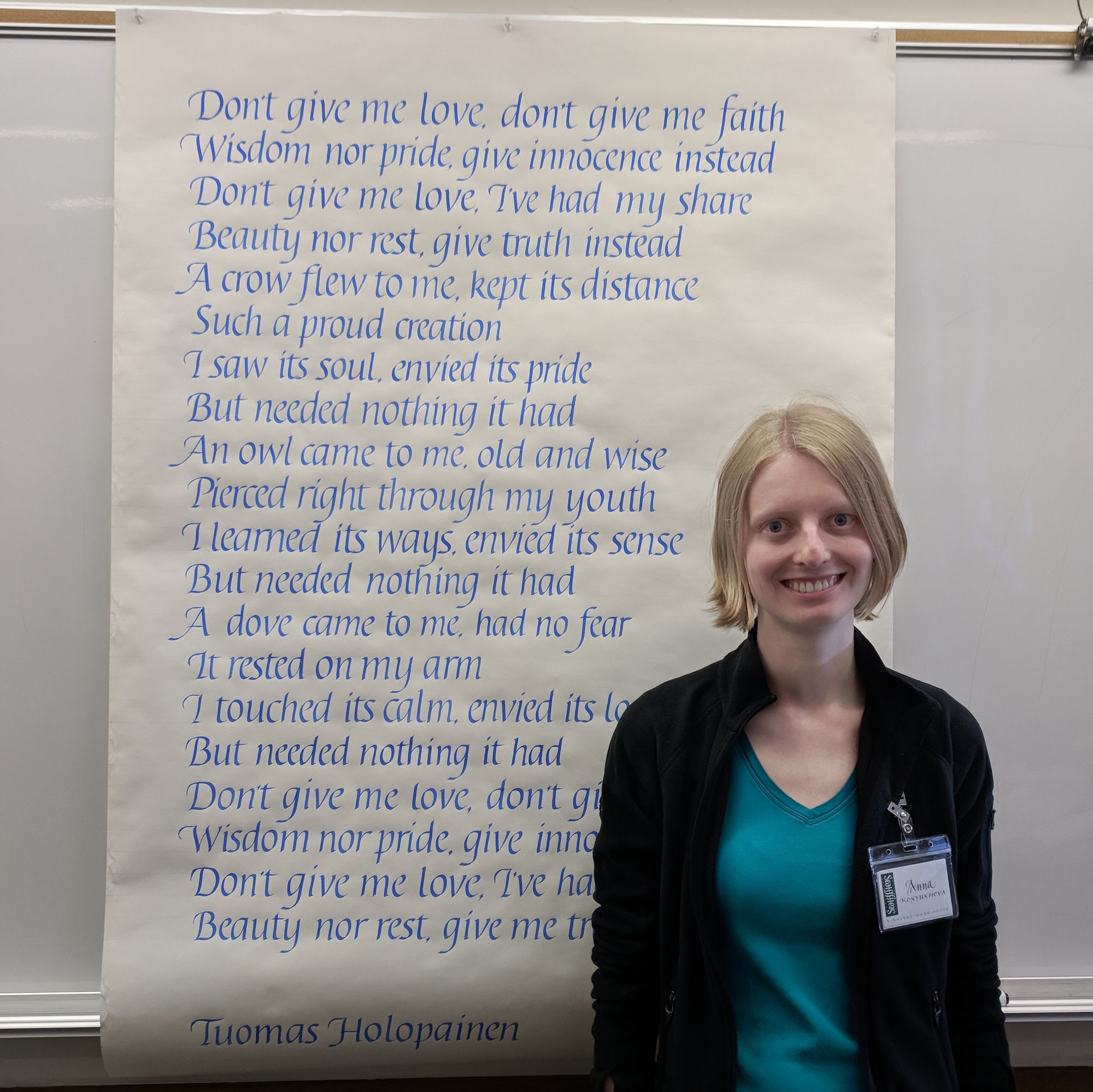
Note to self: work on Italic capitals. A lot.
But hey, at least everyone was impressed with the size of the final project! :)
Comments