Assignment #4: Book (Part 4)
For this week, I just had to refine what I had. Originally, this was supposed to be the last class before the book was due, fully printed and bound. However, the instructor was nice and allowed us to have that extra week for the final critique, and then the book would be due after that.
I was very happy to have the extra week. I had made some improvements to my key spreads, but I didn't feel like they were good enough. Something just wasn't quite right yet.
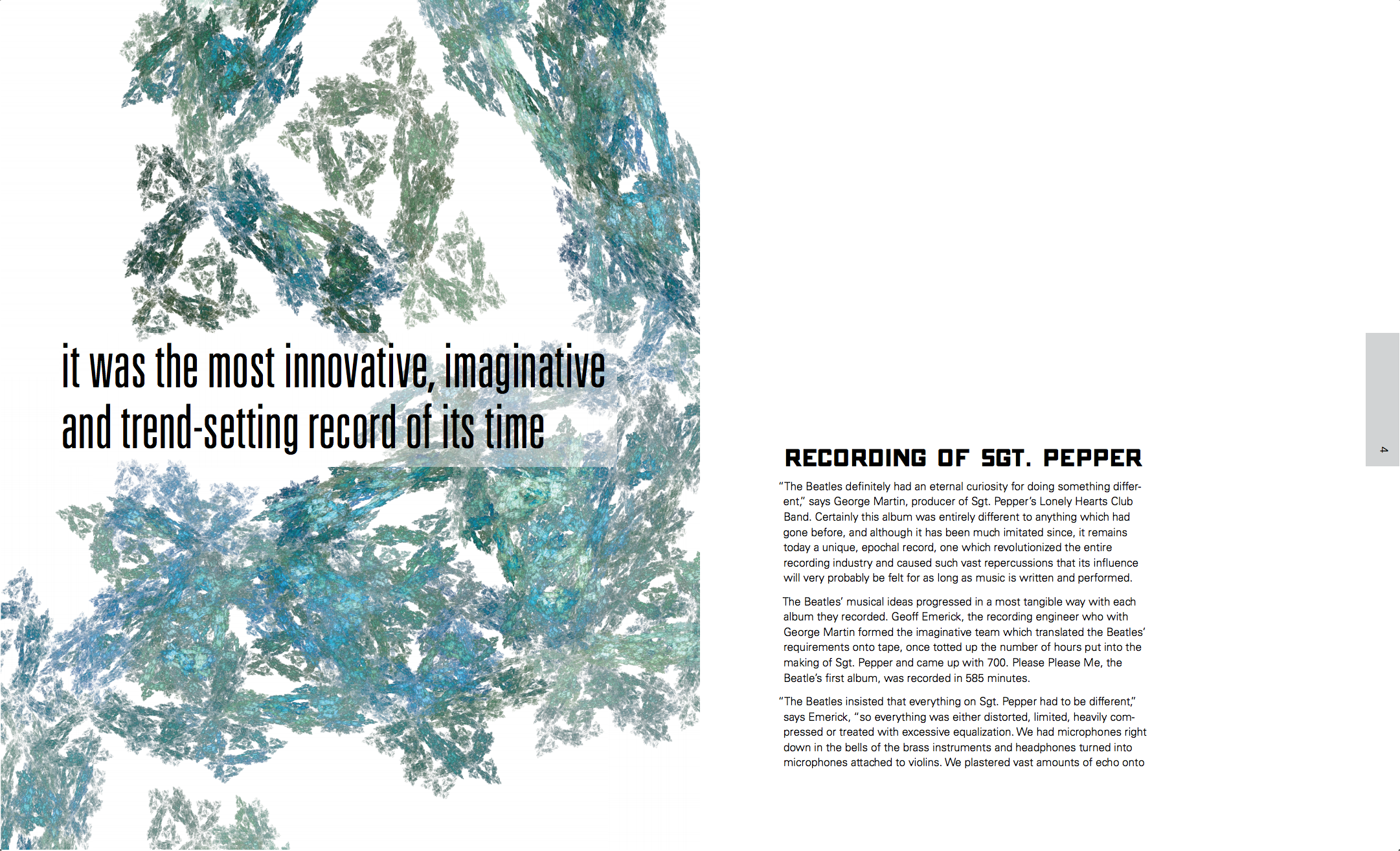
I updated the quotes to be larger as per critique from the previous class. This time, the feedback was that there is still too much conflict going on between the quote and the title. The suggestions were to either make the title smaller, or use the same typeface for the quote.
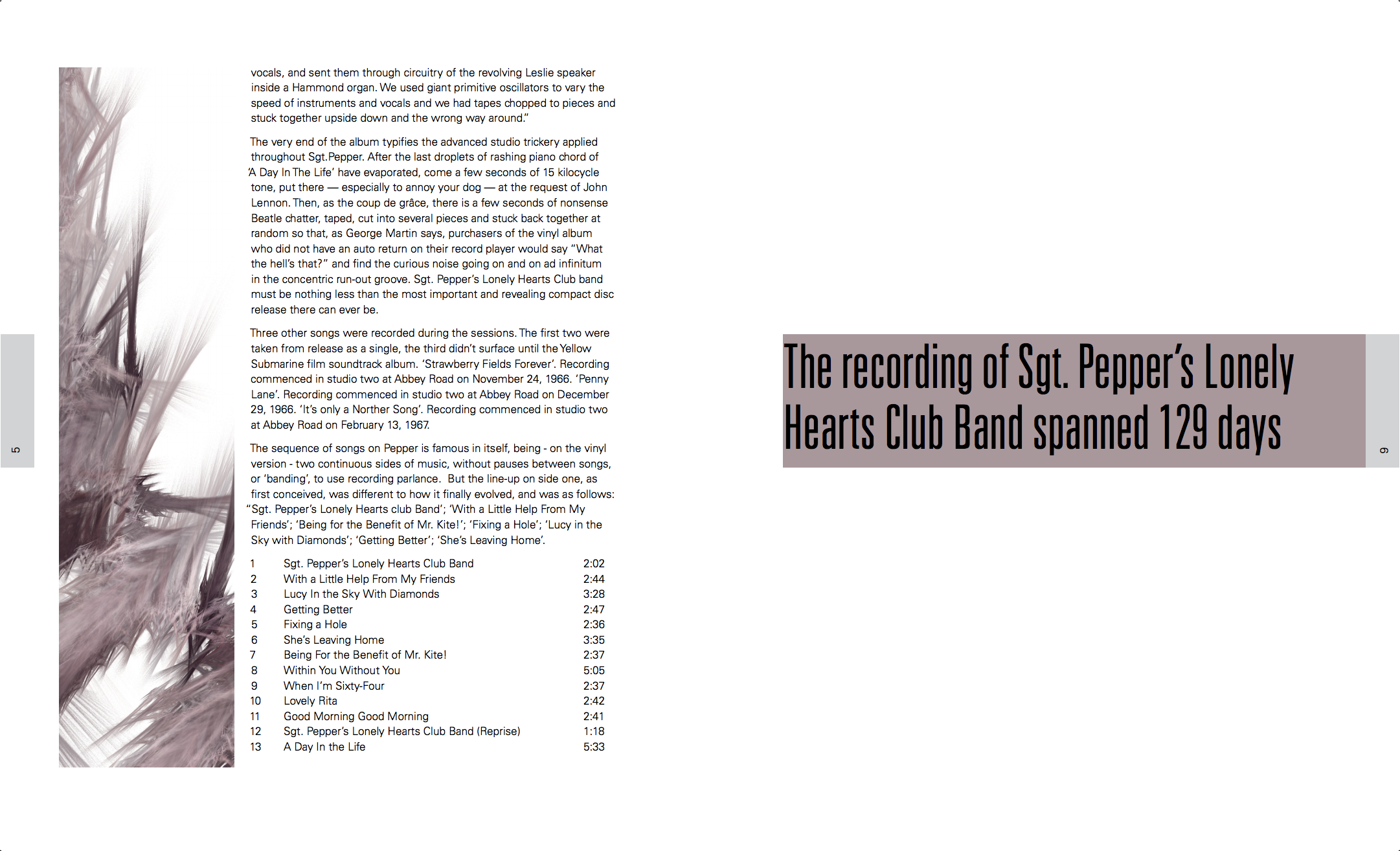
I still got the feedback that some pages need to be more saturated. I was surprised nobody called out the page numbers: those actually look pretty ugly in this version.
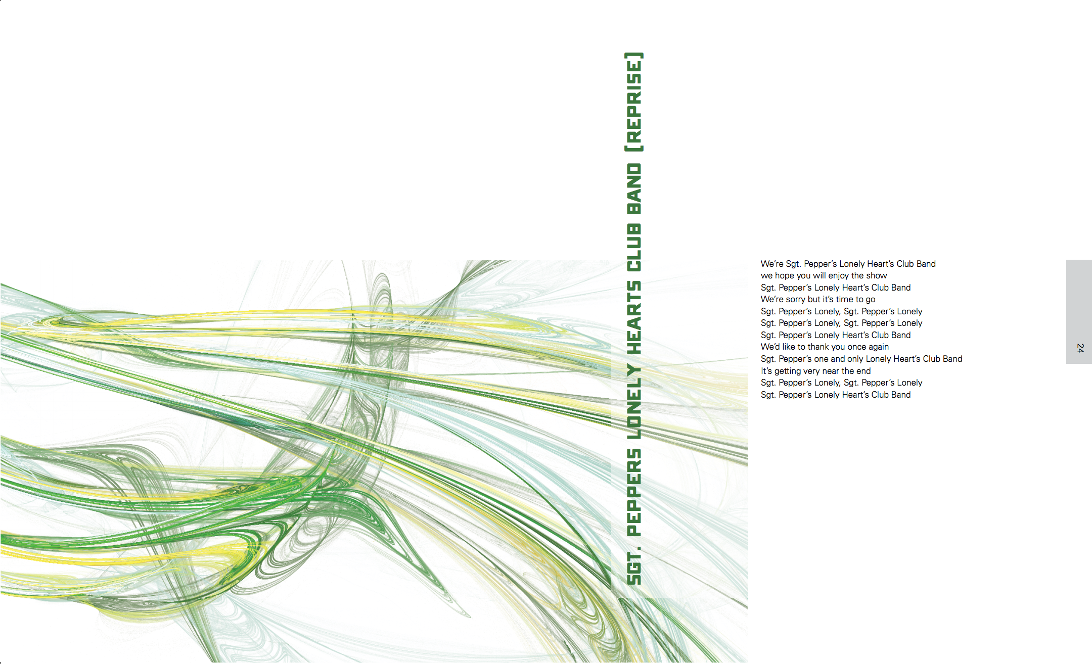
I tried experimenting with text color, but it didn't really add anything. Since I had both vertical and horizontal title, my instructor suggested that I only use one or the other.
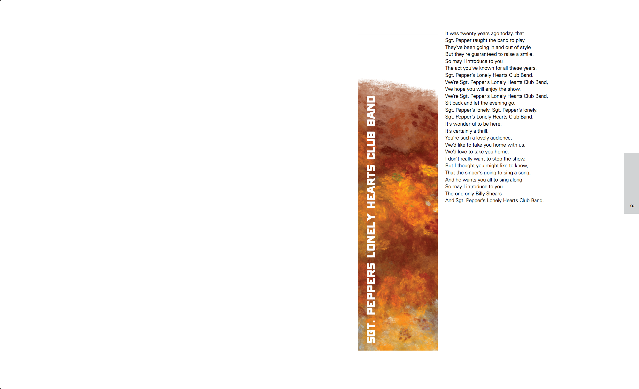
Even though I tried to vary the image size, I still got the feedback that I did not have enough separation between small, medium and large images.
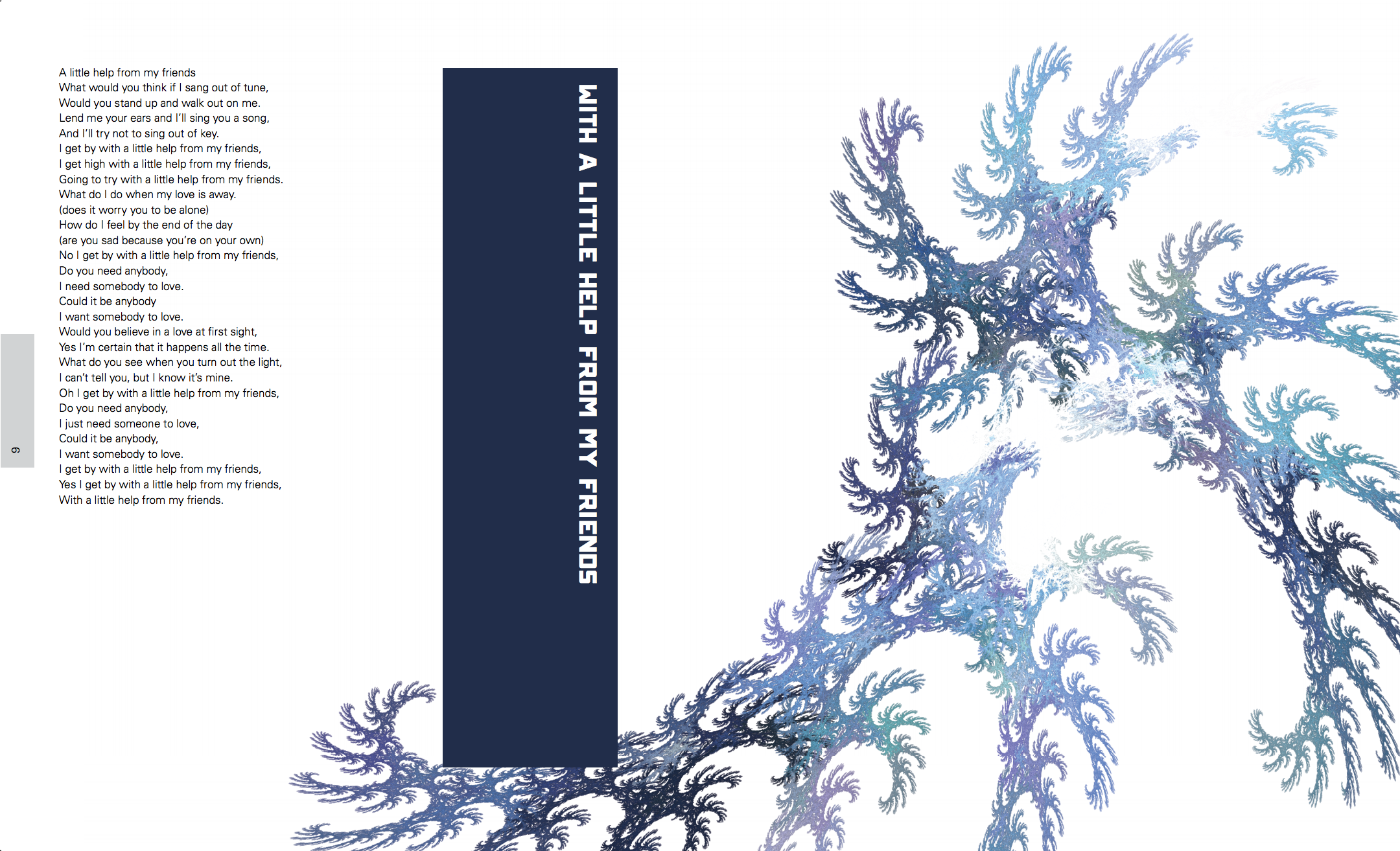
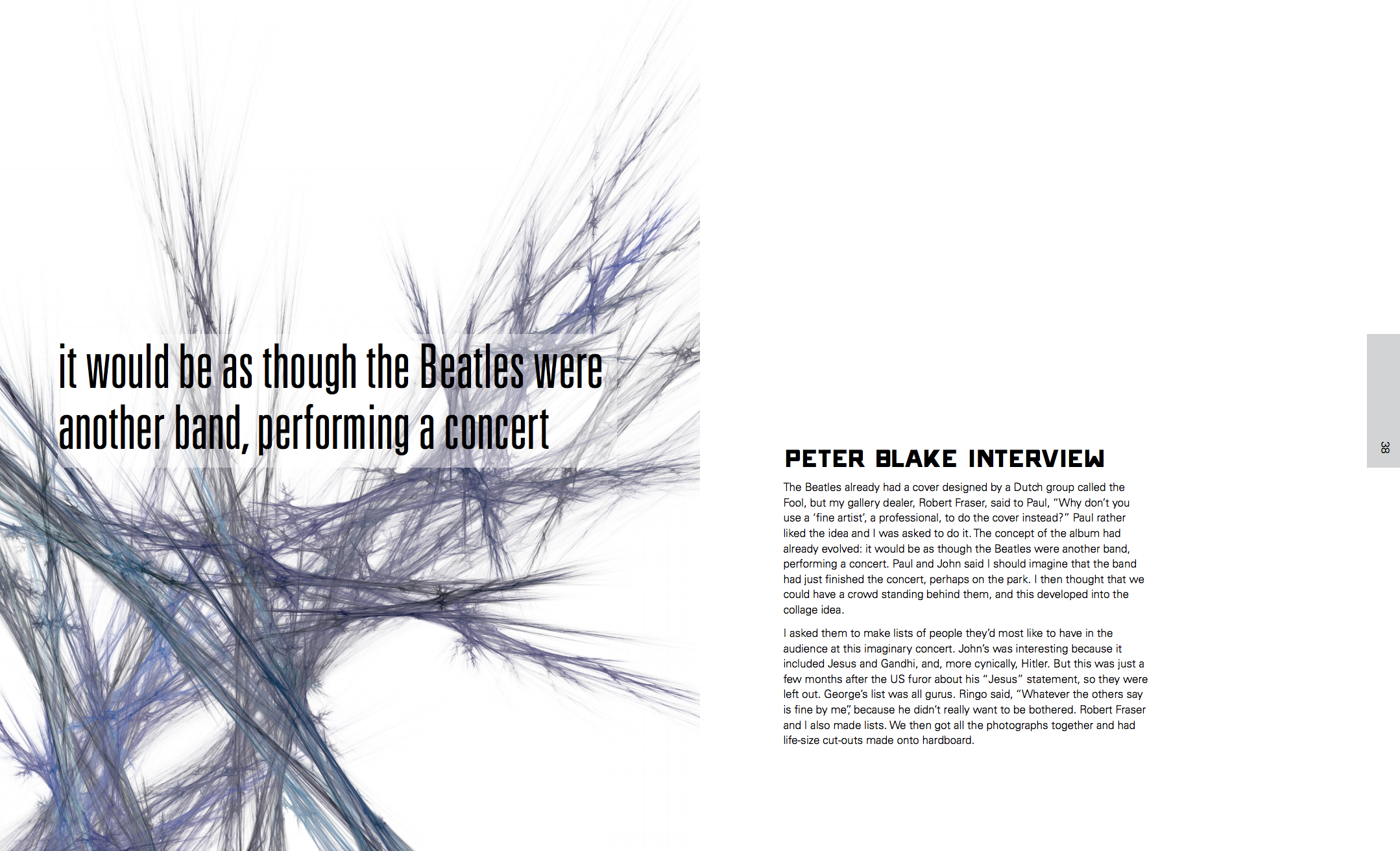
Another interesting point that somebody brought up was the color temperature. Most of the images are cool, but some of them were warm, which makes the whole book less congruent.
Off-white paper was brought up as another option that I could try, but I rejected that one right away. I was already having enough trouble keeping the colors in check. Just imagine how much worse that would be by adding the color of paper.
Overall, I wasn't done with this book yet. There were just too many small things that needed to be tweaked.
In the next part, I am going to write about the changes that I made for the final critique.

Comments