Assignment #4: Book (Part 2)
For the second week of the project, I had to create a pagination plan for the entire book, and also to come up with 10 images that would support the story.
On top of that, I had to refine my spreads and to clarify my creative driver.
Pagination was by far the easiest part: I knew I wanted my book to have 4 sections based on the text.
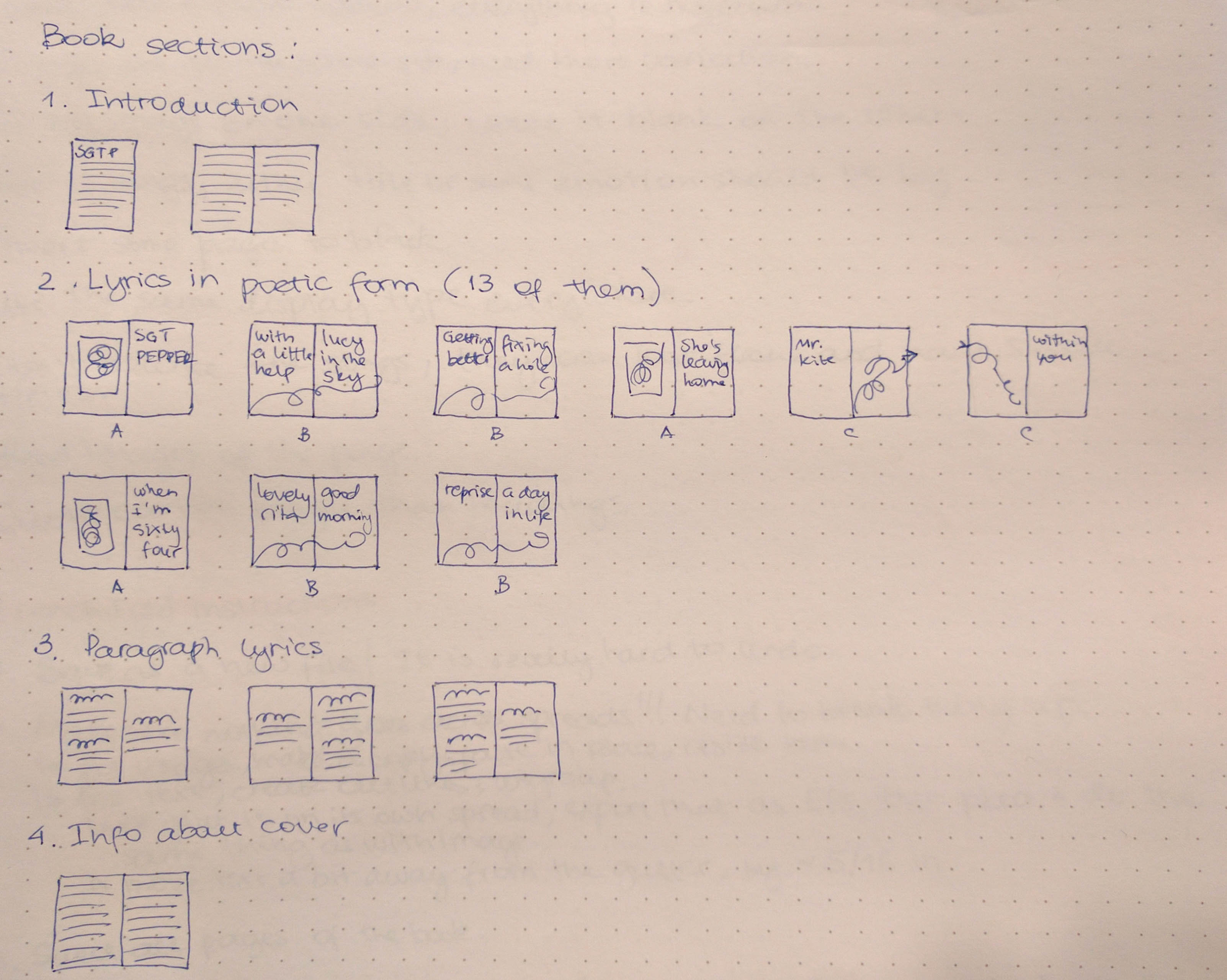
Note that there are two sections that contain lyrics. This is intentional — the first one has those lyrics in proper poetic form, and the second one makes them flow like normal text.
The A, B and C letters under the spreads in the second section stand for three different page formats that I wanted to use.
As for the images, I could easily generate more of the fractals, but I wasn't quite sure that I would end up going with those.
I considered some crazy ideas for my spreads, such as overlaying two different typefaces (that didn't work for me, but somebody else in the class did a similar thing quite successfully), coloring some letters differently to highlight "hidden messages" in the text, and using translucent paper.
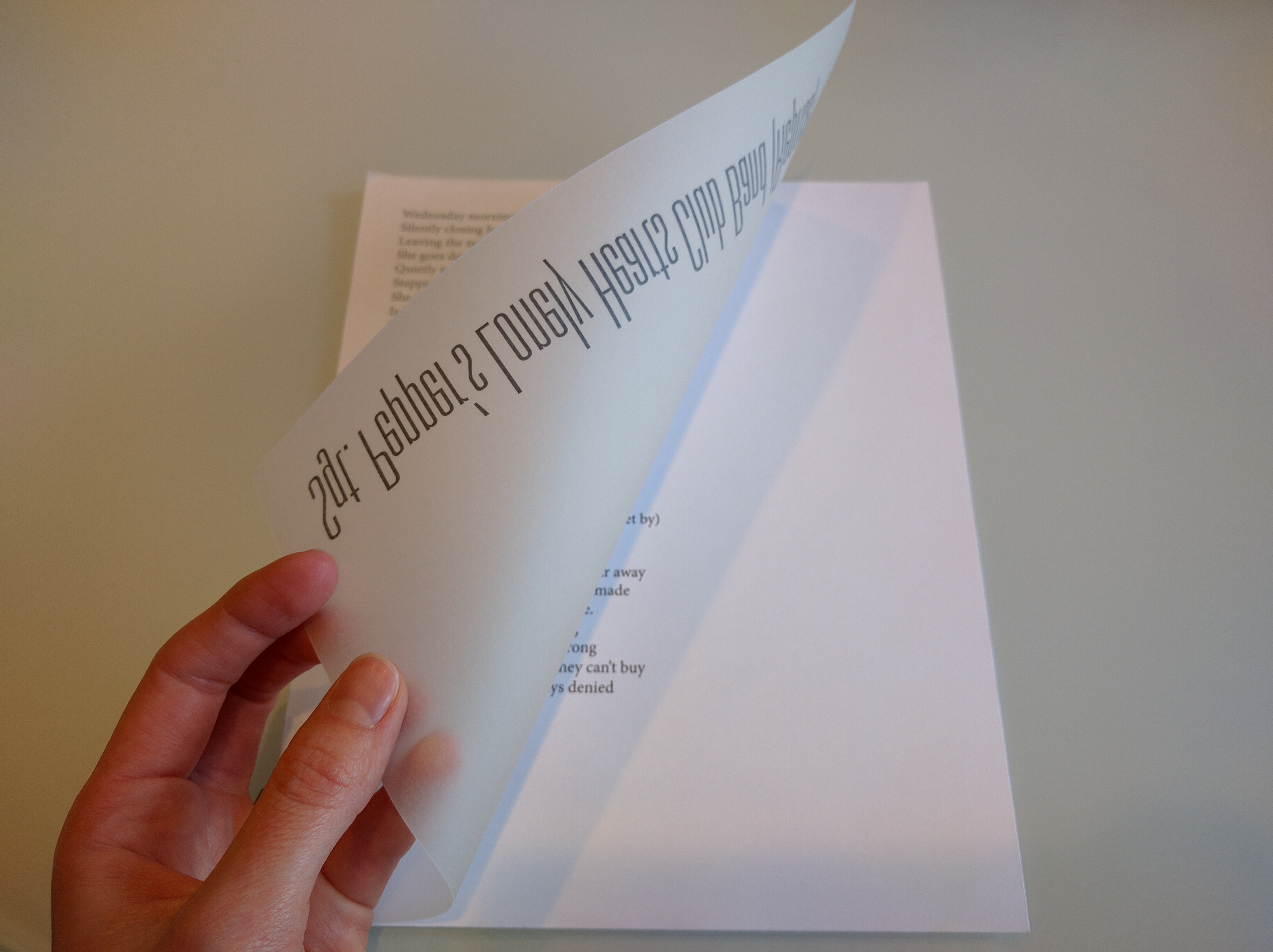
While the first couple ideas didn't make it past the tinkering stage, I made samples of what translucent paper treatment could look like.
One idea that I had was to put the title on a translucent page right before the song. Please keep in mind that I was trying to use the longest song and the longest title, so they don't match correctly.
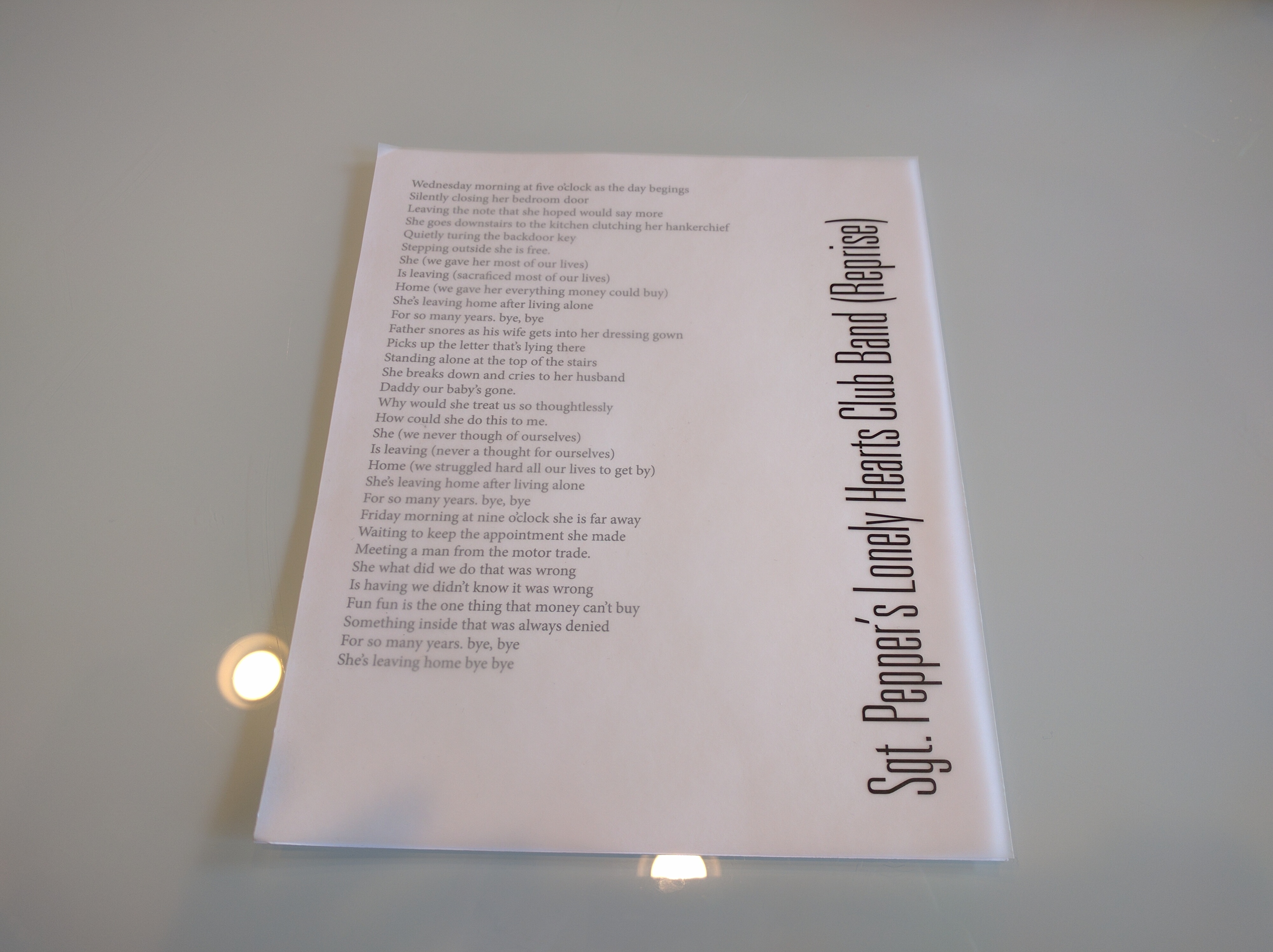
The other idea is similar to highlighting individual letters or words in a different color.
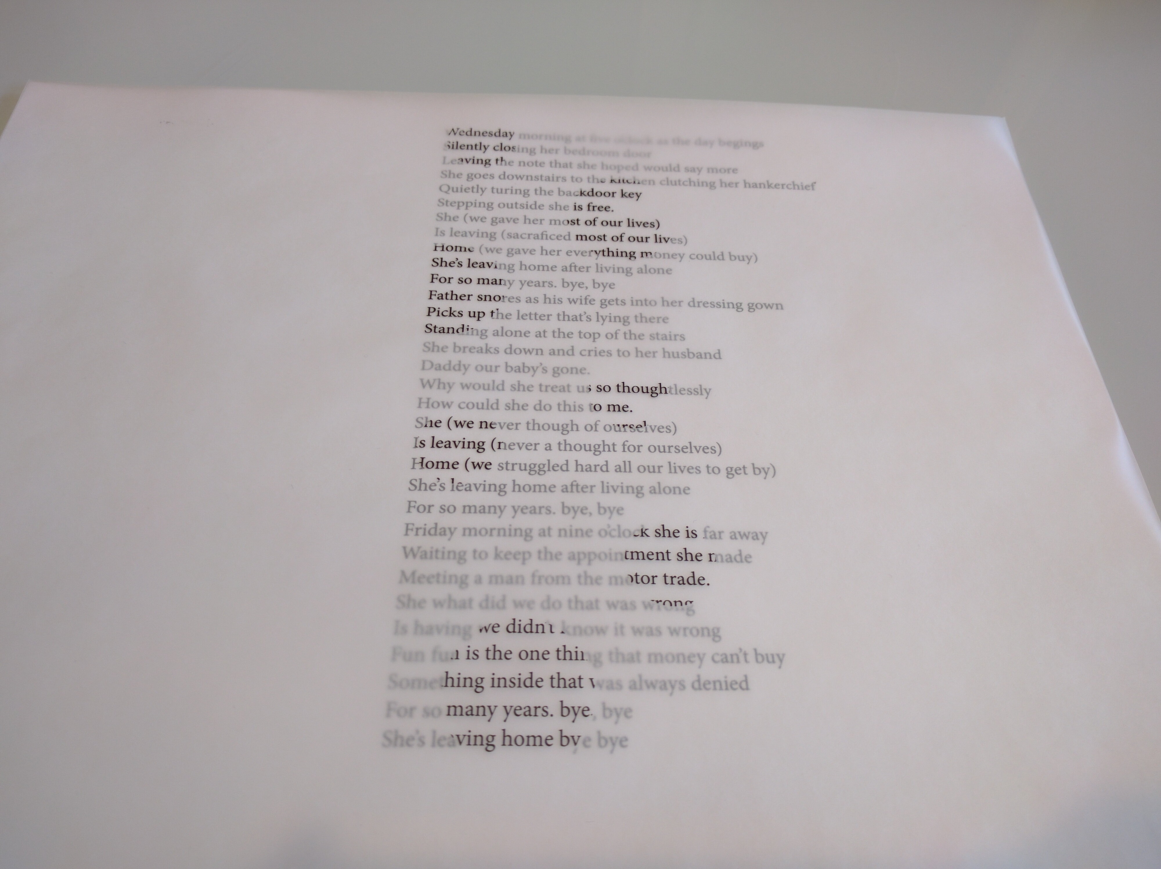
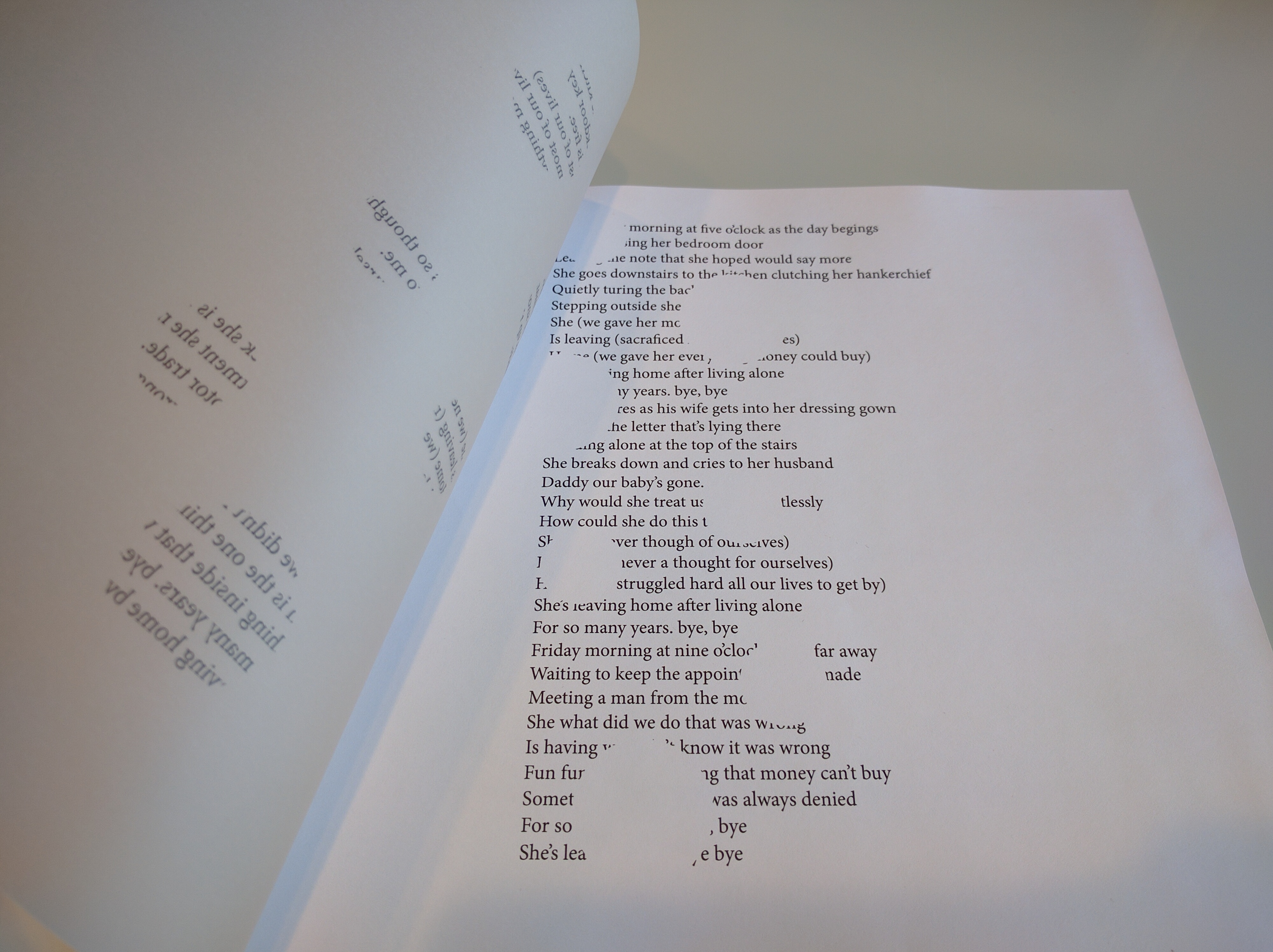
Surprisingly, lining those "cheese holes" up wasn't hard at all. One of my classmates even asked in bewilderment where I got those combined sheets of paper. Just glued them together, buddy! :)
Both of these ideas are kind of cute, but they didn't really get me any closer to the final book or creative driver. Mostly, I did them just to get this stuff out of my system and see if it was worth anything.
I tried to work some more on my spreads, but — let's face it — I had not found my creative driver, and I was starting to get desperate. Below are my somewhat half-hearted attempts at varying the initial spread.
First, I tried to create a pattern similar to the "A" page type in my pagination plan above.
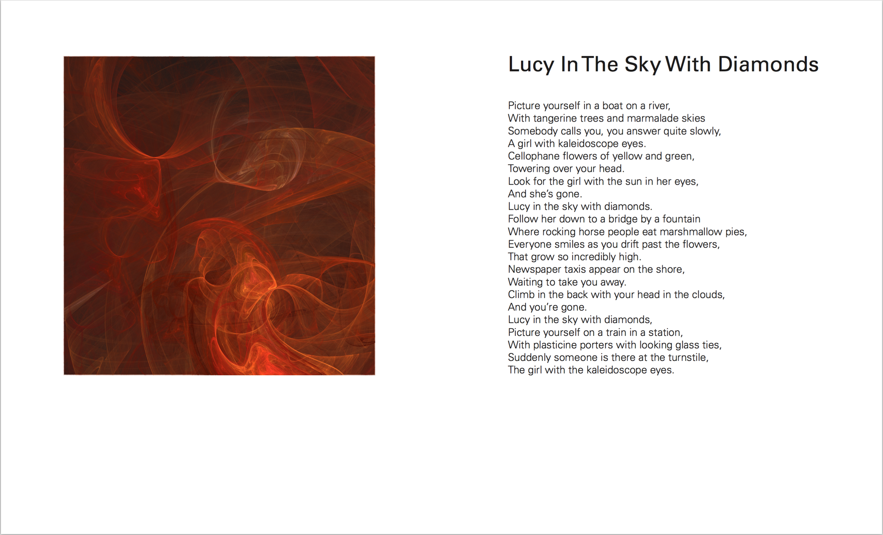
The comments that I got were that the fractal didn't look as impressive when it was boxed in, and that my font size was way too big. Both of those are fair.
I also tried to create a similar spread with page numbers:
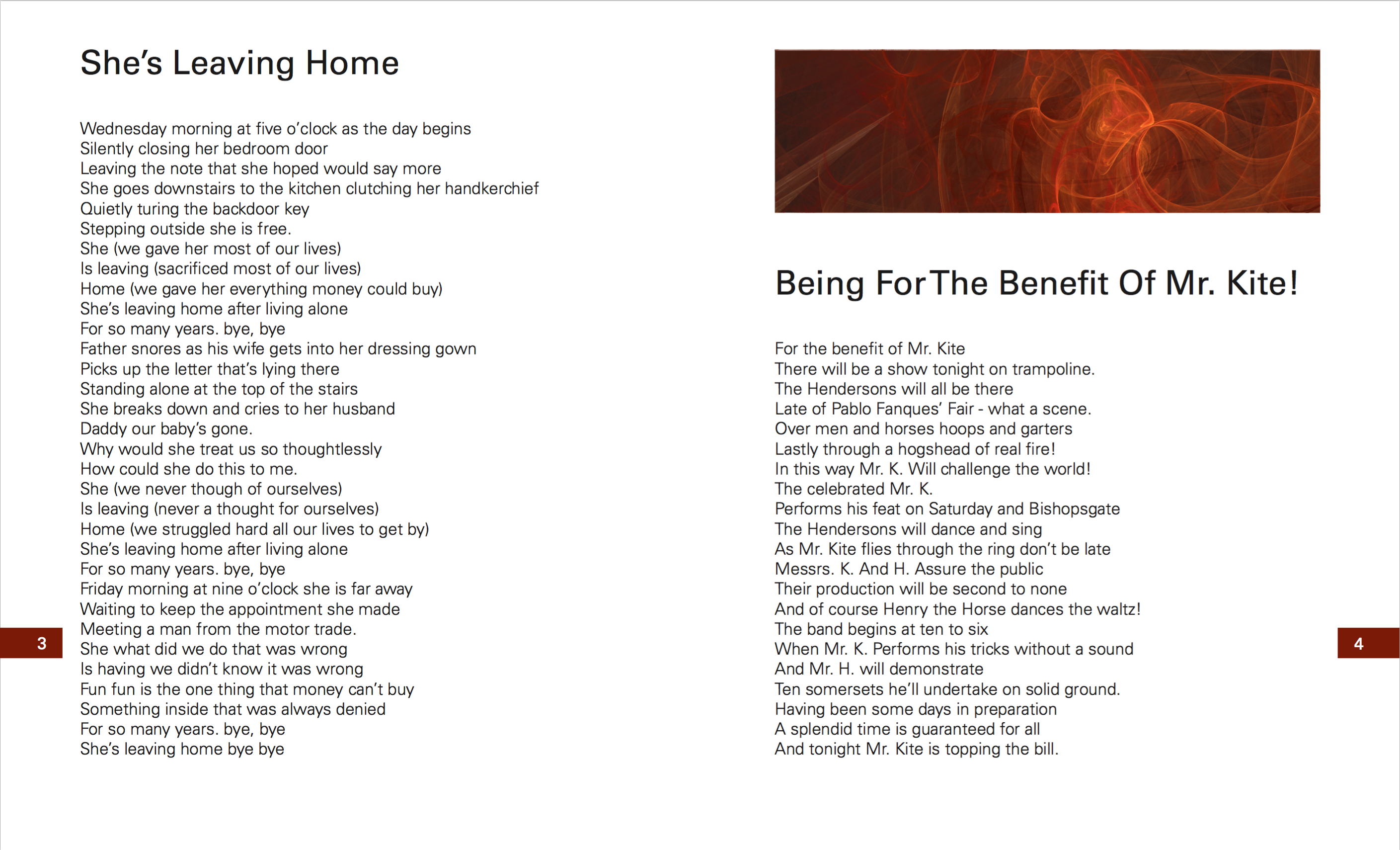
I didn't get any new comments on this one. I suspect it may have been because those page numbers are so bad that people didn't even want to look at them :P
More seriously, though, this spread looks particularly awkward because I tried to line up the top of the title on the left to the top of the image on the right, and even though the alignment is pixel-perfect, it looks off optically.
Finally, I decided to try another image type that I could easily generate. I created a kaleidoscope-like pattern in Illustrator using bright colors.
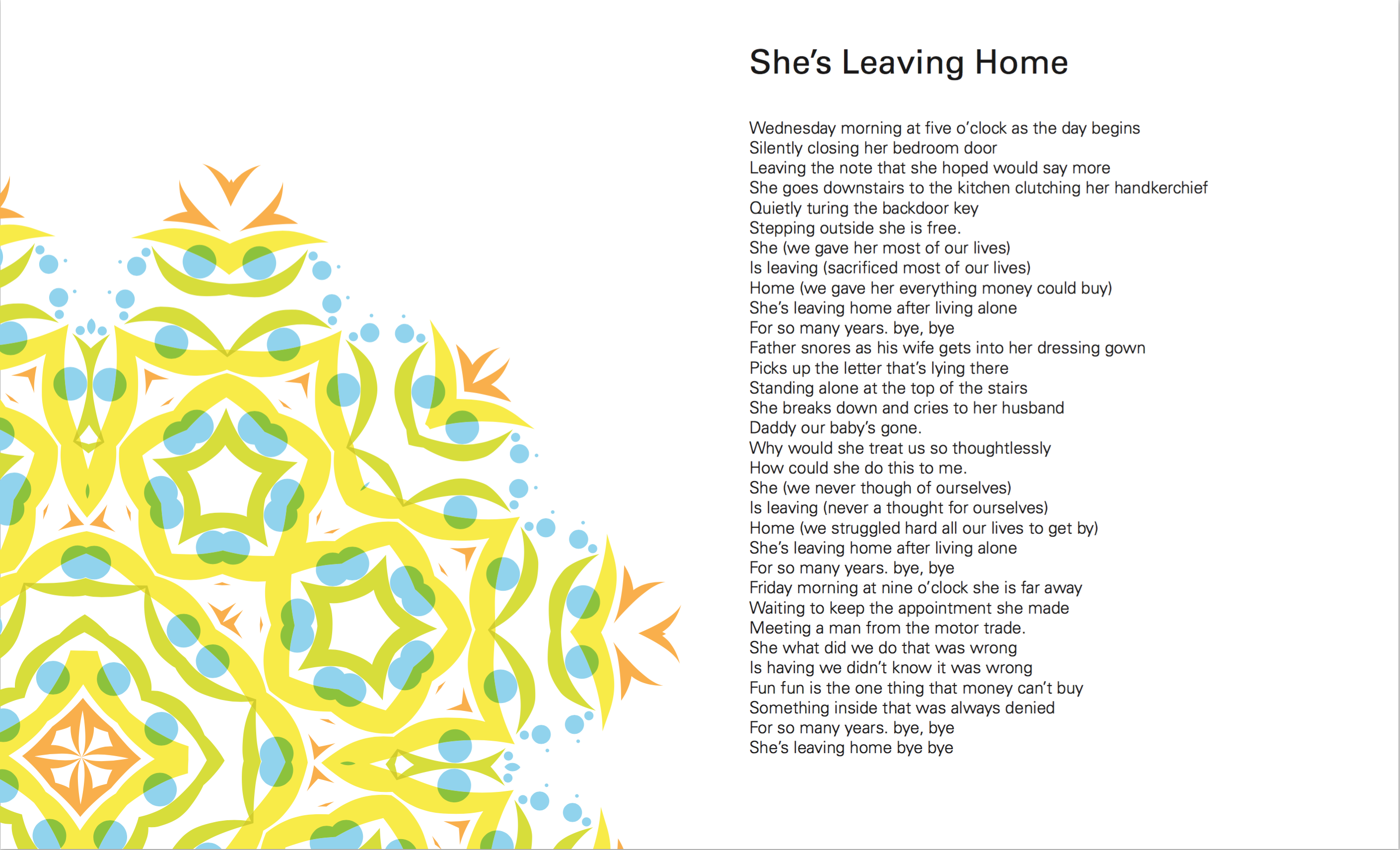
The feedback that I got was that the fractal images look more interesting than the one on this page, so I did not pursue this idea any further. And the instructor pointed out that my song titles were incredibly boring.
P.S. Things got more exciting the following week! Come back to find out how.

Comments