Assignment #2: Refine the logo
It's been a little while since I've written about my design class and its assignments. Part of the reason for that is I have dropped the class, so I only have one more assignment to write about.
As you may remember from my previous post, I had 5 different logo treatments, and I had to select and refine one of them.
After getting the feedback from my instructor, classmate and some friends, I decided to go with the brush version:
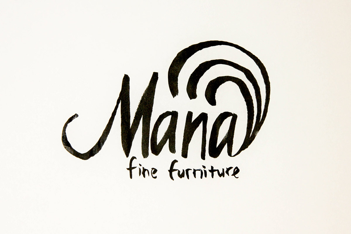
First, I was going to refine the "Mana" part. I decided to use type for the "fine furniture" piece, since this version is not particularly pretty or readable.
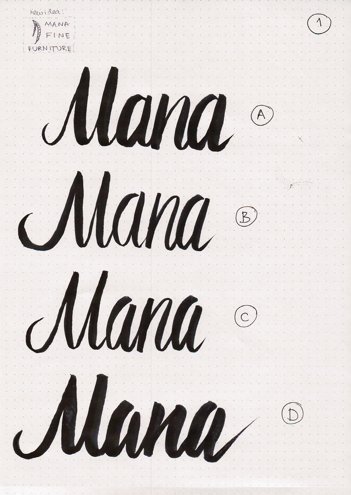
I tried a couple different weights in this version, where all the letters are connected. These are really rough, so I would never consider using any of them.
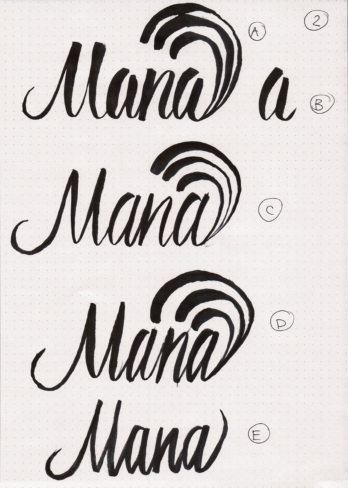
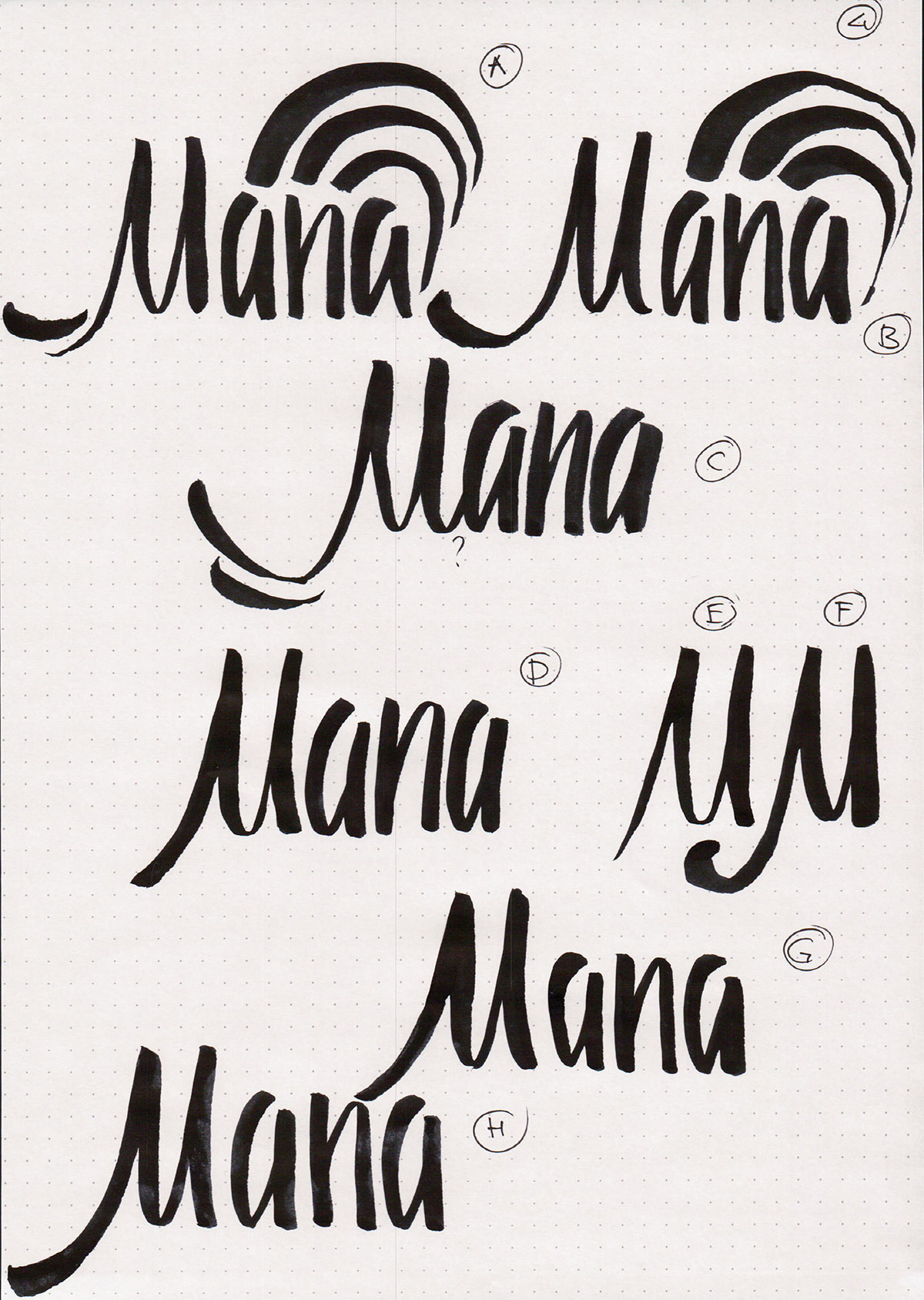
Then, I tried to add in some of the waves back. I think in 2-A the waves are too high above the word, and the M is completely whacky. 2-C is way too skinny. 2-D is generally moving in the right direction, but it's still quite rough. 2-E is just crooked.
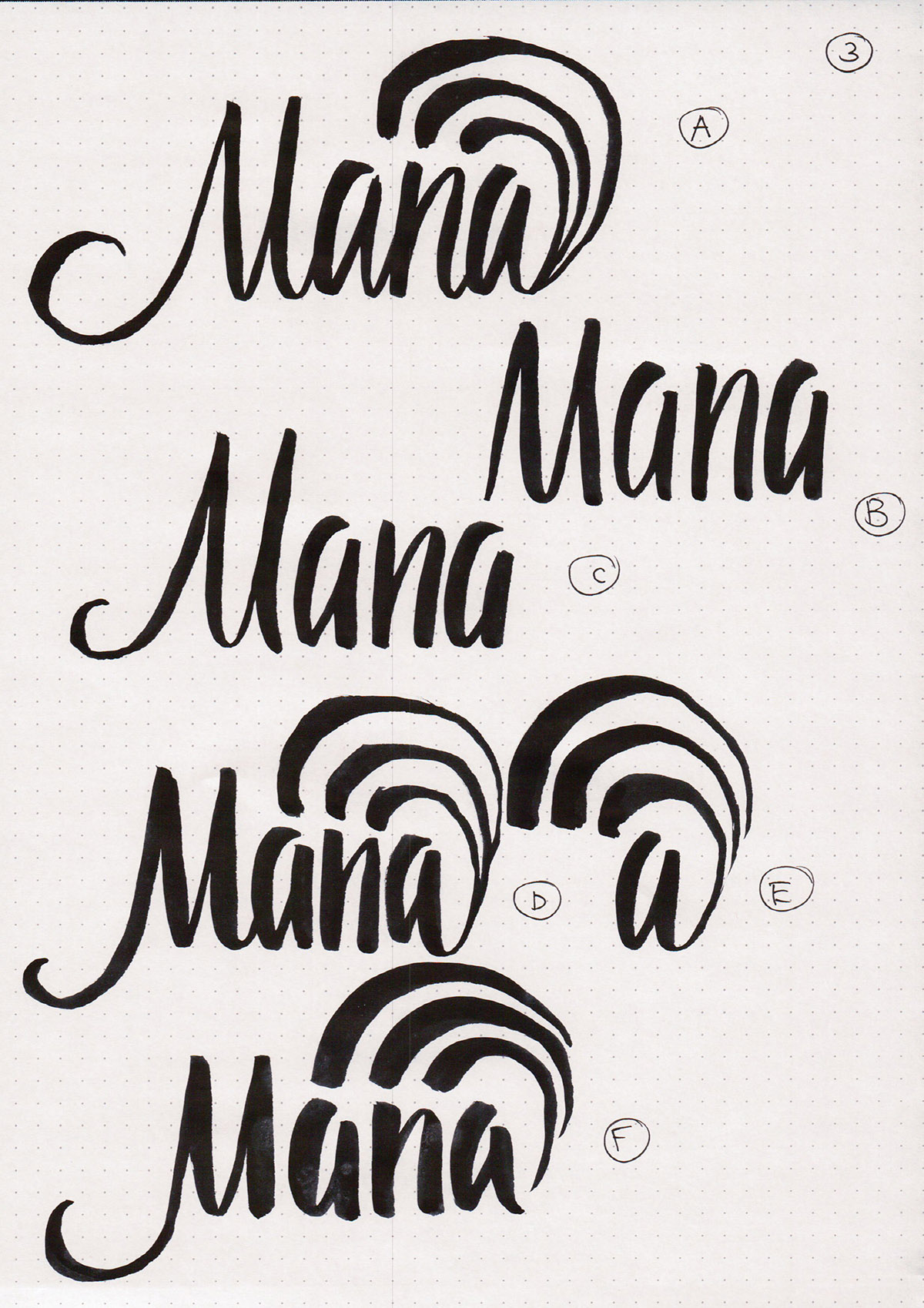
On the next page, I think the combination of 3-D and 3-E would have been decent. The other version have some serious problems with the Ms: both the hooks and the internal spacing look off.
I tried to experiment with a double hook for the M to mirror the waves in 4-A and 4-C, but I don't think that worked out well. I also decided to try to make the M's let more straight and heavier towards the bottom in 4-H. So far, 4-H is my favorite. I decided to leave the letters disconnected to decrease the number of thin elements.
In the image below, 5-A was my new favorite for a little while. I am pretty happy with how the waves turned out, although the M and the N can use a little bit more fine tuning.
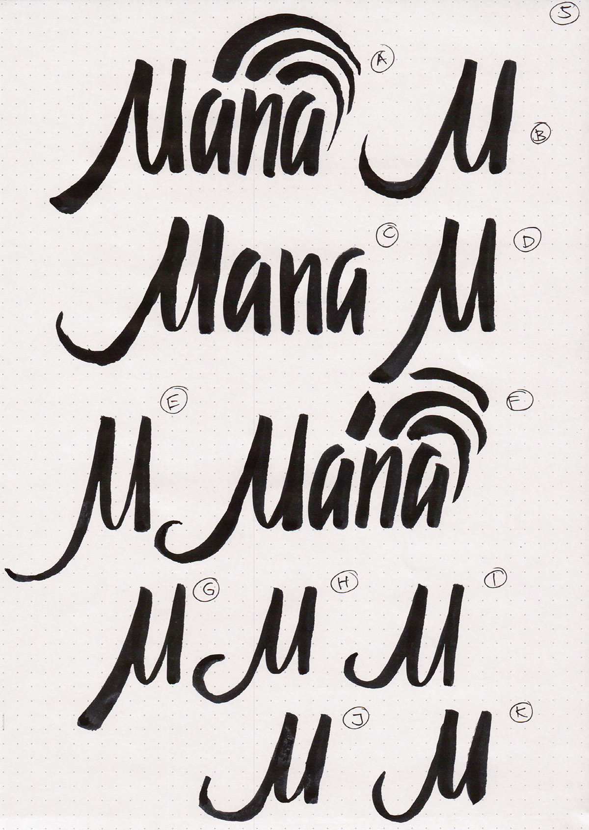
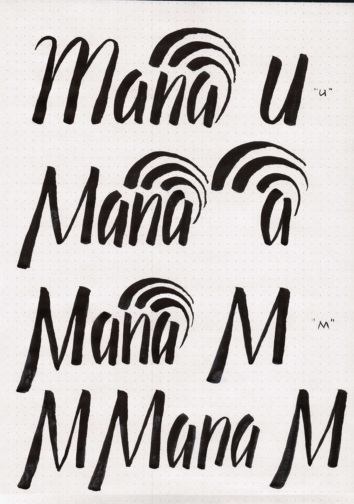
However, I showed the previous version to a friend who has not seen this project before, and he thought it read "Uana" instead of "Mana". Well, that wasn't good at all. It was funny that he apologized so much for reading it wrong: I would much rather have a friend read it wrong and point that out to me, than learn many months later that I got too excited with my lettering and made it unreadable.
I did some more exploration on M vs U look to make sure my writing was legible. I also looked a bit more at a different logo idea just to get it out of my head.
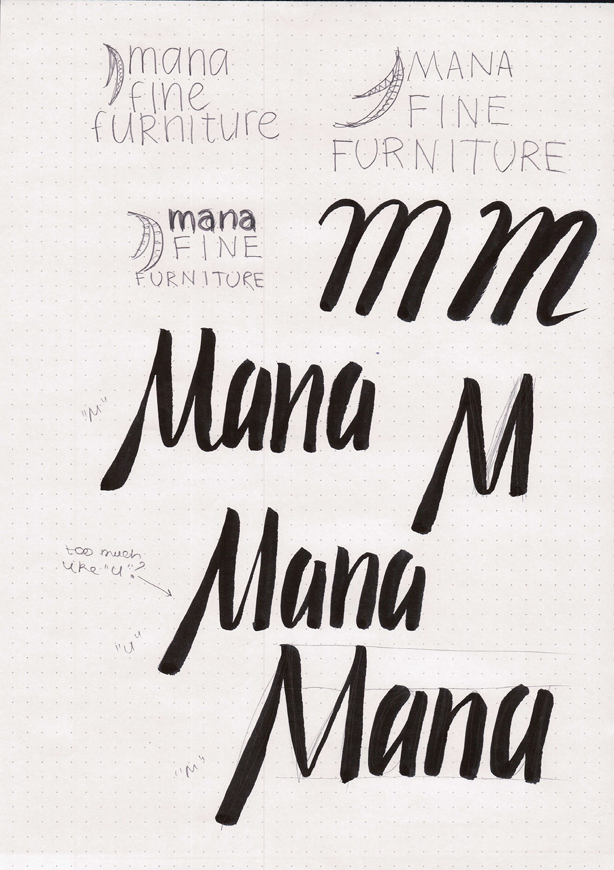
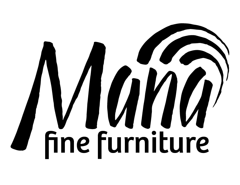
Finally, I decided on the M shape with a pointy bottom, since that would never be confused for a U. I wrote it out a couple more times until I felt ready to scan the image and create a digital version of the logo.
I decided to preserve some of the stroke unevenness in the digital version to maintain the handwritten look. I picked Bree for the "fine furniture" part, but while I like how the logo looks on its own, I would have to change it to a simpler type if this were to ever be used. The reason for that is that Bree really clashes with other typefaces if I try to put this logo on a business card or an envelope.
Overall, I think this was an interesting project. I definitely had a lot of fun with brush lettering, even though it didn't always come up as nicely as I would have liked.

Comments